Linear Trends and Correlations MDM 4 U Lesson
- Slides: 16

Linear Trends and Correlations MDM 4 U Lesson 2. 1

Definitions ¢ ¢ Scatter Plot: a graphical method of showing the joint distribution of two variables in which each point of the graph represents a pair of values. Independent Variable: a variable whose values are arbitrarily chosen (ie time, age, year, month). Horizontal axis. Dependent Variable: a variable whose values depends on the independent variable (i. e. cost, height, weight). Vertical axis. Correlation: The apparent relationship between two variables.

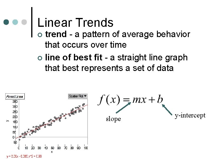
Linear Trends trend - a pattern of average behavior that occurs over time ¢ line of best fit - a straight line graph that best represents a set of data ¢ slope y-intercept

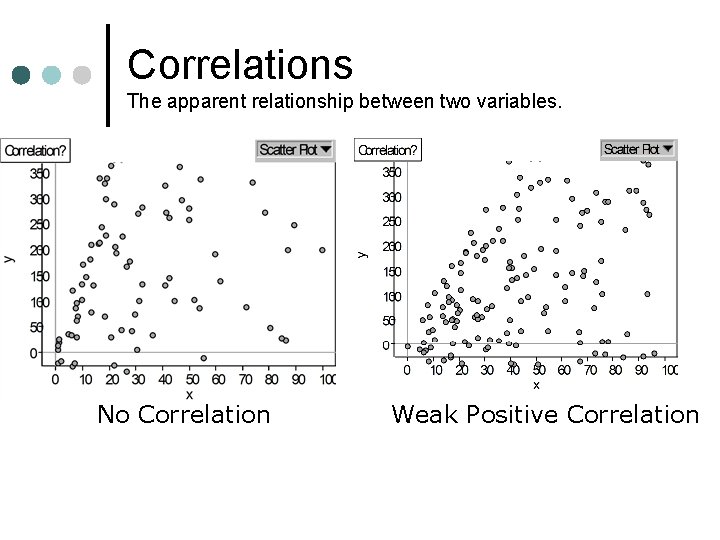
Correlations The apparent relationship between two variables. No Correlation Weak Positive Correlation

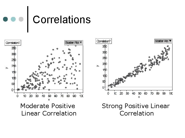
Correlations Moderate Positive Linear Correlation Strong Positive Linear Correlation

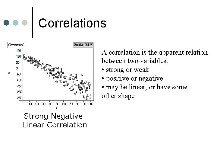
Correlations A correlation is the apparent relation between two variables. • strong or weak • positive or negative • may be linear, or have some other shape Strong Negative Linear Correlation

Measuring Strength of Correlations ¢ Correlations can be strong or weak, but how do we measure how strong or how weak they are? l l l Look at the Correlation Coefficient (r). (thank you Karl Pearson for developing the formula!) You can look at the residuals to get a picture You can sum the squares of the residuals to get a measure (you want this to be small)

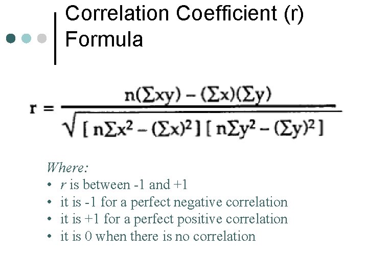
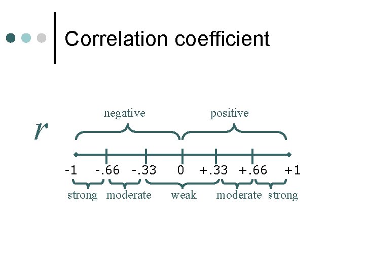
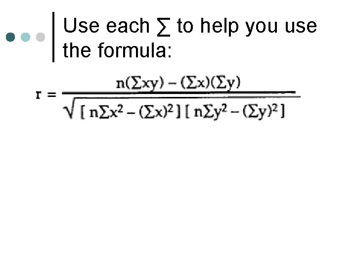
Correlation Coefficient (r) Formula Where: • r is between -1 and +1 • it is -1 for a perfect negative correlation • it is +1 for a perfect positive correlation • it is 0 when there is no correlation

Correlation coefficient negative r -1 -. 66 -. 33 strong moderate positive 0 weak +. 33 +. 66 +1 moderate strong

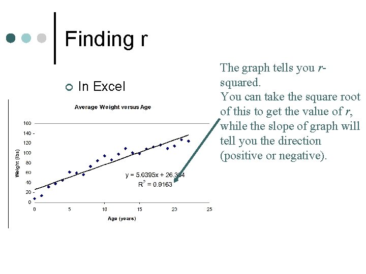
Finding r ¢ In Excel The graph tells you rsquared. You can take the square root of this to get the value of r, while the slope of graph will tell you the direction (positive or negative).

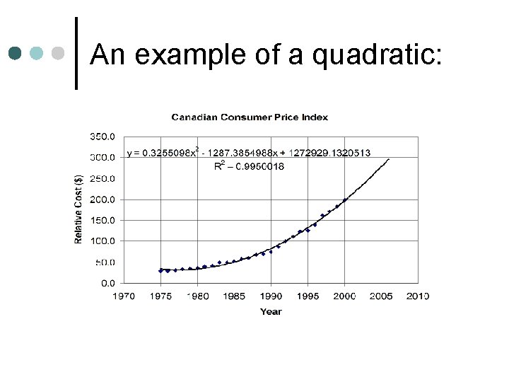
An example of a quadratic:

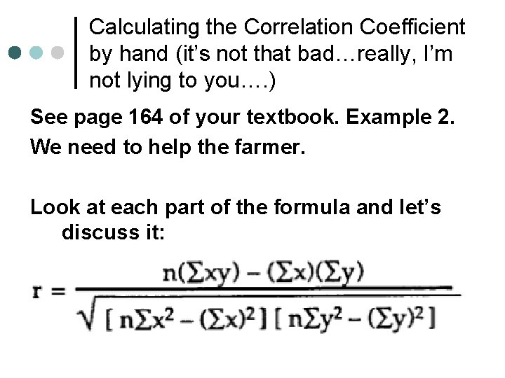
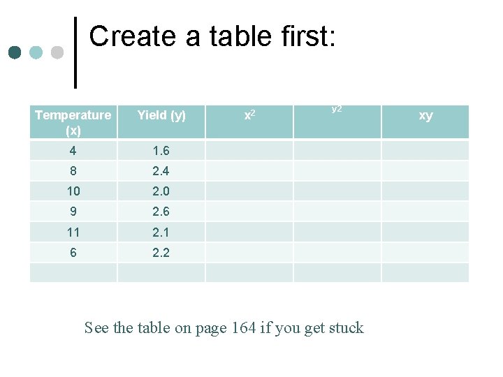
Calculating the Correlation Coefficient by hand (it’s not that bad…really, I’m not lying to you…. ) See page 164 of your textbook. Example 2. We need to help the farmer. Look at each part of the formula and let’s discuss it:

Create a table first: Temperature (x) Yield (y) 4 1. 6 8 2. 4 10 2. 0 9 2. 6 11 2. 1 6 2. 2 x 2 y 2 See the table on page 164 if you get stuck xy

Use each ∑ to help you use the formula:

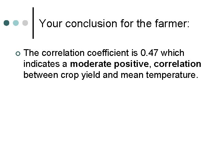
Your conclusion for the farmer: ¢ The correlation coefficient is 0. 47 which indicates a moderate positive, correlation between crop yield and mean temperature.

Homework: ¢ Page 168 #1, 2, 3(Excel), 5 a (Excel), 5 b(no Excel), 5 cde, 6 bc(no Excel), 10, 12 (Excel optional). In your homework you are creating 2 graphs in Excel (and calculating the r 2) and calculating r by hand twice. And doing a few random questions. That’s not too much to ask. Do your homework. Ask for help. We’ll learn about Excel tomorrow.