Linear transformations A linear transformation changes the original

- Slides: 21

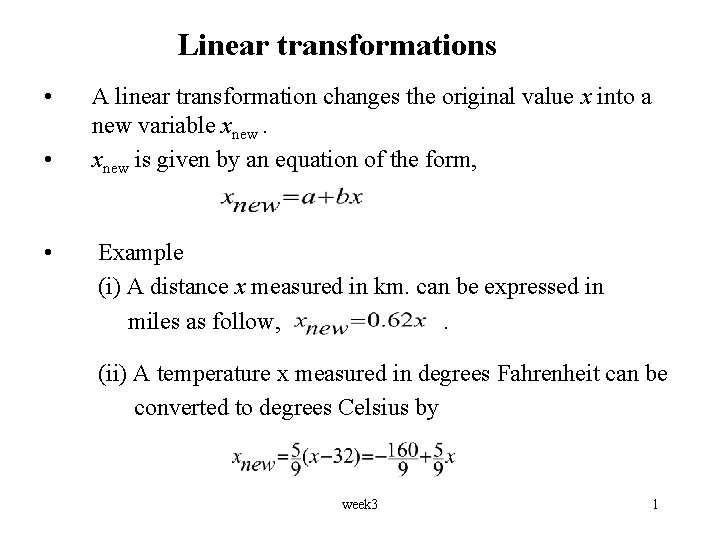
Linear transformations • • • A linear transformation changes the original value x into a new variable xnew is given by an equation of the form, Example (i) A distance x measured in km. can be expressed in miles as follow, . (ii) A temperature x measured in degrees Fahrenheit can be converted to degrees Celsius by week 3 1

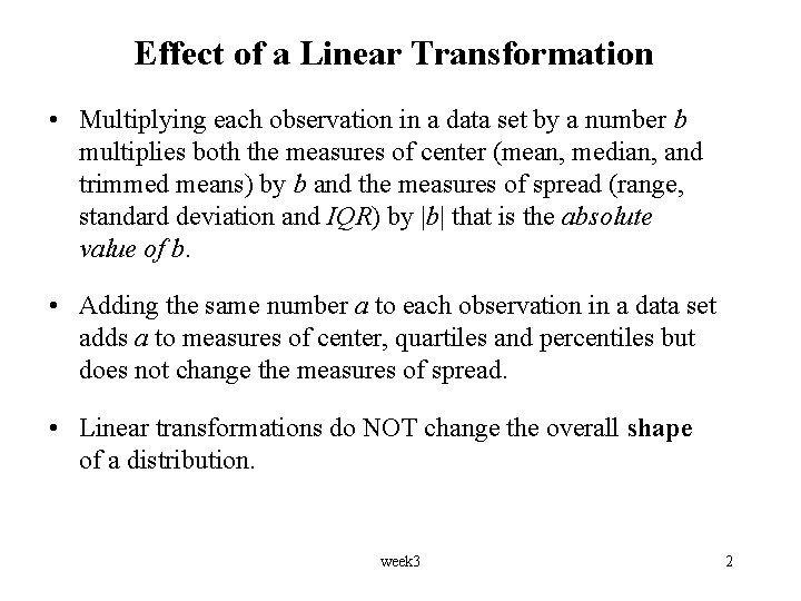
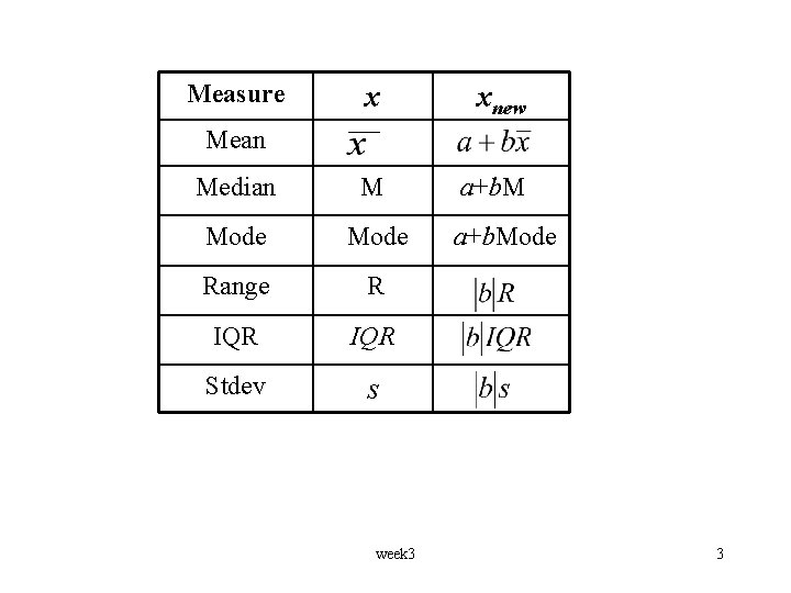
Effect of a Linear Transformation • Multiplying each observation in a data set by a number b multiplies both the measures of center (mean, median, and trimmed means) by b and the measures of spread (range, standard deviation and IQR) by |b| that is the absolute value of b. • Adding the same number a to each observation in a data set adds a to measures of center, quartiles and percentiles but does not change the measures of spread. • Linear transformations do NOT change the overall shape of a distribution. week 3 2

Measure x xnew Median M a+b. M Mode Range R IQR Stdev s Mean week 3 a+b. Mode 3

Example 1 • A sample of 20 employees of a company was taken and their salaries were recorded. Suppose each employee receives a $300 raise in the salary for the next year. State whether the following statements are true or false. a) The IQR of the salaries will i. be unchanged ii. increase by $300 iii. be multiplied by $300 b) The mean of the salaries will i. be unchanged ii. increase by $300 iii. be multiplied by $300 week 3 4

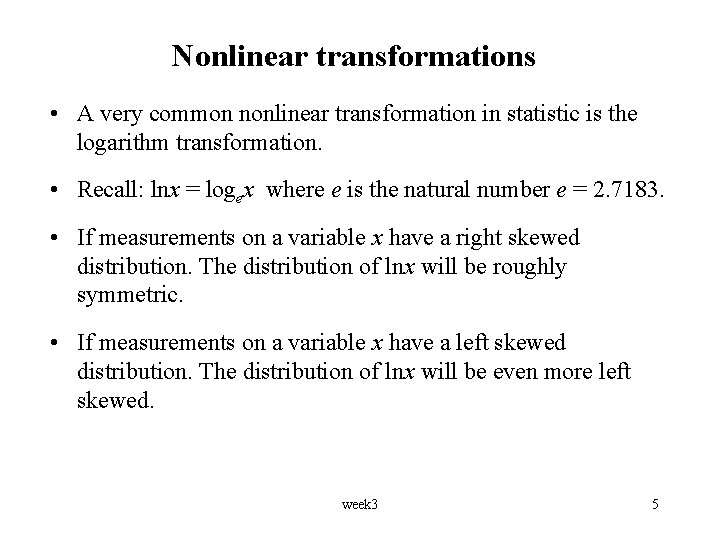
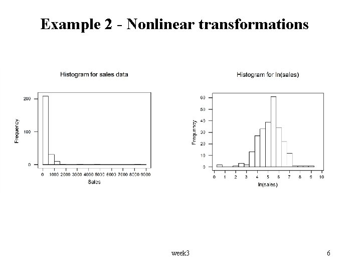
Nonlinear transformations • A very common nonlinear transformation in statistic is the logarithm transformation. • Recall: lnx = logex where e is the natural number e = 2. 7183. • If measurements on a variable x have a right skewed distribution. The distribution of lnx will be roughly symmetric. • If measurements on a variable x have a left skewed distribution. The distribution of lnx will be even more left skewed. week 3 5

Example 2 - Nonlinear transformations week 3 6

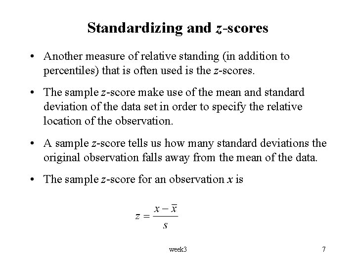
Standardizing and z-scores • Another measure of relative standing (in addition to percentiles) that is often used is the z-scores. • The sample z-score make use of the mean and standard deviation of the data set in order to specify the relative location of the observation. • A sample z-score tells us how many standard deviations the original observation falls away from the mean of the data. • The sample z-score for an observation x is week 3 7

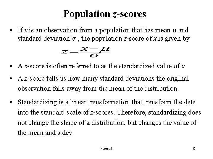
Population z-scores • If x is an observation from a population that has mean and standard deviation , the population z-score of x is given by • A z-score is often referred to as the standardized value of x. • A z-score tells us how many standard deviations the original observation falls away from the mean of the distribution. • Standardizing is a linear transformation that transform the data into the standard scale of z-scores. Therefore, standardizing does not change the shape of a distribution, but changes the value of the mean and stdev. week 3 8

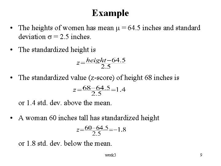
Example • The heights of women has mean = 64. 5 inches and standard deviation = 2. 5 inches. • The standardized height is • The standardized value (z-score) of height 68 inches is or 1. 4 std. dev. above the mean. • A woman 60 inches tall has standardized height or 1. 8 std. dev. below the mean. week 3 9

Looking at data - relationships • Two variables measured on the same individuals are associated if some values of one variable tend to occur more often with some values of the second variable than with other values of that variable. • When examining the relationship between two or more variables, we should first think about the following questions: – What individuals do the data describe? – What variables are present? How are they measured? – Which variables are quantitative and which are categorical? – Is the purpose of the study is simply to explore the nature of the relationship, or do we hope to show that one variable can explain variation in the other? week 3 10

Response and explanatory variables • A response variable measure an outcome of a study. An explanatory variable explains or causes changes in the response variables. • Explanatory variables are often called independent variables and response variables are called dependent variables. The ides behind this is that response variables depend on explanatory variables. • We usually call the explanatory variable x and the response variable y. • The relationship between two quantitative variables is called bivariate relationship. week 3 11

Scatterplot • A scatterplot is a two-dimensional plot, with one variable’s values plotted along the vertical axis and the other along the horizontal axis. • A scatterplot shows the relationship between two quantitative variables measured on the same individuals. • Each individual in the data appears as a point in the plot fixed by the values of both variables for that individual. • Always plot the explanatory variable, if there is one, on the horizontal axis (the x axis) of a scatterplot. week 3 12

Examining and interpreting Scatterplots • Look for overall pattern and striking deviations from that pattern. • The overall pattern of a scatterplot can be described by the form, direction and strength of the relationship. • An important kind of deviation is an outlier, an individual value that falls outside the overall pattern. • If large values of one variables are associated with large values of the second variable, we say that the two variables are “positively related” or “positively correlated”. • Alternatively, if large values of one variables are associated with small values of the second variable, we say that the two variables are “negatively correlated”. week 3 13

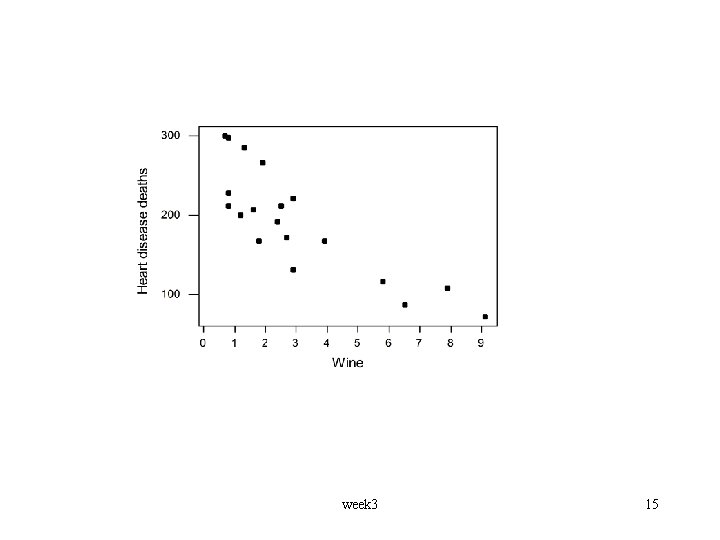
Example • There is some evidence that drinking moderate amounts of wine helps prevent heart attack. A data set contain information on yearly wine consumption (litters person) and yearly deaths from heart disease (deaths per 100, 000 people) in 19 developed nations. Answer the following questions. • What is the explanatory variable? • What is the response variable? • Examine the scatterplot below. week 3 14

week 3 15

• Interpretation of the scatterplot – The pattern is fairly linear with a negative slope. No outliers. – The direction of the association is negative. This means that higher levels of wine consumption are associated with lower death rates. – This does not mean there is a causal effect. There could be lurking variables. For example, higher wine consumption could be linked to higher income, which would allow better medical care. • MINITAB command for scatterplot Graph > Scatterplot week 3 16

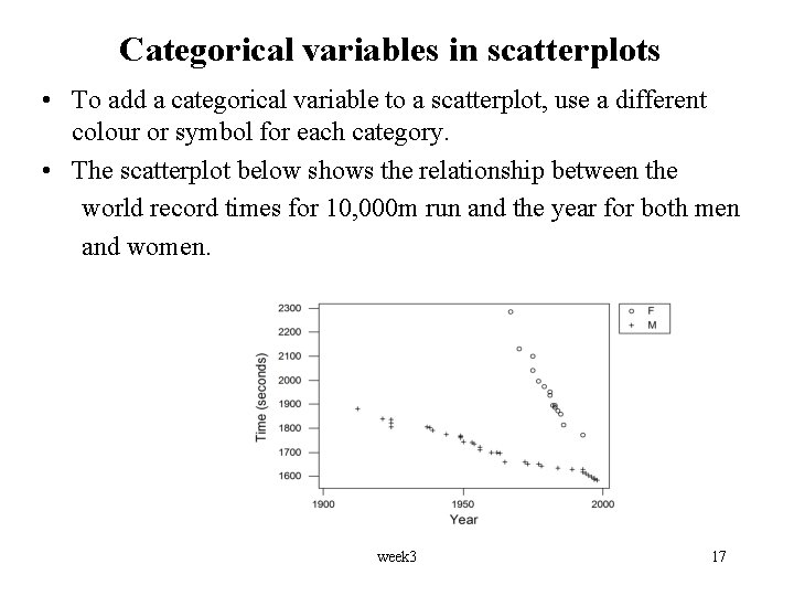
Categorical variables in scatterplots • To add a categorical variable to a scatterplot, use a different colour or symbol for each category. • The scatterplot below shows the relationship between the world record times for 10, 000 m run and the year for both men and women. week 3 17

Categorical explanatory variables • Scatterplots display the association between two quantitative variables. • To display a relationship between a categorical explanatory variable and a quantitative response variable, make a side-byside comparison of the distributions of the response for each category. • A back-to-back stemplot compares two distributions. • Side-by-side boxplots compare any number of distributions. week 3 18

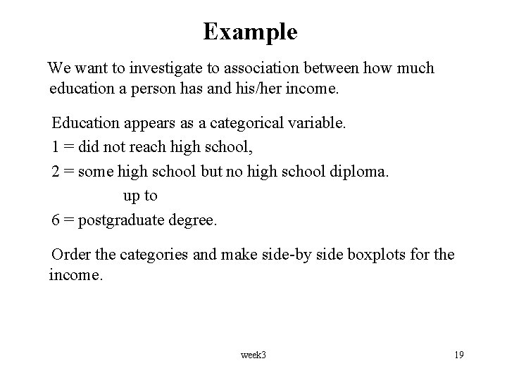
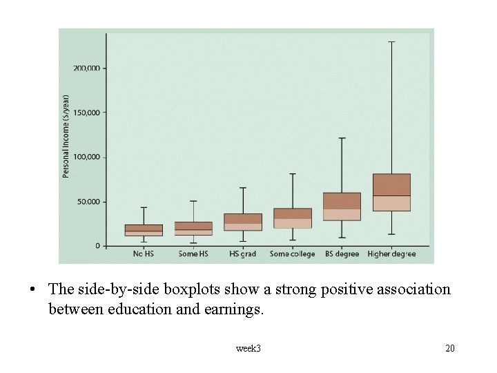
Example We want to investigate to association between how much education a person has and his/her income. Education appears as a categorical variable. 1 = did not reach high school, 2 = some high school but no high school diploma. up to 6 = postgraduate degree. Order the categories and make side-by side boxplots for the income. week 3 19

• The side-by-side boxplots show a strong positive association between education and earnings. week 3 20

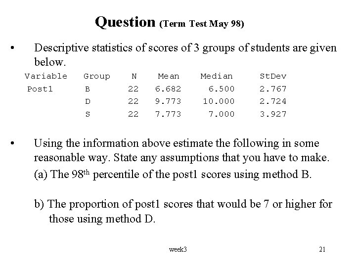
Question (Term Test May 98) • Descriptive statistics of scores of 3 groups of students are given below. Variable Post 1 • Group B D S N 22 22 22 Mean 6. 682 9. 773 7. 773 Median 6. 500 10. 000 7. 000 St. Dev 2. 767 2. 724 3. 927 Using the information above estimate the following in some reasonable way. State any assumptions that you have to make. (a) The 98 th percentile of the post 1 scores using method B. b) The proportion of post 1 scores that would be 7 or higher for those using method D. week 3 21