LINE There are many types of lines thick

- Slides: 45

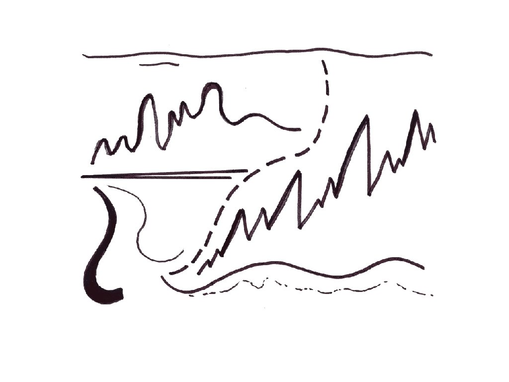
LINE There are many types of lines: thick, thin, horizontal, vertical, zigzag, diagonal, curly, curved, spiral, etc. Lines are basic tools for artists— though some artists show their lines more than others.


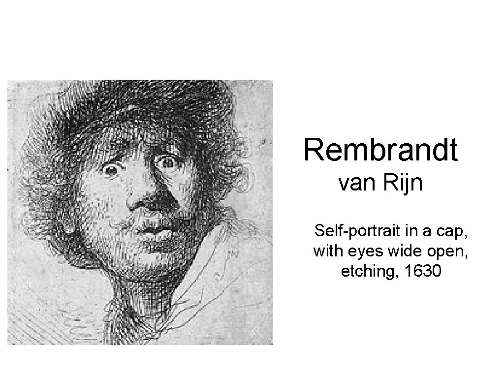
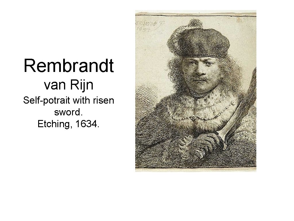
Parallel or Cross Hatching • Marks created with. Lines repeating lines are used to create texture, patterns or shading • • By creating lines that are close together or intersecting them at diagonal angles, delicate or harsh shading can be achieved. The more lines that are clustered next to one another or crossing over each other, the darker the shading becomes. The shading can also be altered by the pressure of the tool used to make the marks. However, if ink is being used, pressure will not alter the intensity of color. Instead, choosing to make less marks or make them further apart from one another will give the effect of lighter shadows.

Rembrandt van Rijn Self-portrait in a cap, with eyes wide open, etching, 1630

Rembrandt van Rijn Self-potrait with risen sword. Etching, 1634.

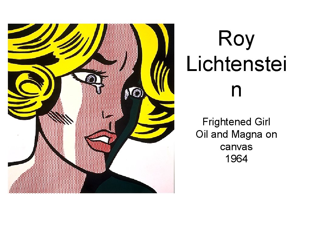
Roy Lichtenstei n Frightened Girl Oil and Magna on canvas 1964

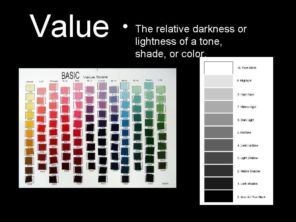
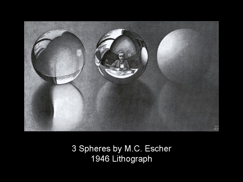
Value • The relative darkness or lightness of a tone, shade, or color.

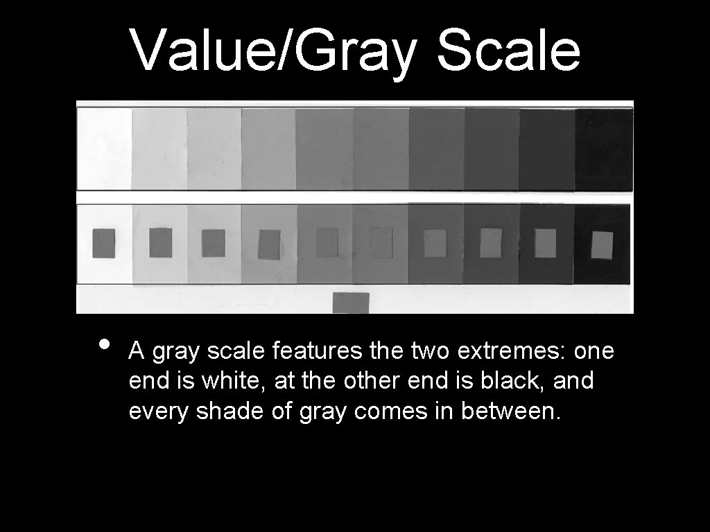
Value/Gray Scale • A gray scale features the two extremes: one end is white, at the other end is black, and every shade of gray comes in between.

3 Spheres by M. C. Escher 1946 Lithograph

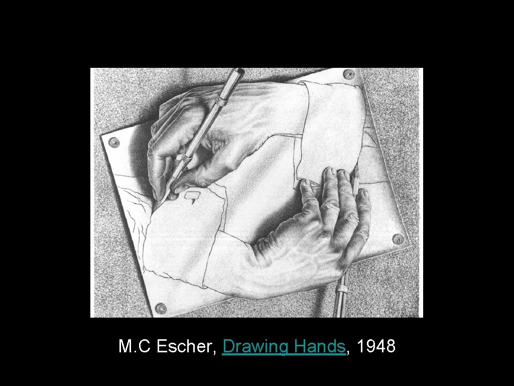
M. C Escher, Drawing Hands, 1948

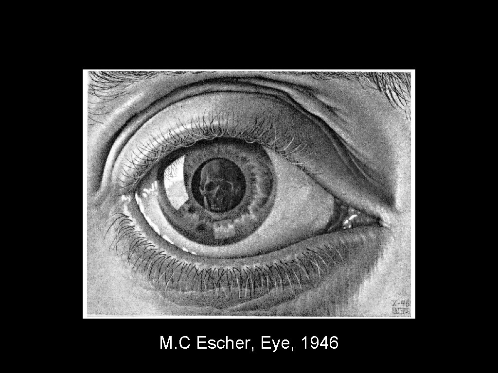
M. C Escher, Eye, 1946

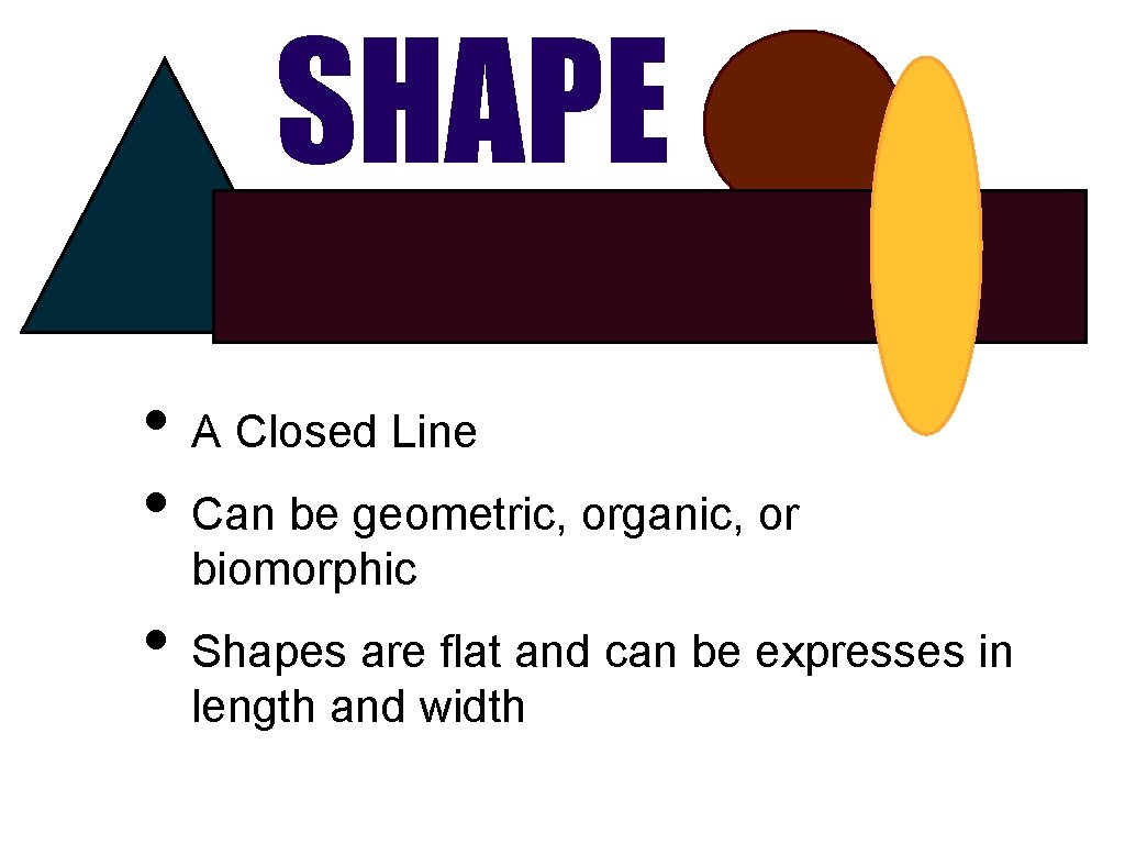
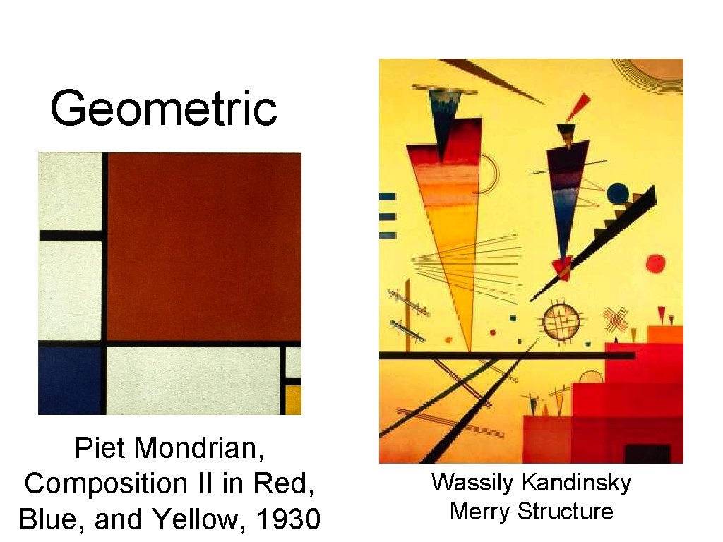
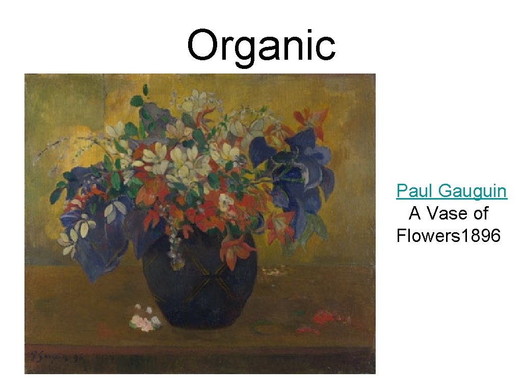
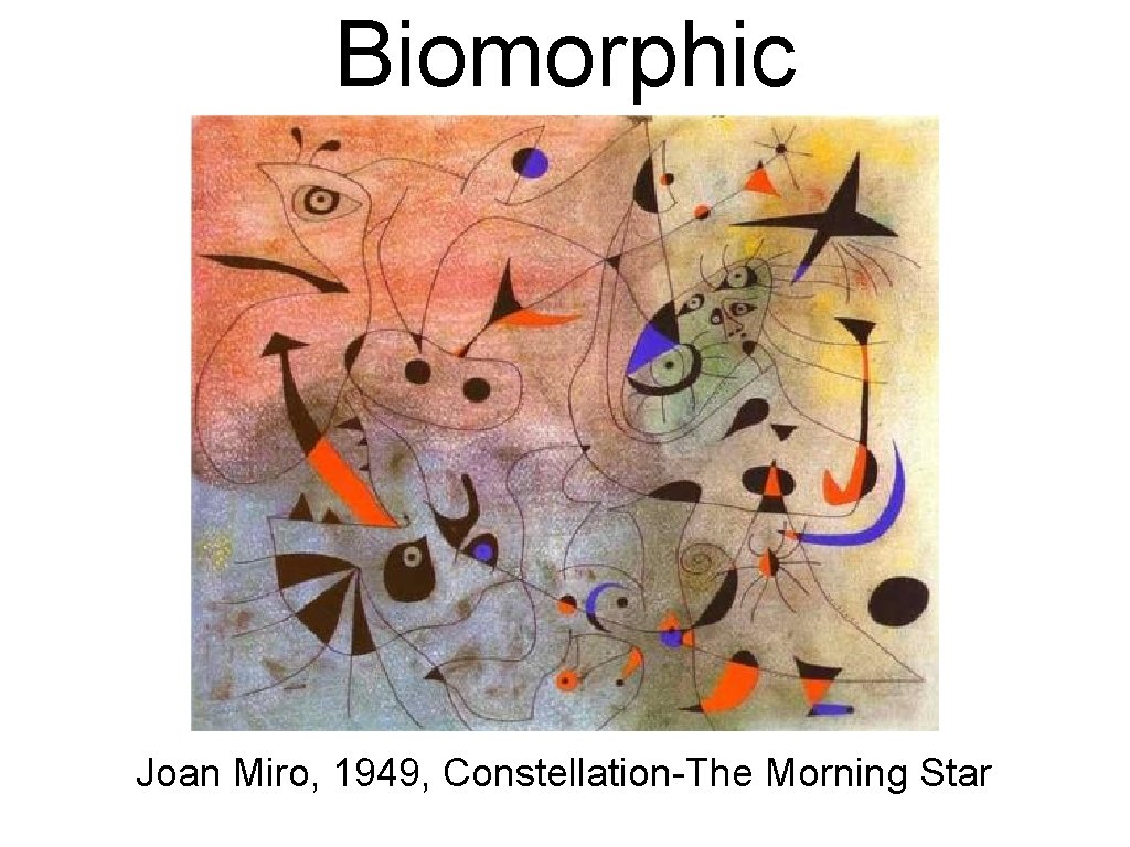
SHAPE • A Closed Line • Can be geometric, organic, or biomorphic • Shapes are flat and can be expresses in length and width

Geometric Piet Mondrian, Composition II in Red, Blue, and Yellow, 1930 Wassily Kandinsky Merry Structure

Organic Paul Gauguin A Vase of Flowers 1896

Biomorphic Joan Miro, 1949, Constellation-The Morning Star

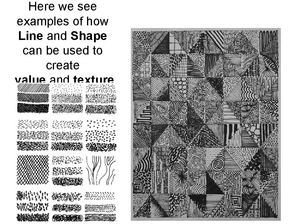
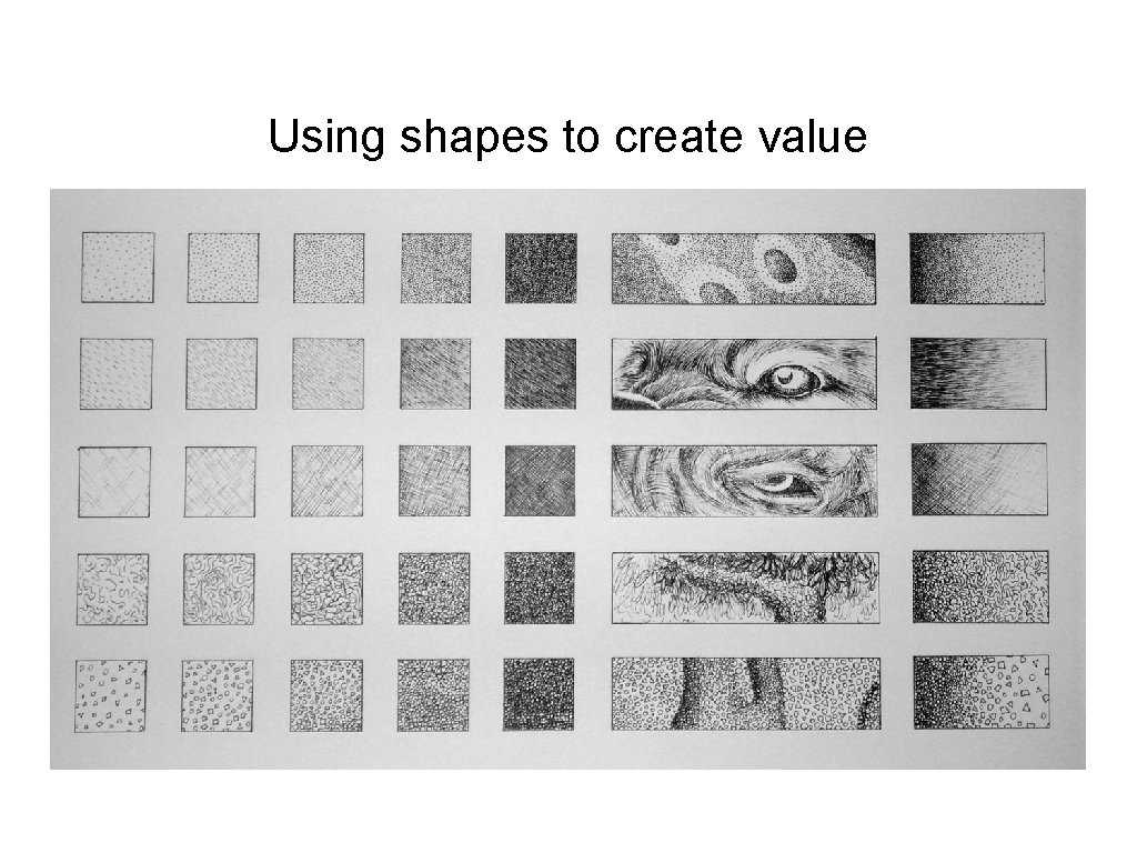
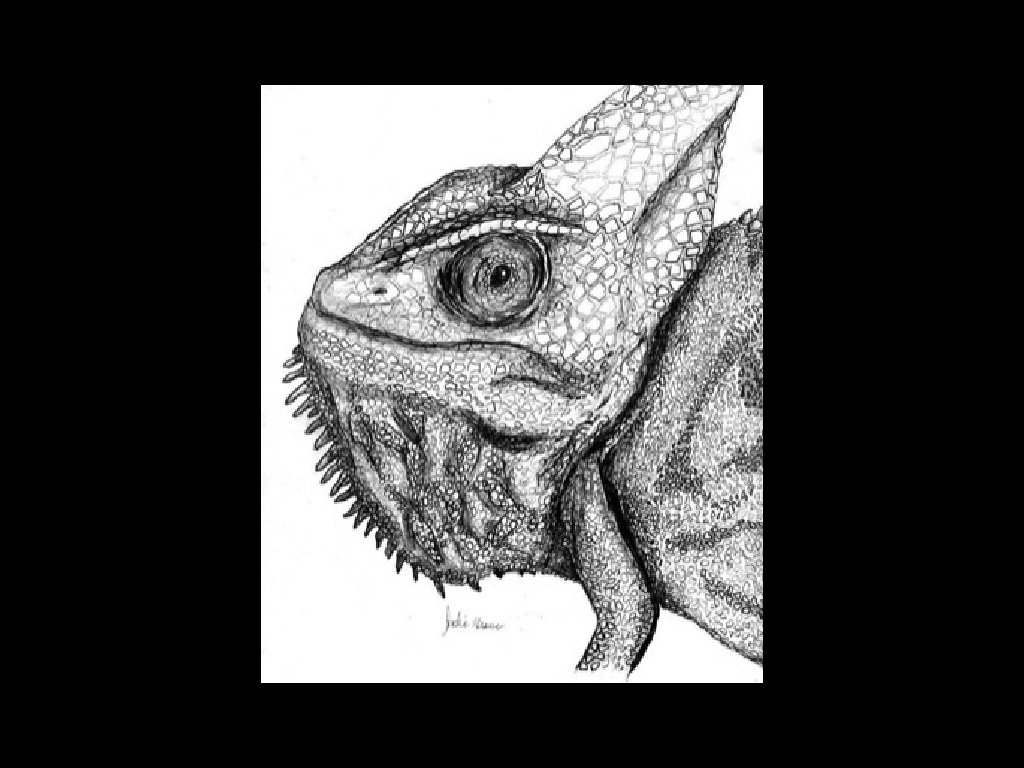
Here we see examples of how Line and Shape can be used to create value and texture

Using shapes to create value


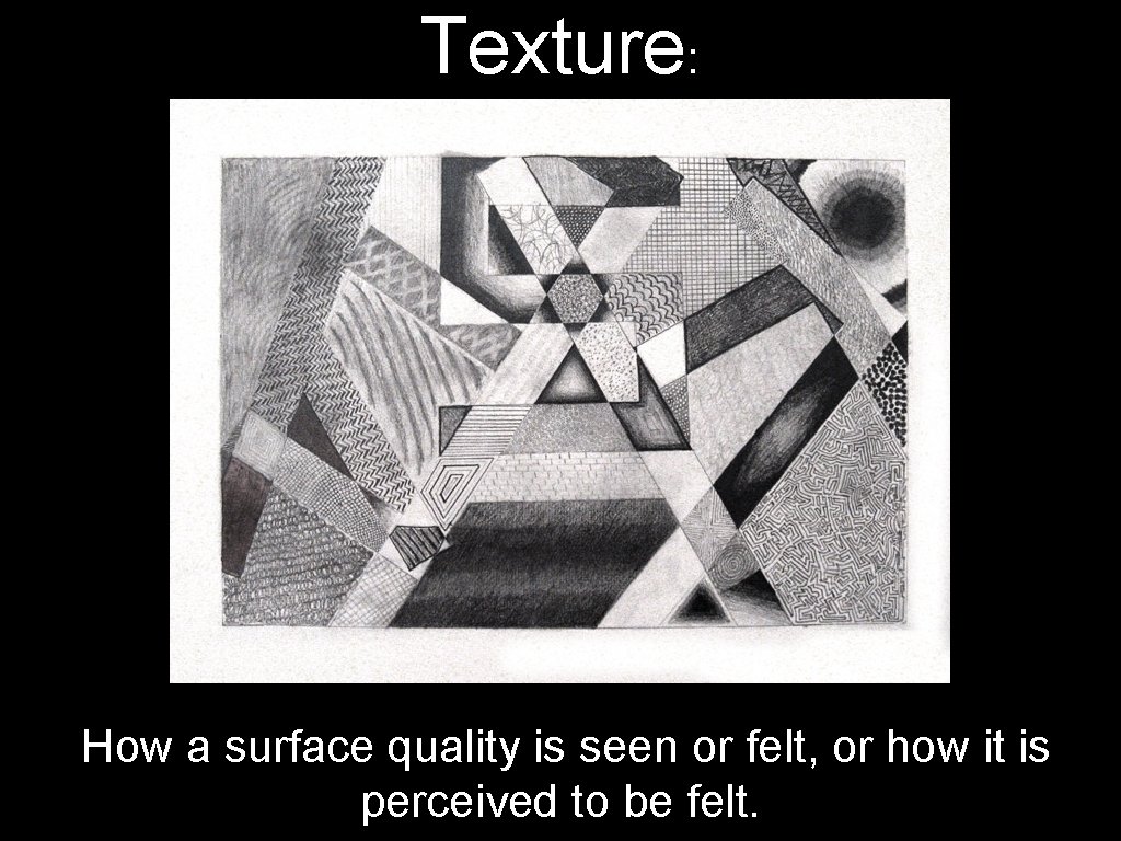
Texture: How a surface quality is seen or felt, or how it is perceived to be felt.

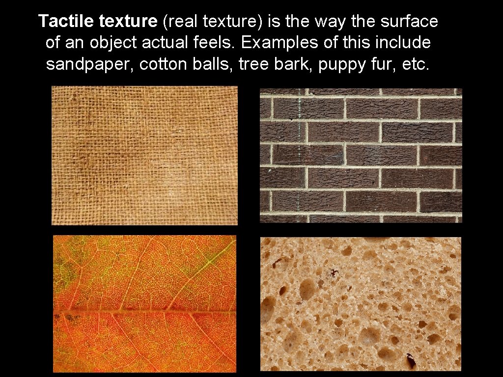
Tactile texture (real texture) is the way the surface of an object actual feels. Examples of this include sandpaper, cotton balls, tree bark, puppy fur, etc.

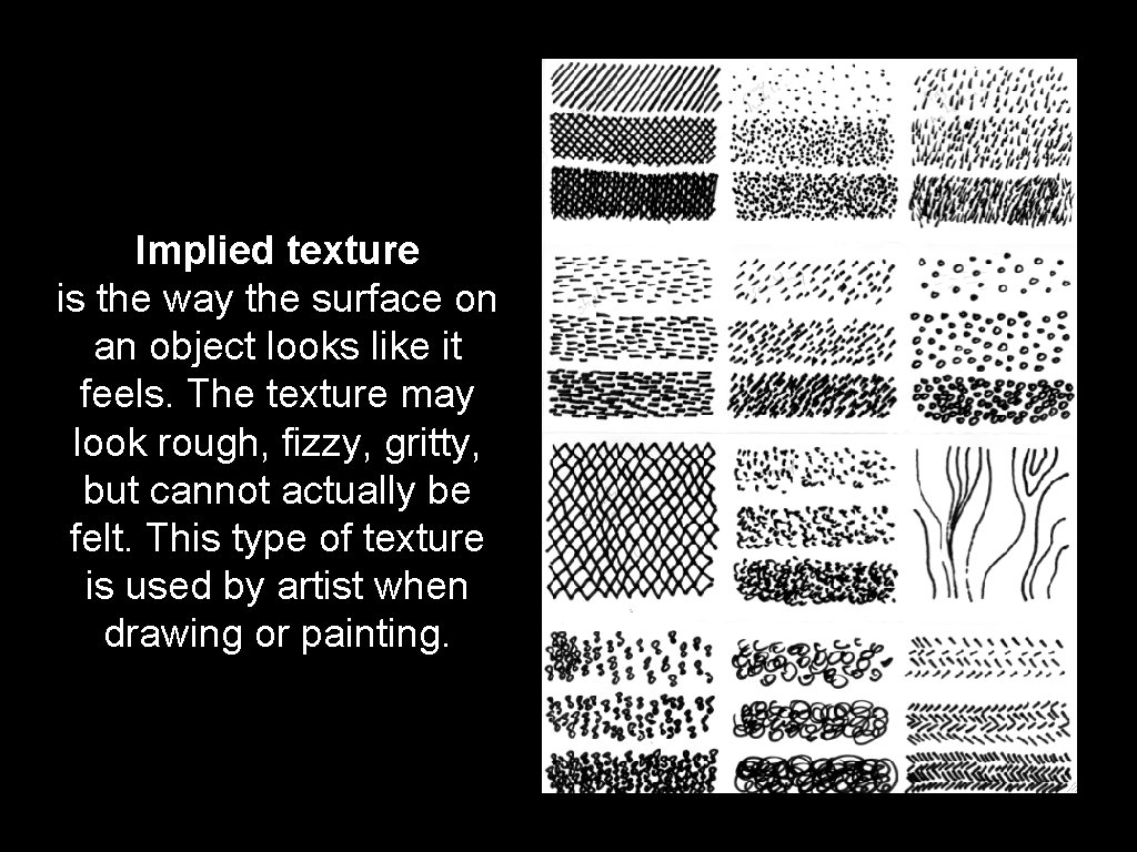
Implied texture is the way the surface on an object looks like it feels. The texture may look rough, fizzy, gritty, but cannot actually be felt. This type of texture is used by artist when drawing or painting.

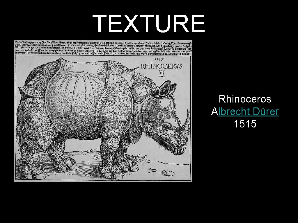
TEXTURE Rhinoceros Albrecht Dürer 1515

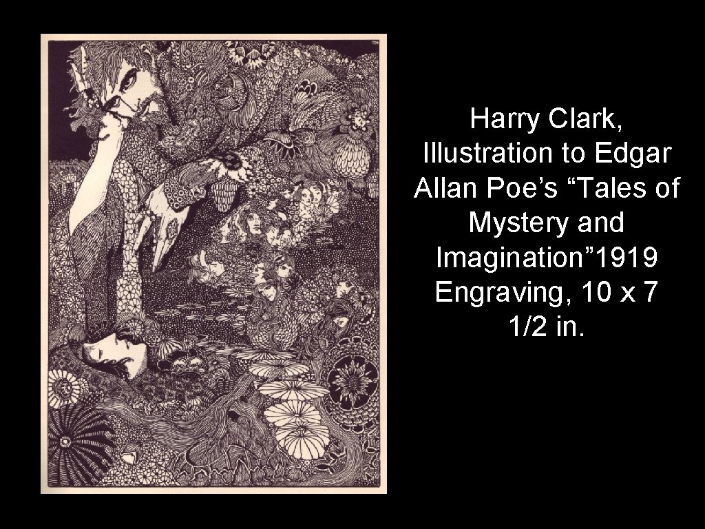
Harry Clark, Illustration to Edgar Allan Poe’s “Tales of Mystery and Imagination” 1919 Engraving, 10 x 7 1/2 in.

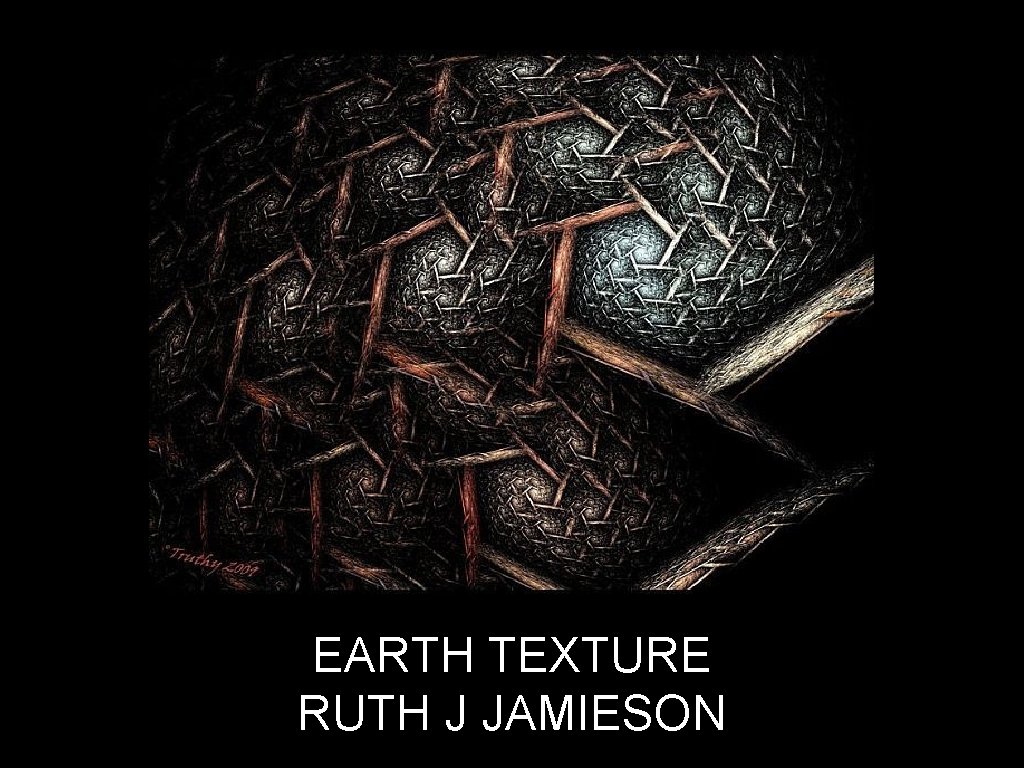
EARTH TEXTURE RUTH J JAMIESON

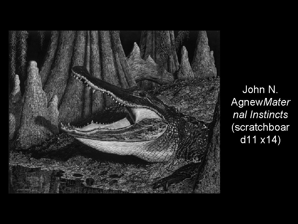
John N. Agnew. Mater nal Instincts (scratchboar d 11 x 14)

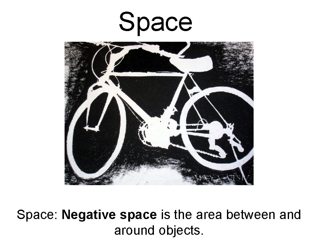
Space: Negative space is the area between and around objects.

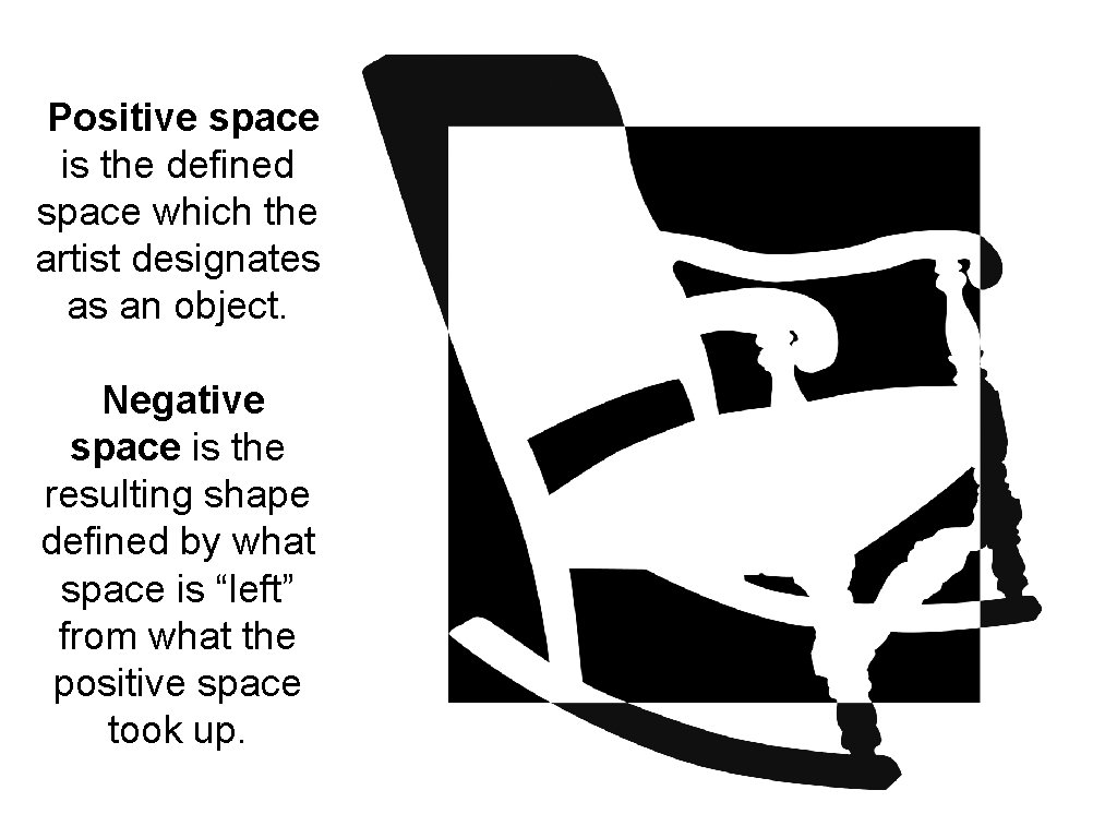
Positive space is the defined space which the artist designates as an object. Negative space is the resulting shape defined by what space is “left” from what the positive space took up.

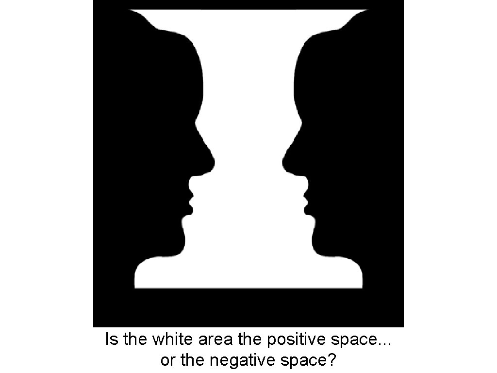
Is the white area the positive space. . . or the negative space?

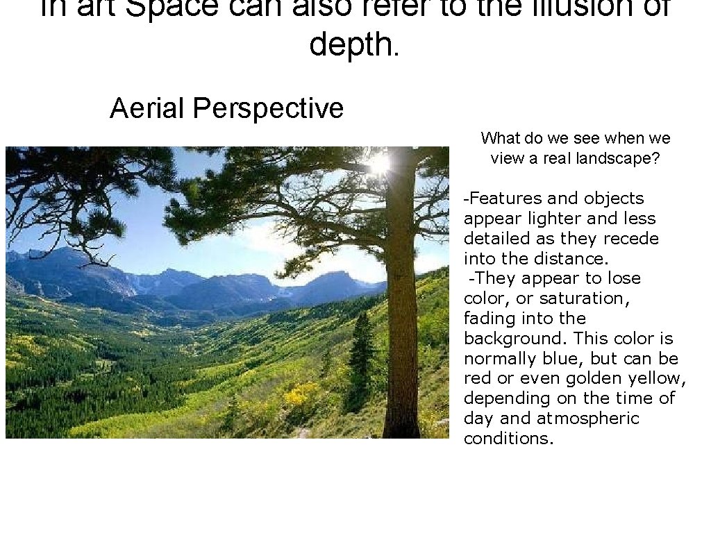
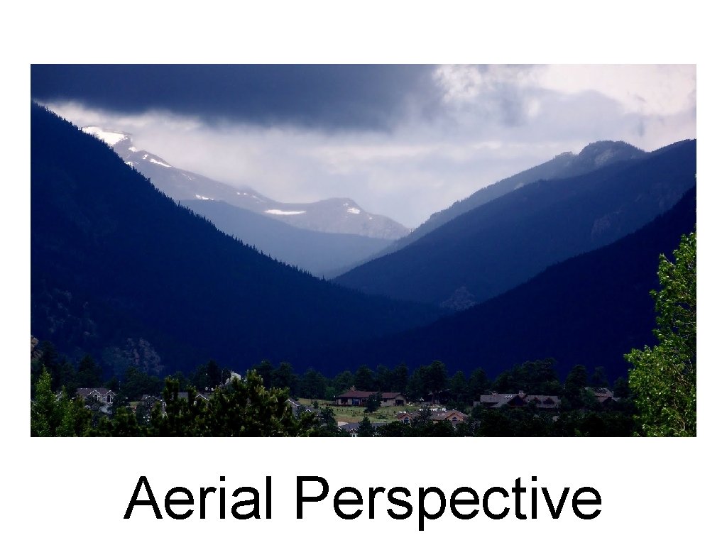
In art Space can also refer to the illusion of depth. Aerial Perspective What do we see when we view a real landscape? -Features and objects appear lighter and less detailed as they recede into the distance. -They appear to lose color, or saturation, fading into the background. This color is normally blue, but can be red or even golden yellow, depending on the time of day and atmospheric conditions.

Aerial Perspective

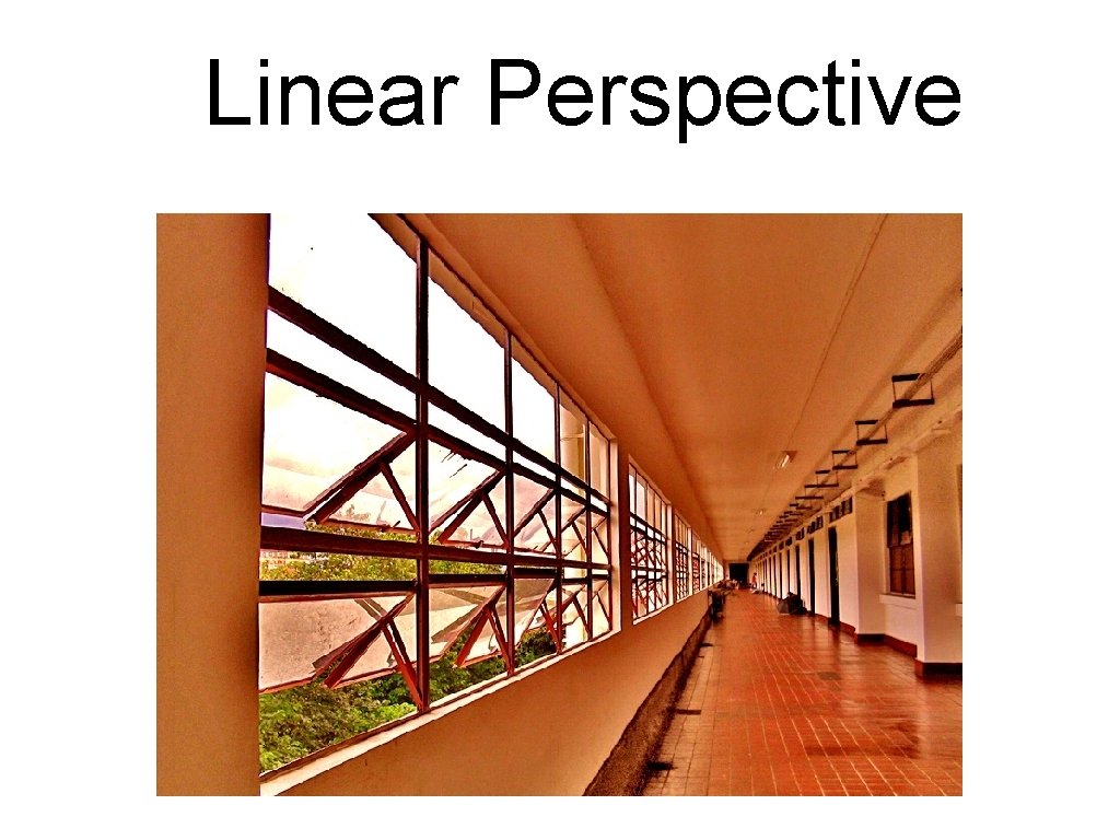
Linear Perspective

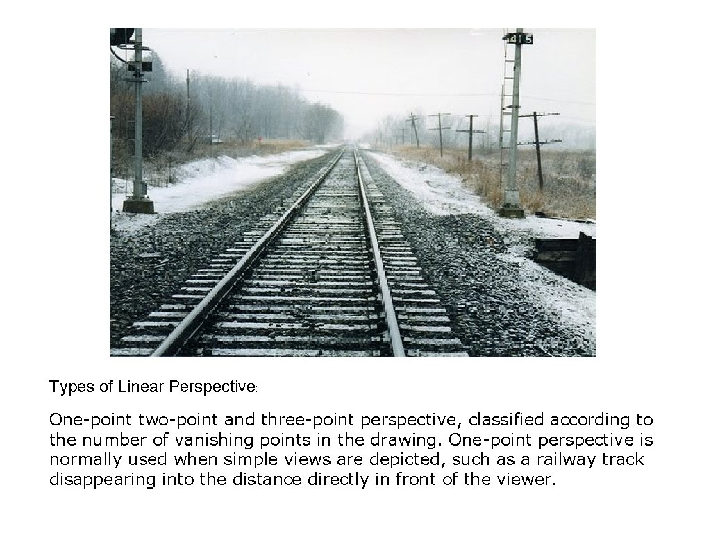
Types of Linear Perspective: One-point two-point and three-point perspective, classified according to the number of vanishing points in the drawing. One-point perspective is normally used when simple views are depicted, such as a railway track disappearing into the distance directly in front of the viewer.

Color: Light reflected off objects. Its main Characteristics are: Hue, The name of the color like blue Value, how light or dark it is Intensity, how bright or dull it is.

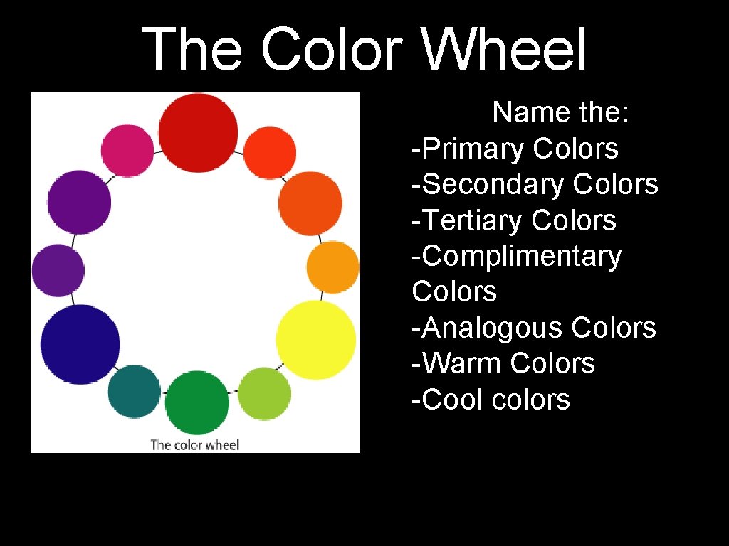
The Color Wheel Name the: -Primary Colors -Secondary Colors -Tertiary Colors -Complimentary Colors -Analogous Colors -Warm Colors -Cool colors

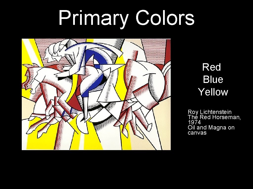
Primary Colors Red Blue Yellow Roy Lichtenstein The Red Horseman, 1974 Oil and Magna on canvas

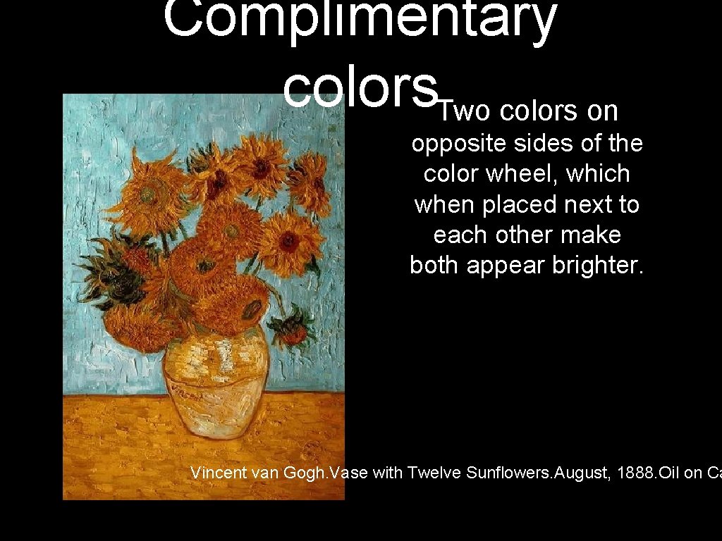
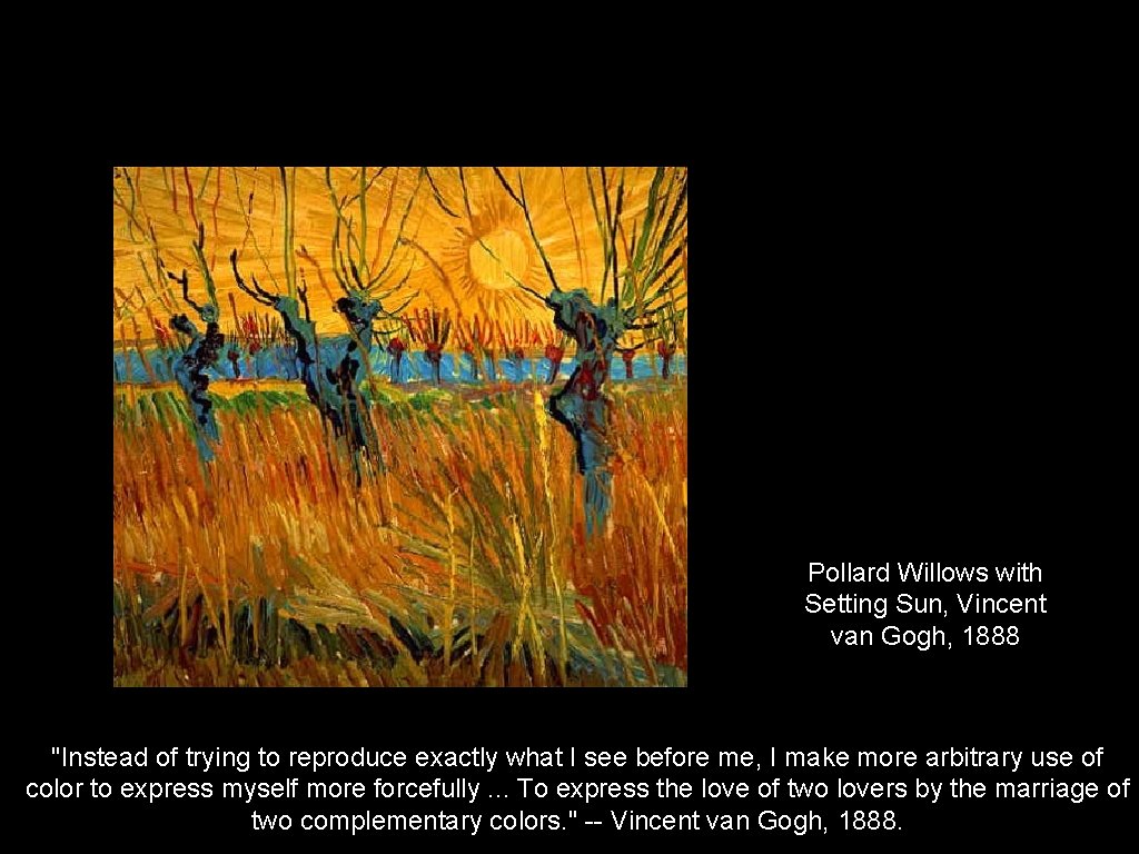
Complimentary colors. Two colors on opposite sides of the color wheel, which when placed next to each other make both appear brighter. Vincent van Gogh. Vase with Twelve Sunflowers. August, 1888. Oil on Ca

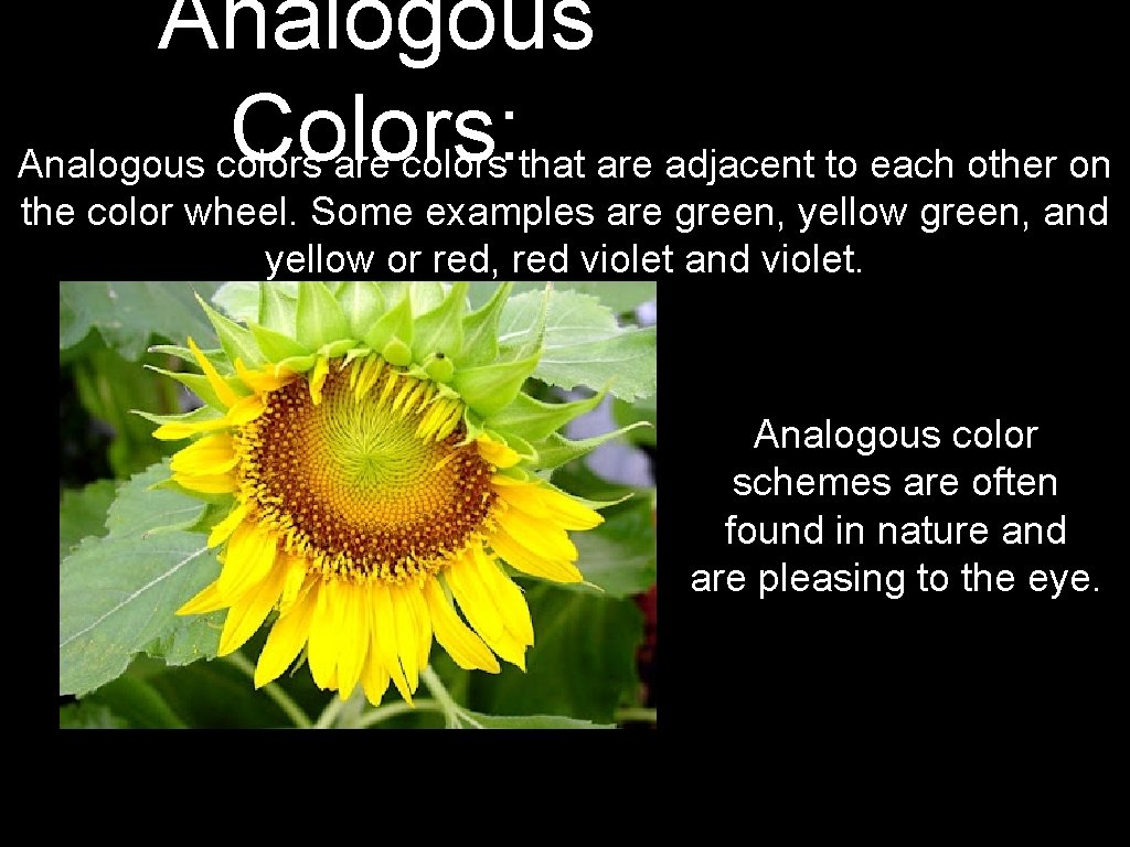
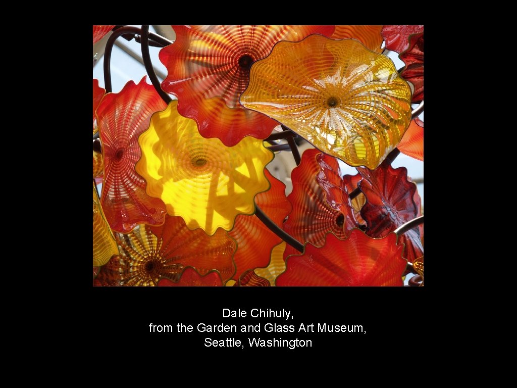
Analogous Colors: Analogous colors are colors that are adjacent to each other on the color wheel. Some examples are green, yellow green, and yellow or red, red violet and violet. Analogous color schemes are often found in nature and are pleasing to the eye.

Dale Chihuly, from the Garden and Glass Art Museum, Seattle, Washington

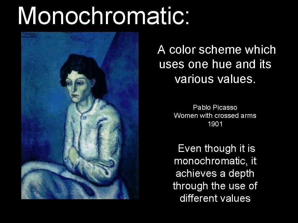
Monochromatic: A color scheme which uses one hue and its various values. Pablo Picasso Women with crossed arms 1901 Even though it is monochromatic, it achieves a depth through the use of different values

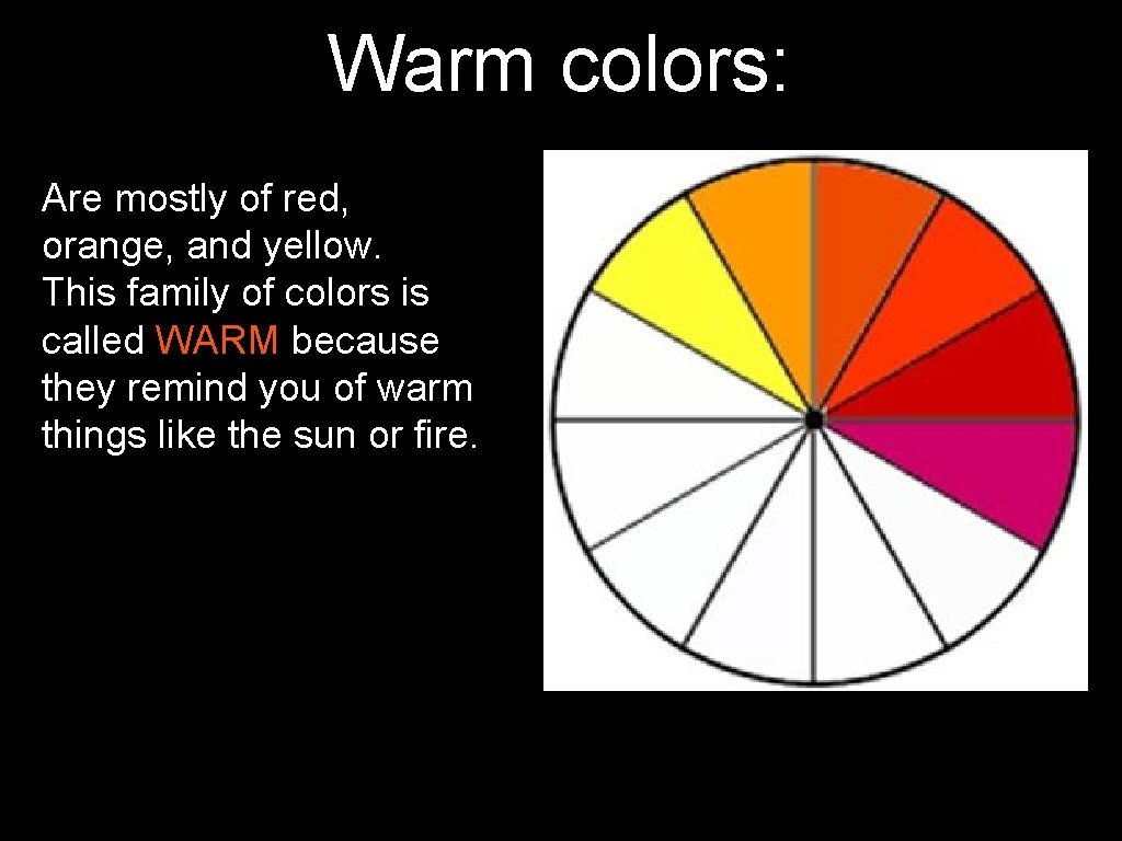
Warm colors: Are mostly of red, orange, and yellow. This family of colors is called WARM because they remind you of warm things like the sun or fire.

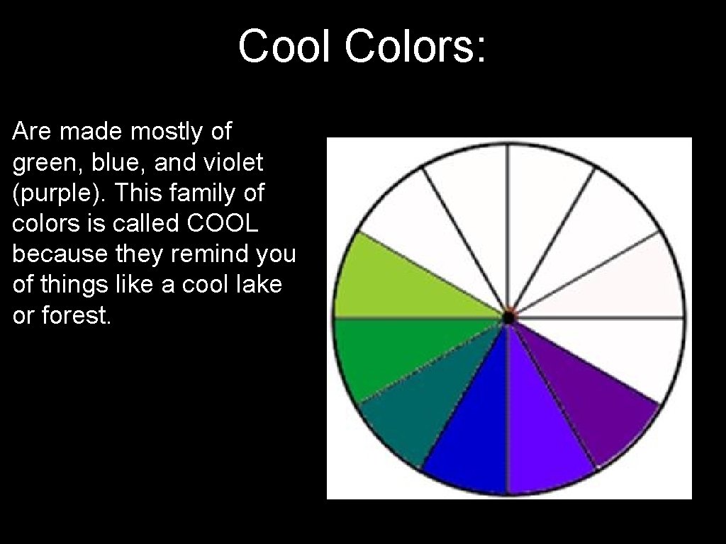
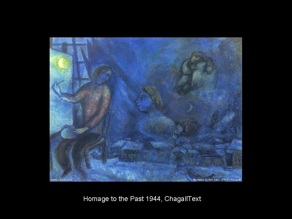
Cool Colors: Are made mostly of green, blue, and violet (purple). This family of colors is called COOL because they remind you of things like a cool lake or forest.


Homage to the Past 1944, Chagall. Text

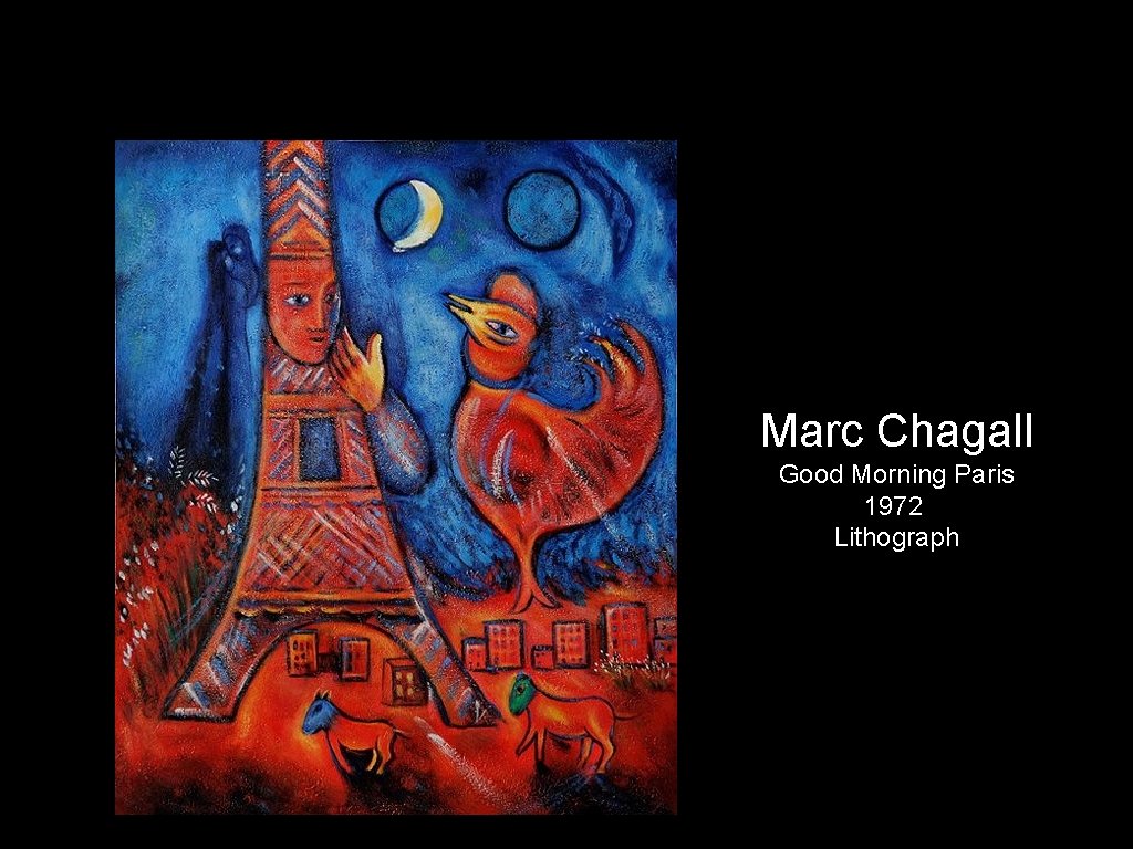
Marc Chagall Good Morning Paris 1972 Lithograph

Pollard Willows with Setting Sun, Vincent van Gogh, 1888 "Instead of trying to reproduce exactly what I see before me, I make more arbitrary use of color to express myself more forcefully. . . To express the love of two lovers by the marriage of two complementary colors. " -- Vincent van Gogh, 1888.