Line Shape Color Value Texture Space Form Line


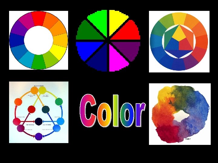







- Slides: 90


Line Shape Color Value Texture Space Form

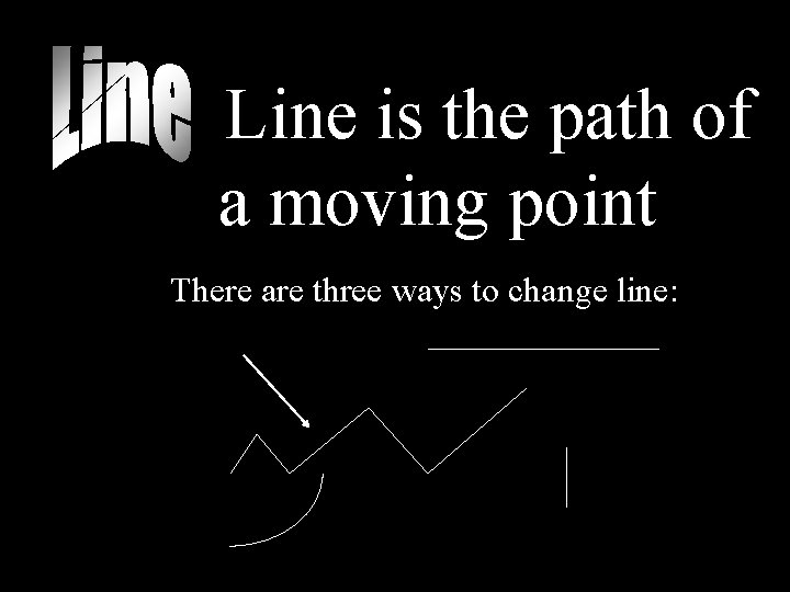
Line is the path of a moving point There are three ways to change line:

• Line Direction • Line Speed • Line weight

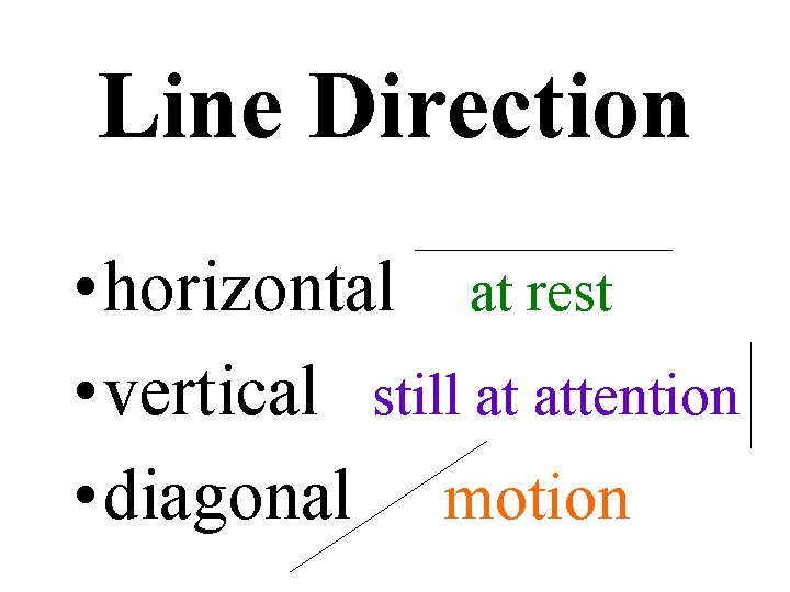
Line Direction • horizontal at rest • vertical still at attention • diagonal motion

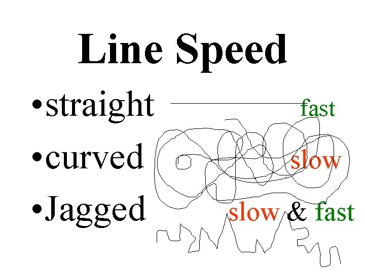
Line Speed • straight • curved • Jagged Restful fast slow & fast

Line Weight • Heavy close • Light distant

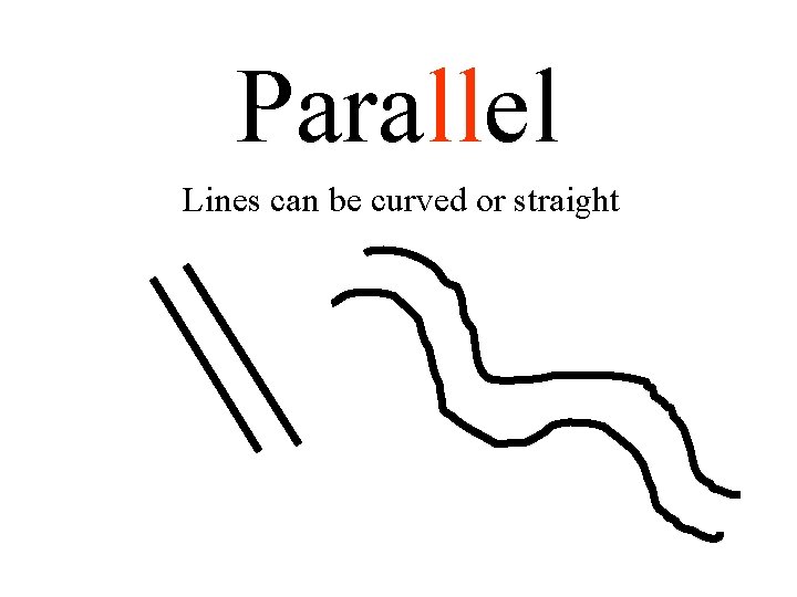
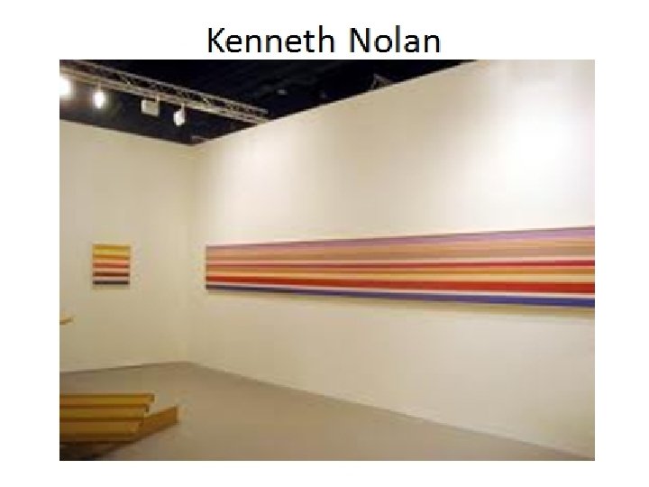
Parallel Lines can be curved or straight


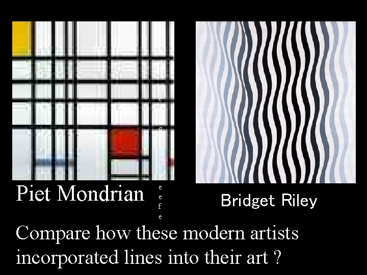
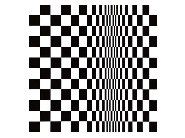
Piet Mondrian G e o r g i a O ' K e e f e G r a n t W o o d Bridget Riley Compare how these modern artists incorporated lines into their art ?

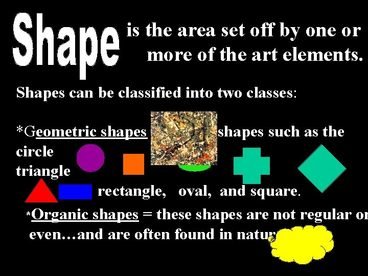
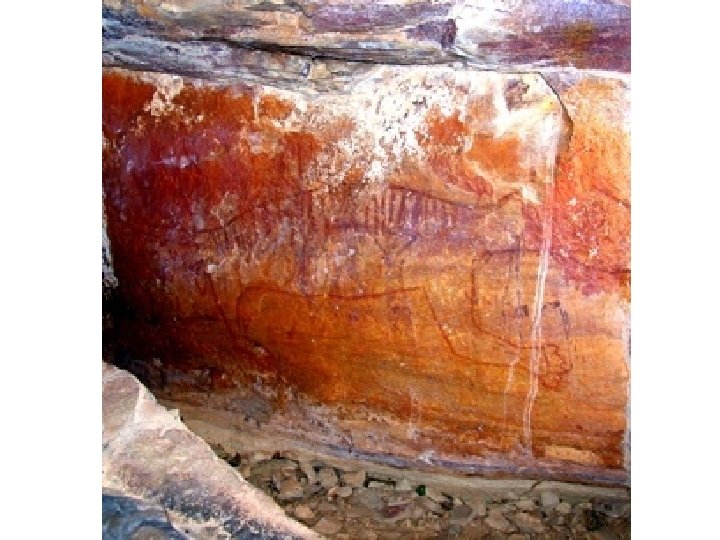
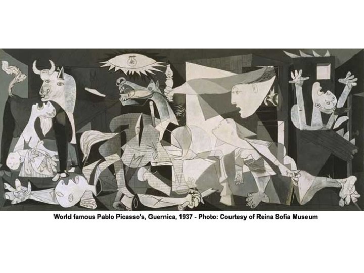
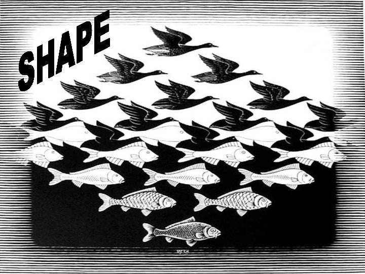
is the area set off by one or more of the art elements. Shapes can be classified into two classes: *Geometric shapes = precise shapes such as the circle , triangle , rectangle, oval, and square. *Organic shapes = these shapes are not regular or even…and are often found in nature.


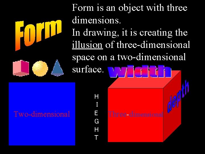
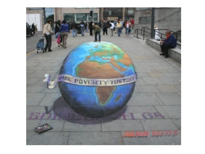
Form is an object with three dimensions. In drawing, it is creating the illusion of three-dimensional space on a two-dimensional surface. Two-dimensional H I E G H T Three-dimensional


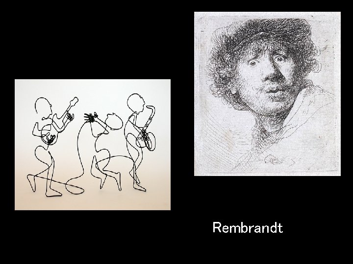
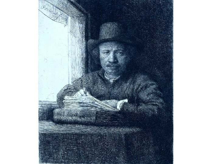
Rembrandt


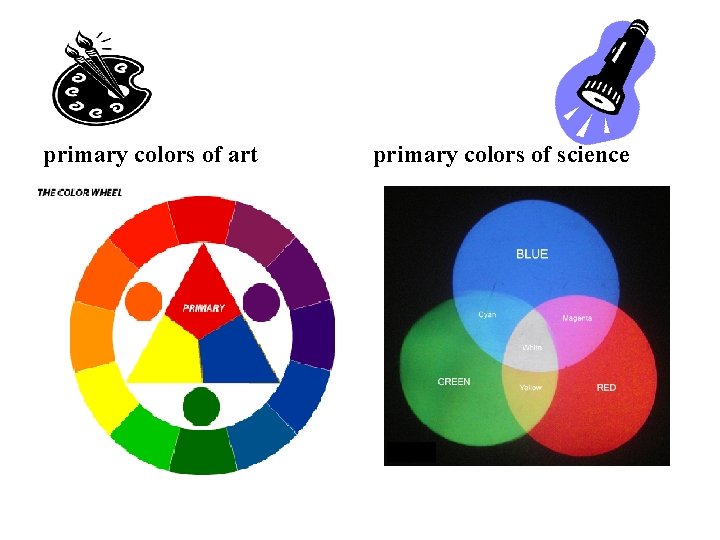
The primary colors of art are very different from the primary colors of science.

The primary colors of art primary colors of science

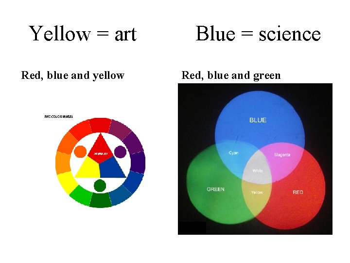
The color wheel Yellow = art Red, blue and yellow Blue = science Red, blue and green

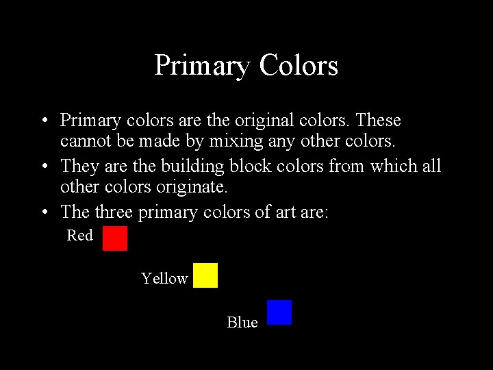
Primary Colors • Primary colors are the original colors. These cannot be made by mixing any other colors. • They are the building block colors from which all other colors originate. • The three primary colors of art are: Red Yellow Blue

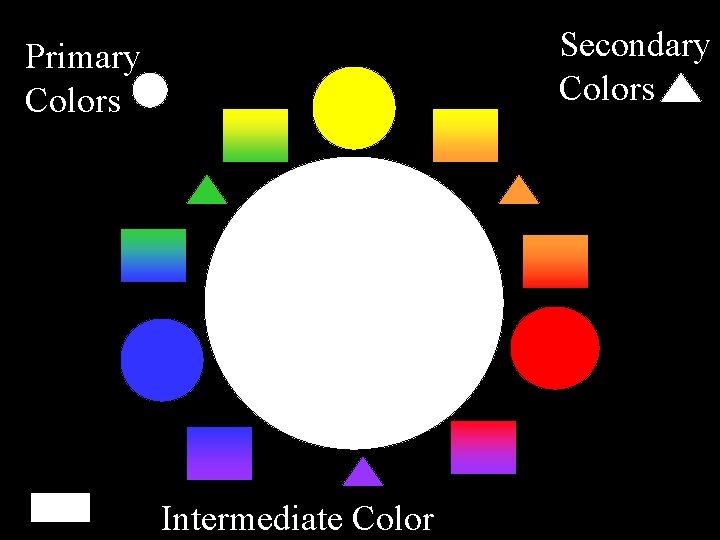
Secondary Colors Primary Colors Intermediate Color

PRIMARY COLORS

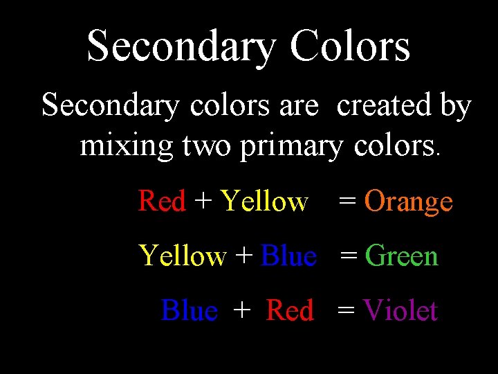
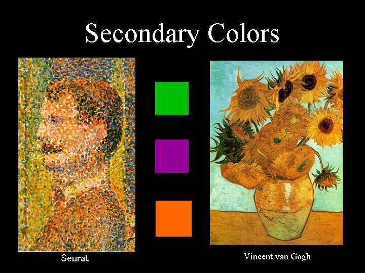
Secondary Colors Secondary colors are created by mixing two primary colors. Red + Yellow = Orange Yellow + Blue = Green Blue + Red = Violet

Secondary Colors Seurat Vincent van Gogh

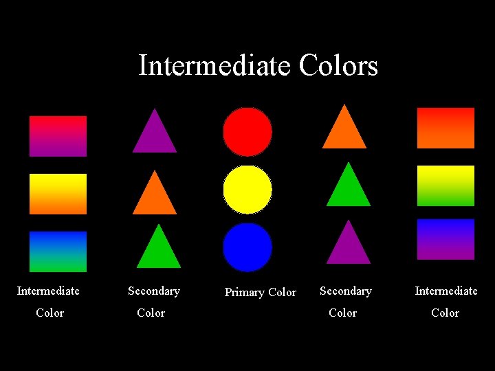
Intermediate Colors Intermediate colors (also known as tertiary colors) are colors created by mixing a primary color with its neighboring secondary color. Primary Red + Secondary Orange = Reddish Orange Primary Blue + Secondary Violet = Blue Violet Primary Yellow + Secondary Green = Yellow green

Intermediate Colors Intermediate Secondary Color Primary Color Secondary Intermediate Color

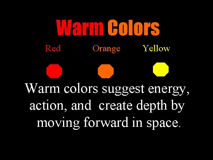
Warm Colors Red Orange Yellow Warm colors suggest energy, action, and create depth by moving forward in space.

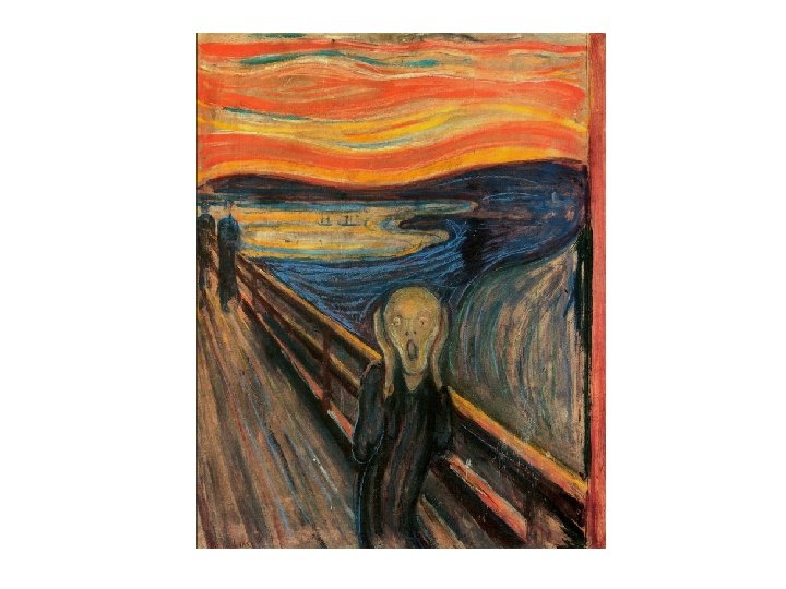
Artists Use of Warm Colors Rothko Mun ch Cezanne Van Gogh

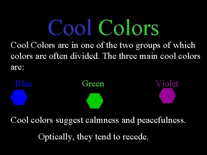
Cool Colors are in one of the two groups of which colors are often divided. The three main cool colors are: Blue Green Violet Cool colors suggest calmness and peacefulness. Optically, they tend to recede.

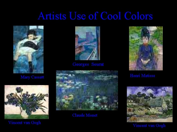
Artists Use of Cool Colors Georges Seurat Henri Matisse Mary Cassatt Claude Monet Vincent van Gogh

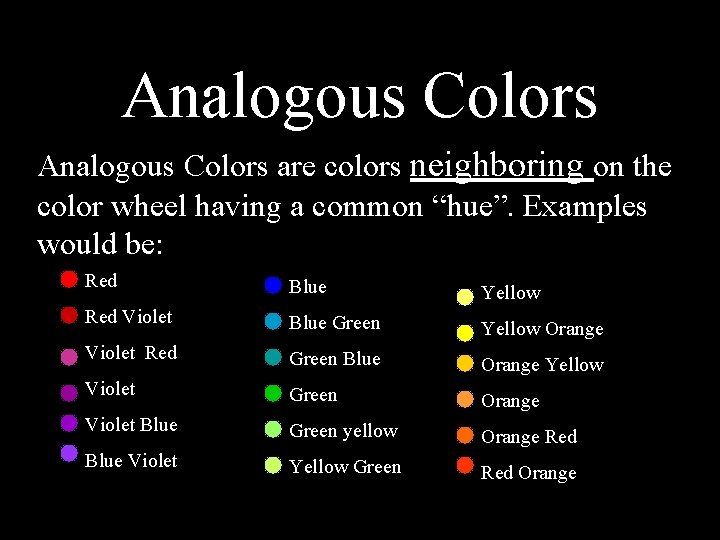
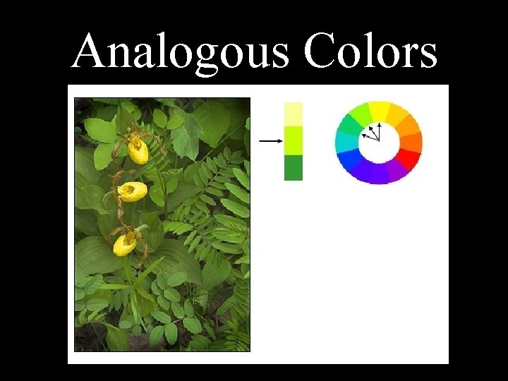
Analogous Colors are colors neighboring on the color wheel having a common “hue”. Examples would be: Red Blue Yellow Red Violet Blue Green Yellow Orange Violet Red Green Blue Orange Yellow Violet Green Orange Violet Blue Green yellow Orange Red Blue Violet Yellow Green Red Orange

Analogous Colors

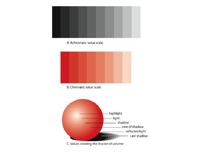
Color Shades The SHADE of a color is changed by adding black.

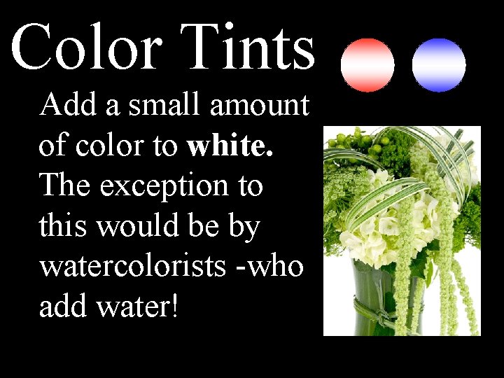
Color Tints Add a small amount of color to white. The exception to this would be by watercolorists -who add water!

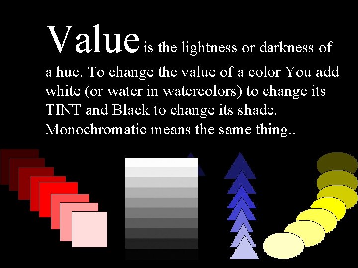
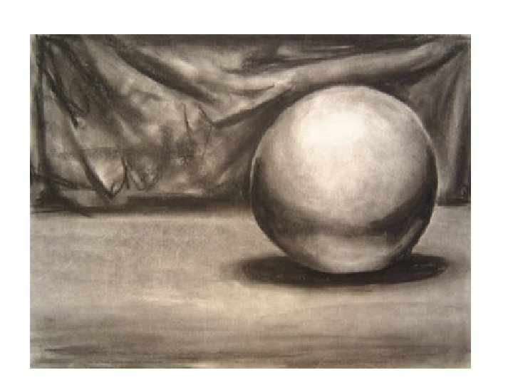
Value is the lightness or darkness of a hue. To change the value of a color You add white (or water in watercolors) to change its TINT and Black to change its shade. Monochromatic means the same thing. .

Monochromatic: one color mixed with black or white


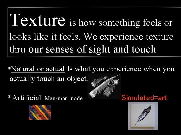
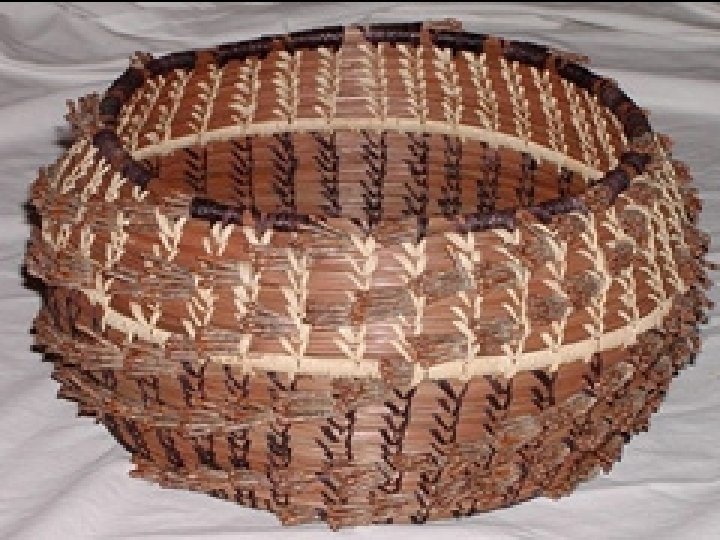
Texture is how something feels or looks like it feels. We experience texture thru our senses of sight and touch *Natural or actual Is what you experience when you actually touch an object. *Artificial: Man-man made *Simulated=art


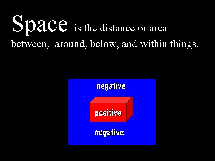
Space is the distance or area between, around, below, and withings.

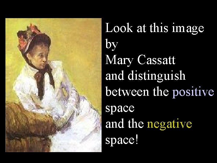
Look at this image by Mary Cassatt and distinguish between the positive space and the negative space!

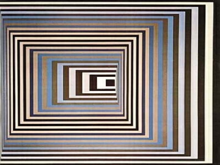
Space… is the illusion of depth 1. = Overlapping 2. = Size 3. = Details and focus 4. = Value 5. = Linear Perspective


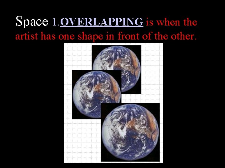
Space 1. OVERLAPPING is when the artist has one shape in front of the other.

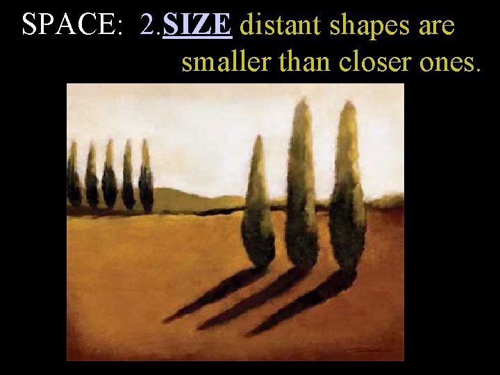
SPACE: 2. SIZE distant shapes are smaller than closer ones.

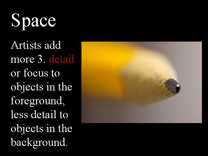
Space Artists add more 3. detail or focus to objects in the foreground, less detail to objects in the background.

SPACE

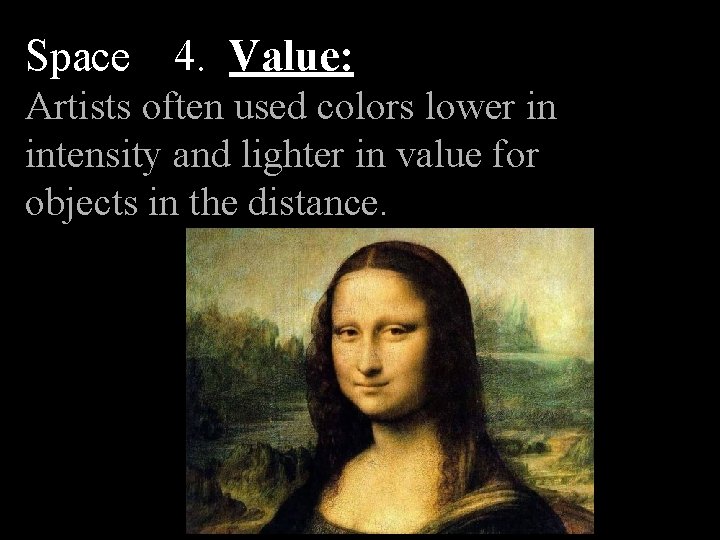
Space 4. Value: Artists often used colors lower in intensity and lighter in value for objects in the distance.


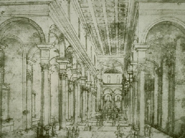
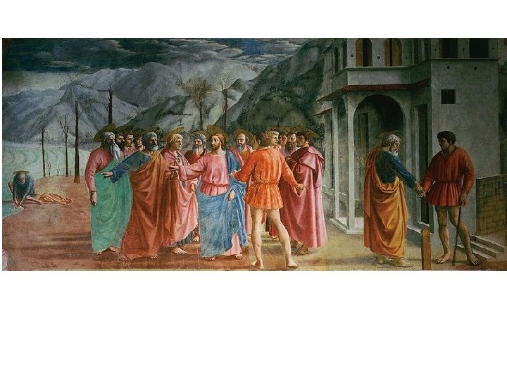
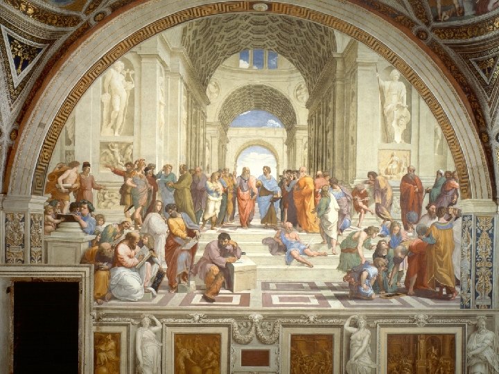
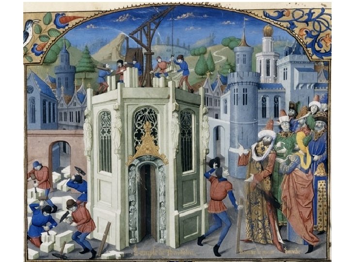
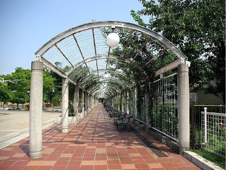
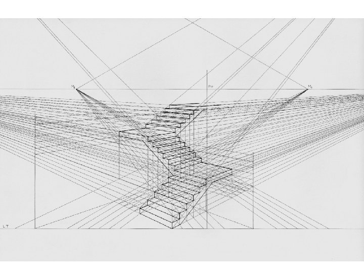
Space 5. Linear Perspective


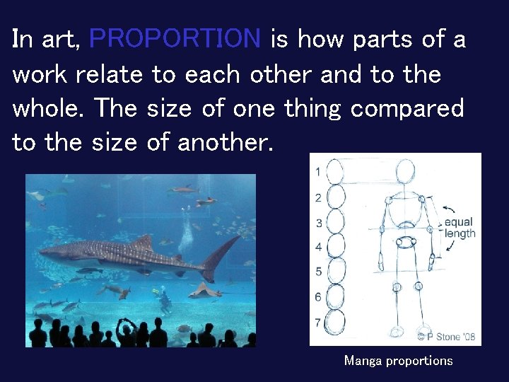
In art, PROPORTION is how parts of a work relate to each other and to the whole. The size of one thing compared to the size of another. Manga proportions

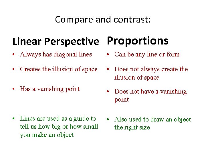
Compare and contrast: Linear Perspective Proportions • Always has diagonal lines • Can be any line or form • Creates the illusion of space • Does not always create the illusion of space • Has a vanishing point • Does not have a vanishing point • Lines are used as a guide to tell us how big or how small you make an object • Also used to draw an object the right size

The Principles of Art are basically rules or guidelines that describe the way in which the Art Elements work together. They are like the verbs in a sentence. EMPHASISE BALANCE CONTRAST *RHYTHM and repeat UNITY or unify Movement or move

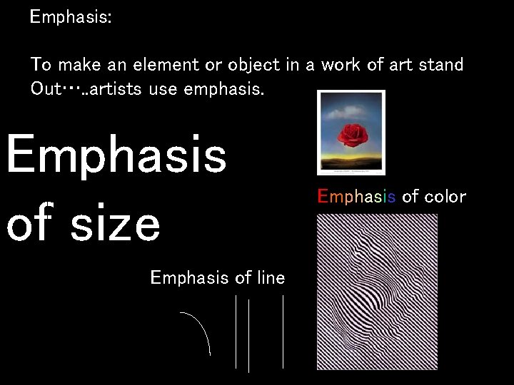
EMPHASIS is used by an artist to make an element or object stand out in a work of art. EMPHASIS is used by the artist to control What part of the artwork the viewer sees most or most often. EMPHASIS is also used by the artist to control how long a viewer spends looking at each of the different parts.

MOVEMENT in a work of art directs the viewer through the art piece –often to the focal area. It also encourages the viewer to sense action within the work. V

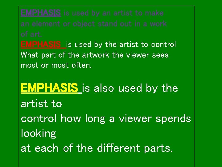
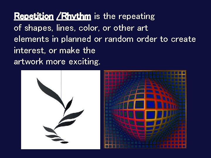
Repetition /Rhythm is the repeating of shapes, lines, color, or other art elements in planned or random order to create interest, or make the artwork more exciting.

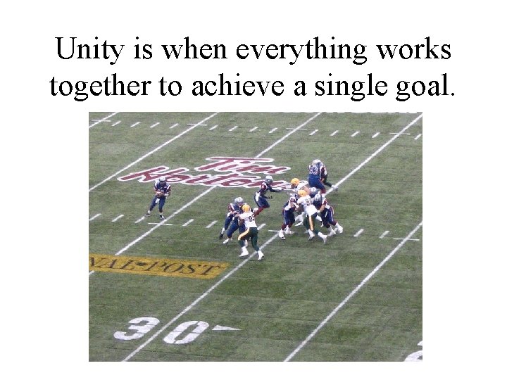
Unity is when everything works together to achieve a single goal.


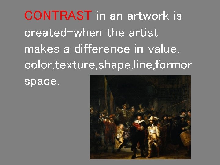
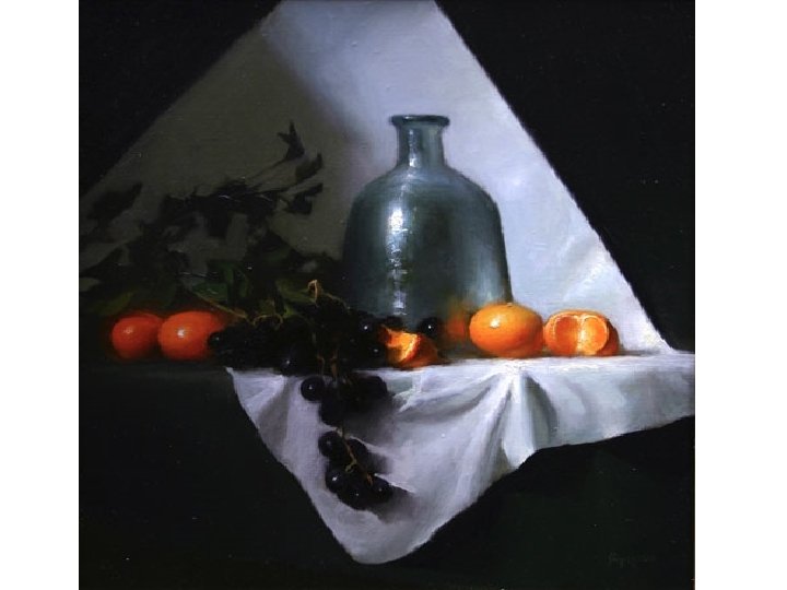
CONTRAST in an artwork is created-when the artist makes a difference in value, color, texture, shape, line, formor space.


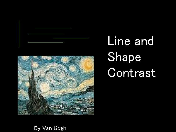
Line and Shape Contrast By Van Gogh

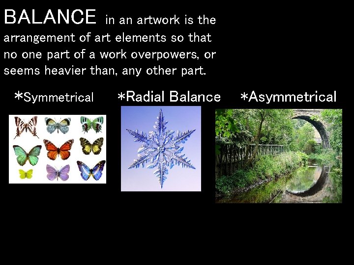
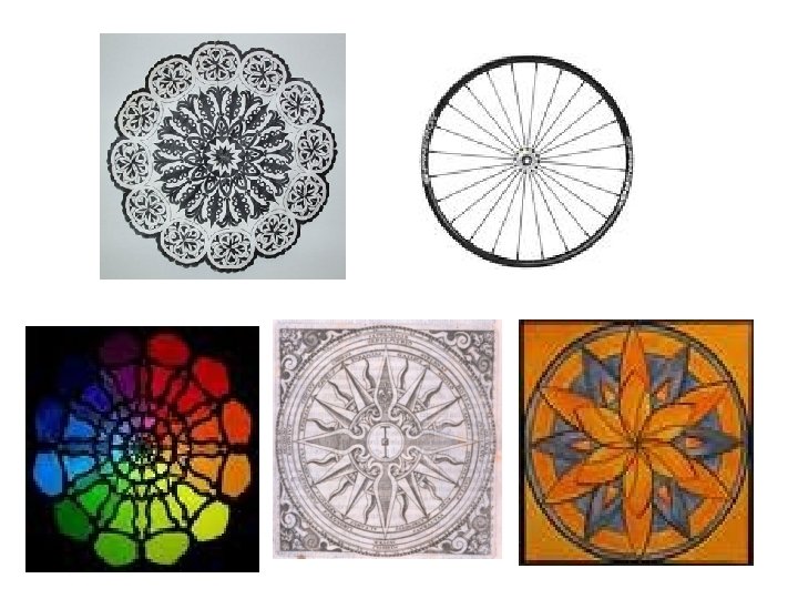
BALANCE in an artwork is the arrangement of art elements so that no one part of a work overpowers, or seems heavier than, any other part. *Symmetrical *Radial Balance *Asymmetrical


Emphasis: To make an element or object in a work of art stand Out…. . artists use emphasis. Emphasis of size Emphasis of line Emphasis of color
