Line Graphs There are many different types of
- Slides: 10

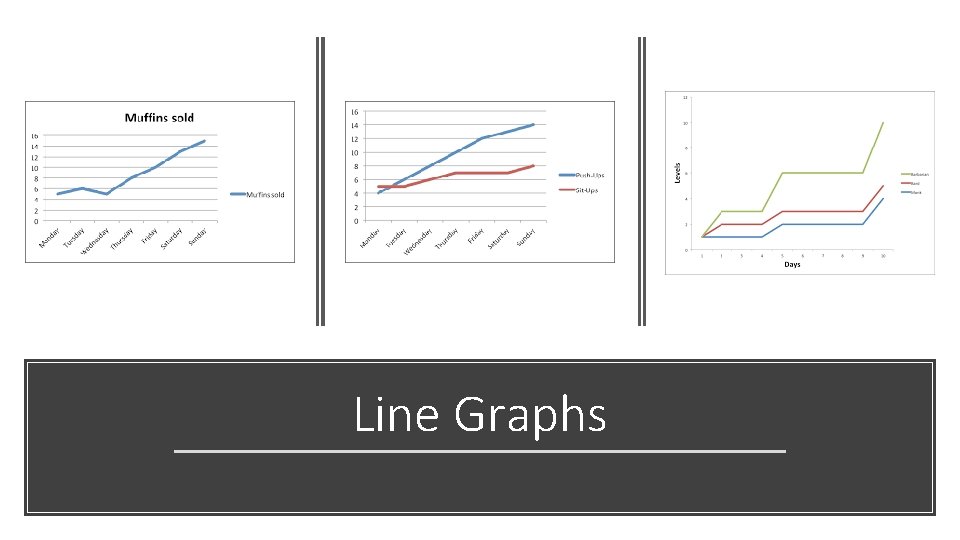
Line Graphs

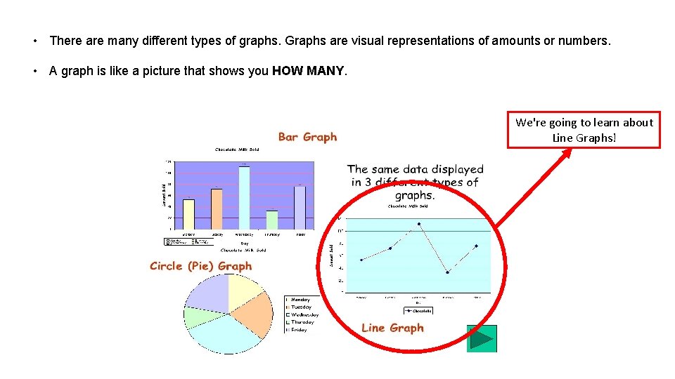
• There are many different types of graphs. Graphs are visual representations of amounts or numbers. • A graph is like a picture that shows you HOW MANY. We're going to learn about Line Graphs!

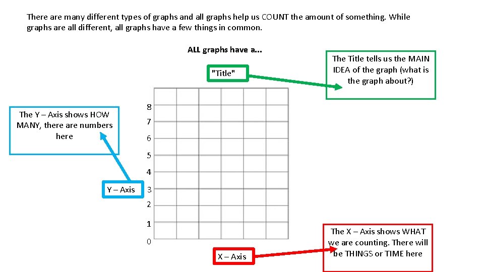
There are many different types of graphs and all graphs help us COUNT the amount of something. While graphs are all different, all graphs have a few things in common. ALL graphs have a. . . "Title" The Y – Axis shows HOW MANY, there are numbers here The Title tells us the MAIN IDEA of the graph (what is the graph about? ) 8 7 6 5 4 Y – Axis 3 2 1 0 X – Axis The X – Axis shows WHAT we are counting. There will be THINGS or TIME here

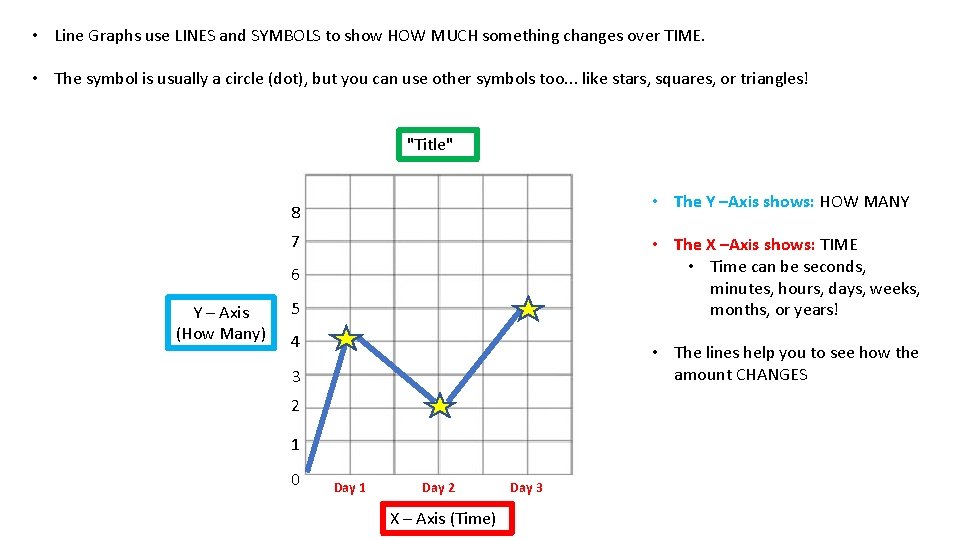
• Line Graphs use LINES and SYMBOLS to show HOW MUCH something changes over TIME. • The symbol is usually a circle (dot), but you can use other symbols too. . . like stars, squares, or triangles! "Title" • The Y –Axis shows: HOW MANY 8 7 • The X –Axis shows: TIME • Time can be seconds, minutes, hours, days, weeks, months, or years! 6 Y – Axis (How Many) 5 4 • The lines help you to see how the amount CHANGES 3 2 1 0 Day 1 Day 2 X – Axis (Time) Day 3

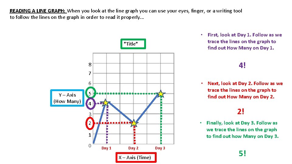
READING A LINE GRAPH: When you look at the line graph you can use your eyes, finger, or a writing tool to follow the lines on the graph in order to read it properly. . . • First, look at Day 1. Follow as we trace the lines on the graph to find out How Many on Day 1. "Title" 4! 8 7 6 Y – Axis (How Many) • Next, look at Day 2. Follow as we trace the lines on the graph to find out How Many on Day 2. 5 4 2! 3 • Finally, look at Day 3. Follow as we trace the lines on the graph to find out how Many on Day 3. 2 1 0 Day 1 Day 2 X – Axis (Time) Day 3 5!

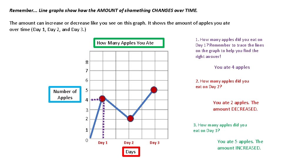
Remember. . . Line graphs show the AMOUNT of shomething CHANGES over TIME. The amount can increase or decrease like you see on this graph. It shows the amount of apples you ate over time (Day 1, Day 2, and Day 3. ) How Many Apples You Ate 8 You ate 4 apples 7 6 Number of Apples 1. How many apples did you eat on Day 1? Remember to trace the lines on the graph to help you find the right answer! 2. How many apples did you eat on Day 2? 5 4 You ate 2 apples. The amount DECREASED. 3 2 3. How many apples did you eat on Day 3? 1 0 Day 1 Day 2 Days Day 3 You ate 5 apples. The amount INCREASED.

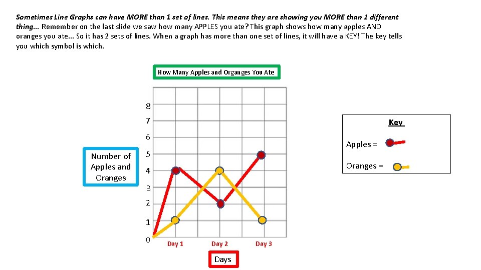
Sometimes Line Graphs can have MORE than 1 set of lines. This means they are showing you MORE than 1 different thing. . . Remember on the last slide we saw how many APPLES you ate? This graph shows how many apples AND oranges you ate. . . So it has 2 sets of lines. When a graph has more than one set of lines, it will have a KEY! The key tells you which symbol is which. How Many Apples and Organges You Ate 8 7 Key 6 Number of Apples and Oranges Apples = 5 Oranges = 4 3 2 1 0 Day 1 Day 2 Days Day 3

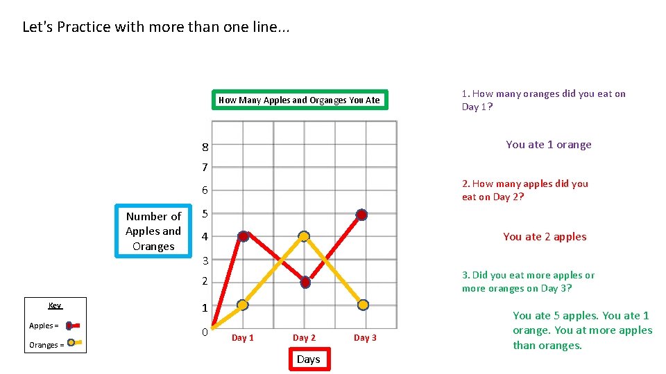
Let's Practice with more than one line. . . How Many Apples and Organges You Ate 1. How many oranges did you eat on Day 1? You ate 1 orange 8 7 2. How many apples did you eat on Day 2? 6 Number of Apples and Oranges 5 You ate 2 apples 4 3 3. Did you eat more apples or more oranges on Day 3? 2 Key Apples = Oranges = 1 0 Day 1 Day 2 Days Day 3 You ate 5 apples. You ate 1 orange. You at more apples than oranges.

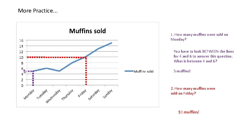
More Practice. . . 1. How many muffins were sold on Monday? You have to look BETWEEN the lines for 4 and 6 to answer this question. What is between 4 and 6? 5 5 muffins! 2. How many muffins were sold on Friday? 10 muffins!

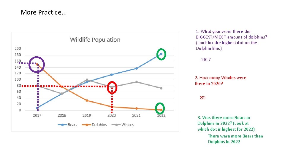
More Practice. . . 1. What year were the BIGGEST/MOST amount of dolphins? (Look for the highest dot on the Dolphin line. ) 2017 2. How many Whales were there in 2020? 80 3. Was there more Bears or Dolphins in 2022? (Look at which dot is highest for 2022) There were more Bears than Dolphins in 2022