Line colour texture value Principles of Graphic Design

- Slides: 17

Line, colour, texture & value (Principles of Graphic Design- the Basics)

Graphic Design • The process and art of combining text and graphics and communicating an effective message in the design of logos, graphics, brochures, newsletters, posters, signs, and any other type of visual communication Building Blocks of Graphic Design • The five elements of lines, shapes, mass, texture, and color are the building blocks of design for desktop publishers.

Lines • Sometimes a designer uses a line alone to divide or unite elements on a page. • Lines can denote direction of movement (as in diagonal lines and arrows) or provide an anchor to hold elements on a page (such as lines at the top, bottom, or sides of a page).

Texture • For desktop publishing, actual texture is the feel of the paper. • Is it smooth to the touch or rough? • Textures can also be visual. On the Web, especially, backgrounds that simulate familiar fabrics, stone, and other textures are common

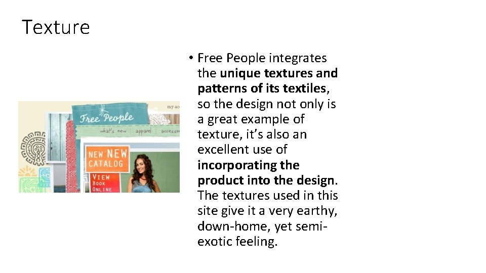
Texture • Free People integrates the unique textures and patterns of its textiles, so the design not only is a great example of texture, it’s also an excellent use of incorporating the product into the design. The textures used in this site give it a very earthy, down-home, yet semiexotic feeling.

Color • Color can be used to ellicit specific emotions and reactions. • Red is typically thought of as an attention-grabbing, hot color. • Blues are more calming or convey stability. Some color combinations are used to create a specific identity (corporate colors, school colors) or may be used in conjunction with texture to simulate the look of other objects (the look of plain paper wrapping or neon lights, for example). • Color may provide cues for the reader.

Color definitions • Hue is another word for color. • Chroma is the intensity or purity of color. • Tint is a color mixed with white. • Tone is a color mixed with gray. • Shade is a color mixed with black.

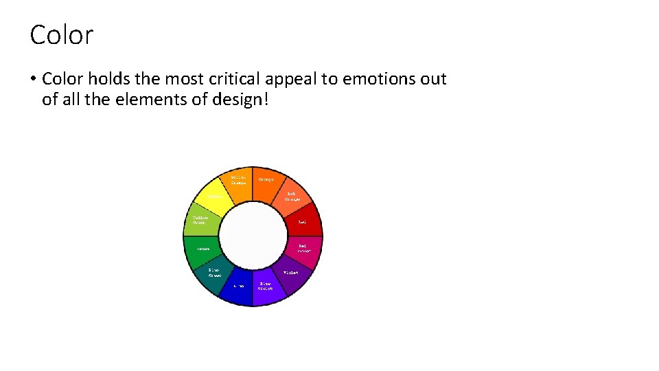
Color • Color holds the most critical appeal to emotions out of all the elements of design!

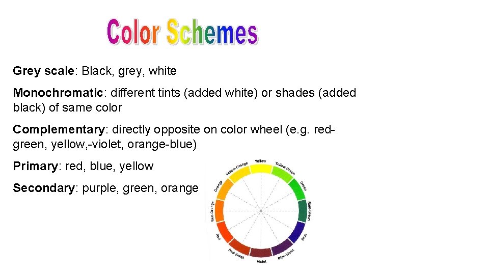
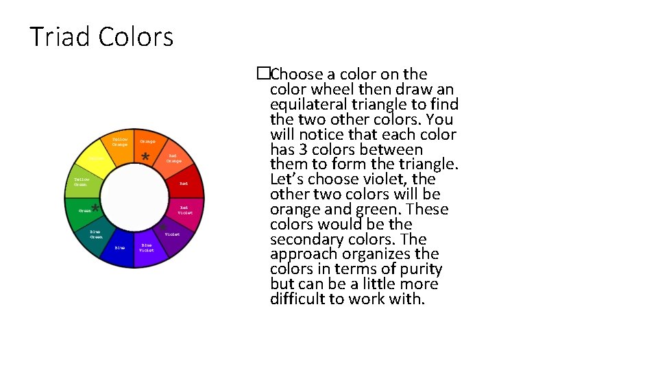
Grey scale: Black, grey, white Monochromatic: different tints (added white) or shades (added black) of same color Complementary: directly opposite on color wheel (e. g. redgreen, yellow, -violet, orange-blue) Primary: red, blue, yellow Secondary: purple, green, orange

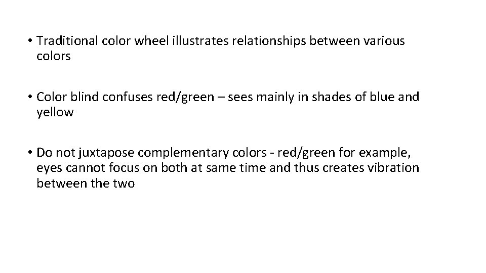
• Traditional color wheel illustrates relationships between various colors • Color blind confuses red/green – sees mainly in shades of blue and yellow • Do not juxtapose complementary colors - red/green for example, eyes cannot focus on both at same time and thus creates vibration between the two

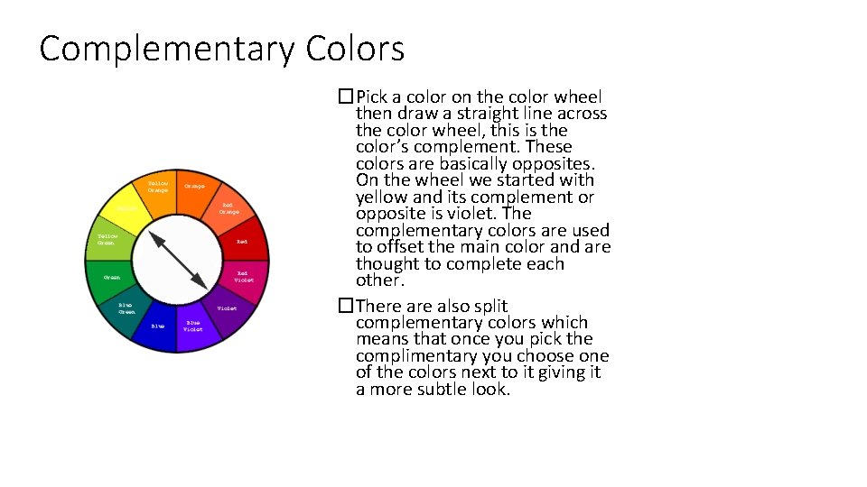
Complementary Colors �Pick a color on the color wheel then draw a straight line across the color wheel, this is the color’s complement. These colors are basically opposites. On the wheel we started with yellow and its complement or opposite is violet. The complementary colors are used to offset the main color and are thought to complete each other. �There also split complementary colors which means that once you pick the complimentary you choose one of the colors next to it giving it a more subtle look.

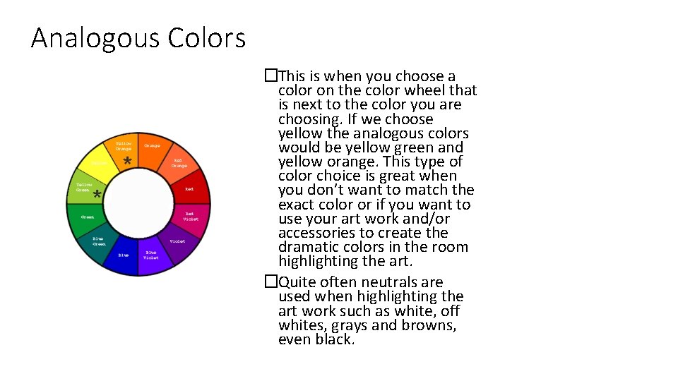
Analogous Colors �This is when you choose a color on the color wheel that is next to the color you are choosing. If we choose yellow the analogous colors would be yellow green and yellow orange. This type of color choice is great when you don’t want to match the exact color or if you want to use your art work and/or accessories to create the dramatic colors in the room highlighting the art. �Quite often neutrals are used when highlighting the art work such as white, off whites, grays and browns, even black.

Triad Colors �Choose a color on the color wheel then draw an equilateral triangle to find the two other colors. You will notice that each color has 3 colors between them to form the triangle. Let’s choose violet, the other two colors will be orange and green. These colors would be the secondary colors. The approach organizes the colors in terms of purity but can be a little more difficult to work with.

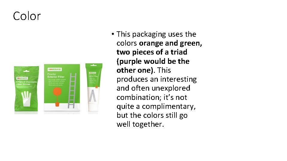
Color • This packaging uses the colors orange and green, two pieces of a triad (purple would be the other one). This produces an interesting and often unexplored combination; it’s not quite a complimentary, but the colors still go well together.

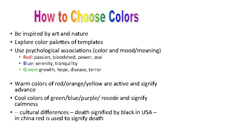
• Be inspired by art and nature • Explore color palettes of templates • Use psychological associations (color and mood/meaning) • Red: passion, bloodshed, power, zeal • Blue: serenity, tranquility • Green: growth, hope, disease, terror • Warm colors of red/orange/yellow are active and signify advance • Cool colors of green/blue/purple/ recede and signify calmness • -- cultural differences – death signified by black in USA – in china red is used to signify death

Color Associations • Red • hot, warning, • aggression, love • Pink • female, cute, cotton candy • Orange • autumn, warm, Halloween, Cell phone Culturally specific, contextually specific • Yellow • happy, caution, joy • Brown • warm, fall, dirt, earth • Green • lush, pastoral, envy • Purple • royal, sophisticated, Barney
