Line and Area Maps Petersons Chapter 14 Line
- Slides: 27

Line and Area Maps Peterson’s Chapter 14

Line Maps • google. maps. Polyline class – A linear overlay of connected line segments on a map • google. maps. Polyline. Options object – map—where to display the line – path—an array defines the line segments – stroke. Color, stroke. Opacity, stroke. Weight • Example code – 14_01_Simple_Line. html – What’s the line?

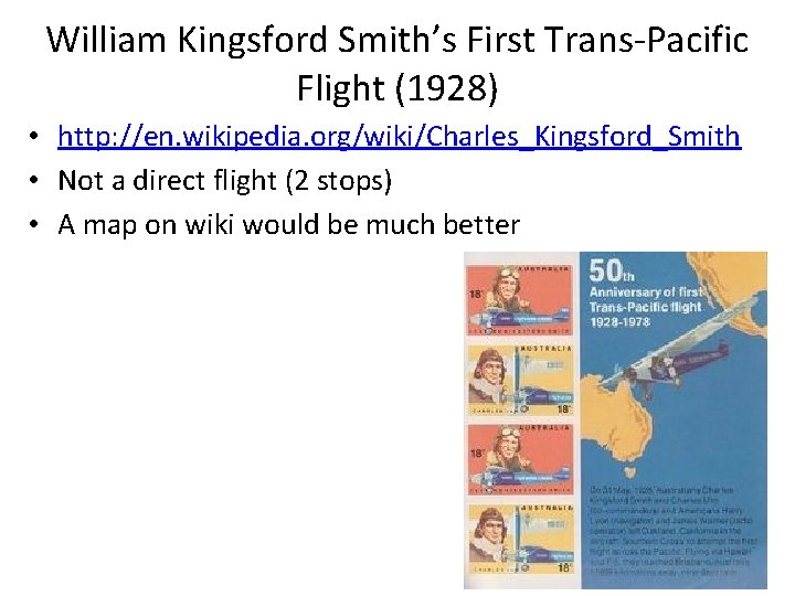
William Kingsford Smith’s First Trans-Pacific Flight (1928) • http: //en. wikipedia. org/wiki/Charles_Kingsford_Smith • Not a direct flight (2 stops) • A map on wiki would be much better

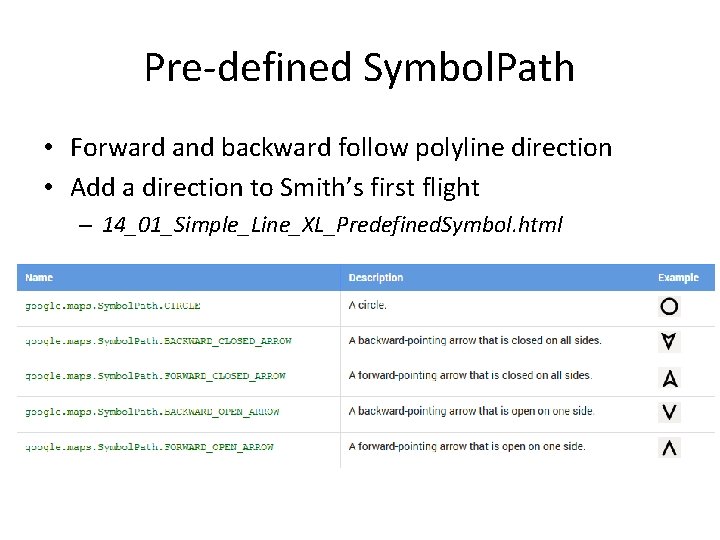
Symbolize Polylines • A Symbol in Google Maps is a vector-based image/icon that can be displayed on a Marker or a Polyline object – https: //developers. google. com/maps/documentation/j avascript/symbols • A symbol's shape is defined by a path • Using predefined paths in google. maps. Symbol. Path • Assigned to polyline through the “icons” property – Icon sequence – Each has icon, offset, and repeat properties

Pre-defined Symbol. Path • Forward and backward follow polyline direction • Add a direction to Smith’s first flight – 14_01_Simple_Line_XL_Predefined. Symbol. html

Symbolize Polylines • Using custom path with SVG path notation – defined in a 22 x 22 px box • SVG path notation – path: 'M 0, -1 L 0, 1‘ • Using dashed line for Simth’s flight – 14_01_Simple_Line_XL_Custom. Symbol. html • Explore how the coordinates and “scale” property works together – path: 'M -1 0, L 1 0'

More Symbol Examples • https: //developers. google. com/maps/documentation/javascri pt/symbols • Including one animation example – https: //developers. google. com/maps/documentation/java script/examples/overlay-symbol-animate • Animate Smith’s flight – 14_01_Simple_Line_XL_Animate. Symbol. html • Adjust the speed based on the flight • A final project with similar idea?

Clickable Line with an Infowindow • When click on the line, a infowindow will popup and show some information about the line • 14_01_Simple_Line_XL_With. Infowindow. html

Exercise #8—Part A • Add direction on flow map 14_02_Flow_Map. html • Play with pre-defined symbol path • Play with the “offset” and “repeat” properties associated with an icon

How to Connect Vertices in a Polyline • Connected line segments and defined by vertices • Line segments (straight line or shortest path) – On 2 D plane – On a spheroid (sphere or ellipsoid such as WGS 84) • Two options – #1: Project the vertices and connect the vertices – #2: Add additional vertices along the shortest path between the ends and project all the points • By default polylines are display as option #1 – Least calculation • When the “geodesic” property is true, option #2 is used

Geodesic Polyline • Example code – 14_03_Geodesic_Line. html • great circle between LA and London – 14_03 b_Great_Circle_input • Great circle between two clicked locations • google. maps. geometry. spherical library – Utility functions for computing geodesic angles, distance, and area

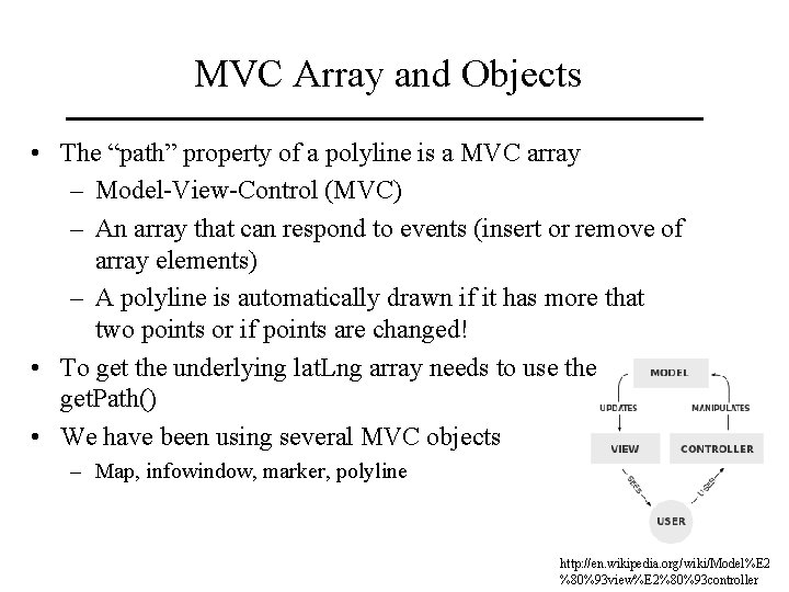
MVC Array and Objects • The “path” property of a polyline is a MVC array – Model-View-Control (MVC) – An array that can respond to events (insert or remove of array elements) – A polyline is automatically drawn if it has more that two points or if points are changed! • To get the underlying lat. Lng array needs to use the get. Path() • We have been using several MVC objects – Map, infowindow, marker, polyline http: //en. wikipedia. org/wiki/Model%E 2 %80%93 view%E 2%80%93 controller

Exercise #8—Part B • Show my implementation – 14_03 b_Great_Circle_input_XL. html • Extension to 14_03 b_Great_Circle_input. html • Trip can have more than just origin and destination • Computes trip total length • Needs a button to start a new trip • See also 14_09_Line_Input. html on how add a trip stop

Elevation Profile (Cross Section) • Example code – 14_10_Cross_section. html • google. maps. Elevation. Service – Just like the google. maps. Geocoder service – Elevations along a path and locations • Google Chart – Google Visualization API – https: //developers. google. com/chart/interactive/ docs/reference

Elevation Profile (Cross Section) • How to draw the profile? • Google Chart – Google Visualization API – https: //developers. google. com/chart/interactive/ docs/reference • Create a data table and store the elevation in the data table • Show the data table as a column chart

Exercise #8—Part C • Interactive elevation profile – 14_10_Cross_section_XL. html • Need two buttons to show elevation profile and to start a new profile • Extension to 14_10_Cross_section. html • Also see also 14_09_Line_Input. html on how interactively create a profile

Polygon Mashups

Simple vs. Complex Polygons • Simple polygons – Only one boundary • Complex polygons – Multiple boundaries – Polygon with holes – Multi-part disjoint polygons • The paths property in google. maps. Polygon – An array of boundary arrays – Automatically recognize holes • Example – 14_15_Complex_Polygon_XL. html

Choropleth Map • Shaded polygon based on a data value • Convert data values to polygon symbolization property – the fill. Color and fill. Opacity properties in google. maps. Polygon • How to convert? – Unclassified vs. classified – Transform data values? • Example – 14_22_Nebraska_Choropleth_Map. html

Exercise #9—Part A • Flash flood events by county • In a JSON file • Use the jquery-1. 7. 1. min. js to read the file

Google Fusion Table • An experimental data visualization web application to gather, visualize, and share data tables • Example – Kansas county 2000 population table – https: //www. google. com/fusiontables/Data. Source? docid=1 edhkw. Qv H 3 -0 Kypc. YBU 5 n. Evsq. WVCgq 8 K 9 Yu. IMSCz. V • Explore the different views on a table – Row view, card, chart, summary – Map view (multiple maps can be created) • Boundary, population gradient, population buckets (classified)

Google Fusion Table • Peterson’s example – 14_23_Fusion_Tables_Shaded_Polygons. html—minimum of code to visualize the polygons – See the table http: //tables. googlelabs. com/Data. Source? dsrcid=3121331 – But how do you know it is a map of “ 2010 Percent of Population under 18” • Where and how to specify the attribute used to create the map? • Kansas county population table – Multiple maps were created using different attributes – See 14_23_Fusion_Tables_Shaded_Polygons_XL – Using style. Id to specify a map?

Heatmap • Shows the density of features – not necessary to be points • Shaded isarithmic map (or shaded contour map) • A raster is created and then shaded • Tornado heatmap based on a Fusion Table – 14_24_Fusion_Table_Heatmap_Tornadoes. html • See the table – http: //tables. googlelabs. com/Data. Source? dsrcid=894938

Create Fusion Table for Heat Map • Flash flood events in Kansas as a shapefile • Shape Escape--converts shapefiles to KML and uploads them as a spatial data table to Fusion Tables – http: //www. shpescape. com/ • Make the table “Public” before create a heatmap from it • Need a Google account? • One already created – flashfloodeventsinkansas – View it at https: //www. google. com/fusiontables/Data. Source? docid=1 MYh 7 f 3 ipy. GIk. KEXfwfyvgg 0 wo. Py. HNBv. Rrg. JJA 0 T

Exercise 9—Part B • Create a Fusion Table from a shapefile • Create a heatmap from the Fusion Table based on the example code 14_24_Fusion_Table_Heatmap_Tornadoes. html

Heatmap Layer vs. Fusion Table Layer • Both Heatmap. Layer and Fusion. Table. Layer in Google APIs crate a heatmap • Client creates the heatmap and more control on the map • Example – Heatmap. Layer_Kansas. Flash. Flood. Event_XL. html – Read flash flood events JSON file is asynchronous – Points are in a MVC array • As the events are populated into the MVC array, heatmap is generated

Readings • Chapter 21 & 22