
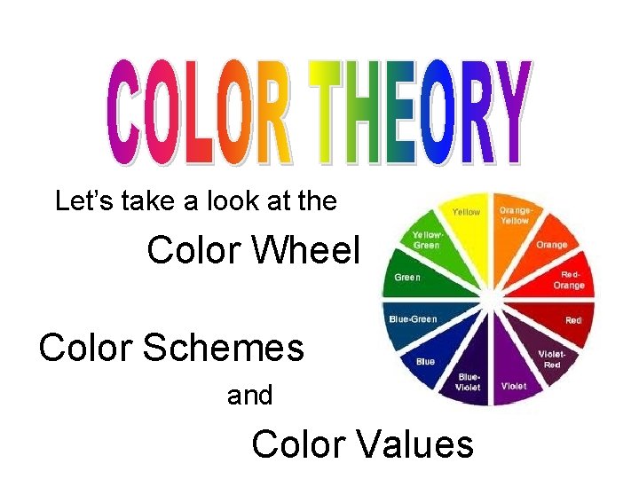
Lets take a look at the Color Wheel
- Slides: 16
Let’s take a look at the Color Wheel Color Schemes and Color Values
• Learning to mix colors is important. • Knowing the placement of colors on the color wheel will help you mix colors and help you decide which colors to add to your painting or drawing! • Your choice of color schemes can make a big difference in the success of your project.
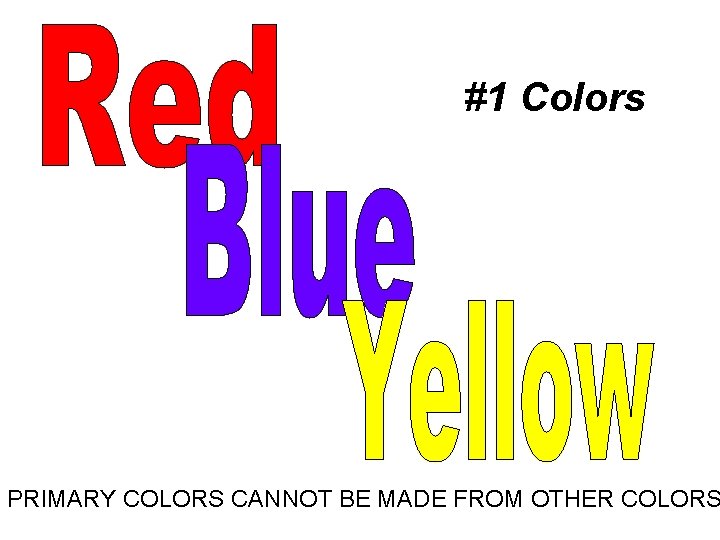
#1 Colors PRIMARY COLORS CANNOT BE MADE FROM OTHER COLORS
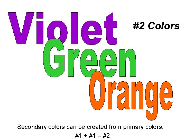
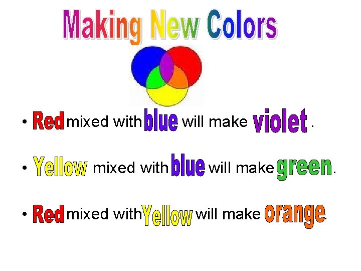
#2 Colors Secondary colors can be created from primary colors. #1 + #1 = #2
• mixed with will make . • mixed with will make . • mixed with will make .
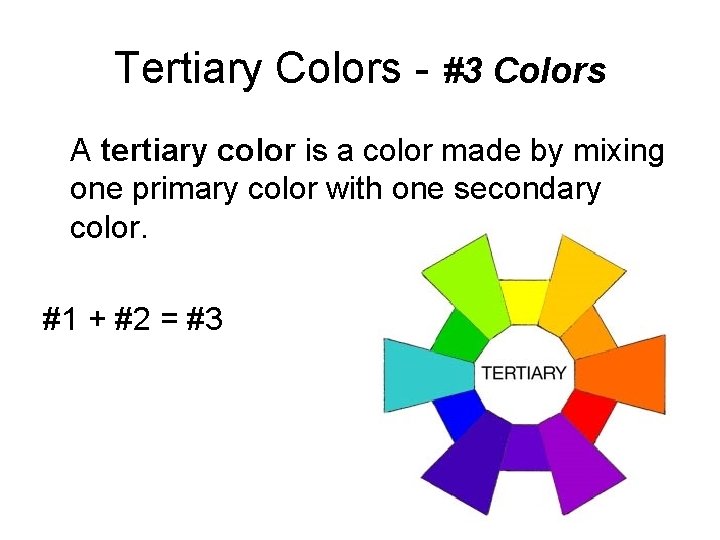
Tertiary Colors - #3 Colors A tertiary color is a color made by mixing one primary color with one secondary color. #1 + #2 = #3
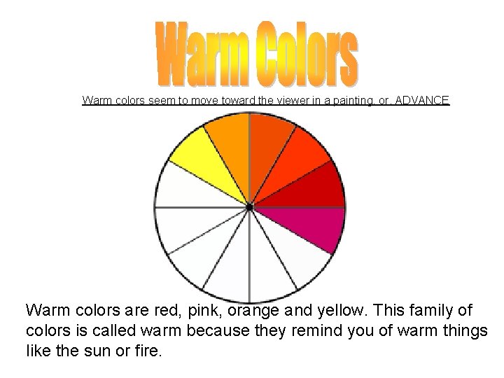
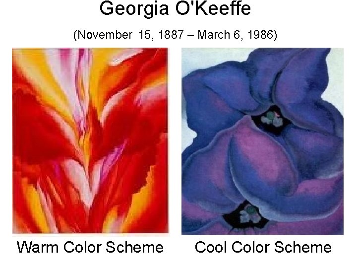
Warm colors seem to move toward the viewer in a painting, or, ADVANCE Warm colors are red, pink, orange and yellow. This family of colors is called warm because they remind you of warm things like the sun or fire.
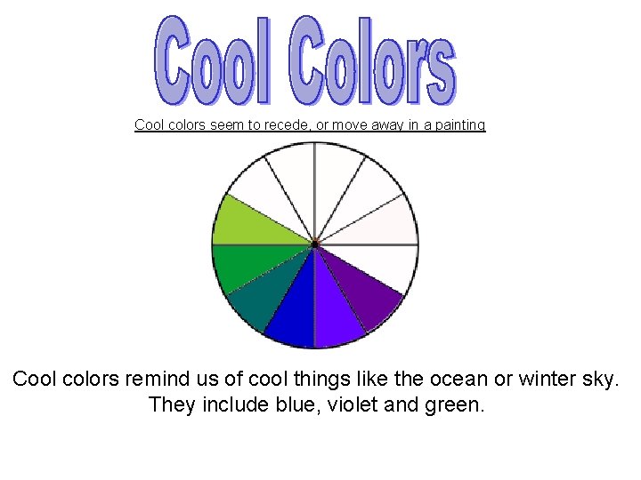
Cool colors seem to recede, or move away in a painting Cool colors remind us of cool things like the ocean or winter sky. They include blue, violet and green.
Georgia O'Keeffe (November 15, 1887 – March 6, 1986) Warm Color Scheme Cool Color Scheme
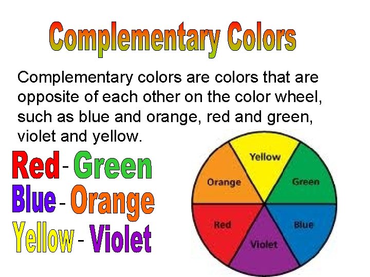
Complementary colors are colors that are opposite of each other on the color wheel, such as blue and orange, red and green, violet and yellow. -
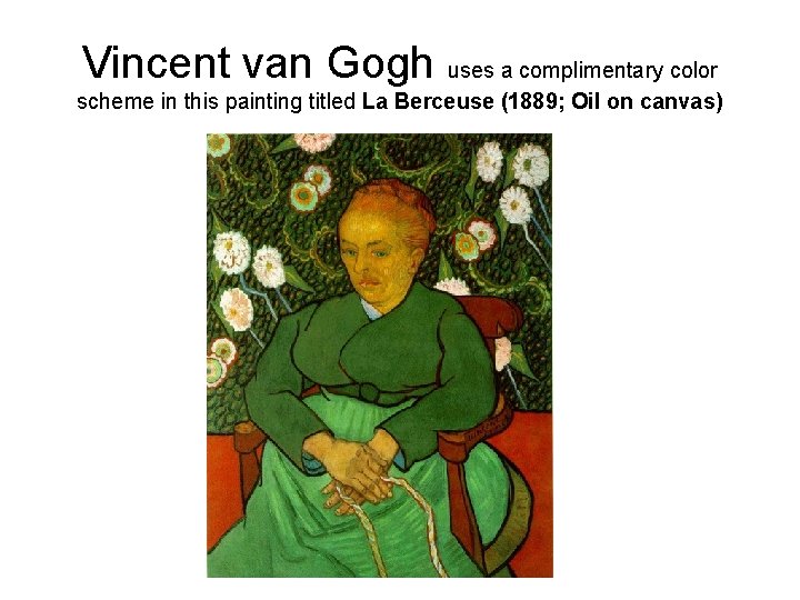
Vincent van Gogh uses a complimentary color scheme in this painting titled La Berceuse (1889; Oil on canvas)
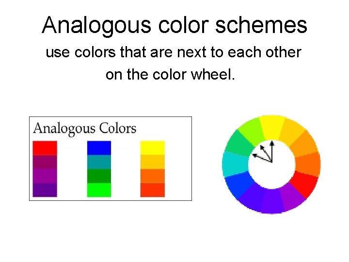
Analogous color schemes use colors that are next to each other on the color wheel.
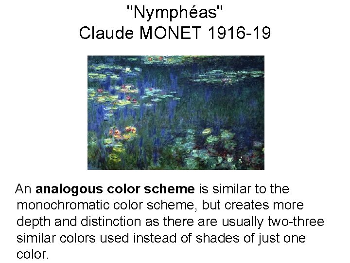
"Nymphéas" Claude MONET 1916 -19 An analogous color scheme is similar to the monochromatic color scheme, but creates more depth and distinction as there are usually two-three similar colors used instead of shades of just one color.
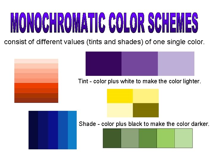
consist of different values (tints and shades) of one single color. Tint - color plus white to make the color lighter. Shade - color plus black to make the color darker.
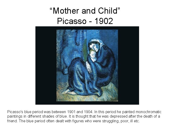
“Mother and Child” Picasso - 1902 Picasso's blue period was between 1901 and 1904. In this period he painted monochromatic paintings in different shades of blue. It is thought that he was depressed after the death of a friend. The blue period often dealt with figures who were struggling, poor, ill etc.
Color Assignment • You have done three sketchbook assignments regarding color (created a color wheel, a values scale and found or drew examples of each color scheme) to give you a foundation in color. • Next, you will be experimenting with paint to understand color mixing. (Lesson 22, Art in Action 8) • Then you will create a painting using one of the color schemes we have studied.