Lesson on Data Displays Dot Plot A dot


- Slides: 17
Lesson on Data Displays
Dot Plot A dot plot can make some observations easier, especially gaps and outliers. It gives an overall sense of the data’s center, spread, and shape. It is like a number line, but you don’t have to start at zero.
Dot Plot
Frequency Table A frequency table is a list of categories that classifies the number of occurrences in each category.
Two-Way Frequency Table A two-ways frequency table displays the distribution for two categorical variables. Athlete Non-Athlete Agree 10 5 Disagree 7 4
Two-Way Frequency Table A two-ways frequency table displays the distribution for two categorical variables. Agree Athlete Non. TOTAL Athlete 10 5 15 Disagree 7 4 11 TOTAL 9 26 17
Categorical Data What Do You Call Carbonated Drinks? STATE California New York Georgia Main “Pop” 4566 3433 455 584 “Soda” 968 493 456 3924 “Coke” 323 1385 5038 453 Other 446 44 445 4523
Stem-and Leaf Plots A stem-and-leaf plot is a graph that organizes the leading digits of data as stems. The remaining digits becomes leaves. DATA: 12, 13, 21, 27, 33, 34, 35, 37, 40, 41 KEY: 1|2 = 12
Stem-and Leaf Plots DATA: 23. 3, 24. 1, 24. 8, 25. 0, 25. 3, 25. 6, 25. 9, 26. 3, 27. 1
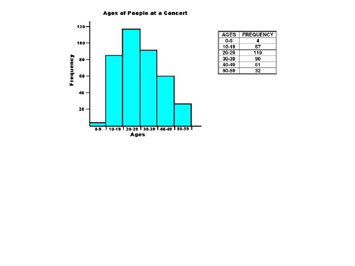
Histogram A histogram is a type of graph that uses vertical bars to display continuous data. Unlike dot plots, which display single values, the bars of a histogram (sometimes called bins/classes) may have any fixed width.
Histogram
Histogram
What makes a good histogram? • Title • Label the x and y-axis • Have a correct scale: – the x-axis = the data values – The y-axis = the frequency values (how often the data may appear) • All of the bins are touching each other
There is no single “correct” bin width for a histogram. The width of a histogram’s bins can affect how well it shows the center, spread, shape, and outliers of the corresponding data.
How to create a histogram •
Example Teachers’ ages: 21, 22, 25, 32, 34, 45, 48, 49, 49, 51, 52, 56, 58, 60, 61, 67