Lesson 71 Making and analyzing scatter plots Scatter


- Slides: 12
Lesson 71 Making and analyzing scatter plots
Scatter plot • One type of graph that relates 2 sets of data with plotted ordered pairs is called a scatter plot. • Scatter plots are considered discrete graphs because their points are separate and disconnected. • The points sometimes form a linear pattern. In these situations, a line can be drawn to model the pattern, which is called a trend line. • A trend line is a line on a scatter plot, which shows the relationship between 2 sof data.
Trend line • A trend line does not have to go through any of the points on the scatter plot. • It has to be drawn equally as close to one point as to another so it models the approximate slope of the points. • Depending on the points chosen, trend lines will vary.
Graphing a scatter plot and a trend line • Make a scatter plot of the data. Then draw the trend line on the scatter plot. • x 1 2 3 4 5 6 • y 4 10 12 18 23 29 • Find the equation for the trend line. • Pick 2 points on the trend line • Find the slope from the points • Use point slope form to get an equation • Write the equation in slope-intercept form
Line of best fit • A trend line that shows the linear relationship of a scatter plot most accurately is called the line of best fit. • The equation of the line of best fit can be calculated on a graphing calculator. • We will do this in lab 7
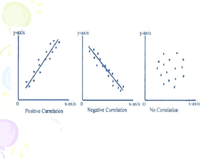
correlation • 2 sets of data may be related to each other. • A correlation is a measure of the strength and direction of the association between data sets or variables. • When the points tightly cluster in a linear pattern, then the correlation is strong. • Data points can be positively correlated or negatively correlated. • There is a positive correlation when the data values for both variables increase. • There is a negative correlation when the data values for one variable increase while the data values for the other variable decrease.
Slope and correlation • If the slope of a trend line is positive, then there is a positive correlation between the data values. • If the slope of the trend line is negative, then there is a negative correlation between the data values.
Identifying correlations • State whethere is a positive, negative or no correlation between the following: • Height and shoe size • Date of birth and shoe size • Hours of sleep and alertness in school • Test scores and eye color
Matching situations to scatter plots • Match each situation with the scatter plot that best models it • Number of trucks on the road and number of days in the month • Time spent driving and distance traveled • Number of months you own a car and the value of the car.
match • Number of times one can lift a dumbbell and the weight of the dumbbell • Time spent reading novels and test scores on math exam • Number of classes taken and amount of homework
Lab 7 -finding line of best fit • P. 464 - 465