Lesson 1 1 Displaying Distribution with Graphs Knowledge
Lesson 1 - 1 Displaying Distribution with Graphs
Knowledge Objectives • What is meant by exploratory data analysis • What is meant by the distribution of a variable • Differentiate between categorical variables and quantitative variables • What is meant by the mode of a distribution • What is meant by an outlier in a stemplot or histogram

Construction Objectives • Construct bar graphs and pie charts for a set of categorical data • Construct a stemplot for a set of quantitative data • Construct a back-to-back stemplot to compare two related distributions • Construct a stemplot using split stems • Construct a histogram for a set of quantitative data, and discuss how changing the class width can change the impression of the data given by the histogram

Construction Objectives cont • Describe the overall pattern of a distribution by its shape, center, and spread • Recognize and identify symmetric and skewed distributions • Construct and interpret an ogive (relative cumulative frequency graph) from a relative frequency table • Construct a time plot for a set of data collected over time
Vocabulary • Roundoff error – errors associated with decimal inaccuracies • Pie chart – chart that emphasize each category’s relation to the whole • Bargraph – displays the distribution of a categorical variable • Stemplot – includes actual numerical values in a plot that gives a quick picture of the distribution • Back-to-back stemplot – two distributions plotted with a common stem • Splitting stems – divides step into 0 -4 and 5 -9 • Trimming – removes the last digit or digits before making a stemplot • Histogram – breaks range of values into classes and displays their frequencies • Frequency – counts of data in a class • Frequency table – table of frequencies
Vocabulary • • Modes – major peaks in a distribution Unimodal – a distribution whose shape with a single peak (mode) Bimodal – a distribution whose shape has two peaks (modes) Symmetric – if values smaller and larger of the center are mirror images of each other Skewed – if smaller or larger values from the center form a tail Ogive – relative cumulative frequency graph Time plot – plots a variable against time on the horizontal scale of the plot Seasonal variation – a regular rise and fall in a time plot
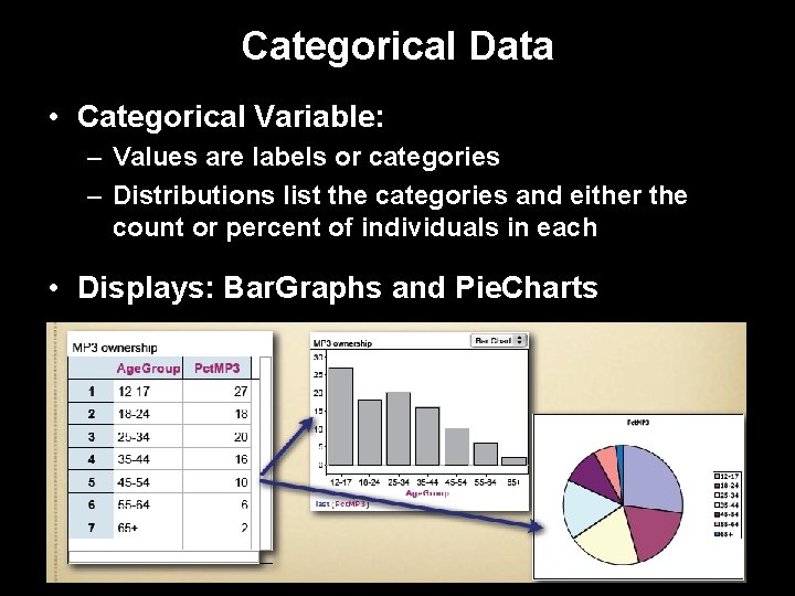
Categorical Data • Categorical Variable: – Values are labels or categories – Distributions list the categories and either the count or percent of individuals in each • Displays: Bar. Graphs and Pie. Charts

Categorical Data Example Body Part Frequency Relative Frequency Back 12 0. 4 Wrist 2 0. 0667 Elbow 1 0. 0333 Hip 2 0. 0667 Shoulder 4 0. 1333 Knee 5 0. 1667 Hand 2 0. 0667 Groin 1 0. 0333 Neck 1 0. 0333 Total 30 1. 0000 Physical Therapist’s Rehabilitation Sample

Categorical Data • Items are placed into one of several groups or categories (to be counted) • Typical graphs of categorical data: – Pie Charts; emphasizes each category’s relation to the whole – Bar Charts; emphasizes each category’s relation with other categories Bar Chart Pie Chart
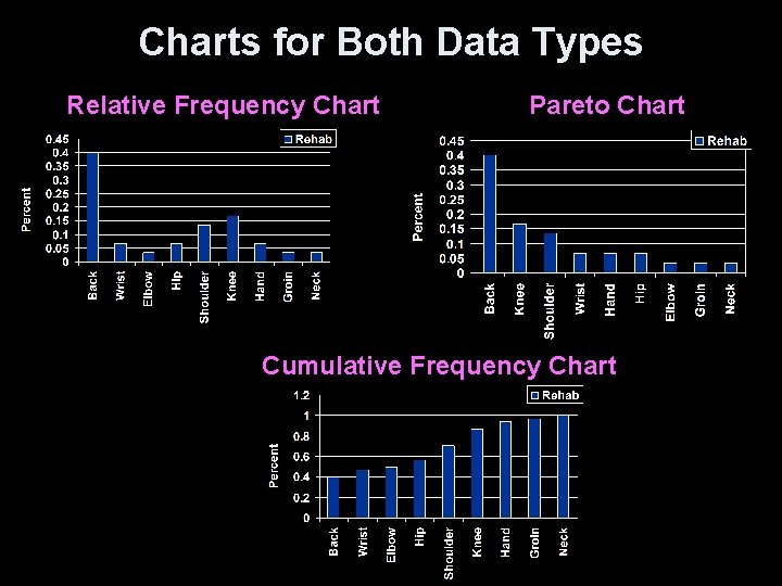
Charts for Both Data Types Relative Frequency Chart Pareto Chart Cumulative Frequency Chart
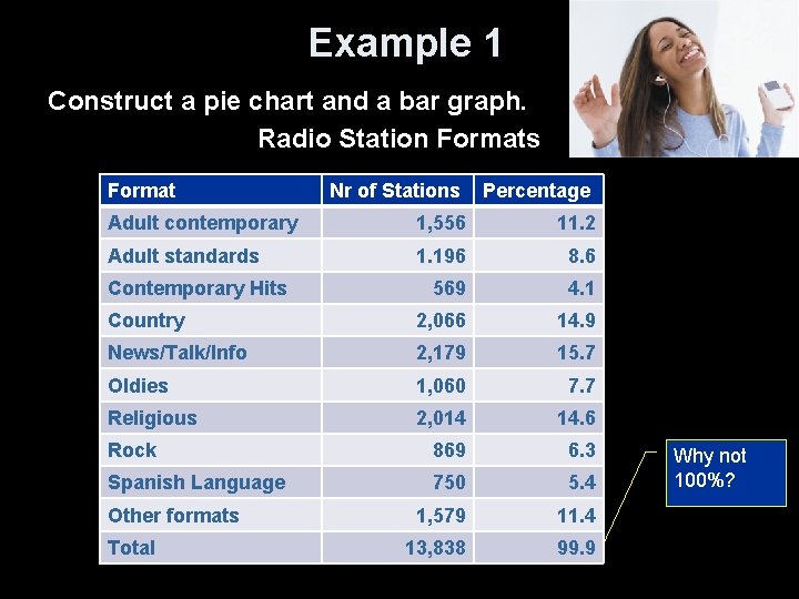
Example 1 Construct a pie chart and a bar graph. Radio Station Formats Format Nr of Stations Percentage Adult contemporary 1, 556 11. 2 Adult standards 1. 196 8. 6 569 4. 1 Country 2, 066 14. 9 News/Talk/Info 2, 179 15. 7 Oldies 1, 060 7. 7 Religious 2, 014 14. 6 Rock 869 6. 3 Spanish Language 750 5. 4 1, 579 11. 4 13, 838 99. 9 Contemporary Hits Other formats Total Why not 100%?
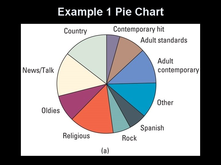
Example 1 Pie Chart

Example 1 Bar Graph
Quantitative Data • Quantitative Variable: – Values are numeric - arithmetic computation makes sense (average, etc. ) – Distributions list the values and number of times the variable takes on that value • Displays: – Dotplots – Stemplots – Histograms – Boxplots
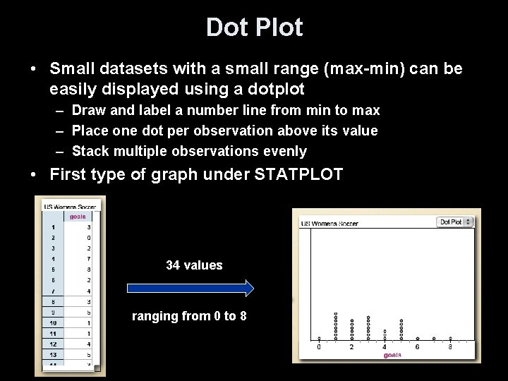
Dot Plot • Small datasets with a small range (max-min) can be easily displayed using a dotplot – Draw and label a number line from min to max – Place one dot per observation above its value – Stack multiple observations evenly • First type of graph under STATPLOT 34 values ranging from 0 to 8
Stem Plots • A stemplot gives a quick picture of the shape of a distribution while including the numerical values – Separate each observation into a stem and a leaf eg. 14 g -> 1|4 256 -> 25|6 32. 9 oz -> 32|9 – Write stems in a vertical column and draw a vertical line to the right of the column – Write each leaf to the right of its stem • Note: – Stemplots do not work well for large data sets – Not available on calculator
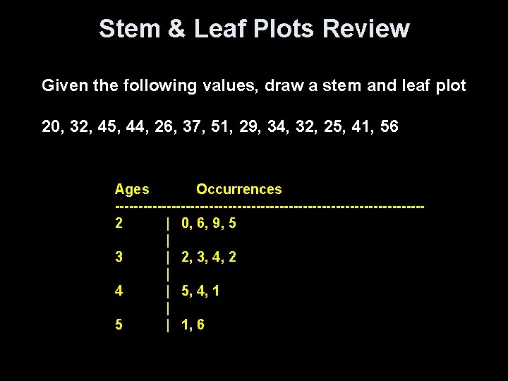
Stem & Leaf Plots Review Given the following values, draw a stem and leaf plot 20, 32, 45, 44, 26, 37, 51, 29, 34, 32, 25, 41, 56 Ages Occurrences ---------------------------------2 | 0, 6, 9, 5 | 3 | 2, 3, 4, 2 | 4 | 5, 4, 1 | 5 | 1, 6
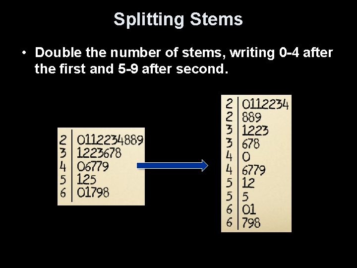
Splitting Stems • Double the number of stems, writing 0 -4 after the first and 5 -9 after second.
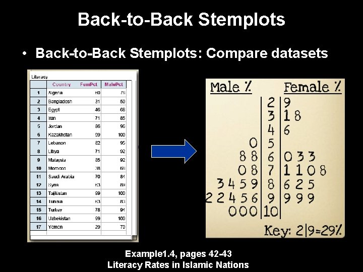
Back-to-Back Stemplots • Back-to-Back Stemplots: Compare datasets Example 1. 4, pages 42 -43 Literacy Rates in Islamic Nations
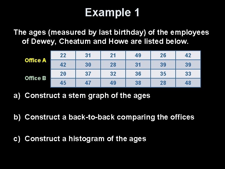
Example 1 The ages (measured by last birthday) of the employees of Dewey, Cheatum and Howe are listed below. Office A Office B 22 31 21 49 26 42 42 30 28 31 39 39 20 37 32 36 35 33 45 47 49 38 28 48 a) Construct a stem graph of the ages b) Construct a back-to-back comparing the offices c) Construct a histogram of the ages
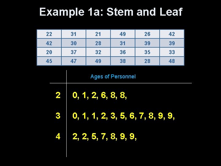
Example 1 a: Stem and Leaf 22 31 21 49 26 42 42 30 28 31 39 39 20 37 32 36 35 33 45 47 49 38 28 48 Ages of Personnel 2 0, 1, 2, 6, 8, 8, 3 0, 1, 1, 2, 3, 5, 6, 7, 8, 9, 9, 4 2, 2, 5, 7, 8, 9, 9,
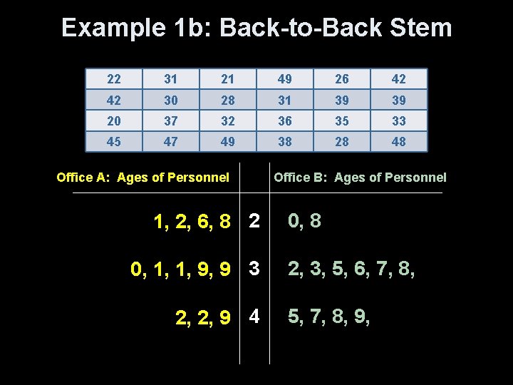
Example 1 b: Back-to-Back Stem 22 31 21 49 26 42 42 30 28 31 39 39 20 37 32 36 35 33 45 47 49 38 28 48 Office A: Ages of Personnel 1, 2, 6, 8 2 0, 1, 1, 9, 9 3 2, 2, 9 4 Office B: Ages of Personnel 0, 8 2, 3, 5, 6, 7, 8, 5, 7, 8, 9,
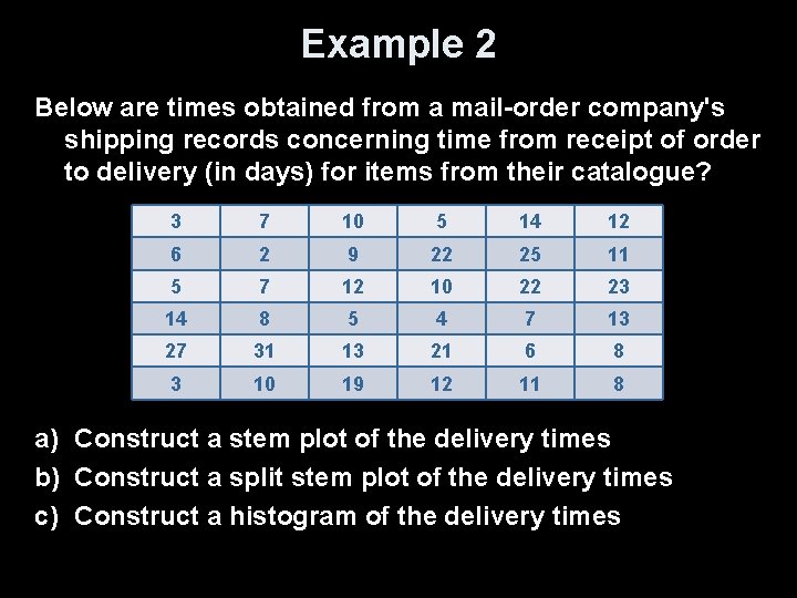
Example 2 Below are times obtained from a mail-order company's shipping records concerning time from receipt of order to delivery (in days) for items from their catalogue? 3 7 10 5 14 12 6 2 9 22 25 11 5 7 12 10 22 23 14 8 5 4 7 13 27 31 13 21 6 8 3 10 19 12 11 8 a) Construct a stem plot of the delivery times b) Construct a split stem plot of the delivery times c) Construct a histogram of the delivery times
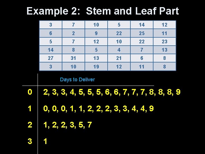
Example 2: Stem and Leaf Part 3 7 10 5 14 12 6 2 9 22 25 11 5 7 12 10 22 23 14 8 5 4 7 13 27 31 13 21 6 8 3 10 19 12 11 8 Days to Deliver 0 2, 3, 3, 4, 5, 5, 5, 6, 6, 7, 7, 7, 8, 8, 8, 9 1 0, 0, 0, 1, 1, 2, 2, 2, 3, 3, 4, 4, 9 2 1, 2, 2, 3, 5, 7 3 1
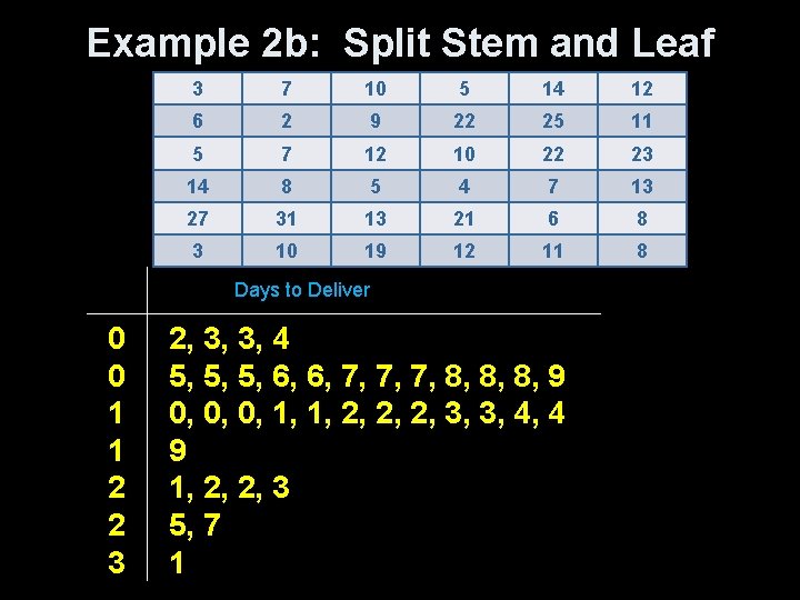
Example 2 b: Split Stem and Leaf 3 7 10 5 14 12 6 2 9 22 25 11 5 7 12 10 22 23 14 8 5 4 7 13 27 31 13 21 6 8 3 10 19 12 11 8 Days to Deliver 0 0 1 1 2 2 3 2, 3, 3, 4 5, 5, 5, 6, 6, 7, 7, 7, 8, 8, 8, 9 0, 0, 0, 1, 1, 2, 2, 2, 3, 3, 4, 4 9 1, 2, 2, 3 5, 7 1
Day 1 Summary and Homework • Summary – Categorical data • Data where adding/subtracting makes no sense • Pie charts and bar graphs – Quantitative data • Data where arithmetic operations make sense • Stem plots and histograms – Some graphs can work for both types of data • Frequency and dot plots • Ogive and Pareto • Homework – pg 46 – 48 problems 1 -5
- Slides: 26