Lesson 1 1 Day 2 Histograms Ogives and


- Slides: 22

Lesson 1. 1 Day #2 Histograms, Ogives, and Timeplots!

Displaying Quantitative Variables: Histograms Making and interpreting stemplots can be tedious for large data sets. For larger amounts of data, ______ are the Histograms most common way to display the distribution of a Quantitative ______variable. The disadvantage of a histogram is lose individual values that you __________.

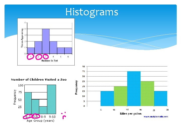
Histograms

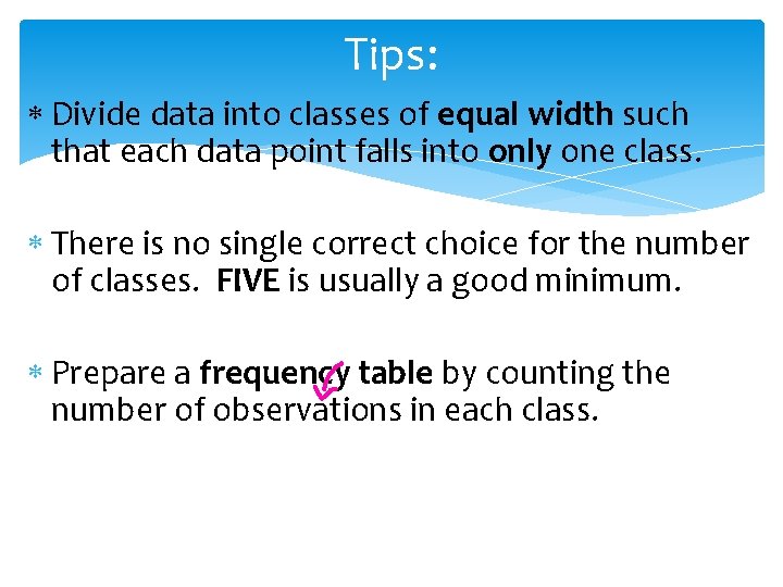
Tips: Divide data into classes of equal width such that each data point falls into only one class. There is no single correct choice for the number of classes. FIVE is usually a good minimum. Prepare a frequency table by counting the number of observations in each class.

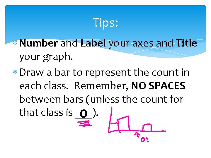
Tips: Number and Label your axes and Title your graph. Draw a bar to represent the count in each class. Remember, NO SPACES between bars (unless the count for that class is ___). 0

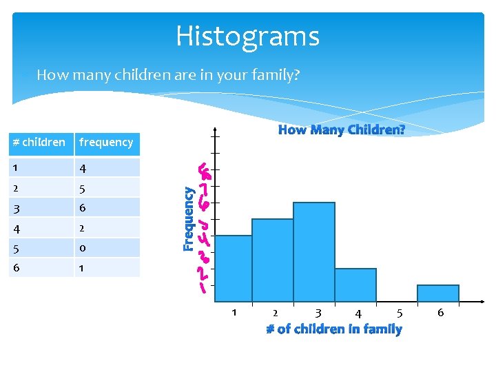
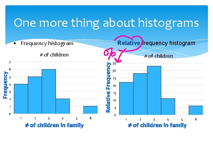
Histograms How many children are in your family? frequency 1 4 2 5 3 6 4 2 5 0 6 1 Frequency # children How Many Children? 1 2 3 4 5 # of children in family 6

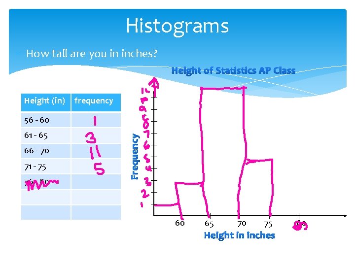
Histograms How tall are you in inches? Height of Statistics AP Class Height (in) frequency 61 - 65 66 - 70 71 - 75 76 - 80 Frequency 56 - 60 60 65 70 75 Height in inches 80

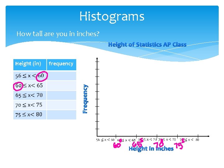
Histograms How tall are you in inches? Height of Statistics AP Class frequency Frequency Height (in) Height in inches

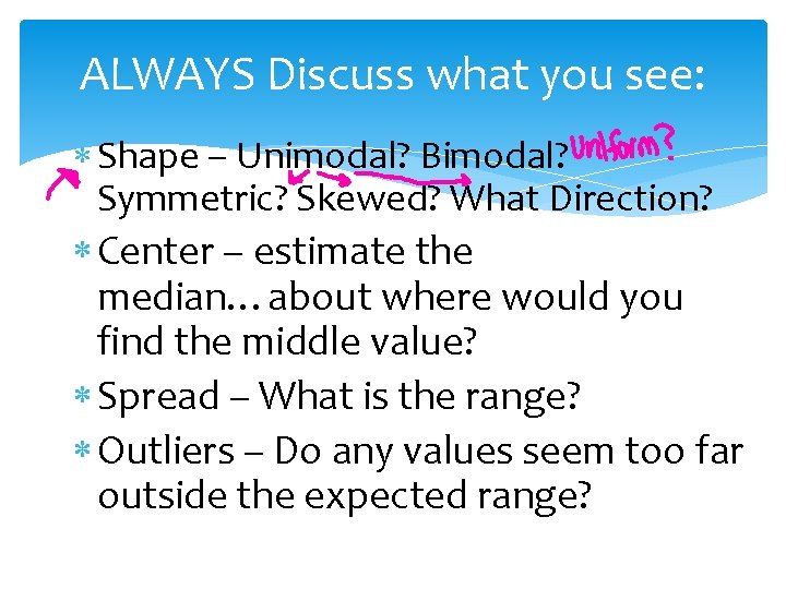
ALWAYS Discuss what you see: Shape – Unimodal? Bimodal? Symmetric? Skewed? What Direction? Center – estimate the median…about where would you find the middle value? Spread – What is the range? Outliers – Do any values seem too far outside the expected range?

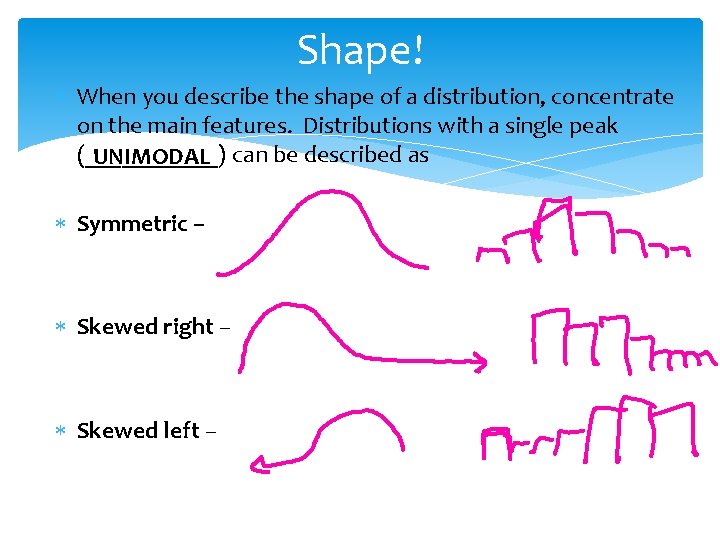
Shape! When you describe the shape of a distribution, concentrate on the main features. Distributions with a single peak (______) can be described as UNIMODAL Symmetric – Skewed right – Skewed left –

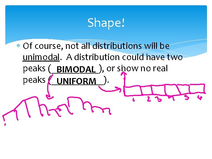
Shape! Of course, not all distributions will be unimodal. A distribution could have two peaks (_____), or show no real BIMODAL peaks (______). UNIFORM

On your Calculator Histograms can be made using the STAT PLOT feature on your calculator (see p. 59). Be sure to set your own WINDOW - Do not ONLY use the ZOOM STAT feature of your calculator!

Practice Make a histogram of the salary data in your calculator. BE SURE TO SET THE WINDOW APPROPRIATELY! Draw the histogram in your notes.

Example: The data* below shows the median starting salary of college graduates with Bachelors Degrees in various fields. Create an appropriate graphical display and describe what you see. Chemical Engineering $65, 700 Electrical Engineering $60, 200 Computer Science $56, 400 Economics $50, 200 Statistics $48, 600 Environmental Science $43, 300 Business Administration $43, 300 Political Science $41, 300 From www. payscale. com/bestcolleges/degrees. asp July, 2009 Philosophy Biology Communications Fashion Design Journalism Education Graphic Design Psychology Social Work $40, 000 $38, 700 $36, 300 $36, 200 $36, 000 $33, 400

One more thing about histograms • Frequency histogram Relative frequency histogram # of children Relative Frequency 7 Frequency 6 5 4 3 2 1 0 1 2 3 4 5 # of children in family 6 35 30 25 20 15 10 5 0 1 2 3 4 5 # of children in family 6

Relative Cumulative Frequency Plots (Ogives) A histogram does not always tell us everything we want to know about a distribution. Sometimes we want to describe the relative position of an individual within a distribution. For this we use a relative cumulative frequency plot (Ogive). The pth percentile of a distribution is the value such that p percent of the observations fall at or below it.

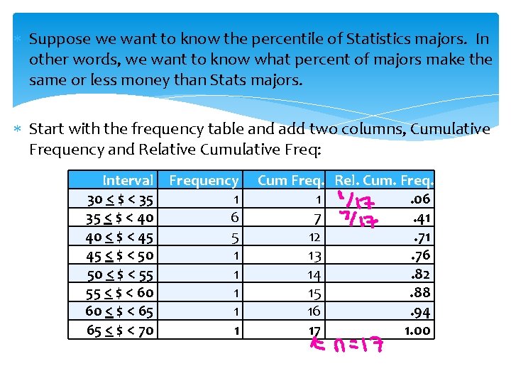
Suppose we want to know the percentile of Statistics majors. In other words, we want to know what percent of majors make the same or less money than Stats majors. Start with the frequency table and add two columns, Cumulative Frequency and Relative Cumulative Freq: Interval Frequency 30 < $ < 35 1 35 < $ < 40 6 40 < $ < 45 5 45 < $ < 50 1 50 < $ < 55 1 55 < $ < 60 1 60 < $ < 65 1 65 < $ < 70 1 Cum Freq. Rel. Cum. Freq. 1. 06 7. 41 12. 71 13. 76 14. 82 15. 88 16. 94 17 1. 00

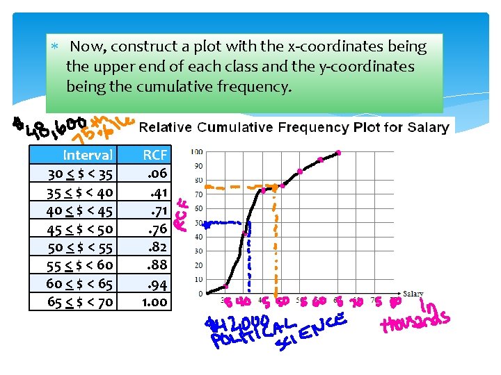
Now, construct a plot with the x-coordinates being the upper end of each class and the y-coordinates being the cumulative frequency. Interval 30 < $ < 35 35 < $ < 40 40 < $ < 45 45 < $ < 50 50 < $ < 55 55 < $ < 60 60 < $ < 65 65 < $ < 70 RCF. 06. 41. 76. 82. 88. 94 1. 00

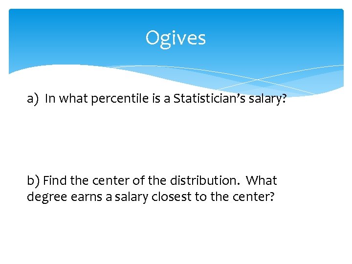
Ogives a) In what percentile is a Statistician’s salary? b) Find the center of the distribution. What degree earns a salary closest to the center?

Time Plots show a variable changes with time. The time scale goes on the horizontal axis. The variable of interest goes on the vertical axis. Look for trends (long-term upward or downward movement) and seasonal variations.

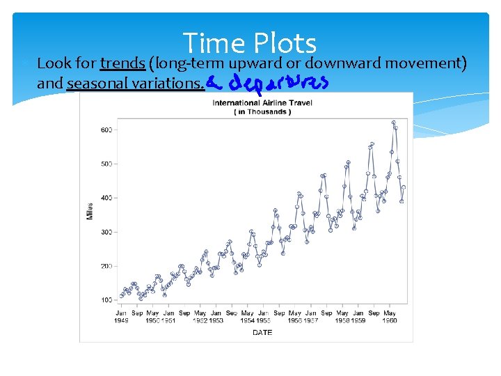
Time Plots Look for trends (long-term upward or downward movement) and seasonal variations.

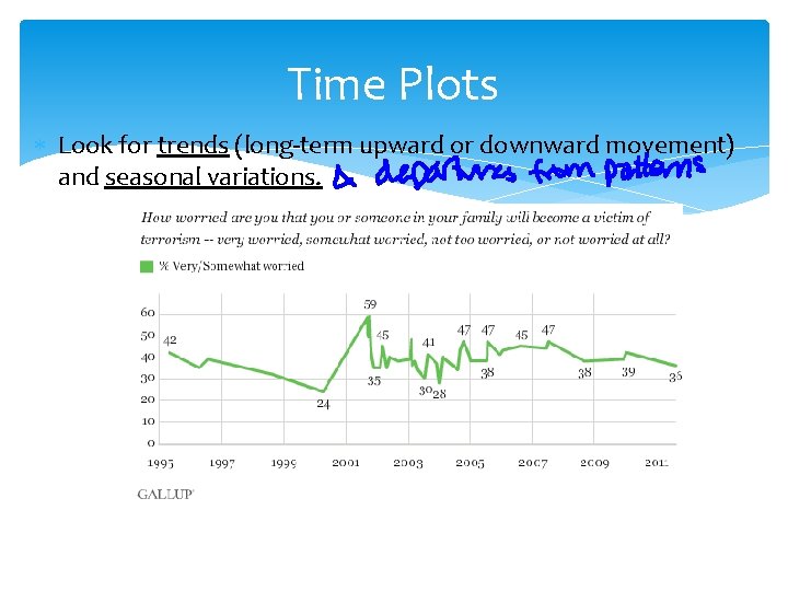
Time Plots Look for trends (long-term upward or downward movement) and seasonal variations.