Lecture 6 Page Design Content Design Site Design
- Slides: 17

Lecture 6: Page Design, Content Design, Site Design, (part 2) Brad Myers 20 -790 Human-Computer Interaction in e. Commerce 1

Notes: n Final exam scheduled: n n n Mon, Dec 16 from 9 -12 in GSIA 152 OK? (May be changeable to Tuesday evening or Wednesday) Homework 2 due today Start on Homework 3 Special make-up lecture: n n Mon, Nov 18 in Wean 4623, 1: 30 pm-3: 30 pm Note special day and room, same time 2

Site Design Rules for the whole site n Often more important for usability n 3

Navigating sites is often difficult n Studies find 58% or 74% failure at achieving a task at a site! n n Lower rate when need a sequence of steps Never say “under construction” n The web is always changing 4

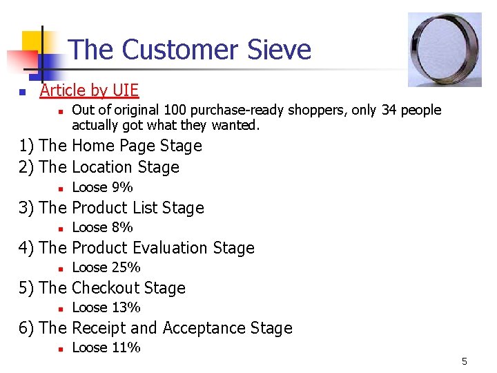
The Customer Sieve n Article by UIE n Out of original 100 purchase-ready shoppers, only 34 people actually got what they wanted. 1) The Home Page Stage 2) The Location Stage n Loose 9% 3) The Product List Stage n Loose 8% 4) The Product Evaluation Stage n Loose 25% 5) The Checkout Stage n Loose 13% 6) The Receipt and Acceptance Stage n Loose 11% 5

Why Follow Conventions? “Now, if you're designing a website, wouldn't you want to put the 'Home' link in the position where people are used to finding it? Implementing web convention means that the person who visits your website has less to learn in order to successfully navigate around your website. ” -- Gerry Mc. Govern, Content Critical 6

Why Home Page Design is Important n n n From: Jakob Nielsen's Alertbox, May 12, 2002: “Top Ten Guidelines for Homepage Usability”: http: //www. useit. com/alertbox/20020512. html “Homepages are the most valuable real estate in the world” “A homepage's impact on a company’s bottom line is far greater than simple measures of e-commerce revenues: The homepage is your company's face to the world. Increasingly, potential customers will look at your company's online presence before doing business with you regardless of whether they plan to close the actual sale online. ” 7

Home Page n n Design differently than inside pages No “home” button on home page; example n n n Larger logo and company name (upper left corner) Should be obvious what company does n n Annoying when buttons don’t go anywhere Serco still an example What does Arch. Vision do? (And what is RPCnet? ) Good example: allrecipes Provide good entry into site’s navigation n Also news that of general interest n n Secondary Reason to return to site 8

Home Page, 2 n n Provide direct access to most important functions (example) No “splash screens” – waste time (example 2) n n (Except for porn sites!) One click access to home from all interior pages Good title for home page (used by search engines) Nielsen’s “Top Ten Guidelines for Homepage Usability” n Or his book with 113 usability guidelines 9

Site Design n Make Search Easy n Many users are “search oriented” n n Search in upper right, especially on home page Search box on front page n n n Other examples: ACM, CDW, etc. Easy link to search Metaphors n Minimize use of metaphors n n Not pretent web page is like things in the real world Shopping cart metaphor is useful n Make it easy to add, remove items 10

Navigation n Where am I? n Make sure each page identifies site n n Where have I been? n n Logo, standard structure and consistent design Link coloring Where can I go? n n Visible links on page Standard navigation-bar is good n Show where you are: Amazon 11

Navigation, 2 n n n Don’t use pop-ups for links Links should have meaningful labels Site Structure n Have one! n n n Hierarchy Table List Multiple ways to get to same information Easy to tell from web site Maps into user’s ideas and tasks n Nielsen reports 80% vs. 9% success rates depending on structure 12

Navigation, 3 n Leave a trail n n Product lists n n Yahoo, Useit, Microsoft Make it easy to compare Careful with forwarding n Breaks the “back” button 13

Search n n n Nielsen: ½ users go straight for the search option Jumps right to pages, so need to be clear where ended up Show what searched for Offer scoped search if large space Larger search box -> type more terms -> better results Don’t use Boolean queries n n Men and Women Search results n n n As a useful list Sorted by quality and relevance New: clustering 14

Search, 2 n UIE: searching again doesn’t help n n n n First time: 23% of the users got a "no results" message. Of those users who kept going, 44% got a "no results" on the second attempt. If they still persisted, 50% got a "no results" on the third attempt. And if they were really persistent, it didn't help because 100% got a "no results" on the fourth attempt. Encouraging users to continue with helpful hints doesn't actually seem to help. So: get users relevant results on the first try! Reference 15

Search, 3 n Another UIE Search study showed: 1) The more users used Search, the less they purchased. 2) Users waited, on average, three clicks into the site before attempting to use Search. 3) The more users used Search, the worse they rated the site. 4) The more users used Search, the less likely they'd return to shop on the site again. 5) The more previous experience a user had with a site, the less they used Search on that site. 6) Two of the study's best performing sites, the Gap and Old Navy, have no Search feature. (And the users didn't notice. ) 16

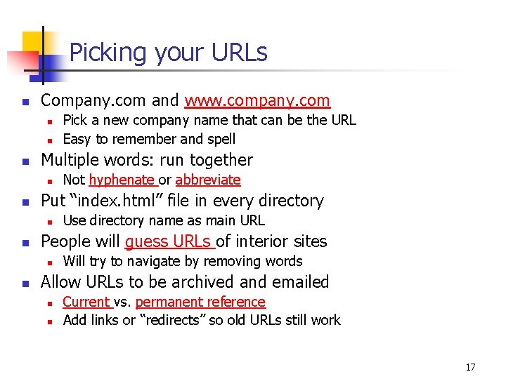
Picking your URLs n Company. com and www. company. com n n n Multiple words: run together n n Use directory name as main URL People will guess URLs of interior sites n n Not hyphenate or abbreviate Put “index. html” file in every directory n n Pick a new company name that can be the URL Easy to remember and spell Will try to navigate by removing words Allow URLs to be archived and emailed n n Current vs. permanent reference Add links or “redirects” so old URLs still work 17