Lecture 5 Page Design Content Design Site Design
- Slides: 27

Lecture 5: Page Design, Content Design, Site Design, (part 1) Brad Myers Human-Computer Interaction in e. Commerce 1

Notes: n n Note Homework for guest lecture Interested in other examples for each point n Both good and bad example web pages 2

How to Create for WWW Ø n (After you have a basic design) Page Design (chapter 2 of Nielsen) n n Content Design (chapter 3) n n Authoring the information for the page Site Design (chapter 4) n n How to design individual pages Navigation and flow Set of heuristics, design rules and guidelines n Backed by experience, but little “theory” 3

Page Design Rules for the look of individual pages 4

Use most of page for content n Use most of page for content rather than navigation n E. g. Mapquest n n n 15% of picture is map Rest are ads, site navigation, OS and browser, whitespace Compare results from Google to Netscape search 5

Design for multiple browsers n n Cross platform design You don’t control the layout or navigation n n People use various browsers, window sizes, etc. Various languages and fonts installed Even cell phones, PDAs, pagers, etc. Users can jump in middle, go back and forward Test your pages in Netscape and Internet Explorer! n E. g. , our Pebbles page works differently 6

Design for multiple browsers, 2 n Resolution-independent design n Don’t use fixed column widths n Scaling, and non-scaling examples n n n Icons that work at different resolutions Don’t use overly specific fonts n n Note effect when change font size <font face="Arial Black">Windows font</font> Don’t put text in pictures n Also can’t be selected for copy/paste 7

Design for multiple browsers, 3 n Don’t use “advanced” features n n n People don’t upgrade browsers Nielsen: wait at least 1 year from introduction Keep old versions of browsers around for testing Netscape version 2 Also, Web TV, PDAs, etc. 8

Design for multiple browsers, 4 n Use “semantic” tags instead of markup tags n n n <H 3> instead of <B> Enables translation by “special” browsers Speech interfaces, screen readers 9

Design for quick downloading n n Users #1 complaint is slow downloading Users want response times of less than 1 second n n n Longer than 10 seconds, users cannot stay focused on the task Forwards and backwards Predictable is important n n Always mark pages that may be slow due to multimedia content Jerusalem Archaeological Park 10

Design for quick downloading, 2 n Nielsen’s pages are mostly text n n Pictures only when useful Can get fancy designs without lots of pictures n n n E. g. , CNET. com Frontpage and Dream. Weaver will tell download times Arrange for first screenfull to display immediately n n Requires pictures to have sizes, layout to be computable without full page, tables that have specified sizing Example that does and ? ? doesn’t 11

Rules for links n Types: n n n Structural: get to sub-content Associative: get to related content “See also”: additional content in case this isn’t the right information Provide links to related items of interest Link text should be descriptive n n Not: “For the schedule, click here” Better: “See the schedule and homeworks” n n n Easier to tell what link will get to Underlined words are visually highlighted Handicapped, etc. users won’t “click” 12

Rules for links, 2 n n Use default link colors If re-coloring: n n n Using pop-ups, roll-overs and javascript means links are not colored differently when visited n n Unvisited links should be blue Visited links should be reddish or purple Example: HCII site Don’t open up new browser windows n n Can’t go back Lose track of all the windows 13

Rules for links, 3 n OK to have outbound links (to other sites) n n Make site friendly for incoming links n n n Maybe mark them Every page has a permanent URL Every page has links to the home page, and other parts of the structure Advertising links go to “payoff” pages rather than to general pages n Users don’t explore to find the advertised item 14

Don’t use frames n Why n n n Title gives wrong URL. example Can mess up “back” and “forward” buttons Can make it hard to print Sometimes can’t tell what is being scrolled Hard to link to the page Usually OK if left column scrolls also (so no need for frames) 15

Design for credibility n Don’t look amateurish n n n Nice, clean designs Good graphic design and color choices Links and code that work Example of small, amateurish site Ability to find out privacy policy Obvious way to provide feedback 16

Design for printing n n Many people print web pages Provide 2 formats: n n n printable versions or PDF versions PDF links should be clearly marked Provide simple way to print multiple related parts n E. g. , all papers from a workshop 17

Content Design People visit your site for the content, not for the design 18

Note: n From: Joonhwan n n More than half of Korean use the internet 60% of internet connections are broadband 19

Web is an Attention Economy n n n Ø Ultimate currency is the user’s time In traditional media, inertia helps keep people reading On the web, it is almost as easy to go to the competitor as to go to your next page Web content must give immediate benefits to the users or they will allocate their time to other sites 20

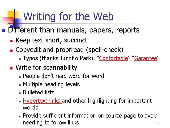
Writing for the Web n Different than manuals, papers, reports n n Keep text short, succinct Copyedit and proofread (spell-check) n n Typos (thanks Jungho Park): “Confortable” “Garantee” Write for scannability n n n People don’t read word-for-word Multiple heading levels Bulleted lists Hypertext links and other highlighting for important words Provide sufficient information on source page to avoid needing to follow links 21

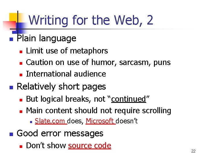
Writing for the Web, 2 n Plain language n n Limit use of metaphors Caution on use of humor, sarcasm, puns International audience Relatively short pages n n But logical breaks, not “continued” Main content should not require scrolling n n Slate. com does, Microsoft doesn’t Good error messages n Don’t show source code 22

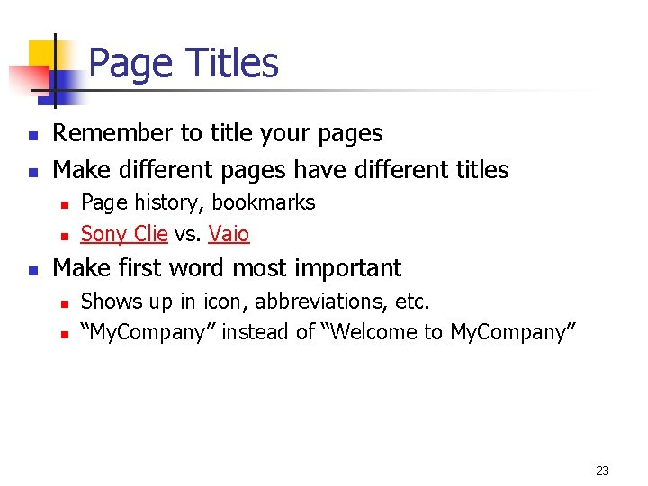
Page Titles n n Remember to title your pages Make different pages have different titles n n n Page history, bookmarks Sony Clie vs. Vaio Make first word most important n n Shows up in icon, abbreviations, etc. “My. Company” instead of “Welcome to My. Company” 23

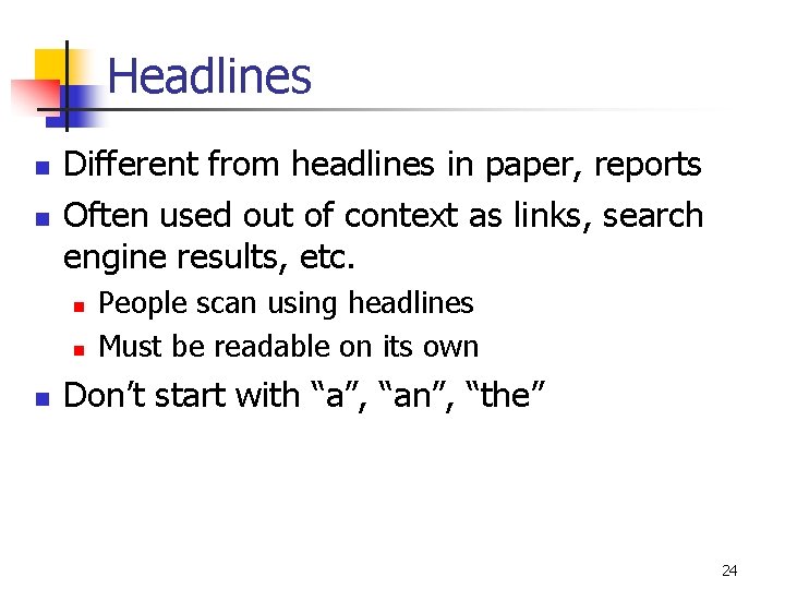
Headlines n n Different from headlines in paper, reports Often used out of context as links, search engine results, etc. n n n People scan using headlines Must be readable on its own Don’t start with “a”, “an”, “the” 24

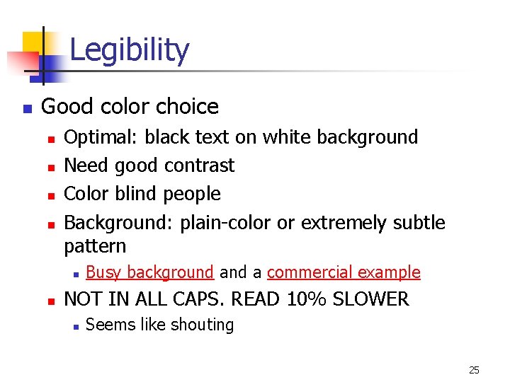
Legibility n Good color choice n n Optimal: black text on white background Need good contrast Color blind people Background: plain-color or extremely subtle pattern n n Busy background a commercial example NOT IN ALL CAPS. READ 10% SLOWER n Seems like shouting 25

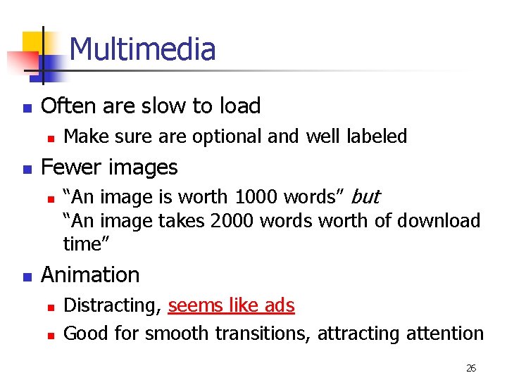
Multimedia n Often are slow to load n n Fewer images n n Make sure are optional and well labeled “An image is worth 1000 words” but “An image takes 2000 words worth of download time” Animation n n Distracting, seems like ads Good for smooth transitions, attracting attention 26

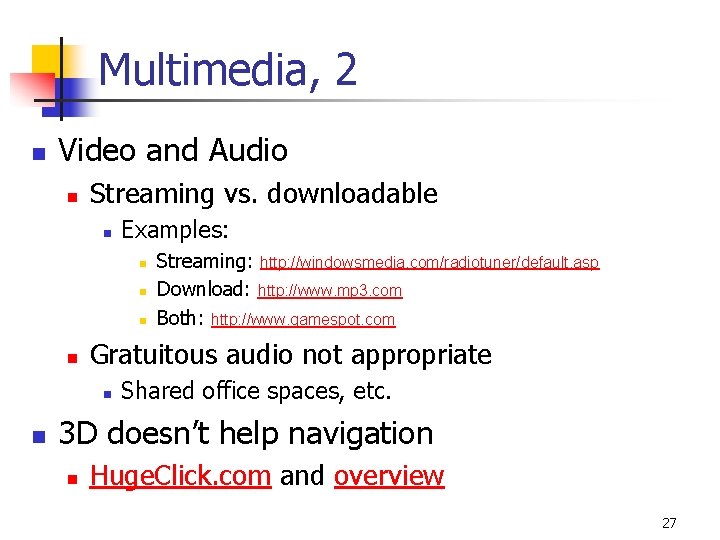
Multimedia, 2 n Video and Audio n Streaming vs. downloadable n Examples: n n Gratuitous audio not appropriate n n Streaming: http: //windowsmedia. com/radiotuner/default. asp Download: http: //www. mp 3. com Both: http: //www. gamespot. com Shared office spaces, etc. 3 D doesn’t help navigation n Huge. Click. com and overview 27