Lecture 5 Page Design Content Design Site Design
- Slides: 35

Lecture 5: Page Design, Content Design, Site Design, (part 1) Brad Myers 20 -790 Human-Computer Interaction in e. Commerce 1

How to Create for WWW Ø n (After you have a basic design) Page Design (chapter 2 of Nielsen) n n Content Design (chapter 3) n n Authoring the information for the page Site Design (chapter 4) n n How to design individual pages Navigation and flow Set of heuristics, design rules and guidelines n Backed by experience, but little “theory” 2

Page Design Rules for the look of individual pages 3

Use most of page for content n Use most of page for content rather than navigation n E. g. Mapquest n n n 15% of picture is map Rest are ads, site navigation, OS and browser, whitespace Good: Google n All other sites now have copied them: n n Yahoo main page, vs. Yahoo search page MSN search 4

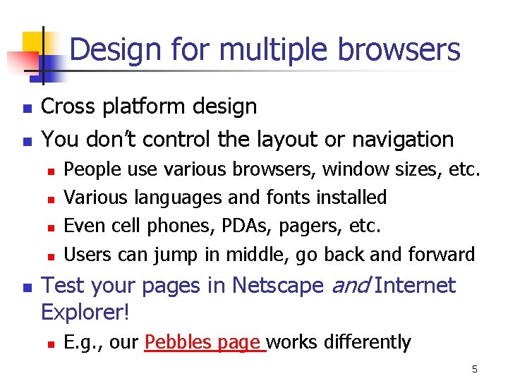
Design for multiple browsers n n Cross platform design You don’t control the layout or navigation n n People use various browsers, window sizes, etc. Various languages and fonts installed Even cell phones, PDAs, pagers, etc. Users can jump in middle, go back and forward Test your pages in Netscape and Internet Explorer! n E. g. , our Pebbles page works differently 5

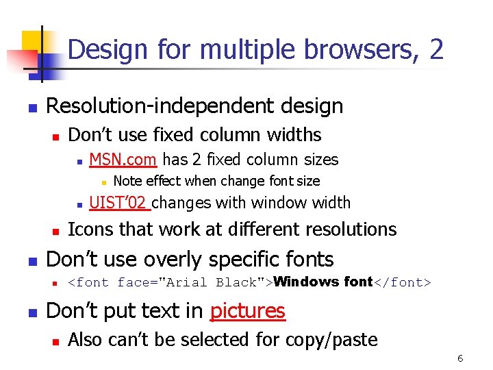
Design for multiple browsers, 2 n Resolution-independent design n Don’t use fixed column widths n MSN. com has 2 fixed column sizes n n UIST’ 02 changes with window width Icons that work at different resolutions Don’t use overly specific fonts n n Note effect when change font size <font face="Arial Black">Windows font</font> Don’t put text in pictures n Also can’t be selected for copy/paste 6

Design for multiple browsers, 3 n Don’t use “advanced” features n n n People don’t upgrade browsers Nielsen: wait at least 1 year from introduction Keep old versions of browsers around for testing Netscape version 2 Also, Web TV, PDAs, etc. 7

Design for multiple browsers, 4 n Use “semantic” tags instead of markup tags n n n <H 3> instead of <B> Enables translation by “special” browsers Speech interfaces, screen readers 8

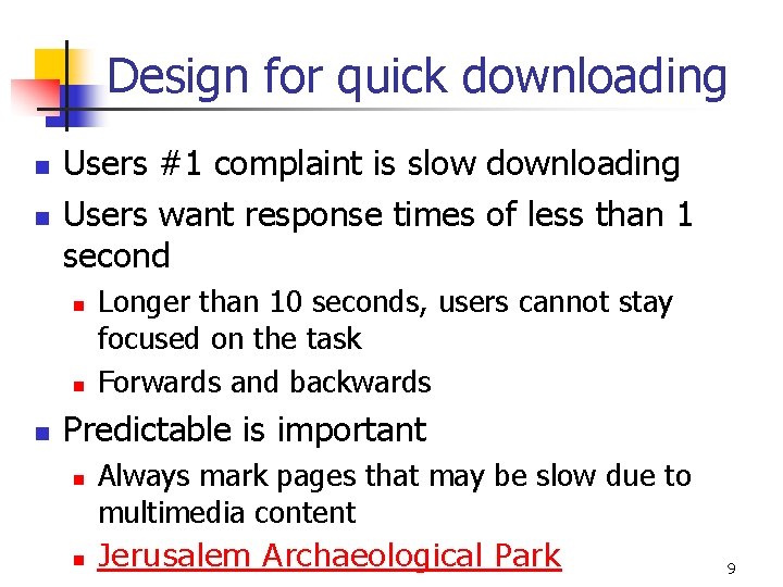
Design for quick downloading n n Users #1 complaint is slow downloading Users want response times of less than 1 second n n n Longer than 10 seconds, users cannot stay focused on the task Forwards and backwards Predictable is important n n Always mark pages that may be slow due to multimedia content Jerusalem Archaeological Park 9

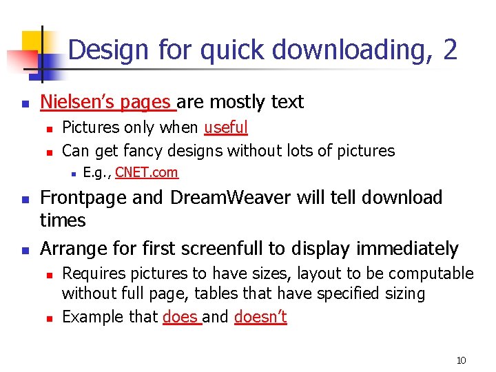
Design for quick downloading, 2 n Nielsen’s pages are mostly text n n Pictures only when useful Can get fancy designs without lots of pictures n n n E. g. , CNET. com Frontpage and Dream. Weaver will tell download times Arrange for first screenfull to display immediately n n Requires pictures to have sizes, layout to be computable without full page, tables that have specified sizing Example that does and doesn’t 10

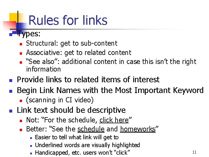
Rules for links n Types: n n n Provide links to related items of interest Begin Link Names with the Most Important Keyword n n Structural: get to sub-content Associative: get to related content “See also”: additional content in case this isn’t the right information (scanning in CI video) Link text should be descriptive n n Not: “For the schedule, click here” Better: “See the schedule and homeworks” n n n Easier to tell what link will get to Underlined words are visually highlighted Handicapped, etc. users won’t “click” 11

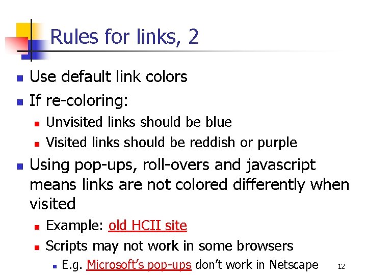
Rules for links, 2 n n Use default link colors If re-coloring: n n n Unvisited links should be blue Visited links should be reddish or purple Using pop-ups, roll-overs and javascript means links are not colored differently when visited n n Example: old HCII site Scripts may not work in some browsers n E. g. Microsoft’s pop-ups don’t work in Netscape 12

Rules for links, 3 n Don’t open up new browser windows n n OK to have outbound links (to other sites) n n Maybe mark them Make site friendly for incoming links n n n Can’t go back Lose track of all the windows Example: ACM dl search: pdf vs. link for results Every page has a permanent URL: ACM Technews not obvious Every page has links to the home page, and other parts of the structure Advertising links go to “payoff” pages rather than to general pages n n Users don’t explore to find the advertised item Users want information now not 5 clicks from now 13

Don’t use frames n Why n n n Title gives wrong URL. Example: UIST’ 01 Can mess up “back” and “forward” buttons Can make it hard to print Sometimes can’t tell what is being scrolled Hard to link to the page Usually OK if left column scrolls with the content (so no need for frames) 14

Design for credibility n Don’t look amateurish n n n Nice, clean designs Good graphic design and color choices Links and code that work Ability to find out privacy policy Obvious way to provide feedback n Example for article and website 15

Design for printing n n Many people print web pages Provide 2 formats: n n n printable versions or PDF versions PDF links should be clearly marked Provide simple way to print multiple related parts n E. g. , all papers from a workshop 16

Content Design People visit your site for the content, not for the design 17

Web is an Attention Economy n n Ø Ultimate currency is the user’s time There is too much content on the WWW In traditional media, inertia helps keep people reading On the web, it is almost as easy to go to the competitor as to go to your next page Web content must give immediate benefits to the users or they will allocate their time to other sites 18

Why Focus on Content? “Publishing is about getting the right content to the right person at the right time at the right cost. It's about selecting the best content and editing it really well, so that it makes compelling reading…. My approach doesn't ignore the software or the visuals, but focuses fundamentally on the words on the page. That's because, it is *words* that drive *actions* on a web page. ” -- Gerry Mc. Govern, Content Critical 19

Content Study n In a recent study of 24 web sites, contentrelated issues caused 40. 2% of the usability obstacles. n n n Inaccuracies or missing information in the sites' text Text that didn't do its job -- Jared Spool, www. uie. com 20

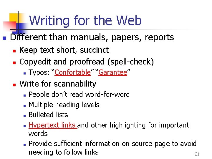
Writing for the Web n Different than manuals, papers, reports n n Keep text short, succinct Copyedit and proofread (spell-check) n n Typos: “Confortable” “Garantee” Write for scannability n n n People don’t read word-for-word Multiple heading levels Bulleted lists Hypertext links and other highlighting for important words Provide sufficient information on source page to avoid needing to follow links 21

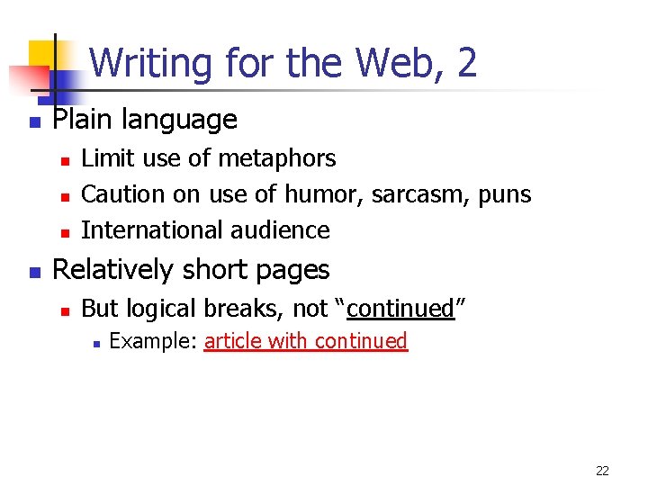
Writing for the Web, 2 n Plain language n n Limit use of metaphors Caution on use of humor, sarcasm, puns International audience Relatively short pages n But logical breaks, not “continued” n Example: article with continued 22

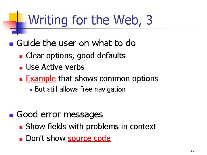
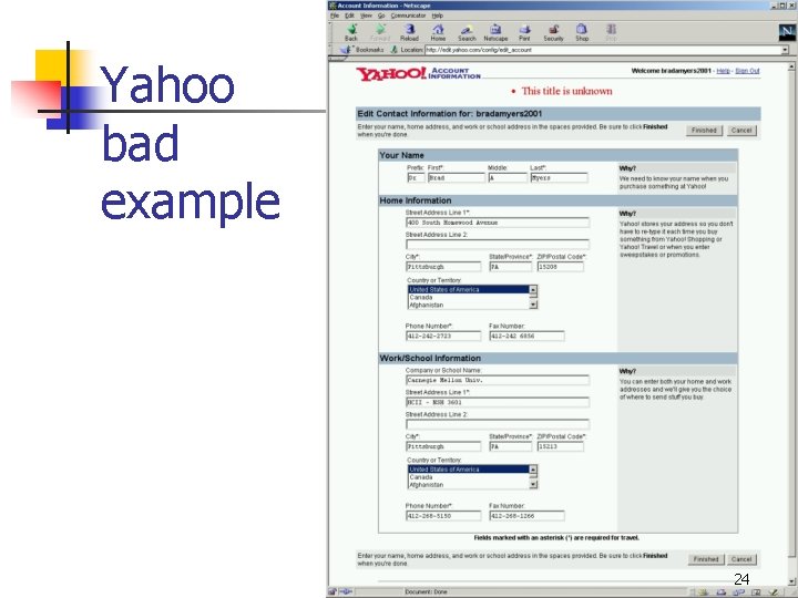
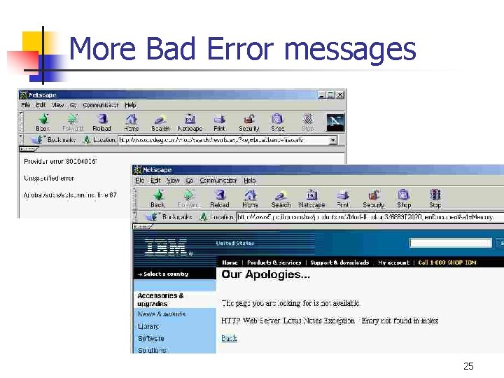
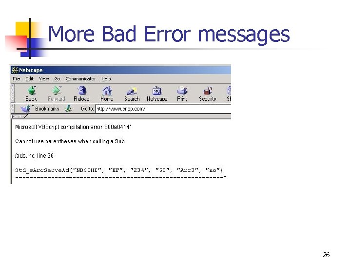
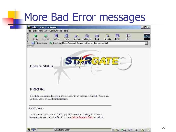
Writing for the Web, 3 n Guide the user on what to do n n n Clear options, good defaults Use Active verbs Example that shows common options n n But still allows free navigation Good error messages n n Show fields with problems in context Don’t show source code 23

Yahoo bad example 24

More Bad Error messages 25

More Bad Error messages 26

More Bad Error messages 27

Page Titles n n n Remember to title your pages Don’t use URL, codes in title Make different pages have different titles n n Page history, bookmarks Make first word most important n n Shows up in icon, abbreviations, etc. “My. Company” instead of “Welcome to My. Company” 28

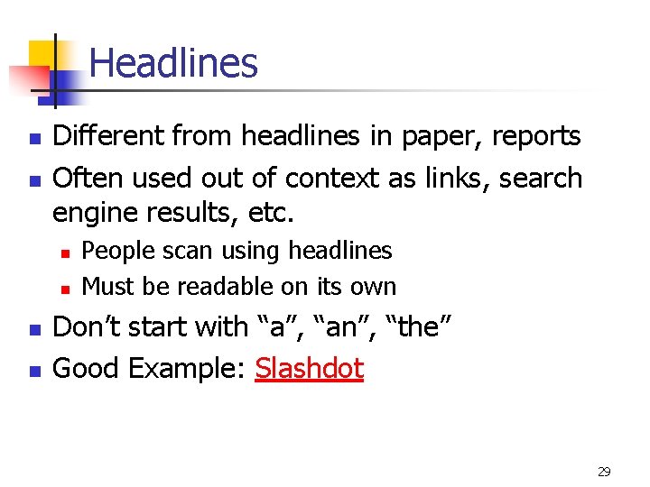
Headlines n n Different from headlines in paper, reports Often used out of context as links, search engine results, etc. n n People scan using headlines Must be readable on its own Don’t start with “a”, “an”, “the” Good Example: Slashdot 29

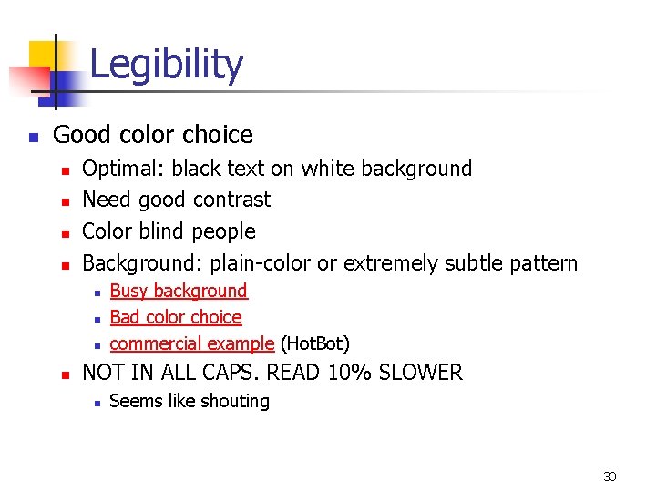
Legibility n Good color choice n n Optimal: black text on white background Need good contrast Color blind people Background: plain-color or extremely subtle pattern n n Busy background Bad color choice commercial example (Hot. Bot) NOT IN ALL CAPS. READ 10% SLOWER n Seems like shouting 30

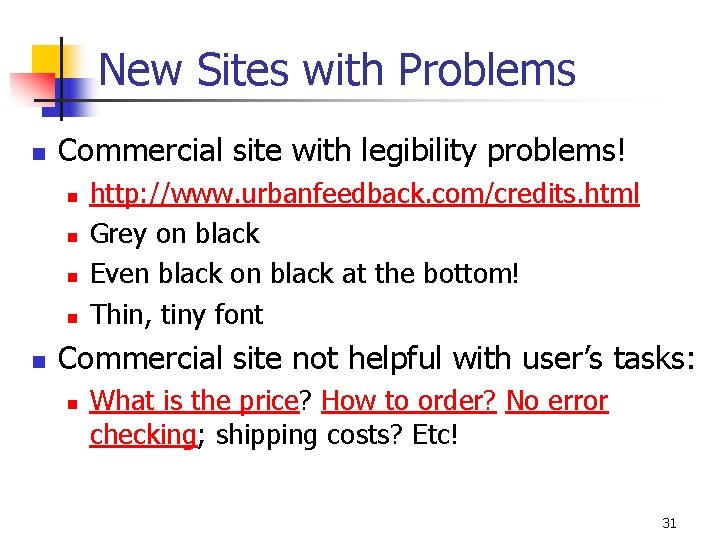
New Sites with Problems n Commercial site with legibility problems! n n n http: //www. urbanfeedback. com/credits. html Grey on black Even black on black at the bottom! Thin, tiny font Commercial site not helpful with user’s tasks: n What is the price? How to order? No error checking; shipping costs? Etc! 31

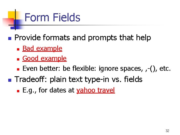
Form Fields n Provide formats and prompts that help n n Bad example Good example Even better: be flexible: ignore spaces, , -(), etc. Tradeoff: plain text type-in vs. fields n E. g. , for dates at yahoo travel 32

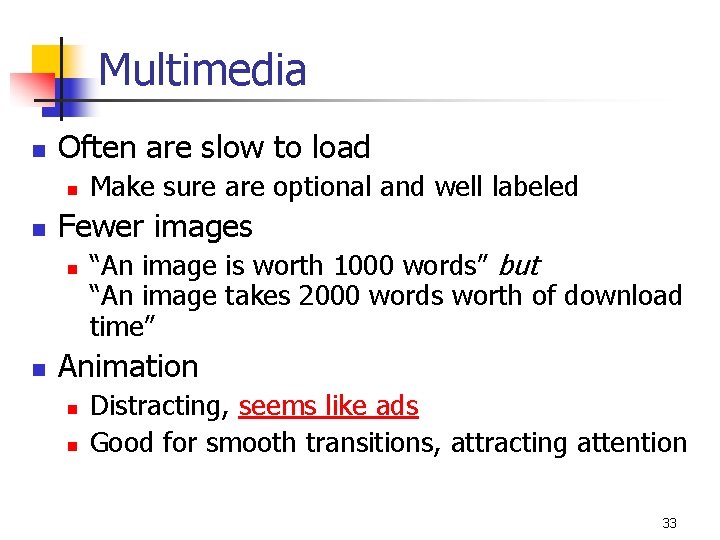
Multimedia n Often are slow to load n n Fewer images n n Make sure are optional and well labeled “An image is worth 1000 words” but “An image takes 2000 words worth of download time” Animation n n Distracting, seems like ads Good for smooth transitions, attracting attention 33

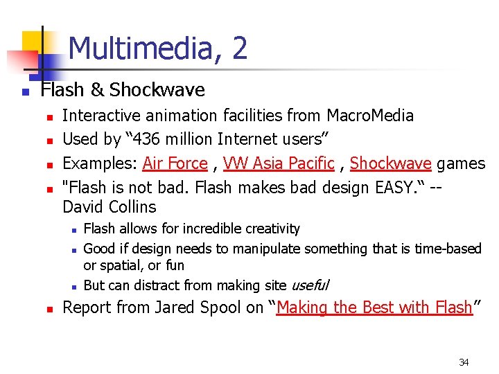
Multimedia, 2 n Flash & Shockwave n n Interactive animation facilities from Macro. Media Used by “ 436 million Internet users” Examples: Air Force , VW Asia Pacific , Shockwave games "Flash is not bad. Flash makes bad design EASY. “ -David Collins n n Flash allows for incredible creativity Good if design needs to manipulate something that is time-based or spatial, or fun But can distract from making site useful Report from Jared Spool on “Making the Best with Flash” 34

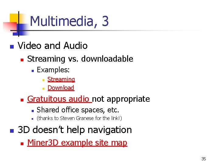
Multimedia, 3 n Video and Audio n Streaming vs. downloadable n Examples: n n Streaming Download Gratuitous audio not appropriate n Shared office spaces, etc. n (thanks to Steven Granese for the link!) 3 D doesn’t help navigation n Miner 3 D example site map 35