Lecture 5 Infographics Definition and Overview Relationship to



- Slides: 28

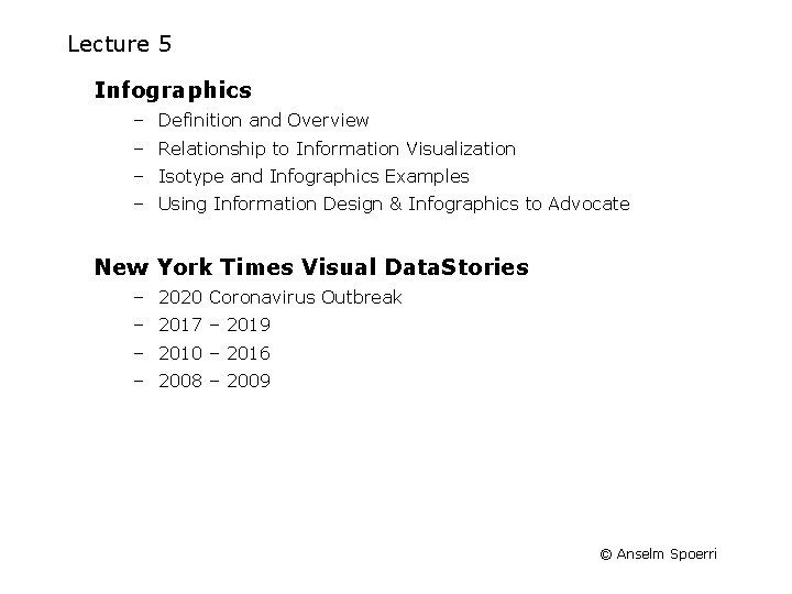
Lecture 5 Infographics – Definition and Overview – Relationship to Information Visualization – Isotype and Infographics Examples – Using Information Design & Infographics to Advocate New York Times Visual Data. Stories – 2020 Coronavirus Outbreak – 2017 – 2019 – 2010 – 2016 – 2008 – 2009 © Anselm Spoerri

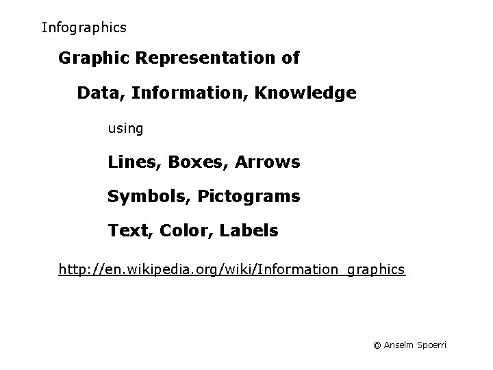
Infographics Graphic Representation of Data, Information, Knowledge using Lines, Boxes, Arrows Symbols, Pictograms Text, Color, Labels http: //en. wikipedia. org/wiki/Information_graphics © Anselm Spoerri

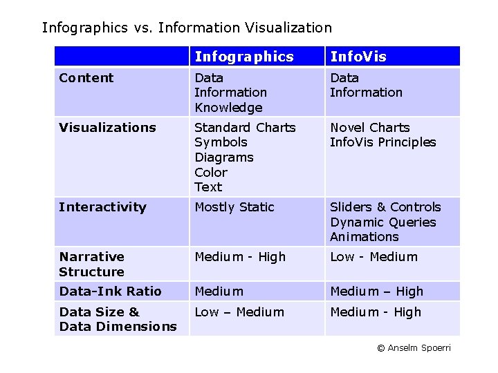
Infographics vs. Information Visualization Infographics Info. Vis Content Data Information Knowledge Data Information Visualizations Standard Charts Symbols Diagrams Color Text Novel Charts Info. Vis Principles Interactivity Mostly Static Sliders & Controls Dynamic Queries Animations Narrative Structure Medium - High Low - Medium Data-Ink Ratio Medium – High Data Size & Data Dimensions Low – Medium - High © Anselm Spoerri

Isotype (International System of TYpographic Picture Education) http: //en. wikipedia. org/wiki/Isotype_(picture_language) © Anselm Spoerri

Isotype (International System of TYpographic Picture Education) http: //www. isotyperevisited. org/ © Anselm Spoerri

Infographics – Some Resources Cool Infographics http: //coolinfographics. blogspot. com/ Smashing Magazine http: //www. smashingmagazine. com/2008/01/14/monday-inspiration-datavisualization-and-infographics/ Six Revisions http: //sixrevisions. com/graphics-design/40 -useful-and-creative-infographics/ © Anselm Spoerri

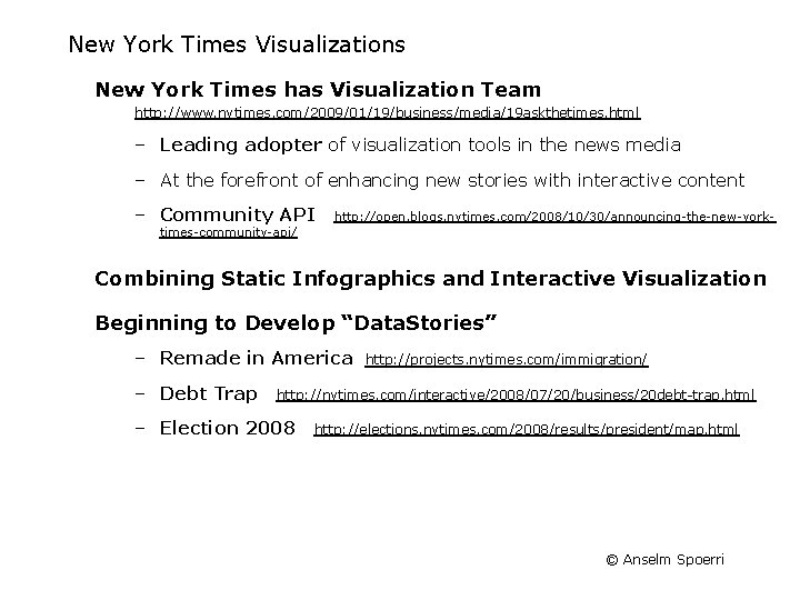
New York Times Visualizations New York Times has Visualization Team http: //www. nytimes. com/2009/01/19/business/media/19 askthetimes. html – Leading adopter of visualization tools in the news media – At the forefront of enhancing new stories with interactive content – Community API http: //open. blogs. nytimes. com/2008/10/30/announcing-the-new-york- times-community-api/ Combining Static Infographics and Interactive Visualization Beginning to Develop “Data. Stories” – Remade in America – Debt Trap http: //projects. nytimes. com/immigration/ http: //nytimes. com/interactive/2008/07/20/business/20 debt-trap. html – Election 2008 http: //elections. nytimes. com/2008/results/president/map. html © Anselm Spoerri

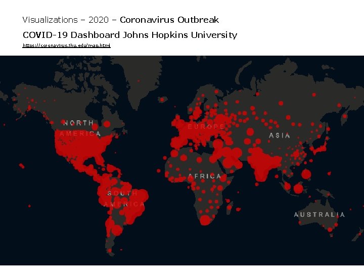
Visualizations – 2020 – Coronavirus Outbreak COVID-19 Dashboard Johns Hopkins University https: //coronavirus. jhu. edu/map. html © Anselm Spoerri

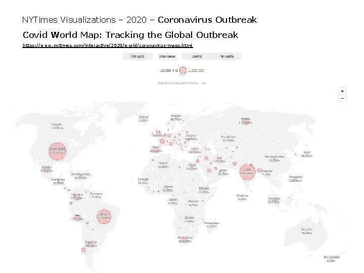
NYTimes Visualizations – 2020 – Coronavirus Outbreak Covid World Map: Tracking the Global Outbreak https: //www. nytimes. com/interactive/2020/world/coronavirus-maps. html © Anselm Spoerri

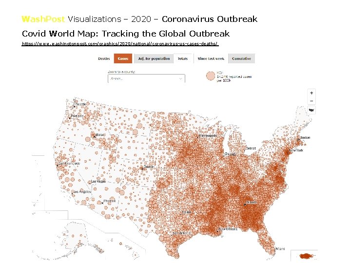
Wash. Post Visualizations – 2020 – Coronavirus Outbreak Covid World Map: Tracking the Global Outbreak https: //www. washingtonpost. com/graphics/2020/national/coronavirus-us-cases-deaths/ © Anselm Spoerri

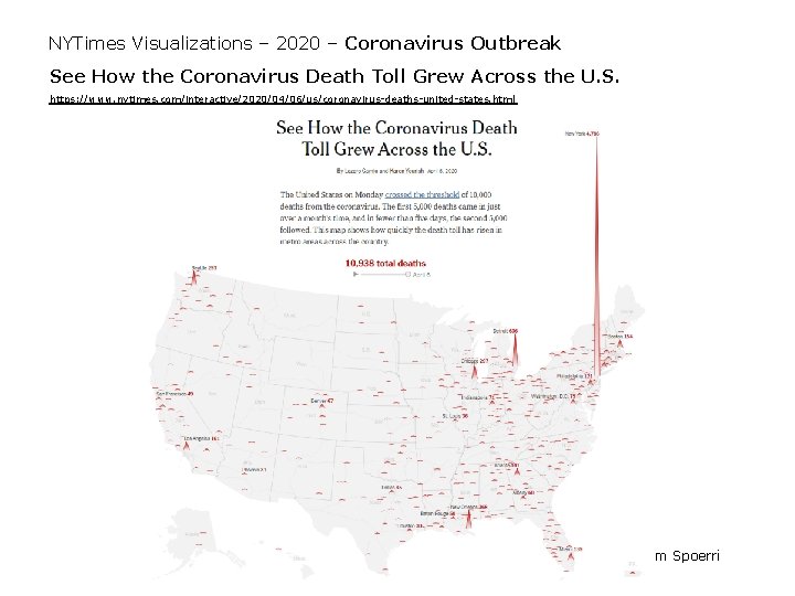
NYTimes Visualizations – 2020 – Coronavirus Outbreak See How the Coronavirus Death Toll Grew Across the U. S. https: //www. nytimes. com/interactive/2020/04/06/us/coronavirus-deaths-united-states. html © Anselm Spoerri

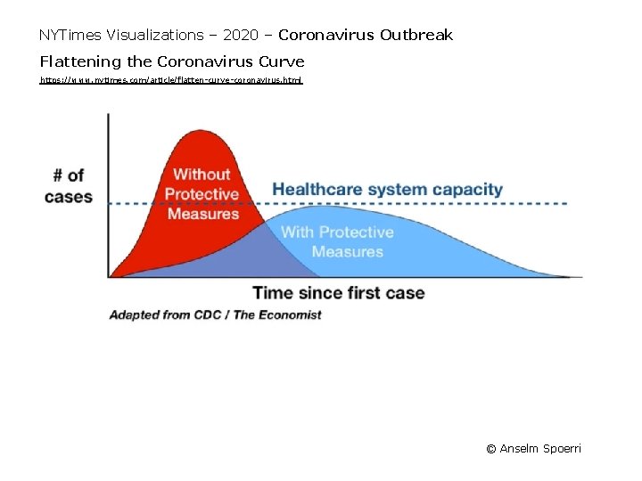
NYTimes Visualizations – 2020 – Coronavirus Outbreak Flattening the Coronavirus Curve https: //www. nytimes. com/article/flatten-curve-coronavirus. html © Anselm Spoerri

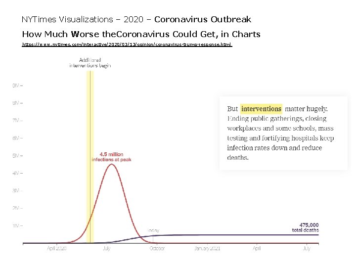
NYTimes Visualizations – 2020 – Coronavirus Outbreak How Much Worse the. Coronavirus Could Get, in Charts https: //www. nytimes. com/interactive/2020/03/13/opinion/coronavirus-trump-response. html © Anselm Spoerri

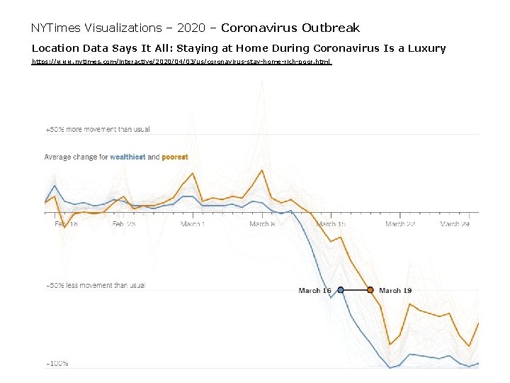
NYTimes Visualizations – 2020 – Coronavirus Outbreak Location Data Says It All: Staying at Home During Coronavirus Is a Luxury https: //www. nytimes. com/interactive/2020/04/03/us/coronavirus-stay-home-rich-poor. html © Anselm Spoerri

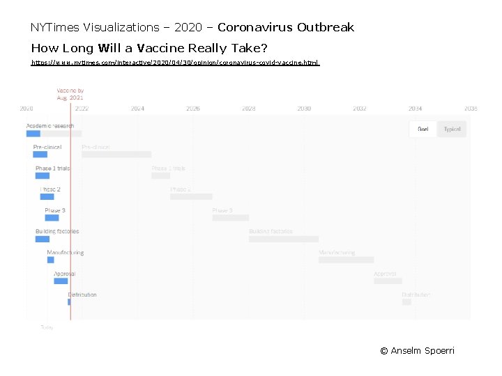
NYTimes Visualizations – 2020 – Coronavirus Outbreak How Long Will a Vaccine Really Take? https: //www. nytimes. com/interactive/2020/04/30/opinion/coronavirus-covid-vaccine. html © Anselm Spoerri

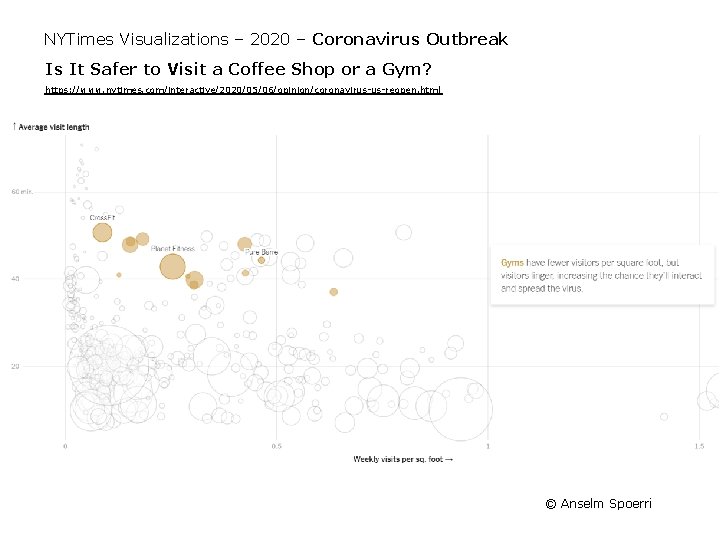
NYTimes Visualizations – 2020 – Coronavirus Outbreak Is It Safer to Visit a Coffee Shop or a Gym? https: //www. nytimes. com/interactive/2020/05/06/opinion/coronavirus-us-reopen. html © Anselm Spoerri

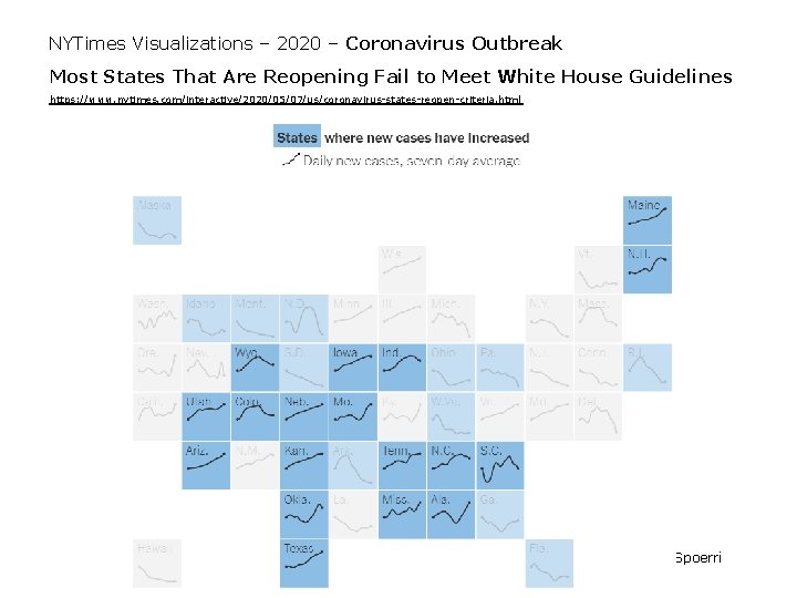
NYTimes Visualizations – 2020 – Coronavirus Outbreak Most States That Are Reopening Fail to Meet White House Guidelines https: //www. nytimes. com/interactive/2020/05/07/us/coronavirus-states-reopen-criteria. html © Anselm Spoerri

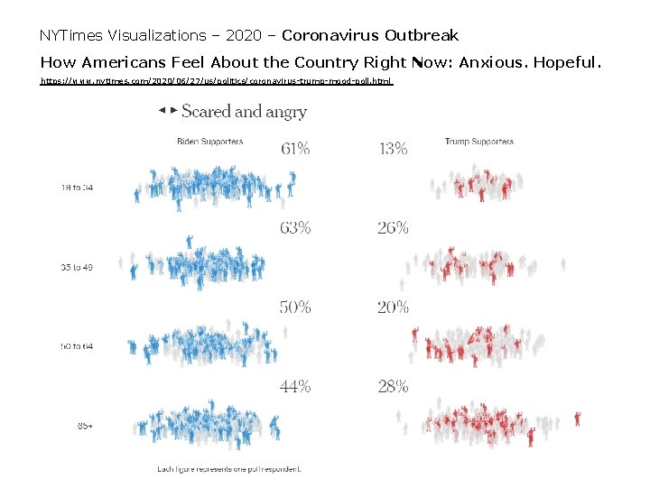
NYTimes Visualizations – 2020 – Coronavirus Outbreak How Americans Feel About the Country Right Now: Anxious. Hopeful. https: //www. nytimes. com/2020/06/27/us/politics/coronavirus-trump-mood-poll. html © Anselm Spoerri

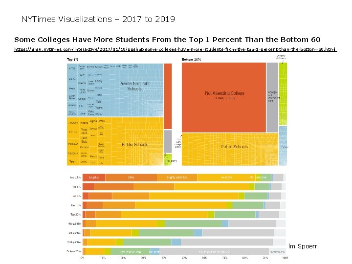
NYTimes Visualizations – 2017 to 2019 Some Colleges Have More Students From the Top 1 Percent Than the Bottom 60 https: //www. nytimes. com/interactive/2017/01/18/upshot/some-colleges-have-more-students-from-the-top-1 -percent-than-the-bottom-60. html © Anselm Spoerri

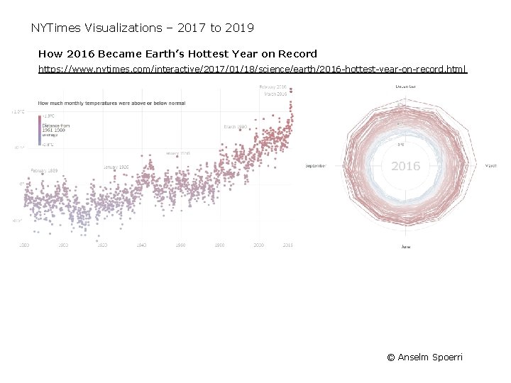
NYTimes Visualizations – 2017 to 2019 How 2016 Became Earth’s Hottest Year on Record https: //www. nytimes. com/interactive/2017/01/18/science/earth/2016 -hottest-year-on-record. html © Anselm Spoerri

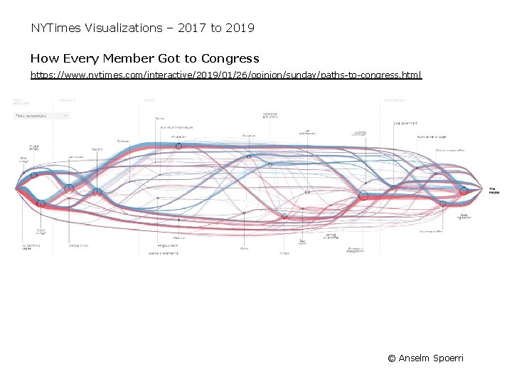
NYTimes Visualizations – 2017 to 2019 How Every Member Got to Congress https: //www. nytimes. com/interactive/2019/01/26/opinion/sunday/paths-to-congress. html © Anselm Spoerri

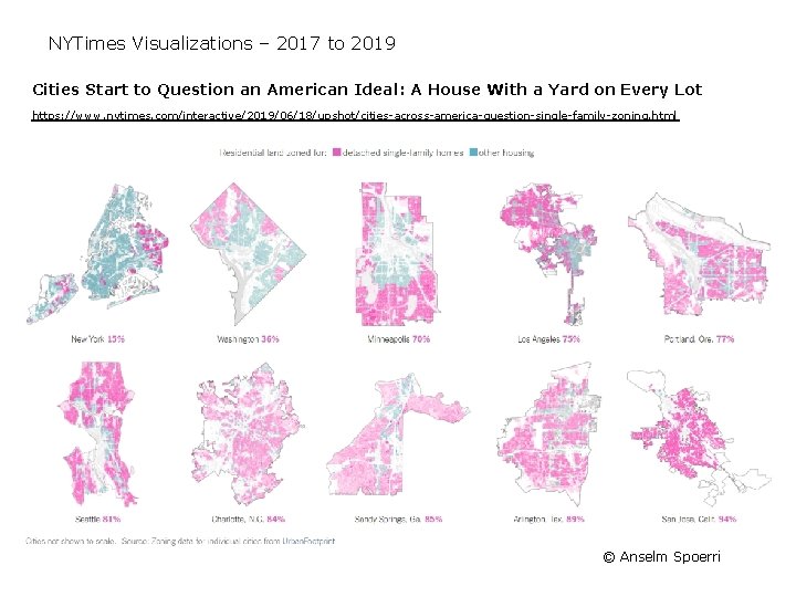
NYTimes Visualizations – 2017 to 2019 Cities Start to Question an American Ideal: A House With a Yard on Every Lot https: //www. nytimes. com/interactive/2019/06/18/upshot/cities-across-america-question-single-family-zoning. html © Anselm Spoerri

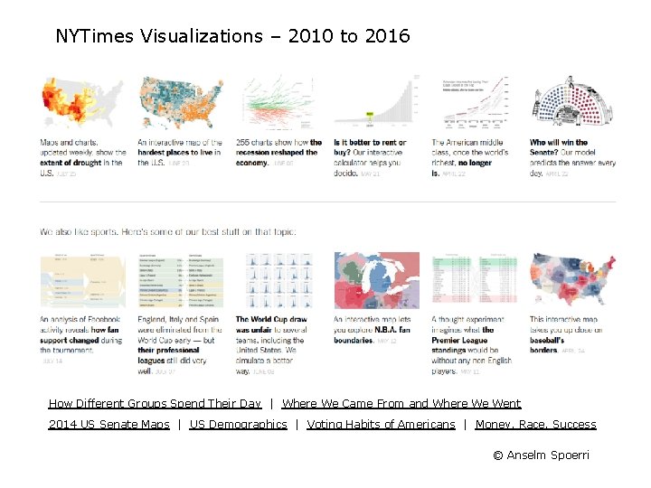
NYTimes Visualizations – 2010 to 2016 A Peek Into Netflix Queues http: //www. nytimes. com/interactive/2010/01/10/nyregion/20100110 -netflix-map. html How Different Groups Spend Their Day http: //www. nytimes. com/interactive/2009/07/31/business/20080801 -metrics-graphic. html Degrees of Debt http: //www. nytimes. com/interactive/2012/05/13/business/student-debt-at-colleges-anduniversities. html Mapping Migration in US http: //www. nytimes. com/2014/08/16/upshot/mapping-migration-in-the-united-states-since 1900. html © Anselm Spoerri

NYTimes Visualizations – 2010 to 2016 Keys to Victory http: //www. nytimes. com/interactive/2011/09/30/us/politics/keys-to-victory. html Paths to the White House http: //elections. nytimes. com/2012/results/president/scenarios Very Detailed Map of 2016 Election https: //www. nytimes. com/interactive/2018/07/25/upshot/precinct-map-highlights. html © Anselm Spoerri

NYTimes Visualizations – Budget Visualizations • Compare Two Approaches – 2011 Proposal http: //www. nytimes. com/interactive/2010/02/01/us/budget. html – 2013 Proposal http: //www. nytimes. com/interactive/2012/02/13/us/politics/2013 -budget-proposalgraphic. html • Which visualization is easier to use? • What type of questions are easy to answer? • What different Perceptual Properties are used? © Anselm Spoerri

NYTimes Visualizations – 2010 to 2016 How Different Groups Spend Their Day | Where We Came From and Where We Went 2014 US Senate Maps | US Demographics | Voting Habits of Americans | Money, Race, Success © Anselm Spoerri

New York Times Visualizations – 2008 to 2009 New York Times has Visualization Team http: //www. nytimes. com/2009/01/19/business/media/19 askthetimes. html – Leading adopter of visualization tools in the news media – At the forefront of enhancing new stories with interactive content – Designers – Matthew Ericson – http: //www. ericson. net/content/ – Michael Bostock – http: //bost. ocks. org/mike/ developer of d 3 Combining Static Infographics and Interactive Visualization Beginning to Develop “Data. Stories” – Debt Trap http: //nytimes. com/interactive/2008/07/20/business/20 debt-trap. html – Toxic Waters http: //projects. nytimes. com/toxic-waters © Anselm Spoerri

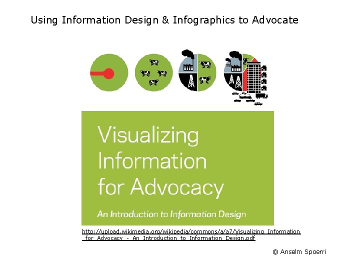
Using Information Design & Infographics to Advocate http: //upload. wikimedia. org/wikipedia/commons/a/a 7/Visualizing_Information _for_Advocacy_-_An_Introduction_to_Information_Design. pdf © Anselm Spoerri