Lecture 4 Data Visualization Demo Baby Name Voyager
Lecture 4 Data Visualization – Demo: Baby Name Voyager – Common Data. Vis Display Types Visual Data. Story Principles – Pie Chart | Bar Chart | Line Chart | Scatterplots | Multi-Dimensional Motion Chart – 1 st Visualization Assignment = Create Motion Chart using Tableau Data. Vis Programming (optional) – 1 st Visualization Assignment = OPTION Data. Vis prog. Using D 3. js © Anselm Spoerri
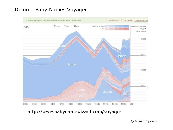
Demo – Baby Names Voyager http: //www. babynamewizard. com/voyager © Anselm Spoerri
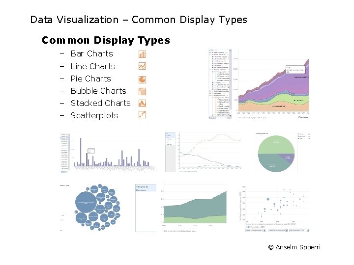
Data Visualization – Common Display Types – Bar Charts – Line Charts – Pie Charts – Bubble Charts – Stacked Charts – Scatterplots © Anselm Spoerri
Visual Data. Story Principles General Design Principles – Leverage Effectiveness of Different Visual Features to encode data – Create Visual Hierarchy – Contrast – Size – Color Display Types and Their Story Narratives – – – Pie Charts Bar Charts Line Charts Special Bar & Line Charts Scatterplots Multidimensional Data © Anselm Spoerri
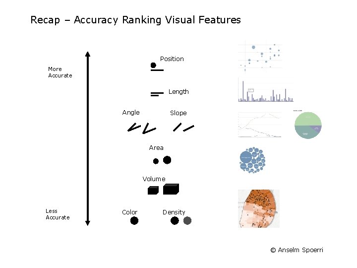
Recap – Accuracy Ranking Visual Features Position More Accurate Length Angle Slope Area Volume Less Accurate Color Density © Anselm Spoerri
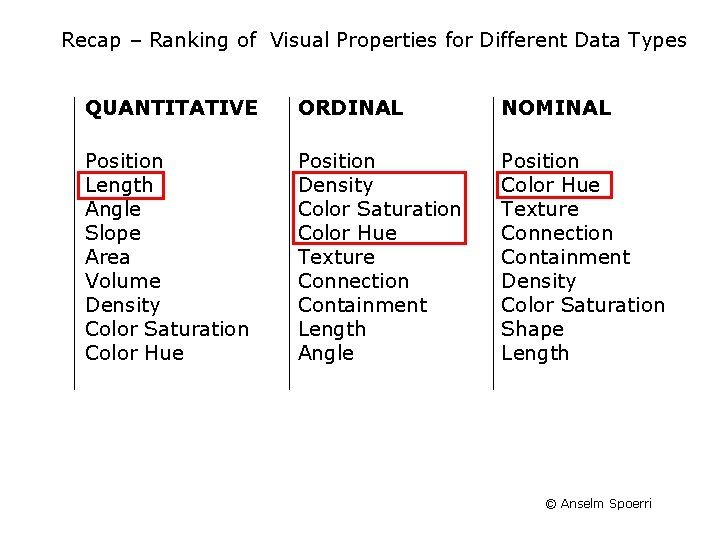
Recap – Ranking of Visual Properties for Different Data Types QUANTITATIVE ORDINAL NOMINAL Position Length Angle Slope Area Volume Density Color Saturation Color Hue Position Density Color Saturation Color Hue Texture Connection Containment Length Angle Position Color Hue Texture Connection Containment Density Color Saturation Shape Length © Anselm Spoerri
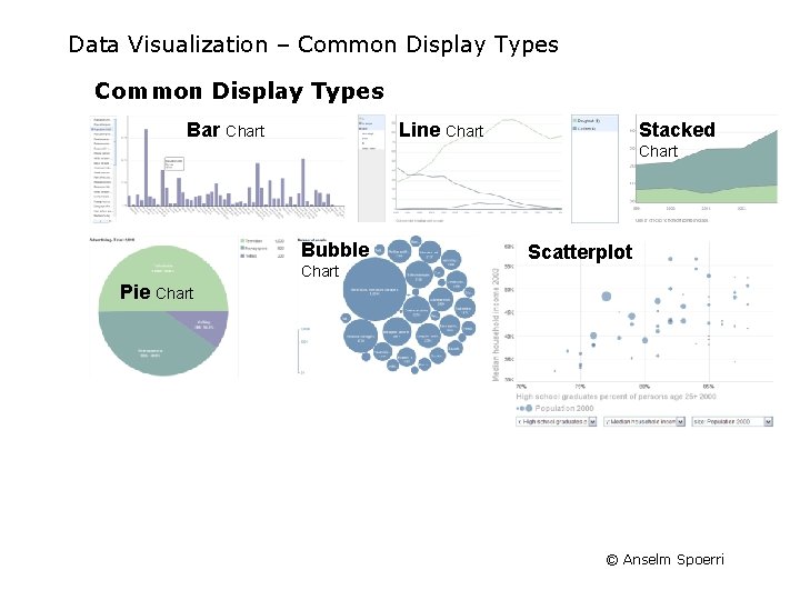
Data Visualization – Common Display Types Bar Chart Line Chart Stacked Chart Bubble Chart Scatterplot Pie Chart © Anselm Spoerri
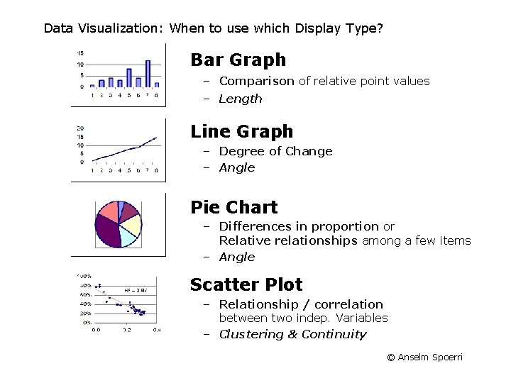
Data Visualization: When to use which Display Type? Bar Graph – Comparison of relative point values – Length Line Graph – Degree of Change – Angle Pie Chart – Differences in proportion or Relative relationships among a few items – Angle Scatter Plot – Relationship / correlation between two indep. Variables – Clustering & Continuity © Anselm Spoerri
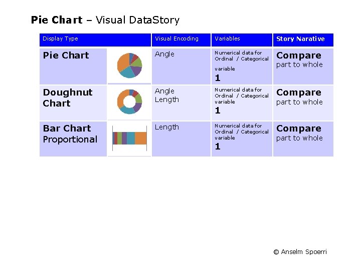
Pie Chart – Visual Data. Story Display Type Visual Encoding Variables Story Narative Pie Chart Angle Numerical data for Ordinal / Categorical Compare variable part to whole 1 Doughnut Chart Angle Length Bar Chart Proportional Length Numerical data for Ordinal / Categorical variable Compare 1 1 part to whole © Anselm Spoerri
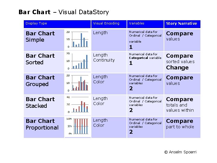
Bar Chart – Visual Data. Story Display Type Visual Encoding Variables Story Narrative Bar Chart Simple Length Numerical data for Ordinal / Categorical Compare variable values 1 Bar Chart Sorted Length Continuity Bar Chart Grouped Length Color Bar Chart Stacked Length Color Bar Chart Proportional Length Color Numerical data for Categorical variable Compare 1 sorted values Numerical data for Ordinal / Categorical variables Compare 2 2 2 Change values totals and values within part to whole © Anselm Spoerri
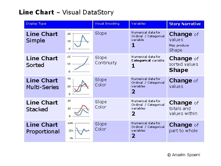
Line Chart – Visual Data. Story Display Type Visual Encoding Variables Story Narrative Line Chart Simple Slope Numerical data for Ordinal / Categorical variable Change 1 Line Chart Sorted Slope Continuity Line Chart Multi-Series Slope Color Line Chart Stacked Slope Color Line Chart Proportional Slope Color Numerical data for Categorical variable 1 of values May produce Shape Change of sorted values Shape Numerical data for Ordinal / Categorical variables Change of Numerical data for Ordinal / Categorical variables Change 2 2 2 values of totals and values within of part to whole © Anselm Spoerri
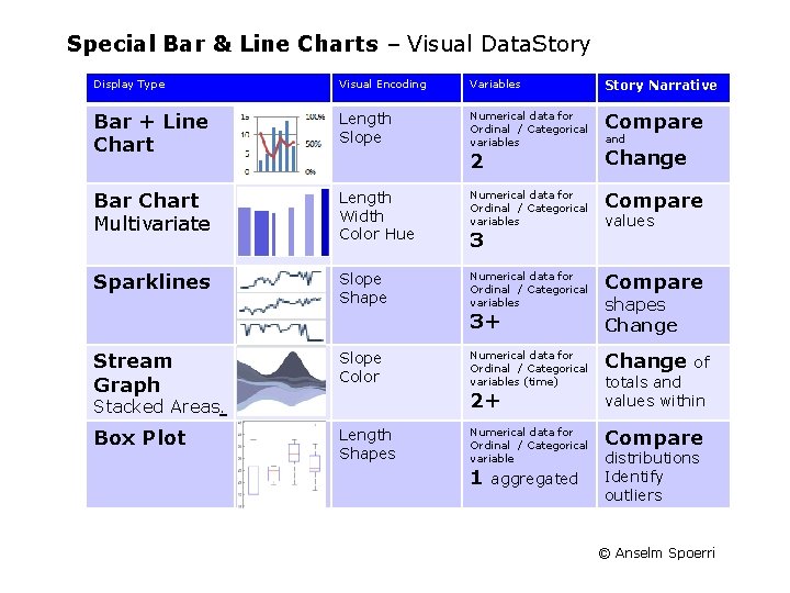
Special Bar & Line Charts – Visual Data. Story Display Type Visual Encoding Variables Story Narrative Bar + Line Chart Length Slope Numerical data for Ordinal / Categorical variables Compare 2 Change Bar Chart Multivariate Length Width Color Hue Numerical data for Ordinal / Categorical variables Compare Sparklines Slope Shape Numerical data for Ordinal / Categorical variables Compare Numerical data for Ordinal / Categorical variables (time) Change Numerical data for Ordinal / Categorical variable Compare 3 3+ Stream Graph Slope Color Box Plot Length Shapes 2+ Stacked Areas. 1 aggregated and values shapes Change of totals and values within distributions Identify outliers © Anselm Spoerri
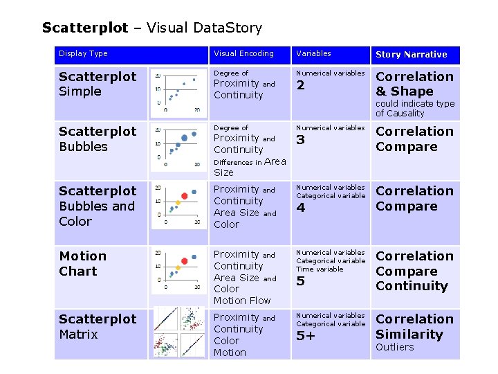
Scatterplot – Visual Data. Story Display Type Visual Encoding Variables Story Narrative Scatterplot Simple Degree of Numerical variables Correlation & Shape Scatterplot Bubbles Degree of Numerical variables Correlation Compare Scatterplot Bubbles and Color Proximity and Continuity Area Size and Color Numerical variables Categorical variable Correlation Compare Motion Chart Proximity and Continuity Area Size and Color Motion Flow Numerical variables Categorical variable Time variable Correlation Compare Continuity Scatterplot Matrix Proximity and Continuity Color Motion Numerical variables Categorical variable Correlation Similarity Proximity and Continuity Differences in Area Size 2 could indicate type of Causality 3 4 5 5+ Outliers © Anselm Spoerri
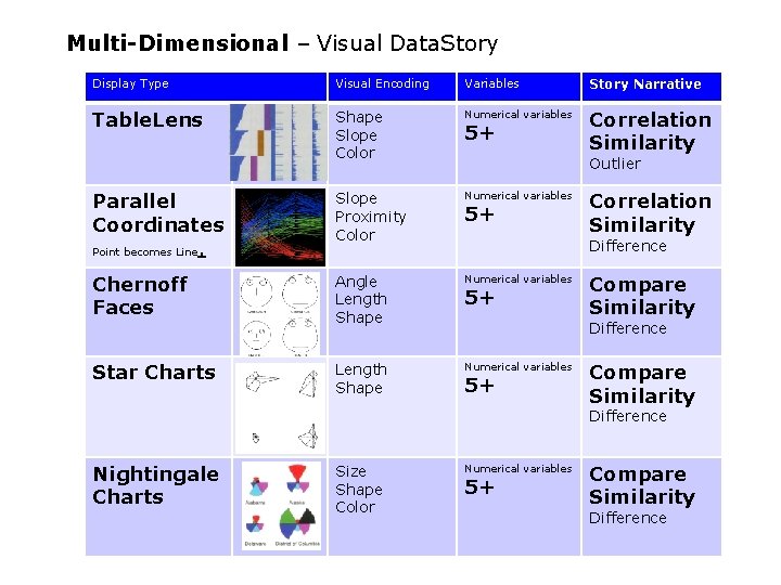
Multi-Dimensional – Visual Data. Story Display Type Visual Encoding Variables Story Narrative Table. Lens Shape Slope Color Numerical variables Correlation Similarity Parallel Coordinates Point becomes Line. Slope Proximity Color Numerical variables Chernoff Faces Angle Length Shape Numerical variables Star Charts Length Shape Numerical variables 5+ Outlier 5+ Correlation Similarity Difference 5+ Compare Similarity Difference Nightingale Charts Size Shape Color Numerical variables 5+ Compare Similarity Difference © Anselm Spoerri
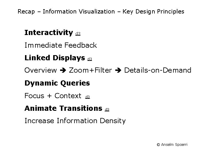
Recap – Information Visualization – Key Design Principles Interactivity d 3 Immediate Feedback Linked Displays d 3 Overview Zoom+Filter Details-on-Demand Dynamic Queries Focus + Context d 3 Animate Transitions d 3 Increase Information Density © Anselm Spoerri
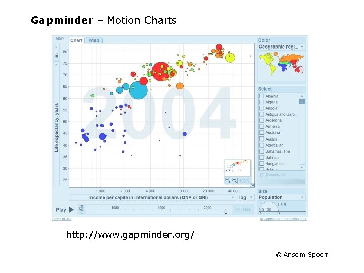
Gapminder – Motion Charts http: //www. gapminder. org/ © Anselm Spoerri
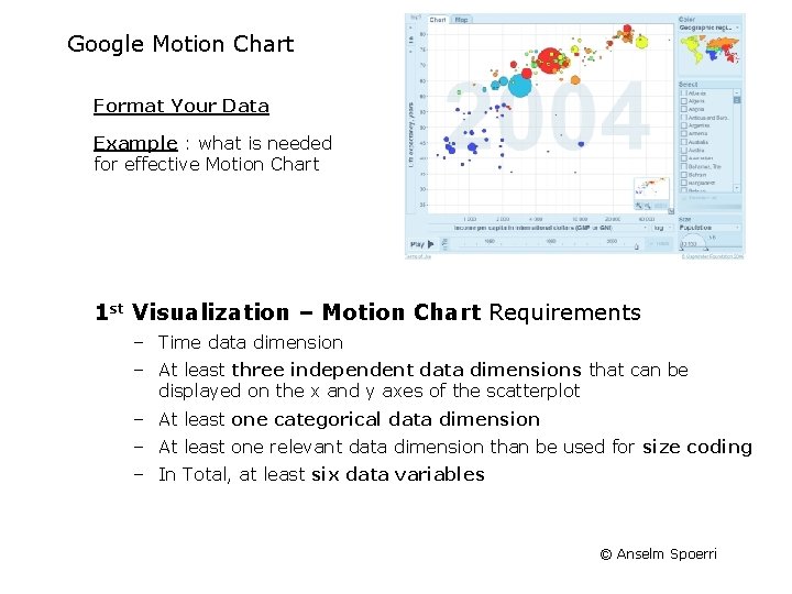
Google Motion Chart Format Your Data Example : what is needed for effective Motion Chart 1 st Visualization – Motion Chart Requirements – Time data dimension – At least three independent data dimensions that can be displayed on the x and y axes of the scatterplot – At least one categorical data dimension – At least one relevant data dimension than be used for size coding – In Total, at least six data variables © Anselm Spoerri
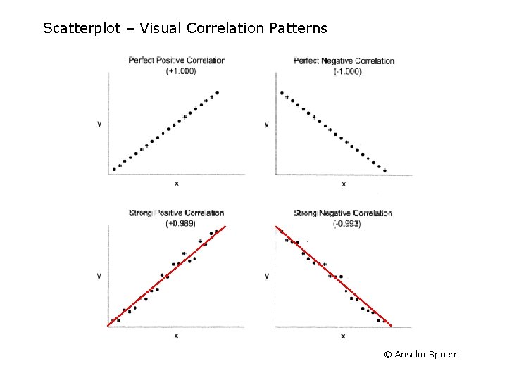
Scatterplot – Visual Correlation Patterns © Anselm Spoerri
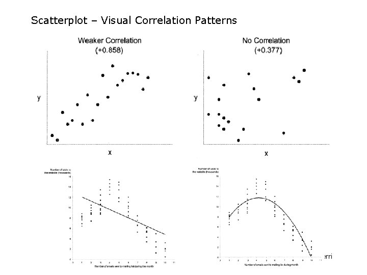
Scatterplot – Visual Correlation Patterns © Anselm Spoerri
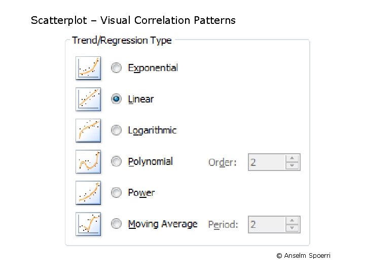
Scatterplot – Visual Correlation Patterns © Anselm Spoerri
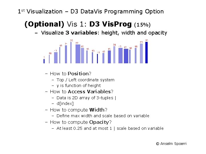
1 st Visualization – D 3 Data. Vis Programming Option (Optional) Vis 1: D 3 Vis. Prog (15%) – Visualize 3 variables: height, width and opacity – How to Position? – Top / Left coordinate system – y is function of height – How to Access Variables? – Data is 2 D array of 3 -tuples | – d[index] – How to compute Width? – Define max width and scale based on variable – How to compute Opacity? – At least 0. 25 and at most 1 | scale based on variable © Anselm Spoerri
- Slides: 21