Lecture 2 VB Net Common Controls Pointer Control
Lecture 2 VB. Net Common Controls
Pointer Control Pointer tool is selected to ignore any other selected control. If we drag any other control on form it causes to create that control on form but pointer does not create any control on form.
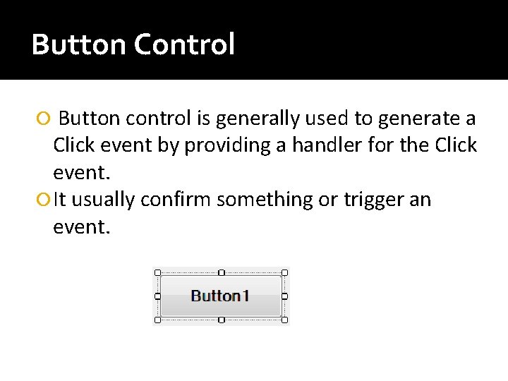
Button Control Button control is generally used to generate a Click event by providing a handler for the Click event. It usually confirm something or trigger an event.
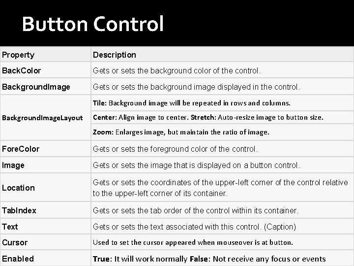
Button Control Property Description Back. Color Gets or sets the background color of the control. Background. Image Gets or sets the background image displayed in the control. Tile: Background image will be repeated in rows and columns. Background. Image. Layout Center: Align image to center. Stretch: Auto-resize image to button size. Zoom: Enlarges image, but maintain the ratio of image. Fore. Color Gets or sets the foreground color of the control. Image Gets or sets the image that is displayed on a button control. Location Gets or sets the coordinates of the upper-left corner of the control relative to the upper-left corner of its container. Tab. Index Gets or sets the tab order of the control within its container. Text Gets or sets the text associated with this control. (Caption) Cursor Used to set the cursor appeared when mouseover is at button. Enabled True: It will work normally False: Not receive any focus or events
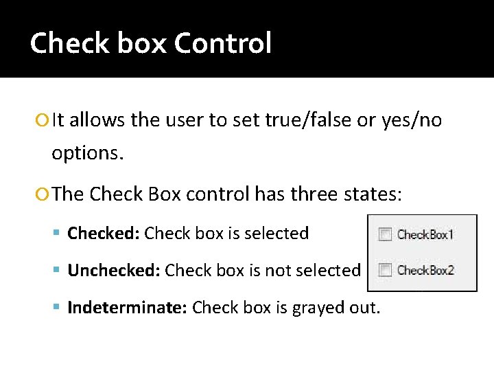
Check box Control It allows the user to set true/false or yes/no options. The Check Box control has three states: Checked: Check box is selected Unchecked: Check box is not selected Indeterminate: Check box is grayed out.
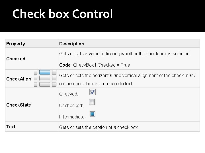
Check box Control Property Description Gets or sets a value indicating whether the check box is selected. Checked Code: Check. Box 1. Checked = True Check. Align Gets or sets the horizontal and vertical alignment of the check mark on the check box as compare to text. Checked: Check. State Unchecked: Intermediate: Text Gets or sets the caption of a check box.
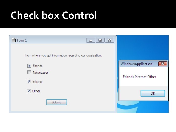
Check box Control
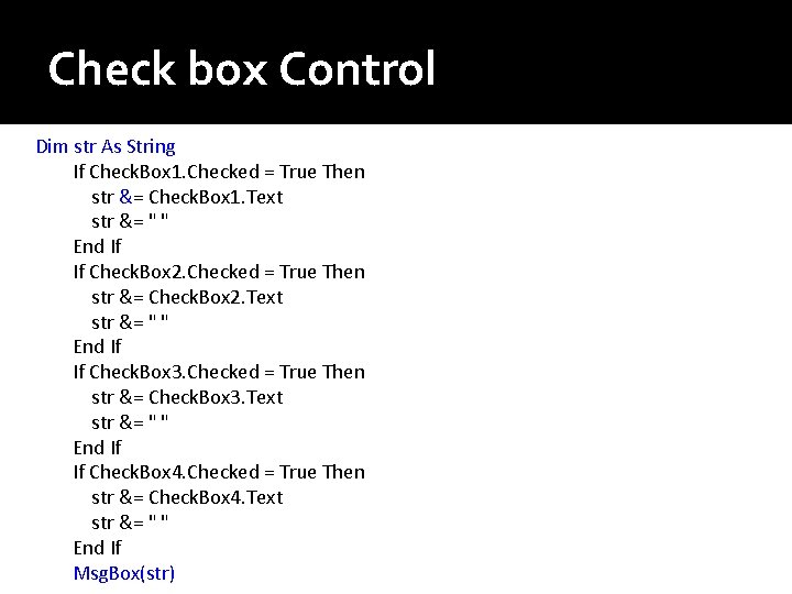
Check box Control Dim str As String If Check. Box 1. Checked = True Then str &= Check. Box 1. Text str &= " " End If If Check. Box 2. Checked = True Then str &= Check. Box 2. Text str &= " " End If If Check. Box 3. Checked = True Then str &= Check. Box 3. Text str &= " " End If If Check. Box 4. Checked = True Then str &= Check. Box 4. Text str &= " " End If Msg. Box(str)
Checked List Box Control Checkedlistbox control is used to add more than one checkboxes in one entity. A checked list box combines the functionalities of the list box and the check box controls.
Checked List Box Control Items can be added to control by two methods: Adding items from properties ▪ Click on items properties add items in dialog box. Adding items by coding ▪ Add following code on any event ▪ Checked. List. Box 1. Items. Add(“Item 01")
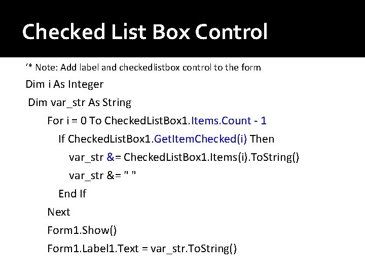
Checked List Box Control ‘* Note: Add label and checkedlistbox control to the form Dim i As Integer Dim var_str As String For i = 0 To Checked. List. Box 1. Items. Count - 1 If Checked. List. Box 1. Get. Item. Checked(i) Then var_str &= Checked. List. Box 1. Items(i). To. String() var_str &= " " End If Next Form 1. Show() Form 1. Label 1. Text = var_str. To. String()
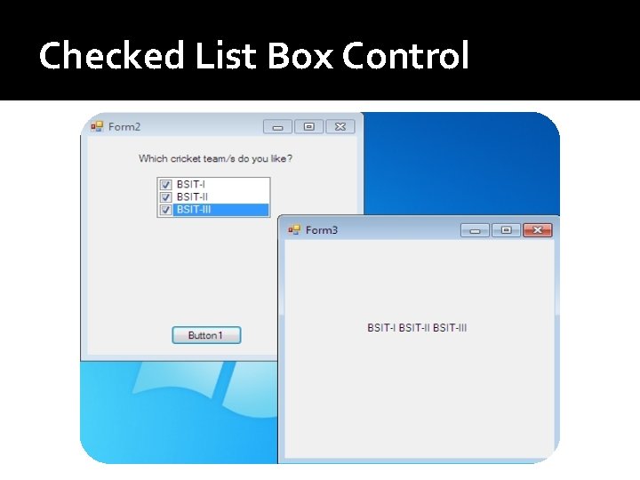
Checked List Box Control
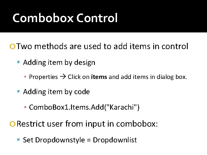
Combobox Control Two methods are used to add items in control Adding item by design ▪ Properties Click on items and add items in dialog box. Adding item by code ▪ Combo. Box 1. Items. Add("Karachi") Restrict user from input in combobox: Set Dropdownstyle = Dropdownlist
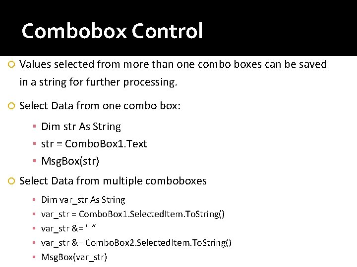
Combobox Control Values selected from more than one combo boxes can be saved in a string for further processing. Select Data from one combo box: ▪ Dim str As String ▪ str = Combo. Box 1. Text ▪ Msg. Box(str) Select Data from multiple comboboxes ▪ ▪ ▪ Dim var_str As String var_str = Combo. Box 1. Selected. Item. To. String() var_str &= " “ var_str &= Combo. Box 2. Selected. Item. To. String() Msg. Box(var_str)
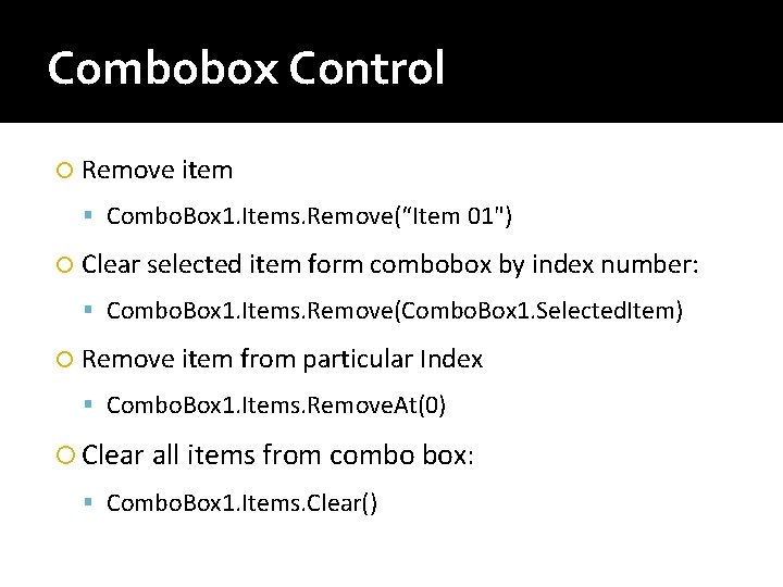
Combobox Control Remove item Combo. Box 1. Items. Remove(“Item 01") Clear selected item form combobox by index number: Combo. Box 1. Items. Remove(Combo. Box 1. Selected. Item) Remove item from particular Index Combo. Box 1. Items. Remove. At(0) Clear all items from combo box: Combo. Box 1. Items. Clear()
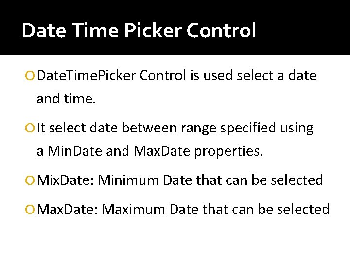
Date Time Picker Control Date. Time. Picker Control is used select a date and time. It select date between range specified using a Min. Date and Max. Date properties. Mix. Date: Minimum Date that can be selected Max. Date: Maximum Date that can be selected
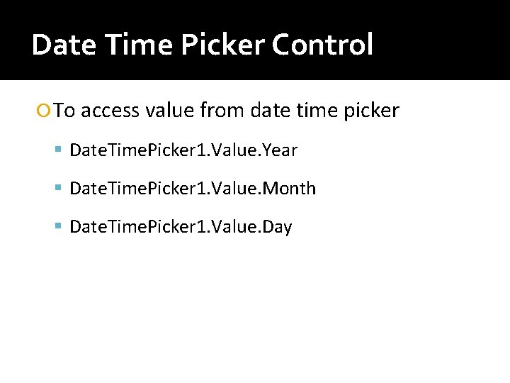
Date Time Picker Control To access value from date time picker Date. Time. Picker 1. Value. Year Date. Time. Picker 1. Value. Month Date. Time. Picker 1. Value. Day
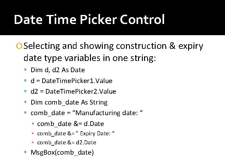
Date Time Picker Control Selecting and showing construction & expiry date type variables in one string: Dim d, d 2 As Date d = Date. Time. Picker 1. Value d 2 = Date. Time. Picker 2. Value Dim comb_date As String comb_date = “Manufacturing date: “ ▪ comb_date &= d. Date ▪ comb_date &= " Expiry Date: “ ▪ comb_date &= d 2. Date Msg. Box(comb_date)
Link Label Control It is used to connect windows application with web. It is an extension of Label control to display one or more hyperlinks. This Class is inherited from the Label Class so all the functions of the label control can be used with the link label control. All the controls(textbox, button, label etc) are available in the Control class. Link. Label are available in the Label class.
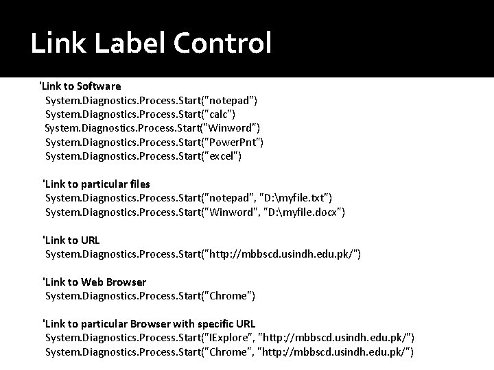
Link Label Control 'Link to Software System. Diagnostics. Process. Start("notepad") System. Diagnostics. Process. Start("calc") System. Diagnostics. Process. Start("Winword") System. Diagnostics. Process. Start("Power. Pnt") System. Diagnostics. Process. Start("excel") 'Link to particular files System. Diagnostics. Process. Start("notepad", "D: myfile. txt") System. Diagnostics. Process. Start("Winword", "D: myfile. docx") 'Link to URL System. Diagnostics. Process. Start("http: //mbbscd. usindh. edu. pk/") 'Link to Web Browser System. Diagnostics. Process. Start("Chrome") 'Link to particular Browser with specific URL System. Diagnostics. Process. Start("IExplore", "http: //mbbscd. usindh. edu. pk/") System. Diagnostics. Process. Start("Chrome", "http: //mbbscd. usindh. edu. pk/")
List Box Control List. Box Control is used to display a list of items, from which the user can select single or multiple choices. Items property is used to add the list items. Adding items to Lixt. Box Items can be added by item property in design view Items can be added by following code: ▪ List. Box 1. Items. Add(Text. Box 1. Text)
List Box Control Removing Items Removing items by index ▪ List. Box 1. Items. Remove. At(0) Removing items by matching text ▪ List. Box 1. Items. Remove("item 1") Removing item at run time ▪ List. Box 1. Items. Remove(Text. Box 2. Text) ‘* its case sensitive Removing all items from List Box ▪ List. Box 1. Items. Clear() Sorting List. Box 1. Sorted = True
List Box Control Selecting Multiple Items In design mode, set the property: ▪ Selection Mode = Multi. Simple Collecting all selected items Dim str As String Dim i As Integer For Each str In List. Box 1. Selected. Items Msg. Box(str) Next
- Slides: 23