Lecture 06 Recap Quantitative Messages related to Data

- Slides: 30

Lecture 06

Recap �Quantitative Messages related to Data Visualization �Characteristics of Effective Graphical Display

Visual perception and Data Visualization �A human can distinguish differences in line length, shape orientation, and color (hue) readily without significant processing effort � These are referred to as "pre-attentive attributes" �For example, it may require significant time and effort ("attentive processing") to identify the number of times the digit "5" appears in a series of numbers; but if that digit is different in size, orientation, or color, instances of the digit can be noted quickly through pre-attentive processing

Continued…. �Effective graphics take advantage of pre-attentive processing and attributes and the relative strength of these attributes �For example, since humans can more easily process differences in line length than surface area, it may be more effective to use a bar chart rather than pie charts

Types of Information Display �Two primary types �Tables �Graphs

Tables �A table contains quantitative data organized into rows and columns with categorical labels �It is primarily used to look up specific values �For example: a table might have categorical column labels representing the name (a qualitative variable) and age (a quantitative variable), with each row of data representing one person (the sampled experimental unit or category subdivision)

Graphs �A graph is primarily used to show relationships among data and portrays values encoded as visual objects �e. g. , lines, bars, or points � Numerical values are displayed within an area delineated by one or more axes �These axes provide scales (quantitative and categorical) used to label and assign values to the visual objects �Many graphs are also referred to as charts

Examples of Diagrams used for Data Visualization

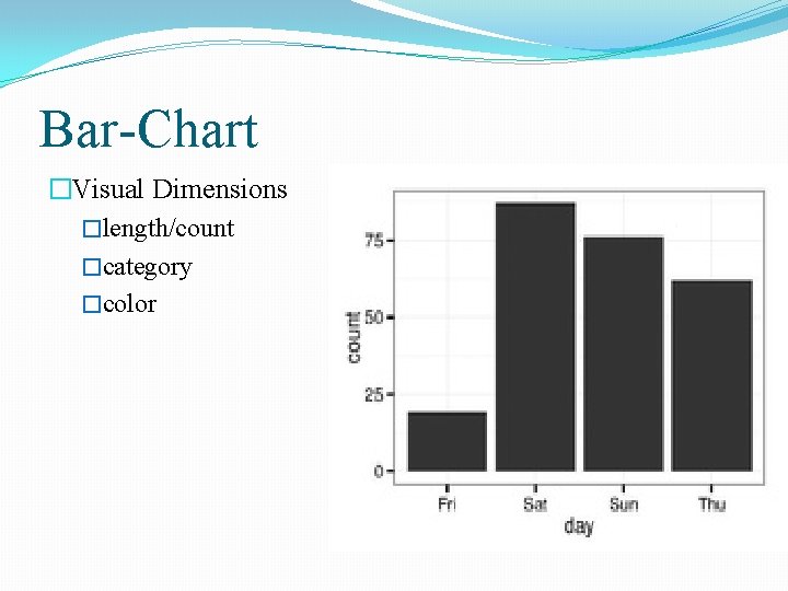
Bar-Chart �Visual Dimensions �length/count �category �color

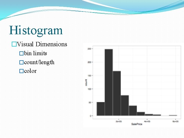
Histogram �Visual Dimensions �bin limits �count/length �color

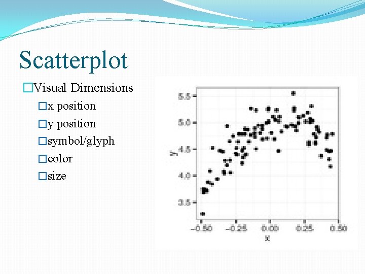
Scatterplot �Visual Dimensions �x position �y position �symbol/glyph �color �size

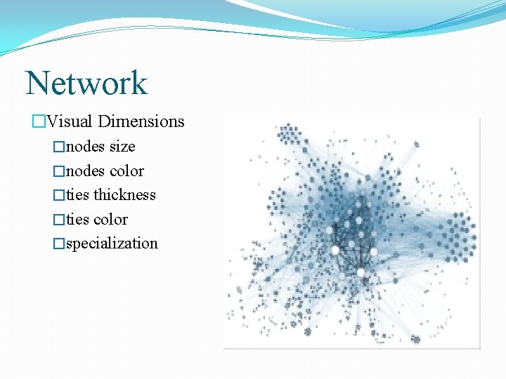
Network �Visual Dimensions �nodes size �nodes color �ties thickness �ties color �specialization

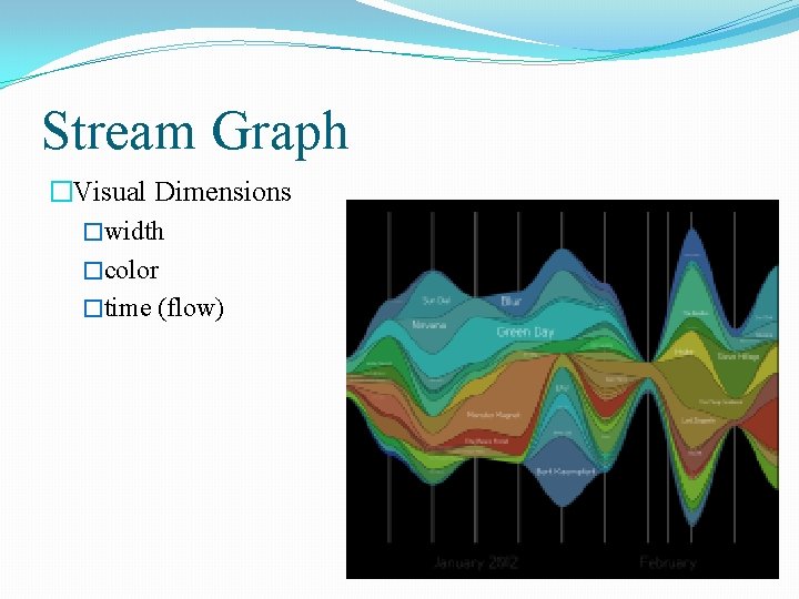
Stream Graph �Visual Dimensions �width �color �time (flow)

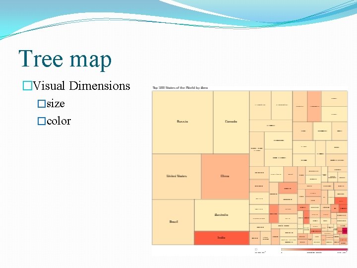
Tree map �Visual Dimensions �size �color

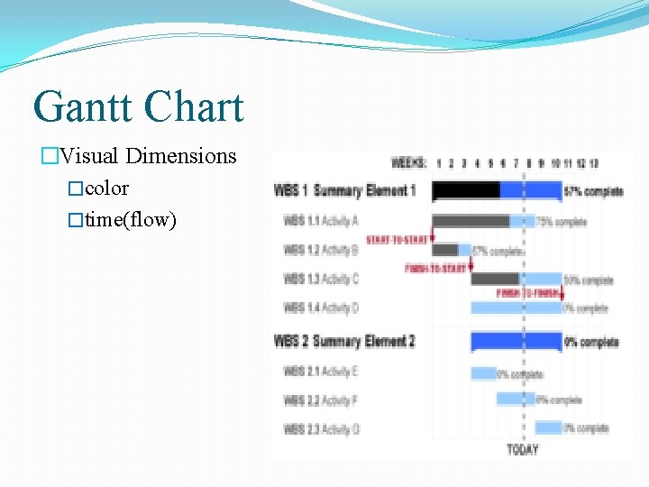
Gantt Chart �Visual Dimensions �color �time(flow)

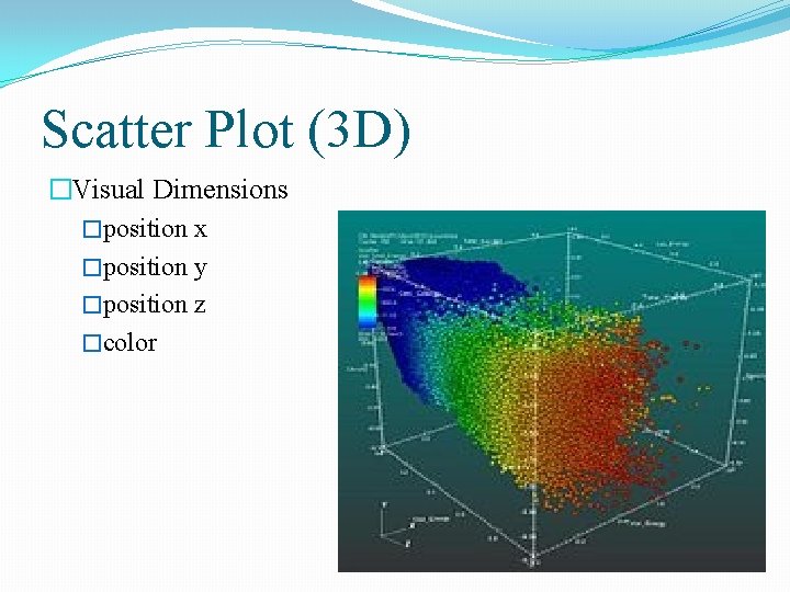
Scatter Plot (3 D) �Visual Dimensions �position x �position y �position z �color

Data Display requires Planning �Each set of data has particular display needs �The purpose for which you’re using the data set has just as much of an effect on those needs as the data itself �There are dozens of quick tools for developing graphics in a cookie-cutter fashion in office programs, on the Web, and elsewhere, but complex data sets used for specialized applications require unique treatment �We’ll discuss how the characteristics of a data set help determine what kind of visualization you’ll use

Data Collection �We’re getting better and better at collecting data, but we lag in what we can do with it �Most of the examples come from freely available data sources on the Internet �Lots of data is out there, but it’s not being used to its greatest potential because it’s not being visualized as well as it could be

Continued…. �With all the data we’ve collected, we still don’t have many satisfactory answers to the sort of questions that we started with �This is the greatest challenge of our information rich era �How can these questions be answered quickly, if not instantaneously? �We’re getting so good at measuring and recording things, why haven’t we kept up with the methods to understand communicate this information?

Thinking about Data �We also do very little sophisticated thinking about information itself �Even though we can collect information, we often don’t know quite what it means �Similarly, when millions of records of personal data are lost or accessed illegally, what does that mean? �With so few people addressing data, our understanding remains quite narrow, boiling down to things like, “My credit card number might be stolen” or “Do I care if anyone sees what I search? ”

Data never stays the same �We might be accustomed to thinking about data as fixed values to be analyzed �But data is a moving target �How do we build representations of data that adjust to new values every second, hour, or week? �This is a necessity because most data comes from the real world, where there are no absolutes �The temperature changes, the train runs late, or a product launch causes the traffic pattern on a web site to change drastically

Continued…. �What happens when things start moving? �How do we interact with “live” data? � How do we unravel data as it changes over time? �We might use animation to play back the evolution of a data set, or interaction to control what time span we’re looking at �How can we write code for these situations?

Benefits of Data Visualization �Data visualization is a complex set of processes which is like an umbrella that covers both information and scientific visualization simultaneously �We can’t ignore the benefits of data visualization for its accurate quantities, as it is easily comparable �It also lends valuable suggestion pertaining to the usage of its technique and tools �Scientifically its effectiveness lies in our brains ability to maintain a proper balance between perception and cognition through visualization

Continued…. �With the sudden increase of thousands of companies with their product, the responsibilities of data visualization is ever on the increase as an essential component of business intelligence �This is why companies are hiring expert designers having visualization skills �The significant messages in data are presented in the patterns and its trends, gaps and outliers

Continued…. �Visualization is so powerful and effective that it can change someone’s mind in a flash �it encompasses various dataset quickly, effectively and efficiently and makes it accessible to the interested viewers �It motivates us to a deep insight with quick access � It gives us opportunity to approach huge data and makes it easily comprehensible, be it the field of entertainment, current affairs, financial issues or political affairs

Continued…. �It also builds in us a deep insight, prompting us to take a good decision and an immediate action if needed �This could be related to child education, people suffering from health issues, market research of a product, rainfall in a specific geographical area and many others �It has emerged in the business world lately as geospatial visualization

Continued…. �The popularity of geo-spatial visualization has occurred due to lot of websites providing web services, attracting visitor’s interest � This type of business needs to take advantage of location specific information which is already present in the system in the form of customer‘s zip code providing better daily analysis experience �This type of visualization adds a new dimension to the figures and helps in better understanding of the matter

Continued…. �it not only provides graphical representation of data but also allows changing the form, omitting what is not required, and browsing deeper to get further details �This is a great eye catcher and attracts our attention better and provides better communication �This provides a great advantage over traditional methods �Visual analytics will provide great benefit to business houses

Continued…. �With the help of it data can be viewed in multiple ways effectively by dividing data findings �It provides an additional sense to the data by making patterns �Data visualization provides a perfect balance between visual appeal and practicality �It helps to provide better efficiency in the presented information �This form helps in quick understanding of data and reduces confusion and doubts

So, we can utilize the full benefit of data visualization if we pay required attention to it. Sometimes too many colors create visual noise, where you can’t measure properly. Hence the only limitation to taking advantage of data visualization is unskilled eyes.