Learning Hub user research Search The Learning Hub
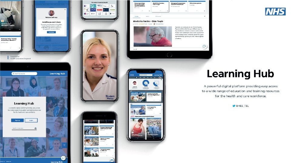

Learning Hub user research: Search The Learning Hub will be the place to go to access and record learning from a broad range of shareable resources, including existing e-Learning for Healthcare (e-Lf. H) programmes, and resources contributed and uploaded from the user community. The Learning Hub will also encourage discussions to take place around the uploaded learning content and networks to form around areas of shared interest to maximise the opportunities for collaboration and realise the potential of the resources. Over the past few months key areas of the Learning Hub’s design have been shared with users from all over the UK and from a variety of NHS, health and care backgrounds. The focus on user research ensures that users are central to the platform’s design and by listening to the needs of the users we can deliver a Learning Hub that meets the learning requirements of the health and care workforce. This pack provides an overview of both the process and findings of this piece of user research, which focussed on searching for resources within the Learning Hub. January 2020 @HEE_TEL https: //telblog. hee. nhs. uk

Key questions • • • What are users' expectations around predictive search? Is the card-based layout expected? (Would they expect a list-view option? ) What sort-by and filter options are expected? How easy is it to understand use the filters? Do users expect their own contributed content to appear in the results? Can users identify different types of resources in the results? Can users open and interact with different resource results? From a selection, which is the most popular card design for results? What user feedback can be gathered on the e-Lf. H resource journey? Are there any key details missing from the results page? @HEE_TEL https: //telblog. hee. nhs. uk

Participants • Total: 13 participants • 9 female, 4 male • Range of educator and learner backgrounds • Digital capabilities: – – – @HEE_TEL Advanced: Intermediate: Novice: Getting started: Unknown: 6 4 0 1 2 • Organisations/Roles include: – – – NHS (Clinical and Non-Clinical) Digital Transformation Lead Charity sector Client Services Manager Care Homes Project Lead • Locations include: – – – East & West Midlands London South, South West & South East England North West England Northern Ireland Yorkshire https: //telblog. hee. nhs. uk

Method • • • Timeframe: 1. 5 weeks interviews, one week analysis Remote Interviews (conducted via Web. Ex and Whereby) 45 minutes - 1 hour sessions Task setting exercises using an Invision prototype Participants were in their work environments using their own devices. • Limitations: – Issues with screensharing for some participants (they had to verbally describe their actions) – There was a high proportion of users who self-identified as ‘Advanced’ in Digital Capability and showed a high degree of familiarity with using search functions – General prototype restrictions (only certain parts of the prototype were functional, this was explained to participants) @HEE_TEL https: //telblog. hee. nhs. uk

Findings @HEE_TEL https: //telblog. hee. nhs. uk

High priority issues Summary of issue Confusion over ‘Source’ in filters Most users showed either poor understanding of what ‘Source’ was within filters or questioned the usefulness of being able to filter based on the sources offered. Need for more metadata to be displayed on results A complaint from users who expected results to be displayed as a list was that the card view did not highlight why a particular result had come up e. g. by highlighting a relevant extract as Google does or by showing the relevant keywords connected to that resource. Impact Priority Most likely impact is that users will ignore the ‘Source’ section in filter. There is a danger of user frustration caused by lack of understanding. Questions from users around why there weren’t options they recognised (e. g. Journals). Serious Without knowing why a search result has been retrieved, users were reluctant to ‘trust’ the system and select a result. In addition, judging results purely by media type and title didn’t assist users in choosing a result from the selection causing frustration and wasted time. NB: Particularly an issue when filters were not used. Serious Frustration and confusion regarding whether a source is up-to-date and can therefore be trusted may result in users placing less trust in the platform or engaging with less content. Medium ‘Published’ date ambiguous Most users couldn’t say for certain whether the ‘Published by X on [Date]’ information on a card was referring to the date the content itself was created or the date that content was uploaded to the platform. When pushed, they assumed the latter but stated the former was the more important. @HEE_TEL https: //telblog. hee. nhs. uk

Issue in detail: Confusion over ‘Source’ in filters "Looking at the options I have here, I wouldn't [filter by them]. If it was something different, let's say choosing a publication from an actual peer-reviewed journal then I would filter. But not in this case, with the options that are here. "I wouldn't filter I would just say 'all' and then as I read [the results] I would try and make the decision about whether it is relevant or not. " Most users did not understand the selection of options offered under ‘Source’ in the search filter (Learning Hub Community, e-Learning for Healthcare, Workforce Information Network and e. Learning Repository). Some options were confused with one another and many weren’t recognised at all. When questioned, users stated that they would expect ‘Source’ to include options like various recognised journals and bodies (e. g. NICE and the Royal Colleges). This would allow them to filter based on trusted providers of information. There was an agreement that it would be good to differentiate ‘community content’ (uploaded by general users) from ‘curated content’ (uploaded by professional bodies/professional learning content creators). @HEE_TEL https: //telblog. hee. nhs. uk

Medium & low priority issues* *these are a sample of the medium and low priority issues Summary of issue Impact Priority Expectation of results list not rows of cards Several users confirmed that their expectation for search results was for them to be displayed as a list. The majority of users accepted that the card design was functional. One user did not find the card layout useful. Most agreed that having the option to switch to a list view would be useful. Frustration at understanding how to view the cards returned from the search. What order are they initially in, and does the user view left to right, or up and down? There was also the issue of space. Using card view to return results could cause frustration at not seeing many results per page, especially on a search that returns a lot of results. Medium If users distrust the resource, or frequently are unsure of where downloaded resources are on their machine, it could cause issues and frustration with PDF resources. Not being able to preview the PDF first before deciding if they want to download/save it could result in users simply not looking at the resources at all. This would cause frustration to users hoping to read resources before deciding to keep them. Medium/Low PDF download not expected When opening a PDF resource, some users questioned the 'call to action' button as being a download button. . . why wouldn't the PDF just open in a separate tab, as is the case when looking at a PDF on the Internet and via search engines. One user commented that she felt users might not want to download PDFs through distrust, and an ability to download items (shared machines etc. ) or that some people don't always know or understand where downloaded files end up. Physical equipment meaning not known The majority of users, when asked, did not have a clear understanding of what was meant by 'Physical equipment' as a type of resource. @HEE_TEL Confusion over the meaning of this type of resource could lead to user frustration or a lack of engagement with this type of resource/filters relating to it. Low https: //telblog. hee. nhs. uk

Supported assumptions and wins • Sort by options were the options users expected in the drop-down menu • Users expected to see their own content in search results • Modal window explaining the journey to an e-Lf. H resource reduced confusion in accessing the resource then returning to the Learning Hub • Users were able to identify and make use of the ‘sticker’ on resources showing a logo of its body of origin (e. g. e-Lf. H) • In interacting with ‘e-learning session’ and ‘e-learning package’ resources, users quickly learned their different meanings. @HEE_TEL https: //telblog. hee. nhs. uk

Preferred card design A selection of card designs were tested for the results page. Users were shown the selection of options, then a view of the results page using their chosen design. This was the preferred option. “I like that one. It's so visible. It also tracks all the way through as your action box and if you've got other things on the page it's so clear what you have to do. " @HEE_TEL https: //telblog. hee. nhs. uk

Next steps Summary of issue Confusion over the ‘source’ of the content when using filters Most users showed either poor understanding of what the term ‘Source’ meant when using filters or questioned the usefulness of being able to filter based on the sources offered. Next steps • Remove Catalogues/Courses/Folders from search filters, potentially add Catalogues/Courses into results • Make a clear visual distinction between Community and Curated content filters • Label the options that are there by Provider/Organisation to make their meaning clearer to users Need for more metadata to be displayed on results An observation from users who expected results to be displayed as a list was that the card view did not highlight why a particular result had come up e. g. by highlighting a relevant extract as Google does or by showing the relevant keywords connected to that resource. • Offer a ‘list view’ for results (potentially as default for release into Public Beta) • Further user research around grid vs list views for results ‘Published’ date ambiguous Most users couldn’t say for certain whether the ‘Published by X on [Date]’ information on a card was referring to the date the content itself was created or the date that content was uploaded to the platform. When pushed, they assumed the latter but stated the former was the more important. @HEE_TEL • Change language to ‘Contributed by’ (to keep consistent terminology) with an associated date and have a ‘Date created’ in the contribution journey • Display both dates, with one bracketed, on a resource https: //telblog. hee. nhs. uk
- Slides: 12