LAYOUT COMPOSITION COLOUR TYPEFACE A BRIEF INTRO OVERVIEW
LAYOUT COMPOSITION COLOUR TYPEFACE A BRIEF INTRO
OVERVIEW By the end of this short session you will be able to: ü Understand the basic principals of graphic design ü Identify good practice in an example ü Demonstrate good practice in your own work You will need to take bullet point notes, I will support you with this.
LAYOUT & COMPOSITION 5 basic principals Why is it so important? 1. Proximity 2. White space • Professional presentation of work is key 3. Alignment • Clarity of your ideas 4. Contrast • Appealing to clients / consumer 5. Repetition • Applies to many media products We will break these down next
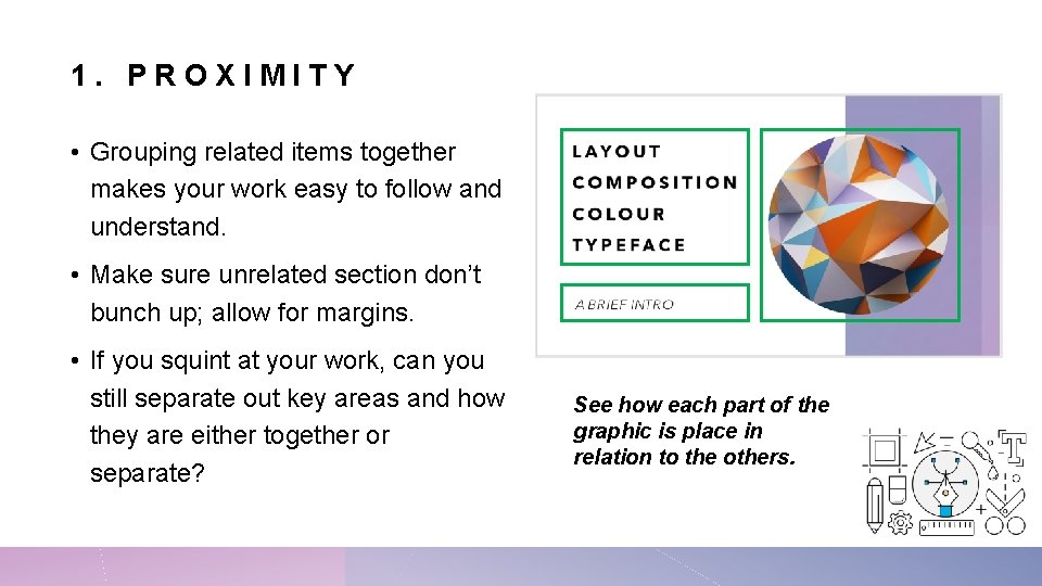
1. PROXIMITY • Grouping related items together makes your work easy to follow and understand. • Make sure unrelated section don’t bunch up; allow for margins. • If you squint at your work, can you still separate out key areas and how they are either together or separate? See how each part of the graphic is place in relation to the others.
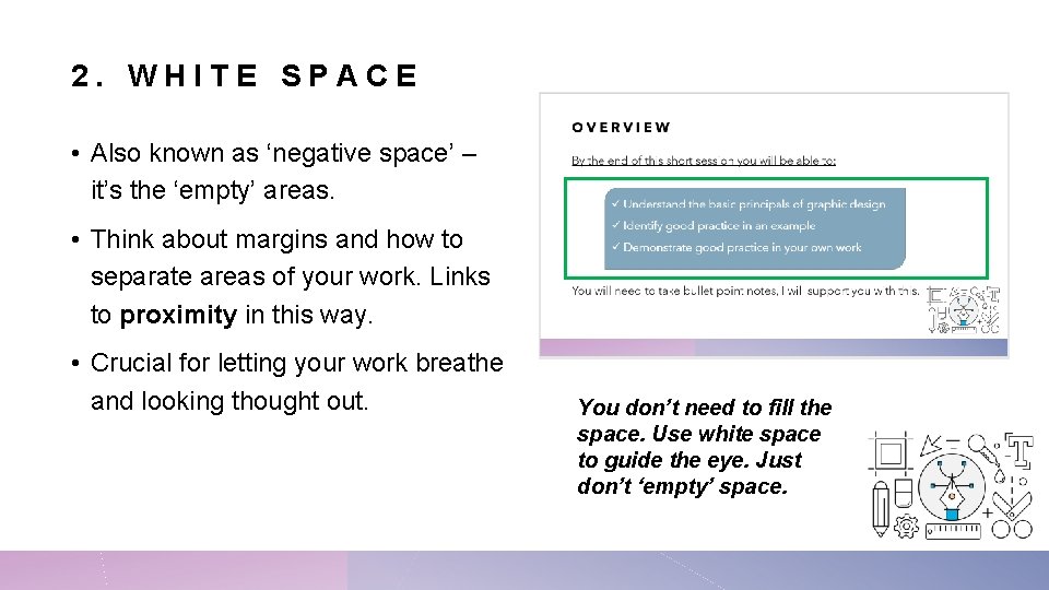
2. WHITE SPACE • Also known as ‘negative space’ – it’s the ‘empty’ areas. • Think about margins and how to separate areas of your work. Links to proximity in this way. • Crucial for letting your work breathe and looking thought out. You don’t need to fill the space. Use white space to guide the eye. Just don’t ‘empty’ space.
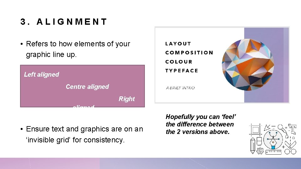
3. ALIGNMENT • Refers to how elements of your graphic line up. Left aligned Centre aligned Right aligned • Ensure text and graphics are on an ‘invisible grid’ for consistency. Hopefully you can ‘feel’ the difference between the 2 versions above.
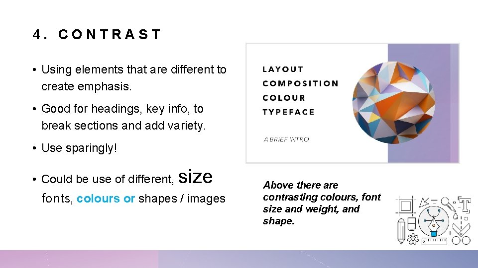
4. CONTRAST • Using elements that are different to create emphasis. • Good for headings, key info, to break sections and add variety. • Use sparingly! • Could be use of different, size fonts, colours or shapes / images Above there are contrasting colours, font size and weight, and shape.
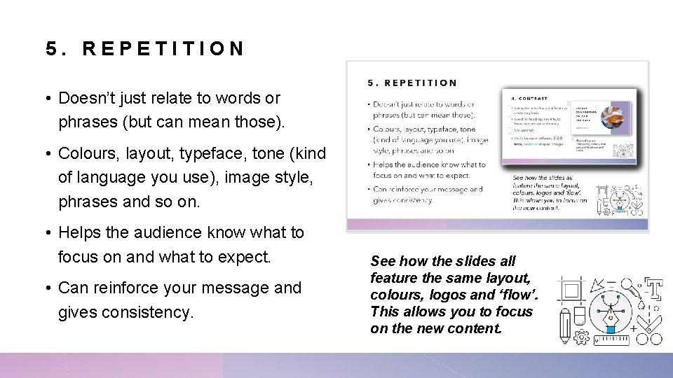
5. REPETITION • Doesn’t just relate to words or phrases (but can mean those). • Colours, layout, typeface, tone (kind of language you use), image style, phrases and so on. • Helps the audience know what to focus on and what to expect. • Can reinforce your message and gives consistency. See how the slides all feature the same layout, colours, logos and ‘flow’. This allows you to focus on the new content.
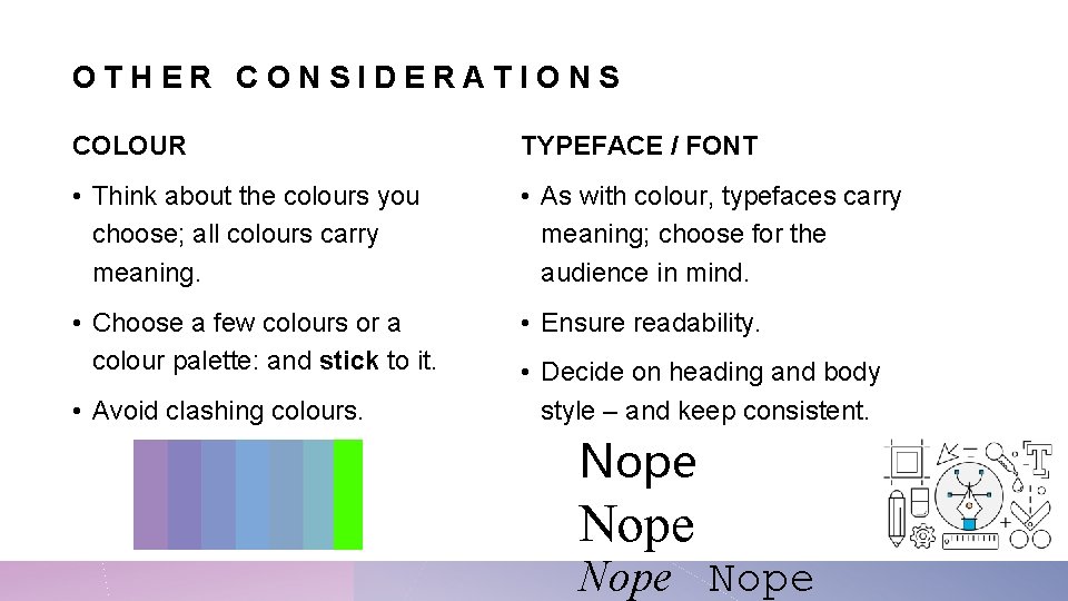
OTHER CONSIDERATIONS COLOUR TYPEFACE / FONT • Think about the colours you choose; all colours carry meaning. • As with colour, typefaces carry meaning; choose for the audience in mind. • Choose a few colours or a colour palette: and stick to it. • Ensure readability. • Avoid clashing colours. • Decide on heading and body style – and keep consistent. Nope
RECAP 5 basic principals Ideas 1. Proximity • Use the squint test – can you navigate your product this way? 2. White space 3. Alignment 4. Contrast 5. Repetition Remember – these principles are overlap and impact each other. • Test it with friends, ask them what the key sections are and in what order. • Count your colours, more than 5 is pushing it. • 3+ fonts might be too many.
- Slides: 10