Kathmandu University Dhulikhel kavre Presentation on Data Visualization


- Slides: 26

Kathmandu University Dhulikhel, kavre Presentation on “Data Visualization of Socio-economic data of Asia” Presented to: Mr. Shashish Maharjan Department of Civil Geomatics Engineering Group Member Binod Humagain(24) Buddha Lama(12) Kapil Aryal(01) Asish Giri(09) Robin Singh(21) August 1 st, 2012 and 1

contents • • • Visualization technique Measurement scales Perception properties Visual variables Maps showing socio-economic data 2

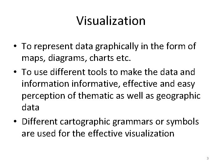
Visualization • To represent data graphically in the form of maps, diagrams, charts etc. • To use different tools to make the data and information informative, effective and easy perception of thematic as well as geographic data • Different cartographic grammars or symbols are used for the effective visualization 3

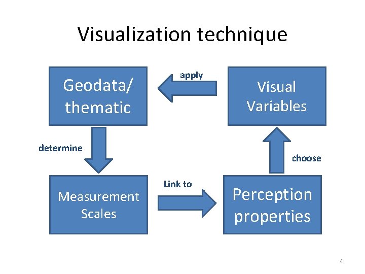
Visualization technique Geodata/ thematic apply determine Measurement Scales Visual Variables choose Link to Perception properties 4

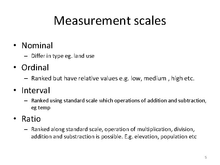
Measurement scales • Nominal – Differ in type eg. land use • Ordinal – Ranked but have relative values e. g. low, medium , high etc. • Interval – Ranked using standard scale which operations of addition and subtraction, eg temp • Ratio – Ranked along standard scale, operation of multiplication, division, addition and substraction is possible. E. g. elevation, population etc 5

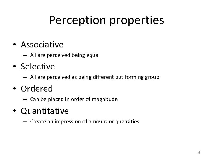
Perception properties • Associative – All are perceived being equal • Selective – All are perceived as being different but forming group • Ordered – Can be placed in order of magnitude • Quantitative – Create an impression of amount or quantities 6

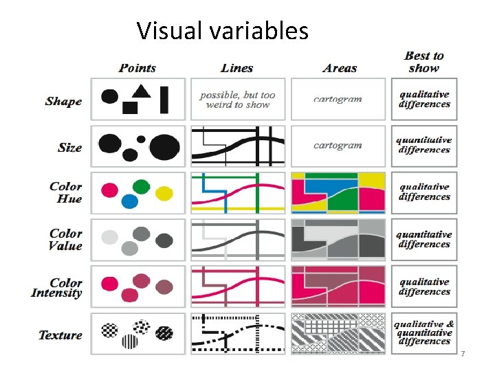
Visual variables 7

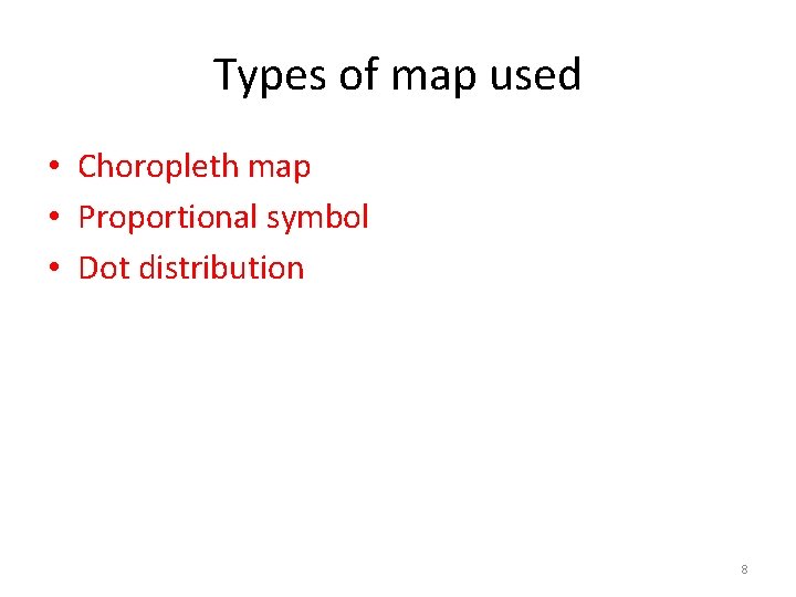
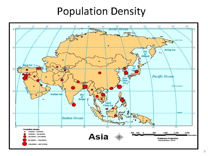
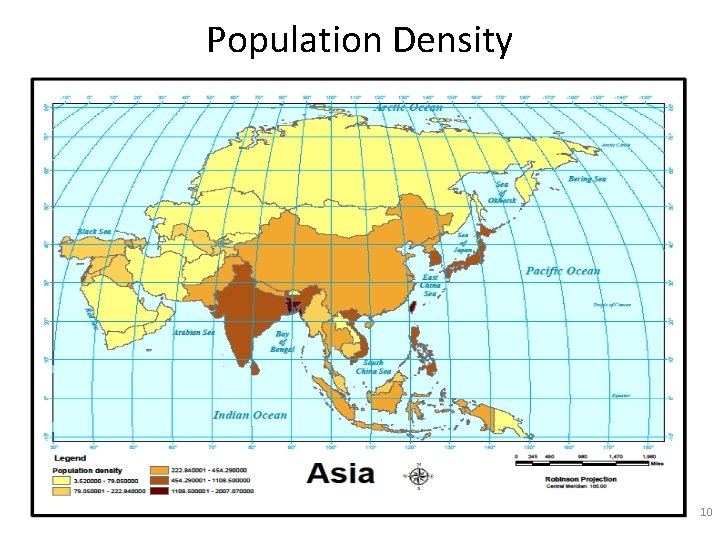
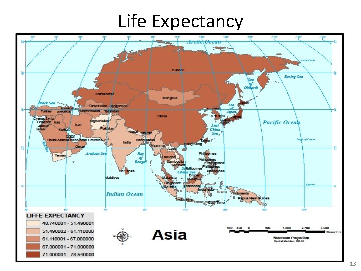
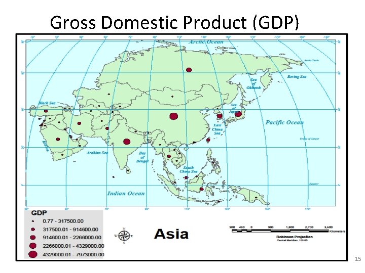
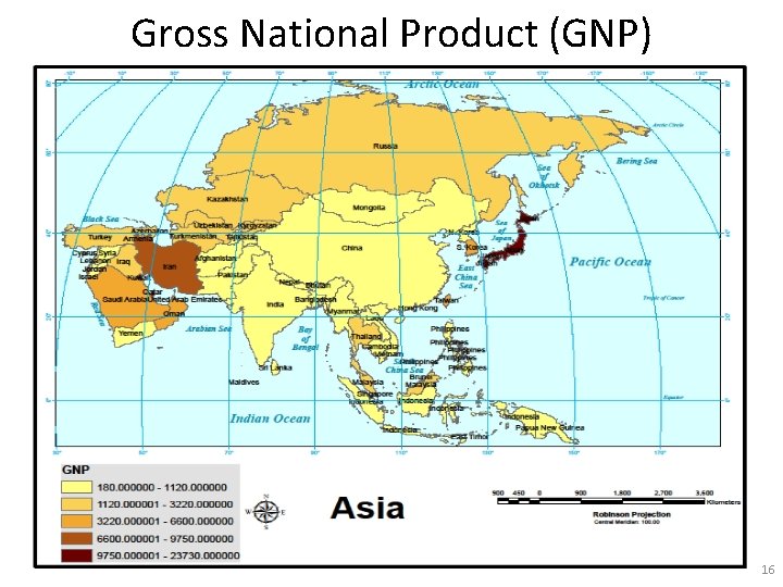
Types of map used • Choropleth map • Proportional symbol • Dot distribution 8

Population Density 9

Population Density 10

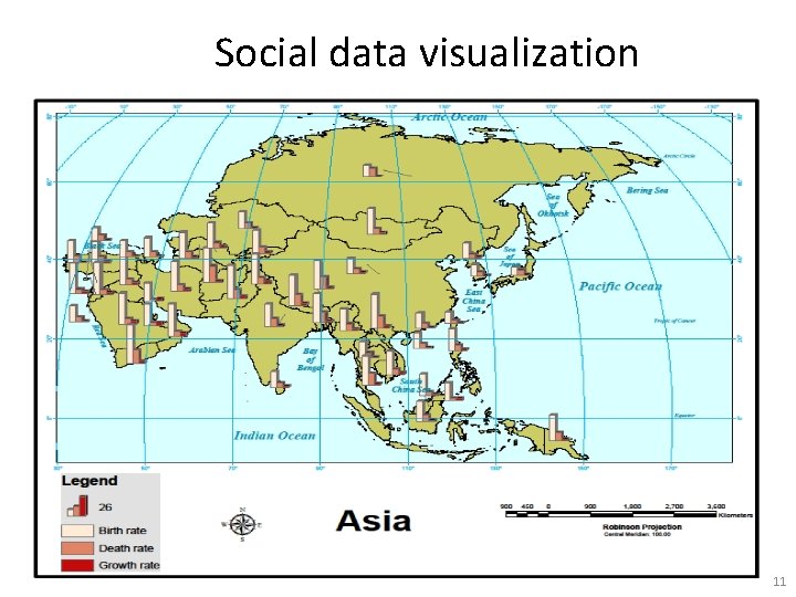
Social data visualization 11

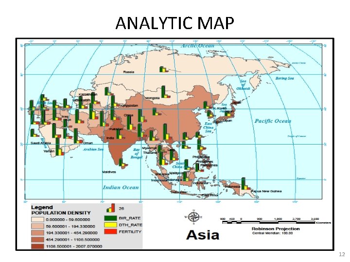
ANALYTIC MAP 12

Life Expectancy 13

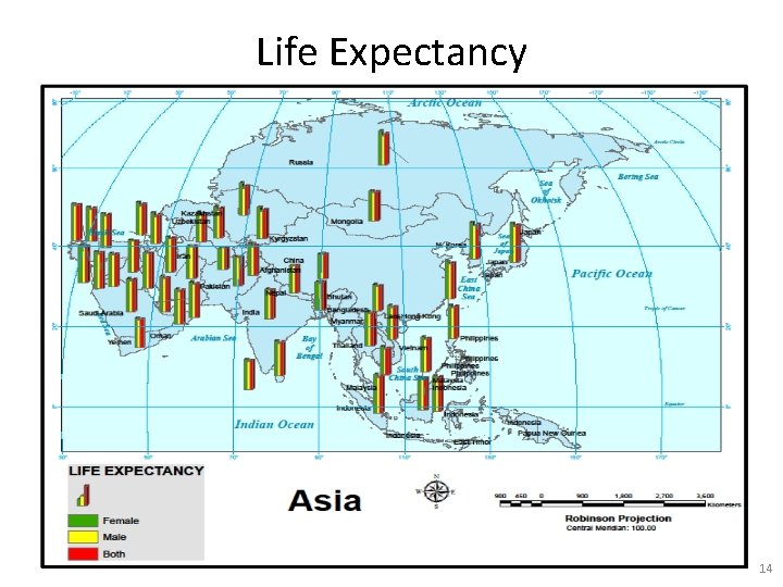
Life Expectancy 14

Gross Domestic Product (GDP) 15

Gross National Product (GNP) 16

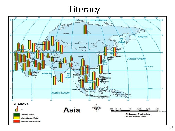
Literacy 17

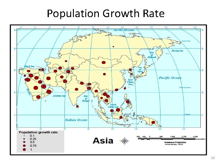
Population Growth Rate 18

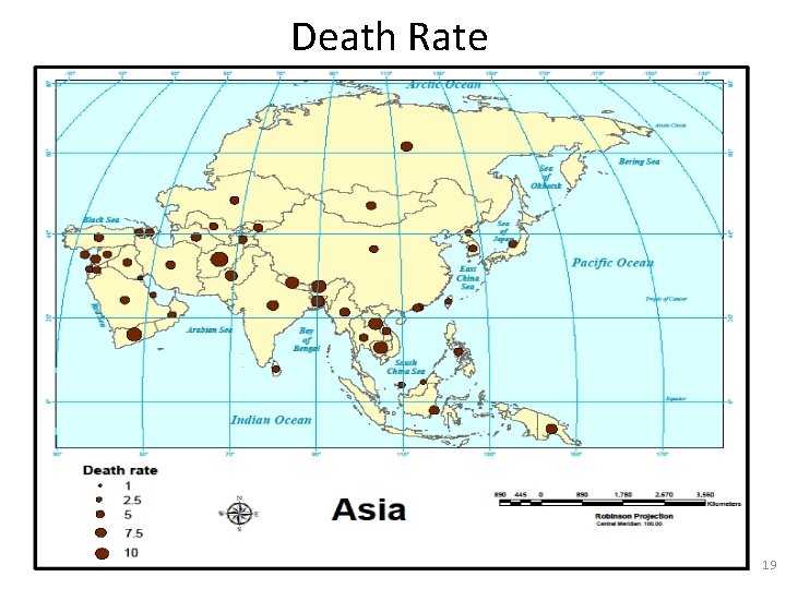
Death Rate 19

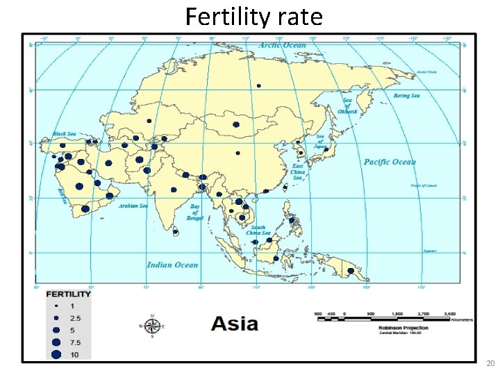
Fertility rate 20

Population distribution 21

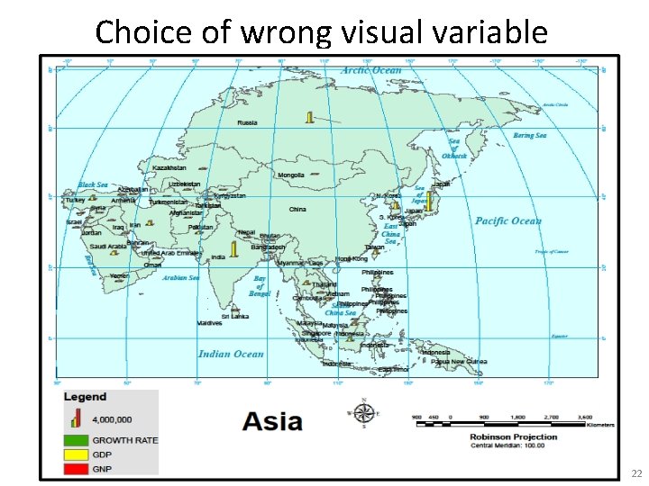
Choice of wrong visual variable 22

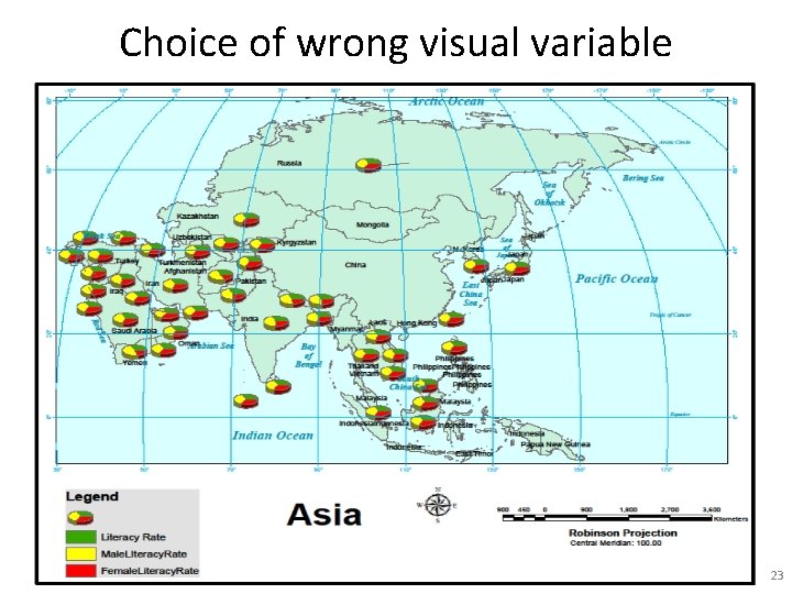
Choice of wrong visual variable 23

Conclusion • These all are quantitative phenomena • Relative(population density, literacy rate, fertility rate etc) and absolute(population) value have been used. • Used socio-economic data(GDP, GNP, growth rate, birth rate etc) of Asian countries. • With the choice of suitable variables in the map, socio-economic data can be perceived and understand easily. 24

References • http: //en. wikipedia. org/wiki/Choropleth_map • http: //en. wikipedia. org/wiki/Socioeconomic_status • www. srnr. arizona. edu/rnr 419/. . . /jenks_caspall_1 971. pdf 25

THANK YOU!! 26