Js Excel 4 Pie Charts Topics Pie Charts

- Slides: 25

J’s Excel 4 Pie Charts

Topics • Pie Charts • Freeze panes • Viewing large charts : split • Sorting • Subtotal rows • Pivot tables

Adding a Pie Chart to a Worksheet • From Teacher’s Docs, open Levitt. xlsx • Go to Estimated Production tab • Select data series B 6: B 11 (labels) and I 6: I 11 (values) nto graph; use Ctrl to select more than one range. • In Insert tab, select Charts | Pie Chart |3 D pie chart • This puts chart in current worksheet.

Moving Pie Chart • To move pie chart, click anywhere in chart area • To move within current worksheet by dragging • Click on chart, move mouse to edge till cursor becomes 4 -headed arrow • Drag to new location: practice moving upper left corner to A 14 • Can select to move to new worksheet or to new location on current sheet • Select chart area. Right-click in chart area. Select Move Chart from context menu • Select New sheet (can name new sheet—call it Year 7 Chart) • Also can move to another sheet from “Object in” using drop-down menu)

Formatting the Chart • Three items explain the chart • Chart Title Data Labels Legend • Can edit and format each of them • Chart also has sections: Chart Area, surrounding Plot Area (the pie). The pie is divided into Data Points, which together form the Data Series. Each of these can be formatted separately. • Click on Chart Area and 3 symbols appear at upper right. The plus sign allows selection and editing of chart elements • Chart Title • Data Labels • Legend

Format Options • Selecting item from + menu or right-clicking on a chart component opens a Format pane on the right. • That pane has two or three tabs, depending on the item selected • Paint bucket allows filling with color or adding borders • Pentagon allows adding shadow, glow, soft edges, 3 D rotation • Third differs depending on context. • For Chart Title, third allows sizing and positioning the title • For Data Series, Bar chart allows setting angle and pie explosion • For Data Point, Bar chart allows setting angle and point explosion

Formatting the Chart Title • To remove Chart Title: Click Plus sign, uncheck Chart Title • Also can choose location or More Options to format. • To change text: Click title to select. Triple click, click to left, or drag through to replace text. Type “Year 7 Production”. Click elsewhere. • To format text: +, Chart Title, More Options, or right click title. • Can format Title, Chart Area, Plot Area, Legend, all from this spot.

Formatting • Arrow after Title Options lets you choose what item to format. • Text options lets you choose color and fill of text. • To change actual text size or content, select text and right click or use mini-toolbar.

Formatting Data Labels • + sign, second item: check Data Labels. • This allows you to select where they go (inside, outside, best, center, end, callout) and also what data to print on the slices. • More options lets you decide what to include and how to separate the items • Selecting data labels puts the cell value in the label. Label options lets you include, series name, category name, value, percentage, legend key. Add Category and percentage. • Also can choose how to separate items: newline, semicolon, comma, period, space. Select newline. • Can also select number format, or link to cells—do what’s in worksheet

Chart Styles and Colors • Paintbrush allows choosing Chart Styles: different backgrounds, etc. Scroll through. • These are big overall changes, like Word or Excel styles • Can change components individually: • Format Data Points (see later), can change each slice to a different color, • Format Plot Area can change background, etc. • Format Chart Area

3 D Rotation • Right-click in Chart Area or Plot Area and select 3 D rotation from menu • Can also select Format Chart Area, bar graph, then 3 D rotation • Select which item to rotate to the front • Use X-rotation. Click arrow to move angle up or down, or type it in

Pie or Point Explosion • Can format data series so all slices explode • Click on pie and Format Data Series opens • Or right-click on pie and select Format Data Series from menu • Select Bar Graph icon and then Pie Explosion and use slider to choose amount • Can format data point so ONE slice is exploded • Double-click on selected slice and Format Data Point opens • Or after double-clicking, right-click on pie allows select Format Data Point from menu • Select Bar Graph icon and then Point Explosion and use slider to choose amount

Sorting • Sorting means putting items in order, most typically numerically or alphabetically • You can sort all or part of an Excel worksheet • You can sort one column or a group of related columns • You can sort on one field or on multiple fields • Open January worksheet from Teacher’s Docs

Sorting Data • The records in an Excel worksheet initially appear in the order they were entered; you can view the same records in a different order • Ascending order arranges text alphabetically from A to Z, numbers from smallest to largest, and dates from oldest to newest • Descending order arranges text in reverse alphabetical order from Z to A, numbers from largest to smallest, and dates from newest to oldest New Perspectives on Microsoft Excel 2013 14

Sorting Worksheet Columns • The book talks about sorting tables, but I have skipped the part on tables. • You can sort columns in ANY worksheet, so just ignore the Table talk. • Use the sort buttons in the Data menu New Perspectives on Microsoft Excel 2013 15

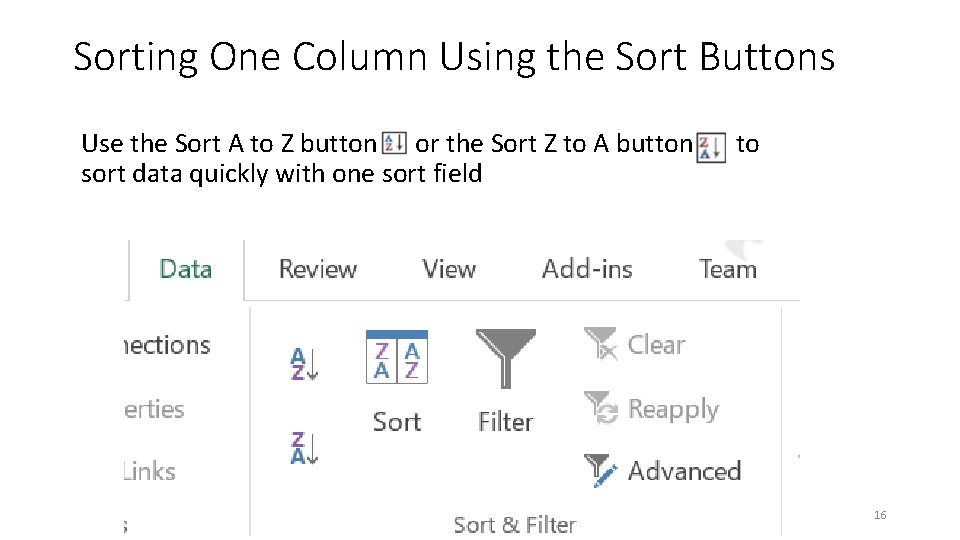
Sorting One Column Using the Sort Buttons Use the Sort A to Z button or the Sort Z to A button s to sort data quickly with one sort field New Perspectives on Microsoft Excel 2013 16

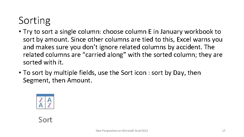
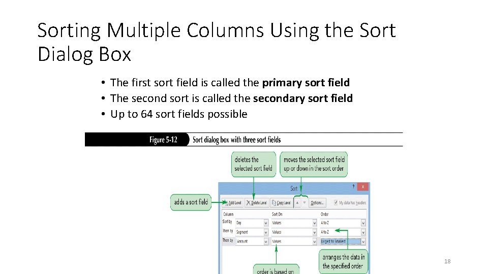
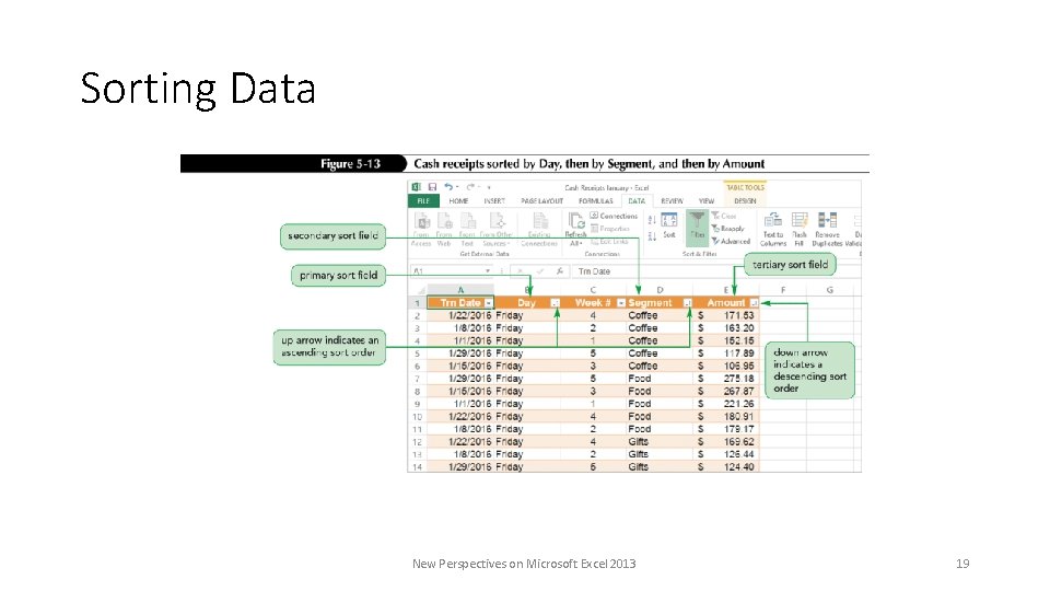
Sorting • Try to sort a single column: choose column E in January workbook to sort by amount. Since other columns are tied to this, Excel warns you and makes sure you don’t ignore related columns by accident. The related columns are “carried along” with the sorted column; they are sorted with it. • To sort by multiple fields, use the Sort icon : sort by Day, then Segment, then Amount. New Perspectives on Microsoft Excel 2013 17

Sorting Multiple Columns Using the Sort Dialog Box • The first sort field is called the primary sort field • The second sort is called the secondary sort field • Up to 64 sort fields possible New Perspectives on Microsoft Excel 2013 18

Sorting Data New Perspectives on Microsoft Excel 2013 19

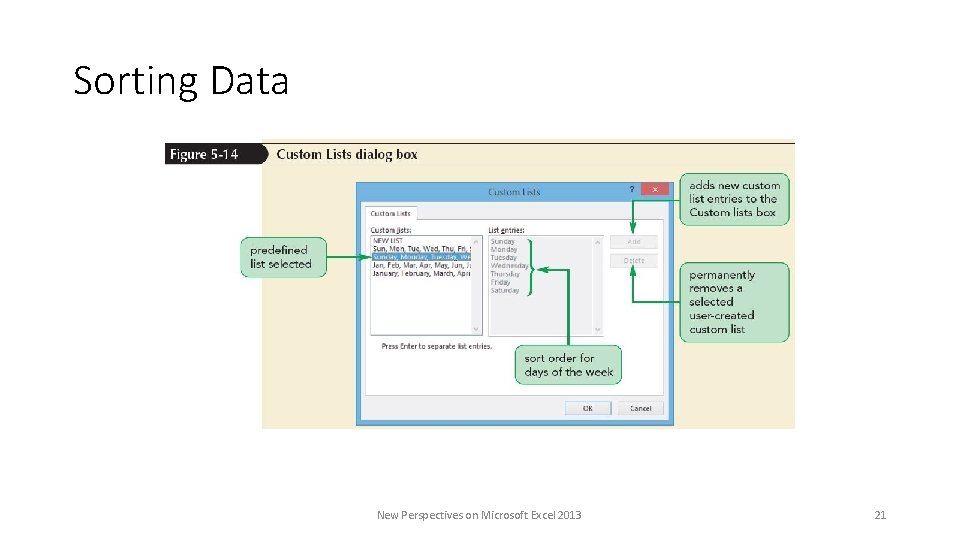
Sorting Using a Custom List A custom list indicates sequence to order data Two predefined custom sort lists Day-of-the-week custom list Month-of-the-year custom lists Can create a custom list to sort records in a sequence you define: For example, Freshman, Sophomore, Junior, Senior: not alphabetical!

Sorting Data New Perspectives on Microsoft Excel 2013 21

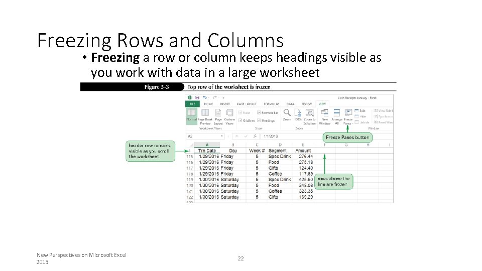
Freezing Rows and Columns • Freezing a row or column keeps headings visible as you work with data in a large worksheet New Perspectives on Microsoft Excel 2013 22

Freezing and Unfreezing • Put mouse in cell A 2 • From View menu select Freeze Panes, then Freeze Top Row. • Scroll to see that we can read top row all the way down. • To Unfreeze, View, Freeze Panes, Unfreeze • To freeze first row and first column, select B 2. • Can freeze anything to left or above selection. New Perspectives on Microsoft Excel 2013 23

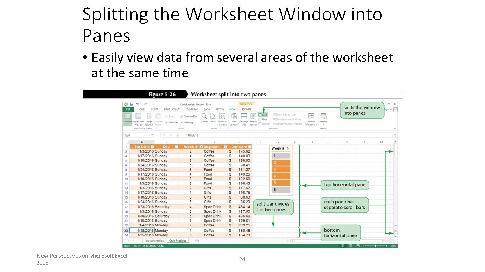
Splitting the Worksheet Window into Panes • Easily view data from several areas of the worksheet at the same time New Perspectives on Microsoft Excel 2013 24

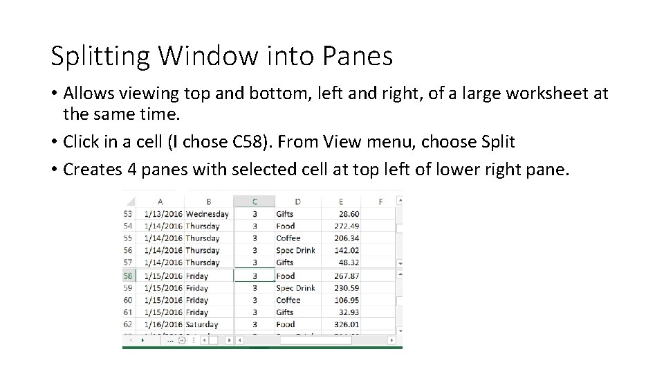
Splitting Window into Panes • Allows viewing top and bottom, left and right, of a large worksheet at the same time. • Click in a cell (I chose C 58). From View menu, choose Split • Creates 4 panes with selected cell at top left of lower right pane.