Java Swing Introduction to Swing Package javax swing


 • String get. Text( ) • void set.")


 • void set. Pressed. Icon(Icon pi) •")


; Image.")


 { JCheck. Box cb = (JCheck. Box)ie.")


 •")
 • Tab layout")


 { JButton b 1 =")
 { JCheck. Box cb 1")
 { JCombo. Box jcb =")

 • JScroll. Pane(Component comp) • JScroll. Pane(int vsb, int hsb)")

{ Container content. Pane")


; content. Pane. set. Layout(new Border. Layout()); Default. Mutable. Tree.")
; int v=Scroll. Pane. Constants. VERTICAL_SCROLLBAR_AS_NEEDED; int h=Scroll. Pane. Constants. HORIZONTAL_SCROLLBAR_AS_NEEDED; JScroll. Pane")
 { Tree. Path p=tree. get. Path. For. Location(me.")

 Create a")


 : returns")

; p. add(b); f. add(p); f. set. Size(500, 500); f. set.")
- Slides: 70
Java Swing
Introduction to Swing • Package : javax. swing. * • Swing is set of classes which provides more powerful and flexible components as compare to AWT. • Build on top of AWT API and acts as replacement of AWT API. • Swing component follows a Model-View. Controller • Swing Components are implemented using Java and so they are platform independent. • Called lightweight components
Introduction to Swing
Swing Features • Swing introduces many innovations. • Borders we can draw borders in many different styles around components using the set. Border( ) method. • Graphics Debugging We can use set. Debugging. Graphics. Options method to set up graphics debugging which means, that you can watch each line as its drawn and make it flash. • Easy mouseless operation: It is easy to connect keystrokes to components.
• Tooltips We can use the set. Tool. Tip. Text method of JComponent to give components a tooltip, one of those small windows that appear when the mouse hovers over a component and gives explanatory text. • Easy Scrolling We can connect scrolling to various components-something that was impossible in AWT. • Pluggable look and feel We can set the appearance of applets and applications to one of three standard looks. Windows, Motif (Unix) or Metal (Standard swing look). • New Layout Managers Swing introduces the Box. Layout and Overlay. Layout layout managers.
MVC Architecture • Software design pattern for software development. • Model: • Major function of this layer to maintain the data. • Database and logic. • View: • Used to display full or partial data. • User Interface • Controller: • Control the interaction and communication between Model and view. • Communication logic/integration logic
Difference Between AWT & Swing • AWT uses Applet and Frame while Swing uses JApplet and JFrame for GUI. • AWT is platform dependent code while Swing code is platform independent. • Swing has bigger collection of classes and interfaces as compare to AWT. • AWT components are Heavyweight where as Swing components are Lightweight. • In Swing extra feature to Button: Provide Image. • Swing provides: Tree, Table, Scrollpanes, Tabbedpanes, etc. new feature. • AWT does not follow MVC.
JApplet • Fundamental to Swing is the JApplet class, which extends Applet. • Applets that use Swing must be subclasses of JApplet. • JApplet is rich with functionality that is not found in Applet. • For example, JApplet supports various “panes, ” such as the content pane, the glass pane, and the root pane.
Methods • When adding a component to an instance of JApplet, do not invoke the add( ) method of the applet instead, call add( ) for the content pane of the JApplet object. • The content pane can be obtained via the method shown here: • Container get. Content. Pane( ) • The add( ) method of Container can be used to add a component to a content pane. • void add(comp) • Here, comp is the component to be added to the content pane.
Icons and Labels • In Swing, icons are encapsulated by the Image. Icon class, which paints an icon from an image. • Two of its constructors are shown here: • Image. Icon(String filename) • Image. Icon(URL url) • The first form uses the image in the file named filename. • The second form uses the image in the resource identified by url.
• The Image. Icon class implements the Icon interface that declares the methods shown here: • int get. Icon. Height( ) • Returns the height of the icon in pixels. • int get. Icon. Width( ) • Returns the width of the icon in pixels. • void paint. Icon(Component comp, Graphics g, int x, int y) • Paints the icon at position x, y on the graphics context g. Additional information about the paint operation can be provided in comp.
Swing labels • Swing labels are instances of the JLabel class, which extends JComponent. • It can display text and/or an icon. • Some of its constructors are shown here: • JLabel(Icon i) • JLabel(String s, Icon i, int align) • Here, s and i are the text and icon used for the label. • The align argument is either LEFT, RIGHT, CENTER, LEADING, or TRAILING these are constants.
• Icon get. Icon( ) • String get. Text( ) • void set. Icon(Icon i) • void set. Text(String s)
import java. awt. *; import javax. swing. *; /* <applet code="JLabel. Demo" width=250 height=150> </applet> */ public class JLabel. Demo extends JApplet { public void init() { Container content. Pane = get. Content. Pane(); Image. Icon ii = new Image. Icon("IC. jpg"); JLabel jl = new JLabel("IC", ii, JLabel. CENTER); content. Pane. add(jl); } }
Text Fields • The Swing text field is encapsulated by the JText. Component class, which extends JComponent. • It provides functionality that is common to Swing text components. • One of its subclasses is JText. Field, which allows us to edit one line of text. • Some of its constructors are shown here: • JText. Field( ) • JText. Field(int cols) • JText. Field(String s, int cols) • JText. Field(String s)
import java. awt. *; import javax. swing. *; /* <applet code="JText. Field. Demo" width=300 height=50> </applet> */ public class JText. Field. Demo extends Japplet { JText. Field jtf; public void init() { Container content. Pane = get. Content. Pane(); content. Pane. set. Layout(new Flow. Layout()); jtf = new JText. Field(15); content. Pane. add(jtf); } }
Button • Swing buttons provide features that are not found in the Button class defined by the AWT. For example, we can associate an icon with a Swing button. • Swing buttons are subclasses of the Abstract. Button class, which extends JComponent. Abstract. Button contains many methods that allow us to control the behavior of buttons, check box and radio buttons. • For example, we can define different icons that are displayed for the component when it is disabled, pressed, or selected. • Another icon can be used as rollover icon, which is displayed when the mouse is positioned over that component.
Methods • void set. Disabled. Icon(Icon di) • void set. Pressed. Icon(Icon pi) • void set. Selected. Icon(Icon si) • void set. Rollover. Icon(Icon ri) • String get. Text( ) • void set. Text(String s) • Concrete subclasses of Abstract. Button generate action events when they are pressed. Listeners register and un-register for these events via the methods shown here: • void add. Action. Listener(Action. Listener al) • void remove. Action. Listener(Action. Listener al) • Here, al is the action listener.
JButton • The JButton class provides the functionality of a push button. • JButton allows an icon, string, or both to be associated with the push button. • Some of its constructors are shown here: • JButton(Icon i) • JButton(String s, Icon i)
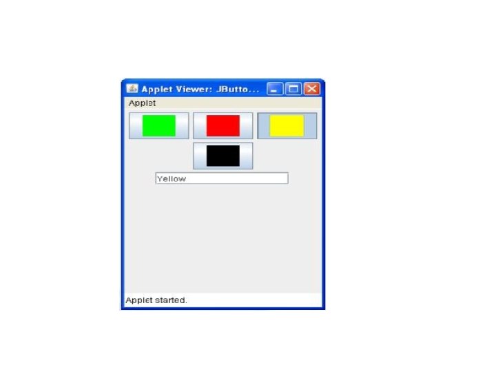
import java. awt. *; import java. awt. event. *; import javax. swing. *; /* <applet code="JButton. Demo" width=250 height=300> </applet> */ public class JButton. Demo extends JApplet implements Action. Listener { JText. Field jtf; public void init() { Container content. Pane = get. Content. Pane(); content. Pane. set. Layout(new Flow. Layout()); Image. Icon france = new Image. Icon("green. jpg"); JButton jb = new JButton(france); jb. set. Action. Command("Green"); jb. add. Action. Listener(this); content. Pane. add(jb);
Image. Icon japan = new Image. Icon germany = new Image. Icon("red. jpg"); Image. Icon("black. jpg"); jb = new JButton(japan); jb = new JButton(germany); jb. set. Action. Command("Red"); jb. set. Action. Command("Black"); jb. add. Action. Listener(this); content. Pane. add(jb); jtf = new JText. Field(15); content. Pane. add(jtf); Image. Icon italy = new } Image. Icon("yellow. jpg"); public void jb = new JButton(italy); action. Performed(Action. Event ae) jb. set. Action. Command("Yellow"); { jb. add. Action. Listener(this); jtf. set. Text(ae. get. Action. Command() ); } content. Pane. add(jb); }
JCheck. Box • The JCheck. Box class, which provides the functionality of a check box, is a concrete implementation of Abstract. Button. • It is immediate super-class is JToggle. Button, which provides support for two-state buttons. • Some of its constructors are shown here: • JCheck. Box(Icon i) • JCheck. Box(Icon i, boolean state) • JCheck. Box(String s, Icon i, boolean state)
• The state of the check box can be changed via the following method: • void set. Selected(boolean state) • When a check box is selected or deselected, an item event is generated. This is handled by item. State. Changed( ). • Inside item. State. Changed( ), the get. Item( ) method gets the JCheck. Box object that generated the event. • The get. Text( ) method gets the text for that check box.
public class JCheck. Box. Demo extends JApplet implements Item. Listener { JText. Field jtf; public void init() { Container content. Pane = get. Content. Pane(); content. Pane. set. Layout(new Flow. Layout()); JCheck. Box cb = new JCheck. Box("C", true); cb. add. Item. Listener(this); content. Pane. add(cb); cb = new JCheck. Box("C++", false); cb. add. Item. Listener(this); content. Pane. add(cb); cb = new JCheck. Box("Java", false); cb. add. Item. Listener(this); content. Pane. add(cb); cb = new JCheck. Box("Perl", false); cb. add. Item. Listener(this); content. Pane. add(cb); jtf = new JText. Field(15); content. Pane. add(jtf); }
public void item. State. Changed(Item. Event ie) { JCheck. Box cb = (JCheck. Box)ie. get. Item(); jtf. set. Text(cb. get. Text()); } }
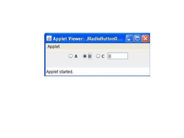
Radio Buttons • Radio buttons are supported by the JRadio. Button class, which is a concrete implementation of Abstract. Button. Its immediate super-class is JToggle. Button, which provides support for two-state buttons. • Some of its constructors are shown here: • JRadio. Button(Icon i) • JRadio. Button(Icon i, boolean state) • JRadio. Button(String s, Icon i, boolean state)
• Radio buttons must be configured into a group. Only one of the buttons in that group can be selected at any time. • The Button. Group class is instantiated to create a button group. Its default constructor is invoked for this purpose. • Elements are then added to the button group via the following method: • void add(Abstract. Button ab)
public class JRadio. Button. Demo extends JApplet implements Action. Listener { JText. Field tf; public void init() { Container content. Pane = get. Content. Pane(); content. Pane. set. Layout(new Flow. Layout()); JRadio. Button b 1 = new JRadio. Button("A"); b 1. add. Action. Listener(this); content. Pane. add(b 1); JRadio. Button b 2 = new JRadio. Button("B"); b 2. add. Action. Listener(this); content. Pane. add(b 2); JRadio. Button b 3 = new JRadio. Button("C"); b 3. add. Action. Listener(this); content. Pane. add(b 3); Button. Group bg = new Button. Group(); bg. add(b 1); bg. add(b 2); bg. add(b 3); tf = new JText. Field(5); content. Pane. add(tf); } public void action. Performed(Action. Event ae) { tf. set. Text(ae. get. Action. Command( )); } }
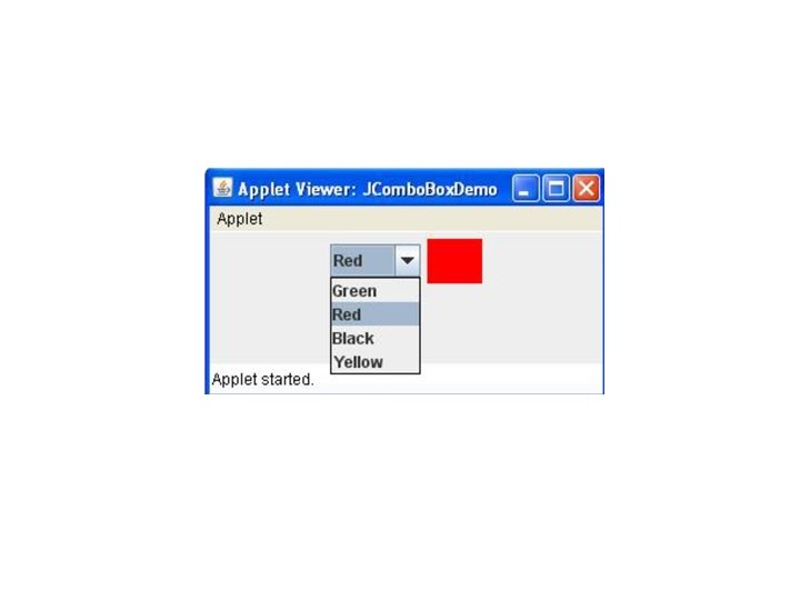
JCombo. Box • Swing provides a combo box (a combination of a text field and a dropdown list) through the JCombo. Box class, which extends JComponent. • A combo box normally displays one entry. However, it can also display a drop-down list that allows a user to select a different entry. We can also type our selection into the text field. • Two of JCombo. Box’s constructors are shown here: • JCombo. Box( ) • JCombo. Box(Vector v) • JCombo. Box(Objects obj[]) • Here, v is a vector that initializes the combo box and obj is the array of objects.
• Items are added to the list of choices via the add. Item( ) method : • void add. Item(Object obj) • public void set. Editable(boolean a. Flag) • It determines whether the JCombo. Box field is editable or not? • public boolean is. Editable() • It returns true if the JCombo. Box is editable. By default, a combo box is not editable. • public void set. Maximum. Row. Count(int count) • It sets the maximum nmber of rows the JCombo. Box displays. • Public void set. Selected. Item(Object an. Object) • public void insert. Item. At(Object an. Object, int index) • public void remove. Item(Object an. Object) • public void remove. Item. At(int an. Index)
public class JCombo. Box. Demo extends JApplet implements Item. Listener { JLabel jl; Image. Icon green, red, black, yellow; public void init() { Container content. Pane = get. Content. Pane(); content. Pane. set. Layout(new Flow. Layout()); JCombo. Box jc = new JCombo. Box(); jc. add. Item("Green"); jc. add. Item("Red"); jc. add. Item("Black"); jc. add. Item("Yellow"); jc. add. Item. Listener(this); public void item. State. Changed(Item. Event ie) { String s = (String)ie. get. Item(); jl. set. Icon(new Image. Icon(s + ". jpg")); } } content. Pane. add(jc); jl = new JLabel(new Image. Icon("green. jpg")); content. Pane. add(jl);
Advanced Swing Components
Tabbed Panes • A tabbed pane is a component that appears as a group of folders in a file cabinet. • Each folder has a title. • When a user selects a folder, its contents become visible. • Only one of the folders may be selected at a time. • Tabbed panes are commonly used for setting configuration options. • Tabbed panes are encapsulated by the JTabbed. Pane class, which extends JComponent.
JTabbed. Pane • There are three constructors of JTabbed. Pane. • JTabbed. Pane() • JTabbed. Pane(int tab. Placement) • The first form creates an empty Tabbed. Pane with a default tab placement of JTabbed. Pane -TOP. • Second form creates an empty Tabbed. Pane with the specified tab placement : • JTabbed. Pane. TOP • JTabbed. Pane. BOTTOM • JTabbed. Pane. LEFT • JTabbed. Pane. RIGHT
JTabbed. Pane • JTabbed. Pane(int tab. Placement, int tab. Layout. Policy) • Tab layout policy may be either of the following: • JTabbed. Pane. WRAP_TAB_LAYOUT • JTabbed. Pane. SCROLL_TAB_LAYOUT
• The general procedure to use a tabbed pane in an applet is outlined here: 1. Create a JTabbed. Pane object. 2. Call add. Tab( ) to add a tab to the pane. (The arguments to this method define the title of the tab and the component it contains. ) 3. Repeat step 2 for each tab. 4. Add the tabbed pane to the content pane of the applet.
• Tabs are defined via the following method: • void add. Tab(String str, Component comp) • Here, str is the title for the tab, and • comp is the component that should be added to the tab. • Typically, a JPanel or a subclass of it is added.
import javax. swing. *; /*<applet code="JTabbed. Pane. Demo" width=400 height=100> </applet> */ public class JTabbed. Pane. Demo extends Japplet { public void init() { JTabbed. Pane jtp = new JTabbed. Pane(); jtp. add. Tab("Languages", new Lang. Panel()); jtp. add. Tab("Colors", new Colors. Panel()); jtp. add. Tab("Flavors", new Flavors. Panel()); get. Content. Pane(). add(jtp); } }
class Lang. Panel extends JPanel { public Lang. Panel() { JButton b 1 = new JButton("Marathi"); add(b 1); JButton b 2 = new JButton("Hindi"); add(b 2); JButton b 3 = new JButton("Bengali"); add(b 3); JButton b 4 = new JButton("Tamil"); add(b 4); } }
class Colors. Panel extends JPanel { public Colors. Panel() { JCheck. Box cb 1 = new JCheck. Box("Red"); add(cb 1); JCheck. Box cb 2 = new JCheck. Box("Green"); add(cb 2); JCheck. Box cb 3 = new JCheck. Box("Blue"); add(cb 3); } }
class Flavors. Panel extends JPanel { public Flavors. Panel() { JCombo. Box jcb = new JCombo. Box(); jcb. add. Item("Vanilla"); jcb. add. Item("Chocolate"); jcb. add. Item("Strawberry"); add(jcb); } }
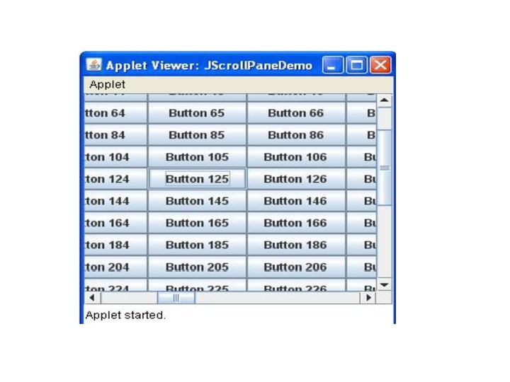
Scroll Panes • A scroll pane is a component that presents a rectangular area in which a component may be viewed. • Horizontal and/or vertical scroll bars may be provided if necessary. • Scroll panes are implemented in Swing by the JScroll. Pane class, which extends JComponent.
Constructors • JScroll. Pane() • JScroll. Pane(Component comp) • JScroll. Pane(int vsb, int hsb) • JScroll. Pane(Component comp, int vsb, int hsb) • Here, comp is component to add to the scroll pane. • vsb and hsb are int constants that define when vertical and horizontal scroll bars for this scroll pane are shown. • These constants are defined by the Scroll. Pane. Constants interface. • HORIZONTAL_SCROLLBAR_ALWAYS • HORIZONTAL_SCROLLBAR_AS_NEEDED • VERTICAL_SCROLLBAR_ALWAYS • VERTICAL_SCROLLBAR_AS_NEEDED
• Here are the steps that you should follow to use a scroll pane in an applet: 1. Create a JComponent object. 2. Create a JScroll. Pane object. (The arguments to the constructor specify the component and the policies for vertical and horizontal scroll bars. ) 3. Add the scroll pane to the content pane of the applet.
public class JScroll. Pane. Demo extends Japplet { public void init(){ Container content. Pane = get. Content. Pane(); content. Pane. set. Layout(new Border. Layout()); JPanel jp = new JPanel(); jp. set. Layout(new Grid. Layout(20, 20)); int b = 0; for(int i = 0; i < 20; i++) { for(int j = 0; j < 20; j++) { jp. add(new JButton("Button " + b)); ++b; } } int v = Scroll. Pane. Constants. VERTICAL_SCROLLBAR_AS_NEEDED; int h = Scroll. Pane. Constants. HORIZONTAL_SCROLLBAR_AS_NEEDED; JScroll. Pane jsp = new JScroll. Pane(jp, v, h); content. Pane. add(jsp, Border. Layout. CENTER); } }
Trees • A tree is a component that presents a hierarchical view of data. • A user has the ability to expand or collapse individual sub-trees in this display.
JTree • Trees are implemented in Swing by JTree class, which extends JComponent. • JTree(Hashtable ht) • JTree(Object obj[ ]) • JTree(Tree. Node tn) • JTree(Vector v) • The first form creates a tree in which each element of the hash table ht is a child node. • Each element of array obj is a child node in the second form. • The tree node tn is the root of the tree in the third form. • Finally, the last form uses the elements of vector v as child nodes.
• A JTree object generates events when a node is expanded or collapsed. The following methods allow listeners to register and unregister for these notifications. • void add. Tree. Expansion. Listener(Tree. Expansion. Listener tel) • void remove. Tree. Expansion. Listener(Tree. Expansion. Listener tel) • • • Here, tel is the listener object. The get. Path. For. Location( ) method is used to translate a mouse click on a specific point of the tree to a tree path. Tree. Path get. Path. For. Location(int x, int y) Here, x and y are the coordinates at which the mouse is clicked. The return value is a Tree. Path object that encapsulates information about the tree node that was selected by the user.
• The Tree. Path class encapsulates information about a path to a particular node in a tree. It provides several constructors and methods. • The Tree. Node interface declares methods that obtain information about a tree node. • For example, it is possible to obtain a reference to the parent node or an enumeration of the child nodes. • The Mutable. Tree. Node interface extends Tree. Node. • It declares methods that can insert and remove child nodes or change the parent node.
• The Default. Mutable. Tree. Node class implements the Mutable. Tree. Node interface. • It represents a node in a tree. • Default. Mutable. Tree. Node(Object obj) • Here, obj is the object to be enclosed in this tree node. • The new tree node doesn’t have a parent or children. • To create a hierarchy of tree nodes, the add( ) method of Default. Mutable. Tree. Node can be used. • void add(Mutable. Tree. Node child)
• Tree expansion events are described by the class Tree. Expansion. Event in • the javax. swing. event package. • The get. Path( ) method of this class returns a Tree. Path object that describes the path to the changed node. • Tree. Path get. Path( ) • The Tree. Expansion. Listener interface provides the following two methods: • void tree. Collapsed(Tree. Expansion. Event tee) • void tree. Expanded(Tree. Expansion. Event tee) • Here, tee is the tree expansion event. • The first method is called when a sub-tree is hidden, and the second method is called when a sub-tree becomes visible.
• Here are the steps that we should follow to use a tree in an applet: 1. Create a JTree object. 2. Create a JScroll. Pane object. (The arguments to the constructor specify the tree and the policies for vertical and horizontal scroll bars. ) 3. Add the tree to the scroll pane. 4. Add the scroll pane to the content pane of the applet.
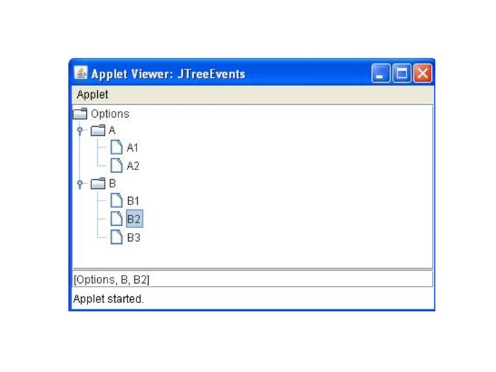
import java. awt. *; import java. awt. event. *; import javax. swing. tree. *; /* <applet code="JTree. Events" width=400 height=200> </applet> */ public class JTree. Events extends JApplet { JTree tree; JText. Field jtf; public void init() {
Container content. Pane=get. Content. Pane(); content. Pane. set. Layout(new Border. Layout()); Default. Mutable. Tree. Node top=new Default. Mutable. Tree. Node("Options"); Default. Mutable. Tree. Node a= new Default. Mutable. Tree. Node("A"); top. add(a); Default. Mutable. Tree. Node a 1=new Default. Mutable. Tree. Node("A 1"); a. add(a 1); Default. Mutable. Tree. Node a 2=new Default. Mutable. Tree. Node("A 2"); a. add(a 2); Default. Mutable. Tree. Node b= new Default. Mutable. Tree. Node("B"); top. add(b); Default. Mutable. Tree. Node b 1=new Default. Mutable. Tree. Node("B 1"); b. add(b 1); Default. Mutable. Tree. Node b 2=new Default. Mutable. Tree. Node("B 2"); b. add(b 2); Default. Mutable. Tree. Node b 3=new Default. Mutable. Tree. Node("B 3"); b. add(b 3);
tree=new JTree(top); int v=Scroll. Pane. Constants. VERTICAL_SCROLLBAR_AS_NEEDED; int h=Scroll. Pane. Constants. HORIZONTAL_SCROLLBAR_AS_NEEDED; JScroll. Pane jsp=new JScroll. Pane(tree, v, h); content. Pane. add(jsp, Border. Layout. CENTER); jtf=new JText. Field("", 20); content. Pane. add(jtf, Border. Layout. SOUTH); tree. add. Mouse. Listener(new Mouse. Adapter() { public void mouse. Clicked(Mouse. Event me) { do. Mouse. Clicked(me); } }); }
void do. Mouse. Clicked(Mouse. Event me) { Tree. Path p=tree. get. Path. For. Location(me. get. X(), me. get. Y()); if(tp!=null) jtf. set. Text(tp. to. String()); else jtf. set. Text(""); } }
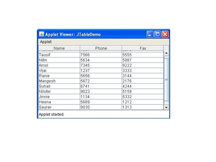
Tables • A table is a component that displays rows and columns of data. We can • drag the cursor on column boundaries to resize columns. We can also drag a • column to a new position. Tables are implemented by the JTable class, which • extends JComponent. One of its constructors is shown here: • JTable(Object data[ ][ ], Object col. Heads[ ]) • JTable(int num. Rows, int num. Columns) • JTable(Vector row. Data, Vector column. Data)
• the steps for using a table in an applet: 1) Create a JTable object. 2) Create a JScroll. Pane object. (The arguments to the constructor specify the table and the policies for vertical and horizontal scroll bars. ) 3) Add the table to the scroll pane. 4) Add the scroll pane to the content pane of the applet.
import java. awt. *; import javax. swing. *; /* <applet code="JTable. Demo" width=400 height=200> </applet> */ public class JTable. Demo extends JApplet { public void init() { Container content. Pane = get. Content. Pane(); content. Pane. set. Layout(new Border. Layout()); final String[] col. Heads = { "Name", "Phone", "Fax" }; final Object[][] data = {
{ "Pramod", "4567", "8675" }, { "Tausif", "7566", "5555" }, { "Nitin", "5634", "5887" }, { "Amol", "7345", "9222" }, { "Vijai", "1237", "3333" }, { "Ranie", "5656", "3144" }, { "Mangesh", "5672", "2176" }, }; JTable table = new JTable(data, col. Heads); int v = Scroll. Pane. Constants. VERTICAL_SCROLLBAR_AS_NEEDED; int h = Scroll. Pane. Constants. HORIZONTAL_SCROLLBAR_AS_NEEDED; JScroll. Pane jsp = new JScroll. Pane(table, v, h); content. Pane. add(jsp, Border. Layout. CENTER); } }
JProgress. Bar • JProgress. Bar visually displays the progress of some specified task. • JProgress. Bar shows the percentage of completion of specified task. • The progress bar fills up as the task reaches it completion. • In addition to show the percentage of completion of task, it can also display some text. • Constructors of JProgress. Bar : • JProgress. Bar() : creates an progress bar with no text on it; • JProgress. Bar(int orientation) orientation Swing. Constants. VERTICAL, Swing. Constants. HORIZONTAL • JProgress. Bar(int min, int max) • JProgress. Bar(int orientation, int min, int max)
• methods of JProgress. Bar are : • int get. Maximum() : returns the progress bar’s maximum value. • int get. Minimum() : returns the progress bar’s minimum value. • String get. String() : get the progress bar’s string representation of current value. • void set. Maximum(int n) : sets the progress bar’s maximum value to the value n. • void set. Minimum(int n) : sets the progress bar’s minimum value to the value n. • void set. Value(int n) : set Progress bar’s current value to the value n. • void set. String(String s) : set the value of the progress String to the String s.
import java. awt. *; import javax. swing. *; import java. awt. event. *; public class progress extends JFrame { static JFrame f; static JProgress. Bar b; public static void main() { f = new JFrame("Progress. Bar demo"); JPanel p = new JPanel(); b = new JProgress. Bar(); b. set. Value(0);
b. set. String. Painted(true); p. add(b); f. add(p); f. set. Size(500, 500); f. set. Visible(true); fill(); } public static void fill() { int i = 0; try { while (i <= 100) { b. set. Value(i + 10); Thread. sleep(1000); i += 20; } catch (Exception e) { } } }