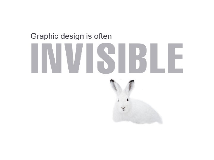
is the art or profession of visual communication


 Avoid underlining headings (Unless you’re")


- Slides: 60
“…is the art or profession of visual communication that combines images, words and ideas to convey information to an audience. ” Dictionary. com
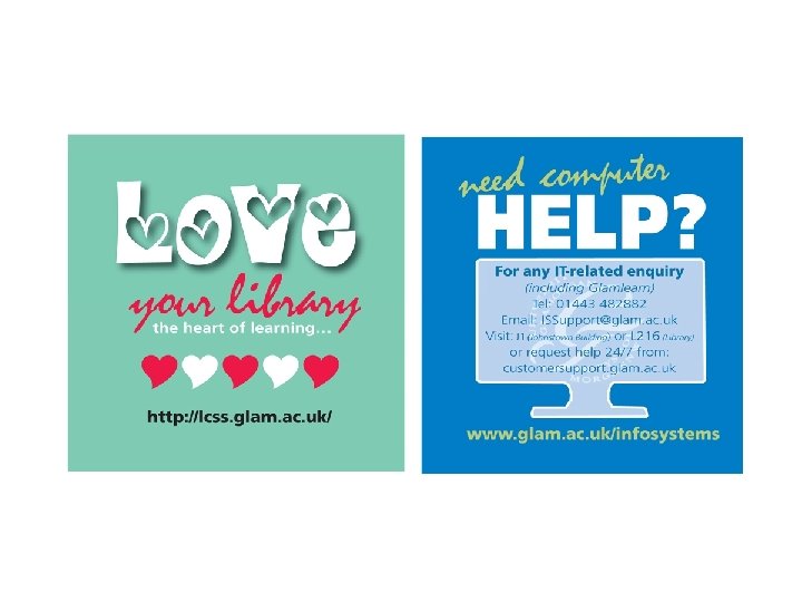
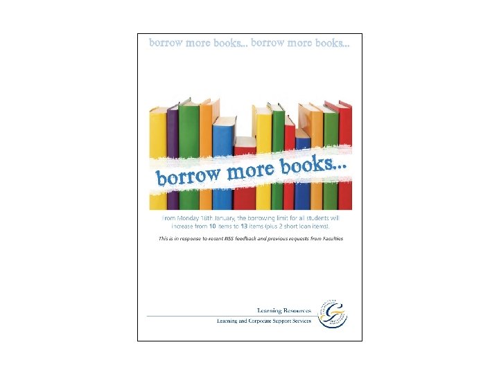
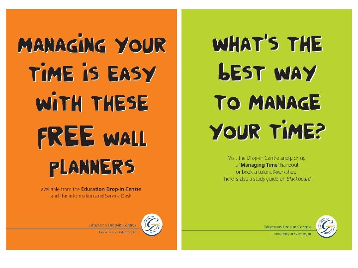
This power point was created by a designer who helped a college library with their promotional materials. This resource was downloaded from Slideshare. Modifications have been made to make this suitable for a high school graphic design class.
Editorial
Editorial
promotion
Signage & wayfinding
Packaging
CARP Contrast Alignment Repetition Proximity
CARP Contrast Alignment Repetition Proximity
Contrast Make your reader want to look at the page
Size
Size
Size
Read me first! Read me next Then, if you have some time and are interested, would you please read me?
Anita Read Information Librarian Learning Resources Centre University of Glamorgan 01443 480480
Contrast Value
Anita Read Information Librarian Learning Resources Centre University of Glamorgan 01443 480480
Anita Read Information Librarian Learning Resources Centre University of Glamorgan 01443 480480
Anita Read • Information Librarian Learning Resources Centre • University of Glamorgan 01443 480480
Color
Anita Read Information Librarian Learning Resources Centre University of Glamorgan 01443 480480
Contrast fonts Heavy with light Contrast fonts Light with heavy Contrast fonts Serif with sans serif
Sans serif Decorative Slab serif Script
CARP Contrast Alignment Repetition Proximity
Alignment Nothing should be placed at random on the page
Anita Read Information Librarian Learning Resources Centre University of Glamorgan 01443 480480
Anita Read Information Librarian Learning Resources Centre University of Glamorgan 01443 480480
Anita Read Information Librarian Learning Resources Centre University of Glamorgan 01443 480480
Source: The Non-Designers Design Book by Robin Williams
CARP Contrast Alignment Repetition Proximity
Repetition Be consistent and repeat elements to add visual interest repeat for visual interest • repeat for visual interest
Anita Read Information Librarian Learning Resources Centre University of Glamorgan 01443 480480
Anita Read Information Librarian Learning Resources Centre University of Glamorgan 01443 480480
Anita Read Information Librarian Learning Resources Centre University of Glamorgan 01443 480480
CARP Contrast Alignment Repetition Proximity
Proximity Items relating to each other should be grouped together
Information Librarian 01443 480480 Anita Read Learning Resources Centre University of Glamorgan
Anita Read Information Librarian Learning Resources Centre University of Glamorgan 01443 480480
Source: The Non-Designers Design Book by Robin Williams
Source: The Non-Designers Design Book by Robin Williams
White Space Why is it important in design?
Anita Read Information Librarian Learning Resources Centre University of Glamorgan 01443 480480
Anita Read Information Librarian Learning Resources Centre University of Glamorgan 01443 480480
Anita Read Information Librarian Learning Resources Centre University of Glamorgan 01443 480480
CARP Contrast Alignment Repetition Proximity And last but not least – white space
Pet Hates Things you should try to avoid…
LIBRARY L I B R A R Y
If you use borders around your text make sure you include enough white space
The same rule applies to coloured boxes (even if your ‘white’ space is actually blue!) The same rule applies to coloured boxes…
Avoid underlining headings. (Unless you’re using a typewriter. ) Avoid underlining headings (Unless you’re using a typewriter)
DO NOT TYPE MORE THAN A FEW WORDS IN UPPER CASE BECAUSE IT IS RATHER DIFFICULT TO READ AND LOOKS AS IF YOU ARE SHOUTING AT ME!
A SHORT UPPER CASE HEADING IS OK Please do not type more than a few words in upper case because it is rather difficult to read and looks as if you are shouting at me!
Avoid using Comic Sans abc 123 And by the way, using too many colours is not a good idea either
And finally… NEVER, EVER USE A COMBINATION OF ANY OF THESE!