IS 4300 HumanComputer Interaction Web Interface Design Martin
IS 4300: Human-Computer Interaction Web Interface Design Martin Schedlbauer, Ph. D. m. schedlbauer@neu. edu
Resources & References • The content and discussion of this lesson are based on the following resources: Scott, B. , Neil, T. (2009). Designing Web Interfaces: Principles and Patterns for Rich Interactions. O’Reilly Media. http: //designingwebinterfaces. com/6 -tips-for-a-great-flex-ux-part-5 Also from: http: //www. tristream. com/tristream/how/usability_heuristics. html IS 4300 - HCI Web Interface Design 2
Web Interface Design USABILITY BEST PRACTICES IS 4300 - HCI Web Interface Design 3
Usability Best Practices • These best practices are based on Nielsen’s Usability Heuristics: – Visibility of system status (Feedback) – Match between system and real world (Metaphor) – User control and freedom (Navigation) IS 4300 - HCI – Help and documentation (Help) Web Interface Design 4
Web Development • These practices apply to: – Web sites developed with XHTML and CSS – Rich Internet Applications (RIA) developed with Adobe Flex, Microsoft Silverlight, and Java. Script/AJAX IS 4300 - HCI Web Interface Design 5
Feedback • Inform the user of what’s going on: – Show appropriate feedback and progress – Do not show blank screens – Do not show static “load” or progress messages IS 4300 - HCI Web Interface Design 6
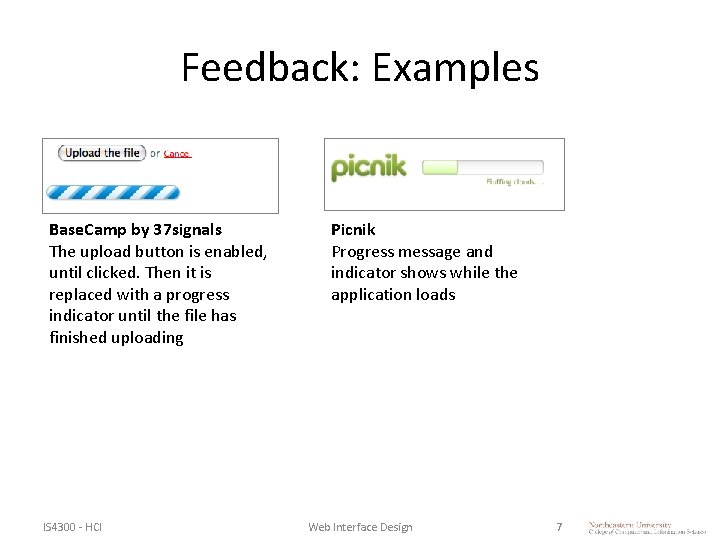
Feedback: Examples Base. Camp by 37 signals The upload button is enabled, until clicked. Then it is replaced with a progress indicator until the file has finished uploading IS 4300 - HCI Picnik Progress message and indicator shows while the application loads Web Interface Design 7
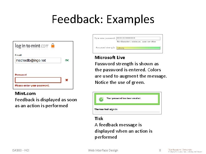
Feedback: Examples Microsoft Live Password strength is shown as the password is entered. Colors are used to augment the message. Notice the use of green. Mint. com Feedback is displayed as soon as an action is performed Tick A feedback message is displayed when an action is performed IS 4300 - HCI Web Interface Design 8
Metaphor • There must be a match between the system’s interface controls and the real world. • The system should speak the users’ language, with words, phrases and concepts familiar to the user, rather than system-oriented terms. • Follow real-world conventions, making information appear in a natural and logical order. IS 4300 - HCI Web Interface Design 9
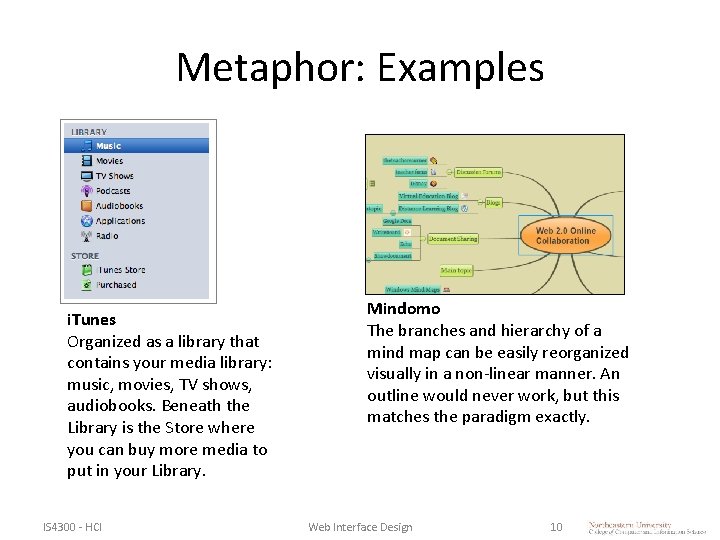
Metaphor: Examples i. Tunes Organized as a library that contains your media library: music, movies, TV shows, audiobooks. Beneath the Library is the Store where you can buy more media to put in your Library. IS 4300 - HCI Mindomo The branches and hierarchy of a mind map can be easily reorganized visually in a non-linear manner. An outline would never work, but this matches the paradigm exactly. Web Interface Design 10
Navigation • Users often choose system functions by mistake and will need a clearly marked “emergency exit” to leave the unwanted state without having to go through an extended dialog. • Support undo and redo and a clear way to navigate. • Provide bread crumbs and clearly show where the user is. IS 4300 - HCI Web Interface Design 11
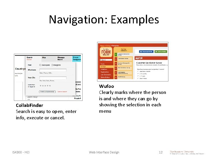
Navigation: Examples Collab. Finder Search is easy to open, enter info, execute or cancel. IS 4300 - HCI Wufoo Clearly marks where the person is and where they can go by showing the selection in each menu Web Interface Design 12
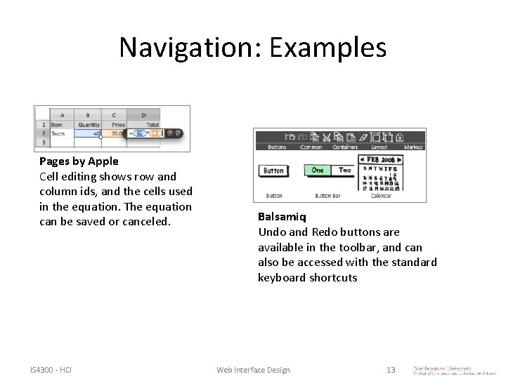
Navigation: Examples Pages by Apple Cell editing shows row and column ids, and the cells used in the equation. The equation can be saved or canceled. IS 4300 - HCI Balsamiq Undo and Redo buttons are available in the toolbar, and can also be accessed with the standard keyboard shortcuts Web Interface Design 13
Consistency • Users should not have to wonder whether different words, situations, or actions mean the same thing. • Follow platform conventions. IS 4300 - HCI Web Interface Design 14
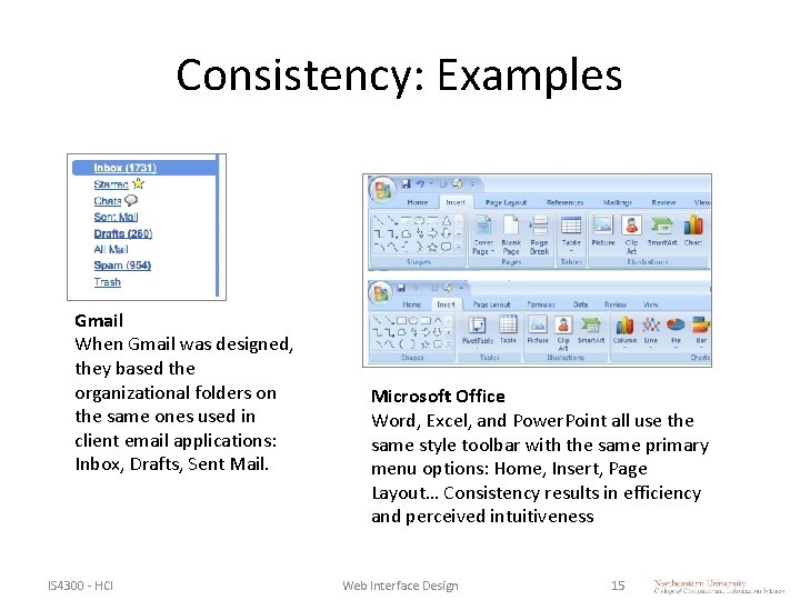
Consistency: Examples Gmail When Gmail was designed, they based the organizational folders on the same ones used in client email applications: Inbox, Drafts, Sent Mail. IS 4300 - HCI Microsoft Office Word, Excel, and Power. Point all use the same style toolbar with the same primary menu options: Home, Insert, Page Layout… Consistency results in efficiency and perceived intuitiveness Web Interface Design 15
Prevention • Even better than good error messages is a careful design, which prevents a problem from occurring in the first place. IS 4300 - HCI Web Interface Design 16
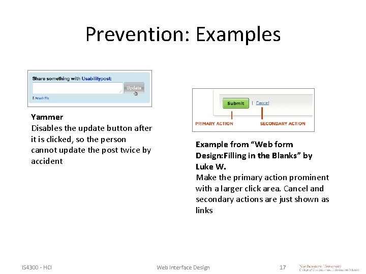
Prevention: Examples Yammer Disables the update button after it is clicked, so the person cannot update the post twice by accident IS 4300 - HCI Example from “Web form Design: Filling in the Blanks” by Luke W. Make the primary action prominent with a larger click area. Cancel and secondary actions are just shown as links Web Interface Design 17
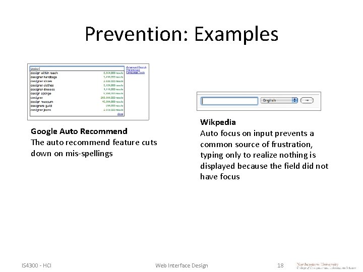
Prevention: Examples Google Auto Recommend The auto recommend feature cuts down on mis-spellings IS 4300 - HCI Wikpedia Auto focus on input prevents a common source of frustration, typing only to realize nothing is displayed because the field did not have focus Web Interface Design 18
Memory • Minimize the user’s memory load. • Make objects, actions, and options visible. • The user should not have to remember information from one part of the dialogue to another. • Instructions for use of the system should be visible or easily retrievable whenever appropriate. IS 4300 - HCI Web Interface Design 19
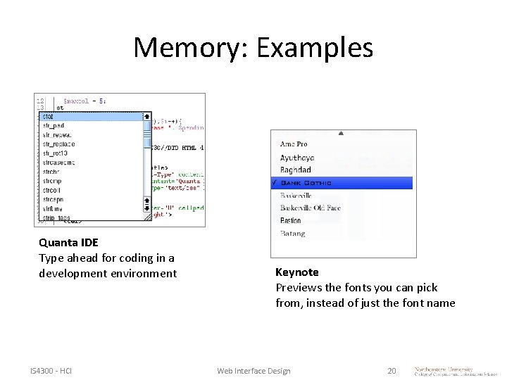
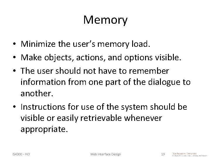
Memory: Examples Quanta IDE Type ahead for coding in a development environment IS 4300 - HCI Keynote Previews the fonts you can pick from, instead of just the font name Web Interface Design 20
Efficiency • Accelerators — unseen by the novice user — may often speed up the interaction for the expert user such that the system can cater to both inexperienced and experienced users. • Allow users to tailor frequent actions. IS 4300 - HCI Web Interface Design 21
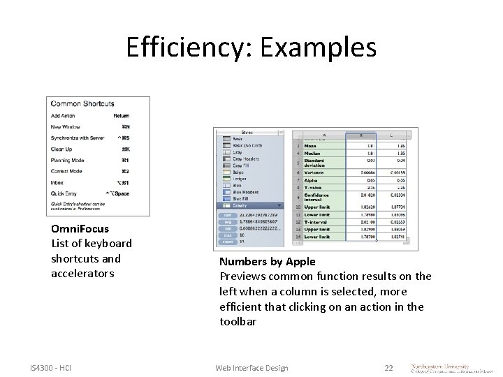
Efficiency: Examples Omni. Focus List of keyboard shortcuts and accelerators IS 4300 - HCI Numbers by Apple Previews common function results on the left when a column is selected, more efficient that clicking on an action in the toolbar Web Interface Design 22
Aesthetics • Follow a mantra of aesthetic and minimalist designs. • Dialogs should not contain information, which is irrelevant or rarely needed. • Every extra unit of information in a dialog competes with the relevant units of information and diminishes their relative visibility. • Visual layout should respect the principles of contrast, repetition, alignment, and proximity. IS 4300 - HCI Web Interface Design 23
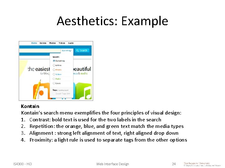
Aesthetics: Example Kontain’s search menu exemplifies the four principles of visual design: 1. Contrast: bold text is used for the two labels in the search 2. Repetition: the orange, blue, and green text match the media types 3. Alignment : strong left alignment of text, right aligned drop down 4. Proximity: a light rule is used to separate tags from the other options IS 4300 - HCI Web Interface Design 24
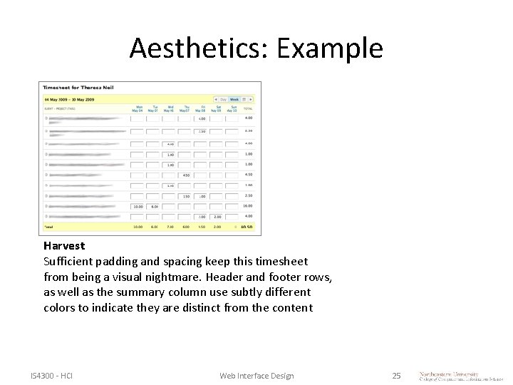
Aesthetics: Example Harvest Sufficient padding and spacing keep this timesheet from being a visual nightmare. Header and footer rows, as well as the summary column use subtly different colors to indicate they are distinct from the content IS 4300 - HCI Web Interface Design 25
Recovery • Help users recognize, diagnose, and recover from errors. • Error messages should be expressed in plain language (no jargon), precisely indicate the problem, and constructively suggest a solution. IS 4300 - HCI Web Interface Design 26
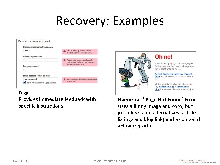
Recovery: Examples Digg Provides immediate feedback with specific instructions IS 4300 - HCI Humorous ‘ Page Not Found’ Error Uses a funny image and copy, but provides viable alternatives (article listings and blog link) and a course of action (report it) Web Interface Design 27
Help • Even though it is better if the web application can be used without documentation, it may be necessary to provide help and documentation. • Any such information should be contextual, easy to search, focused on the user’s task, list concrete steps to be carried out, and not be too large. IS 4300 - HCI Web Interface Design 28
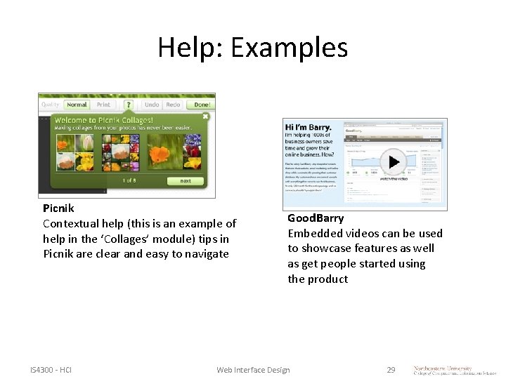
Help: Examples Picnik Contextual help (this is an example of help in the ‘Collages’ module) tips in Picnik are clear and easy to navigate IS 4300 - HCI Good. Barry Embedded videos can be used to showcase features as well as get people started using the product Web Interface Design 29
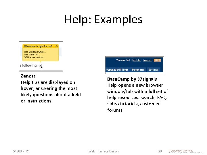
Help: Examples Zenoss Help tips are displayed on hover, answering the most likely questions about a field or instructions IS 4300 - HCI Base. Camp by 37 signals Help opens a new browser window/tab with a full set of help resources: search, FAQ, video tutorials, customer forums Web Interface Design 30
Sharing • Allow user to share their experience with others through social media outlets: – Twitter – Facebook – Flickr, Digg, etc. • Add easy to use toolbars and share buttons. • Allow comments and feedback. • Build a user community. IS 4300 - HCI Web Interface Design 31
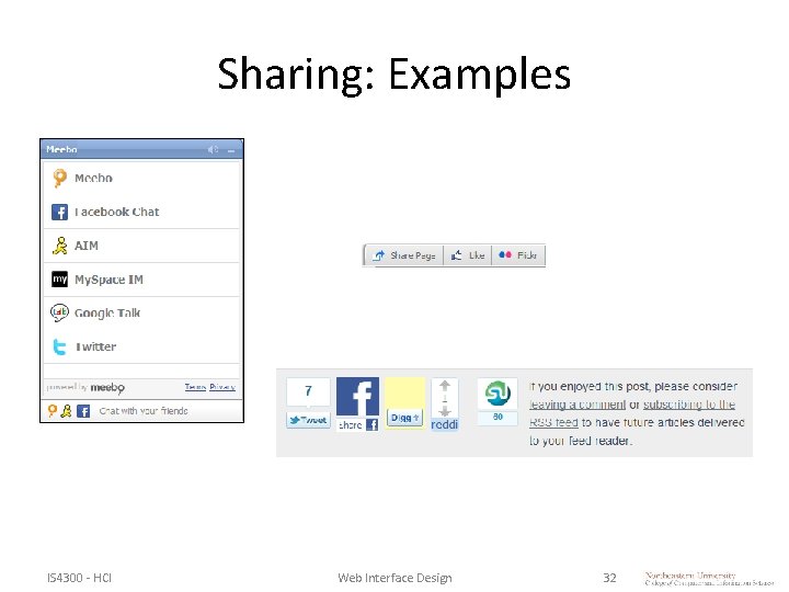
Sharing: Examples IS 4300 - HCI Web Interface Design 32
Taking • Are screens printable or are there printable versions? • Is there an ability to create summaries or reports of key information? • Are these reports or printable screens in known standard formats, useful, and easily archived or shared with co-workers? • Can key information be passed easily into other software tools either manually or automatically and/or emailed? IS 4300 - HCI Web Interface Design 33
Layout • Is the screen real estate user task prioritized? • The use of screen real estate in web-delivered applications is usually divided between branding and UI elements, controls and navigation, status reporting and help, and core user tasks. • The primary real estate areas tend to the top and left of the screen. IS 4300 - HCI Web Interface Design 34
Task Flow • Does the application architecture, navigation, controls, tasks and procedures resonate in general with users’ normal taskflows and workflows, or does the application introduce unusual or foreign flows? • It is understood that all applications will introduce a certain amount of new task and work flows. (note: Workflow here is used to indicate where multiple users work together on a task through the application. Taskflow indicates individual activities) IS 4300 - HCI Web Interface Design 35
Learning from the Best • Great Web apps: – http: //designingwebinterfaces. com/ultimate-guide-totable-ui-patterns • Great Flex apps: – http: //designingwebinterfaces. com/great-flex-ux-part 2 • Great RIA apps: – http: //designingwebinterfaces. com/great-flex-ux-part-3 IS 4300 - HCI Web Interface Design 36
Summary, Review, & Questions… IS 4300 - HCI Web Interface Design 37
- Slides: 37