IS 333 MULTITIER APPLICATION DEVELOPMENT Lecture 2 HTML
- Slides: 48

IS 333: MULTI-TIER APPLICATION DEVELOPMENT Lecture 2: HTML 5 – Part 2 Information Systems Department

Objectives Build a form using the new HTML 5 input. Specify an input element in a form as the one that should receive the focus by default. Use self-validating input elements. Specify temporary placeholder text in various input elements. Use autocomplete input elements that help users reenter text that they have previously entered in a form. 19 -Dec-21 Information Systems Department 2

Objectives Use a datalist to specify a list of values that can be entered in an input element and to autocomplete entries as the user types. Use HTML 5’s new page structure elements to delineate parts of a page, including headers, sections, figures, articles, footers and more. 19 -Dec-21 Information Systems Department 3

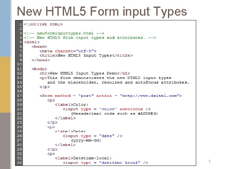
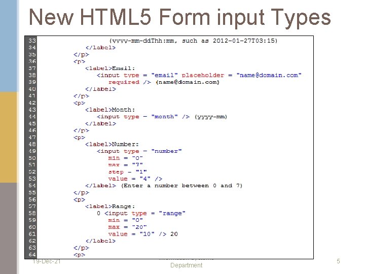
New HTML 5 Form input Types 19 -Dec-21 Information Systems Department 4

New HTML 5 Form input Types 19 -Dec-21 Information Systems Department 5

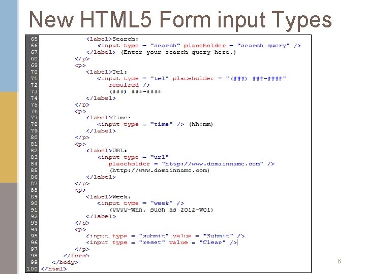
New HTML 5 Form input Types 19 -Dec-21 Information Systems Department 6

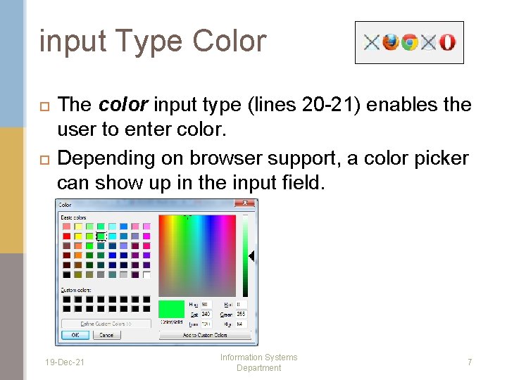
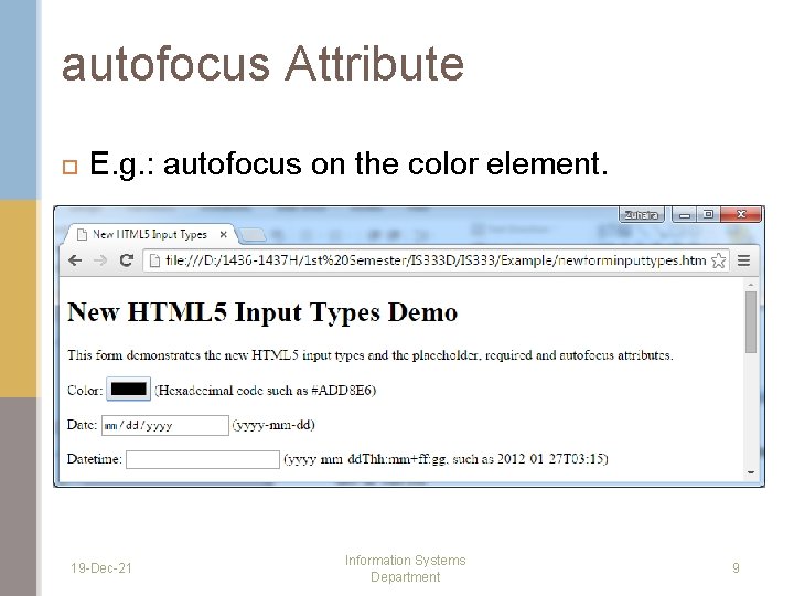
input Type Color The color input type (lines 20 -21) enables the user to enter color. Depending on browser support, a color picker can show up in the input field. 19 -Dec-21 Information Systems Department 7

autofocus Attribute The autofocus attribute (line 20) is an optional attribute that can be used in only one input element on a form. It will automatically gives the focus to the input element, allowing the user to begin typing in that element immediately. 19 -Dec-21 Information Systems Department 8

autofocus Attribute E. g. : autofocus on the color element. 19 -Dec-21 Information Systems Department 9

Validation Traditionally it’s been difficult to validate user input, such as ensuring that an e-mail address, URL, date or time is entered in the proper format. The new HTML 5 input types are self validating on the client side, q q q 19 -Dec-21 eliminating the need to add complicated Javascript code to your web pages to validate user input reducing the amount of invalid data submitted reducing Internet traffic between the server and the client to correct invalid input Information Systems Department 10

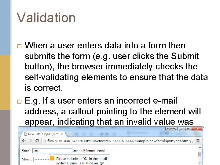
Validation When a user enters data into a form then submits the form (e. g. user clicks the Submit button), the browser immediately checks the self-validating elements to ensure that the data is correct. E. g. If a user enters an incorrect e-mail address, a callout pointing to the element will appear, indicating that an invalid value was entered. 19 -Dec-21 Information Systems Department 11

Validation To bypass validation, add the formnovalidate attribute to input type submit. <input type=“submit” value=“Submit” formnovalidate /> 19 -Dec-21 Information Systems Department 12

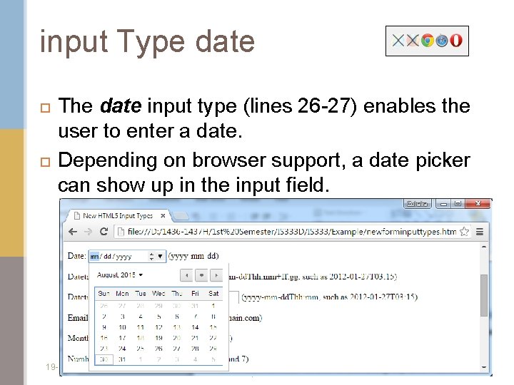
input Type date The date input type (lines 26 -27) enables the user to enter a date. Depending on browser support, a date picker can show up in the input field. 19 -Dec-21 Information Systems Department 13

input Type datetime-local The datetime-local input type (lines 32 -33) enables the user to enter the date and time in a single control. Depending on browser support, a date picker and time control can show up in the input field. 19 -Dec-21 Information Systems Department 14

input Type email The email input type (lines 38 -39) enables the user to enter an e-mail address or a list of e-mail addresses separated by commas (if multiple attribute is specified). All the browsers display a text field. Depending on browser support, the e-mail address can be automatically validated when submitted. If the user enters an invalid e-mail address (not in proper format) and clicks the Submit button, a callout asking the user to enter an e-mail address is rendered pointing to the input element. HTML 5 does not check whether an e-mail address entered by the user actually exists –it just validates the format 19 -Dec-21 Information Systems Department 15

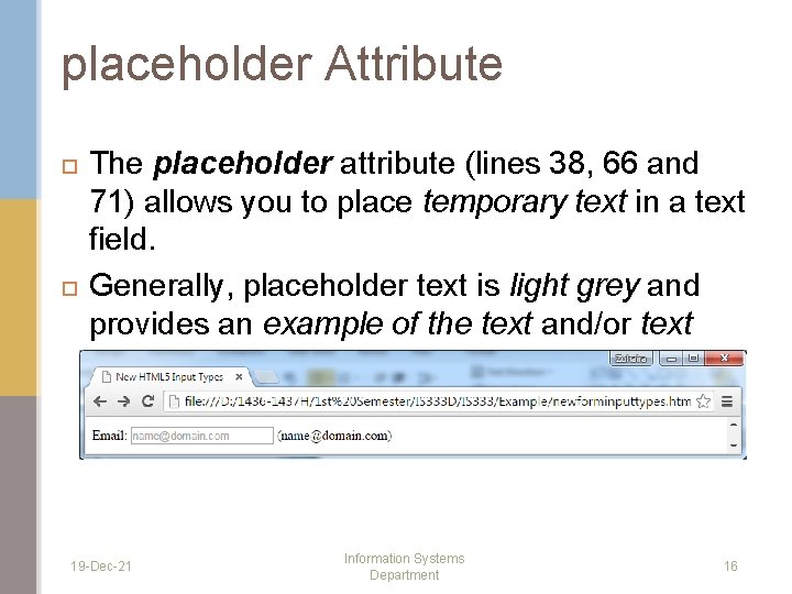
placeholder Attribute The placeholder attribute (lines 38, 66 and 71) allows you to place temporary text in a text field. Generally, placeholder text is light grey and provides an example of the text and/or text format the user should enter. 19 -Dec-21 Information Systems Department 16

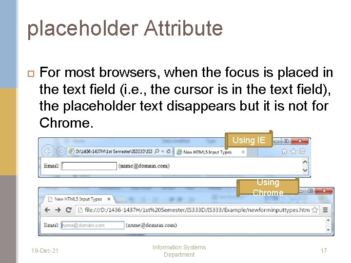
placeholder Attribute For most browsers, when the focus is placed in the text field (i. e. , the cursor is in the text field), the placeholder text disappears but it is not for Chrome. Using IE Using Chrome 19 -Dec-21 Information Systems Department 17

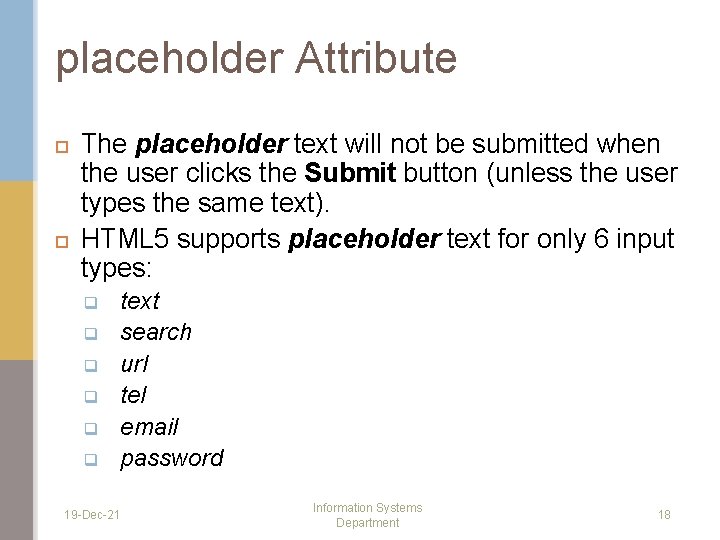
placeholder Attribute The placeholder text will not be submitted when the user clicks the Submit button (unless the user types the same text). HTML 5 supports placeholder text for only 6 input types: q q q 19 -Dec-21 text search url tel email password Information Systems Department 18

required Attribute The required attribute (lines 39 and 72) forces the user to enter a value before submitting the form. It can be added to any of the input types. E. g. : The user must enter an e-mail address and a telephone number before being able to submit the form. 19 -Dec-21 Information Systems Department 19

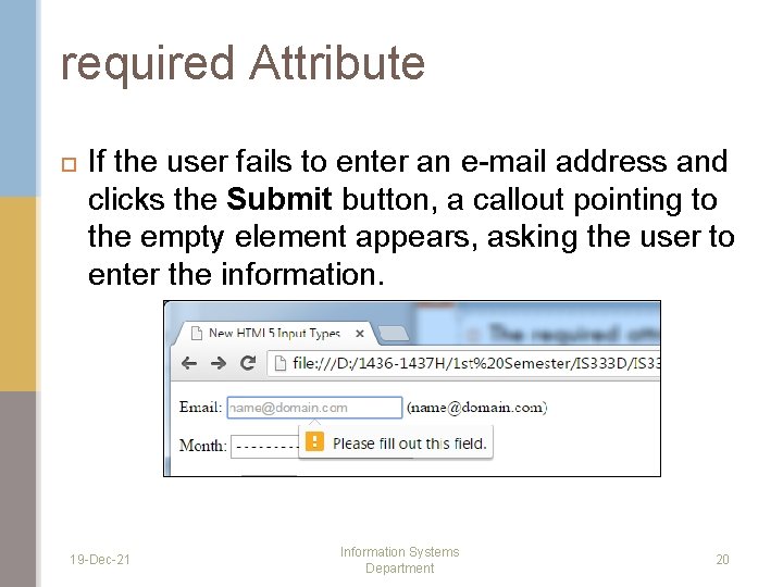
required Attribute If the user fails to enter an e-mail address and clicks the Submit button, a callout pointing to the empty element appears, asking the user to enter the information. 19 -Dec-21 Information Systems Department 20

input Type month The month input type (line 44) enables the user to enter a month and year. Depending on browser support, a date picker can show up in the input field. 19 -Dec-21 Information Systems Department 21

input Type number The number input type (lines 49 -53) enables the user to enter a numerical value. The min attribute sets the minimum valid number. The max attribute sets the maximum valid number. The step attribute determines the increment in which the numbers increase. E. g. : If you set the step to “ 1”, so the number in the spinner control increases or decreases by 1 each time the up or down arrow in the spinner is clicked. 19 -Dec-21 Information Systems Department 22

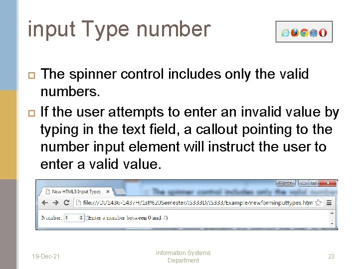
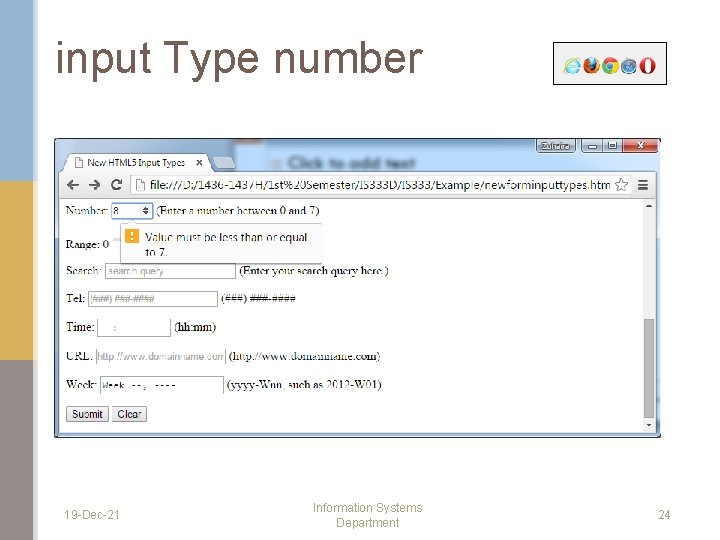
input Type number The spinner control includes only the valid numbers. If the user attempts to enter an invalid value by typing in the text field, a callout pointing to the number input element will instruct the user to enter a valid value. 19 -Dec-21 Information Systems Department 23

input Type number 19 -Dec-21 Information Systems Department 24

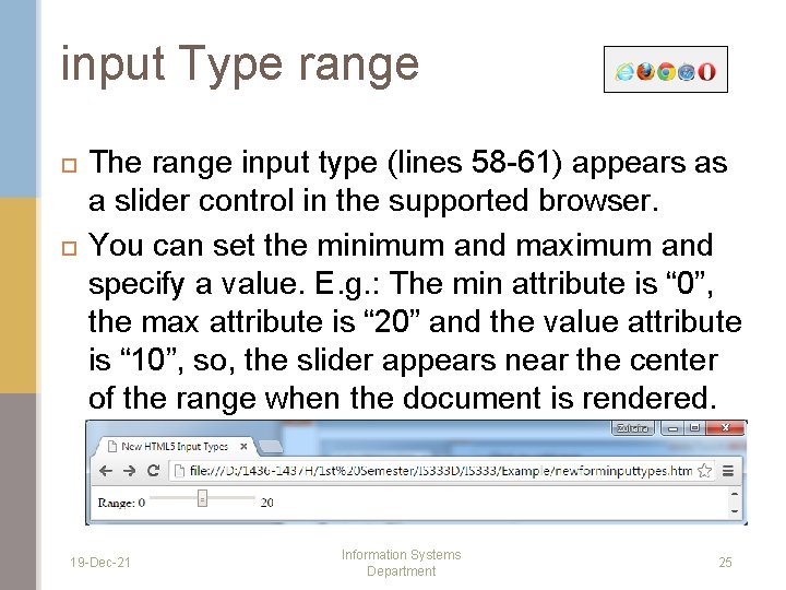
input Type range The range input type (lines 58 -61) appears as a slider control in the supported browser. You can set the minimum and maximum and specify a value. E. g. : The min attribute is “ 0”, the max attribute is “ 20” and the value attribute is “ 10”, so, the slider appears near the center of the range when the document is rendered. 19 -Dec-21 Information Systems Department 25

input Type range The range input type is inherently selfvalidating when it is rendered by the browser as a slider control, because the user is unable to move the slider outside the bounds of the minimum or maximum value. 19 -Dec-21 Information Systems Department 26

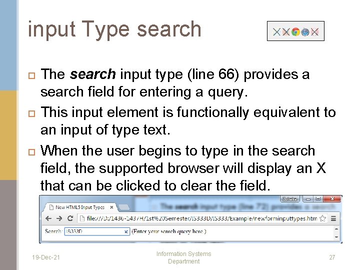
input Type search The search input type (line 66) provides a search field for entering a query. This input element is functionally equivalent to an input of type text. When the user begins to type in the search field, the supported browser will display an X that can be clicked to clear the field. 19 -Dec-21 Information Systems Department 27

input Type tel The tel input type (lines 71 -72) enables the user to enter a telephone number. The tel type is currently supported only in Safari 8. 19 -Dec-21 Information Systems Department 28

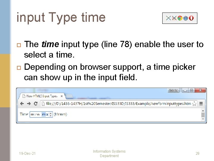
input Type time The time input type (line 78) enable the user to select a time. Depending on browser support, a time picker can show up in the input field. 19 -Dec-21 Information Systems Department 29

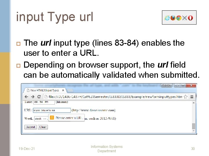
input Type url The url input type (lines 83 -84) enables the user to enter a URL. Depending on browser support, the url field can be automatically validated when submitted. 19 -Dec-21 Information Systems Department 30

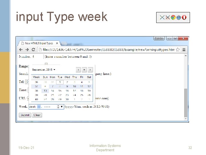
input Type week The week input type (line 90) enables a user to select week and year. Depending on browser support, a date picker can show up in the input field. 19 -Dec-21 Information Systems Department 31

input Type week 19 -Dec-21 Information Systems Department 32

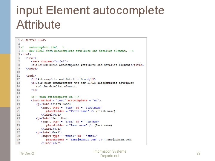
input Element autocomplete Attribute 19 -Dec-21 Information Systems Department 33

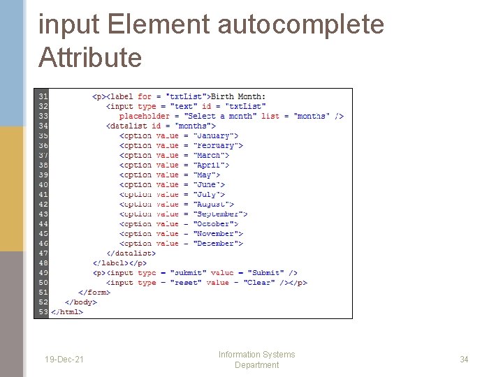
input Element autocomplete Attribute 19 -Dec-21 Information Systems Department 34

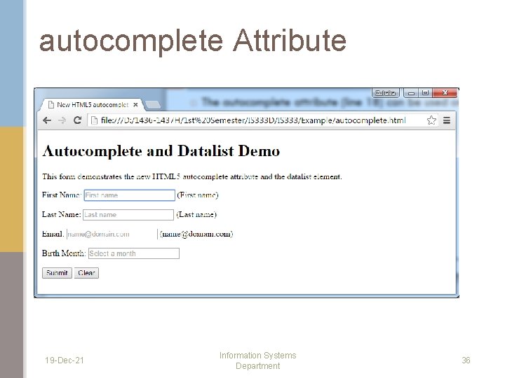
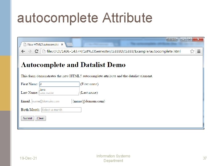
autocomplete Attribute The autocomplete attribute (line 18) can be used on input types to automatically fill in the user’s information based on previous input. The autocomplete attribute can be enabled for an entire form or just for specific elements. 19 -Dec-21 Information Systems Department 35

autocomplete Attribute 19 -Dec-21 Information Systems Department 36

autocomplete Attribute 19 -Dec-21 Information Systems Department 37

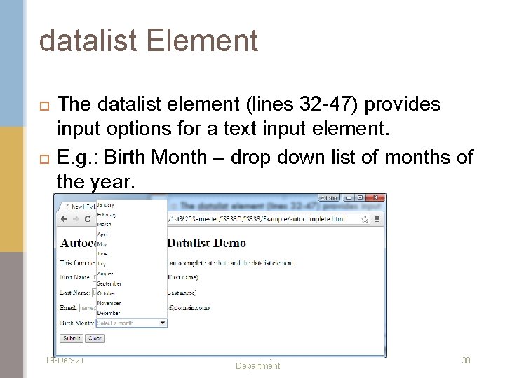
datalist Element The datalist element (lines 32 -47) provides input options for a text input element. E. g. : Birth Month – drop down list of months of the year. 19 -Dec-21 Information Systems Department 38

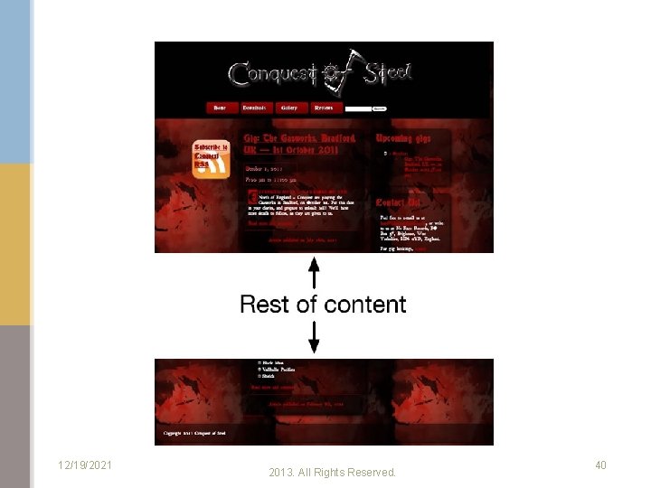
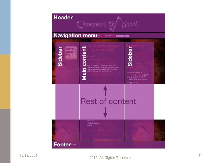
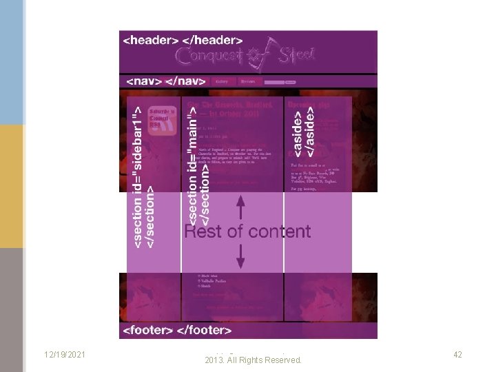
Page-Structure Elements HTML 5 introduces several new page-structure elements that meaningfully identify areas of the page as headers, footers, articles, navigation areas, asides, figures and more. Copyright © Pearson, Inc. 2013. All Rights Reserved.

12/19/2021 Copyright © Pearson, Inc. 2013. All Rights Reserved. 40

12/19/2021 Copyright © Pearson, Inc. 2013. All Rights Reserved. 41

12/19/2021 Copyright © Pearson, Inc. 2013. All Rights Reserved. 42

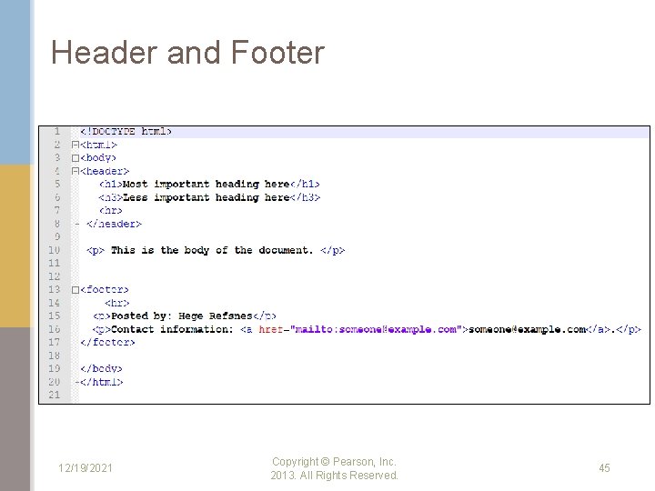
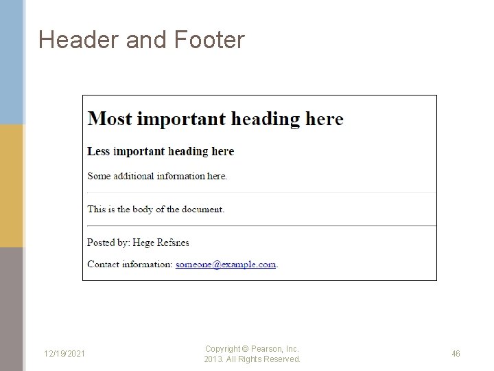
HTML <header> Element The <header> element represents a container for introductory content or a set of navigational links. A <header> element typically contains: • • • one or more heading elements (<h 1> - <h 6>) logo or icon authorship information You can have several <header> elements in one document. 12/19/2021 Copyright © Pearson, Inc. 2013. All Rights Reserved. 43

HTML <footer> Element The <footer> element defines a footer for a document or section. A <footer> element should contain information about its containing element. A <footer> element typically contains: • • • authorship information copyright information contact information sitemap back to top links related documents You can have several <footer> elements in one document. 12/19/2021 Copyright © Pearson, Inc. 2013. All Rights Reserved. 44

Header and Footer 12/19/2021 Copyright © Pearson, Inc. 2013. All Rights Reserved. 45

Header and Footer 12/19/2021 Copyright © Pearson, Inc. 2013. All Rights Reserved. 46

Note HTML elements with no content are called empty elements. HTML 5 does not require empty elements to be closed such as <img> 12/19/2021 Copyright © Pearson, Inc. 2013. All Rights Reserved. 47

Reference Internet and World Wide Web How To Program , Deitel & Deitel, 5 th Edition (Chapter 3) 19 -Dec-21 Information Systems Department 48