IRON MAN 3 MAGAZINE GENRE GENERAL INFORMATION Genre
- Slides: 13

IRON MAN 3 MAGAZINE

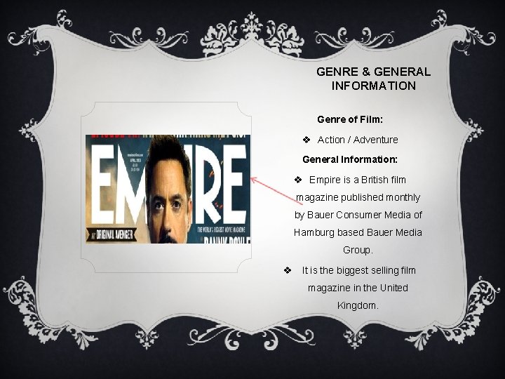
GENRE & GENERAL INFORMATION Genre of Film: v Action / Adventure General Information: v Empire is a British film magazine published monthly by Bauer Consumer Media of Hamburg based Bauer Media Group. v It is the biggest selling film magazine in the United Kingdom.

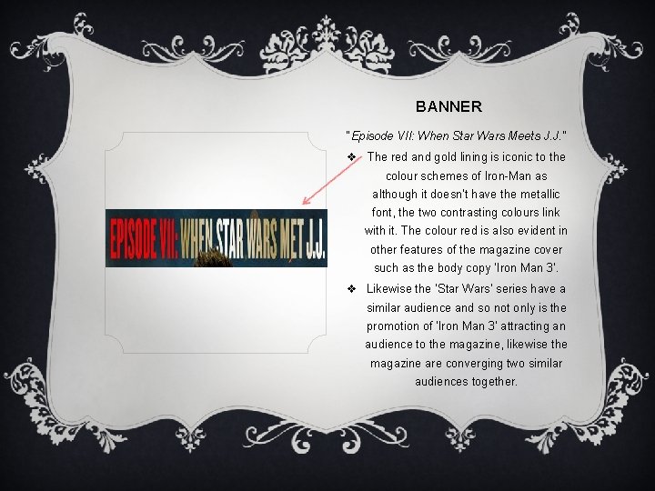
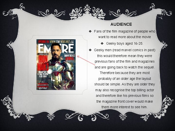
BANNER “Episode VII: When Star Wars Meets J. J. ” v The red and gold lining is iconic to the colour schemes of Iron-Man as although it doesn’t have the metallic font, the two contrasting colours link with it. The colour red is also evident in other features of the magazine cover such as the body copy ‘Iron Man 3’. v Likewise the ‘Star Wars’ series have a similar audience and so not only is the promotion of ‘Iron Man 3’ attracting an audience to the magazine, likewise the magazine are converging two similar audiences together.

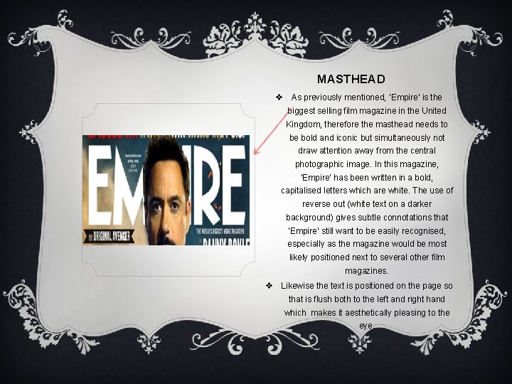
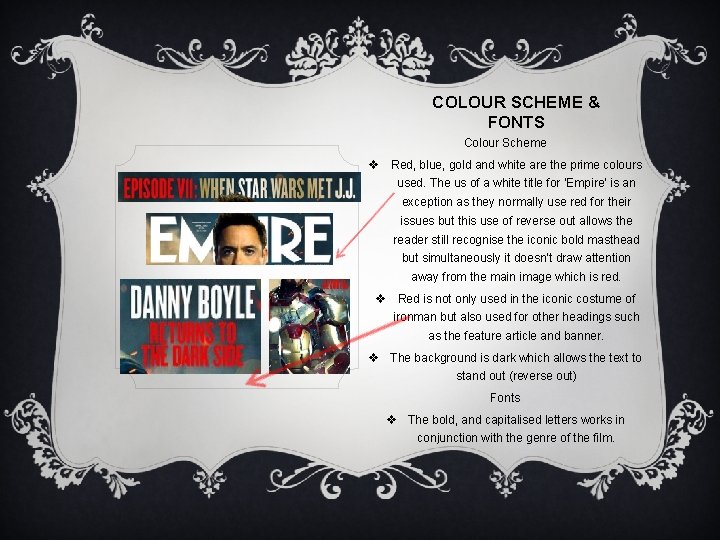
MASTHEAD v As previously mentioned, ‘Empire’ is the biggest selling film magazine in the United Kingdom, therefore the masthead needs to be bold and iconic but simultaneously not draw attention away from the central photographic image. In this magazine, ‘Empire’ has been written in a bold, capitalised letters which are white. The use of reverse out (white text on a darker background) gives subtle connotations that ‘Empire’ still want to be easily recognised, especially as the magazine would be most likely positioned next to several other film magazines. v Likewise the text is positioned on the page so that is flush both to the left and right hand which makes it aesthetically pleasing to the eye.

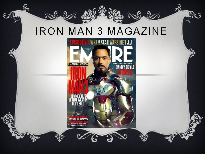
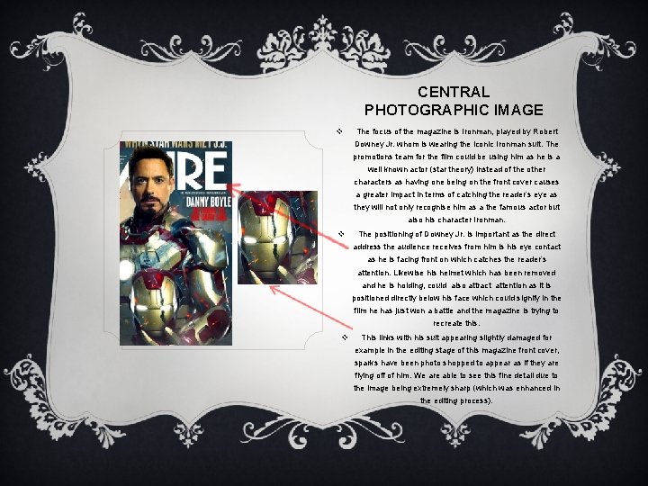
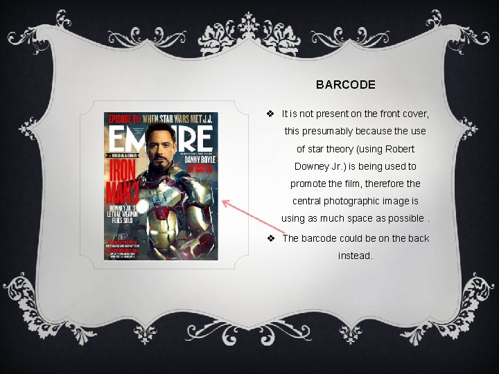
CENTRAL PHOTOGRAPHIC IMAGE v The focus of the magazine is Ironman, played by Robert Downey Jr. whom is wearing the iconic Ironman suit. The promotions team for the film could be using him as he is a well known actor (star theory) instead of the other characters as having one being on the front cover causes a greater impact in terms of catching the reader’s eye as they will not only recognise him as a the famous actor but also his character Ironman. v The positioning of Downey Jr. is important as the direct address the audience receives from him is his eye contact as he is facing front on which catches the reader’s attention. Likewise his helmet which has been removed and he is holding, could also attract attention as it is positioned directly below his face which could signify in the film he has just won a battle and the magazine is trying to recreate this. v This links with his suit appearing slightly damaged for example in the editing stage of this magazine front cover, sparks have been photo shopped to appear as if they are flying off of him. We are able to see this fine detail due to the image being extremely sharp (which was enhanced in the editing process).

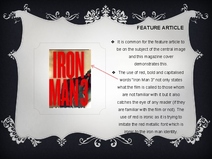
FEATURE ARTICLE v It is common for the feature article to be on the subject of the central image and this magazine cover demonstrates this. v The use of red, bold and capitalised words “Iron Man 3” not only states what the film is called to those whom are not familiar with it but it also catches the eye of any reader (if they are familiar with the film or not). The use of red is ironic as it is trying to imitate the red metallic font which is ironic to the iron man identity.

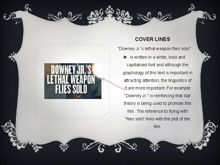
COVER LINES “Downey Jr. ’s lethal weapon flies solo” v Is written in a white, bold and capitalised font and although the graphology of this text is important in attracting attention, the linguistics of it are more important. For example “Downey Jr. ” is reinforcing that star theory is being used to promote this film. The reference to flying with “flies solo” links with the plot of the film.

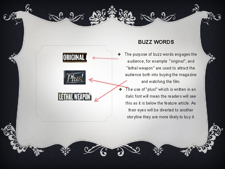
BUZZ WORDS v The purpose of buzz words engages the audience, for example “original”, and “lethal weapon” are used to attract the audience both into buying the magazine and watching the film. v The use of “plus!” which is written in an italic font will mean the readers will see this as it is below the feature article. As their eyes will be diverted to another storyline they are more likely to buy it.

BARCODE v It is not present on the front cover, this presumably because the use of star theory (using Robert Downey Jr. ) is being used to promote the film, therefore the central photographic image is using as much space as possible. v The barcode could be on the back instead.

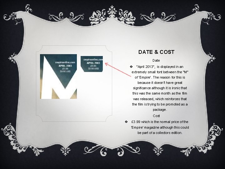
DATE & COST Date v “April 2013”, is displayed in an extremely small font between the “M” of ‘Empire’. The reason for this is because it doesn’t have great significance although it is ironic that this was the same month as the film was released, which reinforces that the film is trying to be promoted as a package. Cost v £ 3. 99 which is the normal price of the ‘Empire’ magazine although this could be part of a collectors edition.

COLOUR SCHEME & FONTS Colour Scheme v Red, blue, gold and white are the prime colours used. The us of a white title for ‘Empire’ is an exception as they normally use red for their issues but this use of reverse out allows the reader still recognise the iconic bold masthead but simultaneously it doesn’t draw attention away from the main image which is red. v Red is not only used in the iconic costume of ironman but also used for other headings such as the feature article and banner. v The background is dark which allows the text to stand out (reverse out) Fonts v The bold, and capitalised letters works in conjunction with the genre of the film.

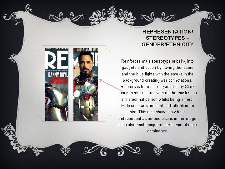
REPRESENTATION/ STEREOTYPES – GENDER/ETHNICITY Reinforces male stereotype of being into gadgets and action by having the lasers and the blue lights with the smoke in the background creating war connotations. Reinforces hero stereotype of Tony Stark being in his costume without the mask so is still a normal person whilst being a hero. Male seen as dominant – all attention on him. This also shows how he is independent as no-one else is in the image so is also reinforcing the stereotype of male dominance.

AUDIENCE v Fans of the film magazine of people who want to read more about the movie v Geeky boys aged 16 -25. v Geeky men (read marvel comics in past) this would therefore mean they were previous fans of the film and magazines and are going back to watch the sequel. Therefore because they are most probably of an older age the layout should be simple. As they are older they may also recognise the top billing actor and therefore like his previous films so the magazine front cover would make them more interest to see him.