Introduction to Methods Engineering and Operations Analysis Sections


, onto which")


- Slides: 28
Introduction to Methods Engineering and Operations Analysis Sections: 1. Evolution and Scope of Methods Engineering – part 1 2. How to Apply Methods Engineering – part 1 3. Basic Data Collection and Analysis Techniques – part 2 4. Automation and Methods Engineering – part 2
Introduction to Methods Engineering and Operations Analysis 3. Basic Data Collection and Analysis Techniques
Basic Data Collection & Analysis Tools 1. 2. 3. 4. 5. 6. 7. Histograms Pareto charts Pie charts Check sheets Defect concentration diagrams Scatter diagrams Cause and effect diagrams
1. Histogram A statistical graph consisting of bars representing different members of a population, in which the length of each bar indicates the frequency or relative frequency of each member § A useful tool because the analyst can quickly visualize the features of the data, such as: § Shape of the distribution § Any central tendency in the distribution § Approximations of the mean and mode § Amount of scatter in the data
Histogram for Data Display
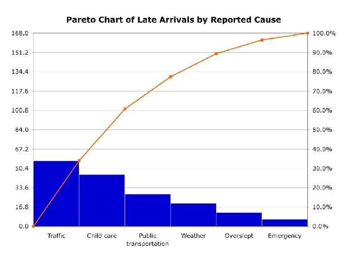
2. Pareto Chart Special form of histogram in which attribute data are arranged according to some criterion such as cost or value § Based on Pareto’s Law: “the vital few and the trivial many” (watch video)* § Often identified as the 80%-20% rule § 80% of a nation’s wealth is owned by 20% of the population § 80% of sales are accounted for by 20% of the SKUs (stock-keeping units)
Pareto Distribution
3. Pie Charts Example: Annual sales revenues and customer distributions for two years
4. Check Sheet Data collection tool generally used in preliminary stages of a study of a quality problem (video) § Data often entered by worker as check marks in a given category § Examples: § Process distribution check sheet - data on process variability § Defective item check sheet – types and frequencies of defects on the product § Defect location check sheet – where defects occur on the product
Check Sheet
5. Defect Concentration Diagram A drawing of the product (all relevant views), onto which the locations and frequencies of various defect types are added § Useful for analyzing the causes of product or part defects § By analyzing the defect types and corresponding locations, the underlying causes of the defects can possibly be identified
Defect Concentration Diagram Four views of refrigerator showing locations of surface defects
Defect Concentration Diagram
6. Scatter Diagrams An x-y plot of data collected on two variables, where a correlation between the variables is suspected § The data are plotted as pairs; for each xi value, there is a corresponding yi value § The shape of the collection of data points often reveals a pattern or relationship between the two variables
Scatter Diagram Effect of cobalt content on wear resistance for a cemented carbide cutting tool
7. Cause and Effect Diagram A graphical-tabular chart used to list and analyze the potential causes of a given problem § Can be used to identify which causes are most consequential and how to take corrective action against them § Also known as a “fishbone diagram” (video)
Cause and Effect Diagram
Introduction to Methods Engineering and Operations Analysis 4. Automation and Methods Engineering
Methods Engineering and Automation § USA Principle § Ten Strategies for Automation § Automation Migration Strategy.
USA Principle 1. Understand the existing process 2. Simplify the process 3. Automate the process
Understand the Existing Process § § What are the inputs? What are the outputs? Number and placement of inspections Number of moves and delays experienced by the work unit § Time spent in storage
Mathematical Models § What are the important output variables? § How are these output variables affected by inputs to the process? § Develop mathematical model of the process
Simplify the Process § What is the purpose of this operation or this transport? § Can this step be eliminated? § Is the most appropriate technology being used? § How can this step be simplified? § Can steps be combined? § Can steps be performed simultaneously? § Can steps be integrated into a manually operated production line?
Automate the Process § If simplification is successful, automation may not be necessary § Otherwise: automation is necessary § Ten strategies for automation § Automation migration strategy
Ten Strategies for Automation 1. 2. 3. 4. 5. 6. 7. 8. 9. 10. Specialization of operations Combined operations Simultaneous operations Integration of operations Increased flexibility Improved material handling and storage On‑line inspection Process control and optimization Plant operations control Computer integrated manufacturing (CIM)
Automation Migration Strategy § Phase 1: Manual production usingle station manned cells operating independently § Phase 2: Automated production usingle station automated cells operating independently. § Phase 3: Automated integrated production using a multi-station automated system with serial operations and automated transfer of work units between stations.
Automation Migration Strategy