Introduction to Data Analysis in Python for Physics


- Slides: 25

Introduction to Data Analysis in Python for Physics Laboratories Dr. Peter T. Gallagher & Dr. Matthias Möbius School of Physics Trinity College Dublin School of Physics

What is Python? • Python is an interactive language that allows you to write programs to: – Plot data – Analyse data – Model data • It is straight-forward to learn, relatively fast, and widely used in physics, astronomy, mathematics, computer science, etc. It’s also free!

Scientific PYthon Development Envi. Ronment (Spyder) • Spyder is an interactive development environment (IDE) that is freely available for Mac, PC and Linux. • General information on Spyder is available at: http: //code. google. com/p/spyderlib/ • For installation on your home computer or laptop, you can consult http: //code. google. com/p/spyderlib/wiki/Installation (available on PC, Mac and Linux)

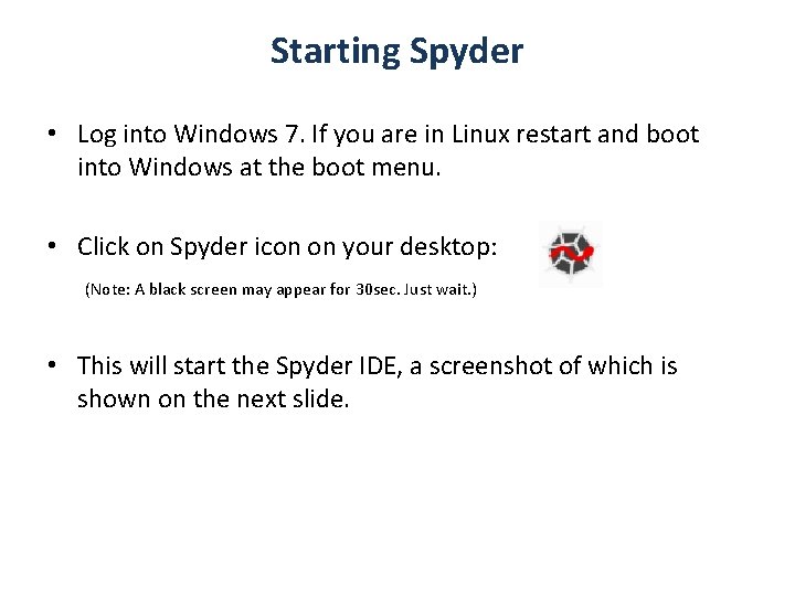
Starting Spyder • Log into Windows 7. If you are in Linux restart and boot into Windows at the boot menu. • Click on Spyder icon on your desktop: (Note: A black screen may appear for 30 sec. Just wait. ) • This will start the Spyder IDE, a screenshot of which is shown on the next slide.

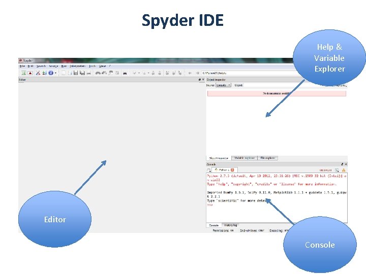
Spyder IDE Help & Variable Explorer Editor Console

Set your global directory • Go to “Tools” and click on “Preferences”. Set global directory to your network folder (usually S: ). You may want to create a new folder for your Python scripts. e. g. S: Python and change the global directory accordingly. • Also, select “the global working directory” for “open file” and “new file”. Do not store the files on the local disk (C: ) !

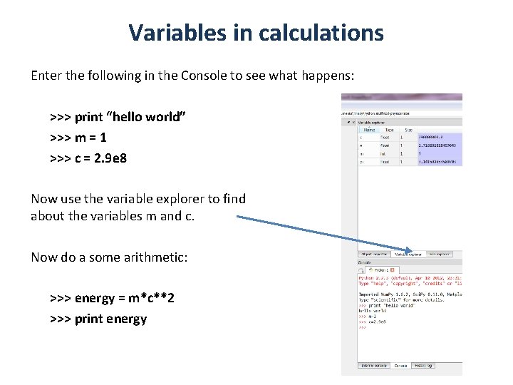
Variables in calculations Enter the following in the Console to see what happens: >>> print “hello world” >>> m = 1 >>> c = 2. 9 e 8 Now use the variable explorer to find about the variables m and c. Now do a some arithmetic: >>> energy = m*c**2 >>> print energy out more

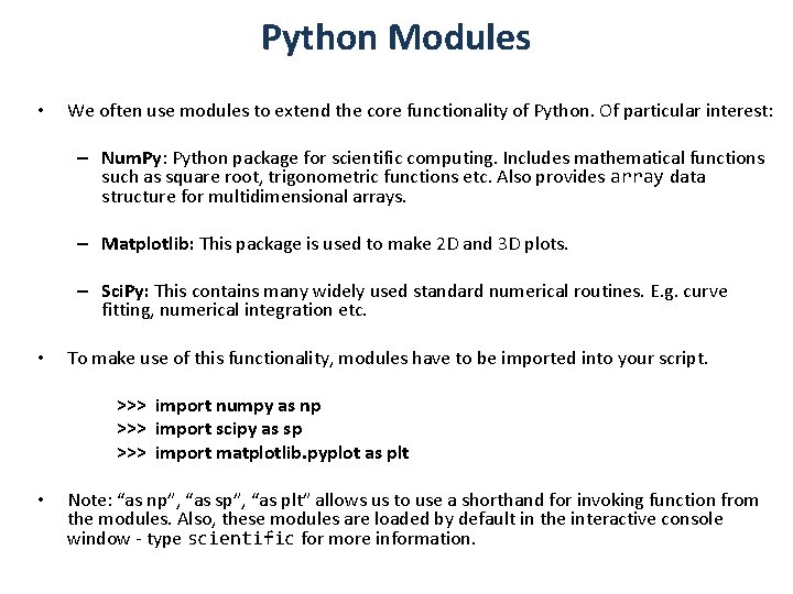
Python Modules • We often use modules to extend the core functionality of Python. Of particular interest: – Num. Py: Python package for scientific computing. Includes mathematical functions such as square root, trigonometric functions etc. Also provides array data structure for multidimensional arrays. – Matplotlib: This package is used to make 2 D and 3 D plots. – Sci. Py: This contains many widely used standard numerical routines. E. g. curve fitting, numerical integration etc. • To make use of this functionality, modules have to be imported into your script. >>> import numpy as np >>> import scipy as sp >>> import matplotlib. pyplot as plt • Note: “as np”, “as sp”, “as plt” allows us to use a shorthand for invoking function from the modules. Also, these modules are loaded by default in the interactive console window - type scientific for more information.

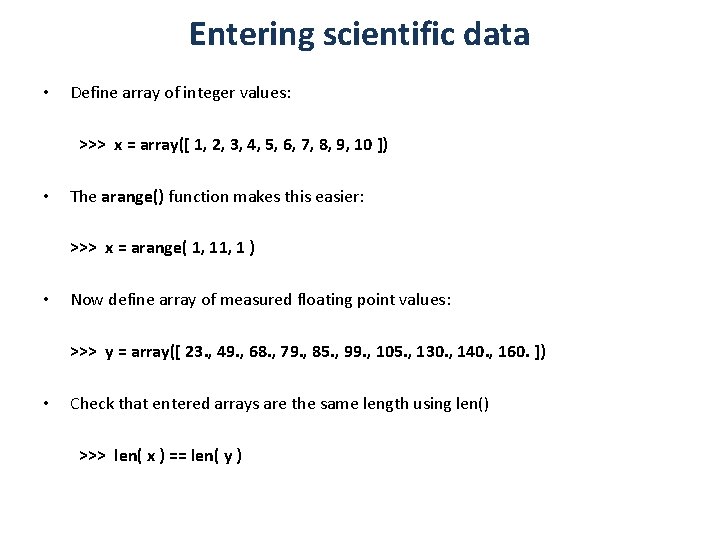
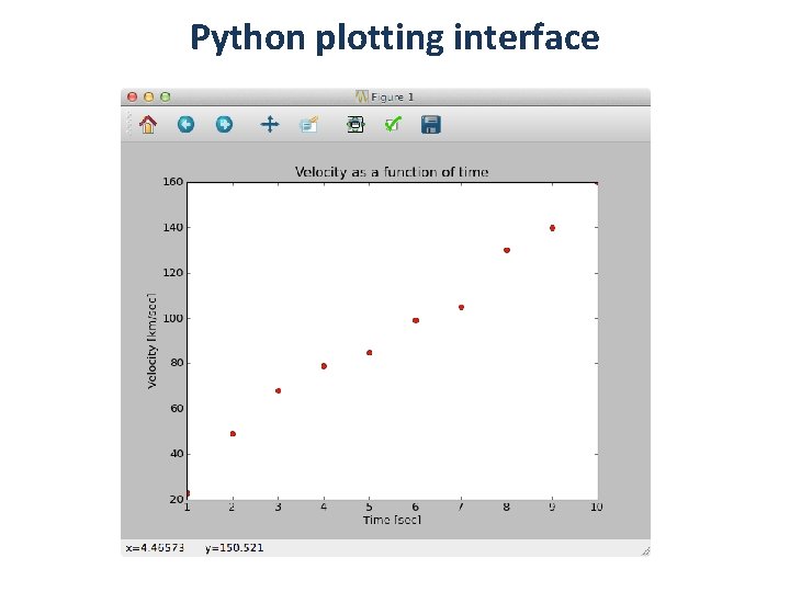
Entering scientific data • Define array of integer values: >>> x = array([ 1, 2, 3, 4, 5, 6, 7, 8, 9, 10 ]) • The arange() function makes this easier: >>> x = arange( 1, 1 ) • Now define array of measured floating point values: >>> y = array([ 23. , 49. , 68. , 79. , 85. , 99. , 105. , 130. , 140. , 160. ]) • Check that entered arrays are the same length using len() >>> len( x ) == len( y )

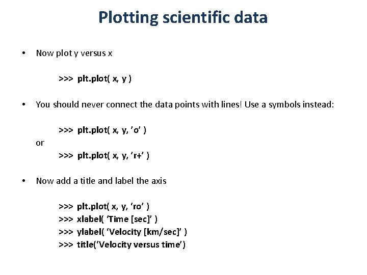
Plotting scientific data • Now plot y versus x >>> plt. plot( x, y ) • You should never connect the data points with lines! Use a symbols instead: >>> plt. plot( x, y, ’o’ ) or >>> plt. plot( x, y, ’r+’ ) • Now add a title and label the axis >>> >>> plt. plot( x, y, ‘ro’ ) xlabel( ‘Time [sec]’ ) ylabel( ‘Velocity [km/sec]’ ) title(‘Velocity versus time’)

Python plotting interface

Plotting scientific data • An easy way of plotting data is using >>> plt. scatter( x, y ) The following functions are useful for logarithmic plots >>> plt. loglog( x, y ) >>> plt. semilogx( x, y ) >>> plt. semilogy( x, y )

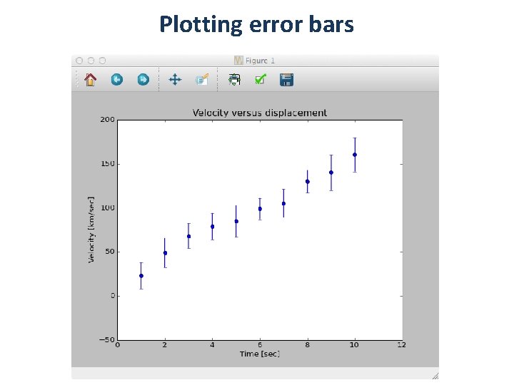
Plotting error bars • Now let’s add uncertainties to the y values: >>> y_sig = array( [ 15. , 17. , 14. , 15. , 18. , 12. , 16. , 13. , 20. , 19. ]) • Check that there are 10 elements in the array >>> len( y_sig ) • Now plot the data with the uncertainties in the y-axis >>> >>> plt. errorbar( x, y, y_sig, fmt = ‘o’ ) xlabel( ‘Time [sec]’ ) ylabel( ‘Velocity [km/sec]’ ) title(‘Velocity versus displacement’)

Plotting error bars

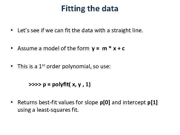
Fitting the data • Let’s see if we can fit the data with a straight line. • Assume a model of the form y = m * x + c • This is a 1 st order polynomial, so use: >>>> p = polyfit( x, y , 1) • Returns best-fit values for slope p[0] and intercept p[1] using a least-squares fit.

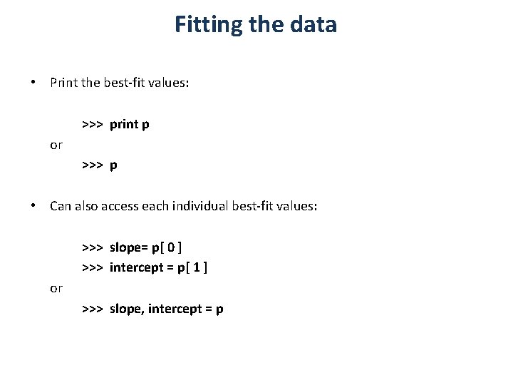
Fitting the data • Print the best-fit values: >>> print p or >>> p • Can also access each individual best-fit values: >>> slope= p[ 0 ] >>> intercept = p[ 1 ] or >>> slope, intercept = p

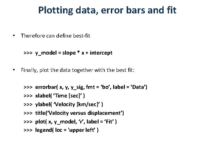
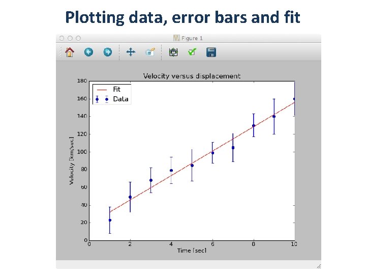
Plotting data, error bars and fit • Therefore can define best-fit >>> y_model = slope * x + intercept • Finally, plot the data together with the best fit: >>> >>> >>> errorbar( x, y, y_sig, fmt = ‘bo’, label = ‘Data’) xlabel( ‘Time [sec]’ ) ylabel( ‘Velocity [km/sec]’ ) title(‘Velocity versus displacement’) plot( x, y_model, ‘r’, label = ‘Fit’ ) legend( loc = 'upper left’ )

Plotting data, error bars and fit

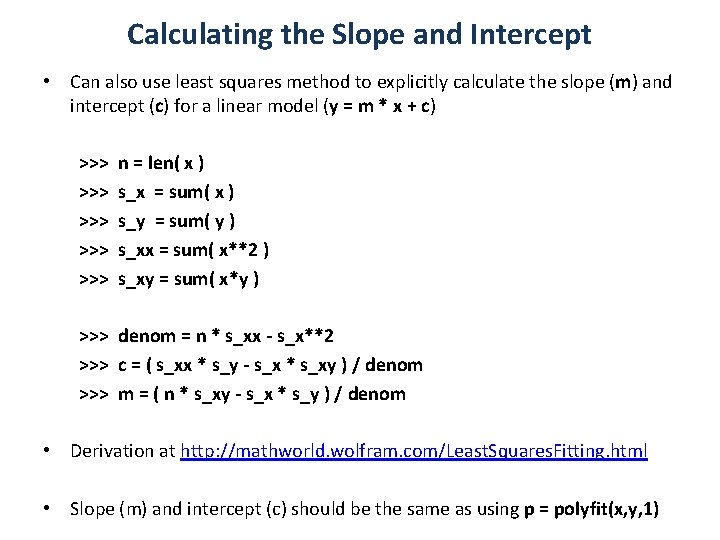
Calculating the Slope and Intercept • Can also use least squares method to explicitly calculate the slope (m) and intercept (c) for a linear model (y = m * x + c) >>> >>> >>> n = len( x ) s_x = sum( x ) s_y = sum( y ) s_xx = sum( x**2 ) s_xy = sum( x*y ) >>> denom = n * s_xx - s_x**2 >>> c = ( s_xx * s_y - s_x * s_xy ) / denom >>> m = ( n * s_xy - s_x * s_y ) / denom • Derivation at http: //mathworld. wolfram. com/Least. Squares. Fitting. html • Slope (m) and intercept (c) should be the same as using p = polyfit(x, y, 1)

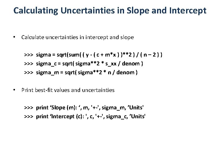
Calculating Uncertainties in Slope and Intercept • Calculate uncertainties in intercept and slope >>> sigma = sqrt(sum( ( y - ( c + m*x ) )**2 ) / ( n – 2 ) ) >>> sigma_c = sqrt( sigma**2 * s_xx / denom ) >>> sigma_m = sqrt( sigma**2 * n / denom ) • Print best-fit values and uncertainties >>> print ‘Slope (m): ‘, m, '+-', sigma_m, ’Units' >>> print ‘Intercept (c): ', c, '+-', sigma_c, ’Units'

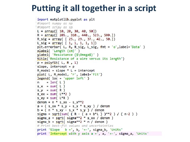
Putting it all together in a script

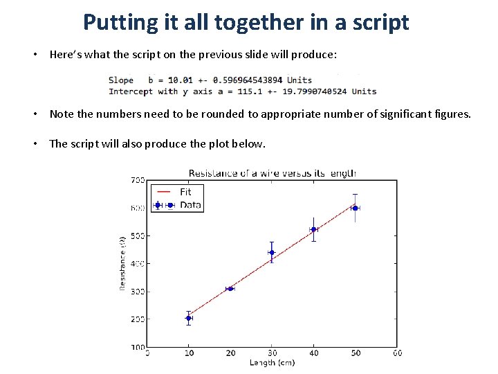
Putting it all together in a script • Here’s what the script on the previous slide will produce: • Note the numbers need to be rounded to appropriate number of significant figures. • The script will also produce the plot below.

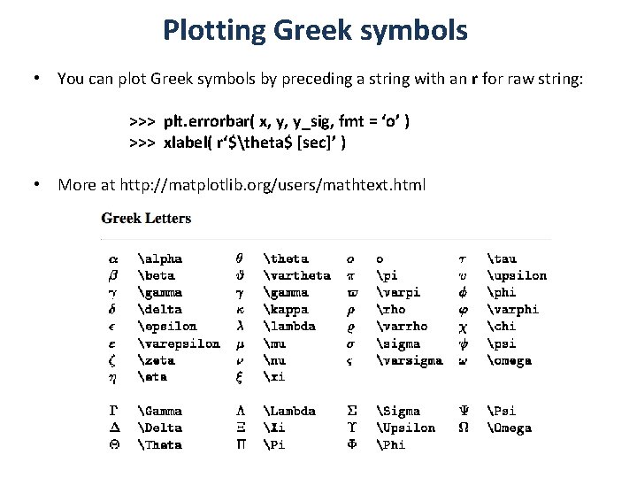
Plotting Greek symbols • You can plot Greek symbols by preceding a string with an r for raw string: >>> plt. errorbar( x, y, y_sig, fmt = ‘o’ ) >>> xlabel( r‘$theta$ [sec]’ ) • More at http: //matplotlib. org/users/mathtext. html

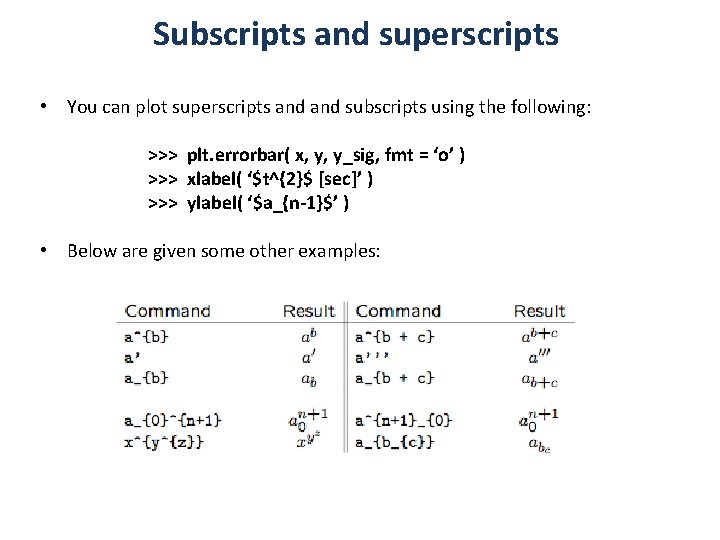
Subscripts and superscripts • You can plot superscripts and subscripts using the following: >>> plt. errorbar( x, y, y_sig, fmt = ‘o’ ) >>> xlabel( ‘$t^{2}$ [sec]’ ) >>> ylabel( ‘$a_{n-1}$’ ) • Below are given some other examples:

Additional Reading How to Create a Graph in Python: http: //www. thetechrepo. com/main-articles/465 -how -to-create-a-graph-in-python A First Program: Straight Line Fitting: https: //alexandria. astro. cf. ac. uk/Joomlapython/index. php/week 4 -straight-line-fitting Good general introduction to Python for data analysis: http: //www. astro. unibonn. de/~rschaaf/Python 2008/ Codecademy’s excellent introduction to Python basics: http: //www. codecademy. com/tracks/python Khan Academy’s excellent introduction to Python: http: //www. khanacademy. org/science/computer-science