Introduction to Computer Graphics Color Color To understand
- Slides: 74

Introduction to Computer Graphics Color

Color To understand how to make realistic images, we need a basic understanding of the physics and physiology of vision. Here we step away from the code and math for a bit to talk about basic principles.

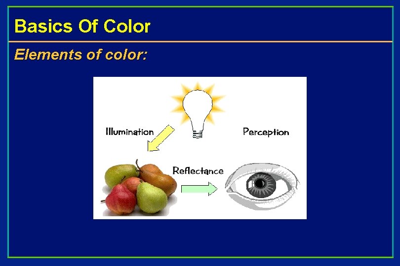
Basics Of Color Elements of color:

Basics of Color Physics: • Illumination – Electromagnetic spectra • Reflection – Material properties – Surface geometry and microgeometry (i. e. , polished versus matte versus brushed) Perception • Physiology and neurophysiology • Perceptual psychology

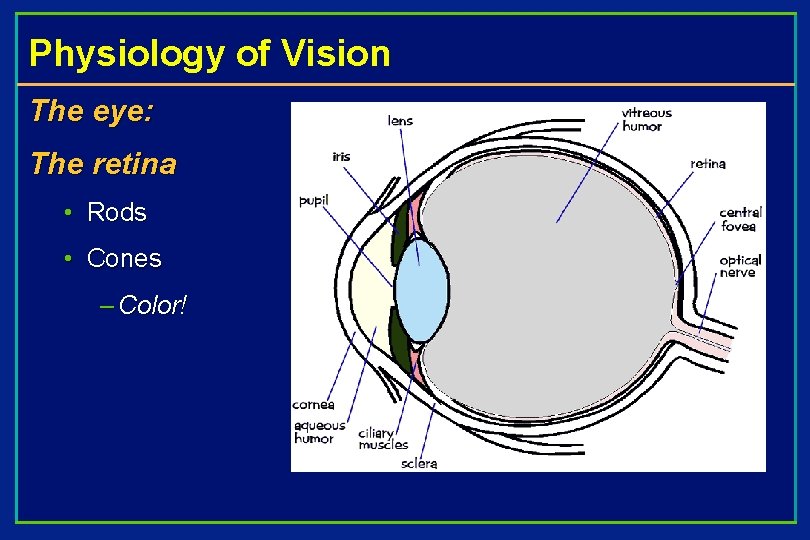
Physiology of Vision The eye: The retina • Rods • Cones – Color!

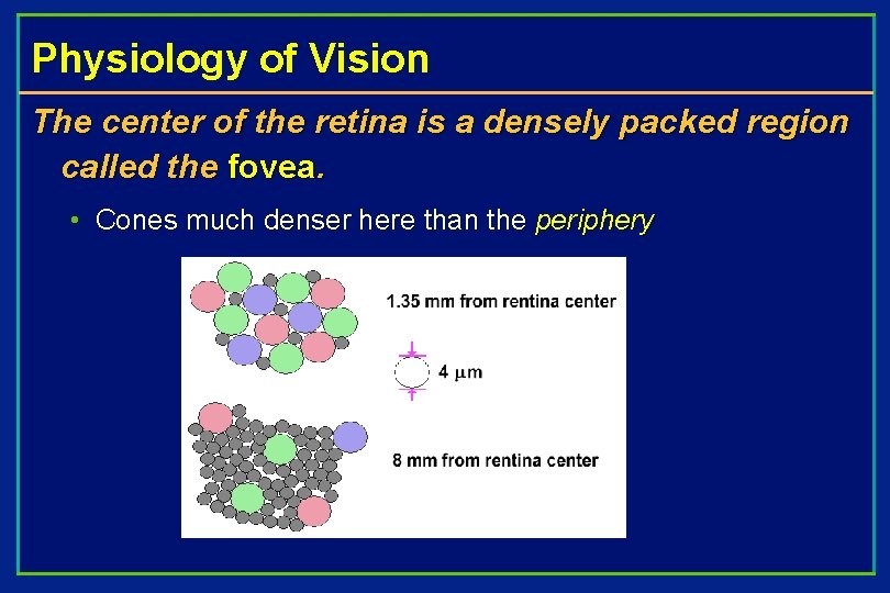
Physiology of Vision The center of the retina is a densely packed region called the fovea. • Cones much denser here than the periphery

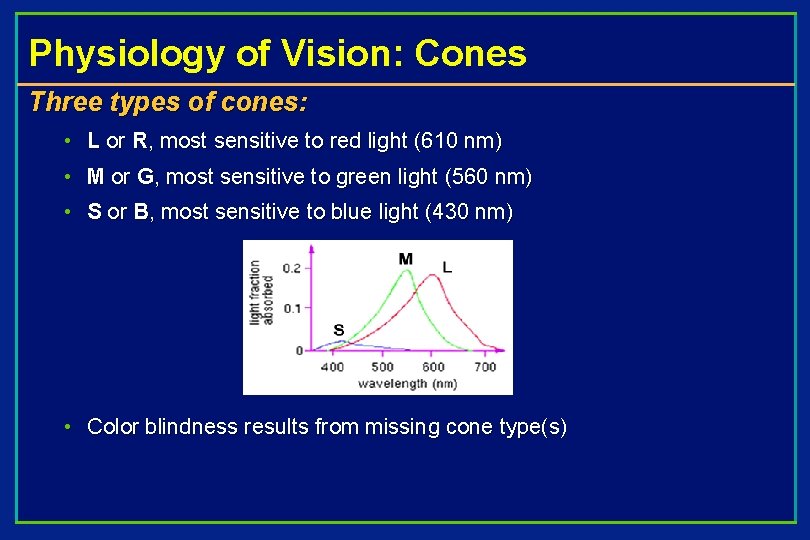
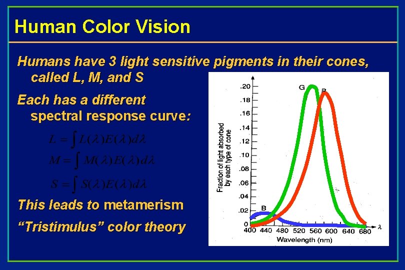
Physiology of Vision: Cones Three types of cones: • L or R, most sensitive to red light (610 nm) • M or G, most sensitive to green light (560 nm) • S or B, most sensitive to blue light (430 nm) • Color blindness results from missing cone type(s)

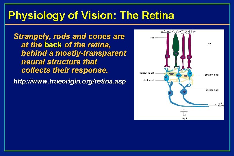
Physiology of Vision: The Retina Strangely, rods and cones are at the back of the retina, behind a mostly-transparent neural structure that collects their response. http: //www. trueorigin. org/retina. asp

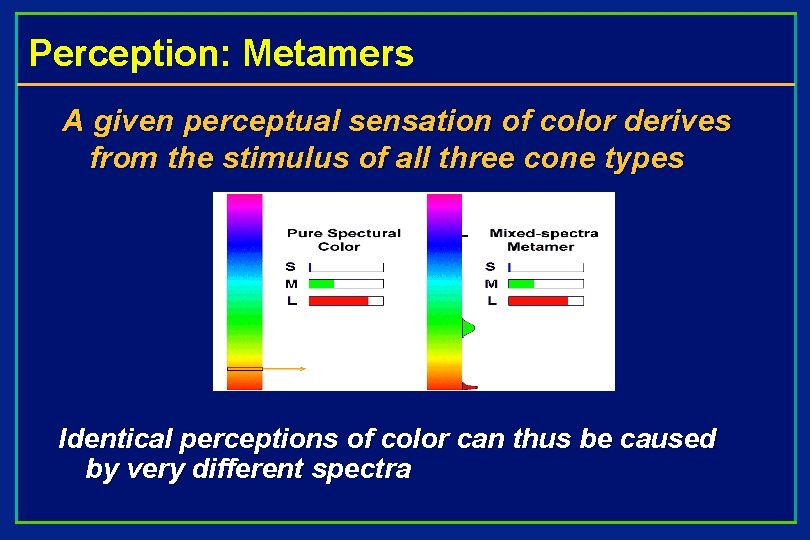
Perception: Metamers A given perceptual sensation of color derives from the stimulus of all three cone types Identical perceptions of color can thus be caused by very different spectra

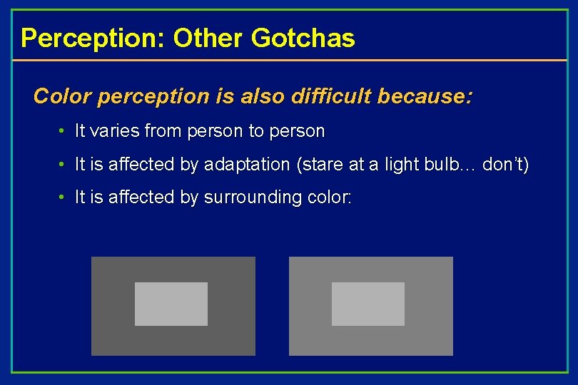
Perception: Other Gotchas Color perception is also difficult because: • It varies from person to person • It is affected by adaptation (stare at a light bulb… don’t) • It is affected by surrounding color:

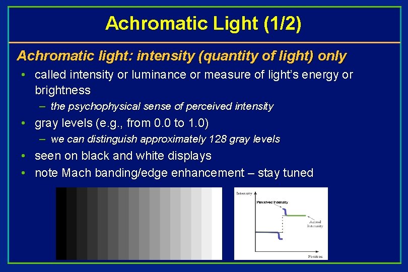
Achromatic Light (1/2) Achromatic light: intensity (quantity of light) only • called intensity or luminance or measure of light’s energy or brightness – the psychophysical sense of perceived intensity • gray levels (e. g. , from 0. 0 to 1. 0) – we can distinguish approximately 128 gray levels • seen on black and white displays • note Mach banding/edge enhancement – stay tuned

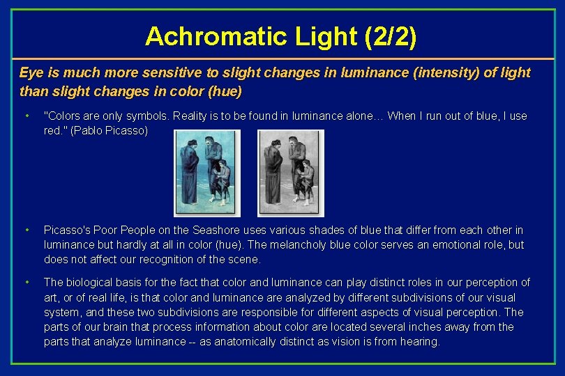
Achromatic Light (2/2) Eye is much more sensitive to slight changes in luminance (intensity) of light than slight changes in color (hue) • "Colors are only symbols. Reality is to be found in luminance alone… When I run out of blue, I use red. " (Pablo Picasso) • Picasso's Poor People on the Seashore uses various shades of blue that differ from each other in luminance but hardly at all in color (hue). The melancholy blue color serves an emotional role, but does not affect our recognition of the scene. • The biological basis for the fact that color and luminance can play distinct roles in our perception of art, or of real life, is that color and luminance are analyzed by different subdivisions of our visual system, and these two subdivisions are responsible for different aspects of visual perception. The parts of our brain that process information about color are located several inches away from the parts that analyze luminance -- as anatomically distinct as vision is from hearing.

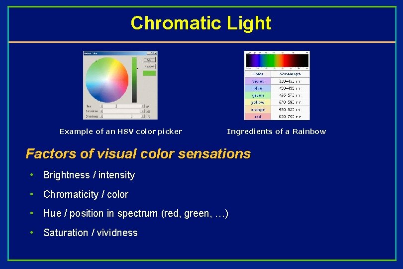
Chromatic Light Example of an HSV color picker Ingredients of a Rainbow Factors of visual color sensations • Brightness / intensity • Chromaticity / color • Hue / position in spectrum (red, green, …) • Saturation / vividness

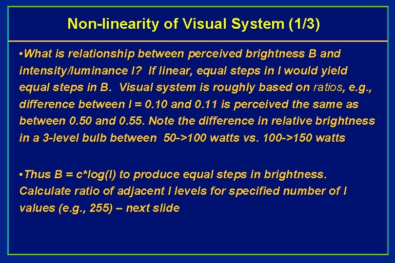
Non-linearity of Visual System (1/3) • What is relationship between perceived brightness B and intensity/luminance I? If linear, equal steps in I would yield equal steps in B. Visual system is roughly based on ratios, e. g. , difference between I = 0. 10 and 0. 11 is perceived the same as between 0. 50 and 0. 55. Note the difference in relative brightness in a 3 -level bulb between 50 ->100 watts vs. 100 ->150 watts • Thus B = c*log(I) to produce equal steps in brightness. Calculate ratio of adjacent I levels for specified number of I values (e. g. , 255) – next slide

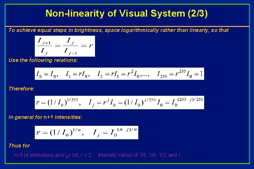
Non-linearity of Visual System (2/3) To achieve equal steps in brightness, space logarithmically rather than linearly, so that Use the following relations: Therefore: In general for n+1 intensities: Thus for n=3 (4 intensities) and I 0=1/8, r = 2, intensity values of 1/8, 1/4, 1/2, and 1

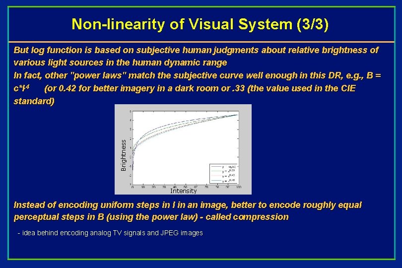
Non-linearity of Visual System (3/3) Brightness But log function is based on subjective human judgments about relative brightness of various light sources in the human dynamic range In fact, other "power laws" match the subjective curve well enough in this DR, e. g. , B = c*I. 4 (or 0. 42 for better imagery in a dark room or. 33 (the value used in the CIE standard) Intensity Instead of encoding uniform steps in I in an image, better to encode roughly equal perceptual steps in B (using the power law) - called compression - idea behind encoding analog TV signals and JPEG images

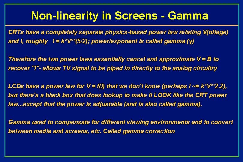
Non-linearity in Screens - Gamma CRTs have a completely separate physics-based power law relating V(oltage) and I, roughly I = k*V**(5/2); power/exponent is called gamma (γ) Therefore the two power laws essentially cancel and approximate V = B to recover "I"- allows TV signal to be piped in directly to the analog circuitry LCDs have a power law for V = f(I) that we don't know (perhaps I ~= k*V**2. 2), but there's a black box that does lookup to make it LOOK like the CRT power law. . . except that the power is adjustable (and is also called gamma). Gamma used to compensate for different viewing environments and to convert between media and screens, etc. Called gamma correction

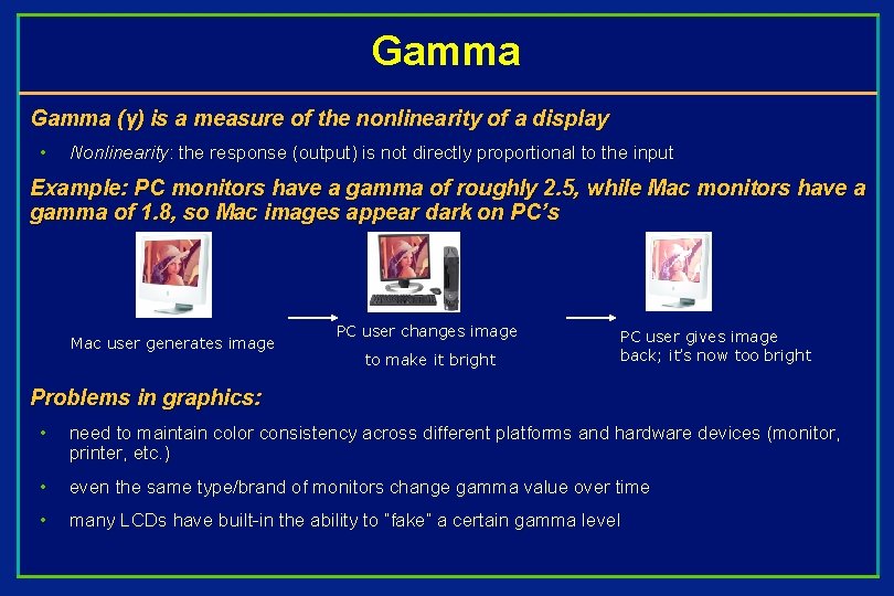
Gamma (γ) is a measure of the nonlinearity of a display • Nonlinearity: the response (output) is not directly proportional to the input Example: PC monitors have a gamma of roughly 2. 5, while Mac monitors have a gamma of 1. 8, so Mac images appear dark on PC’s Mac user generates image PC user changes image to make it bright PC user gives image back; it’s now too bright Problems in graphics: • need to maintain color consistency across different platforms and hardware devices (monitor, printer, etc. ) • even the same type/brand of monitors change gamma value over time • many LCDs have built-in the ability to “fake” a certain gamma level

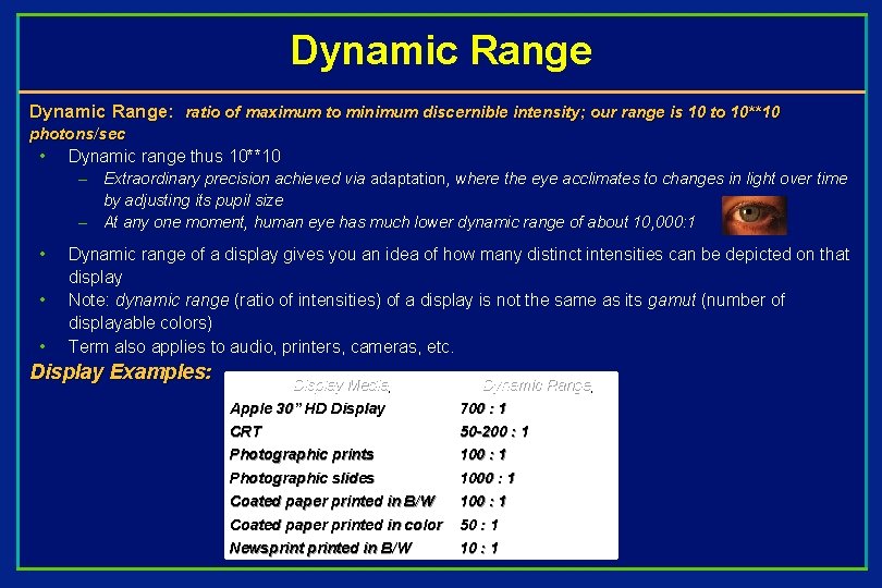
Dynamic Range: ratio of maximum to minimum discernible intensity; our range is 10 to 10** 10 photons/sec • Dynamic range thus 10**10 – Extraordinary precision achieved via adaptation, where the eye acclimates to changes in light over time by adjusting its pupil size – At any one moment, human eye has much lower dynamic range of about 10, 000: 1 • • • Dynamic range of a display gives you an idea of how many distinct intensities can be depicted on that display Note: dynamic range (ratio of intensities) of a display is not the same as its gamut (number of displayable colors) Term also applies to audio, printers, cameras, etc. Display Examples: Display Media Apple 30” HD Display Dynamic Range 700 : 1 CRT Photographic prints 50 -200 : 1 100 : 1 Photographic slides Coated paper printed in B/W 1000 : 1 100 : 1 Coated paper printed in color Newsprinted in B/W 50 : 1 10 : 1

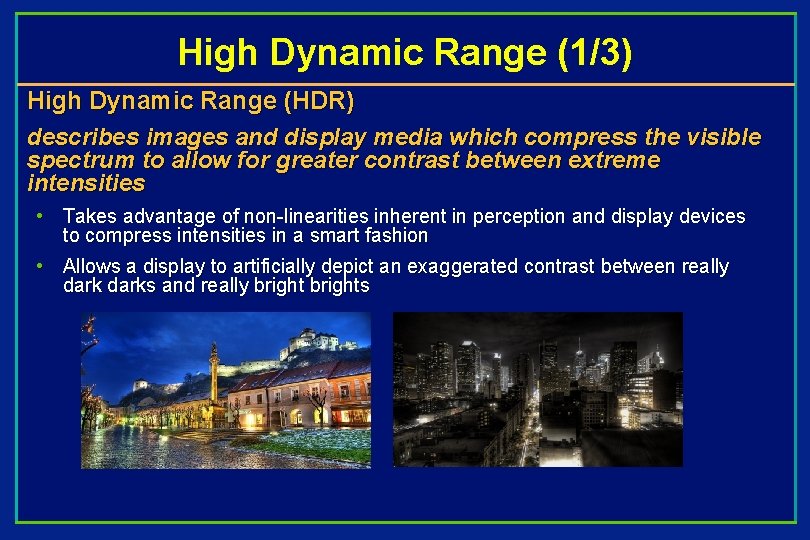
High Dynamic Range (1/3) High Dynamic Range (HDR) describes images and display media which compress the visible spectrum to allow for greater contrast between extreme intensities • Takes advantage of non-linearities inherent in perception and display devices to compress intensities in a smart fashion • Allows a display to artificially depict an exaggerated contrast between really darks and really brights

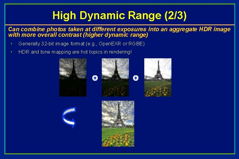
High Dynamic Range (2/3) Can combine photos taken at different exposures into an aggregate HDR image with more overall contrast (higher dynamic range) • Generally 32 -bit image format (e. g. , Open. EXR or RGBE) • HDR and tone mapping are hot topics in rendering!

High Dynamic Range (3/3) To avoid the inevitable lossy compression of squeezing a huge DR taken by a camera or rendered into, typically, 255 discrete intensity bins, cut DR into n sub -intervals and encode each into its own separate image. Then use a function (a linear or whatever ramp) to emphasize the most representative sub-interval and either clamp the ones on either side of the chosen one to min and max I values, or even use, say, slow exponentials to allow a little discrimination of values outside the chosen sub-interval. This function is called the tone map. Expensive displays with many more intensity levels specially designed for HDR images produce incredibly rich images: “Most monitors have a dynamic range of between 300: 1 or 400: 1, but the Sunnybrook (http: //en. wikipedia. org/wiki/Bride's_Hill) HDR display is a staggering 40, 000: 1. “

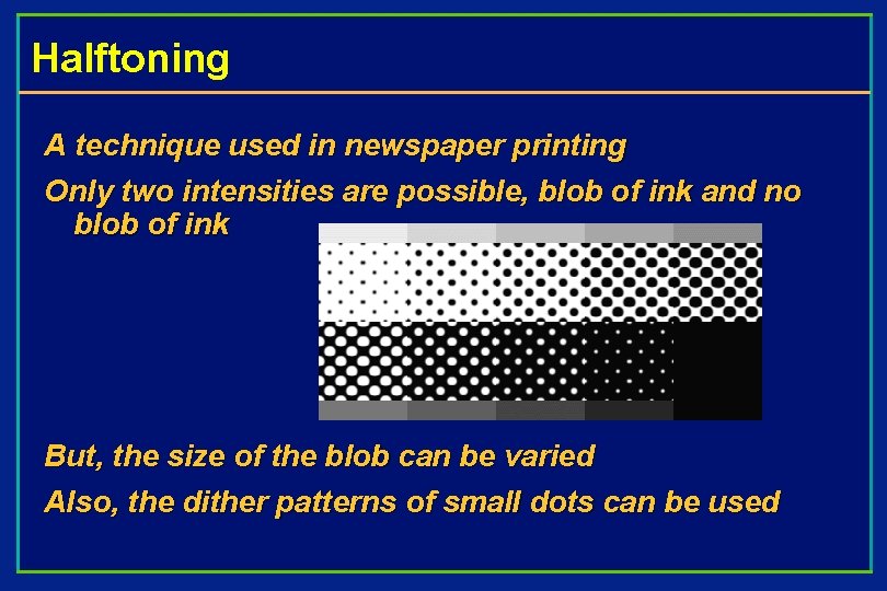
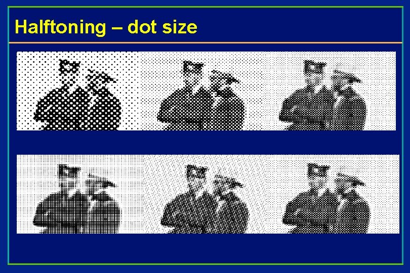
Halftoning A technique used in newspaper printing Only two intensities are possible, blob of ink and no blob of ink But, the size of the blob can be varied Also, the dither patterns of small dots can be used

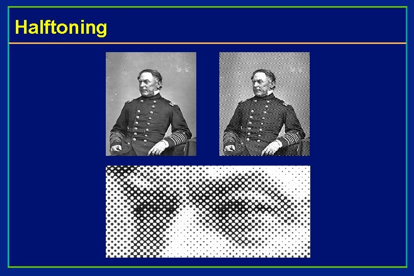
Halftoning

Halftoning – dot size

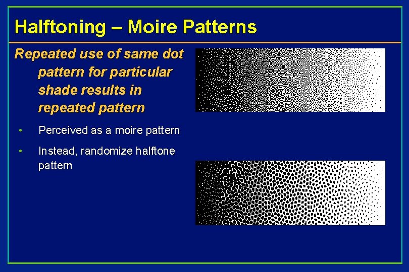
Halftoning – Moire Patterns Repeated use of same dot pattern for particular shade results in repeated pattern • Perceived as a moire pattern • Instead, randomize halftone pattern

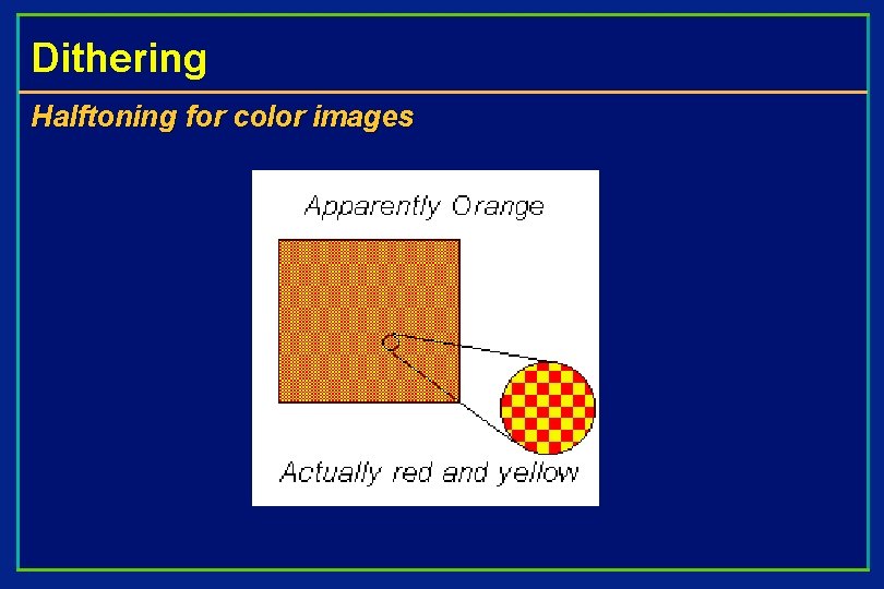
Dithering Halftoning for color images

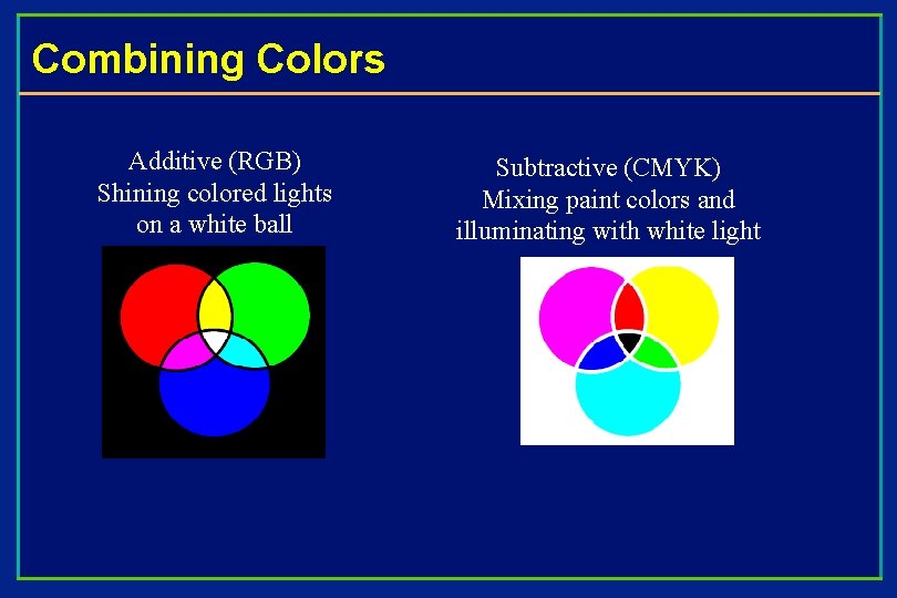
Combining Colors Additive (RGB) Shining colored lights on a white ball Subtractive (CMYK) Mixing paint colors and illuminating with white light

Specifying Color perception usually involves three quantities: • Hue: Distinguishes between colors like red, green, blue, etc • Saturation: How far the color is from a gray of equal intensity • Lightness: The perceived intensity of a reflecting object Sometimes lightness is called brightness if the object is emitting light instead of reflecting it. In order to use color precisely in computer graphics, we need to be able to specify and measure colors.

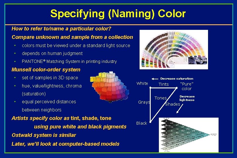
Specifying (Naming) Color How to refer to/name a particular color? Compare unknown and sample from a collection • colors must be viewed under a standard light source • depends on human judgment • PANTONE® Matching System in printing industry Munsell color-order system • set of samples in 3 D space • hue, value/lightness, chroma Decrease saturation White (saturation) • equal perceived distances Grays between neighbors Artists specify color as tint, shade, tone using pure white and black pigments Ostwald system is similar Later, we’ll look at computer-based models Black “Pure” color Tints Tones Decrease lightness Shades

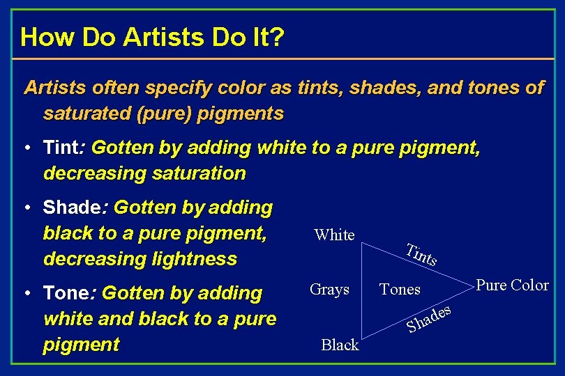
How Do Artists Do It? Artists often specify color as tints, shades, and tones of saturated (pure) pigments • Tint: Gotten by adding white to a pure pigment, decreasing saturation • Shade: Gotten by adding black to a pure pigment, decreasing lightness • Tone: Gotten by adding white and black to a pure pigment White Tin ts Grays Pure Color Tones s Black e d a Sh

Precise Color Specifications • Pigment-mixing is subjective --- depends on human observer, surrounding colors, lighting of the environment, etc • We need an objective color specification • Light is electromagnetic energy in the 400 to 700 nm wavelength range • Dominant wavelength is the wavelength of the color we “see” • Excitation purity is the proportion of pure colored light to white light • Luminance is the amount (or intensity) of the light

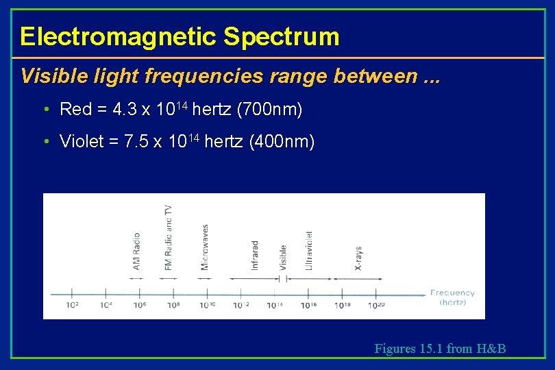
Electromagnetic Spectrum Visible light frequencies range between. . . • Red = 4. 3 x 10¹⁴ hertz (700 nm) • Violet = 7. 5 x 10¹⁴ hertz (400 nm) Figures 15. 1 from H&B

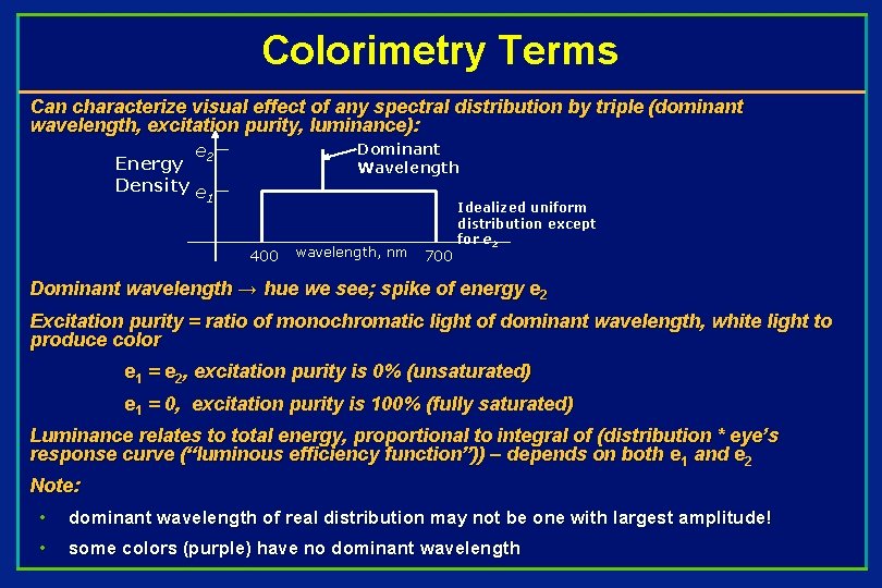
Colorimetry Terms Can characterize visual effect of any spectral distribution by triple (dominant wavelength, excitation purity, luminance): e 2 Dominant Wavelength Energy Density e 1 400 wavelength, nm 700 Idealized uniform distribution except for e 2 Dominant wavelength → hue we see; spike of energy e 2 Excitation purity = ratio of monochromatic light of dominant wavelength, white light to produce color e 1 = e 2, excitation purity is 0% (unsaturated) e 1 = 0, excitation purity is 100% (fully saturated) Luminance relates to total energy, proportional to integral of (distribution * eye’s response curve (“luminous efficiency function”)) – depends on both e 1 and e 2 Note: • dominant wavelength of real distribution may not be one with largest amplitude! • some colors (purple) have no dominant wavelength

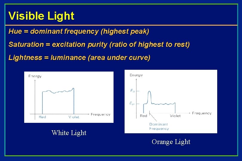
Visible Light Hue = dominant frequency (highest peak) Saturation = excitation purity (ratio of highest to rest) Lightness = luminance (area under curve) White Light Orange Light

How well do we see color? What color do we see the best? • Yellow-green at 550 nm What color do we see the worst? • Blue at 440 nm Flashback: Colortables (colormaps) for color storage • Which RGB value gets the most bits? Can perceive color differences of 10 nm at extremes (violet and red) and 2 nm between blue and yellow Metamers – different energy radiations look like the same color Color perception also affected by surrounding light and adaptation

Just noticeable difference (JND) 128 fully saturated hues can be distinguished Cannot perceive hue differences with less saturated light. Sensitivity to changes in saturation for a fixed hue and brightness ranges from 16 to 23 depending on hue. Talked about representing intensities last lecture

Human Color Vision Humans have 3 light sensitive pigments in their cones, called L, M, and S Each has a different spectral response curve: This leads to metamerism “Tristimulus” color theory

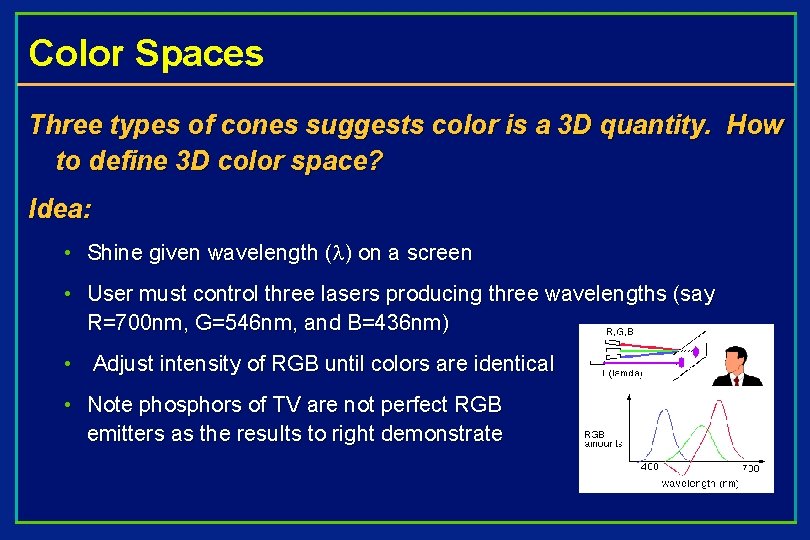
Color Spaces Three types of cones suggests color is a 3 D quantity. How to define 3 D color space? Idea: • Shine given wavelength ( ) on a screen • User must control three lasers producing three wavelengths (say R=700 nm, G=546 nm, and B=436 nm) • Adjust intensity of RGB until colors are identical • Note phosphors of TV are not perfect RGB emitters as the results to right demonstrate

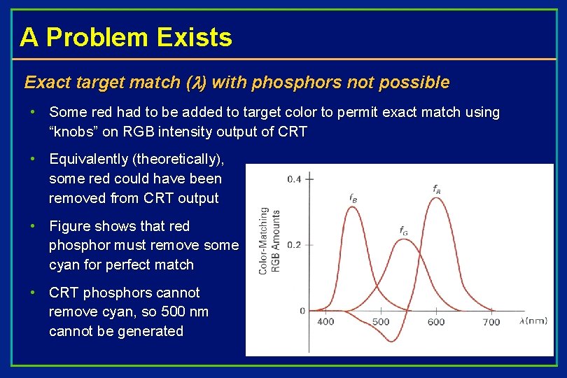
A Problem Exists Exact target match ( ) with phosphors not possible • Some red had to be added to target color to permit exact match using “knobs” on RGB intensity output of CRT • Equivalently (theoretically), some red could have been removed from CRT output • Figure shows that red phosphor must remove some cyan for perfect match • CRT phosphors cannot remove cyan, so 500 nm cannot be generated

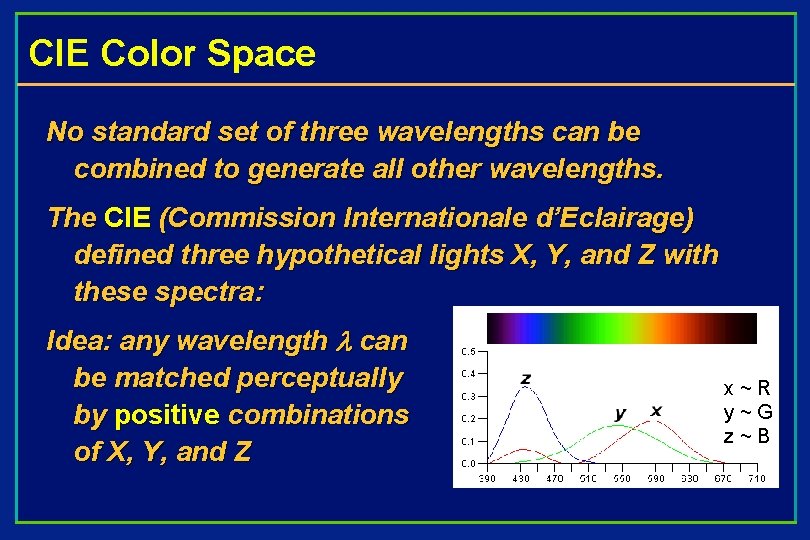
CIE Color Space No standard set of three wavelengths can be combined to generate all other wavelengths. The CIE (Commission Internationale d’Eclairage) defined three hypothetical lights X, Y, and Z with these spectra: Idea: any wavelength can be matched perceptually by positive combinations of X, Y, and Z x ~ R y ~ G z ~ B

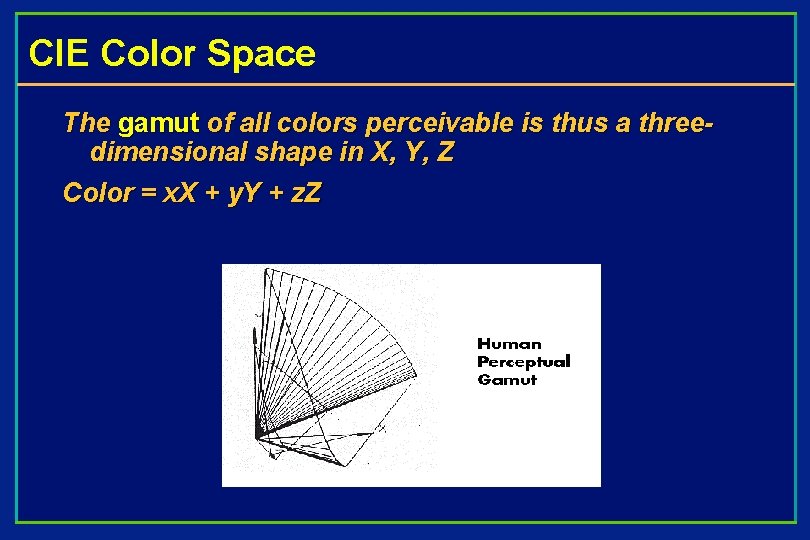
CIE Color Space The gamut of all colors perceivable is thus a threedimensional shape in X, Y, Z Color = x. X + y. Y + z. Z

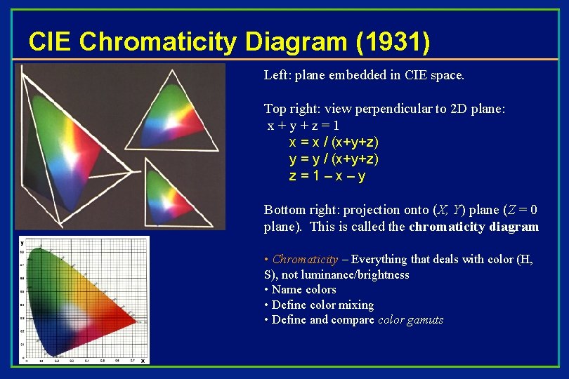
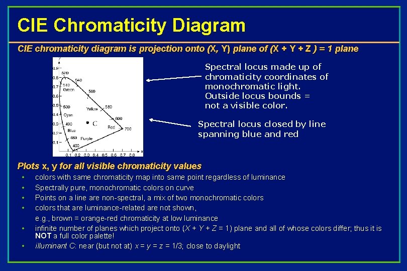
CIE Chromaticity Diagram (1931) Left: plane embedded in CIE space. Top right: view perpendicular to 2 D plane: x+y+z=1 x = x / (x+y+z) y = y / (x+y+z) z = 1 – x – y Bottom right: projection onto (X, Y) plane (Z = 0 plane). This is called the chromaticity diagram • Chromaticity – Everything that deals with color (H, S), not luminance/brightness • Name colors • Define color mixing • Define and compare color gamuts

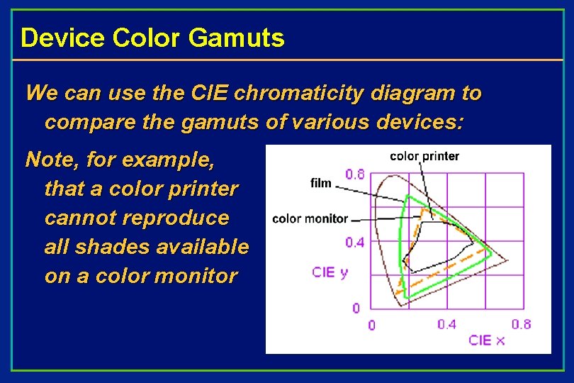
Device Color Gamuts We can use the CIE chromaticity diagram to compare the gamuts of various devices: Note, for example, that a color printer cannot reproduce all shades available on a color monitor

CIE Chromaticity Diagram CIE chromaticity diagram is projection onto (X, Y) plane of (X + Y + Z ) = 1 plane Spectral locus made up of chromaticity coordinates of monochromatic light. Outside locus bounds = not a visible color. Spectral locus closed by line spanning blue and red Plots x, y for all visible chromaticity values • • • colors with same chromaticity map into same point regardless of luminance Spectrally pure, monochromatic colors on curve Points on a line are non-spectral, a mix of two monochromatic colors that are luminance-related are not shown, e. g. , brown = orange-red chromaticity at low luminance infinite number of planes which project onto (X + Y + Z = 1) plane and all of whose colors differ; thus it is NOT a full color palette! illuminant C: near (but not at) x = y = z = 1/3; close to daylight

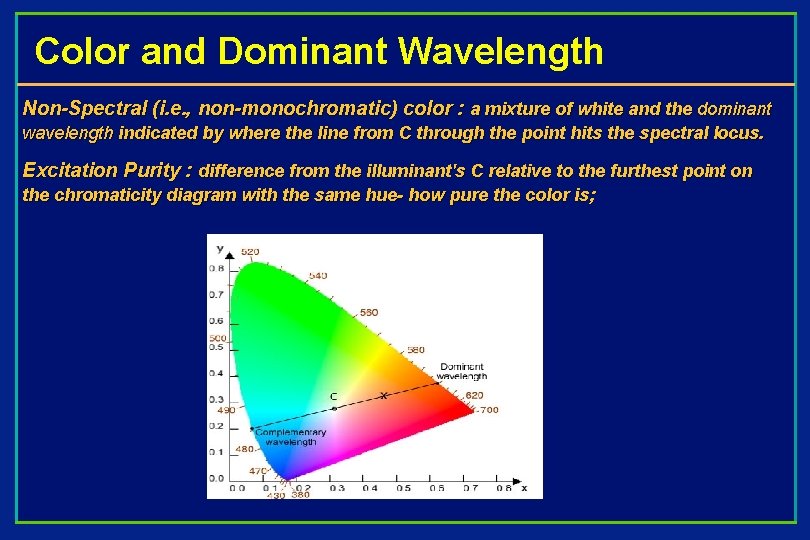
Color and Dominant Wavelength Non-Spectral (i. e. , non-monochromatic) color : a mixture of white and the dominant wavelength indicated by where the line from C through the point hits the spectral locus. Excitation Purity : difference from the illuminant's C relative to the furthest point on the chromaticity diagram with the same hue- how pure the color is;

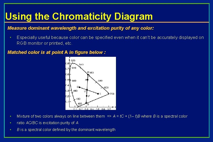
Using the Chromaticity Diagram Measure dominant wavelength and excitation purity of any color: • Especially useful because color can be specified even when it can’t be accurately displayed on RGB monitor or printed, etc. Matched color is at point A in figure below : • Mixture of two colors always on line between them => A = t. C + (1– t)B where B is a spectral color • ratio AC/BC is excitation purity of A • B is a spectral color defined by the dominant wavelength

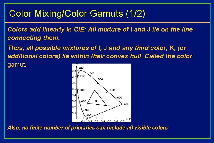
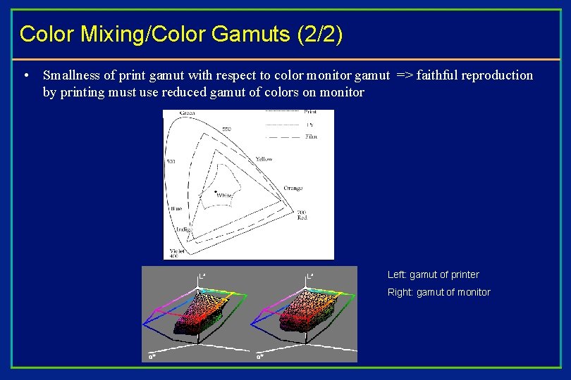
Color Mixing/Color Gamuts (1/2) Colors add linearly in CIE: All mixture of I and J lie on the line connecting them. Thus, all possible mixtures of I, J and any third color, K, (or additional colors) lie within their convex hull. Called the color gamut. Also, no finite number of primaries can include all visible colors

Color Mixing/Color Gamuts (2/2) • Smallness of print gamut with respect to color monitor gamut => faithful reproduction by printing must use reduced gamut of colors on monitor Left: gamut of printer Right: gamut of monitor

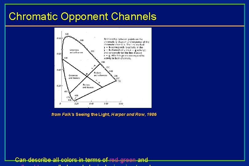
Chromatic Opponent Channels from Falk’s Seeing the Light, Harper and Row, 1986 Can describe all colors in terms of red-green and

A Problem With XYZ Colors If we have two colors C 1 and C 2, and we add DC to both of them, the differences between the original and new colors will not be perceived to be equal This is due to the variation of the just noticeable differences in saturated hues XYZ space is not perceptually uniform LUV space was created to address this problem

Color Models for Raster Graphics • Different situations suggest different ways of talking about colors • Absolutely unambiguous industry standards—requires something like CIE space. • Programming for CRT monitors easier in space defined by monitor phosphors: RGB space • Broadcast TV uses some phosphors, but has different constraints: YIQ space • Printers use CMY (cyan, magenta, yellow) inks for color printing : CMY(K) space • Six-primary-color projection system: 6 -color IRODORI space • User-friendliness: Hue, Saturation, Value is easier than RGB • Need perceptual constancy in the space? Munsell or CIELab Etc. You can make up your own color spaces too…

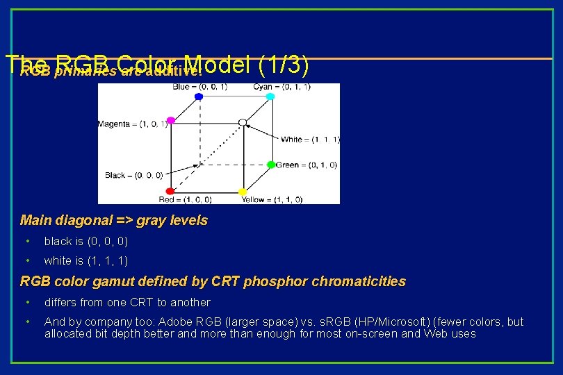
The RGB Color Model (1/3) RGB primaries are additive: Main diagonal => gray levels • black is (0, 0, 0) • white is (1, 1, 1) RGB color gamut defined by CRT phosphor chromaticities • differs from one CRT to another • And by company too: Adobe RGB (larger space) vs. s. RGB (HP/Microsoft) (fewer colors, but allocated bit depth better and more than enough for most on-screen and Web uses

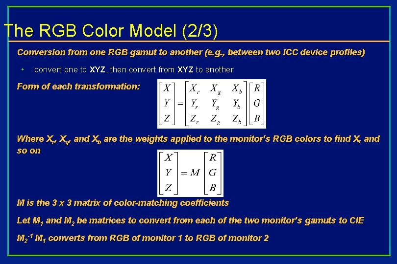
The RGB Color Model (2/3) Conversion from one RGB gamut to another (e. g. , between two ICC device profiles) • convert one to XYZ, then convert from XYZ to another Form of each transformation: Where Xr, Xg, and Xb are the weights applied to the monitor’s RGB colors to find X, and so on M is the 3 x 3 matrix of color-matching coefficients Let M 1 and M 2 be matrices to convert from each of the two monitor’s gamuts to CIE M 2 -1 M 1 converts from RGB of monitor 1 to RGB of monitor 2

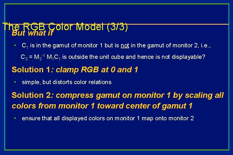
The RGB Color Model (3/3) But what if • C 1 is in the gamut of monitor 1 but is not in the gamut of monitor 2, i. e. , C 2 = M 2 -1 M 1 C 1 is outside the unit cube and hence is not displayable? Solution 1: clamp RGB at 0 and 1 • simple, but distorts color relations Solution 2: compress gamut on monitor 1 by scaling all colors from monitor 1 toward center of gamut 1 • ensure that all displayed colors on monitor 1 map onto monitor 2

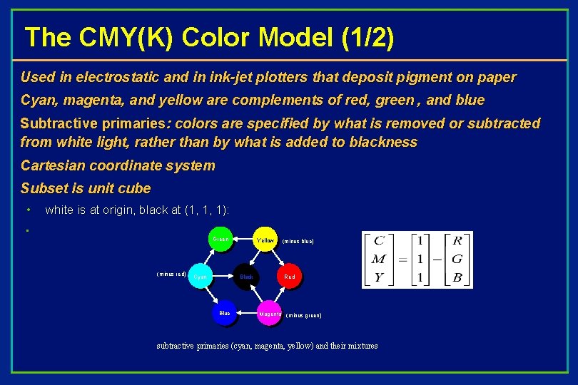
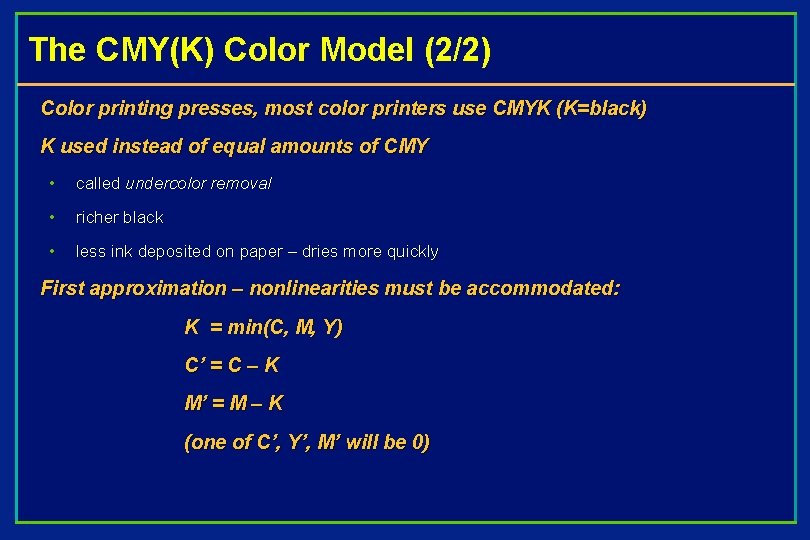
The CMY(K) Color Model (1/2) Used in electrostatic and in ink-jet plotters that deposit pigment on paper Cyan, magenta, and yellow are complements of red, green , and blue Subtractive primaries: colors are specified by what is removed or subtracted from white light, rather than by what is added to blackness Cartesian coordinate system Subset is unit cube • • white is at origin, black at (1, 1, 1): Green (minus red) Cyan Yellow Black Blue (minus blue) Red Magenta (minus green) subtractive primaries (cyan, magenta, yellow) and their mixtures

The CMY(K) Color Model (2/2) Color printing presses, most color printers use CMYK (K=black) K used instead of equal amounts of CMY • called undercolor removal • richer black • less ink deposited on paper – dries more quickly First approximation – nonlinearities must be accommodated: K = min(C, M, Y) C’ = C – K M’ = M – K (one of C’, Y’, M’ will be 0)

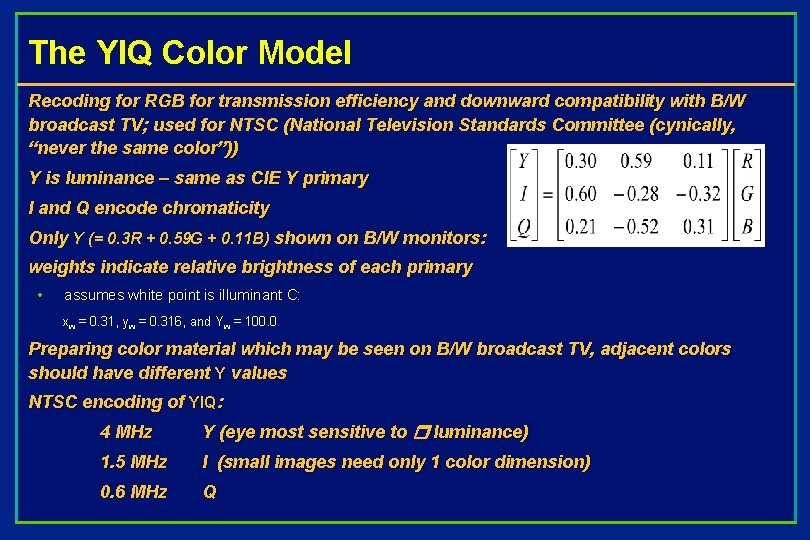
The YIQ Color Model Recoding for RGB for transmission efficiency and downward compatibility with B/W broadcast TV; used for NTSC (National Television Standards Committee (cynically, “never the same color”)) Y is luminance – same as CIE Y primary I and Q encode chromaticity Only Y (= 0. 3 R + 0. 59 G + 0. 11 B) shown on B/W monitors: weights indicate relative brightness of each primary • assumes white point is illuminant C: xw = 0. 31, yw = 0. 316, and Yw = 100. 0 Preparing color material which may be seen on B/W broadcast TV, adjacent colors should have different Y values NTSC encoding of YIQ: 4 MHz Y (eye most sensitive to r luminance) 1. 5 MHz I (small images need only 1 color dimension) 0. 6 MHz Q

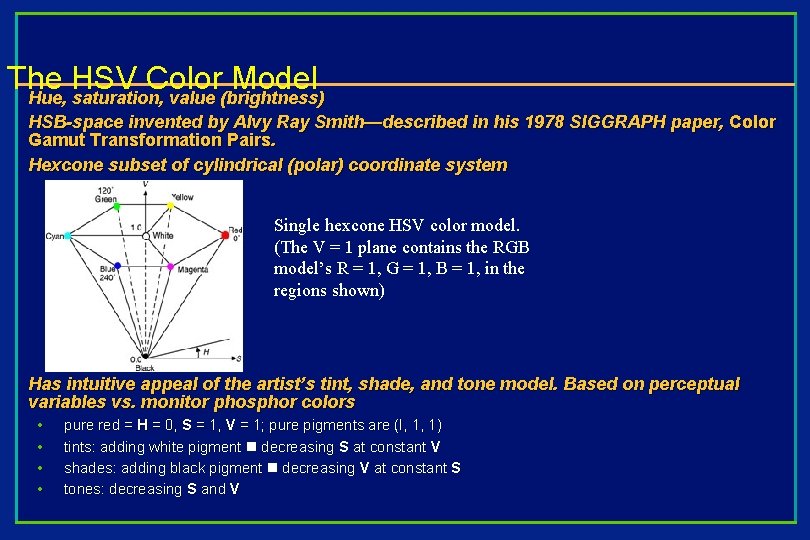
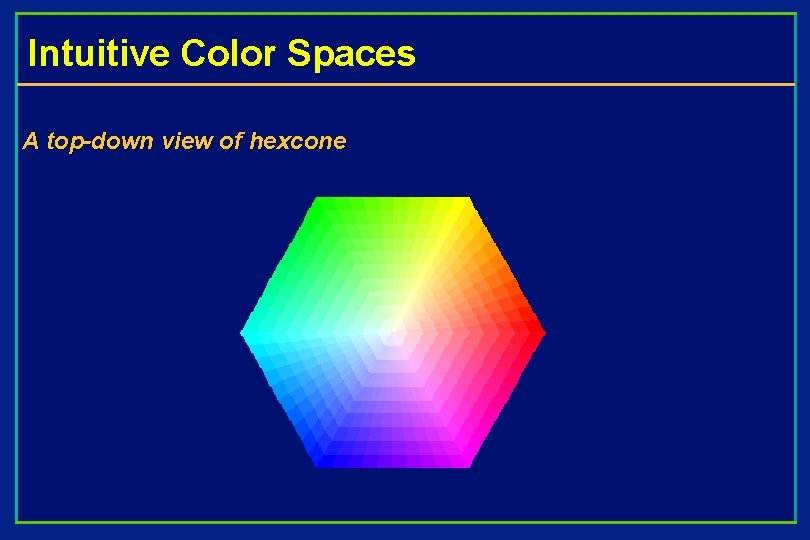
The HSV Color Model Hue, saturation, value (brightness) HSB-space invented by Alvy Ray Smith—described in his 1978 SIGGRAPH paper, Color Gamut Transformation Pairs. Hexcone subset of cylindrical (polar) coordinate system Single hexcone HSV color model. (The V = 1 plane contains the RGB model’s R = 1, G = 1, B = 1, in the regions shown) Has intuitive appeal of the artist’s tint, shade, and tone model. Based on perceptual variables vs. monitor phosphor colors • • pure red = H = 0, S = 1, V = 1; pure pigments are (I, 1, 1) tints: adding white pigment n decreasing S at constant V shades: adding black pigment n decreasing V at constant S tones: decreasing S and V

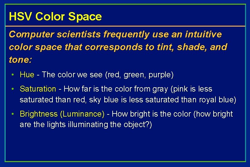
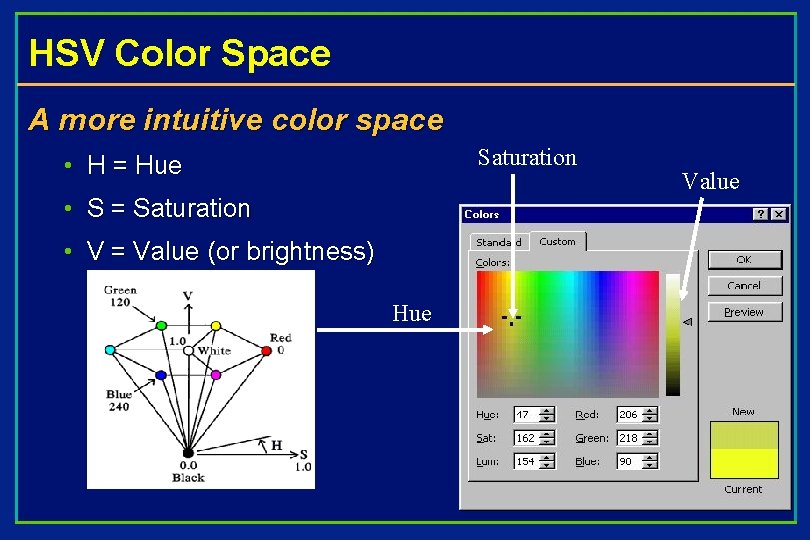
HSV Color Space Computer scientists frequently use an intuitive color space that corresponds to tint, shade, and tone: • Hue - The color we see (red, green, purple) • Saturation - How far is the color from gray (pink is less saturated than red, sky blue is less saturated than royal blue) • Brightness (Luminance) - How bright is the color (how bright are the lights illuminating the object? )

Intuitive Color Spaces A top-down view of hexcone

HSV Color Space A more intuitive color space Saturation • H = Hue • S = Saturation • V = Value (or brightness) Hue Value

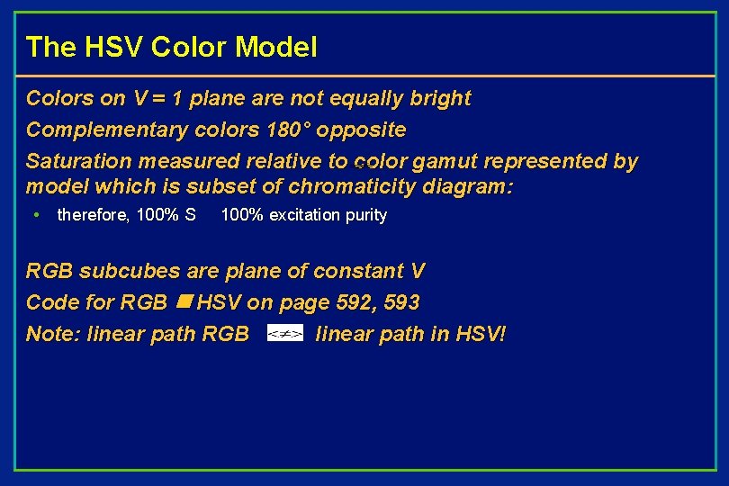
The HSV Color Model Colors on V = 1 plane are not equally bright Complementary colors 180° opposite Saturation measured relative to color gamut represented by model which is subset of chromaticity diagram: • therefore, 100% S 100% excitation purity RGB subcubes are plane of constant V Code for RGB n HSV on page 592, 593 Note: linear path RGB linear path in HSV!

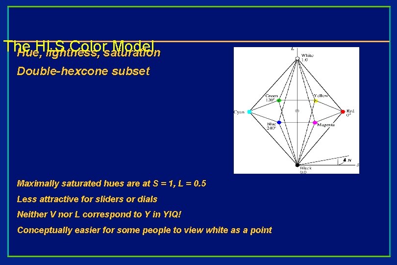
The HLS Color Model Hue, lightness, saturation Double-hexcone subset Maximally saturated hues are at S = 1, L = 0. 5 Less attractive for sliders or dials Neither V nor L correspond to Y in YIQ! Conceptually easier for some people to view white as a point

Perceptual Uniformity (or lack thereof) RGB, HSV, HSL all perceptually non-uniform • move through color space from color C 1 to a new color C 1΄ through a distance ΔC – • move through the same distance ΔC, starting from a different color C 2 – • C 1΄ = C 1 + ΔC C 2΄ = C 2 + ΔC the change in color in both cases is mathematically equal, but is not perceived as equal Moving a slider almost always causes a perceptual change in the other two parameters, which is not reflected by changes in those sliders; thus, changing hue frequently will affect saturation and value, even in Photoshop! Ideally want a perceptually uniform space: two colors that are equally distant are perceived as equally distant, and changing one parameter does not perceptually alter the other two Historically, the first perceptually-uniform color space was the Munsell system (early 1900 s)

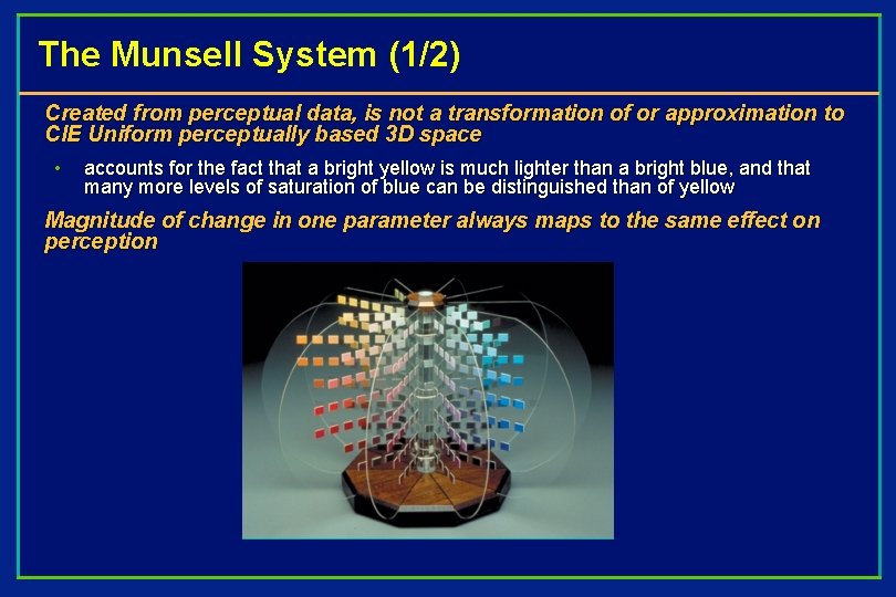
The Munsell System (1/2) Created from perceptual data, is not a transformation of or approximation to CIE Uniform perceptually based 3 D space • accounts for the fact that a bright yellow is much lighter than a bright blue, and that many more levels of saturation of blue can be distinguished than of yellow Magnitude of change in one parameter always maps to the same effect on perception

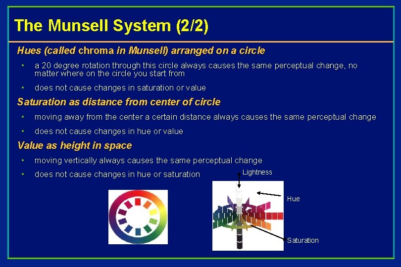
The Munsell System (2/2) Hues (called chroma in Munsell) arranged on a circle • a 20 degree rotation through this circle always causes the same perceptual change, no matter where on the circle you start from • does not cause changes in saturation or value Saturation as distance from center of circle • moving away from the center a certain distance always causes the same perceptual change • does not cause changes in hue or value Value as height in space • moving vertically always causes the same perceptual change • does not cause changes in hue or saturation Lightness Hue Saturation

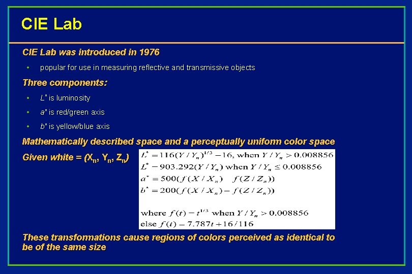
CIE Lab was introduced in 1976 • popular for use in measuring reflective and transmissive objects Three components: • L* is luminosity • a* is red/green axis • b* is yellow/blue axis Mathematically described space and a perceptually uniform color space Given white = (Xn, Yn, Zn) These transformations cause regions of colors perceived as identical to be of the same size

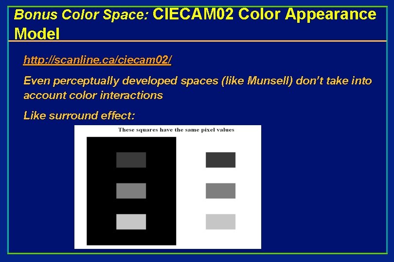
Bonus Color Space: CIECAM 02 Color Appearance Model http: //scanline. ca/ciecam 02/ Even perceptually developed spaces (like Munsell) don’t take into account color interactions Like surround effect:

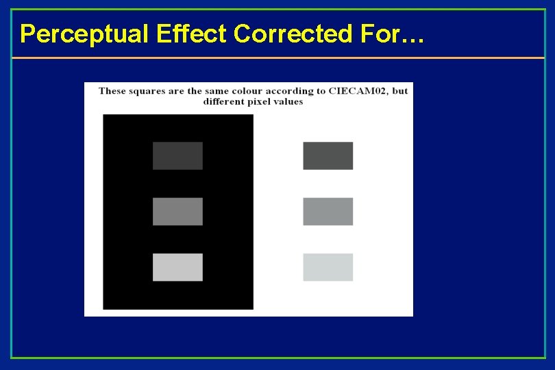
Perceptual Effect Corrected For…

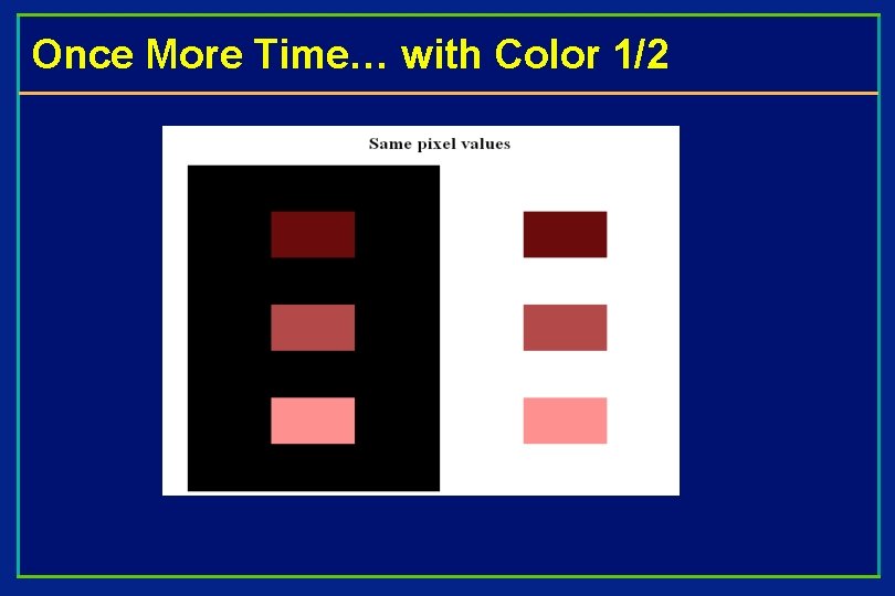
Once More Time… with Color 1/2

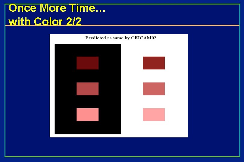
Once More Time… with Color 2/2

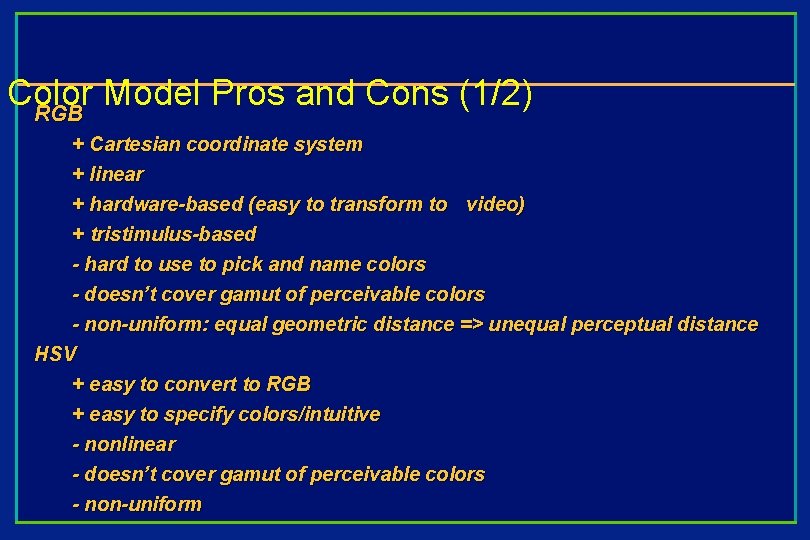
Color Model Pros and Cons (1/2) RGB + Cartesian coordinate system + linear + hardware-based (easy to transform to video) + tristimulus-based - hard to use to pick and name colors - doesn’t cover gamut of perceivable colors - non-uniform: equal geometric distance => unequal perceptual distance HSV + easy to convert to RGB + easy to specify colors/intuitive - nonlinear - doesn’t cover gamut of perceivable colors - non-uniform

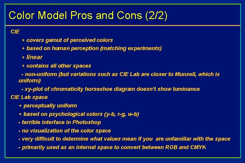
Color Model Pros and Cons (2/2) CIE + covers gamut of perceived colors + based on human perception (matching experiments) + linear + contains all other spaces - non-uniform (but variations such as CIE Lab are closer to Munsell, which is uniform) - xy-plot of chromaticity horseshoe diagram doesn’t show luminance CIE Lab space + perceptually uniform + based on psychological colors (y-b, r-g, w-b) - terrible interface in Photoshop - no visualization of the color space - very difficult to determine what values mean if you are unfamiliar with the space - primarily used as an internal space to convert between RGB and CMYK