Introduction Color How beautiful the world is because

Introduction Color. How beautiful the world is because of color! So easy to understand. It’s one of the first concepts children learn. It’s real. It’s universal. Or is it? It’s not simple. It’s not real. It’s not universal.

Color is our brain’s response to light. “Light” is a term that refers to a electromagnetic radiation. And electromagnetic radiation are waves of different energies that extend over a broad range: frequency, Hz 10 26 10 24 cosmic 10 22 gamma wavelength, nm 10 -8 10 -6 10 -4 10 20 10 18 X-rays 10 -2 1 10 16 10 14 UV 10 2 10 12 Vis 10 4 10 10 IR 10 6 10 8 Radio 10 8 10 6 10 4 10 2 Hz induction power 10 10 10 12 10 14 10 16 nm If the electromagnetic spectrum were a piano keyboard…. . the visible spectral region would be just one key!

Each of the “colors” of visible light has a corresponding wavelength between 400 to 700 nanometers (or nm). Light having a wavelength of near 565 nm will look yellow to most people. 400 450 500 550 600 650 700 750 565 nm Is this because the eye has a specific detector (or receptor) for 565 nm yellow light? And a different receptor for 450 nm blue light? And another one for 650 red-orange light? And so on, for every wavelength between 400 and 700 nm? Seems like that would be a LOT of different types of receptors. Nature is “smarter” —and more efficient—than that. Only three different receptors for visible light are used.

Beauty in the eye of the beholder. 1 Your eyes have only three color receptors (detectors) - the RGB cones (red-green-blue) It is the brain that interprets visible light as “having” color.

Beauty in the eye of the beholder. 2 Yellow light is perceived by our eyes when two color receptors, Red and Green, are stimulated simultaneously. This is indicated on the diagram by the red and green arrows. It is the brain that interprets yellow light as “having” a yellow color.

Beauty in the eye of the beholder. 3 “What about red-orange? ”, you say. “Red-orange light would also simultaneously stimulate the Red and Green receptors. See? ” Aaahhh…. . true. But look! The relative lengths of the arrows are different. The green arrow, i. e. G-receptor, is much less stimulated than the R -receptor. So, red-orange light is seen as different from yellow light due to the ratio of R and G response.

Beauty in the eye of the beholder. 4 When the R receptor gets about the same signal as the G receptor, or R = G, yellow is perceived. When the R receptor gets a larger response the G receptor, something like R = 3 G, red-orange is perceived. It is the brain that interprets color.


THIS IS NOT YELLOW Magenta is not a real color. Biology Philosophy

Magenta is a non-spectral hue.

Maxwell’s Triangle This triangle was devised to illustrate how three primary colors —Red, Green, Blue— can be added together to generate the other colors. At the center of the triangle is white. The colors in the triangle can assigned three coordinates, like a vector, determined by how much red or blue or green is mixed to make that color. For example, a saturated red added to a saturated green makes …yellow. Red and green make YELLOW? ? ? Yup. We’ll show you how.

Maxwell’s Triangle Think of the saturated red and green colors on Maxwell’s diagram as vectors. Now, imagine “decomposing” these R and G vectors into the sum of the dashed arrows.

Maxwell’s Triangle See how two of the decomposed vectors that run along the right edge of the triangle are co-linear but point in exactly opposite directions? They cancel each other. This leaves the shorter vectors components these vectors have the same direction and point from yellow. They represent the yellow “product” from adding red and green.

Maxwell’s Triangle Blue + Yellow = White? ! Blue + yellow vectors point in exactly opposite direction and cancel to make white.

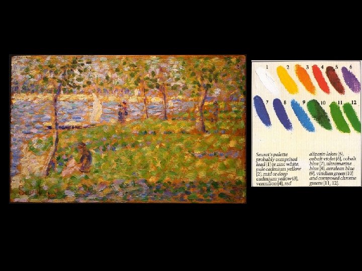
In the early 1800’s, Ogden Rood physicist and Michael-Eugene Chevreul chemist explored optical mixing.


CIE Chromaticity curve Maxwell’s triangle excludes some colors that are visible to eye. Pink at x=0. 34, y= 0. 23 The chromaticity diagram is meant to show extra colors visible to the eye.

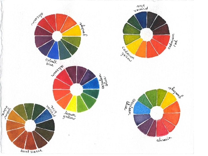
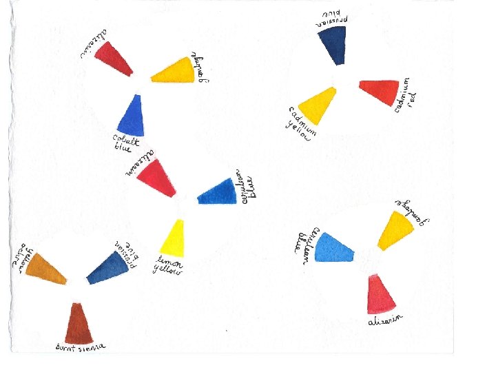
Color wheels for mixing paint to neutralize color: OK. yellow green red cyan magenta blue Not OK for assigning visual compliment in spectroscopic analysis of compounds !!

Subtractive color mixing: light colors are subtracted from one white light beam blue + yellow = green white light beam = sum of all spectral colors reflects this much spectrum blue paint light reflected By both shining on: reflects yellow paint One light beam!!!! Green is only color reflected by both the blue and yellow paints. All red, orange, yellow, blue, violet removed.

ultramarine reflects this much spectrum light reflected by both reflects chrome yellow

Subtractive color mixing: light colors are subtracted from one white light beam blue + yellow = green white light beam = sum of all spectral colors shining on: This blue reflects no violet. blue paint (cerulean) reflects yellow paint (lemon yellow) One light beam!!!! This yellow reflects no orange. light reflected by both a brighter green, less dull, because the (violet + orange = brown) is absent

reflects Cerulean blue this much spectrum light reflected by both reflects lemon yellow

“Mixing an intense paint with its hue complement is just adding reflectance to the dark parts of the spectrum, which flattens out the overall reflectance profile. venetian red viridian prussian blue So a reasonable first rule would be that unsaturated colors have flat reflectance curves. Unsaturated colors are closer to white, gray, or black, and these are all colors that have a flat reflectance profile (they only vary in the average height, or luminosity, of the profile). ” www. handprint. com

So the primary colors are not Red-Yellow-Blue? ? !! Primary Colors for Color Mixing Additive Multiple light beams added primary colors R-G-B red-blue-green R + G + B = White secondary colors Y-M-C Demonstrate this: with 3 slide projectors Subtractive Light “hues” removed from one beam primary colors Y-M-C yellow/magenta/cyan Y + M + C = Black secondary colors R-B-G Demonstrate this: with transparencies
 Color Terminology term Hue common idea green scientific term Lmax, nm or Do")
(some) Color Terminology term Hue common idea green scientific term Lmax, nm or Do what color is grass? Saturation how intense the color, e, absorption coefficient relative to grey Luminosity (Value) relative brightness how much white/black is added Non-spectral hues concentration (e. g. , molarity) are not in the rainbow! are not a component of white light examples: are not due to one wavelength of light brown, salmon, magenta, purple, pink

or saturation

A mid-tone flesh pink Unsaturated, non-spectral hues are especially likely to be found as metameric mixtures.

Metameric Colors Refuting the Physicalism of Color and bird nesting behavior!

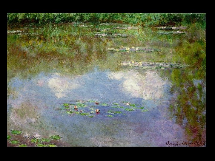
Impression, Sunrise - Claude Monet

- Renoir

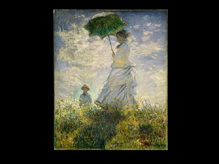
La Grenouillere - Claude Monet

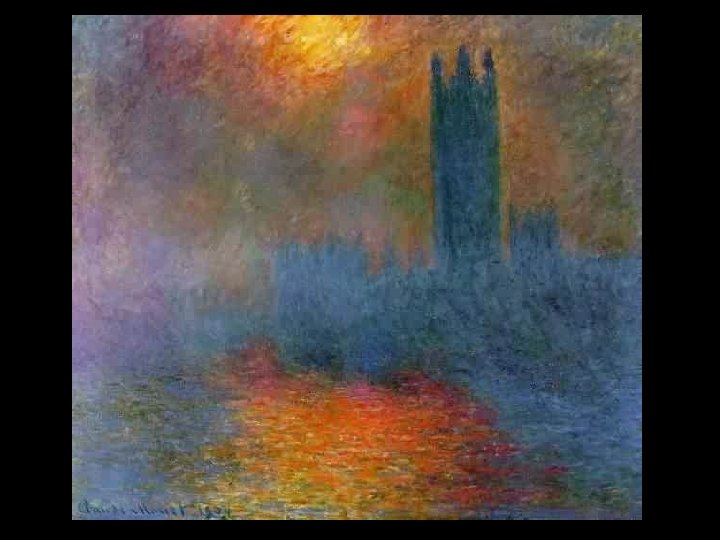
Houses of Parlement - Claude Monet

Gare Saint Lazare - Claude Monet

Gare Saint Lazare - Claude Monet
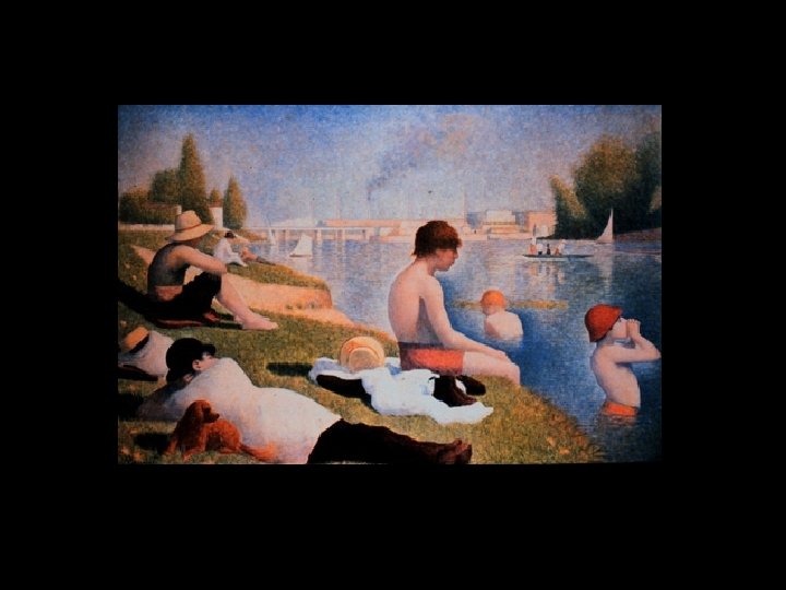

La Grande Jatte - George Seurat

Parade - George Seurat

The Apple Pickers - Pisarro

The Apple Pickers - details - Pisarro

The Apple Pickers - details - Pisarro

There is so much more… See: www. handprint. com
- Slides: 52