Intro unit The Scientific Method Data Collection Graphing
- Slides: 6

Intro unit: The Scientific Method, Data Collection, & Graphing n n n Prior to conducting an experiment you should do research about the topic so that you can develop a good hypothesis. A hypothesis is an educated guess about what you think will happen. Any good experiment has a control group to compare your experimental results to.

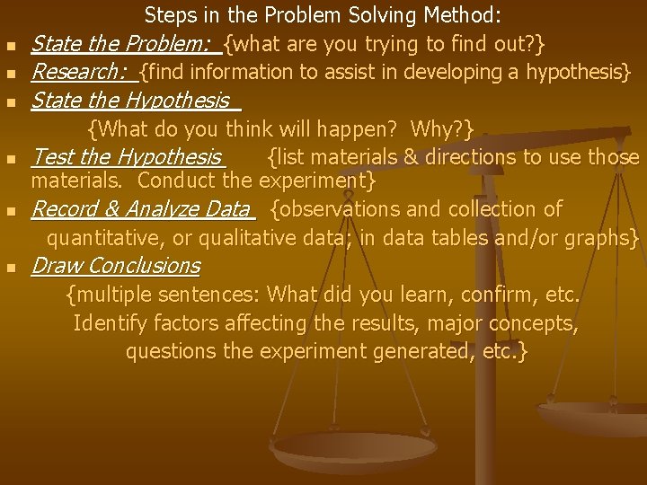
n n n Steps in the Problem Solving Method: State the Problem: {what are you trying to find out? } Research: {find information to assist in developing a hypothesis} State the Hypothesis {What do you think will happen? Why? } Test the Hypothesis {list materials & directions to use those materials. Conduct the experiment} Record & Analyze Data {observations and collection of quantitative, or qualitative data; in data tables and/or graphs} Draw Conclusions {multiple sentences: What did you learn, confirm, etc. Identify factors affecting the results, major concepts, questions the experiment generated, etc. }

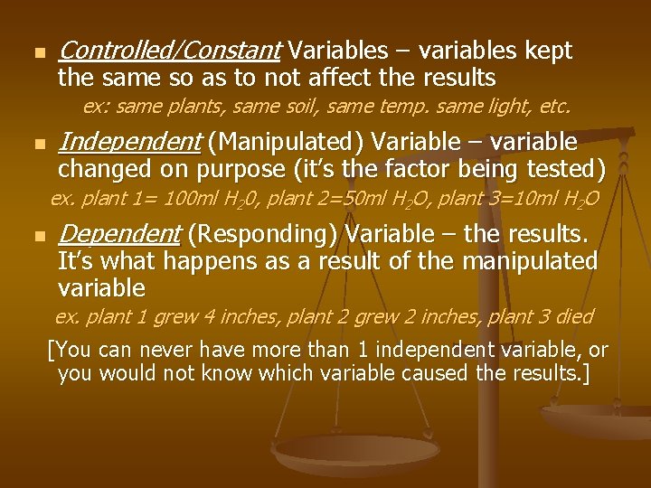
n Controlled/Constant Variables – variables kept the same so as to not affect the results ex: same plants, same soil, same temp. same light, etc. n Independent (Manipulated) Variable – variable changed on purpose (it’s the factor being tested) ex. plant 1= 100 ml H 20, plant 2=50 ml H 2 O, plant 3=10 ml H 2 O n Dependent (Responding) Variable – the results. It’s what happens as a result of the manipulated variable ex. plant 1 grew 4 inches, plant 2 grew 2 inches, plant 3 died [You can never have more than 1 independent variable, or you would not know which variable caused the results. ]

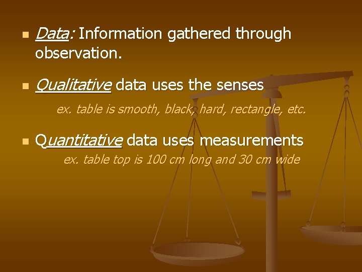
n Data: Information gathered through observation. n Qualitative data uses the senses ex. table is smooth, black, hard, rectangle, etc. n Quantitative data uses measurements ex. table top is 100 cm long and 30 cm wide

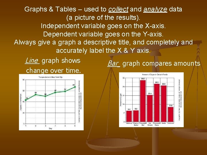
Graphs & Tables – used to collect and analyze data (a picture of the results). Independent variable goes on the X-axis. Dependent variable goes on the Y-axis. Always give a graph a descriptive title, and completely and accurately label the X & Y axis. Line graph shows Bar graph compares amounts change over time.

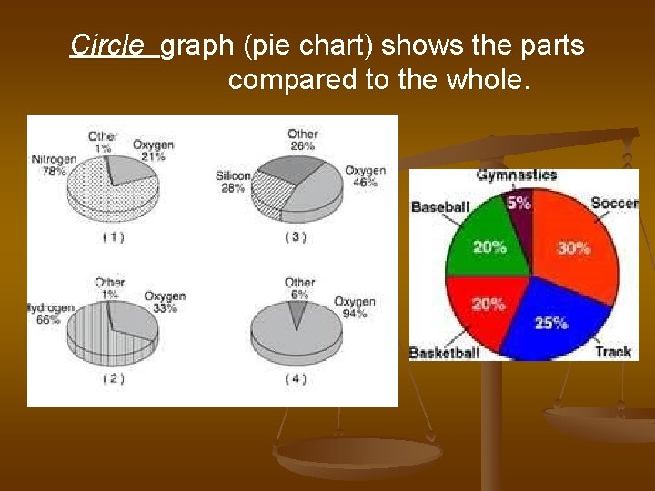
Circle graph (pie chart) shows the parts compared to the whole.