Intro to the Internet and WWW CMPT 165
- Slides: 29

Intro to the Internet and WWW CMPT 165, Spring 2020 Stylesheets and CSS https: //coursys. sfu. ca/2020 sp-cmpt-165 -d 1/pages

Learning Outcomes • • Learn the different types of CSS and how to add them to the HTML. The CSS stylesheet syntax or so called the CSS rule-set. CSS properties for different HTML tags. CSS box model CSS units used for the length such as: width, margin, padding, font-size. CSS selectors and their categories. Colors in CSS Development Tools

Stylesheets and CSS • Cascading Style Sheets (CSS) : • are a language for giving style information to web pages. • That is, after creating content in HTML, we will give information about what each piece of content should look like by using CSS. Using semantic markup in HTML should make it possible to worry about these two things separately. • CSS can be added to HTML elements in 3 ways: • Inline - by using the style attribute in HTML elements • Internal - by using a <style> element in the <head> section • External - by using an external CSS file

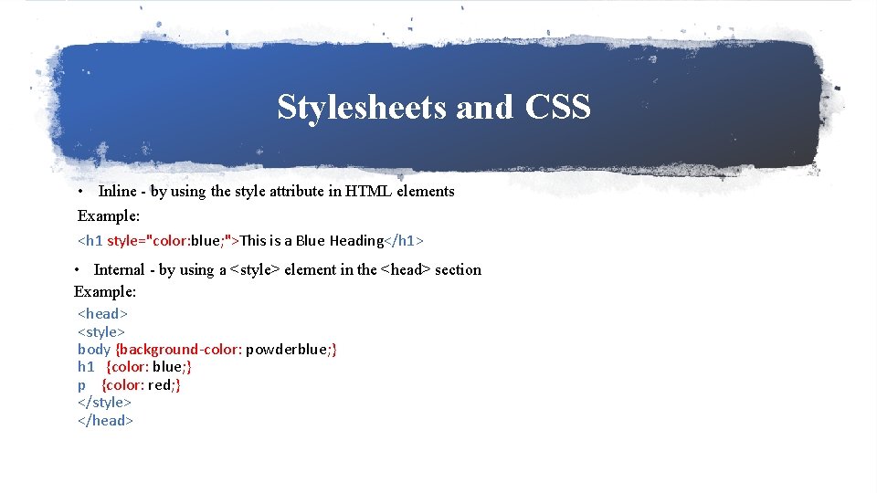
Stylesheets and CSS • Inline - by using the style attribute in HTML elements Example: <h 1 style="color: blue; ">This is a Blue Heading</h 1> • Internal - by using a <style> element in the <head> section Example: <head> <style> body {background-color: powderblue; } h 1 {color: blue; } p {color: red; } </style> </head>

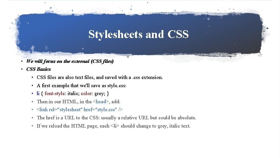
Stylesheets and CSS • We will focus on the external (CSS files) • CSS Basics • CSS files are also text files, and saved with a. css extension. • A first example that we'll save as style. css: • li { font-style: italic; color: grey; } • Then in our HTML, in the <head>, add: • <link rel="stylesheet" href="style. css" /> • The href is a URL to the CSS: usually a relative URL but could be absolute. • If we reload the HTML page, each <li> should change to grey, italic text.

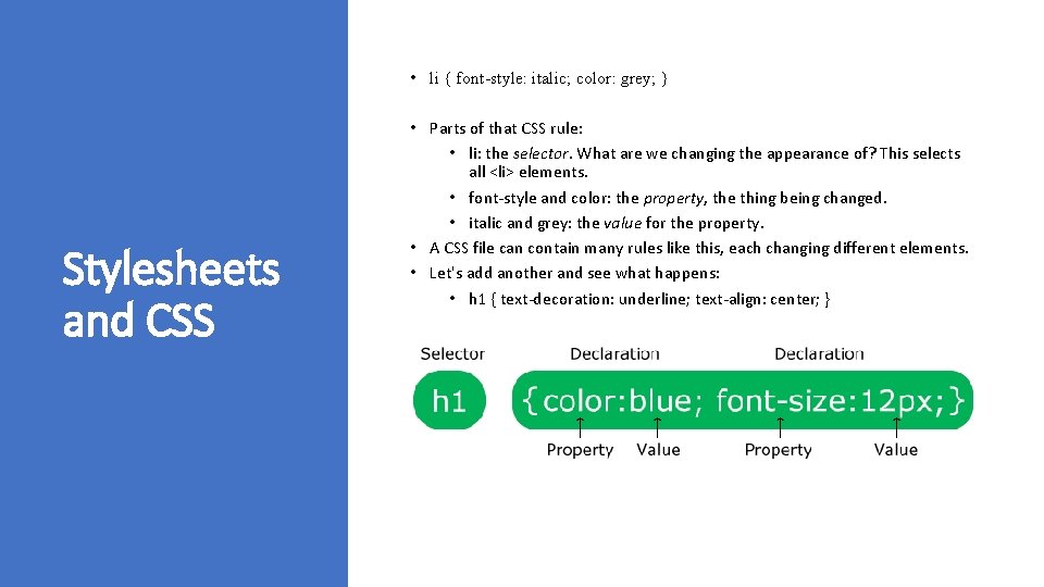
• li { font-style: italic; color: grey; } Stylesheets and CSS • Parts of that CSS rule: • li: the selector. What are we changing the appearance of? This selects all <li> elements. • font-style and color: the property, the thing being changed. • italic and grey: the value for the property. • A CSS file can contain many rules like this, each changing different elements. • Let's add another and see what happens: • h 1 { text-decoration: underline; text-align: center; }

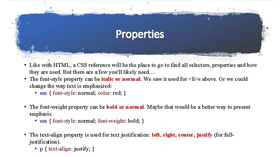
Properties • Like with HTML, a CSS reference will be the place to go to find all selectors, properties and how they are used. But there a few you'll likely need… • The font-style property can be italic or normal. We saw it used for <li>s above. Or we could change the way text is emphasized: • em { font-style: normal; color: red; } • The font-weight property can be bold or normal. Maybe that would be a better way to present emphasis. • em { font-style: normal; font-weight: bold; } • The text-align property is used for text justification: left, right, center, justify (for fulljustification). • p { text-align: justify; }

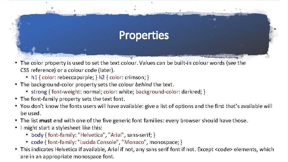
Properties • The color property is used to set the text colour. Values can be built-in colour words (see the CSS reference) or a colour code (later). • h 1 { color: rebeccapurple; } h 2 { color: crimson; } • The background-color property sets the colour behind the text. • strong { font-weight: normal; color: white; background-color: darkred; } • The font-family property sets the text font. • You don't know the fonts users will have available: give a list of options and the first that's available will be used. • The list must end with one of the five generic font families: every browser should have those. • I might start a stylesheet like this: • body { font-family: "Helvetica", "Arial", sans-serif; } • code { font-family: "Lucida Console", "Monaco", monospace; } • This indicates Helvetica if available, Arial if not, any sans serif font if not. Except <code> elements, which are in an appropriate monospace font.

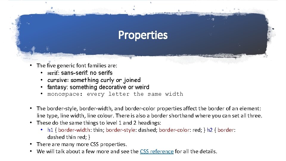
Properties • The five generic font families are: • serif: sans-serif: no serifs • cursive: something curly or joined • fantasy: something decorative or weird • monospace: every letter the same width • The border-style, border-width, and border-color properties affect the border of an element: line type, line width, line colour. There is also a border shorthand where you can set all three. • These do the same things to level 1 and 2 headings: • h 1 { border-width: thin; border-style: dashed; border-color: red; } h 2 { border: dashed thin red; } • There are many more CSS properties. • We will talk about a few more and see the CSS reference for all the details.

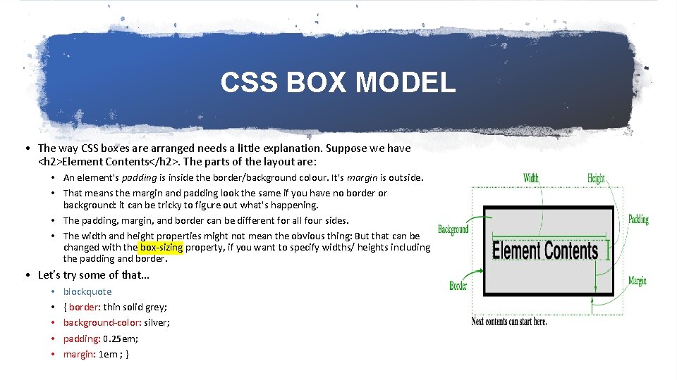
CSS BOX MODEL • The way CSS boxes are arranged needs a little explanation. Suppose we have <h 2>Element Contents</h 2>. The parts of the layout are: • An element's padding is inside the border/background colour. It's margin is outside. • That means the margin and padding look the same if you have no border or background: it can be tricky to figure out what's happening. • The padding, margin, and border can be different for all four sides. • The width and height properties might not mean the obvious thing: But that can be changed with the box-sizing property, if you want to specify widths/ heights including the padding and border. • Let's try some of that… • • • blockquote { border: thin solid grey; background-color: silver; padding: 0. 25 em; margin: 1 em ; }

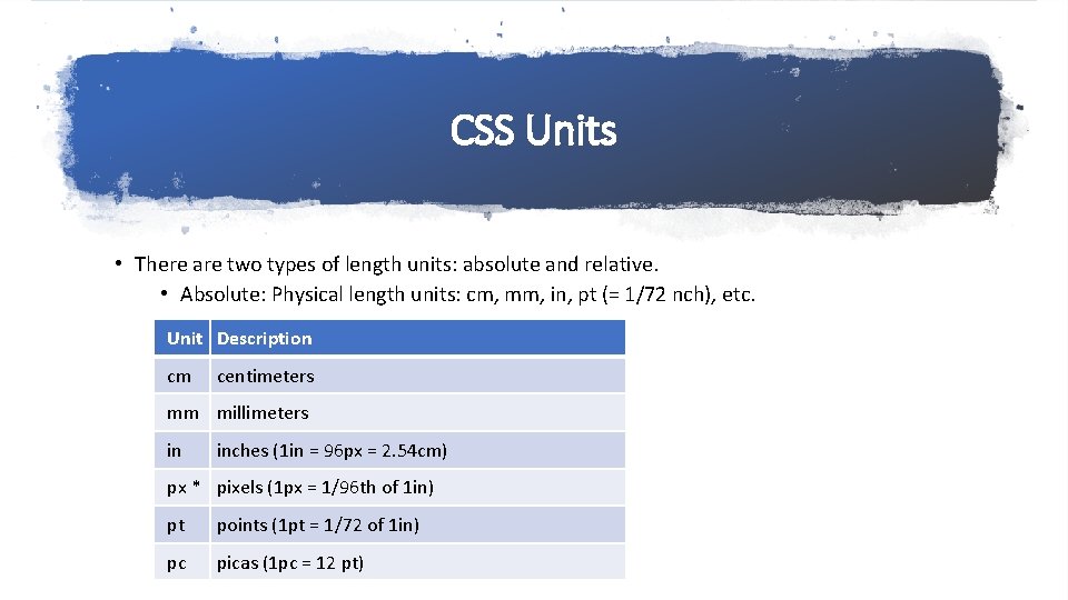
CSS Units • There are two types of length units: absolute and relative. • Absolute: Physical length units: cm, mm, in, pt (= 1/72 nch), etc. Unit Description cm centimeters mm millimeters in inches (1 in = 96 px = 2. 54 cm) px * pixels (1 px = 1/96 th of 1 in) pt points (1 pt = 1/72 of 1 in) pc picas (1 pc = 12 pt)

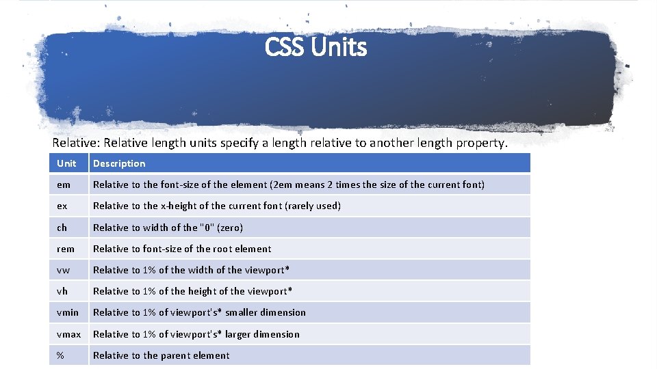
CSS Units Relative: Relative length units specify a length relative to another length property. Unit Description em Relative to the font-size of the element (2 em means 2 times the size of the current font) ex Relative to the x-height of the current font (rarely used) ch Relative to width of the "0" (zero) rem Relative to font-size of the root element vw Relative to 1% of the width of the viewport* vh Relative to 1% of the height of the viewport* vmin Relative to 1% of viewport's* smaller dimension vmax Relative to 1% of viewport's* larger dimension % Relative to the parent element

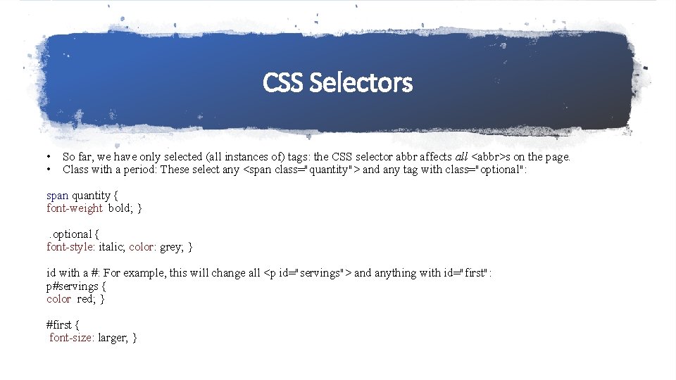
CSS Selectors • So far, we have only selected (all instances of) tags: the CSS selector abbr affects all <abbr>s on the page. • Class with a period: These select any <span class="quantity"> and any tag with class="optional": span. quantity { font-weight: bold; } . optional { font-style: italic; color: grey; } id with a #: For example, this will change all <p id="servings"> and anything with id="first": p#servings { color: red; } #first { font-size: larger; }

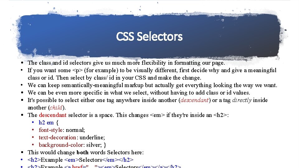
CSS Selectors • The class and id selectors give us much more flexibility in formatting our page. • If you want some <p> (for example) to be visually different, first decide why and give a meaningful class or id. Then select by class/ id in your CSS and make the change. • We can keep semantically-meaningful markup but actually get everything looking the way we want. • We can be even more specific in what we select, without having to add class or id values. • It's possible to select either one tag anywhere inside another (descendant) or a tag directly inside another (child). • The descendant selector is a space. This changes <em> if they're inside an <h 2>: • h 2 em { • font-style: normal; • text-decoration: underline; • background-color: silver; } • This would change both words Selectors here: • <h 2>Example <em>Selectors</em></h 2>

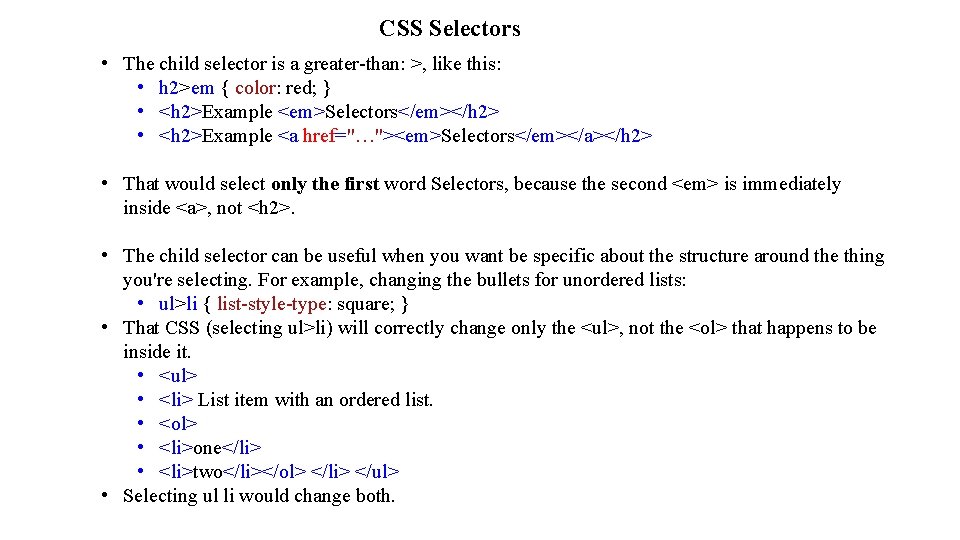
CSS Selectors • The child selector is a greater-than: >, like this: • h 2>em { color: red; } • <h 2>Example <em>Selectors</em></h 2> • <h 2>Example <a href="…"><em>Selectors</em></a></h 2> • That would select only the first word Selectors, because the second <em> is immediately inside <a>, not <h 2>. • The child selector can be useful when you want be specific about the structure around the thing you're selecting. For example, changing the bullets for unordered lists: • ul>li { list-style-type: square; } • That CSS (selecting ul>li) will correctly change only the <ul>, not the <ol> that happens to be inside it. • <ul> • <li> List item with an ordered list. • <ol> • <li>one</li> • <li>two</li></ol> </li> </ul> • Selecting ul li would change both.

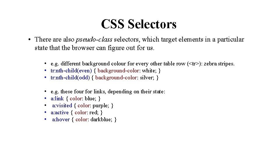
CSS Selectors • There also pseudo-class selectors, which target elements in a particular state that the browser can figure out for us. • e. g. different background colour for every other table row (<tr>): zebra stripes. • tr: nth-child(even) { background-color: white; } • tr: nth-child(odd) { background-color: silver; } • • • e. g. these four for links, depending on their state: a: link { color: blue; } a: visited { color: purple; } a: active { color: red; } a: hover { color: darkblue; }

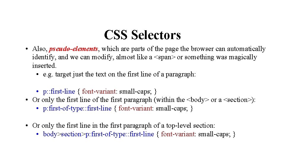
CSS Selectors • Also, pseudo-elements, which are parts of the page the browser can automatically identify, and we can modify, almost like a <span> or something was magically inserted. • e. g. target just the text on the first line of a paragraph: • p: : first-line { font-variant: small-caps; } • Or only the first line of the first paragraph (within the <body> or a <section>): • p: first-of-type: : first-line { font-variant: small-caps; } • Or only the first line in the first paragraph of a top-level section: • body>section>p: first-of-type: : first-line { font-variant: small-caps; }

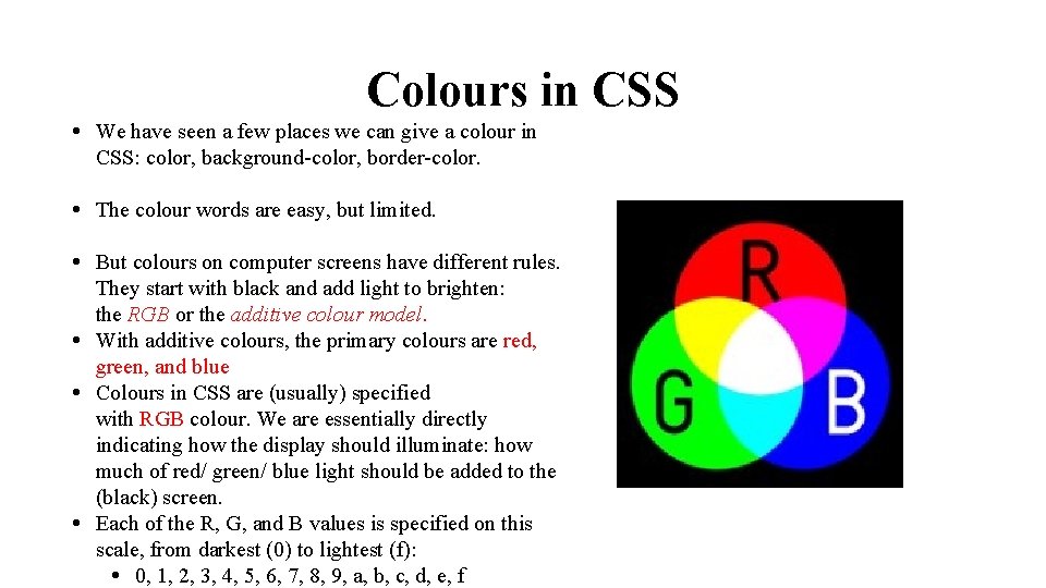
Colours in CSS • We have seen a few places we can give a colour in CSS: color, background-color, border-color. • The colour words are easy, but limited. • But colours on computer screens have different rules. They start with black and add light to brighten: the RGB or the additive colour model. • With additive colours, the primary colours are red, green, and blue • Colours in CSS are (usually) specified with RGB colour. We are essentially directly indicating how the display should illuminate: how much of red/ green/ blue light should be added to the (black) screen. • Each of the R, G, and B values is specified on this scale, from darkest (0) to lightest (f): • 0, 1, 2, 3, 4, 5, 6, 7, 8, 9, a, b, c, d, e, f

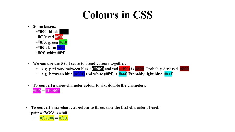
Colours in CSS • Some basics: • #000: black #000 • #f 00: red #f 00 • #0 f 0: green #0 f 0 • #00 f: blue #00 f • #fff: white #fff • We can use the 0 to f scale to blend colours together. • e. g. part way between black (#000) and red (#f 00) is #800. Probably dark red. #800 • e. g. between blue (#00 f) and white (#fff) is #aaf. Probably light blue. #aaf • To convert a three-character colour to six, double the characters: • #f 40 = #ff 4400. • To convert a six-character colour to three, take the first character of each pair: #f 7 c 308 ≈ #fc 0. • #f 7 c 308 = #fc 0.

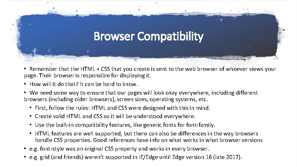
Browser Compatibility • Remember that the HTML + CSS that you create is sent to the web browser of whoever views your page. Their browser is responsible for displaying it. • How will it do that? It can be hard to know. • We need some way to ensure that our pages will look okay everywhere, including different browsers (including older browsers), screen sizes, operating systems, etc. • First, follow the rules: HTML and CSS were designed with this in mind. • Create valid HTML and CSS so it will be understood everywhere. • Use the built-in compatibility features, like generic fonts for font-family. • HTML features are well supported, but there can also be differences in the way browsers handle CSS properties. Good references have info on what works in what browser versions • e. g. font-style was an original CSS property and works in every browser. • e. g. grid (and friends) weren't supported in IE/Edge until Edge version 16 (late 2017).

Browser Styles • As you work with CSS, you will start to notice differences in the default styles between browsers. • e. g. Is the size of the <h 2> font the same in all browsers? Are you sure? • There a couple of ways to deal with this so you get a consistent appearance everywhere… • A reset stylesheet will clear all of the browser's default style rules: no more <em> is italics, <h 2> is a larger font, etc. • you have a consistent nothing styled stylesheet to start with, you can build from there. • You will probably start with the reset CSS (in a separate file) and then add your own from there: • <link rel="stylesheet" href="reset. css" /> • <link rel="stylesheet" href="my_style. css" /> • In my_style. css, you might have rules like: • h 2 { font-size: 1. 5 em; • font-weight: bold; } • em { font-style: italic; }

Browser Styles • My experience: working with a reset CSS is tedious: you have to specify that <ul> is a bulleted list, <a> has an underline, <code> is monospaced, and dozens of others. • But it's kind of nice to think about these things: did you really want <em> to be italics, or is there something better for your site? • The other option for getting a consistent starting point is to let somebody else specify every property that might be different between browsers. • That's the strategy of Normalize. css: specify every inconsistent CSS setting in browser default styles, so they end up being the same everywhere. • Using normalize. css and adding your own style is probably easier than a full reset.

Different Browsers • All of these tools are good, but are no substitute for actually testing your site in different situations and seeing how it works. • Bare minimum must-do: resize your browser window. Different people have different screen/window sizes. Of course, your site should adapt to them well (within reason). • Shrinking your browser window until it's about the size of phone screen isn't exactly the same as seeing it on a phone, but it's a good first step. • Try different browsers: Firefox, Chrome, IE/Edge. They are mostly compatible, but the occasional difference can cause problems. • Try a mobile device. You're probably developing (and therefore, usually testing) on a full-sized screen, but a lot of your viewers will be on phones. • You can't be completely sure what will happen if somebody comes along with an old browser version, limited font availability, and a huge display, but you can do your best to make sure different situations will be okay.

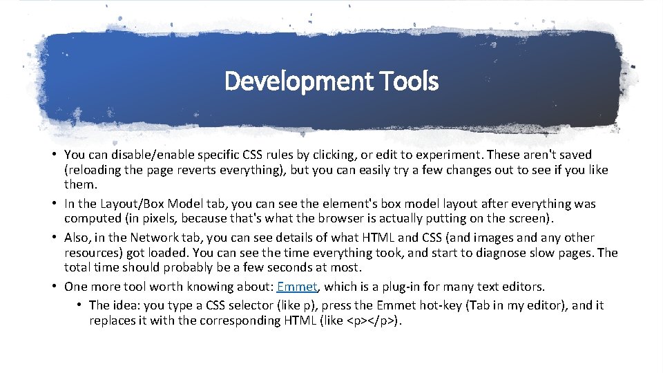
Development Tools • The most direct way to see the page you're looking at: • You can view the HTML source. Press control-U or �⌘U or right-click and select View Page Source. • This shows you the HTML that was sent from the server, not any modifications made by Java. Script after that. [We will see that happen later in the course. ] • Much more powerful: the browser's developer tools. Press F 12 or control-shift. I or �⌘I. • In the Inspector tab, you can explore the page, its elements, and how they fit together. • To the right, the Rules or Styles tab shows the CSS rules that actually apply to that element, and which file they're from.

Development Tools • You can disable/enable specific CSS rules by clicking, or edit to experiment. These aren't saved (reloading the page reverts everything), but you can easily try a few changes out to see if you like them. • In the Layout/Box Model tab, you can see the element's box model layout after everything was computed (in pixels, because that's what the browser is actually putting on the screen). • Also, in the Network tab, you can see details of what HTML and CSS (and images and any other resources) got loaded. You can see the time everything took, and start to diagnose slow pages. The total time should probably be a few seconds at most. • One more tool worth knowing about: Emmet, which is a plug-in for many text editors. • The idea: you type a CSS selector (like p), press the Emmet hot-key (Tab in my editor), and it replaces it with the corresponding HTML (like <p></p>).

HTML + CSS: Review • We have now worked with two languages for two distinct purposes… • HTML for content: here, we worry about the meaning/purpose/role of each piece of content, not the way it looks (semantics) and choose tags with that in mind. • We can use the class or id attributes (with meaningful values) to fine-tune the meaning of tags if necessary. If no other HTML tag matches our content, we can use <div> or <span> and a class/id. • CSS for appearance. We can modify the way elements look on our pages: keep appearancerelated stuff in the CSS: don't let it leak into your HTML. • That might include going back to the HTML and adding some (meaningful) class/id attributes so we can be more specific.

HTML + CSS: Review • We will be adding a third language next: Java. Script for behaviour. Again, this will be a separate language (in a separate file) for the distinct role. • Why are we separating these? • It's easier to work on content and design separately. Those might be handled by different people, or by you at different times. • We can also modify the appearance of all pages in a site by fiddling with one CSS file. • We could also create different CSS for different situations. • e. g. separate rules for small screens where we want to organize the information differently; • or separate rules for print vs screen display; or slides vs printable corse notes. • e. g. we could take the same (HTML) content and re-purpose it into an e-book (with some additional work).

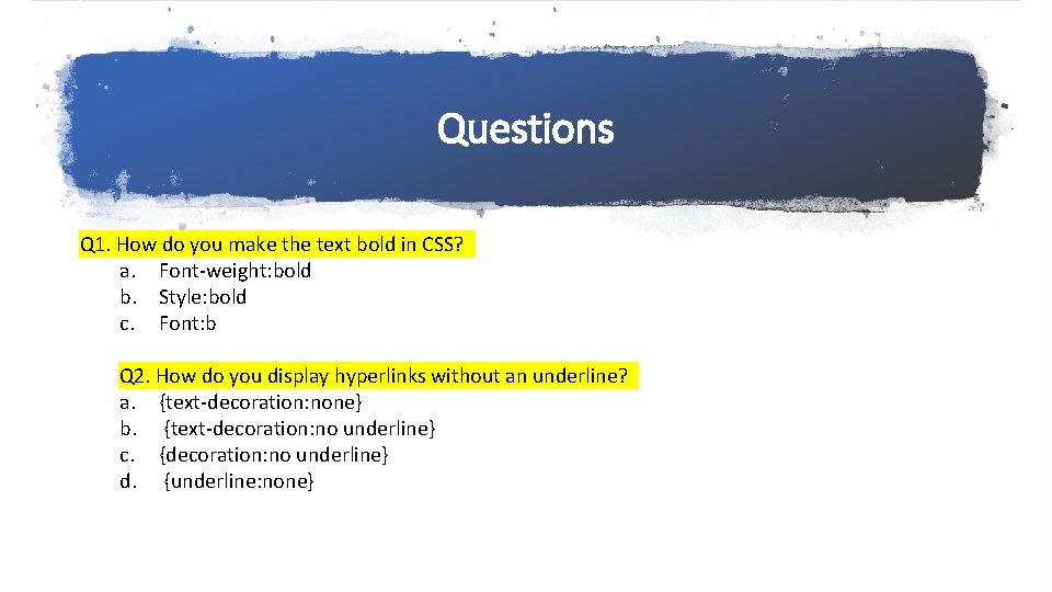
Questions Q 1. How do you make the text bold in CSS? a. Font-weight: bold b. Style: bold c. Font: b Q 2. How do you display hyperlinks without an underline? a. {text-decoration: none} b. {text-decoration: no underline} c. {decoration: no underline} d. {underline: none}

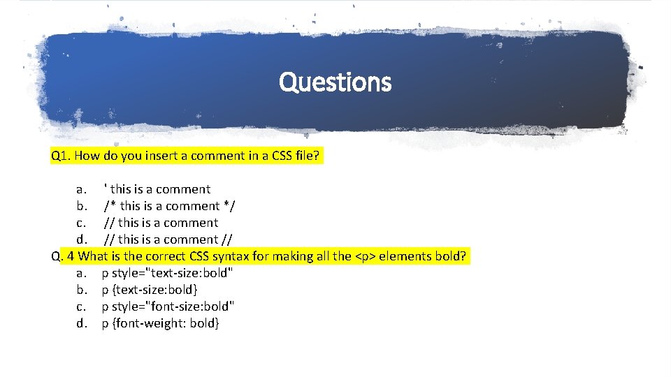
Questions Q 1. How do you insert a comment in a CSS file? a. ' this is a comment b. /* this is a comment */ c. // this is a comment d. // this is a comment // Q. 4 What is the correct CSS syntax for making all the <p> elements bold? a. p style="text-size: bold" b. p {text-size: bold} c. p style="font-size: bold" d. p {font-weight: bold}