
Intro to Data Visualization Simple Graphs in Python
![import matplotlib. pyplot as plt y 1 =[] y 2 =[] x = range(-100,](https://slidetodoc.com/presentation_image_h2/42f1efa0fe2309c3db0b7d6f6631bc78/image-9.jpg "import matplotlib. pyplot as plt y 1 =[] y 2 =[] x = range(-100,")
![Plot import matplotlib. pyplot as plt x = [1, 2, 3, 4] y =](https://slidetodoc.com/presentation_image_h2/42f1efa0fe2309c3db0b7d6f6631bc78/image-10.jpg "Plot import matplotlib. pyplot as plt x = [1, 2, 3, 4] y =")
- Slides: 24
Intro. to Data Visualization Simple Graphs in Python using matplotlib and pyplot By Dr. Ziad Al-Sharif
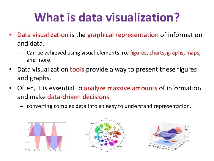
What is data visualization? • Data visualization is the graphical representation of information and data. – Can be achieved using visual elements like figures, charts, graphs, maps, and more. • Data visualization tools provide a way to present these figures and graphs. • Often, it is essential to analyze massive amounts of information and make data-driven decisions. – converting complex data into an easy to understand representation.
Matplotlib • Matplotlib is one of the most powerful tools for data visualization in Python. • Matplotlib is an incredibly powerful (and beautiful!) 2 -D plotting library. – It is easy to use and provides a huge number of examples for tackling unique problems • In order to get matplotlib into your script, – first you need to import it, for example: import matplotlib. pyplot as plt • However, if it is not installed, you may need to install it: – Easiest way to install matplotlib is using pip. – Type the following command in the command prompt (cmd) or your Linux shell; • pip install matplotlib • Note that you may need to run the above cmd as an administrator
matplotlib • Strives to emulate MATLAB – matplotlib. pyplot is a collection of command style functions that make matplotlib work like MATLAB. • Each pyplot function makes some change to the figure: – e. g. , • • creates a figure, creates a plotting area in the figure, plots some lines in the plotting area, decorates the plot with labels, etc. • Note that various states are preserved across function calls • Whenever you plot with matplotlib, the two main code lines should be considered: – Type of graph • this is where you define a bar chart, line chart, etc. – Show the graph • this is to display the graph
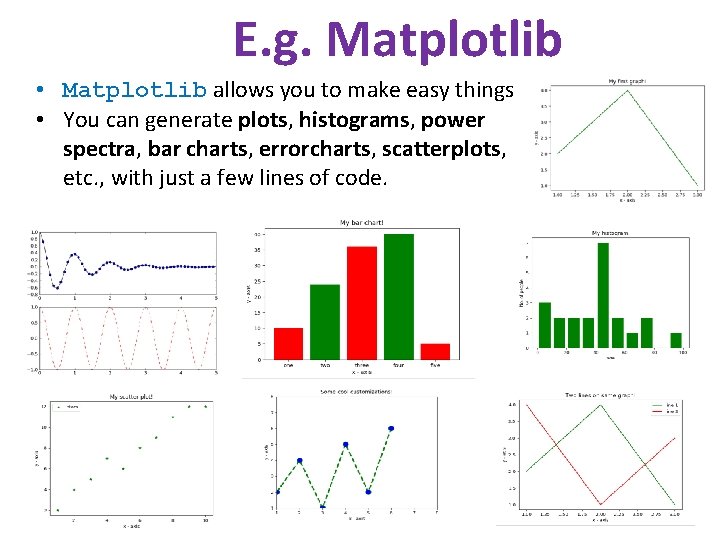
E. g. Matplotlib • Matplotlib allows you to make easy things • You can generate plots, histograms, power spectra, bar charts, errorcharts, scatterplots, etc. , with just a few lines of code.
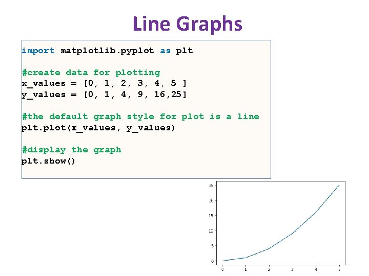
Line Graphs import matplotlib. pyplot as plt #create data for plotting x_values = [0, 1, 2, 3, 4, 5 ] y_values = [0, 1, 4, 9, 16, 25] #the default graph style for plot is a line plt. plot(x_values, y_values) #display the graph plt. show()
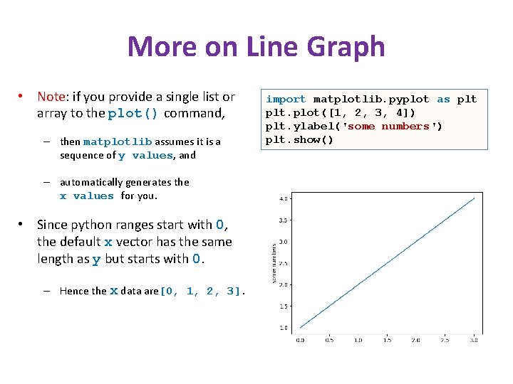
More on Line Graph • Note: if you provide a single list or array to the plot() command, – then matplotlib assumes it is a sequence of y values, and – automatically generates the x values for you. • Since python ranges start with 0, the default x vector has the same length as y but starts with 0. – Hence the x data are[0, 1, 2, 3]. import matplotlib. pyplot as plt. plot([1, 2, 3, 4]) plt. ylabel('some numbers') plt. show()
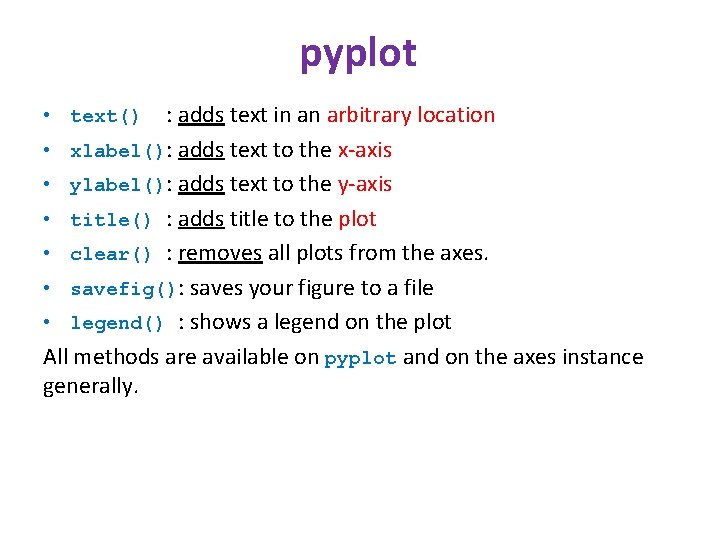
pyplot : adds text in an arbitrary location • xlabel(): adds text to the x-axis • ylabel(): adds text to the y-axis • title() : adds title to the plot • clear() : removes all plots from the axes. • savefig(): saves your figure to a file • legend() : shows a legend on the plot All methods are available on pyplot and on the axes instance generally. • text()
import matplotlib. pyplot as plt y 1 =[] y 2 =[] x = range(-100, 10) for i in x: y 1. append(i**2) for i in x: y 2. append(-i**2) plt. plot(x, y 1) plt. plot(x, y 2) plt. xlabel("x") plt. ylabel("y") plt. ylim(-2000, 2000) plt. axhline(0) # horizontal line plt. axvline(0) # vertical line Incrementally modify the figure. plt. savefig("quad. png") Save your figure to a file plt. show() Show it on the screen
Plot import matplotlib. pyplot as plt x = [1, 2, 3, 4] y = [1, 4, 9, 16] plt. plot(x, y) no return value? • • We are operating on a “hidden” variable representing the figure. This is a terrible, terrible trick. Its only purpose is to pander to MATLAB users. I’ll show you how this works in the next lecture
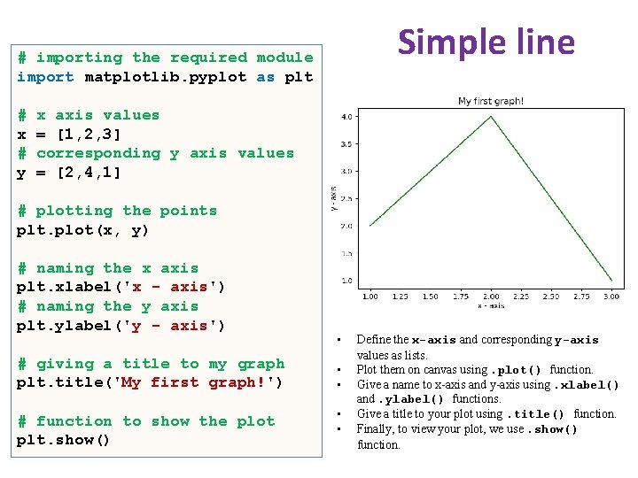
Simple line # importing the required module import matplotlib. pyplot as plt # x # y x axis values = [1, 2, 3] corresponding y axis values = [2, 4, 1] # plotting the points plt. plot(x, y) # naming the x axis plt. xlabel('x - axis') # naming the y axis plt. ylabel('y - axis') # giving a title to my graph plt. title('My first graph!') # function to show the plot plt. show() • • • Define the x-axis and corresponding y-axis values as lists. Plot them on canvas using. plot() function. Give a name to x-axis and y-axis using. xlabel() and. ylabel() functions. Give a title to your plot using. title() function. Finally, to view your plot, we use. show() function.
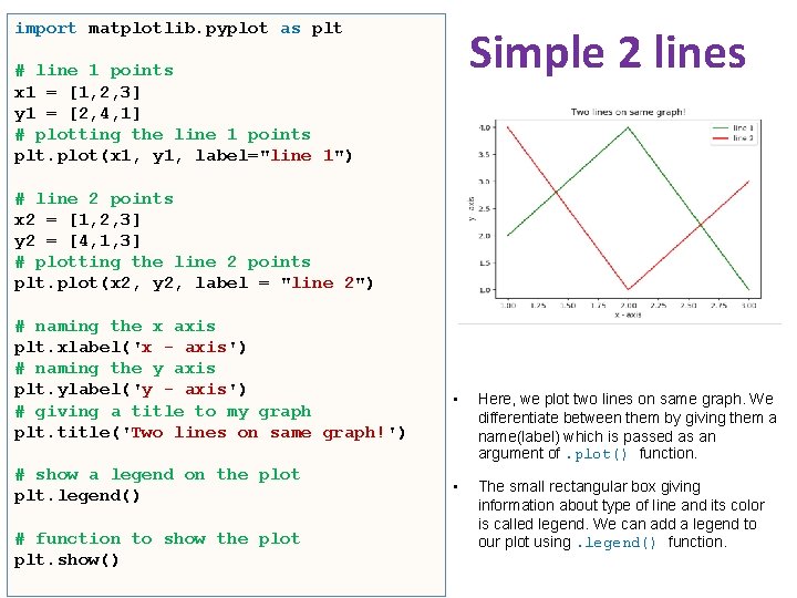
import matplotlib. pyplot as plt Simple 2 lines # line 1 points x 1 = [1, 2, 3] y 1 = [2, 4, 1] # plotting the line 1 points plt. plot(x 1, y 1, label="line 1") # line 2 points x 2 = [1, 2, 3] y 2 = [4, 1, 3] # plotting the line 2 points plt. plot(x 2, y 2, label = "line 2") # naming the x axis plt. xlabel('x - axis') # naming the y axis plt. ylabel('y - axis') # giving a title to my graph plt. title('Two lines on same graph!') # show a legend on the plot plt. legend() # function to show the plot plt. show() • Here, we plot two lines on same graph. We differentiate between them by giving them a name(label) which is passed as an argument of. plot() function. • The small rectangular box giving information about type of line and its color is called legend. We can add a legend to our plot using. legend() function.
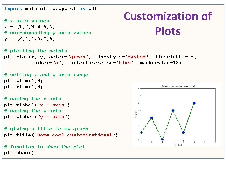
import matplotlib. pyplot as plt # x # y x axis values = [1, 2, 3, 4, 5, 6] corresponding y axis values = [2, 4, 1, 5, 2, 6] Customization of Plots # plotting the points plt. plot(x, y, color='green', linestyle='dashed', linewidth = 3, marker='o', markerfacecolor='blue', markersize=12) # setting x and y axis range plt. ylim(1, 8) plt. xlim(1, 8) # naming the x axis plt. xlabel('x - axis') # naming the y axis plt. ylabel('y - axis') # giving a title to my graph plt. title('Some cool customizations!') # function to show the plot plt. show()
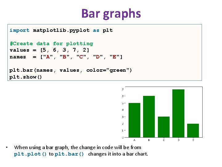
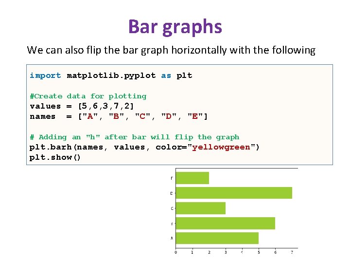
Bar graphs import matplotlib. pyplot as plt #Create data for plotting values = [5, 6, 3, 7, 2] names = ["A", "B", "C", "D", "E"] plt. bar(names, values, color="green") plt. show() • When using a bar graph, the change in code will be from plt. plot() to plt. bar() changes it into a bar chart.
Bar graphs We can also flip the bar graph horizontally with the following import matplotlib. pyplot as plt #Create data for plotting values = [5, 6, 3, 7, 2] names = ["A", "B", "C", "D", "E"] # Adding an "h" after bar will flip the graph plt. barh(names, values, color="yellowgreen") plt. show()
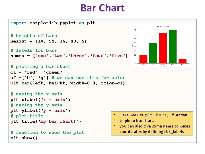
Bar Chart import matplotlib. pyplot as plt # heights of bars height = [10, 24, 36, 40, 5] # labels for bars names = ['one', 'two', 'three', 'four', 'five'] # plotting a bar chart c 1 =['red', 'green'] c 2 =['b', 'g'] # we can use this for color plt. bar(left, height, width=0. 8, color=c 1) # naming the x-axis plt. xlabel('x - axis') # naming the y-axis plt. ylabel('y - axis') # plot title plt. title('My bar chart!') # function to show the plot plt. show() • • Here, we use plt. bar() function to plot a bar chart. you can also give some name to x-axis coordinates by defining tick_labels
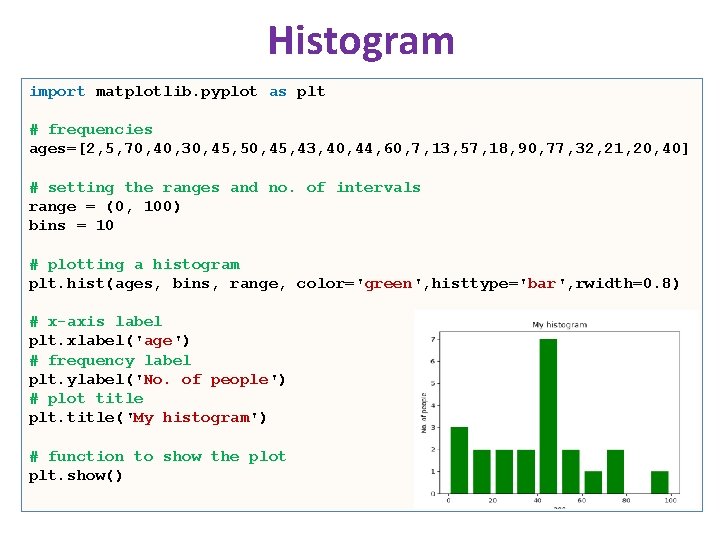
Histogram import matplotlib. pyplot as plt # frequencies ages=[2, 5, 70, 40, 30, 45, 50, 45, 43, 40, 44, 60, 7, 13, 57, 18, 90, 77, 32, 21, 20, 40] # setting the ranges and no. of intervals range = (0, 100) bins = 10 # plotting a histogram plt. hist(ages, bins, range, color='green', histtype='bar', rwidth=0. 8) # x-axis label plt. xlabel('age') # frequency label plt. ylabel('No. of people') # plot title plt. title('My histogram') # function to show the plot plt. show()
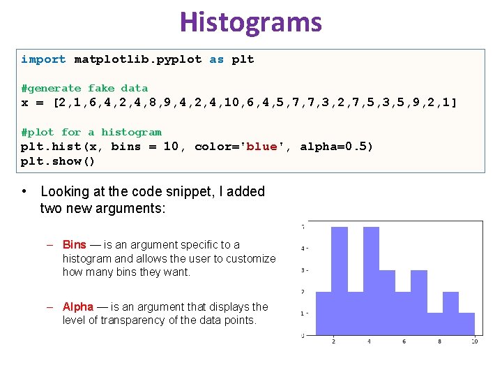
Histograms import matplotlib. pyplot as plt #generate fake data x = [2, 1, 6, 4, 2, 4, 8, 9, 4, 2, 4, 10, 6, 4, 5, 7, 7, 3, 2, 7, 5, 3, 5, 9, 2, 1] #plot for a histogram plt. hist(x, bins = 10, color='blue', alpha=0. 5) plt. show() • Looking at the code snippet, I added two new arguments: – Bins — is an argument specific to a histogram and allows the user to customize how many bins they want. – Alpha — is an argument that displays the level of transparency of the data points.
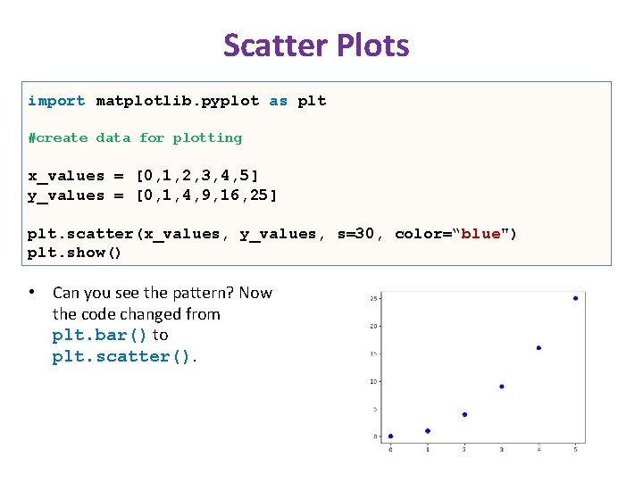
Scatter Plots import matplotlib. pyplot as plt #create data for plotting x_values = [0, 1, 2, 3, 4, 5] y_values = [0, 1, 4, 9, 16, 25] plt. scatter(x_values, y_values, s=30, color=“blue") plt. show() • Can you see the pattern? Now the code changed from plt. bar() to plt. scatter().
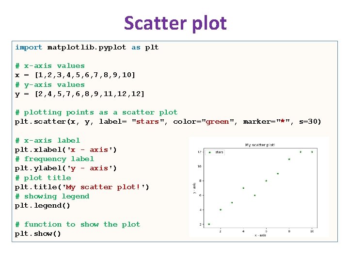
Scatter plot import matplotlib. pyplot as plt # x # y x-axis values = [1, 2, 3, 4, 5, 6, 7, 8, 9, 10] y-axis values = [2, 4, 5, 7, 6, 8, 9, 11, 12] # plotting points as a scatter plot plt. scatter(x, y, label= "stars", color="green", marker="*", s=30) # x-axis label plt. xlabel('x - axis') # frequency label plt. ylabel('y - axis') # plot title plt. title('My scatter plot!') # showing legend plt. legend() # function to show the plot plt. show()
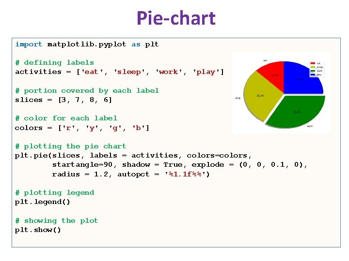
Pie-chart import matplotlib. pyplot as plt # defining labels activities = ['eat', 'sleep', 'work', 'play'] # portion covered by each label slices = [3, 7, 8, 6] # color for each label colors = ['r', 'y', 'g', 'b'] # plotting the pie chart plt. pie(slices, labels = activities, colors=colors, startangle=90, shadow = True, explode = (0, 0, 0. 1, 0), radius = 1. 2, autopct = '%1. 1 f%%') # plotting legend plt. legend() # showing the plot plt. show()
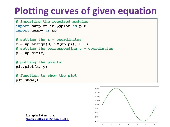
Plotting curves of given equation # importing the required modules import matplotlib. pyplot as plt import numpy as np # x # y setting the x - coordinates = np. arange(0, 2*(np. pi), 0. 1) setting the corresponding y - coordinates = np. sin(x) # potting the points plt. plot(x, y) # function to show the plot plt. show() Examples taken from: Graph Plotting in Python | Set 1
Summary • We just scratched the surface of the power of matplotlib. • You can read more and find how you can create more colorful, detailed, and vibrant graphs. • There a lot more graphs available in the matplotlib library as well as other popular libraries available in python, including: – seaborn • https: //seaborn. pydata. org/ – pandas plot (pandas. Data. Frame. plot) • https: //pandas. pydata. org/pandasdocs/stable/reference/api/pandas. Data. Frame. plot. html – plotly (Plotly Python Open Source Graphing Library) • https: //plotly. com/python/
References • Matplotlib: Visualization with Python – https: //matplotlib. org/index. html • matplotlib. pyplot – https: //matplotlib. org/3. 2. 1/api/pyplot_summary. html • Tutorials – https: //matplotlib. org/tutorials/index. html • Gallery & Examples – https: //matplotlib. org/gallery/index. html • Videos – https: //www. youtube. com/watch? v=3 Fp 1 zn 5 ao 2 M&feature=plcp • Book: Mastering matplotlib – https: //www. packtpub. com/big-data-and-business-intelligence/mastering -matplotlib