INTERPRETATING TABLES AND GRAPHS BY GHANA STATISTICAL SERVICE
INTERPRETATING TABLES AND GRAPHS BY GHANA STATISTICAL SERVICE OCTOBER, 2018 1
Outline of Presentation ØIntroduction ØFive-Step Framework for Interpreting Tables and Graphs ØInterpreting Tables ØInterpreting Graphs (e. g. bar, charts, line) ØWhen to use Tables or Graphs ØUsing Text to present Data ØExplaining what the Data reveals ØTips on writing on Tables and Charts 2
Introduction • Earlier Wallman (1993) in her presidential address to the American Statistical Association described Statistical Literacy as: • ‘’the ability to understand critically evaluate statistical results that permeate our daily lives -coupled with the ability to appreciate the contributions that statistical thinking can make in public and private, professional and personal decisions’’. 3
Five-Step Framework for Interpreting Tables and Graphs ØStep 1: Getting Started • Look at the title, axes, headings, legends, footnotes and source to find out the context and expected quality of the data. • Take into account information on the questions asked in surveys and polls, sample size, sampling procedures and sampling error. ØStep 2: WHAT do the numbers mean? • Make sure you know what all the numbers (percentages, ‘ 000 s, etc. ) represent. Look for the largest and smallest values in one or more categories or years to get an impression of the data. ØStep 3: HOW do they differ? • Look at the differences in the values of the data in a single data set, a row or column or part 4 of a graph. This may involve changes over time, or comparison within a category, such as male and female at any time.
Five-Step Framework for Interpreting Tables and Graphs (cont’d) ØStep 4: WHERE are the differences? • What are the relationships in the table that connect the variables? Use information from Step 3 to help you make comparisons across two or more categories or time frames. ØStep 5: WHY do they change? • Why are there differences? Look for reasons for the relationships in the data that you have found by considering social, environmental and economic factors. Think about sudden or unexpected changes in terms of state, national and international policies. 5
Things to Note ØAs You Read Take notes on the data you found in the chart, table, or graph. This will help you keep the information organized. ØAfter You Read Analyze the data you gathered and determine what conclusions you can draw based on the data. 6
Interpreting Tables (1/6) ØData are presented in a variety of contexts in tabular form. Koschat (2005), identified three main advantages in using tables for providing information. üFirst, a table presents data, or a summary of that data, in numerical form. (as absolute numbers or percentages) üSecondly, people can easily use the data and convert to other forms such as a graph or a model if they wish to do so, but this is not easy in reverse. üThirdly, it can quite often be the case that the reader wants to see and interpret the actual numbers 7
Interpreting Tables (2/6) q. When you read a table, be sure to: ØRead the title, the column headings, and the row headings. ØRead down the far left column first to determine how the table is organized. ØDetermine the meaning of abbreviations or symbols used. ØDetermine the timeframe of the table. 8
Interpreting Tables (3/6) ØTo find specific information you are looking for, read down the left column until you come to a description of your data; then read across to the column that contains the specific information you need. ØAnalyze the patterns you see in the table and the differences from one column to the next. ØCheck how the data is arranged in the table – is it ROW totals or COLUMN totals 9
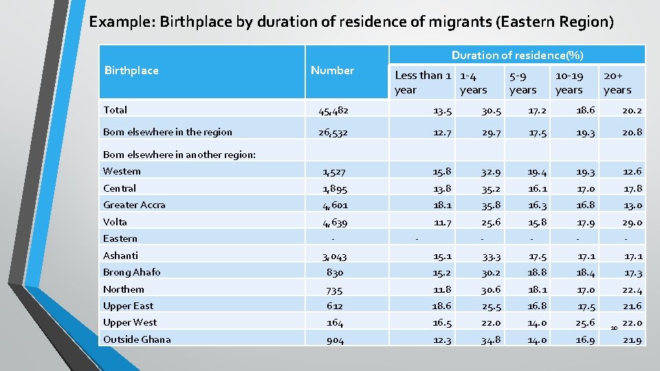
Example: Birthplace by duration of residence of migrants (Eastern Region) Birthplace Duration of residence(%) Number Less than 1 1 -4 years Total 45, 482 13. 5 30. 5 17. 2 18. 6 20. 2 Born elsewhere in the region 26, 532 12. 7 29. 7 17. 5 19. 3 20. 8 Western 1, 527 15. 8 32. 9 19. 4 19. 3 12. 6 Central 1, 895 13. 8 35. 2 16. 1 17. 0 17. 8 Greater Accra 4, 601 18. 1 35. 8 16. 3 16. 8 13. 0 Volta 4, 639 11. 7 25. 6 15. 8 17. 9 29. 0 - - 5 -9 years 10 -19 years 20+ years Born elsewhere in another region: Eastern - - Ashanti 3, 043 15. 1 33. 3 17. 5 17. 1 Brong Ahafo 830 15. 2 30. 2 18. 8 18. 4 17. 3 Northern 735 11. 8 30. 6 18. 1 17. 0 22. 4 Upper East 612 18. 6 25. 5 16. 8 17. 5 21. 6 Upper West 164 16. 5 22. 0 14. 0 25. 6 Outside Ghana 904 12. 3 34. 8 14. 0 16. 9 10 22. 0 21. 9
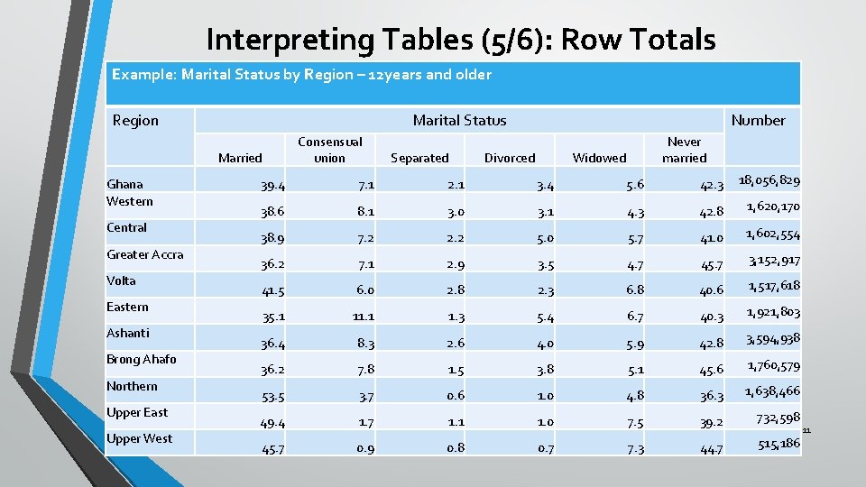
Interpreting Tables (5/6): Row Totals Example: Marital Status by Region – 12 years and older Region Marital Status Consensual union Married Ghana Western Central Greater Accra Volta Eastern Ashanti Brong Ahafo Northern Upper East Upper West Separated Number Divorced Never married Widowed 39. 4 7. 1 2. 1 3. 4 5. 6 42. 3 18, 056, 829 38. 6 8. 1 3. 0 3. 1 4. 3 42. 8 1, 620, 170 38. 9 7. 2 2. 2 5. 0 5. 7 41. 0 1, 602, 554 36. 2 7. 1 2. 9 3. 5 4. 7 45. 7 3, 152, 917 41. 5 6. 0 2. 8 2. 3 6. 8 40. 6 1, 517, 618 35. 1 11. 1 1. 3 5. 4 6. 7 40. 3 1, 921, 803 36. 4 8. 3 2. 6 4. 0 5. 9 42. 8 3, 594, 938 36. 2 7. 8 1. 5 3. 8 5. 1 45. 6 1, 760, 579 53. 5 3. 7 0. 6 1. 0 4. 8 36. 3 1, 638, 466 49. 4 1. 7 1. 1 1. 0 7. 5 39. 2 732, 598 45. 7 0. 9 0. 8 0. 7 7. 3 44. 7 515, 186 11
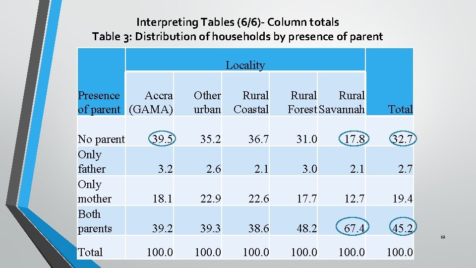
Interpreting Tables (6/6)- Column totals Table 3: Distribution of households by presence of parent Locality Accra Presence of parent (GAMA) No parent Only father Only mother Both parents Total Other urban Rural Coastal Rural Forest Savannah 39. 5 35. 2 36. 7 31. 0 17. 8 32. 7 3. 2 2. 6 2. 1 3. 0 2. 1 2. 7 18. 1 22. 9 22. 6 17. 7 12. 7 19. 4 39. 2 39. 3 38. 6 48. 2 67. 4 45. 2 100. 0 Total 12
Interpreting Graphs/Charts (1/4) ØGraphs are often seen in all forms of media, printed and electronic. ØWe need to know the appropriate use of graphs for specific purposes such as showing trends or proportions, for discrete and continuous data and to have some knowledge of what the shape of a graph can convey 13
Interpreting Graphs/Charts (2/4) Øinformation within large data Charts are: Øeasy to understand than tables, Øoften more effective for highlighting important sets for readers who are less apt with numbers. 14
Interpreting Graphs/Charts (3/4) ØCharts are especially useful for: Øshowing patterns and comparing trends, Øare more visual and attractive than tables, they can help in presentations. 15
Interpreting Graphs/Charts (4/4) ØOn the other hand, charts are not suitable for communicating more detailed and precise data, and can be time-consuming and expensive to design or construct. 16
Bar Graph (1/5) ØBar graphs show relationships between groups or categories of information. ØThe data is represented by color or shade-coded bars. ØThese graphs show data for only one point in time. 17
Bar Graph (2/5) ØA bar chart displays data as rectangular bars with lengths proportional to the values that they represent. ØBar charts are useful for comparing two or more values, such as the employment by industry in example on the next slide 18
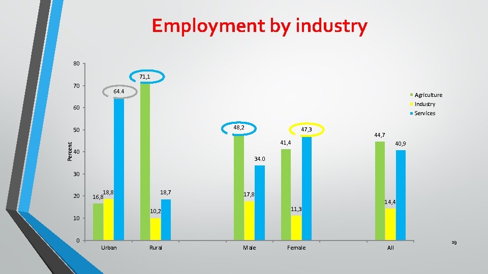
Employment by industry 80 71, 1 70 64. 4 Agriculture Industry 60 Services 48, 2 Percent 50 47, 3 41, 4 40 44, 7 40, 9 34. 0 30 20 18, 8 16, 8 18, 7 17, 8 11, 3 10, 2 10 14, 4 0 Urban Rural Male Female All 19
Bar Graph (4/5) ØThe bars can be vertically or horizontally oriented Ø Horizontal bar charts are often used when there are many bars and each bar requires a long label, which would overlap or be truncated in vertical bar charts 20
Bar graph (5/5) q. When you read a bar graph, be sure to: Ø Read the labels on each axis of the graph. ØRead the markings on each axis to determine the numeric values represented. ØDetermine represents. the value or amount that each bar ØAnalyze the relationships among all the lines by determining how they compare/contrast to one another. 21
Pie Chart (1/8) ØA Pie chart is a circle divided into sections, which are often shown in different colors. ØThe sections show percentages, relative sizes, or proportions of specific data as it relate to the whole pie, or 100 percent 22
Pie Chart (2/8) ØWhen you read a pie chart, be sure to: üRead the labels for each section of the pie. ü Analyze the relationships between the parts and the whole. üNotice the different colors and what they represent. 23
Pie Chart (3/8) ØWhen you read a pie chart, be sure to: üThink about the significance of the size of each section of the circle. üHow do the sections relate to each other? üHow do they correspond to the written data? 24
Pie Chart (4/8) ØPie charts are useful for illustrating percentage distributions of components within a total and are therefore suitable for presenting overviews of data. e. g. the breakdown of the annual education budget by types of expenditure is a good example of information that can be presented clearly using a pie chart ØThe area of each slice of the pie is proportional to the relative share, or frequency, of each item that makes up the total. 25
Pie Chart (5/8) ØThe pie chart however is not suitable for displaying data with a high degree of accuracy. ØThis is especially true when an item represents a very small share of the total, in which case its slice may be very thin and difficult to measure. 26
Pie Chart (6/8) ØIt can also be difficult to see the difference between two items with similar but slightly different shares of the total. ØDo not include too many data items on the same pie chart. ØToo many slices, especially thin slices or slices of a similar size, may make a pie chart difficult to interpret. ØA maximum of 5 or 6 slices is optimal. 27
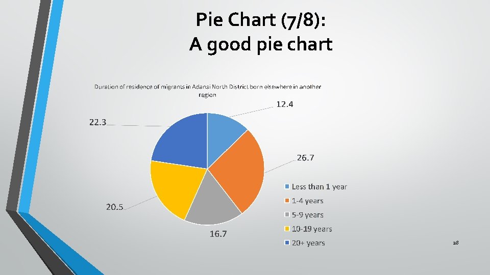
Pie Chart (7/8): A good pie chart 28
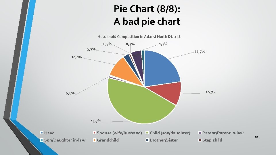
Pie Chart (8/8): A bad pie chart Household Composition in Adansi North District 0, 7% 0, 3% 1, 3% 2, 7% 22, 7% 4, 7% 10, 0% 10, 7% 0, 8% 45, 7% Head Spouse (wife/husband) Child (son/daughter) Parent/Parent in-law Son/Daughter in-law Grandchild Brother/Sister Step child 29
Line Graph (1/5) ØA line graph shows continuing data or changes in data over time. ØLine graphs are used to show rates of change or market trends. ØThey can also compare data for more than one product or contrast performance or growth. 30
Line Graph (2/5) ØWhen you read a line graph, be sure to: ü Read the labels for the horizontal (X) axis. The X-axis shows you the time periods. üRead the labels for the vertical (Y) axis. The Y-axis shows you what is being measured. üTo read a line graph, start at the bottom left. Read up and then across to the right. üAnalyze the relationships among the data 31
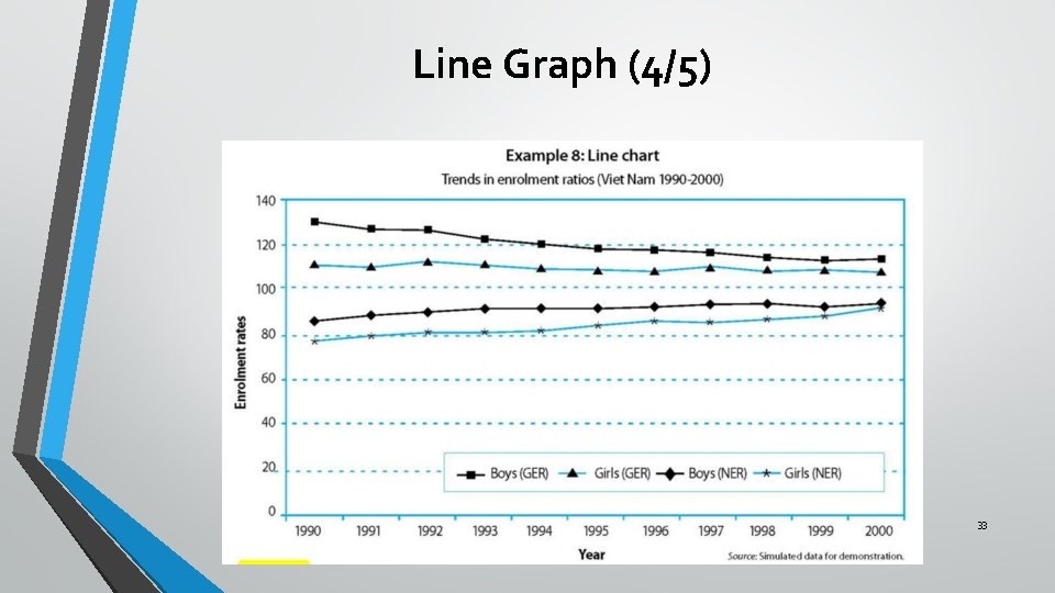
Line Graph (3/5) ØA line graph is a simple way to show time-series or trends. ØA single graph can display multiple lines, with one line for each data series or sub-population, such as the number of students by sex, or gross and net enrolment ratios for boys and girls over time (see example 8 below). 32
Line Graph (4/5) 33
Line Graph (5/5) ØHorizontal grid- lines make it easier for the eye to follow the plotted lines, to identify the data values along the data series, and to get a clearer picture of the trend and changes in the values for different data series. ØIt is generally not advisable to label every data point in a line chart, unless it is important to show precise values that are quoted in the accompanying text. 34
When to use a table or a chart (1/8) ØTables: ü Have columns and rows of information. üTables interact primarily with our verbal system. üInformation in tables are processed in a sequential fashion, reading down columns or across rows of numbers, comparing this number to that number, one pair at a time. 35
When to use a table or a chart (2/8) ØTips for choosing tables v. Tables work best when the data presentation: ücontains many data series for cross-analysis üis used to look up or compare individual values ürequires precise values ücontains values that involve multiple units of measurement 36
When to use a table or a chart (3/8) Charts: ØCharts are perceived by our visual system. ØThey give shape and form to numbers. To see patterns and relationships is a natural function of visual perception. Ø A single chart can convey important features of the data more vividly and memorably than columns of data. 37
When to use a table or a chart (4/8) ØTIPS for choosing chart v. Graphs work best when the data presentation: üis used to identify patterns and trends üis used to communicate a message that can be highlighted in the shape of the graph üis used to visually reveal relationships among several values 38
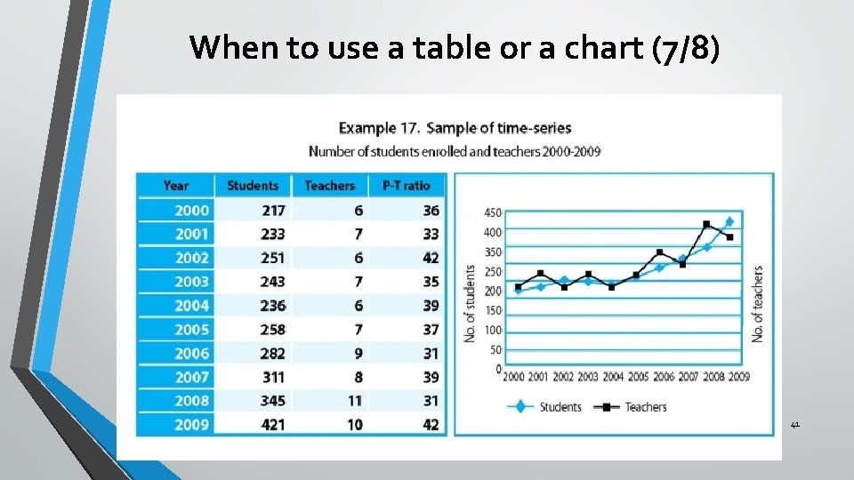
When to use a table or a chart (5/8) ØSometimes, we need to present information about changes over time. ØTo present time-series data, we use summary tables and charts that effectively show changes in values from one time period to the next in chronological order. 39
When to use a table or a chart (6/8) ØAs long as the definition of the data and the collection methods were consistent over time, we can use tables and charts to study past trends and estimate future values. ØExample 17 shows two time-series lines in the same graph – one for students and one for teachers. The two time-series have been combined, with different scales on the left and the right side of the graph. 40
When to use a table or a chart (7/8) 41
When to use a table or a chart (8/8) ØIt is interesting to see that the two trends generally overlap but the lines crisscross over each other. ØThis can be interpreted as overall correspondence in the availability of teachers in relation to the number of students over the years, although there have been noticeable fluctuations, or instability. 42
Using text to present data (1/6) ØTables and charts are often accompanied by descriptive text that highlights the Øfindings, Øpatterns, Øissues and Øimplications of the data. ØTextual descriptions and discussions play a crucial role in almost every kind of data presentation, especially for people who are not familiar with data, tables and charts. 43
Using text to present data (2/6) ØMany people even prefer plain textual descriptions to tables and charts, or at least need some clear and simple explanations to help them understand the data and important points presented in the tables and charts. 44
Using text to present data: basic rules (3/6) One of the important functions of text is to provide a verbal description of the data in tables and charts. 5 basic rules when drafting a text to describe a table or chart: ü Try to capture the readers’ interest by highlighting key findings and meanings. ü Take time to write clearly and succinctly – draft and redraft to clearly and unambiguously describe the data. 45
Using text to present data: basic rules (4/6) üEnsure consistency of language and style throughout the report or presentation – üOften sections of a single piece are written separately for each table or chart, so a final check to ensure consistency is advisable. 46
Using text to present data: basic rules (5/6) • Avoid unnecessary repetition – if parts of the report or presentation are written separately, contents get repeated. Review the written text to eliminate unnecessary repetitions and to harmonize the texts. 47
Using text to present data: basic rules (6/6) ü Focus on the main points and minimize unnecessary details – Present the most important information first, and add details only if absolutely necessary. 48
Explaining what the data reveal (1/3) ØA verbal summary should simply accompany the table or chart to explain what the data reveal. ØKeep the summary short – never allow the verbal summary to expand into an itemized account of each entry in the table or chart. ØPosition the summary in the text close to the table or chart to which it refers. Quoting directly the key reference numbers is the best way. For example: “From Table 2, 46 percent of girls (6 -15) were out of school in 2001. ” 49
Explaining what the data reveal (2/3) ØUse ‘emotional’ descriptions and wording sparingly: üSensational messages can be effective with a non-technical audience, but they can communicate biases or lead to biased interpretations. üFor example: “Education expenditure per student in Adaklu rose by 10 per cent” may be better than: “Education expenditure per student in Adaklu shot up by 10 per cent!”. 50
Explaining what the data reveal (3/3) ØBe cautious when attributing causality to a factor ØE. g. some erratic movements in a data series may be due to changes in definitions or measurement unit, rather than actual changes in the underlying event. ØDo not jump to conclusions that ‘this caused that’, unless there is ample evidences to justify it. 51
Tips on writing on tables and charts(1/5) • Avoid long sentences. Short, sharp sentences are more effective. • Paragraph breaks provide the reader with a short rest, and are necessary to maintain the reader’s interest. • On the other hand, having too many short paragraphs may ruin the flow of the text and make it confusing and uninteresting. 52
Tips on writing on tables and charts (2/5) ØCommas provide pauses within a sentence, but, if over-used, may be bothersome and misleading. ØMinimize the use of brackets. ØWhen several pairs of brackets are used in the same sentence or section, the reader may become confused and lose track of the central theme. 53
Tips on writing on tables and charts (3/5) ØAvoid repeating the same wording in close proximity. It looks careless and may be distracting. To avoid this problem, try to search for and use synonyms. ØAvoid unnecessary words and phrases. These give the reader extra work and may distract them from the central theme or main findings. 54
Tips on writing on tables and charts (4/5) ØKeep the language simple. Readers are usually more impressed by clear language than by words that they do not fully understand. ØBe logical. Ensure that the structure is sequential and that the conclusions reflect the body of the text. This reduces the chances of the readers becoming confused. ØEnsure that the use of articles is clear. Whenever words such as ‘it’ or ‘that’ are used, be sure that the reader has no doubt about what these pronouns refer to. 55
Tips on writing on tables and charts (5/5) ØAdopt conventions and keep to them throughout. ØConventions can include headings, numbering, use of abbreviations and acronyms, or other matters of style such as the use of digits and written numbers. ØIf necessary, these should be spelt out by the writer or writing team. If conventions are maintained throughout, the report will be clearer and better received. 56

THANK YOU 57
- Slides: 57