Interaktiv datavisualisering som effektiv ledelsesinformation greb til kvantitativ

Interaktiv datavisualisering som effektiv ledelsesinformation - greb til kvantitativ afrapportering Dansk Evalueringskonference: Læringsseminar 4. september 2019 Jacob Jensen Analysechef, Syddansk Universitet jac@sdu. dk

Program Ø Intro + præsentationsrunde Ø Kontekst/begrebsafklaring ift ledelsesinformation & kvantitativ analyse Ø Design principper for topledelsesinformation inkl. eksempler Ø På egen hånd – deltagerøvelse i excel se 2 Pau 16 Ca. 5 1 16: Ø Udfordringer – fælles drøftelse af erfaringer og perspektiver Pau s Ca. e 1 1515: 1 5

Interaktiv datavisualisering som effektiv ledelsesinformation - greb til kvantitativ afrapportering

Unemployment - master graduates Unemployment after 1, quarter - 2015 Unemployment after 1, quarter – 2015, all univ. Unemployment after 1, quarter – 2009 -2015, all univ.

Starting point? Measuring Organizational Maturity in Analytics? Data Denial 0 Data Indifferent Data Informed Data Driven

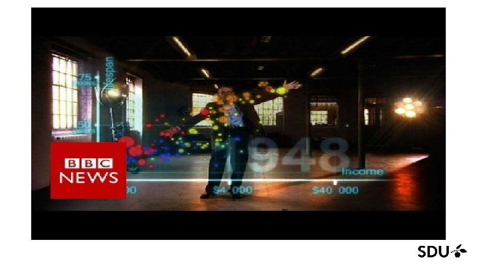
Generations of Analytics Discovery Descriptive Analytics Complex models Analytics Data. Viz Simple models Old School: Internal data sources Historic or Real Time Data Social Science Approach Licensed Software PC/In. House. Server Information 1 0 5 4 Predictive Analytics Prescriptive Analytics gic V e t a r t S alue Modern: Big Data sources Automated Data Flow Data Science Approach Open Source Coding Cloud solutions Optimization Cognitive Analytics Self-learning & selfservice systems

Hvad kendetegner jeres ledelsesinformation? Ledelsesinfo udbredt i organisationen? Ingen musik Improvisation Solo Ensemble Symfoni Generation af Analytics Deskriptiv analyse Discovery / Dataviz Prædiktion Præskription Cognitiv

SDU 2000 -2010 Analytics: The Internal view Annual old school PDF reporting 0

SDU Guidelines to effective management information Core principles in our approach to data visualization • Use the right metrics! • Design matters - beauty is truth! • Put metrics into perspective - compared to what?

Use the right metrics! • Metrics involving strategy, policy and money are important for executive management • Focus on impact metrics (i. e. value chain: input > activities > output > outcome > impact) • Impact metrics are strong metrics when answering ‘why’ questions in strategic decisions • Other issues to be considered • • Accept a proxy - choose metrics based on information needs and not on data availability Use real time metrics whenever possible – data agility gives an analytic advantage Think metrics on aggregated levels Think metrics on societal key issues that could influence the strategy

Design matters - beauty is truth! • Structure and simplify • • • Structure information in the dashboard either horizontally or vertically Place key metrics at the top, position-charts in the middle, and trend charts at the bottom. Keep it simple, i. e. no logos, no fancy functions and no 3 D graphics. Less is more! • Consider the use of colors carefully • Use dark/high intensity colors to highligt specific data - use soft/low intensity colors for the rest • Only use a few wellknown charts (makes the interpretation easier) • • Pre-sorted barcharts are good at displaying benchmark / ranking Line charts are good at displaying development over a period of time Scatterplots are good at relation analysis Maps are an extremely effective tool in geographical analysis

Put metrics into perspective - compared to what? • General issues • An interactive design highly enhances analytical usability of the dashboard • Whenever two charts / metrics should be compared, always place them next to each other • Benchmark • Comparison between different types of metrics gives a broader perspective • Comparing organizational key metrics with other similar organizations gives a competitive edge • Time series data • Comparing metrics with last year/month is often effective • Longer time series makes it easy to compare trends • Points of interest are not limited to high/low values – e. g. crossing curves are equally important

Udfordringer og perspektiver Metodefagligt: § Hvornår hellere vise tal end visualisering? § Real Time Data: Viser data adfærd eller administrativ registreringspraksis? § Fra Dokumentation til Prædiktion og Præskription – hvor bliver usikkerheden af? Etik: § ”Visuel evidens” - visualisering som manipulerende narrativ? § Outliers og Victim Blaiming? …. Data Literacy? ….

Inspirationskilder Stephen Few Masser af gode bøger + http: //www. perceptualedge. com/ Edward Tufte Fx Envisioning Information Hans Rosling Fx Factfulness

To be continued 26. september 2018
- Slides: 16