Information Visualization Main Concepts and Techniques Silvia Batraneanu
Information Visualization Main Concepts and Techniques Silvia Batraneanu MSPAS 2009
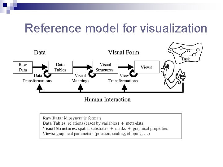
Reference model for visualization
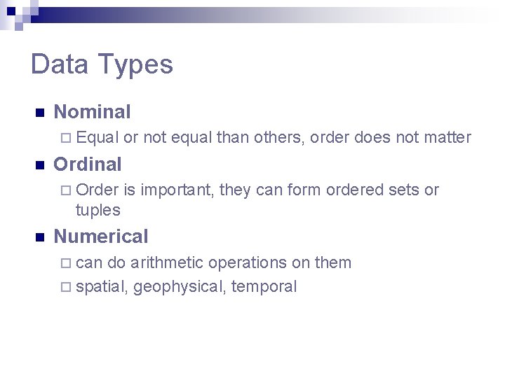
Data Types n Nominal ¨ Equal n or not equal than others, order does not matter Ordinal ¨ Order is important, they can form ordered sets or tuples n Numerical ¨ can do arithmetic operations on them ¨ spatial, geophysical, temporal
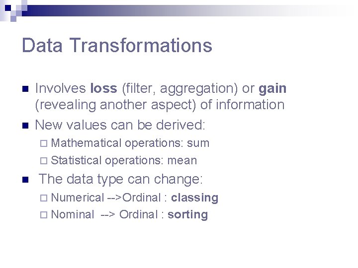
Data Transformations n n Involves loss (filter, aggregation) or gain (revealing another aspect) of information New values can be derived: ¨ Mathematical operations: sum ¨ Statistical operations: mean n The data type can change: ¨ Numerical -->Ordinal : classing ¨ Nominal --> Ordinal : sorting
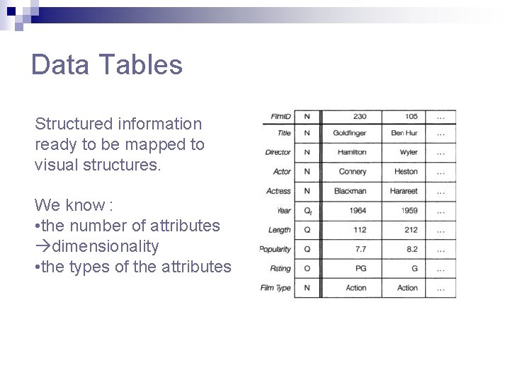
Data Tables Structured information ready to be mapped to visual structures. We know : • the number of attributes dimensionality • the types of the attributes
Visual Structures n Spatial substrate – perceptually dominant ¨ Main aspect : axes ¨ Types of axes: nominal, ordinal, quantitative n Marks(glyphs) ¨ 4 elementary types: points, lines, areas, volumes ¨ Take up space n Marks’s graphical properties ¨ Spatial : size, orientation ¨ Object related: Grayscale, Color, Texture, Shape ¨ Some are more effective than others
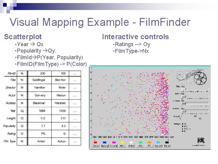
Visual Mapping Example - Film. Finder Scatterplot • Year Qx • Popularity Qy. • Film. Id P(Year, Popularity) • Film. ID(Film. Type) -> P(Color) Interactive controls • Ratings --> Oy • Film. Type->Nx
Encoding more information with spatial position n Composition n Alignment n Folding n Recursion n Overloading
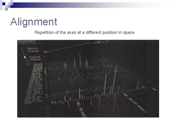
Alignment Repetition of the axes at a different position in space
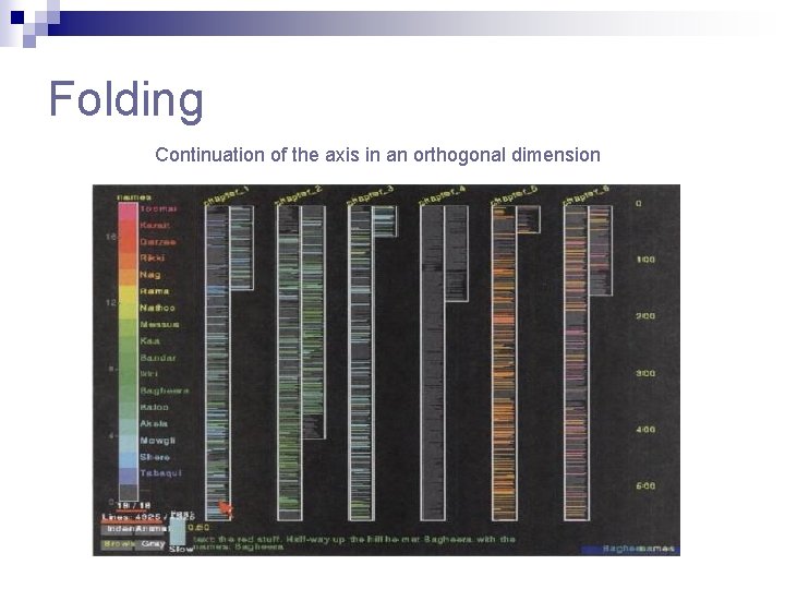
Folding Continuation of the axis in an orthogonal dimension
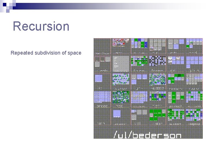
Recursion Repeated subdivision of space
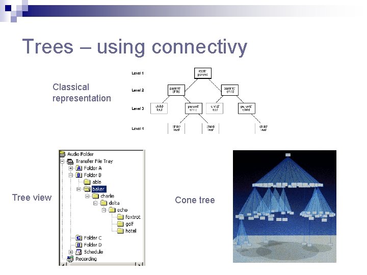
Trees – using connectivy Classical representation Tree view Cone tree
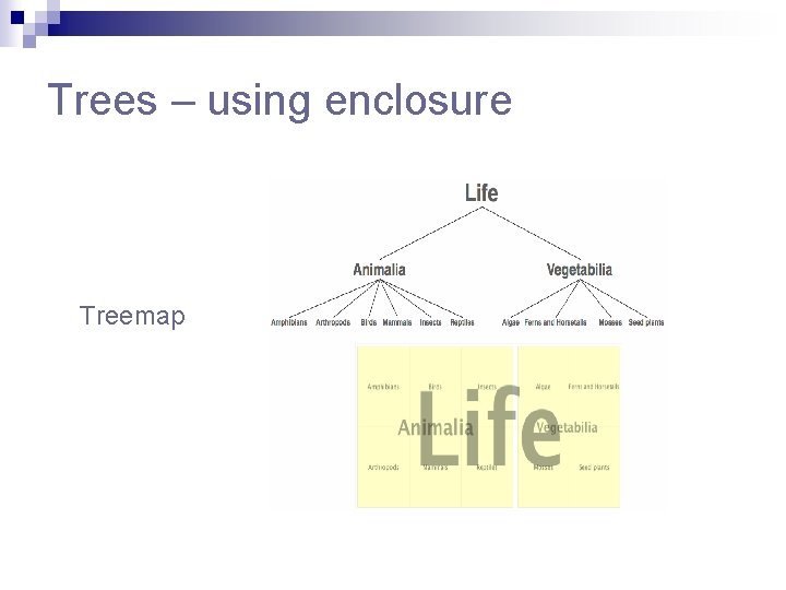
Trees – using enclosure Treemap
Networks n The most complex data structures that need to be visualized n Used to describe telecom and computer networks, World Wide Web n Contains cycles sole encoding technique : connectivity n Graphs containing just tens of nodes tend to look like a ball of tangled strings map clutter
Important aspects in visualizing networks n Positioning the nodes key to readability ¨ ¨ ¨ n Managing the links so they convey information ¨ ¨ ¨ n Color the links according to type or utilization: Sem. Net Select a link subset with the help of interactive sliders: See. Net Represent a pair of directed arcs as a single arc: See. Net Handling large-scale graphs -> uses some form of aggregation ¨ ¨ ¨ n Geographical position: See. Net Graphical layout algorithms : mininization of link crossing Advanced iterative positioning algorithms : spring embedder, planar straight line embedding Hierarchical clustering : Sem. Net Geographical clustering: See. Net Clustering based on natural hierarchy : software systems Interacting with and navigating through large networks ¨ Levels of detail can enable nonuniform and interactively progressive aggregation
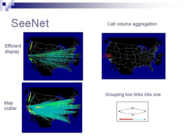
See. Net Call volume aggregation Efficient display Grouping two links into one Map clutter
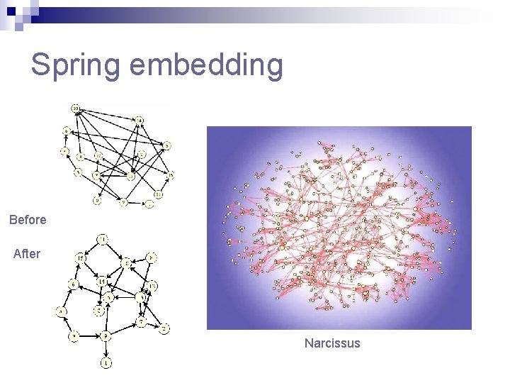
Spring embedding Before After Narcissus
Using 3 D: Pros and Cons Pros: n more effective for 3 D physical data n additional dimension for encoding data n can accommodate large-scale visual structures Cons: n greater implementation challenges: shading, lighting, navigation, occlusion n significantly more processing power
View transformations n Location probes ¨ ¨ ¨ n Viewpoint controls ¨ ¨ n Zoom, pan, clip Overview+detail Distorsions (Focus+Context) ¨ ¨ ¨ n Details on demand Brushing Magic lenses Bifocal : Perspective Wall, Document Lens Polyfocal : Table Lens Based on levels of interest: Fish Eye Lens Levels of Detail
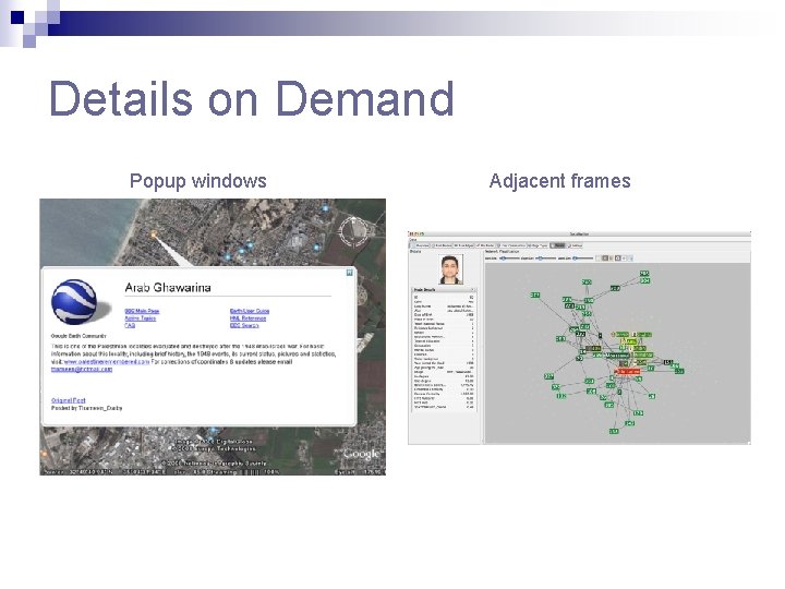
Details on Demand Popup windows Adjacent frames
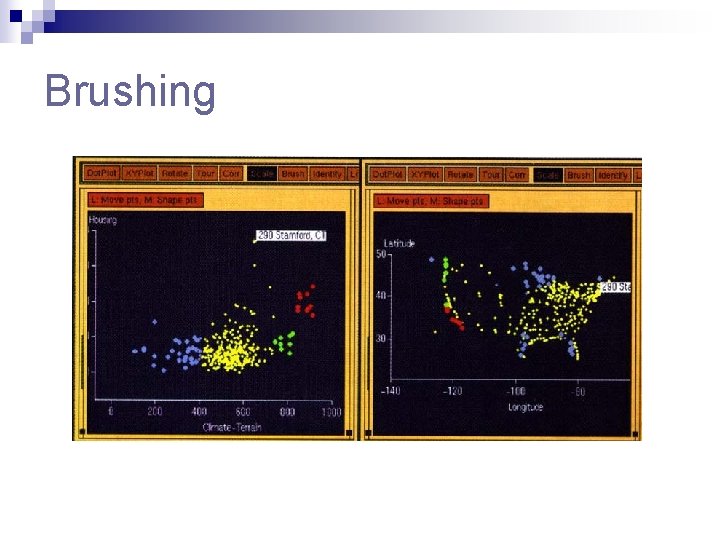
Brushing
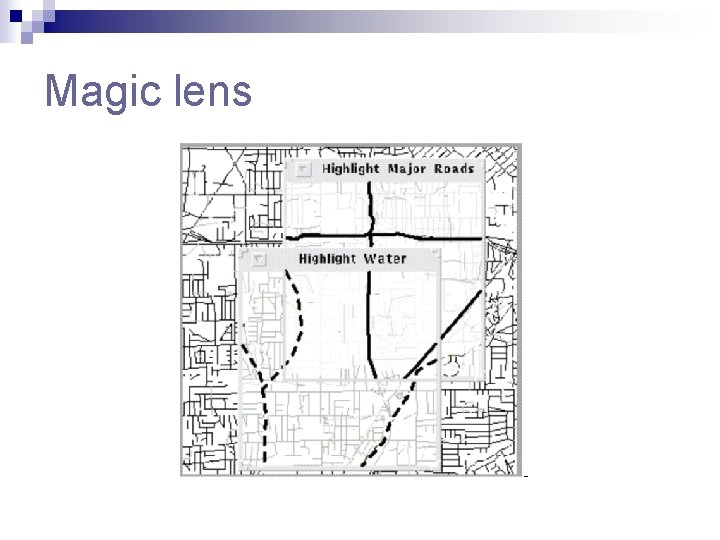
Magic lens
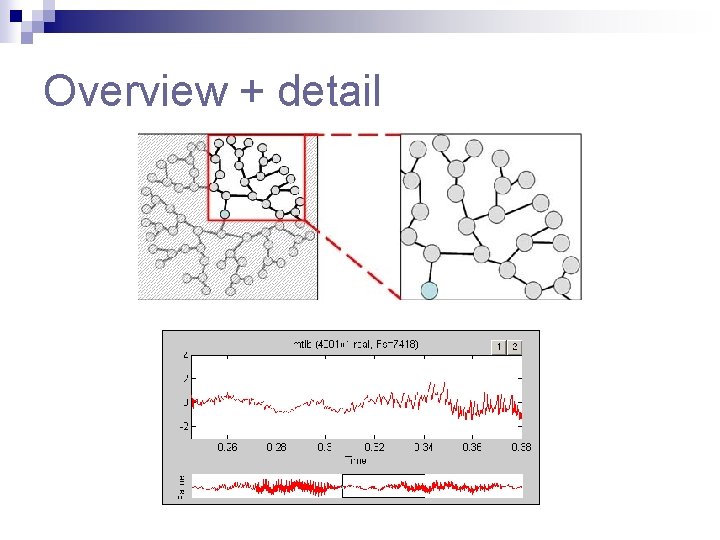
Overview + detail
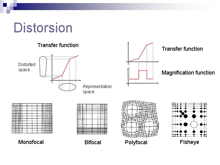
Distorsion Transfer function Distorted space Magnification function Representation space Monofocal Bifocal Polyfocal Fisheye
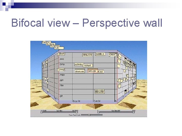
Bifocal view – Perspective wall
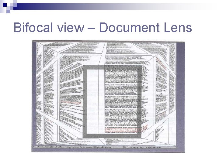
Bifocal view – Document Lens
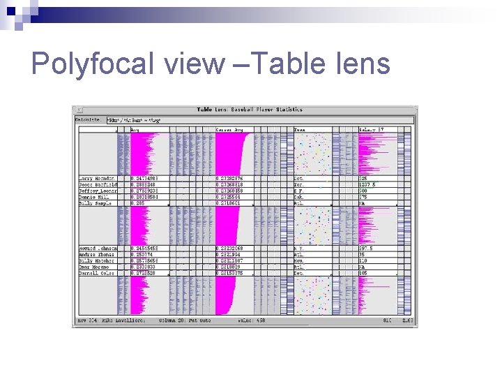
Polyfocal view –Table lens
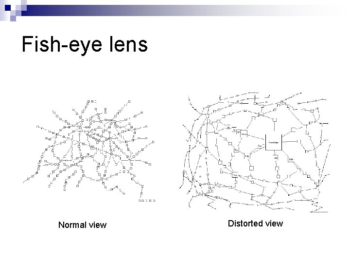
Fish-eye lens Normal view Distorted view
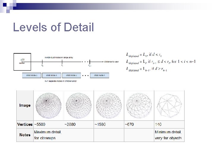
Levels of Detail
Overview+detail vs. Focus+Context n Overview+detail Simple to implement and understand ¨ Operators need to shift attention between the two windows ¨ Typical zoom: 5 -15 scaling to 1000 with intermediate views ¨ n Focus+context Harder to implement and understand ¨ Effective if critical features remain undistorted ¨ Keeps overview and details visible at all times ¨ Typical zoom: 2 -5 ¨
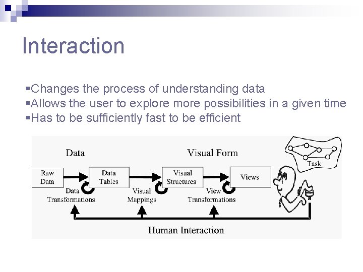
Interaction §Changes the process of understanding data §Allows the user to explore more possibilities in a given time §Has to be sufficiently fast to be efficient
Time and Interaction q Three levels of interaction ¨ Finest level – psychological moment – 0. 1 s n n ¨ Intermediate level – unprepared response – 1 s n ¨ Stimuli fuse in a single percept Animation breaks down if longer than 10 frames/second. The user has a minimum of time to respond Coarsest level – unit task –about 10 sec n Can do a minimal unit of cognitive work q Animation must be slowed down in some cases q Interactive visualization systems need scheduling mechanisms
Interacting with Data Transformations n Dynamic Queries ¨ n Uses interactive controls to filter data Direct Walk ¨ Navigates from record to record through linking ->Web browser n Details On Demand n Attribute Walk ¨ n Searches for objects with similar properties as a selected one Brushing
Interacting with Visual Mappings n Data Flow ¨ Uses explicit node-link diagram to represent the mappings n Pivot tables ¨ Lets the user rapidly manipulate the mapping of data to rows and collumns
Interacting with View Transformations n Direct selection n Camera movement n Magic lens n Overview+detail n Zooming
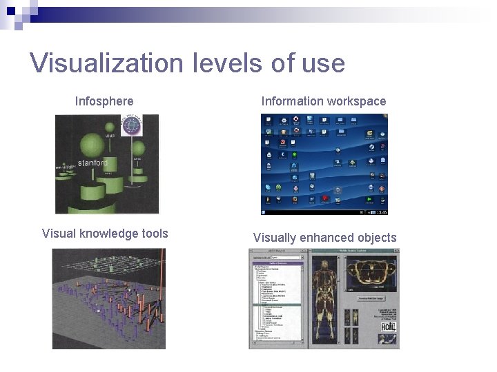
Visualization levels of use Infosphere Information workspace Visual knowledge tools Visually enhanced objects
We learned about. . n n n The different phases in the information visualization process Improving the use of space and displaying more variables Displaying complex structures such as trees and networks The main visual transformations Interacting with a visualization system
Bibliography n n n “Readings in information visualization: Using vision to think”, S. K. Card, J. D. Mac. Kinlay, B. Schneiderman, 1999, Morgan Kaufmann Publishers “Information Visualization: Beyond the horizon”, 2 nd ed, Chaomei Chen, Springer “Information Visualization”, Robert Spence, 2000, Addison-Wesley http: //www. infovis-wiki. net/ IEEE Information Visualization Conference http: //vis. computer. org/
Advanced real-time visualization system for ATLAS TDAQ networks
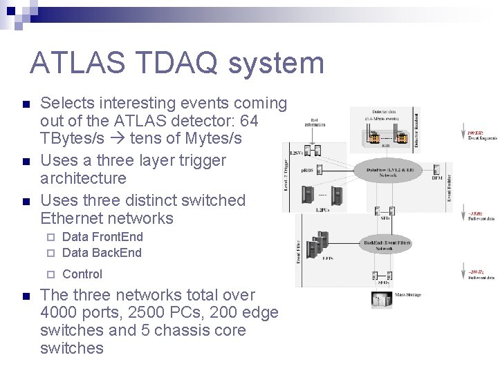
ATLAS TDAQ system n n n Selects interesting events coming out of the ATLAS detector: 64 TBytes/s tens of Mytes/s Uses a three layer trigger architecture Uses three distinct switched Ethernet networks Data Front. End ¨ Data Back. End ¨ ¨ n Control The three networks total over 4000 ports, 2500 PCs, 200 edge switches and 5 chassis core switches
ATLAS-Specific Visualization Requirements n A comprehensive monitoring system provides large amounts of data -> what data to present to who and how n Three types of consumer groups: ¨ ¨ ¨ n The ideal visualization system would: ¨ ¨ ¨ n Networking experts System analists Operators Follow the system architecture and its data flow Display both traffic and status info in real-time Allow efficient navigation so as not to lose the big picture Available 2 D display solutions have proven to be very limited
3 D visualization system n Chose 3 D because it can cope better with large scale models n Profited from recent advances: levels-of-detail, fly-through navigation, proximity sensors etc n Used X 3 D standard: ¨ ¨ ¨ n Can be extended through prototypes Has an external Scene Access Interface Chosen X 3 D browser : Octaga Player Modeled a hierarchical 3 D model for the TDAQ system
Hierarchical 3 D model n Top layer ¨ Overall picture at a glance ¨ Contains processor farms and network cores n Middle layer ¨ Contains processors and edge switches grouped by functionality n Bottom layer ¨ Contains individual ports and their associated traffic statistics and plots
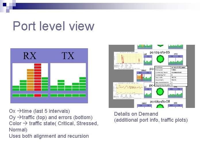
Port level view Ox time (last 5 intervals) Oy traffic (top) and errors (bottom) Color traffic state( Critical, Stressed, Normal) Uses both alignment and recursion Details on Demand (additional port info, traffic plots)
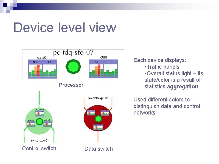
Device level view Each device displays: • Traffic panels • Overall status light – its state/color is a result of statistics aggregation Processor Used different colors to distinguish data and control networks Control switch Data switch
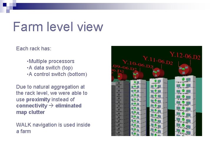
Farm level view Each rack has: • Multiple processors • A data switch (top) • A control switch (bottom) Due to natural aggregation at the rack level, we were able to use proximity instead of connectivity eliminated map clutter WALK navigation is used inside a farm
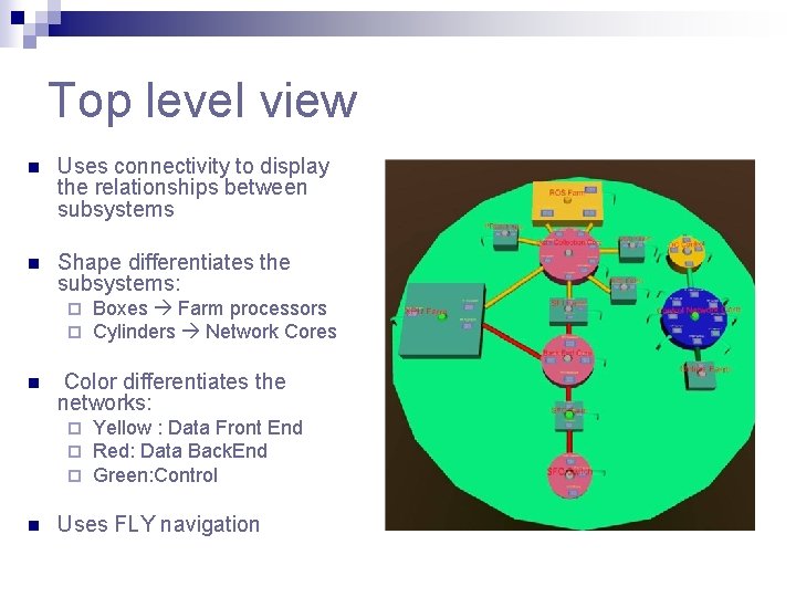
Top level view n Uses connectivity to display the relationships between subsystems n Shape differentiates the subsystems: ¨ ¨ n Color differentiates the networks: ¨ ¨ ¨ n Boxes Farm processors Cylinders Network Cores Yellow : Data Front End Red: Data Back. End Green: Control Uses FLY navigation
Important characteristics n n Uses a prototype for each object type scene automation and expansion Refreshes the scene at 30 seconds Uses levels of details to be able to render the model Combines FLY and WALK navigation types with proximity sensors to accomplish smooth flythrough navigation
- Slides: 48