Information Visualization Antvision is humanitys usual fate but
Information Visualization • “Ant-vision is humanity’s usual fate; but seeing the whole is every thinking person’s aspiration” - David Gelernter • “Visualization … transforms the symbolic into the geometric, enabling researchers to observe their simulations and computations” - Mc. Cormick et al
Information Visualization and Computer Science • The use of computer-supported, interactive, visual representations of abstract data to amplify cognition
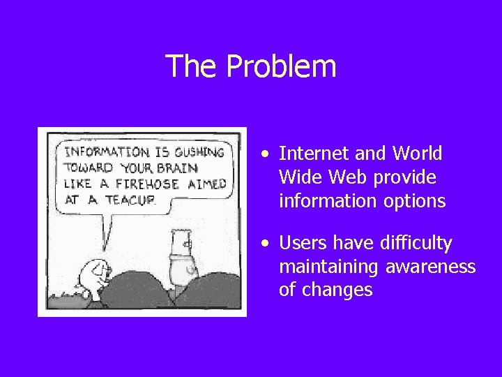
The Problem • Internet and World Wide Web provide information options • Users have difficulty maintaining awareness of changes
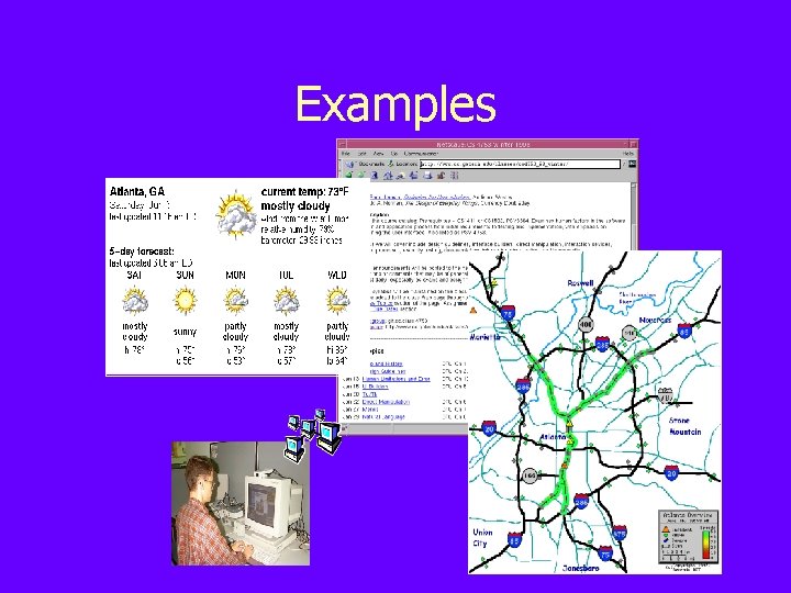
Examples
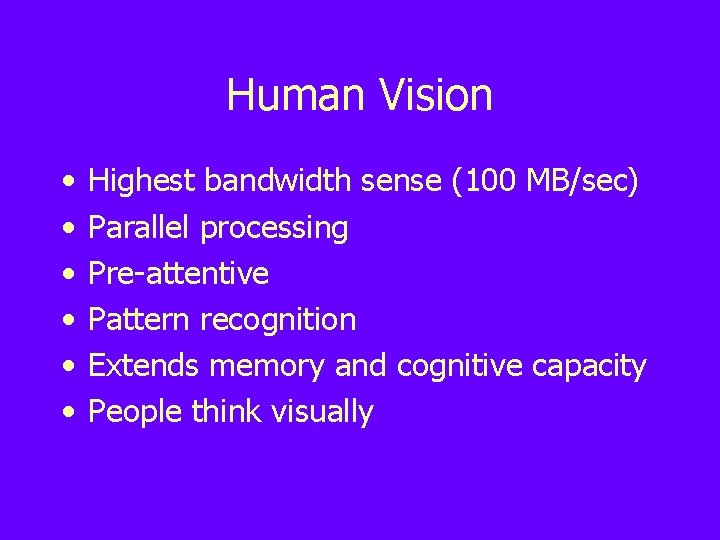
Human Vision • • • Highest bandwidth sense (100 MB/sec) Parallel processing Pre-attentive Pattern recognition Extends memory and cognitive capacity People think visually
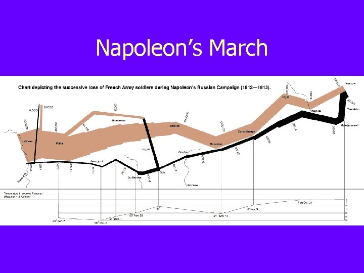
Napoleon’s March
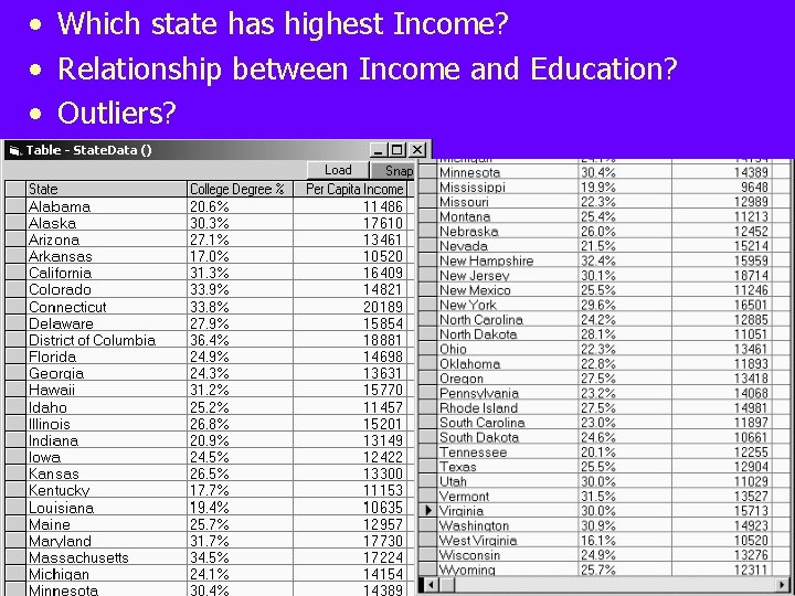
• Which state has highest Income? • Relationship between Income and Education? • Outliers?
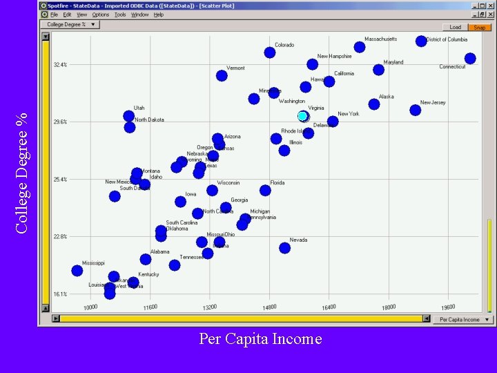
College Degree % Per Capita Income
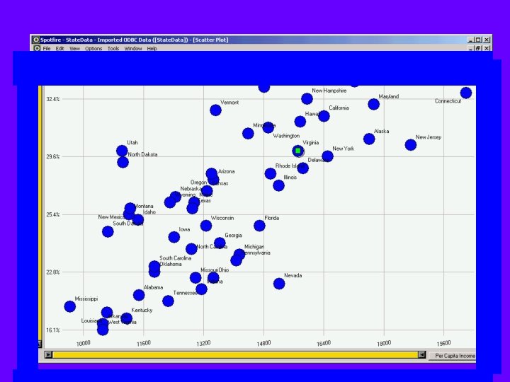
Find the green square?
How to Lie with IV • Only show data ranges that accentuate your argument (chop off bottoms) • Choose time spans appropriate for you • Compare logarithmic data on a nonlogarithmic graph • Use multiple dimensions to show onedimensional data • Change scale in the middle of your graph
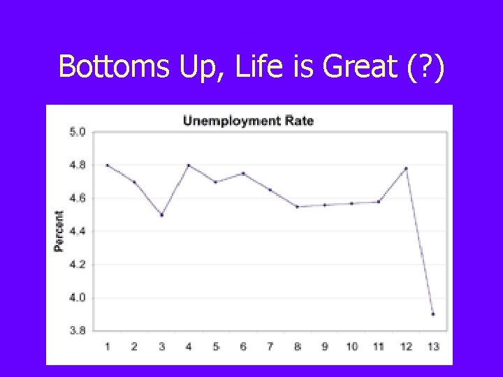
Bottoms Up, Life is Great (? )
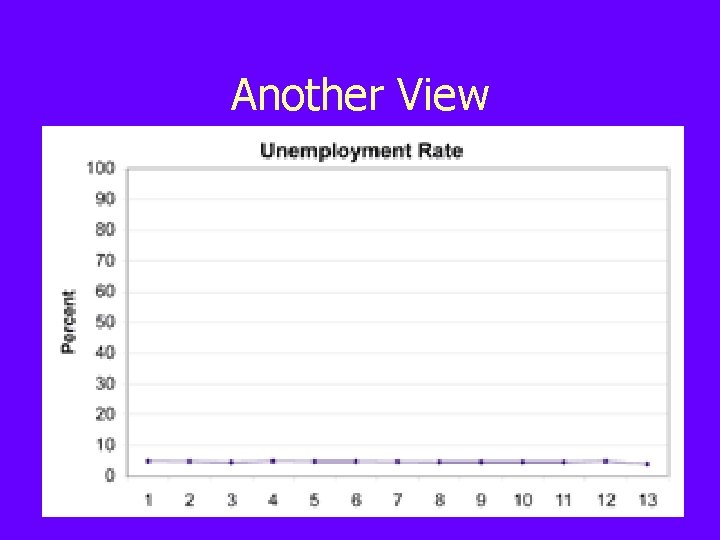
Another View
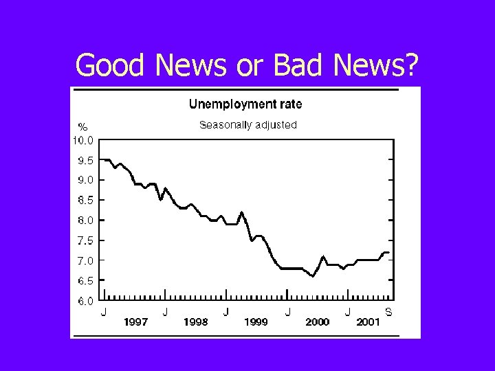
Good News or Bad News?
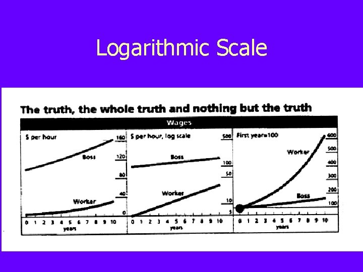
Logarithmic Scale
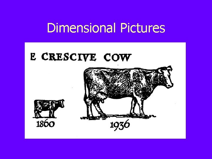
Dimensional Pictures
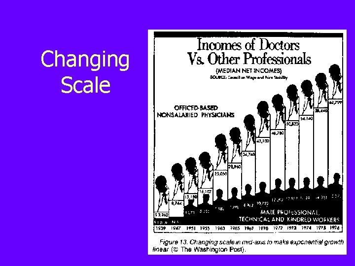
Changing Scale
How NOT to Lie with IV • Show complete data ranges • Choose representative time spans • Use appropriate scales in displaying information • Use dimensions in an appropriate manner • Maintain a common scale throughout your graph
IV Mantra Overview first, zoom and filter, details on demand
IV Tasks • • Overview Zoom Filter Details-on-demand Relate History Extract
Data Types • • 1 -D Linear (document lens, See. Soft, IM) 2 -D Map (GIS, Theme. Scape) 3 -D World (CAD, Visible Human) Temporal (Perspective Wall, Life. Lines) Multi-dimensional (Spot. Fire, Home. Finder) Tree (Cone trees, Hyperbolic trees) Network (Netmap, Sem. Net) Documents (Digital Library)
1 -D Linear Data • Examples include text documents, source code listings, and other sequential lists • Simple visualizations include font, color, and size highlighting • More complex visualizations attempt to show an overview and facilitate scrolling and selection
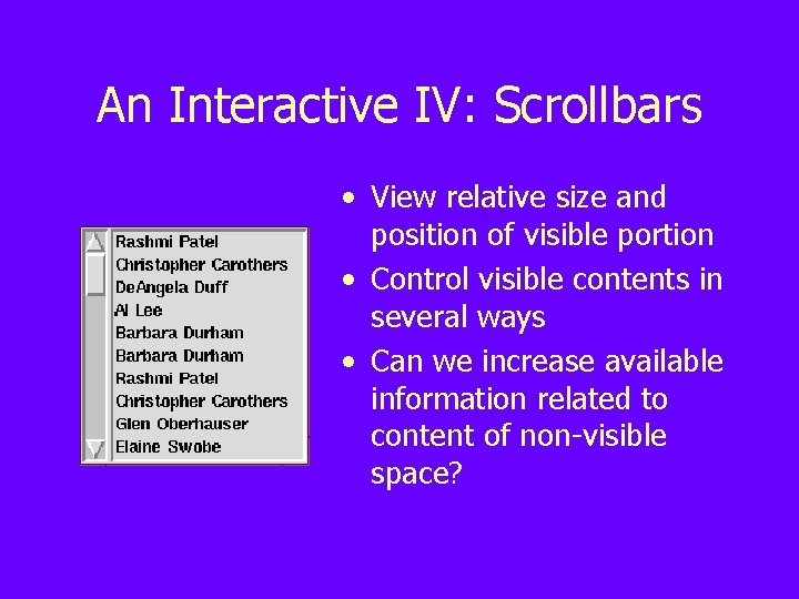
An Interactive IV: Scrollbars • View relative size and position of visible portion • Control visible contents in several ways • Can we increase available information related to content of non-visible space?
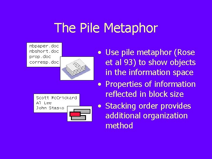
The Pile Metaphor • Use pile metaphor (Rose et al 93) to show objects in the information space • Properties of information reflected in block size • Stacking order provides additional organization method
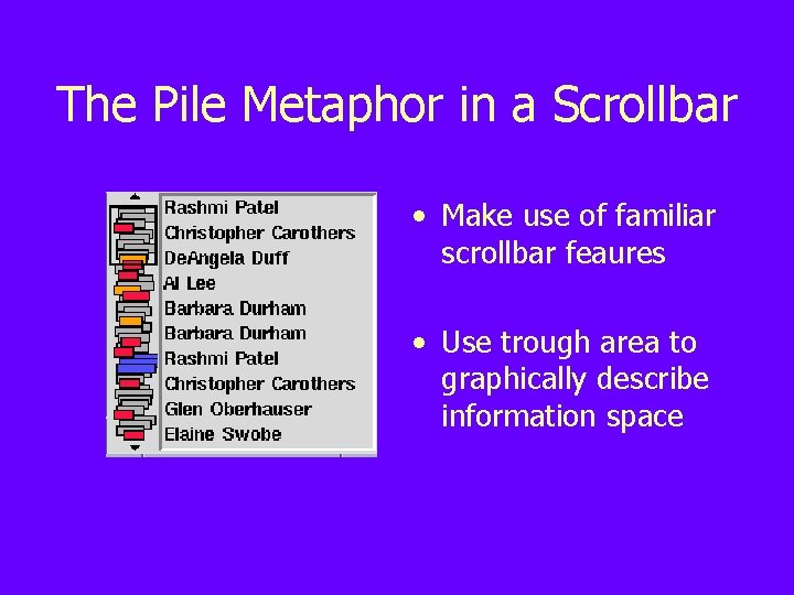
The Pile Metaphor in a Scrollbar • Make use of familiar scrollbar feaures • Use trough area to graphically describe information space
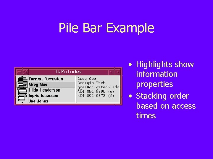
Pile Bar Example • Highlights show information properties • Stacking order based on access times
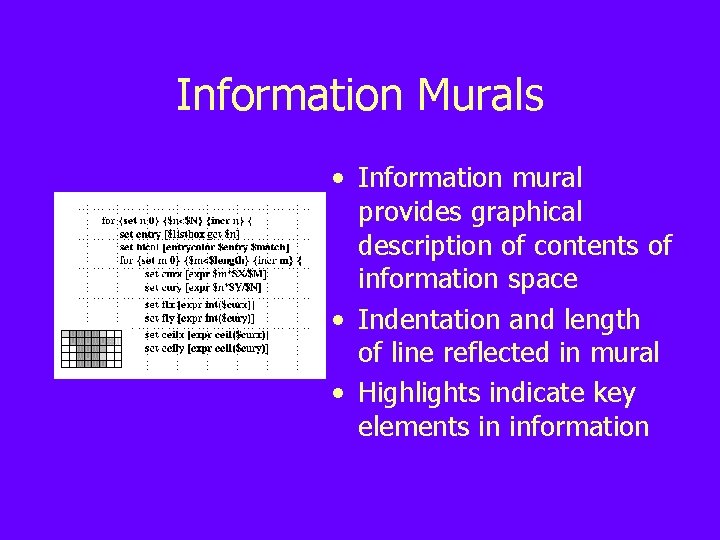
Information Murals • Information mural provides graphical description of contents of information space • Indentation and length of line reflected in mural • Highlights indicate key elements in information
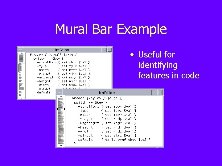
Mural Bar Example • Useful for identifying features in code
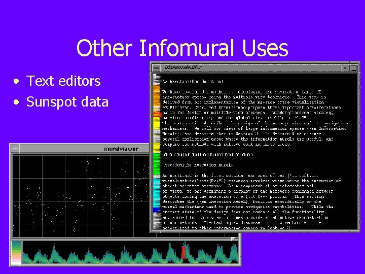
Other Infomural Uses • Text editors • Sunspot data
2 -D Map Data • Examples include geographic maps, newspaper layouts, other 2 D data • Zooming is the most common method for viewing this data • Other techniques combine overview of space with focus on points of interest
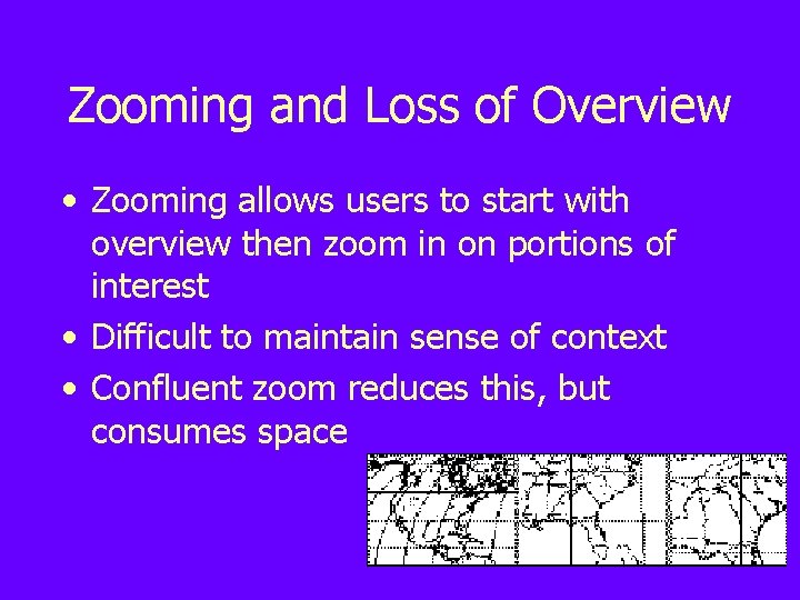
Zooming and Loss of Overview • Zooming allows users to start with overview then zoom in on portions of interest • Difficult to maintain sense of context • Confluent zoom reduces this, but consumes space
Solution: Fisheye Views • Attempts to provide overview (context) and detail (focus) at the same time • Also known as focus+context views, non-linear magnification, distortionoriented presentations • Focus area magnified to show detail while preserving context
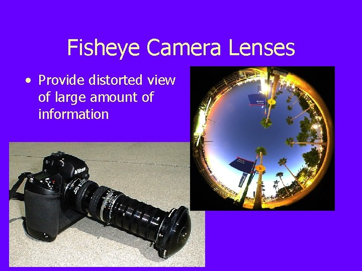
Fisheye Camera Lenses • Provide distorted view of large amount of information
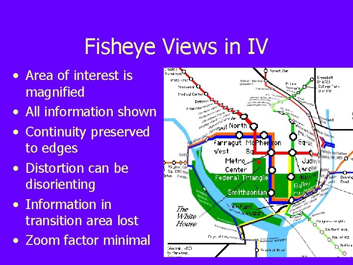
Fisheye Views in IV • Area of interest is magnified • All information shown • Continuity preserved to edges • Distortion can be disorienting • Information in transition area lost • Zoom factor minimal
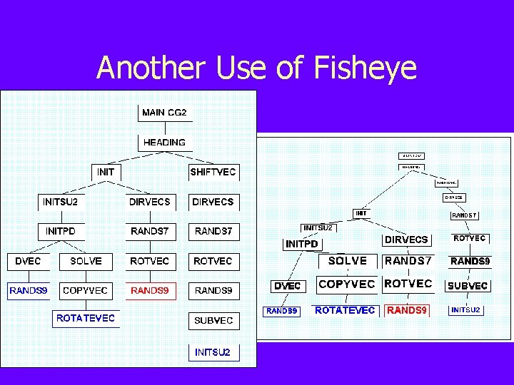
Another Use of Fisheye
Fisheye Experiment (Video)
Trees • Examples include directory structures, office hierarchies, categorization systems • Common examples include typical file browsers in Windows • Other examples show tree structure and relationships in greater detail while preserving context
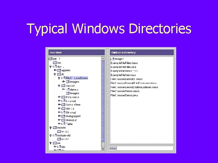
Typical Windows Directories
Treemaps • Slice-and-dice visualization • Child items are rectangles nested inside parent rectangles • Can show many levels of depth (with increasingly less detail) • Difficult to compare sizes unless aspect ratio is close to 1
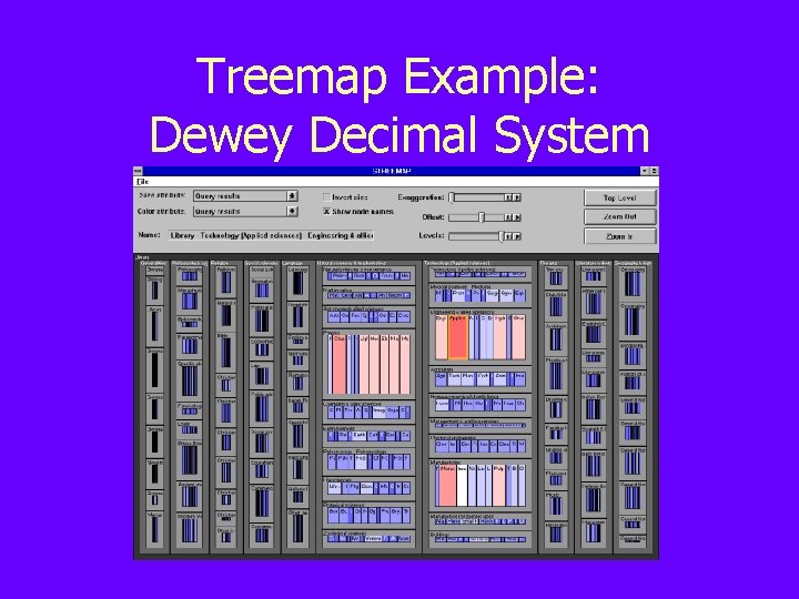
Treemap Example: Dewey Decimal System
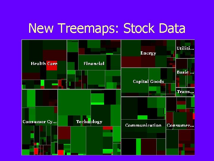
New Treemaps: Stock Data
Treemap Alternative: Sunburst • Circular, space-filling technique • Items laid out radially with top at center and branches extending to edges • Performance better using Sunburst for many overview tasks
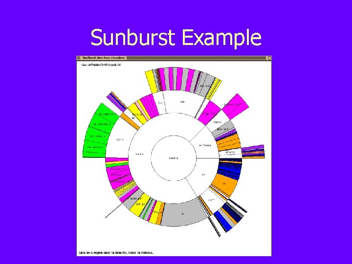
Sunburst Example

Extra Credit: Last Chance! • • Tuesday 2 -4 PM Mc. Bryde 655 Takes about 15 minutes Free pizza!
VTURCS Project Fair • • Friday October 26 at 4 pm in Mc. B 655 Hear about VTURCS projects Eat free food Win cool prizes (digital camera, webcam, handheld, software)
2 ½ -D Visualizations • Typical WIMP elements are given a 3 D appearance using shading or overlap • Light source typically at their top right • Useful for providing affordances, highlighting priorities in complex trees and graphs
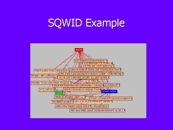
SQWID Example
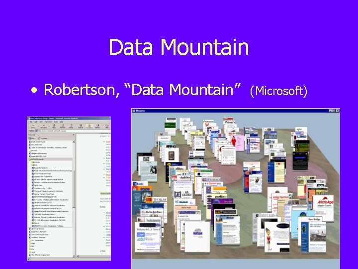
Data Mountain • Robertson, “Data Mountain” (Microsoft)
Hyperbolic Geometric Transformations • Goal: Keep information space within the confines of a circular area • In a hyperbolic plane, the circumference of a circle grows exponentially with its radius • Hierarchies (which expand exponentially with depth) can be laid out uniformly so that distances between parents, siblings, and children are similar
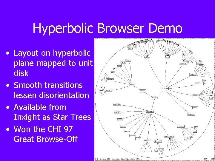
Hyperbolic Browser Demo • Layout on hyperbolic plane mapped to unit disk • Smooth transitions lessen disorientation • Available from Inxight as Star Trees • Won the CHI 97 Great Browse-Off
3 D Views • Objects often still flat • Displayed in perspective when at an angle • Shrink when “further away” • Virtual reality adds head tracking, immersion, stereo vision
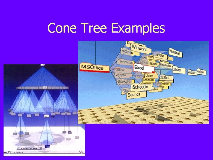
Cone Tree Examples
Drawbacks of 3 D/VR • Easy to get lost: Focus+context difficult • 2 D input (typing, selecting) is unnatural • Practical concerns: expensive, blocky, cartoonish, long setup times • Lesson: Choose application areas carefully
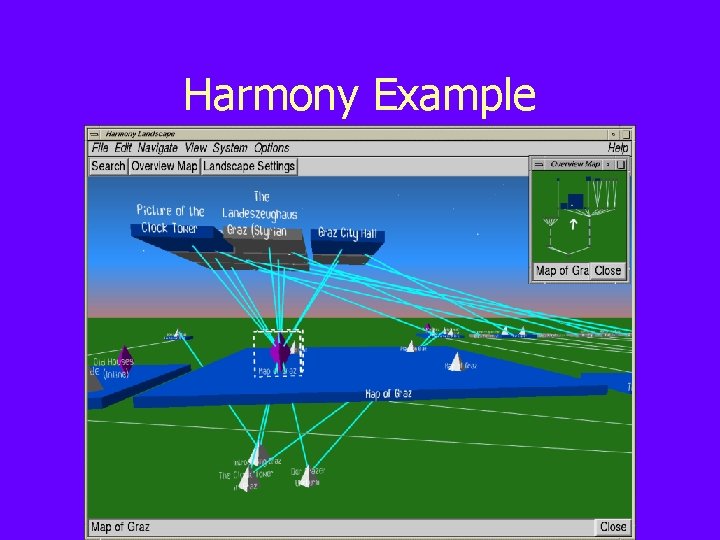
Harmony Example
Overcoming 3 D Limitations • Identify domain that is applicable to 3 D displays • Focus on selected information first, then connected/related information • Provide overview of entire information space with current selection highlighted
Data Vis vs Info Vis • Data is – structured – numeric – easy to map to visual properties – the result of applications and experiments • Information is – – – unstructured free form hierarchical difficult to quantify generated by people
Visualizing Image Collections • Large amounts of data • Often hierarchical (date, event) • Difficult for computer to process and understand • Solution: Leverage what humans do well and what computers do well
Creating Visual Displays • How do basic properties of visualizations affect their ability to communicate information? • What tasks can be performed using visualizations? • When are visual displays inappropriate or intrusive?
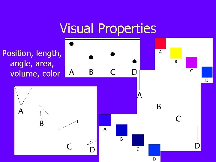
Visual Properties Position, length, angle, area, volume, color
Cleveland’s Ordering Decoding accuracy (from best to worst): • Position • Length • Angle (slope/direction) • Area • Volume • Color (hue, saturation, density)
Example: Pie Charts • Relies on low accuracy decoding skills (angles, irregular areas) • Use higher accuracy decoding skills when possible (position, length)
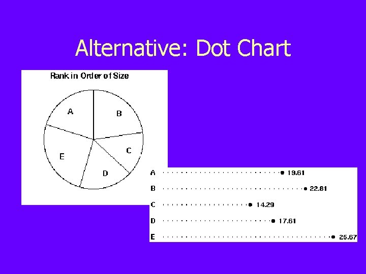
Alternative: Dot Chart
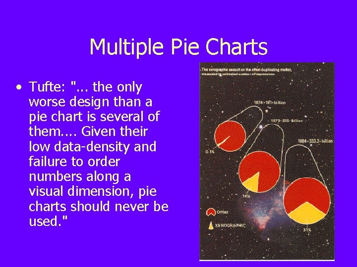
Multiple Pie Charts • Tufte: ". . . the only worse design than a pie chart is several of them. . Given their low data-density and failure to order numbers along a visual dimension, pie charts should never be used. "
Task Type • Mackinlay claims that ranking of perceptual properties depends on task: – Quantitative: position, length, angle, slope, area – Ordinal: position, density, color, texture, connection – Nominal: position, color hue, texture, connection, containment
What is Pre-attentive Processing? • Refers to cognitive operations that can be performed prior to focusing attention on any particular region of an image • Estimation based on viewing displays for <200 -250 ms (qualifies as preattentive)
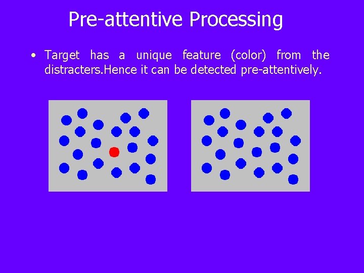
Pre-attentive Processing • Target has a unique feature (color) from the distracters. Hence it can be detected pre-attentively.
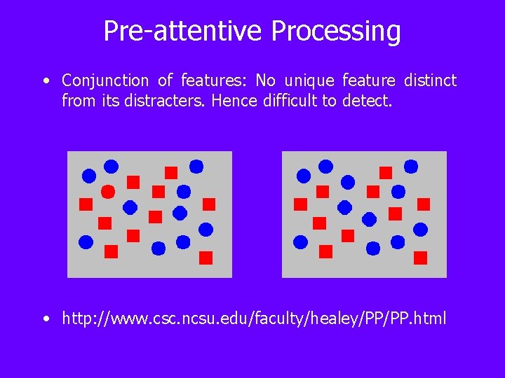
Pre-attentive Processing • Conjunction of features: No unique feature distinct from its distracters. Hence difficult to detect. • http: //www. csc. ncsu. edu/faculty/healey/PP/PP. html
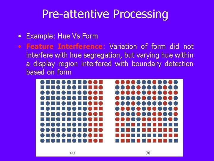
Pre-attentive Processing • Example: Hue Vs Form • Feature Interference: Variation of form did not interfere with hue segregation, but varying hue within a display region interfered with boundary detection based on form
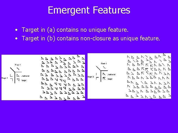
Emergent Features • Target in (a) contains no unique feature. • Target in (b) contains non-closure as unique feature.
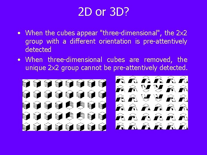
2 D or 3 D? • When the cubes appear "three-dimensional", the 2 x 2 group with a different orientation is pre-attentively detected • When three-dimensional cubes are removed, the unique 2 x 2 group cannot be pre-attentively detected.
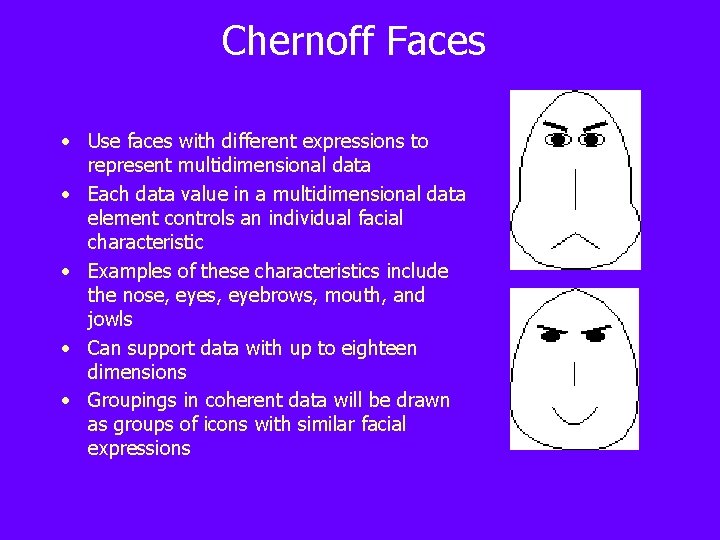
Chernoff Faces • Use faces with different expressions to represent multidimensional data • Each data value in a multidimensional data element controls an individual facial characteristic • Examples of these characteristics include the nose, eyes, eyebrows, mouth, and jowls • Can support data with up to eighteen dimensions • Groupings in coherent data will be drawn as groups of icons with similar facial expressions
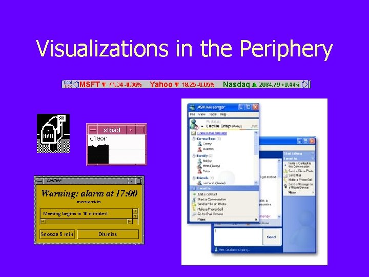
Visualizations in the Periphery
Questions • Do peripheral displays interfere with other daily tasks? • What are the relative advantages of different classes of peripheral displays? • How does changing visual features of the display affect information processing and distraction?
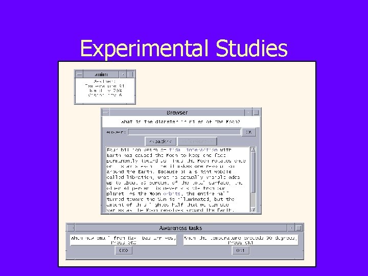
Experimental Studies
Example Tasks and Activities • Browsing tasks – In what year did Gautama found Buddhism? – How many miles long is the Mississippi River? • Monitoring activities – When a flash flood warning appears, press Button 1. – When IBM drops below 120, press Button 2. • Awareness questions – What teams were playing in the basketball game? – Which team scored the most points in the game?
Data Collection • Collected user response data – Browsing times – Monitoring times – Awareness responses • Correctness rate • Hit rate • Collected user opinion data
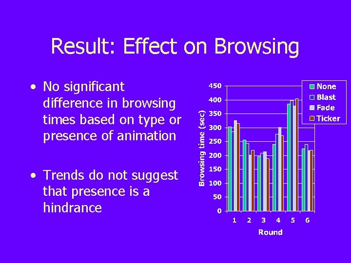
Result: Effect on Browsing • No significant difference in browsing times based on type or presence of animation • Trends do not suggest that presence is a hindrance
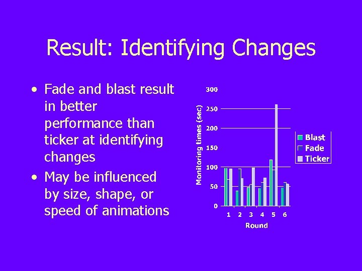
Result: Identifying Changes • Fade and blast result in better performance than ticker at identifying changes • May be influenced by size, shape, or speed of animations
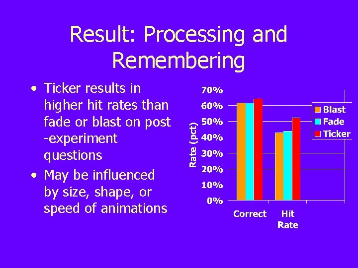
Result: Processing and Remembering • Ticker results in higher hit rates than fade or blast on post -experiment questions • May be influenced by size, shape, or speed of animations
Results • Animated displays can be used without negatively impacting certain other tasks • In-place animations better for monitoring • Motion-based animations better for awareness questions • Small displays better for monitoring • Fast displays better for awareness • Balance productivity and preferences
Visualization in the Periphery – People do not always use information visualizations as their sole or even primary task – How could information visualizations intended for multiple-task situations be designed? – It is suspected that such visualizations are distracting, but little is known about the degree to which it distracts users and whether users can overcome these distractions and interpret the peripheral visualizations – Peripheral visualization vs standalone visualization
Overview – Information visualizations as secondary displays (peripheral visualizations) – How quickly and effectively can people interpret information visualizations (Secondary) while busily performing other tasks (Primary)? – How can peripheral visualizations be designed to reduce distraction while maintaining awareness? – Factors that might impact performance evaluated: • Visual density • Visualization presence time • Secondary task type
Experimental Design – Dual-task setting • Primary task – a video game • Secondary task – answer a question about info in a visualization that appeared while you played game – The experiment included three independent variables: • Time (1 or 8 seconds ) visualization was present • Density (low=20 objects, high=320) of visualization • Question type (find single item or a cluster)
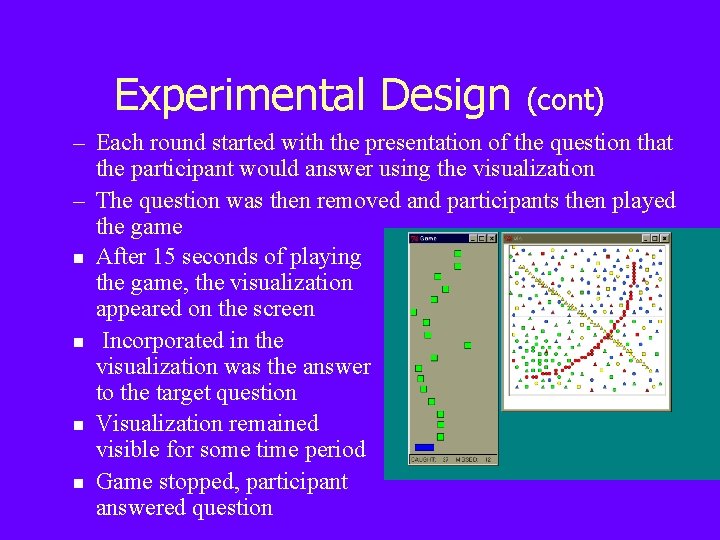
Experimental Design (cont) – Each round started with the presentation of the question that the participant would answer using the visualization – The question was then removed and participants then played the game n After 15 seconds of playing the game, the visualization appeared on the screen n Incorporated in the visualization was the answer to the target question n Visualization remained visible for some time period n Game stopped, participant answered question
Conclusions – Peripheral visualizations can be introduced without hindering primary task performance – Interpreting complex visualizations within 1 second in a dual-task scenario can not be done effectively but with relaxed time constraints can be effective – Lower density displays can result in performance that is as good or better than high density displays in a dual-task scenario – Finding clusters of visually similar items is easier than locating a single item
Ongoing Work • Do typical visualization guidelines (Cleveland, Mackinlay) apply to peripheral displays? • Does conjoining attributes affect our ability to perceive information? • Are observed guidelines applicable to more realistic situations?
- Slides: 85