Infographics Data visualization and inforgraphics Data visualization and

- Slides: 54

Infographics

Data visualization and inforgraphics • Data visualization and infographics play an important role in helping you succeed in the ever complex and changing online world of business. • Clients and businesses alike can greatly benefit from these two resources when they are used correctly. • More and more businesses are utilizing the power of infographics and data visualization to share valuable data with their clients. • Both infographics and data visualization help web users understand complex topics through graphics. • These graphics are simple to use and are easy to share on websites and social media platforms. • people have a much shorter attention span nowadays, graphics are the perfect way to get their attention, even if it is just for a quick moment. • On social media in particular, people are more attracted to a picture or another graphic than to a wordy post that means little to them. 2

Data visualization • Data visualization is the representation of statistical data in a graphic form that can be easily interpreted by the viewer. • To make the data stand out and to attract the viewer, it needs to be aesthetically pleasing but not so distracting that the meaning gets lost in the visuals. • There must be a balance between both the information and graphics presented. Data visualization takes the form of charts, plots, and graphs. • The research information displayed should be clear and easy for the viewer to understand. 3

Infographics • Infographics go along with data visualization and communicate information by a visual representation of a story. • These graphics artistically enhance the given information. • Infographics interpret information by visual storytelling. • Infographics are seen all over the web. They are embedded in presentations, within content of blogs, in annual reports, and more. 4

Diff b/t dv and info • Data visualization can be incorporated in infographics, yet infographics are not data visualization. • Each of them represents a different kind of information: data visualization is best at presenting research and statistical data, while infographics are great at telling the whole story providing the reader with insights and necessary conclusions. • Creation of infographics usually requires a great deal of creativity and originality from the designer. • For effectiveness, it is best to use infographics and data visualization together, while making sure they support each other and help to present information more clearly. 5

Using dv in an inforgraphic Data visualization gives a picture of the information being interpreted. Infographics and data visualization work together to clarify data and present it in a visually appealing way. There shouldn’t be too much information or too many graphics. One should balance the other out. Data visualization involves creation of graphics to represent data in such a way that the viewer will instantly understand what kind of data it is and what it means. By enhancing comprehension of presented data, these graphics let the viewers come to their own conclusions about the data. 6

Why infographics • Infographics have many large benefits, as they allow you to present your information in a userfriendly manner that’s effective and succinct. • Whatever your topic, it’s possible to present it in the form of an infographic. • In fact, providing an infographic is a brilliant way of conveying it in the easiest way possible. • Infographics are more readily shared than written content alone tends to be, and they do incredibly well on image-based social media platforms. 7

Why part 2 • The statistics on visual content are impressive. • Eighty percent of text-based content is forgotten as soon as it’s read, while infographics are read 30 times more than the same information in text format. • You’ll also enjoy a 12 percent boost in traffic after publishing an infographic. • Sixty-five percent of people are wired to learn visually. • It will do wonders for your SEO by providing multimedia content, then there are loads of great reasons to make infographics. 8

Info on inforgraphics • Remember, there’s more to creating an infographic than using the tools needed to create the visual. • Like any piece of content, your infographic should be designed for maximum value and impact. • Plan your infographic carefully. • Think of a catchy, attention-grabbing headline, and follow it up with a compelling subheading. • Arrange your information so it flows and has a clear narrative, even if only to the extent that facts and text are laid out in the most logical order. • Use original design elements, such as your logo and brand photographs, and customize every aspect of your infographic so it aligns with your brand colors, fonts, and the general look and feel. 9

Info stats • There are some interesting trends with both infographics and data visualization. Infographics help publishers grow their traffic 12 percent faster compared to those who do not use infographics. • The most popular type of content out there for business is in the form of infographics, which get shared and liked on social media three times more often than other visuals. 10

Objectives • • • Create a poster or a banner Draw a table Create a table structure Format table components Change table layout Share information between applications 11

Objectives (continued) • • • Identify chart types and elements Create and insert a chart Change a chart type Change the chart layout Format chart elements 12

Text-Based Charts • Text-based chart - a chart based on text that communicates relationships primarily through words, numbers, and/or graphics • Statistical charts/graphs - use points, lines, circles, bars, or other shapes to visually communicate numerical relationships • Text-based chart examples – posters – banners 13

Banners 14

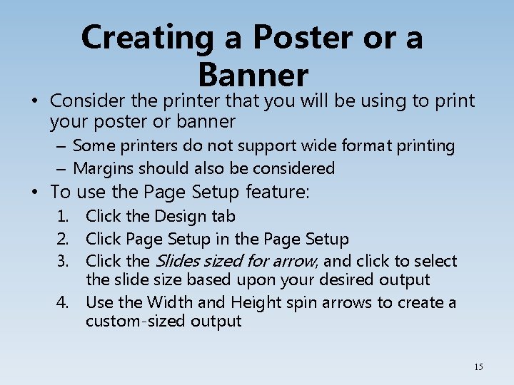
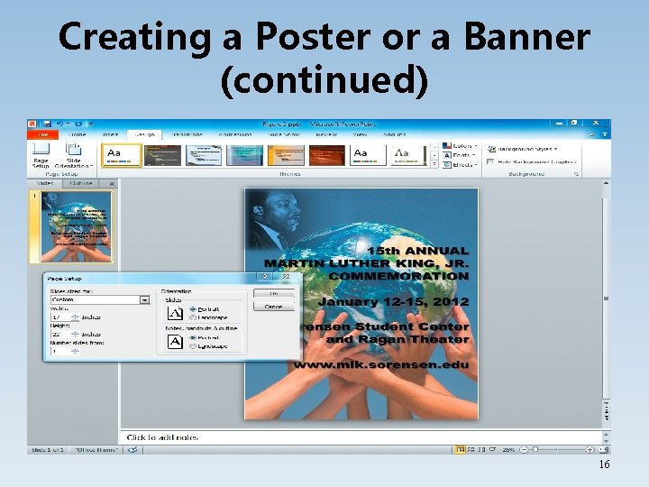
Creating a Poster or a Banner • Consider the printer that you will be using to print your poster or banner – Some printers do not support wide format printing – Margins should also be considered • To use the Page Setup feature: 1. Click the Design tab 2. Click Page Setup in the Page Setup 3. Click the Slides sized for arrow, and click to select the slide size based upon your desired output 4. Use the Width and Height spin arrows to create a custom-sized output 15

Creating a Poster or a Banner (continued) 16

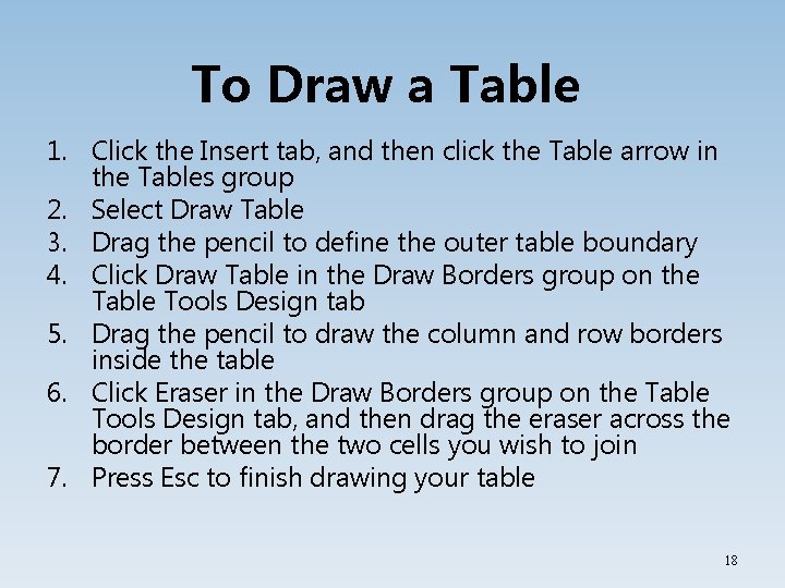
Drawing a Table • Tables are a form of text-based chart that organizes into a highly structured grid • Tables can be created in – Word – Excel – Access – Power. Point • To have varied cell heights and widths or diagonal borders, you may use the Pencil tool to draw the table 17

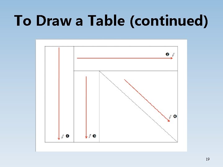
To Draw a Table 1. Click the Insert tab, and then click the Table arrow in the Tables group 2. Select Draw Table 3. Drag the pencil to define the outer table boundary 4. Click Draw Table in the Draw Borders group on the Table Tools Design tab 5. Drag the pencil to draw the column and row borders inside the table 6. Click Eraser in the Draw Borders group on the Table Tools Design tab, and then drag the eraser across the border between the two cells you wish to join 7. Press Esc to finish drawing your table 18

To Draw a Table (continued) 19

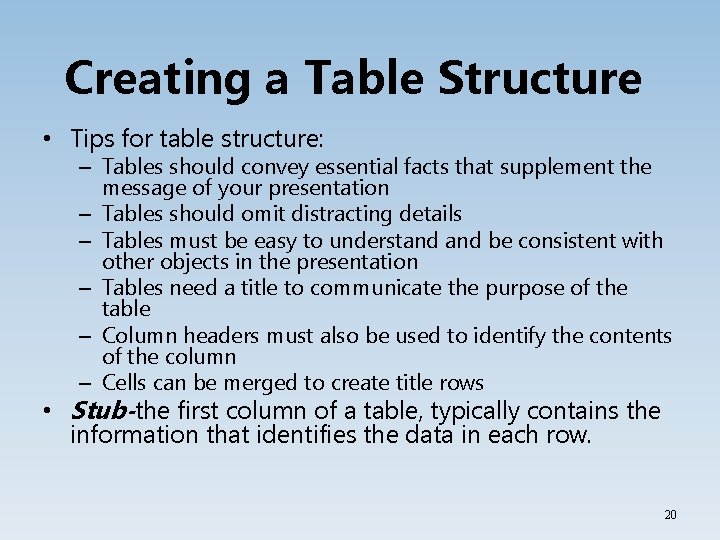
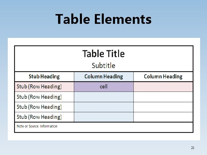
Creating a Table Structure • Tips for table structure: – Tables should convey essential facts that supplement the message of your presentation – Tables should omit distracting details – Tables must be easy to understand be consistent with other objects in the presentation – Tables need a title to communicate the purpose of the table – Column headers must also be used to identify the contents of the column – Cells can be merged to create title rows • Stub-the first column of a table, typically contains the information that identifies the data in each row. 20

Table Elements 21

Simplify Table Data • The text must stay large enough for your audience to read • Round off numbers with decimals to make them whole numbers • Designate that numbers are being displayed in thousands or millions if need be when using large numbers 22

Change Row Height, Column Width, and Table Size • Change column width or row heights to accommodate information • To adjust columns or rows point to border, the pointer will change to a resizing pointer, then drag to the desired location • To adjust the size of the table itself drag a corner or middle sizing handle 23

Align Text Within Cells, Rows, and Columns • Alignments Group on the Table Tools Layout tab includes features that can be used to align text • Options: – Align contents horizontally or vertically – Change the direction of the text – Change the margins inside the cell 24

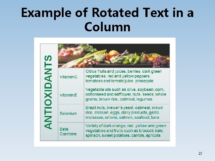
Example of Rotated Text in a Column 25

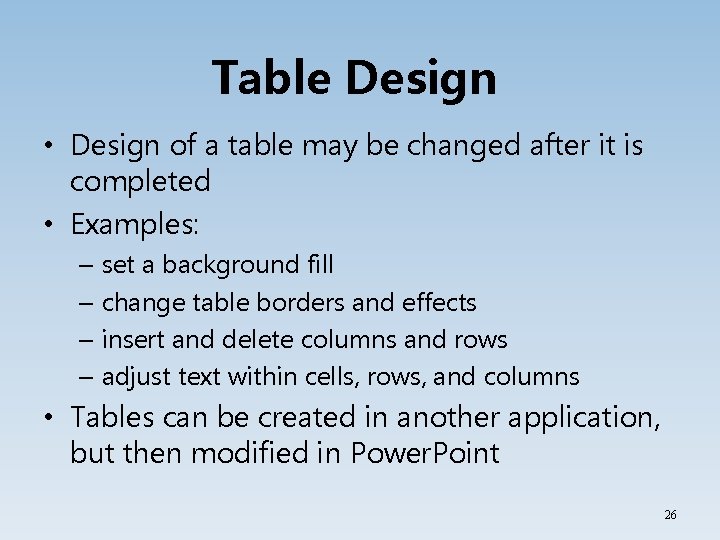
Table Design • Design of a table may be changed after it is completed • Examples: – set a background fill – change table borders and effects – insert and delete columns and rows – adjust text within cells, rows, and columns • Tables can be created in another application, but then modified in Power. Point 26

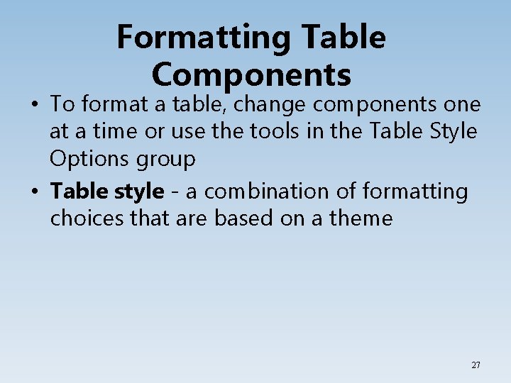
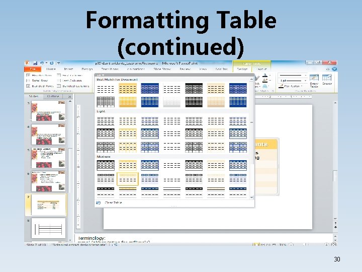
Formatting Table Components • To format a table, change components one at a time or use the tools in the Table Style Options group • Table style - a combination of formatting choices that are based on a theme 27

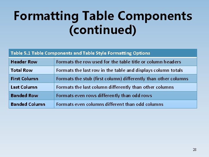
Formatting Table Components (continued) Table 5. 1 Table Components and Table Style Formatting Options Header Row Formats the row used for the table title or column headers Total Row Formats the last row in the table and displays column totals First Column Formats the stub (first column) differently than other columns Last Column Formats the last column differently than other columns Banded Row Formats even rows differently than odd rows Banded Column Formats even columns different than odd columns 28

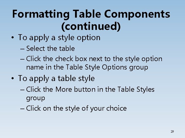
Formatting Table Components (continued) • To apply a style option – Select the table – Click the check box next to the style option name in the Table Style Options group • To apply a table style – Click the More button in the Table Styles group – Click on the style of your choice 29

Formatting Table (continued) 30

Set a Background Fill • To change the Background Style: 1. Select the cells in which you want a background change 2. Click the Table Tools Design tab 3. Click the shading arrow in the Table Styles group 4. Select Color, Picture, Gradient, Texture, or Table Background 31

Set a Background Fill (continued) • To add a picture background to a table cell: 1. Right-click the cell, and then select Format Shape 2. Click the Picture or texture fill option in the right pane 3. Click File 4. Browse to locate the picture of your choice, and then click Insert 5. Select other fill or formatting options 6. Click Close 32

Change Table Borders • The pen options located in the Draw Borders group allow you to change border style, weight, and color • Pen style - changes the line used; includes options for dotted and dashed lines • Pen weight - changes the width of the border • Pen color - changes the color of the border 33

Apply a Table Special Effect • Special Effects can be applied to a cell, selected cells, or a table • To apply an effect: 1. Click Effects in the Table Styles group on the Table Tools Design tab 2. Three effects options appear-Cell Bevel, Shadow, and Reflection 3. Point to one of the effect options and click on your choice 34

Changing Table Layout • Table Tools Layout Tab allows you to insert or delete columns and rows at any time • To insert, click in the cell next to where you want the new row, and then click Insert Above or Insert Below – The process is similar when inserting a column • Click Delete in the Rows & Columns group to delete selected columns and rows – You can also select Delete Columns 35

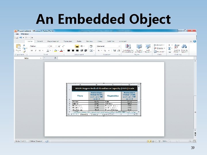
Sharing Information Between Applications • A table that will perform calculations should be created in Excel, then it can be embedded • Object linking and embedding (OLE) is inserting an objected created in one application into a document created in another application. • Linking an object is different than embedding an object 36

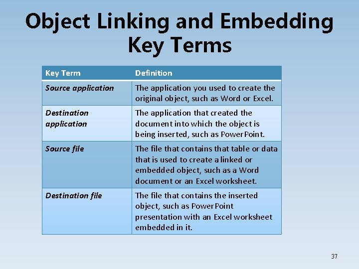
Object Linking and Embedding Key Terms Key Term Definition Source application The application you used to create the original object, such as Word or Excel. Destination application The application that created the document into which the object is being inserted, such as Power. Point. Source file The file that contains that table or data that is used to create a linked or embedded object, such as a Word document or an Excel worksheet. Destination file The file that contains the inserted object, such as Power. Point presentation with an Excel worksheet embedded in it. 37

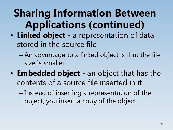
Sharing Information Between Applications (continued) • Linked object - a representation of data stored in the source file – An advantage to a linked object is that the file size is smaller • Embedded object - an object that has the contents of a source file inserted in it – Instead of inserting a representation of the object, you insert a copy of the object 38

An Embedded Object 39

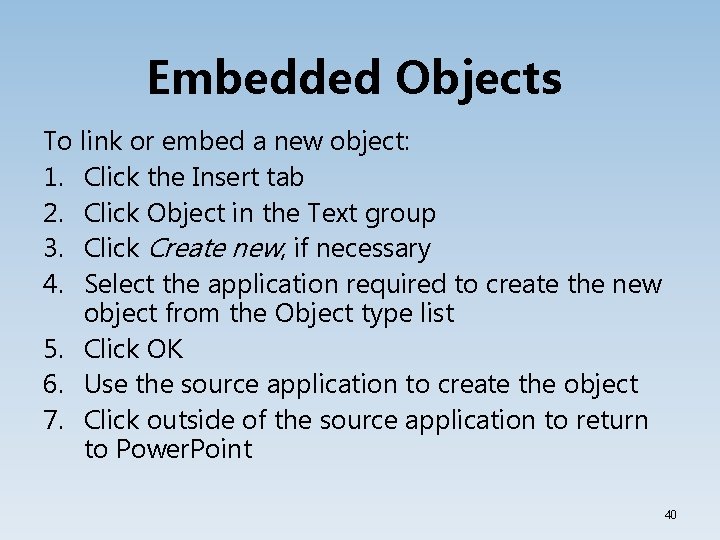
Embedded Objects To link or embed a new object: 1. Click the Insert tab 2. Click Object in the Text group 3. Click Create new, if necessary 4. Select the application required to create the new object from the Object type list 5. Click OK 6. Use the source application to create the object 7. Click outside of the source application to return to Power. Point 40

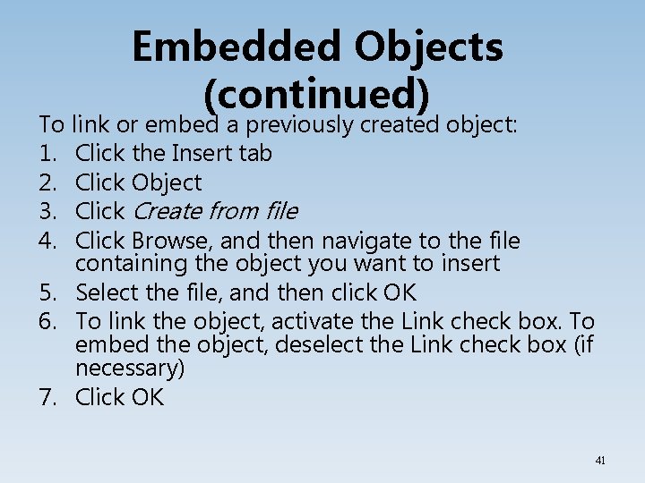
Embedded Objects (continued) To link or embed a previously created object: 1. Click the Insert tab 2. Click Object 3. Click Create from file 4. Click Browse, and then navigate to the file containing the object you want to insert 5. Select the file, and then click OK 6. To link the object, activate the Link check box. To embed the object, deselect the Link check box (if necessary) 7. Click OK 41

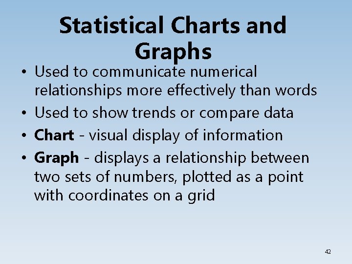
Statistical Charts and Graphs • Used to communicate numerical relationships more effectively than words • Used to show trends or compare data • Chart - visual display of information • Graph - displays a relationship between two sets of numbers, plotted as a point with coordinates on a grid 42

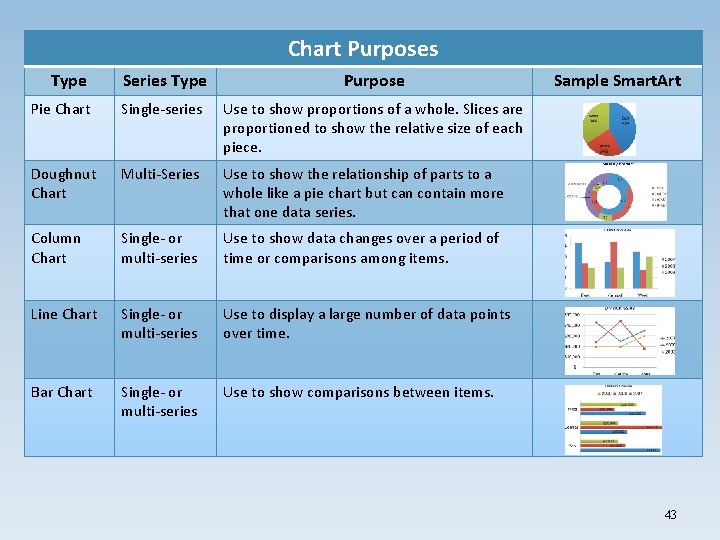
Chart Purposes Type Series Type Purpose Pie Chart Single-series Use to show proportions of a whole. Slices are proportioned to show the relative size of each piece. Doughnut Chart Multi-Series Use to show the relationship of parts to a whole like a pie chart but can contain more that one data series. Column Chart Single- or multi-series Use to show data changes over a period of time or comparisons among items. Line Chart Single- or multi-series Use to display a large number of data points over time. Bar Chart Single- or multi-series Use to show comparisons between items. Sample Smart. Art 43

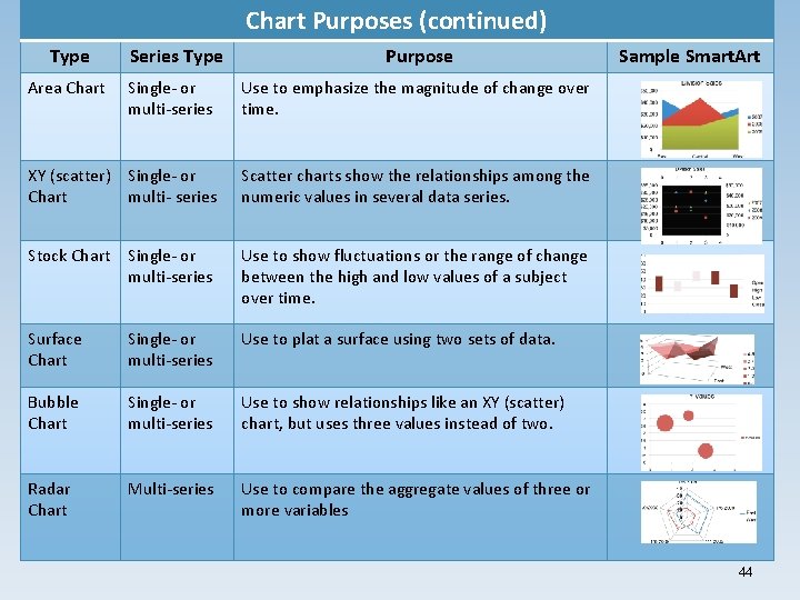
Chart Purposes (continued) Type Area Chart Series Type Purpose Single- or multi-series Use to emphasize the magnitude of change over time. XY (scatter) Single- or Chart multi- series Scatter charts show the relationships among the numeric values in several data series. Stock Chart Single- or multi-series Use to show fluctuations or the range of change between the high and low values of a subject over time. Surface Chart Single- or multi-series Use to plat a surface using two sets of data. Bubble Chart Single- or multi-series Use to show relationships like an XY (scatter) chart, but uses three values instead of two. Radar Chart Multi-series Use to compare the aggregate values of three or more variables Sample Smart. Art 44

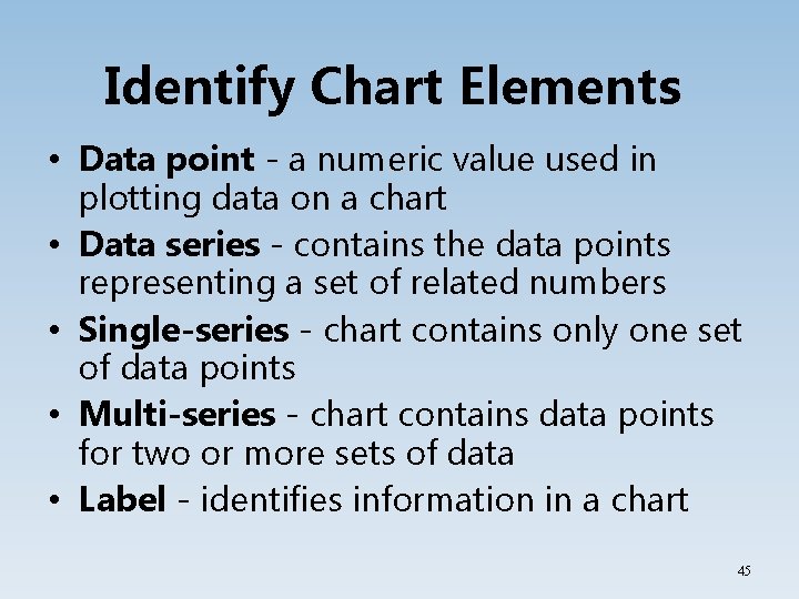
Identify Chart Elements • Data point - a numeric value used in plotting data on a chart • Data series - contains the data points representing a set of related numbers • Single-series - chart contains only one set of data points • Multi-series - chart contains data points for two or more sets of data • Label - identifies information in a chart 45

Identify Chart Elements (continued) • Leader - a connecting line between labels and pie slices • Exploded pie chart - separates one or more slices of the pie chart for emphasis • Chart area - the chart and all its elements • Plot area - the area representing the data in a chart • X-axis - horizontal category axis • Y-axis - vertical value axis • Z-axis - axis used to plot the depth of a chart 46

Identify Chart Elements (continued) • Gridline - a horizontal or vertical line that extends from the horizontal or vertical axis of a chart to make the data in the chart easier to read • Tick mark - a short line on an axis that marks the category and value divisions • Data marker - a graphical representation of a data point, such as a bar, circle, or slice • Legend - a key that displays identifying information about the data series connected to the data series name 47

Creating and Inserting a Chart • To create a chart: – Click the Insert tab and then click Chart – The Insert Chart dialog box will appear show the types and subtypes – Click on the chart to be used and click OK • To edit a chart: – Click the Chart Tools Design tab – Click the Edit Data in the Data group – Edit your data and click Close 48

Chart Modification • To convey the message quickly and accurately, you may modify your chart • Tips: – Add a chart title or subtitle, axes titles, data labels, and/or a legend – If possible, shorten numbers 49

Chart Modification To change a chart type: 1. 2. 3. 4. Select the chart Click the Chart Tools Design tab Click Change Chart Type in the Type group Click the chart type you want from the left pane or the chart subtype from the right pane 5. Click OK 50

Chart Modification (continued) To change the chart layout: 1. Select the chart 2. Click the Layout tab 3. Click Axis Titles 4. Point to Primary Vertical Axis Title 5. Select Rotated Title, Vertical Title, or Horizontal Title 6. Type the designation in the text box 51

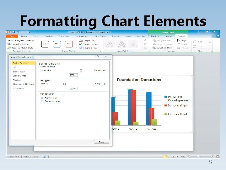
Formatting Chart Elements 52

Summary • A text-based chart or a statistical chart can be used to organize and understand information. • Text-based charts can be banners or posters, while statistical charts can be graphs that display numerical data. 53

Questions 54