INFOGRAPH 5 COMPARING TWO SIDES OF THE SAME

- Slides: 1

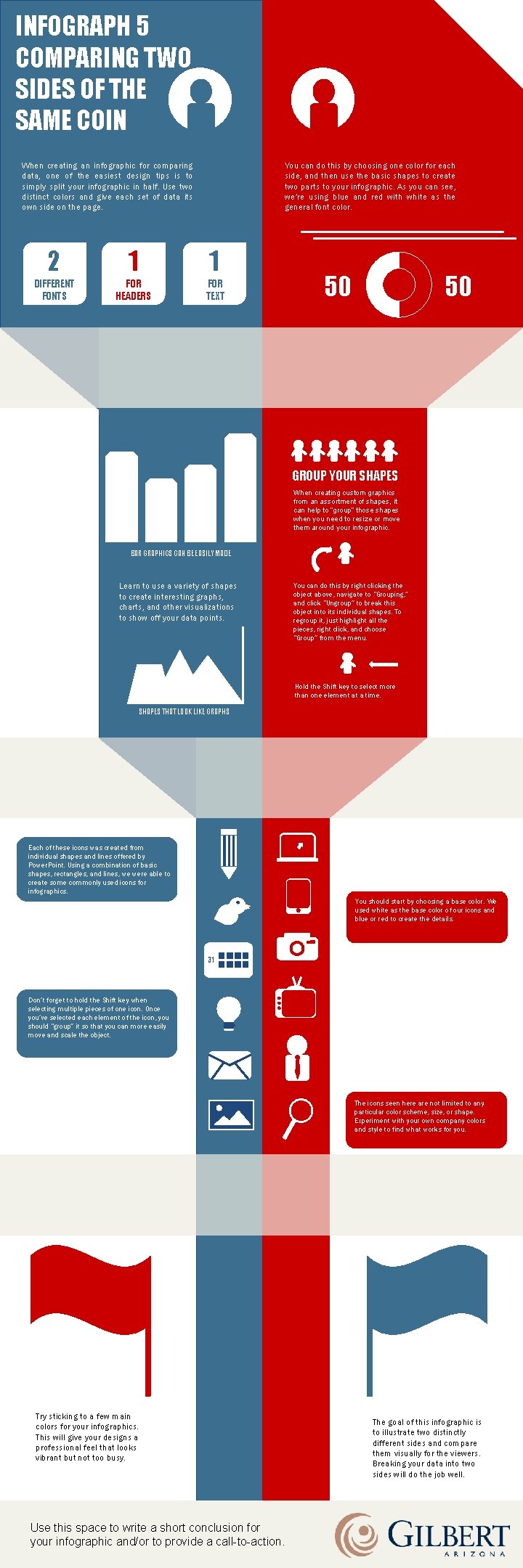
INFOGRAPH 5 COMPARING TWO SIDES OF THE SAME COIN When creating an infographic for comparing data, one of the easiest design tips is to simply split your infographic in half. Use two distinct colors and give each set of data its own side on the page. You can do this by choosing one color for each side, and then use the basic shapes to create two parts to your infographic. As you can see, we’re using blue and red with white as the general font color. 2 1 1 DIFFERENT FONTS FOR HEADERS FOR TEXT 50 50 GROUP YOUR SHAPES When creating custom graphics from an assortment of shapes, it can help to “group” those shapes when you need to resize or move them around your infographic. BAR GRAPHICS CAN BE EASILY MADE Learn to use a variety of shapes to create interesting graphs, charts, and other visualizations to show off your data points. You can do this by right clicking the object above, navigate to “Grouping, ” and click “Ungroup” to break this object into its individual shapes. To regroup it, just highlight all the pieces, right click, and choose “Group” from the menu. Hold the Shift key to select more than one element at a time. SHAPES THAT LOOK LIKE GRAPHS Each of these icons was created from individual shapes and lines offered by Power. Point. Using a combination of basic shapes, rectangles, and lines, we were able to create some commonly used icons for infographics. You should start by choosing a base color. We used white as the base color of our icons and blue or red to create the details. 31 Don’t forget to hold the Shift key when selecting multiple pieces of one icon. Once you’ve selected each element of the icon, you should “group” it so that you can more easily move and scale the object. The icons seen here are not limited to any particular color scheme, size, or shape. Experiment with your own company colors and style to find what works for you. Try sticking to a few main colors for your infographics. This will give your designs a professional feel that looks vibrant but not too busy. Use this space to write a short conclusion for your infographic and/or to provide a call-to-action. The goal of this infographic is to illustrate two distinctly different sides and compare them visually for the viewers. Breaking your data into two sides will do the job well.