IMGD 2905 Presenting Data Chapter 2 Outline Types

- Slides: 51

IMGD 2905 Presenting Data Chapter 2

Outline • Types of Charts • Guidelines for Charts • Common Mistakes (next)

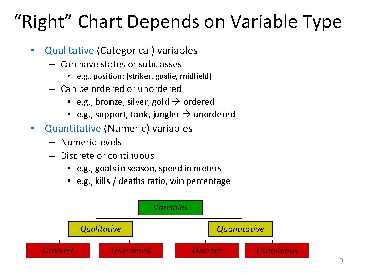
“Right” Chart Depends on Variable Type • Qualitative (Categorical) variables – Can have states or subclasses • e. g. , position: [striker, goalie, midfield] – Can be ordered or unordered • e. g. , bronze, silver, gold ordered • e. g. , support, tank, jungler unordered • Quantitative (Numeric) variables – Numeric levels – Discrete or continuous • e. g. , goals in season, speed in meters • e. g. , kills / deaths ratio, win percentage Variables Qualitative Ordered Unordered Quantitative Discrete Continuous 3

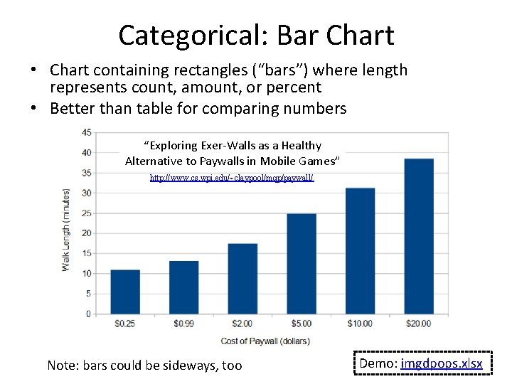
Categorical: Bar Chart • Chart containing rectangles (“bars”) where length represents count, amount, or percent • Better than table for comparing numbers “Exploring Exer-Walls as a Healthy Alternative to Paywalls in Mobile Games” http: //www. cs. wpi. edu/~claypool/mqp/paywall/ Note: bars could be sideways, too Demo: imgdpops. xlsx

Categorical: Pareto Chart • Bar chart, arranged most to least frequent • Line showing cumulative percent • Helps identify most common Demo: imgdpops. xlsx https: //usercontent 2. hubstatic. com/3767965_f 520. jpg Sort by column D. New column E for percent [=D 2/SUM(D$2: D$12)] New column F for running [=SUM(E$2: E 2)] Note: $ “locks” value in (e. g. , D$12 versus D 12) Select 2: 11 in B, E and F. Insert combo plot

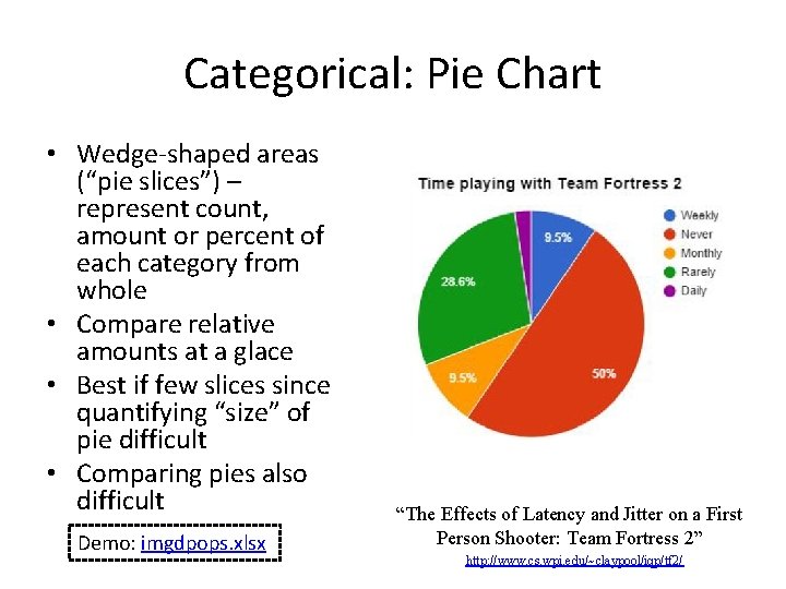
Categorical: Pie Chart • Wedge-shaped areas (“pie slices”) – represent count, amount or percent of each category from whole • Compare relative amounts at a glace • Best if few slices since quantifying “size” of pie difficult • Comparing pies also difficult Demo: imgdpops. xlsx “The Effects of Latency and Jitter on a First Person Shooter: Team Fortress 2” http: //www. cs. wpi. edu/~claypool/iqp/tf 2/

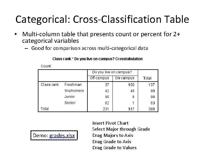
Categorical: Cross-Classification Table • Multi-column table that presents count or percent for 2+ categorical variables – Good for comparison across multi-categorical data Demo: grades. xlsx Insert Pivot Chart Select Major through Grade Drag Majors to Axis Drag Grade to Values

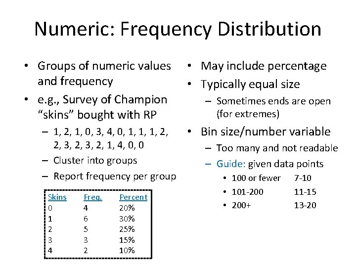
Numeric: Frequency Distribution • Groups of numeric values and frequency • e. g. , Survey of Champion “skins” bought with RP – 1, 2, 1, 0, 3, 4, 0, 1, 1, 1, 2, 2, 3, 2, 1, 4, 0, 0 – Cluster into groups – Report frequency per group Skins 0 1 2 3 4 Freq. 4 6 5 3 2 Percent 20% 30% 25% 10% • May include percentage • Typically equal size – Sometimes ends are open (for extremes) • Bin size/number variable – Too many and not readable – Guide: given data points • 100 or fewer • 101 -200 • 200+ 7 -10 11 -15 13 -20

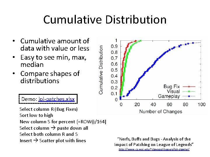
Cumulative Distribution • Cumulative amount of data with value or less • Easy to see min, max, median • Compare shapes of distributions Demo: lol-patches. xlsx Select column R (Bug Fixes) Sort low to high New column S for percent [=ROW()/164] Select column paste down all Select both column R and S Insert Scatter plot with lines “Nerfs, Buffs and Bugs - Analysis of the Impact of Patching on League of Legends” http: //www. cs. wpi. edu/~claypool/papers/lol-crawler/

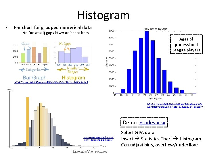
Histogram • Bar chart for grouped numerical data – No (or small) gaps btwn adjacent bars Ages of professional League players https: //www. mathsisfun. com/data/images/bar-chart-vs-histogram. gif https: //www. reddit. com/r/leagueoflegends/comme nts/4 x 5 s 9 m/analysis_of_age_in_league_of_legends/ Demo: grades. xlsx http: //www. leaguemath. com/e arly-vs-late-game-champions/ Select GPA data Insert Statistics Chart Histogram Can adjust bins, overflow/underflow

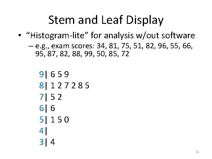
Stem and Leaf Display • “Histogram-lite” for analysis w/out software – e. g. , exam scores: 34, 81, 75, 51, 82, 96, 55, 66, 95, 87, 82, 88, 99, 50, 85, 72 9| 6 5 9 8| 1 2 7 2 8 5 7| 5 2 6| 6 5| 1 5 0 4| 3| 4 11

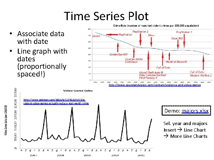
Time Series Plot • Associate data with date • Line graph with dates (proportionally spaced!) http: //www. soundandvision. com/content/violence-and-video-games http: //www. polygon. com/2014/9/12/6141515/doviolent-video-games-actually-reduce-real-world-crime Demo: majors. xlsx Sel. year and majors Insert Line Chart More Line Charts

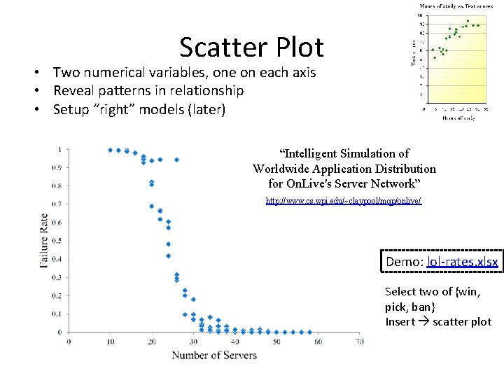
Scatter Plot • Two numerical variables, one on each axis • Reveal patterns in relationship • Setup “right” models (later) “Intelligent Simulation of Worldwide Application Distribution for On. Live's Server Network” http: //www. cs. wpi. edu/~claypool/mqp/onlive/ Demo: lol-rates. xlsx Select two of {win, pick, ban} Insert scatter plot

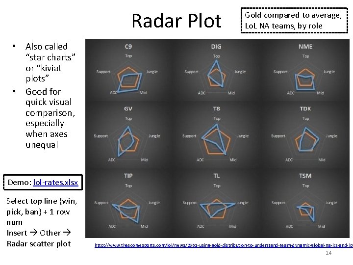
Radar Plot Gold compared to average, Lo. L NA teams, by role • Also called “star charts” or “kiviat plots” • Good for quick visual comparison, especially when axes unequal Demo: lol-rates. xlsx Select top line {win, pick, ban} + 1 row num Insert Other Radar scatter plot http: //www. thescoreesports. com/lol/news/2561 -using-gold-distribution-to-understand-team-dynamic-global-na-lcs-and-lpl 14

Many More Charts! https: //en. wikipedia. org/wiki/Chart • • Bubble Waterfall Tree Gap Polar Violin Candlestick Kagi • • Gantt Nolan Pert Smith Skyline Vowel Nomogram Natal • If common chart effective for message, use • Learn/use other charts as needed

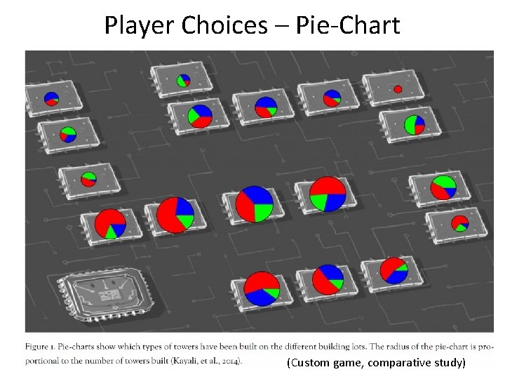
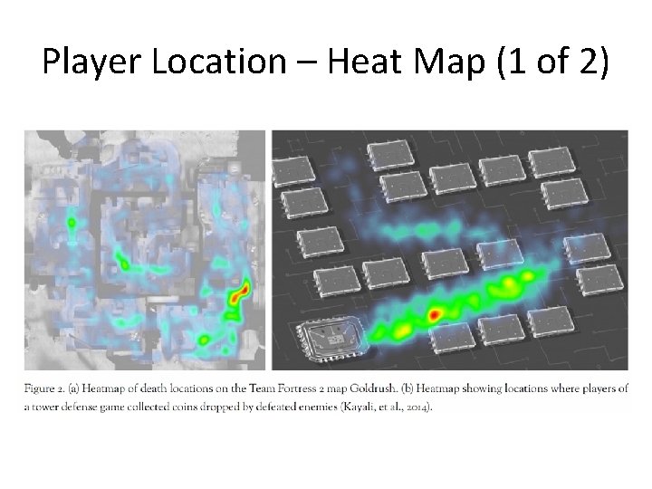
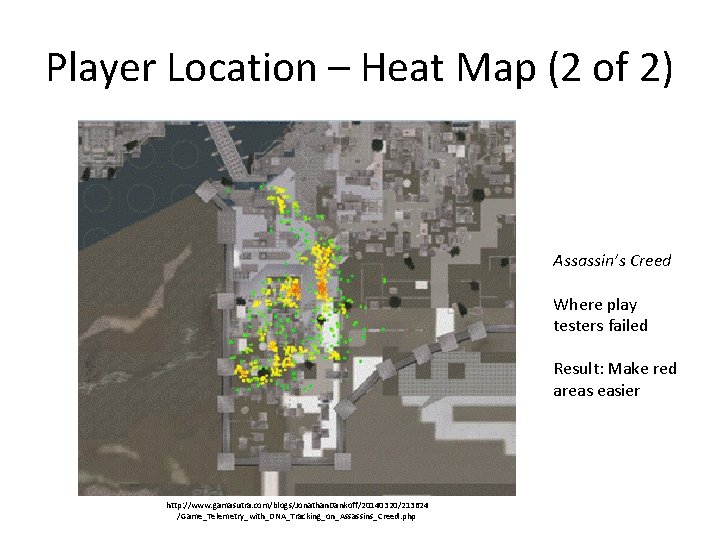
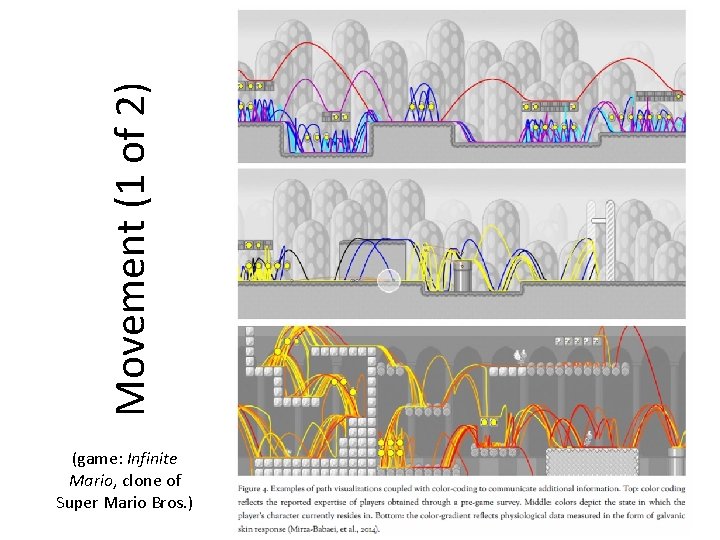
Game Analytics Charts Gunter Wallner and Simone Kriglstein. “An Introduction to Gameplay Data Visualization”, Game Research Methods, pages 231 -250, ETC Press, ISBN: 978 -1 -312 -88473 -1, 2015. http: //dl. acm. org/citation. cfm? id=2812792 • Player choices (e. g. , build units) • Density of activities (e. g. , where spend time on map) • Movement through levels

Player Choices – Pie-Chart (Custom game, comparative study)

Player Location – Heat Map (1 of 2)

Player Location – Heat Map (2 of 2) Assassin’s Creed Where play testers failed Result: Make red areas easier http: //www. gamasutra. com/blogs/Jonathan. Dankoff/20140320/213624 /Game_Telemetry_with_DNA_Tracking_on_Assassins_Creed. php

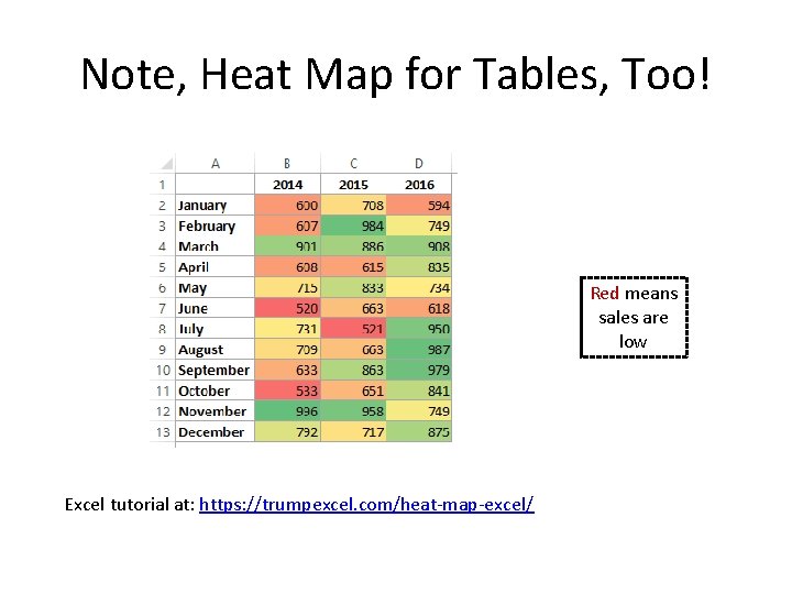
Note, Heat Map for Tables, Too! Red means sales are low Excel tutorial at: https: //trumpexcel. com/heat-map-excel/

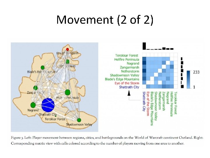
Movement (1 of 2) (game: Infinite Mario, clone of Super Mario Bros. )

Movement (2 of 2)

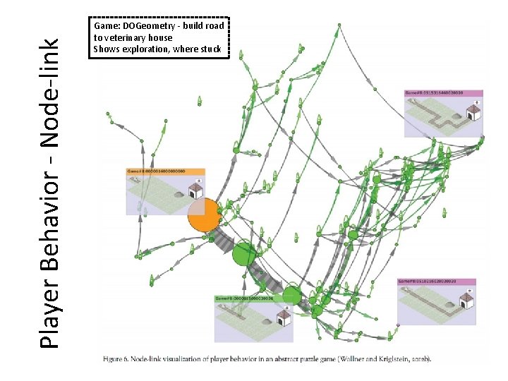
Player Behavior - Node-link Game: DOGeometry - build road to veterinary house Shows exploration, where stuck

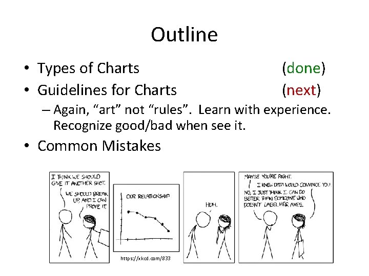
Outline • Types of Charts • Guidelines for Charts (done) (next) – Again, “art” not “rules”. Learn with experience. Recognize good/bad when see it. • Common Mistakes https: //xkcd. com/833

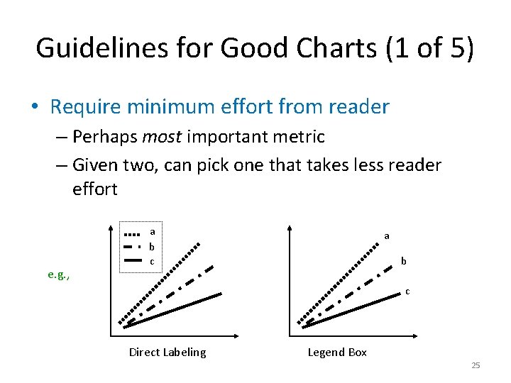
Guidelines for Good Charts (1 of 5) • Require minimum effort from reader – Perhaps most important metric – Given two, can pick one that takes less reader effort e. g. , a b c Direct Labeling Legend Box 25

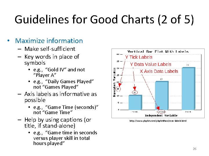
Guidelines for Good Charts (2 of 5) • Maximize information – Make self-sufficient – Key words in place of symbols • e. g. , “Gold IV” and not “Player A” • e. g. , “Daily Games Played” not “Games Played” – Axis labels as informative as possible • e. g. , “Game Time (seconds)” not “Game Time” – Help by using captions (or title, if stand-alone) http: //www. phplot. com/phplotdocs/conc-labels. html • e. g. , “Game time in seconds versus player skill in total hours played” 26

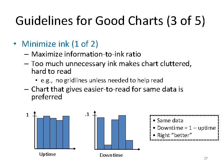
Guidelines for Good Charts (3 of 5) • Minimize ink (1 of 2) – Maximize information-to-ink ratio – Too much unnecessary ink makes chart cluttered, hard to read • e. g. , no gridlines unless needed to help read – Chart that gives easier-to-read for same data is preferred. 1 1 Uptime • Same data • Downtime = 1 – uptime • Right “better” Downtime 27

Guidelines for Good Charts (3 of 5) • Minimize ink (2 of 2) https: //www. slideshare. net/Nicole. Marinsek/darkhorse-line-chart

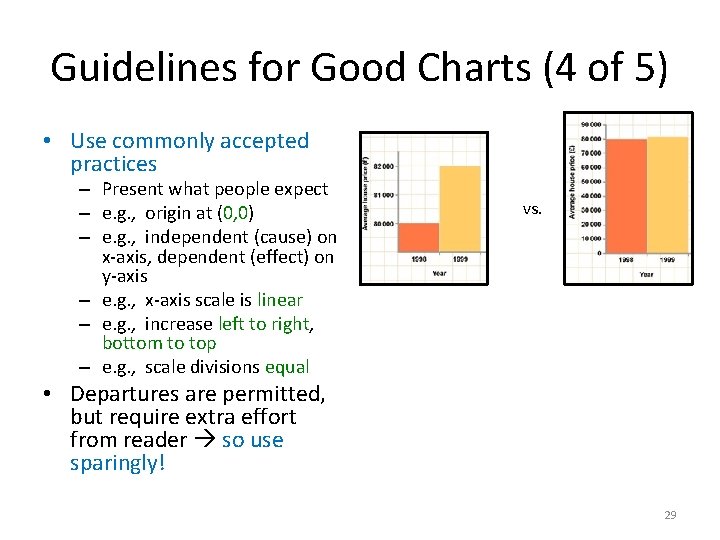
Guidelines for Good Charts (4 of 5) • Use commonly accepted practices – Present what people expect – e. g. , origin at (0, 0) – e. g. , independent (cause) on x-axis, dependent (effect) on y-axis – e. g. , x-axis scale is linear – e. g. , increase left to right, bottom to top – e. g. , scale divisions equal vs. • Departures are permitted, but require extra effort from reader so use sparingly! 29

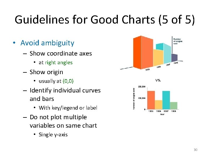
Guidelines for Good Charts (5 of 5) • Avoid ambiguity – Show coordinate axes • at right angles – Show origin • usually at (0, 0) vs. – Identify individual curves and bars • With key/legend or label – Do not plot multiple variables on same chart http: //www. carltonassociatesinc. com/images/confusion-new. jpg • Single y-axis 30

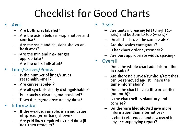
Checklist for Good Charts • Axes – Are both axes labeled? – Are the axis labels self-explanatory and concise? – Are the scale and divisions shown on both axes? – Are the min and max ranges appropriate? – Are the units indicated? • Lines/Curves/Points – Is the number of lines/curves reasonably small? – Are curves labeled? – Are all symbols clearly distinguishable? – Is a concise, clear legend provided? – Does the legend obscure any data? • Information – If the y-axis is variable, is an indication of spread (error bars) shown? – Are grid lines required to read data (if not, then remove)? • Scale – Are units increasing left to right (xaxis) and bottom to top (y-axis)? – Do all charts use the same scale? – Are the scales contiguous? – Is bar chart order systematic? – Are bars appropriate width, spacing? • Overall – Does the whole chart add information to reader? – Are there no curves/symbols/text that can be removed and still have the same information? – Does the chart have a title or caption (not both)? – Is the chart self-explanatory and concise? – Do the variables plotted give more information than alternatives? – Is chart referenced and discussed in any accompanying report?

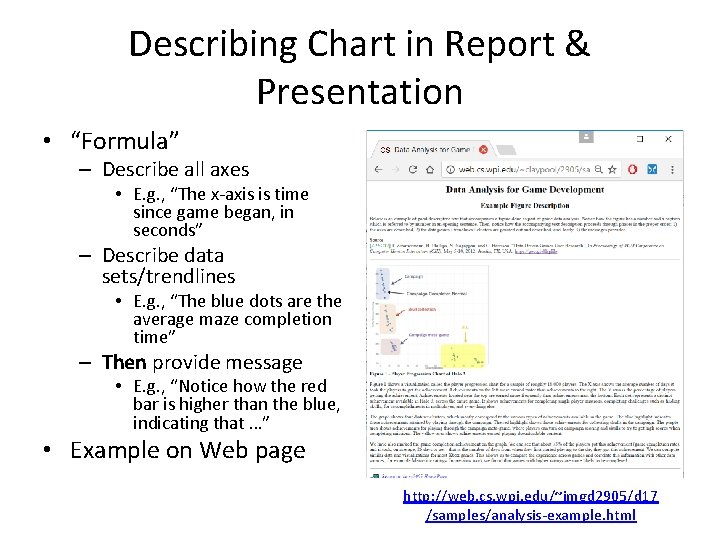
Describing Chart in Report & Presentation • “Formula” – Describe all axes • E. g. , “The x-axis is time since game began, in seconds” – Describe data sets/trendlines • E. g. , “The blue dots are the average maze completion time” – Then provide message • E. g. , “Notice how the red bar is higher than the blue, indicating that …” • Example on Web page http: //web. cs. wpi. edu/~imgd 2905/d 17 /samples/analysis-example. html

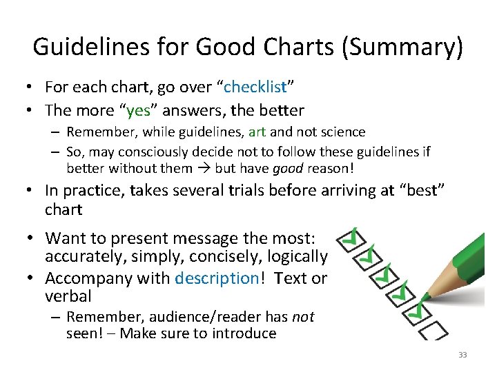
Guidelines for Good Charts (Summary) • For each chart, go over “checklist” • The more “yes” answers, the better – Remember, while guidelines, art and not science – So, may consciously decide not to follow these guidelines if better without them but have good reason! • In practice, takes several trials before arriving at “best” chart • Want to present message the most: accurately, simply, concisely, logically • Accompany with description! Text or verbal – Remember, audience/reader has not seen! – Make sure to introduce 33

Outline • Types of Charts • Guidelines for Charts • Common Mistakes (done) (next)

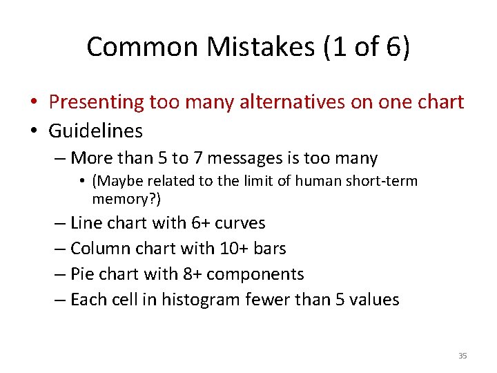
Common Mistakes (1 of 6) • Presenting too many alternatives on one chart • Guidelines – More than 5 to 7 messages is too many • (Maybe related to the limit of human short-term memory? ) – Line chart with 6+ curves – Column chart with 10+ bars – Pie chart with 8+ components – Each cell in histogram fewer than 5 values 35

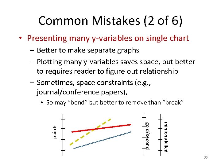
Common Mistakes (2 of 6) • Presenting many y-variables on single chart – Better to make separate graphs – Plotting many y-variables saves space, but better to requires reader to figure out relationship – Sometimes, space constraints (e. g. , journal/conference papers), minions killed gold/second points • So may “bend” but better to remove than “break” 36

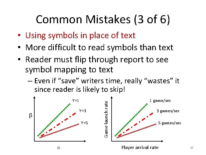
Common Mistakes (3 of 6) • Using symbols in place of text • More difficult to read symbols than text • Reader must flip through report to see symbol mapping to text Y=1 Y=3 Y=5 Game launch rate – Even if “save” writers time, really “wastes” it since reader is likely to skip! 1 game/sec 3 games/sec 5 games/sec Player arrival rate 37

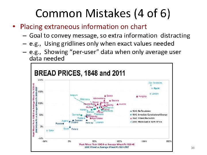
Common Mistakes (4 of 6) • Placing extraneous information on chart – Goal to convey message, so extra information distracting – e. g. , Using gridlines only when exact values needed – e. g. , Showing “per-user” data when only average user data needed 38

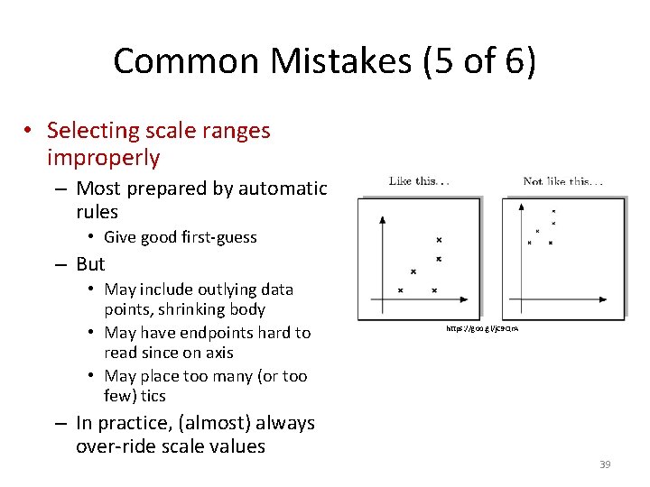
Common Mistakes (5 of 6) • Selecting scale ranges improperly – Most prepared by automatic rules • Give good first-guess – But • May include outlying data points, shrinking body • May have endpoints hard to read since on axis • May place too many (or too few) tics – In practice, (almost) always over-ride scale values https: //goo. gl/j. C 9 Qr. A 39

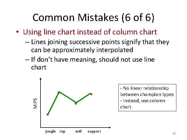
Common Mistakes (6 of 6) • Using line chart instead of column chart – Lines joining successive points signify that they can be approximately interpolated – If don’t have meaning, should not use line chart MIPS - No linear relationship between champion types - Instead, use column chart jungle top mid support 40

Misleading Charts

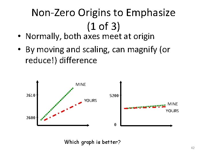
Non-Zero Origins to Emphasize (1 of 3) • Normally, both axes meet at origin • By moving and scaling, can magnify (or reduce!) difference MINE 2610 YOURS 5200 MINE YOURS 2600 0 Which graph is better? 42

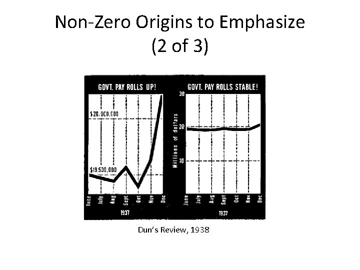
Non-Zero Origins to Emphasize (2 of 3) Dun’s Review, 1938

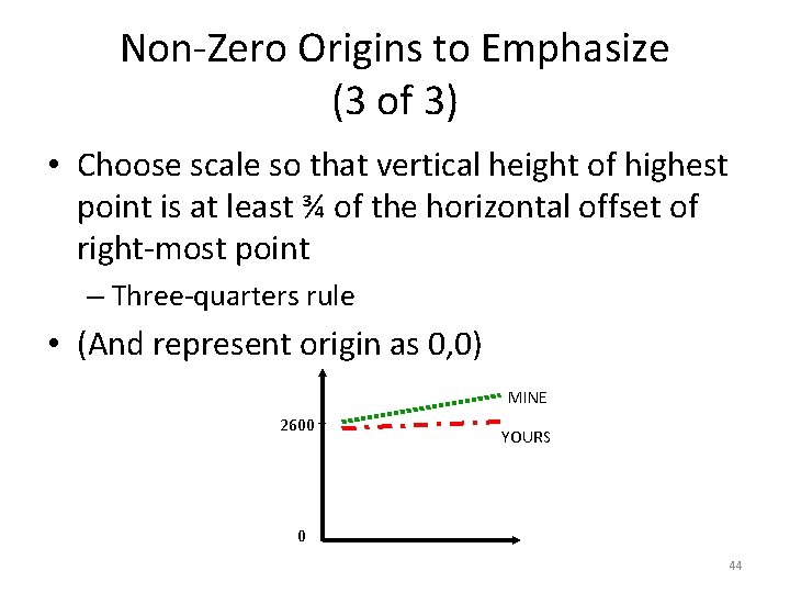
Non-Zero Origins to Emphasize (3 of 3) • Choose scale so that vertical height of highest point is at least ¾ of the horizontal offset of right-most point – Three-quarters rule • (And represent origin as 0, 0) MINE 2600 YOURS 0 44

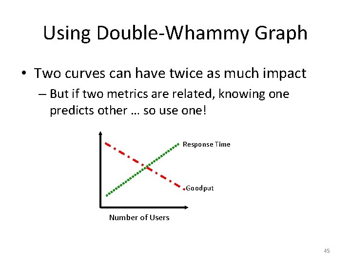
Using Double-Whammy Graph • Two curves can have twice as much impact – But if two metrics are related, knowing one predicts other … so use one! Response Time Goodput Number of Users 45

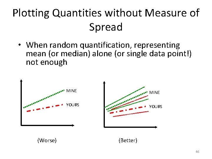
Plotting Quantities without Measure of Spread • When random quantification, representing mean (or median) alone (or single data point!) not enough (Worse) MINE YOURS (Better) 46

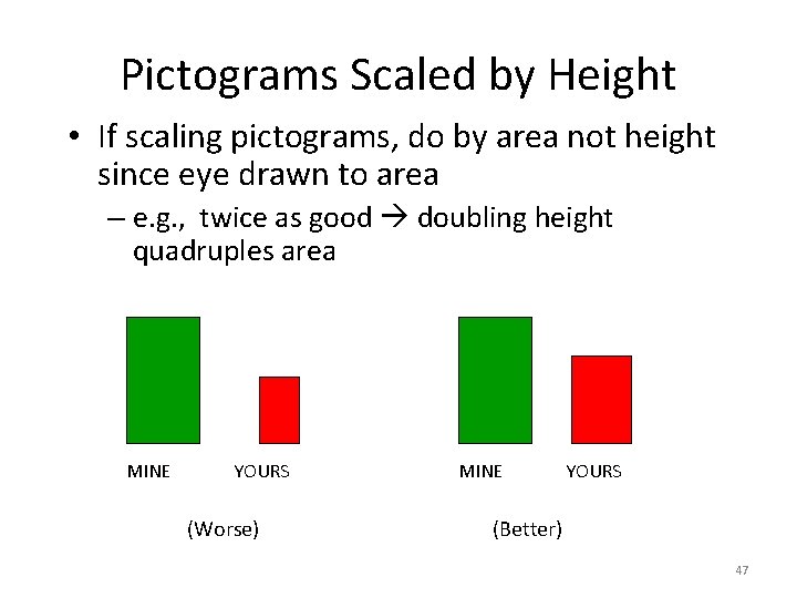
Pictograms Scaled by Height • If scaling pictograms, do by area not height since eye drawn to area – e. g. , twice as good doubling height quadruples area MINE YOURS (Worse) MINE YOURS (Better) 47

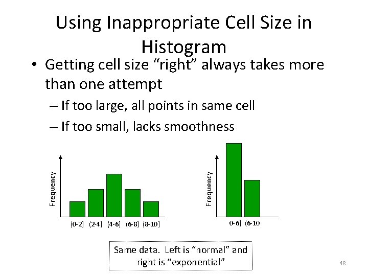
Using Inappropriate Cell Size in Histogram • Getting cell size “right” always takes more than one attempt Frequency – If too large, all points in same cell – If too small, lacks smoothness (0 -2] (2 -4] (4 -6] (6 -8] (8 -10] 0 -6] (6 -10 Same data. Left is “normal” and right is “exponential” 48

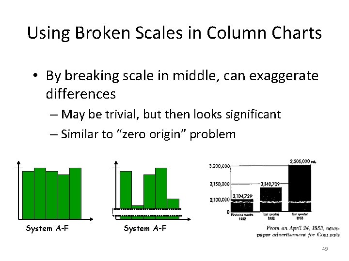
Using Broken Scales in Column Charts • By breaking scale in middle, can exaggerate differences – May be trivial, but then looks significant – Similar to “zero origin” problem System A-F 49

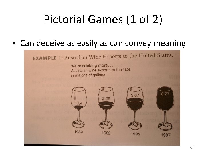
Pictorial Games (1 of 2) • Can deceive as easily as can convey meaning 50

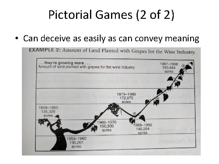
Pictorial Games (2 of 2) • Can deceive as easily as can convey meaning