Imagemaking Pairs and Triplets Talk to your neighours



- Slides: 43

Image-making Pairs and Triplets • Talk to your neighours or acquaintances in the class and organize yourselves into pairs (or triplets). Select which person’s laptop is being used. • Write down the names and emails of your team members. You can pick a name for your team. • Designate a note taker. Today the notetaker will email me the names and student numbers of team members attending today. • Marks for participation and for statements about specific goals for image and what in particular was achieved.

Workshop Lectures • 1 st lecture: – on day of lecture send in team member’s FULL names and student numbers and if they participated. – the email must also include • colour contrast the team is aiming for • the colours the team plans to use • 2 nd workshop lecture – greyscale images MUST be on laptop BEFORE arriving at class. – use your own stretches or Dr English’s stretches at http: //www. physics. umanitoba. ca/~english/2015 winter phys 1830/bwimaging/chimney/

A Recipe for Cooking Up Astronomical Images • Cooking Up Astronomy Images Online at http: //astronomy. swin. edu. au/sao/guest/english/imageindex. html • Dr. English’s You. Tube videos linked at her visualization website. (If you want a lot of detail. ) (As well as last year’s lectures. )

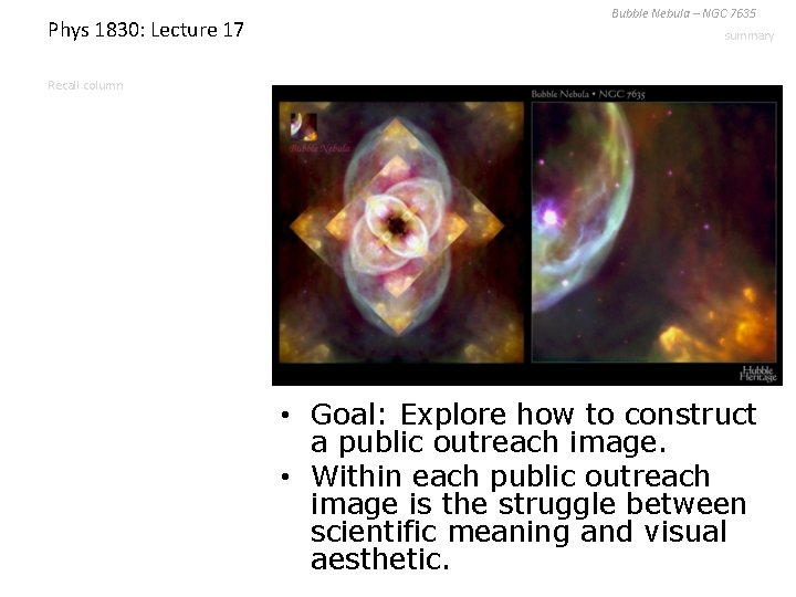
Phys 1830: Lecture 17 Bubble Nebula – NGC 7635 summary Recall column • Goal: Explore how to construct a public outreach image. • Within each public outreach image is the struggle between scientific meaning and visual aesthetic.

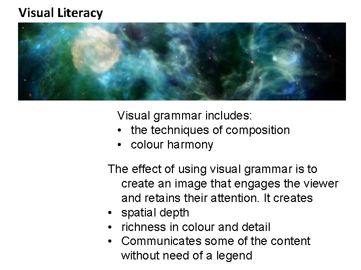
Visual Literacy Visual grammar includes: • the techniques of composition • colour harmony The effect of using visual grammar is to create an image that engages the viewer and retains their attention. It creates • spatial depth • richness in colour and detail • Communicates some of the content without need of a legend

Visualization versus Scientific Meaning 1 Composition and Colour Harmony Play a Role 1. How is your eye led in a picture? V. Van Gogh

Visualization versus Scientific Meaning 1 This painting can be seen at: http: //www. moma. org/collection/browse_results. php? o bject_id=79802 V. Van Gogh


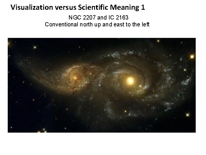
Visualization versus Scientific Meaning 1 NGC 2207 and IC 2163 Conventional north up and east to the left

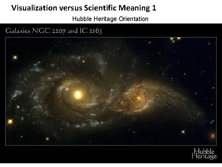
Visualization versus Scientific Meaning 1 Hubble Heritage Orientation

Visualization versus Scientific Meaning 2 Composition and Colour Harmony Play a role 2. Which part of this image is cold and which part is hot? V. Van Gogh

Visualization versus Scientific Meaning 2 This image can be seen at: http: www. guggenheimcollection. org/site/artist_work _md_158_8. html V. Van Gogh

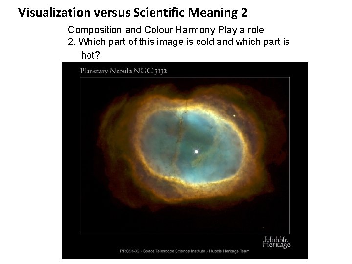
Visualization versus Scientific Meaning 2 Composition and Colour Harmony Play a role 2. Which part of this image is cold and which part is hot?

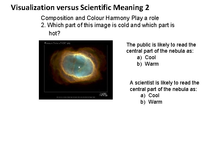
Visualization versus Scientific Meaning 2 Composition and Colour Harmony Play a role 2. Which part of this image is cold and which part is hot? The public is likely to read the central part of the nebula as: a) Cool b) Warm A scientist is likely to read the central part of the nebula as: a) Cool b) Warm

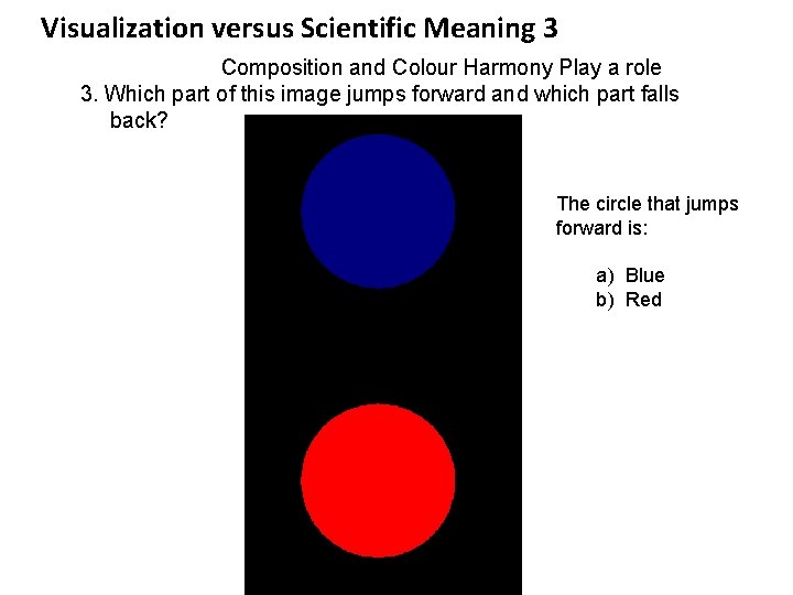
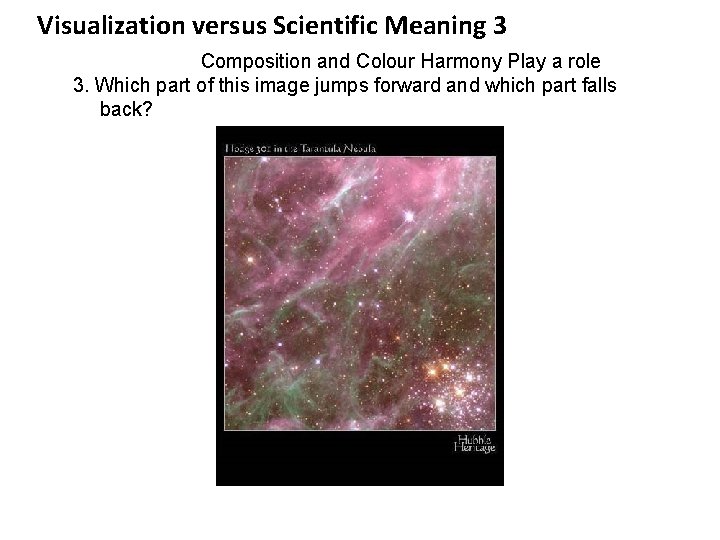
Visualization versus Scientific Meaning 3 Composition and Colour Harmony Play a role 3. Which part of this image jumps forward and which part falls back? The circle that jumps forward is: a) Blue b) Red

Visualization versus Scientific Meaning 3 Composition and Colour Harmony Play a role 3. Which part of this image jumps forward and which part falls back?

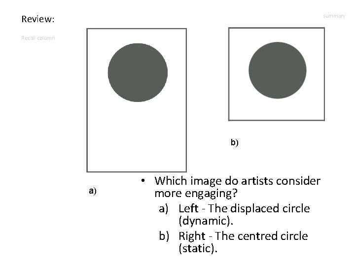
Review: summary Recall column b) a) • Which image do artists consider more engaging? a) Left - The displaced circle (dynamic). b) Right - The centred circle (static).

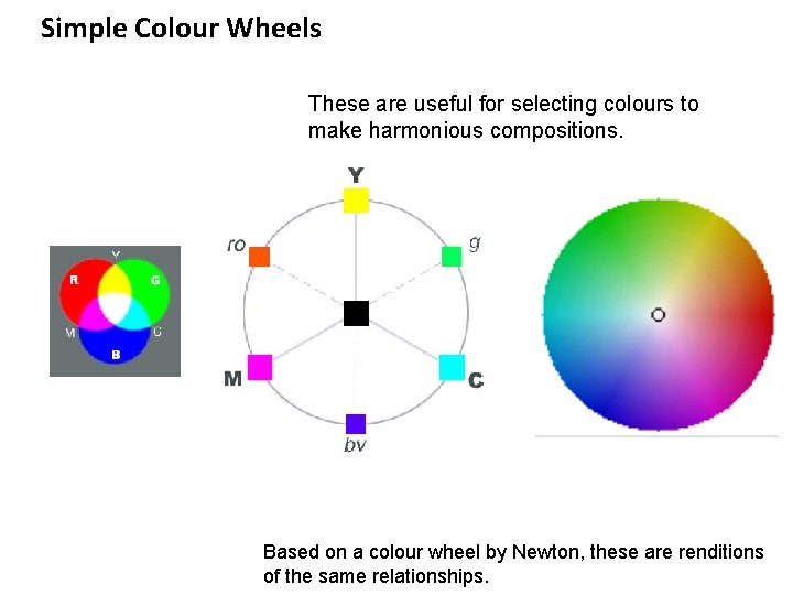
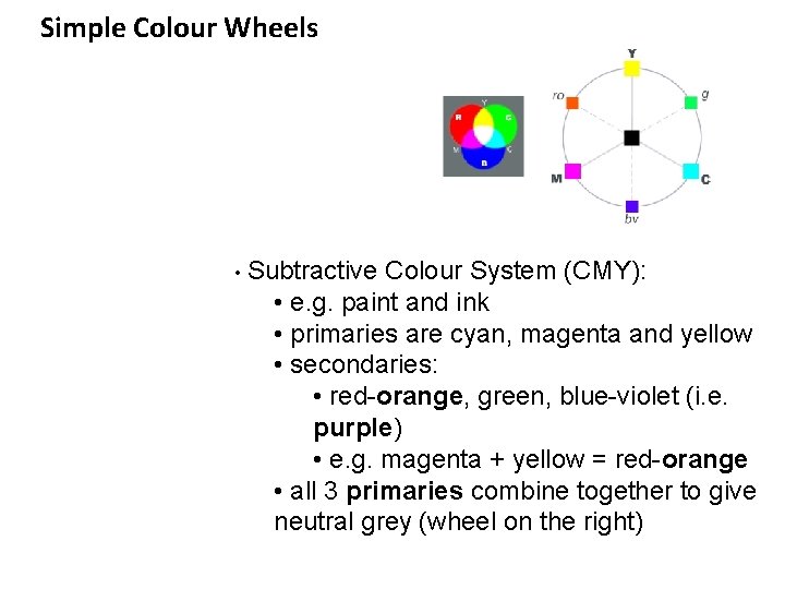
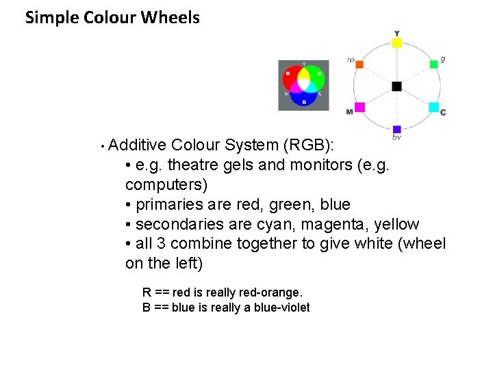
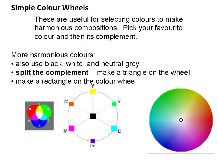
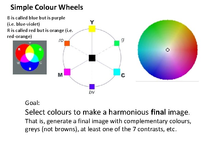
Simple Colour Wheels These are useful for selecting colours to make harmonious compositions. Based on a colour wheel by Newton, these are renditions of the same relationships.

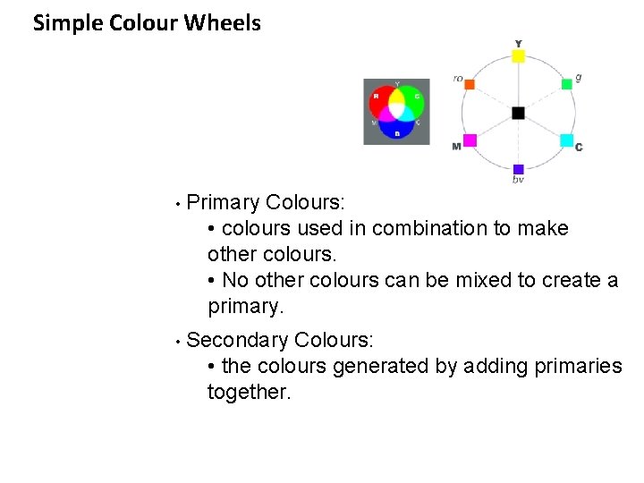
Simple Colour Wheels • Primary Colours: • colours used in combination to make other colours. • No other colours can be mixed to create a primary. • Secondary Colours: • the colours generated by adding primaries together.

Simple Colour Wheels • Subtractive Colour System (CMY): • e. g. paint and ink • primaries are cyan, magenta and yellow • secondaries: • red-orange, green, blue-violet (i. e. purple) • e. g. magenta + yellow = red-orange • all 3 primaries combine together to give neutral grey (wheel on the right)

Simple Colour Wheels • Additive Colour System (RGB): • e. g. theatre gels and monitors (e. g. computers) • primaries are red, green, blue • secondaries are cyan, magenta, yellow • all 3 combine together to give white (wheel on the left) R == red is really red-orange. B == blue is really a blue-violet

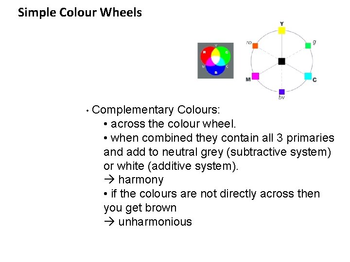
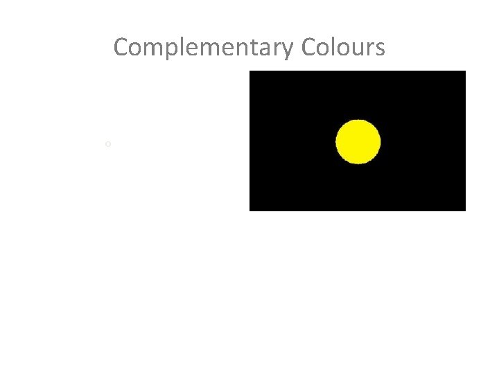
Simple Colour Wheels • Complementary Colours: • across the colour wheel. • when combined they contain all 3 primaries and add to neutral grey (subtractive system) or white (additive system). harmony • if the colours are not directly across then you get brown unharmonious

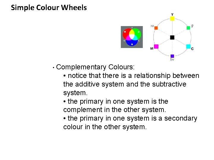
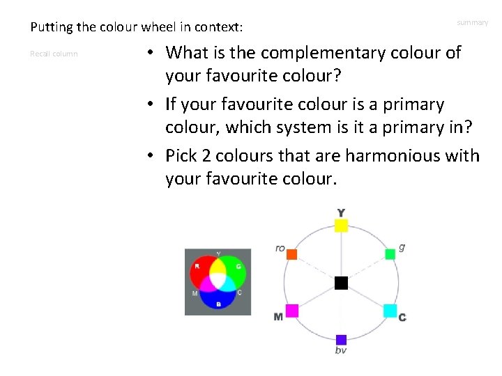
Simple Colour Wheels • Complementary Colours: • notice that there is a relationship between the additive system and the subtractive system. • the primary in one system is the complement in the other system. • the primary in one system is a secondary colour in the other system.

Complementary Colours o

Simple Colour Wheels These are useful for selecting colours to make harmonious compositions. Pick your favourite colour and then its complement. More harmonious colours: • also use black, white, and neutral grey • split the complement - make a triangle on the wheel • make a rectangle on the colour wheel

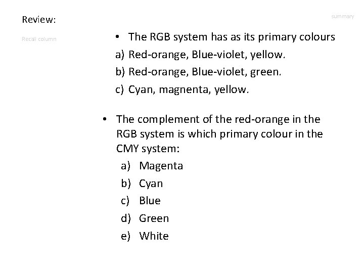
Review: Recall column summary • The RGB system has as its primary colours a) Red-orange, Blue-violet, yellow. b) Red-orange, Blue-violet, green. c) Cyan, magnenta, yellow. • The complement of the red-orange in the RGB system is which primary colour in the CMY system: a) Magenta b) Cyan c) Blue d) Green e) White

Putting the colour wheel in context: Recall column summary • What is the complementary colour of your favourite colour? • If your favourite colour is a primary colour, which system is it a primary in? • Pick 2 colours that are harmonious with your favourite colour.

Simple Colour Wheels B is called blue but is purple (i. e. blue-violet) R is called red but is orange (i. e. red-orange) Goal: Select colours to make a harmonious final image. That is, generate a final image with complementary colours, greys (not browns), at least one of the 7 contrasts, etc.

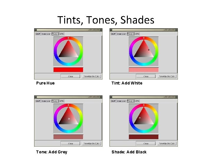
Tints, Tones, Shades Pure Hue Tint: Add White Tone: Add Grey Shade: Add Black

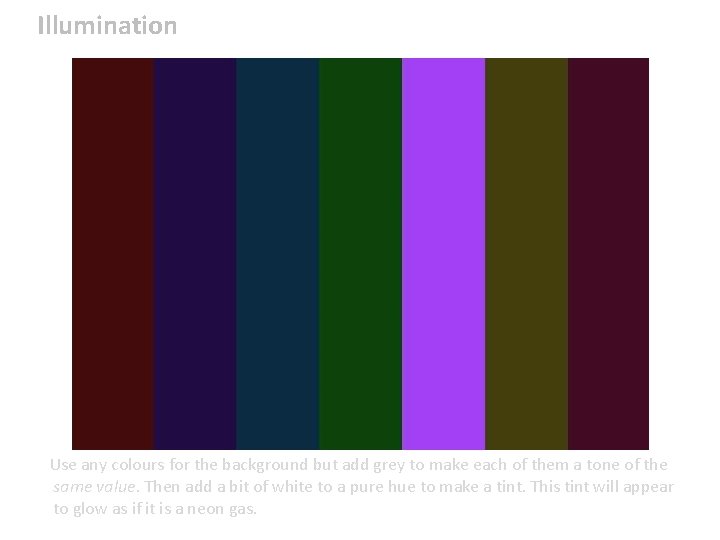
Illumination Use any colours for the background but add grey to make each of them a tone of the same value. Then add a bit of white to a pure hue to make a tint. This tint will appear to glow as if it is a neon gas.

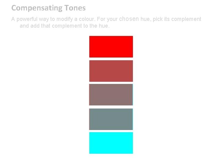
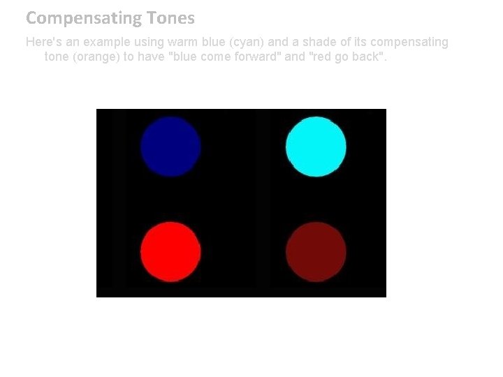
Compensating Tones A powerful way to modify a colour. For your chosen hue, pick its complement and add that complement to the hue.

Compensating Tones Here's an example using warm blue (cyan) and a shade of its compensating tone (orange) to have "blue come forward" and "red go back".

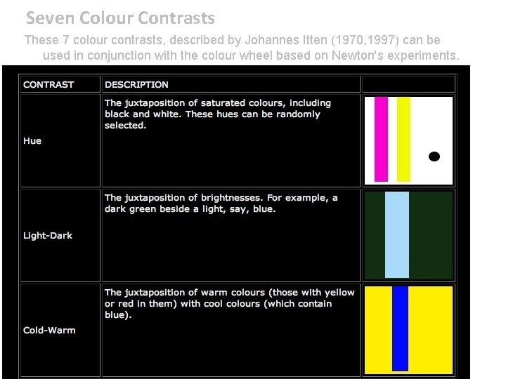
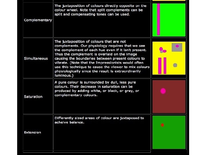
Seven Colour Contrasts These 7 colour contrasts, described by Johannes Itten (1970, 1997) can be used in conjunction with the colour wheel based on Newton's experiments.

Seven Colour Contrasts

Summary: Recall column summary • Composition Considerations: – Lead the eye to keep it in the picture plane. – Create a foreground, middleground, and background. – Consider how the image will be read in terms of temperature, etc. • Colour Considerations: – Harmonious colours work with the viewers’ physiology. – Optical effects can be used to help explain the science. – There are 7 colour contrasts.

Visual Grammar: Recall column summary • We learned that visual grammar can be very powerful. • Would the artists in the class like to share any tips?

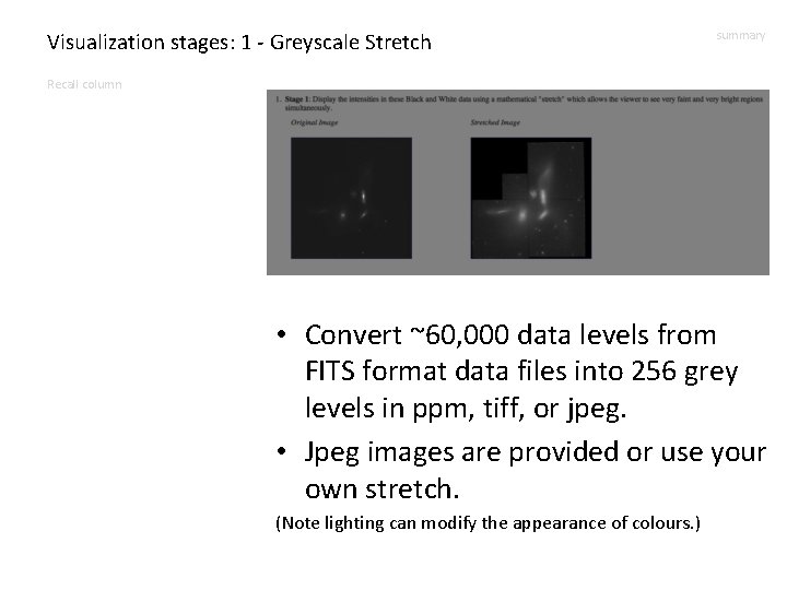
Visualization stages: 1 - Greyscale Stretch summary Recall column • Convert ~60, 000 data levels from FITS format data files into 256 grey levels in ppm, tiff, or jpeg. • Jpeg images are provided or use your own stretch. (Note lighting can modify the appearance of colours. )

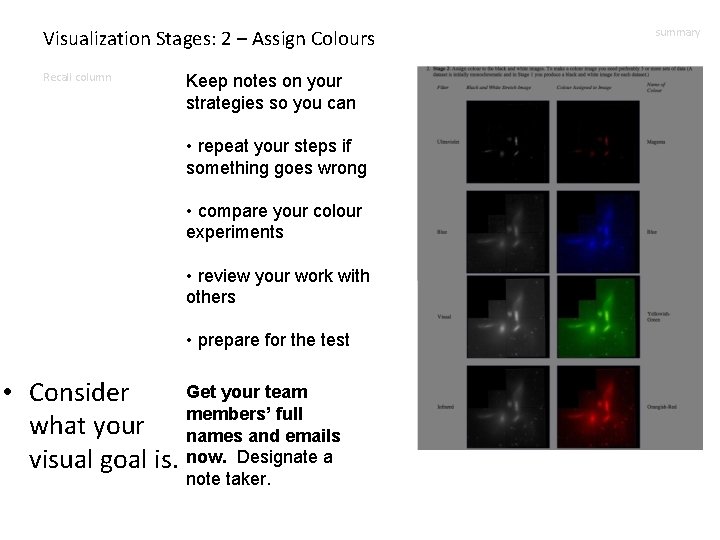
Visualization Stages: 2 – Assign Colours Recall column Keep notes on your strategies so you can • repeat your steps if something goes wrong • compare your colour experiments • review your work with others • prepare for the test Get your team • Consider members’ full what your names and emails visual goal is. now. Designate a note taker. summary

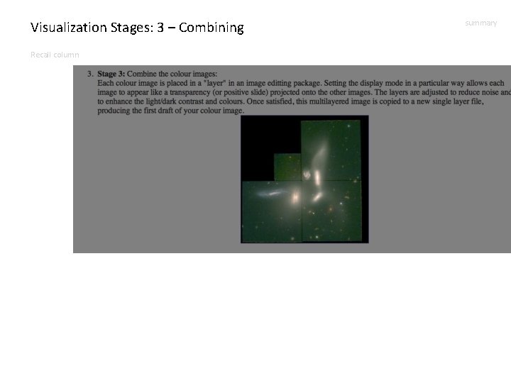
Visualization Stages: 3 – Combining Recall column summary

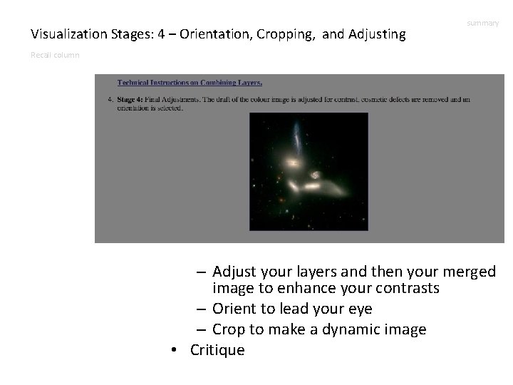
Visualization Stages: 4 – Orientation, Cropping, and Adjusting summary Recall column – Adjust your layers and then your merged image to enhance your contrasts – Orient to lead your eye – Crop to make a dynamic image • Critique

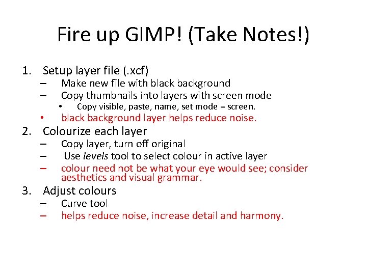
Fire up GIMP! (Take Notes!) 1. Setup layer file (. xcf) – – • Make new file with black background Copy thumbnails into layers with screen mode • Copy visible, paste, name, set mode = screen. black background layer helps reduce noise. 2. Colourize each layer – – – Copy layer, turn off original Use levels tool to select colour in active layer colour need not be what your eye would see; consider aesthetics and visual grammar. 3. Adjust colours – – Curve tool helps reduce noise, increase detail and harmony.

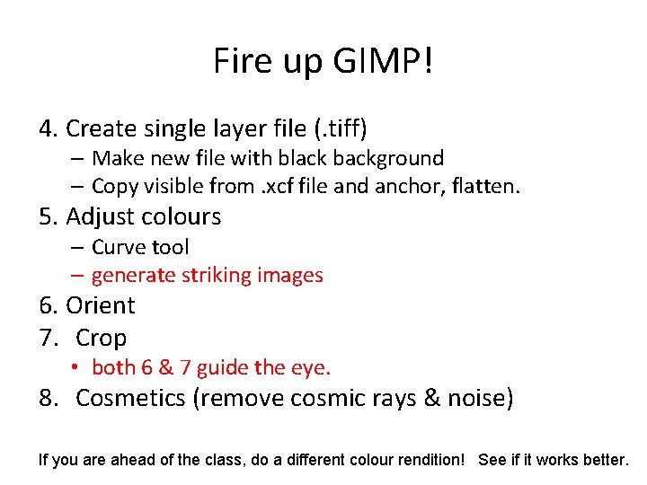
Fire up GIMP! 4. Create single layer file (. tiff) – Make new file with black background – Copy visible from. xcf file and anchor, flatten. 5. Adjust colours – Curve tool – generate striking images 6. Orient 7. Crop • both 6 & 7 guide the eye. 8. Cosmetics (remove cosmic rays & noise) If you are ahead of the class, do a different colour rendition! See if it works better.

See slides at beginning of lecture for preparation for next lecture.