IELTS Task 1 Language Graphs What language do



- Slides: 13

IELTS Task 1 Language - Graphs What language do you know to describe graphs? EFL SMARTblog

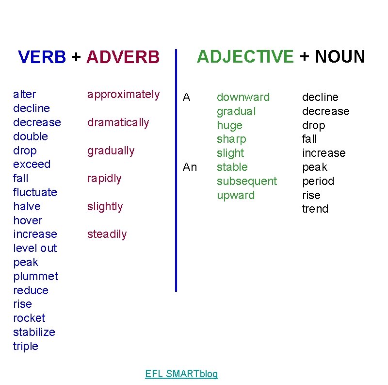
IELTS Task 1 Language - Graphs VERB + ADVERB ADJECTIVE + NOUN EFL SMARTblog

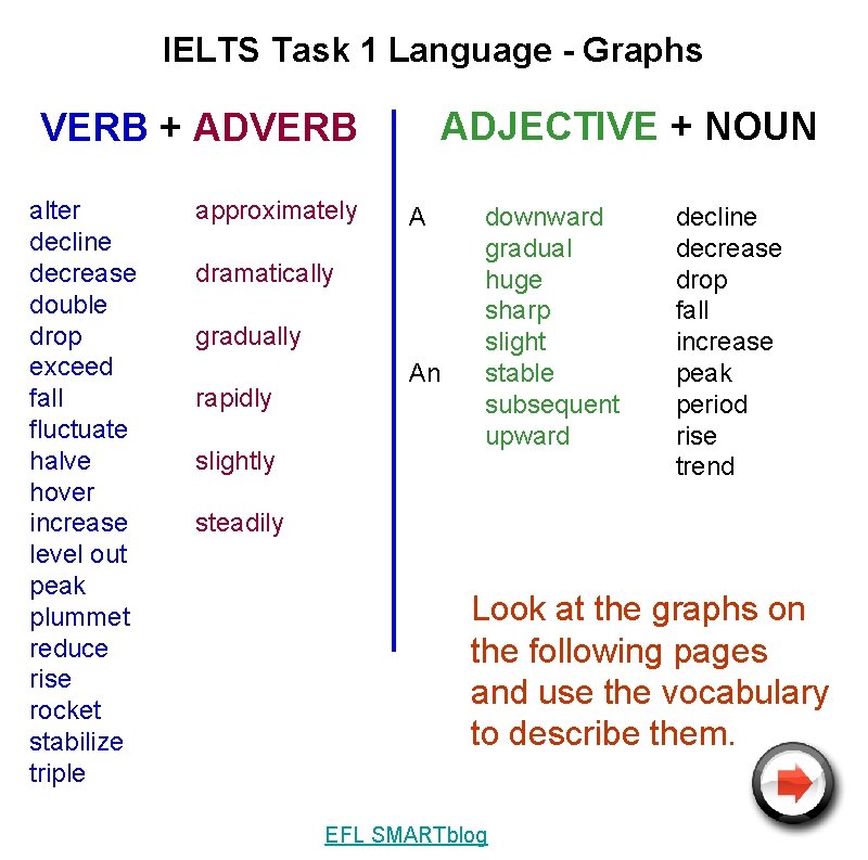
IELTS Task 1 Language - Graphs ADJECTIVE + NOUN VERB + ADVERB alter decline decrease double drop exceed fall fluctuate halve hover increase level out peak plummet reduce rise rocket stabilize triple approximately A dramatically gradually rapidly slightly An downward gradual huge sharp slight stable subsequent upward decline decrease drop fall increase peak period rise trend steadily Look at the graphs on the following pages and use the vocabulary to describe them. EFL SMARTblog

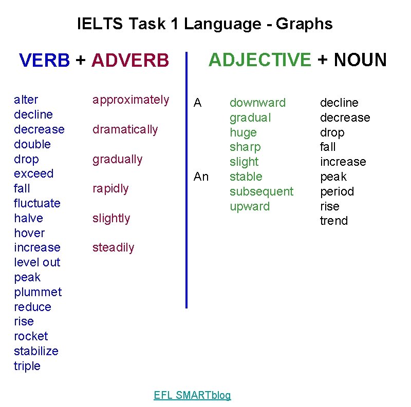
IELTS Task 1 Language - Graphs ADJECTIVE + NOUN VERB + ADVERB alter decline decrease double drop exceed fall fluctuate halve hover increase level out peak plummet reduce rise rocket stabilize triple approximately A dramatically gradually rapidly slightly An downward gradual huge sharp slight stable subsequent upward steadily EFL SMARTblog decline decrease drop fall increase peak period rise trend

ADJECTIVE + NOUN VERB + ADVERB alter decline decrease double drop exceed fall fluctuate halve hover increase level out peak plummet reduce rise rocket stabilize triple approximately A dramatically gradually rapidly slightly An downward gradual huge sharp slight stable subsequent upward steadily EFL SMARTblog decline decrease drop fall increase peak period rise trend

Describe what you see on the graph EFL SMARTblog

Describe what you see on the graph EFL SMARTblog

IELTS Task 1 Language - Graphs Describe what you see on the graph EFL SMARTblog

Describe what you see on the graph EFL SMARTblog

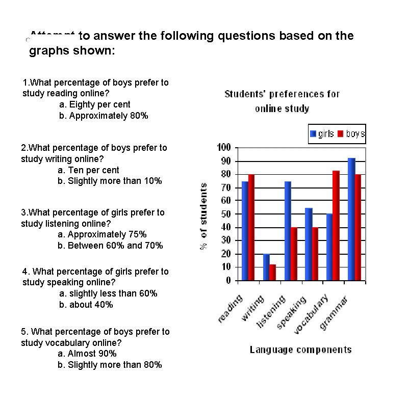
Attempt to answer the following questions based on the graphs shown: 1. What percentage of boys prefer to study reading online? a. Eighty per cent b. Approximately 80% 2. What percentage of boys prefer to study writing online? a. Ten per cent b. Slightly more than 10% 3. What percentage of girls prefer to study listening online? a. Approximately 75% b. Between 60% and 70% 4. What percentage of girls prefer to study speaking online? a. slightly less than 60% b. about 40% 5. What percentage of boys prefer to study vocabulary online? a. Almost 90% b. Slightly more than 80%

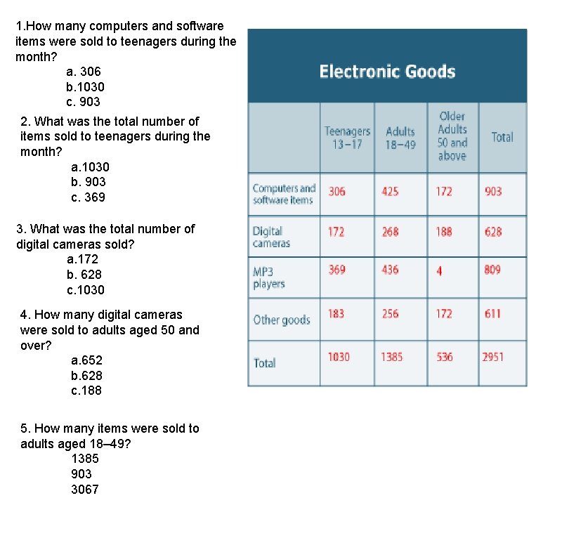
1. How many computers and software items were sold to teenagers during the month? a. 306 b. 1030 c. 903 2. What was the total number of items sold to teenagers during the month? a. 1030 b. 903 c. 369 3. What was the total number of digital cameras sold? a. 172 b. 628 c. 1030 4. How many digital cameras were sold to adults aged 50 and over? a. 652 b. 628 c. 188 5. How many items were sold to adults aged 18– 49? 1385 903 3067

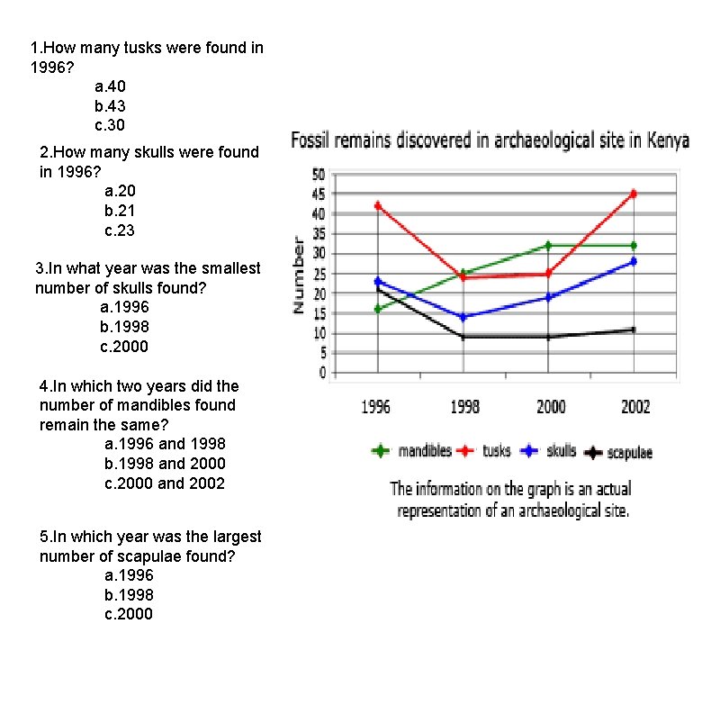
1. How many tusks were found in 1996? a. 40 b. 43 c. 30 2. How many skulls were found in 1996? a. 20 b. 21 c. 23 3. In what year was the smallest number of skulls found? a. 1996 b. 1998 c. 2000 4. In which two years did the number of mandibles found remain the same? a. 1996 and 1998 b. 1998 and 2000 c. 2000 and 2002 5. In which year was the largest number of scapulae found? a. 1996 b. 1998 c. 2000

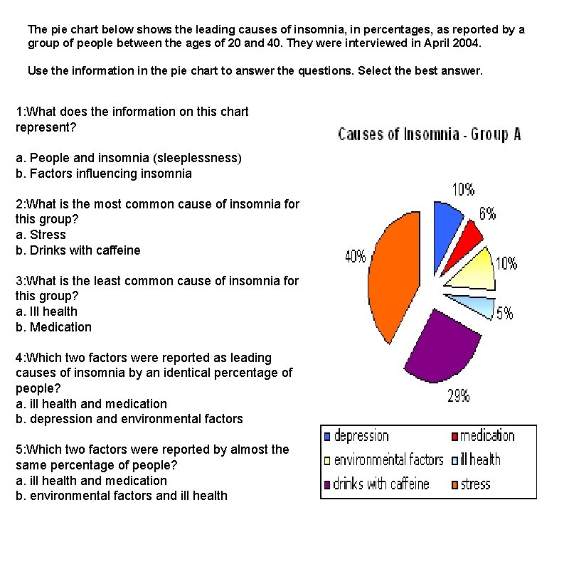
The pie chart below shows the leading causes of insomnia, in percentages, as reported by a group of people between the ages of 20 and 40. They were interviewed in April 2004. Use the information in the pie chart to answer the questions. Select the best answer. 1: What does the information on this chart represent? a. People and insomnia (sleeplessness) b. Factors influencing insomnia 2: What is the most common cause of insomnia for this group? a. Stress b. Drinks with caffeine 3: What is the least common cause of insomnia for this group? a. Ill health b. Medication 4: Which two factors were reported as leading causes of insomnia by an identical percentage of people? a. ill health and medication b. depression and environmental factors 5: Which two factors were reported by almost the same percentage of people? a. ill health and medication b. environmental factors and ill health