Icon Design Human Computer Interaction LOGO Icon Design

- Slides: 19

Icon Design Human Computer Interaction

LOGO Icon Design v. An icon is a small visual symbol. v. Well-designed icons: - save screen space - are recognized quickly in a busy visual environment - are easily remembered - help interfaces become international.

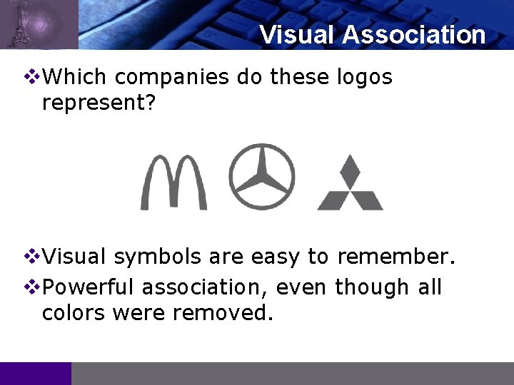
LOGO Visual Association v. Which companies do these logos represent? v. Visual symbols are easy to remember. v. Powerful association, even though all colors were removed.

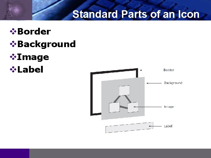
LOGO Standard Parts of an Icon v. Border v. Background v. Image v. Label

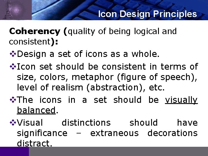
LOGO Icon Design Principles Coherency (quality of being logical and consistent): v. Design a set of icons as a whole. v. Icon set should be consistent in terms of size, colors, metaphor (figure of speech), level of realism (abstraction), etc. v. The icons in a set should be visually balanced. v. Visual distinctions should have significance – extraneous decorations distract.

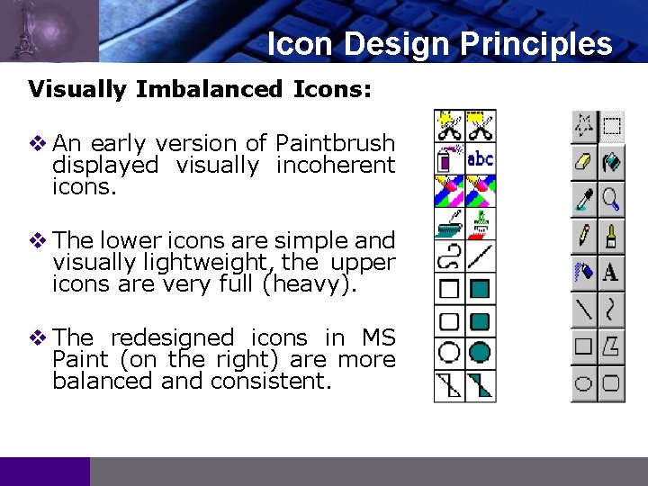
LOGO Icon Design Principles Visually Imbalanced Icons: v An early version of Paintbrush displayed visually incoherent icons. v The lower icons are simple and visually lightweight, the upper icons are very full (heavy). v The redesigned icons in MS Paint (on the right) are more balanced and consistent.

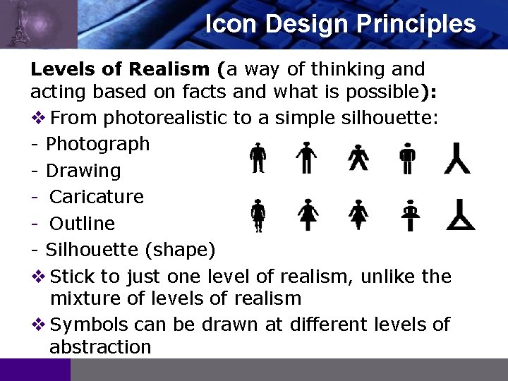
LOGO Icon Design Principles Levels of Realism (a way of thinking and acting based on facts and what is possible): v From photorealistic to a simple silhouette: - Photograph - Drawing - Caricature - Outline - Silhouette (shape) v Stick to just one level of realism, unlike the mixture of levels of realism v Symbols can be drawn at different levels of abstraction

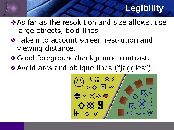
LOGO Legibility v As far as the resolution and size allows, use large objects, bold lines. v Take into account screen resolution and viewing distance. v Good foreground/background contrast. v Avoid arcs and oblique lines (“jaggies”).

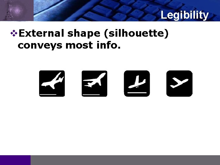
LOGO Legibility v. External shape (silhouette) conveys most info.

LOGO Recognition and Recall v Where possible, choose a symbol familiar to the viewer. v Use concrete objects wherever possible, abstract concepts and actions are difficult to visualize. v There is no good icon for the concept of “Undo”, but in the meantime there is a convention of a backwards curving arrow. v Provide textual labels (at least by default).

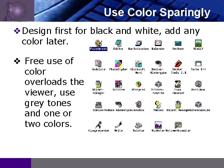
LOGO Use Color Sparingly v Design first for black and white, add any color later. v Free use of color overloads the viewer, use grey tones and one or two colors.

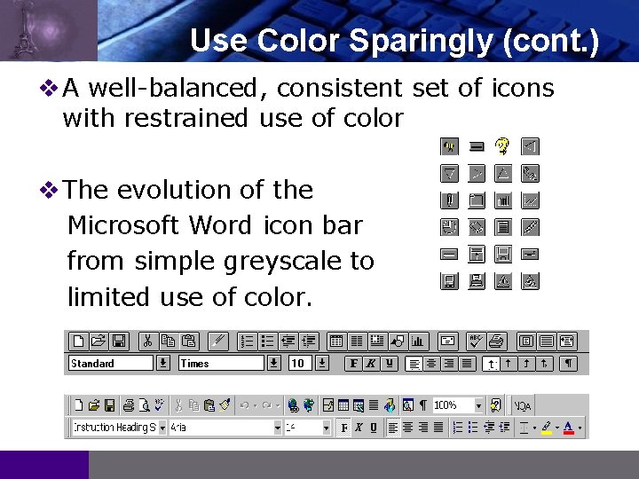
LOGO Use Color Sparingly (cont. ) v A well-balanced, consistent set of icons with restrained use of color v The evolution of the Microsoft Word icon bar from simple greyscale to limited use of color.

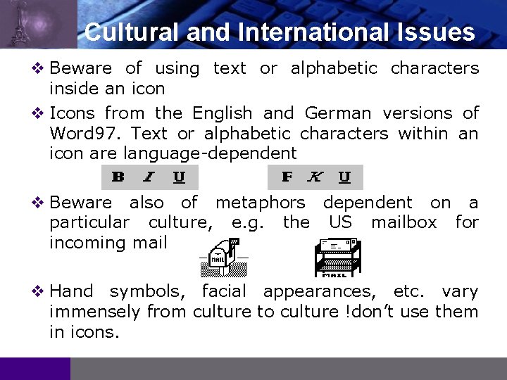
LOGO Cultural and International Issues v Beware of using text or alphabetic characters inside an icon v Icons from the English and German versions of Word 97. Text or alphabetic characters within an icon are language-dependent v Beware also of metaphors dependent on a particular culture, e. g. the US mailbox for incoming mail v Hand symbols, facial appearances, etc. vary immensely from culture to culture !don’t use them in icons.

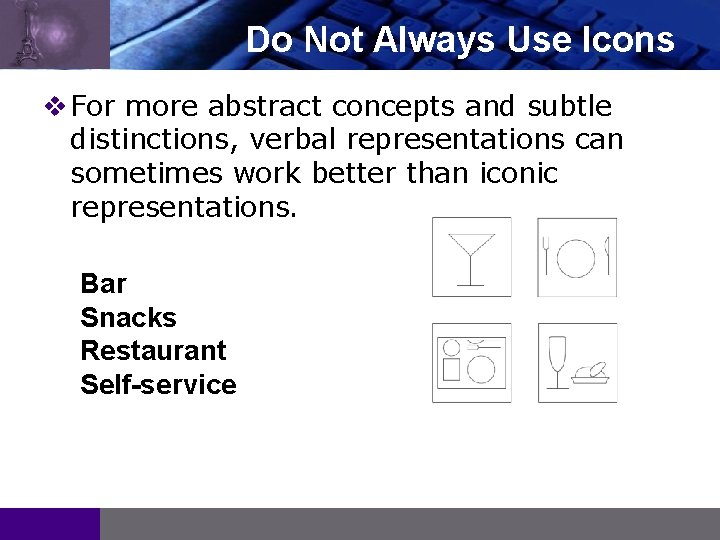
LOGO Do Not Always Use Icons v For more abstract concepts and subtle distinctions, verbal representations can sometimes work better than iconic representations. Bar Snacks Restaurant Self-service

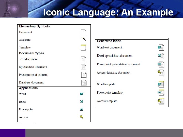
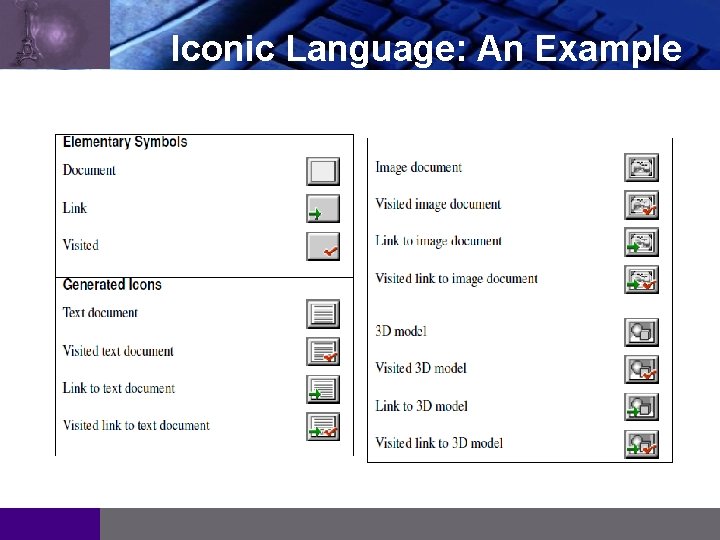
LOGO Iconic Language v For larger sets of icons, it is often useful to develop an iconic language. v An iconic language is a systematic way of combining elementary symbols into more complex icons: - Vocabulary: Set of primitive symbols. - Grammar: Rules for combining them.

LOGO Iconic Language: An Example

LOGO Iconic Language: An Example

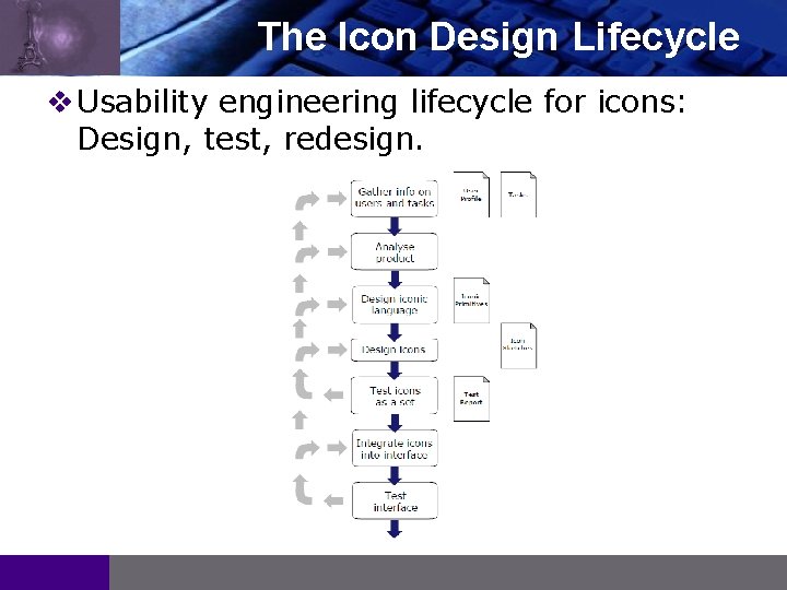
LOGO The Icon Design Lifecycle v Usability engineering lifecycle for icons: Design, test, redesign.

References LOGO 1 Lecture Notes of Prof. www. iicm. tugraz. at/hci Keith Andrews, Available at: