i PSC Quality Round 2019 Genetic Analysis Data







- Slides: 25

i. PSC Quality Round 2019 Genetic Analysis Data Page 1

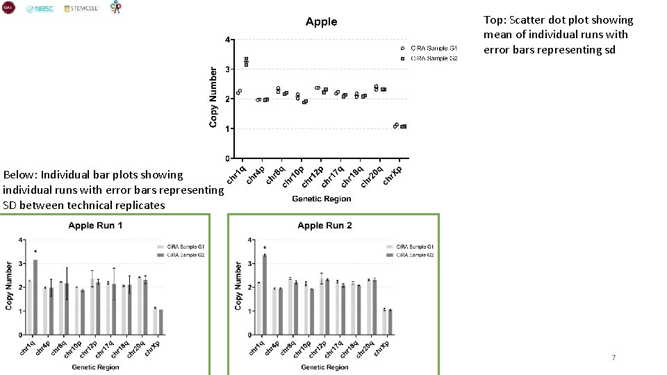
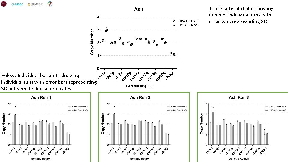
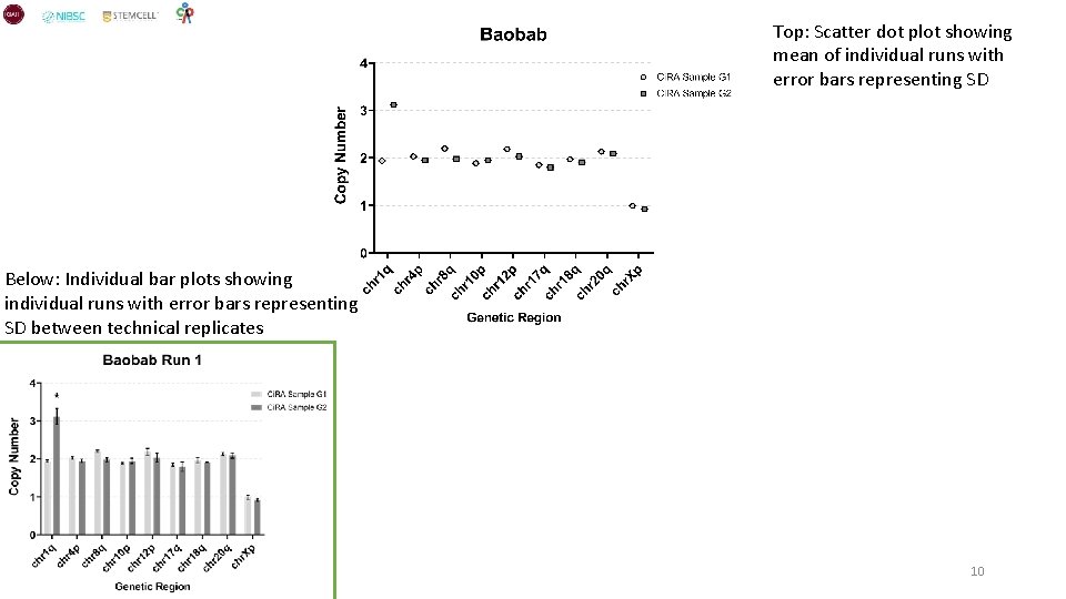
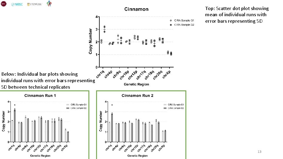
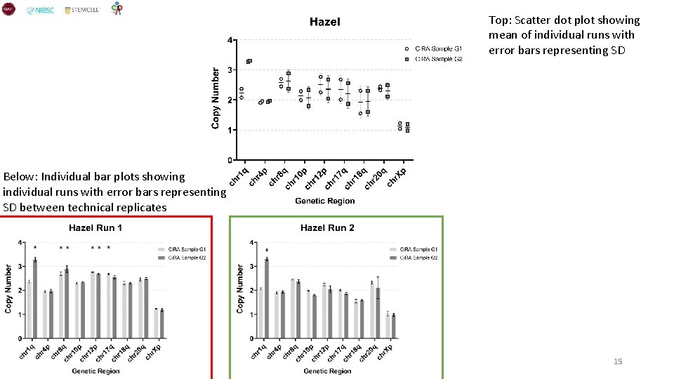
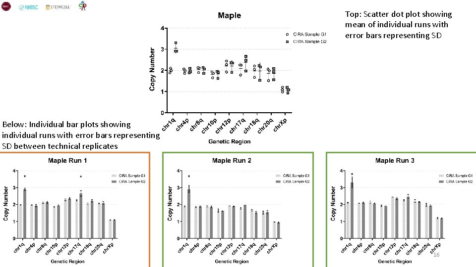
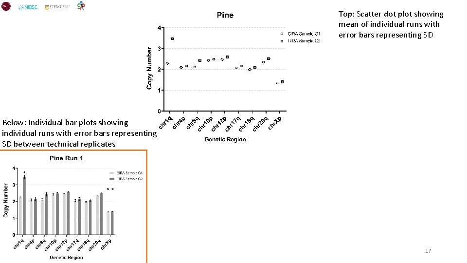
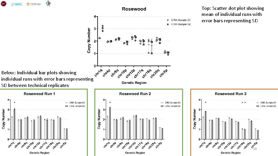
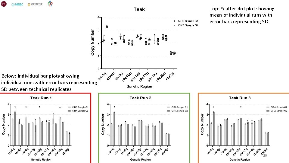
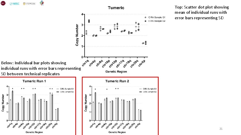
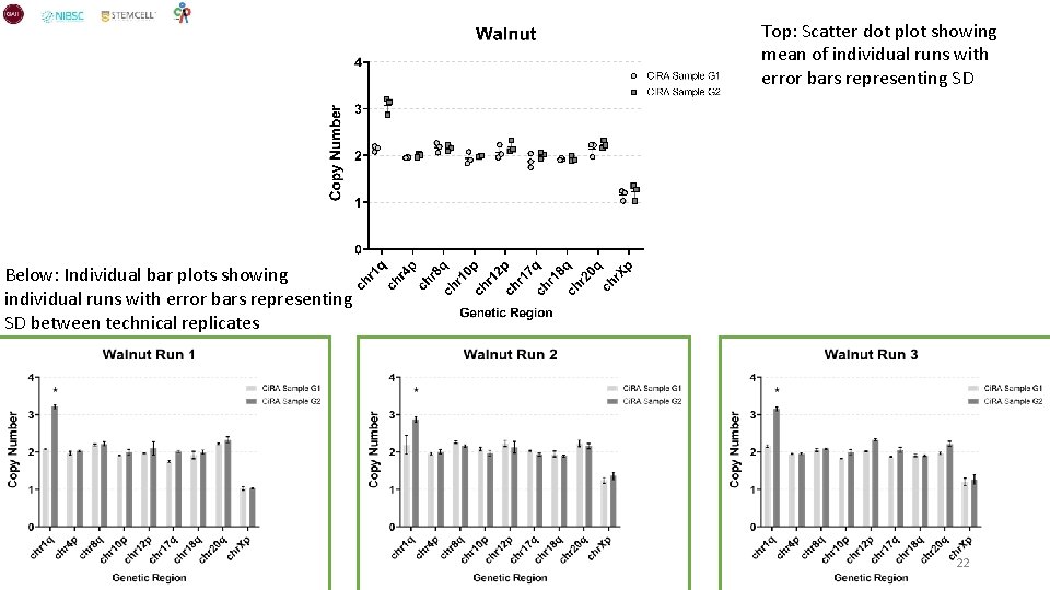
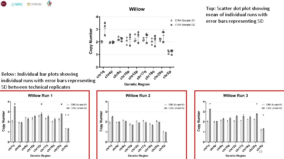
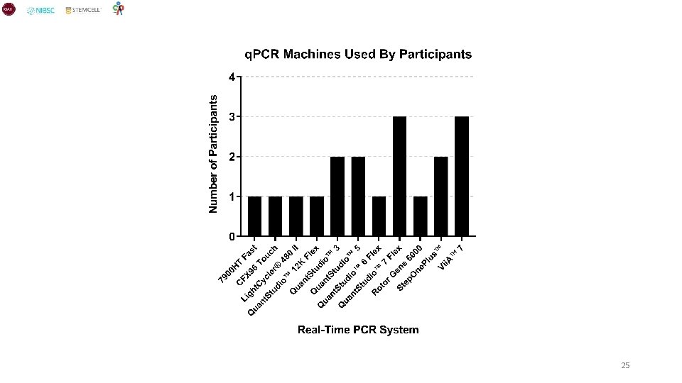
Summary Overall the data from this quality round was encouraging, the data was consistent across the majority of participants. All but one participant detected the Chr 1 q gain in all runs with the majority of participants detecting it as the sole abnormality. There were a few false positives detected but these were mainly accumulated in specific participants which could be improved with gaining more experience with the kit or specific training. Overall the technical variability between technical replicates within a run and across runs was low and improved over time (runs). A deeper analysis of the data will be performed in the coming weeks. Participants • 17/18 detected a significant gain of 1 q in Ci. RA Sample G 2 across all runs • • • 9/18 detected the Chr 1 q gain as the sole significant abnormality in Ci. RA Sample G 2 across all runs performed 5/18 detected the Chr 1 q gain as the sole significant abnormality in either Ci. RA Sample G 1 or G 2 in at least one run 4/18 detected the Chr 1 q gain but detected at least one other significant abnormality in either Ci. RA Sample G 1 or G 2 in all runs performed Consistency • • 30/44 individual runs across all participants detected the Chr 1 q gain as the sole significant abnormality 1/44 individual runs had a false negative result that did not detect the Chr 1 q gain in Ci. RA Sample G 2 • • Trend that technical replicates have less variance over runs performed Majority of participants used q. PCR machines from Applied Biosystems (10/12) with the remaining using 1 of each Bio-Rad and Roche 2

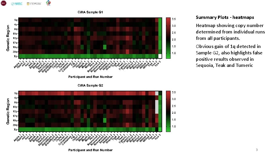
Summary Plots - heatmaps Heatmap showing copy number determined from individual runs from all participants. Obvious gain of 1 q detected in Sample G 2, also highlights false positive results observed in Sequoia, Teak and Tumeric 3

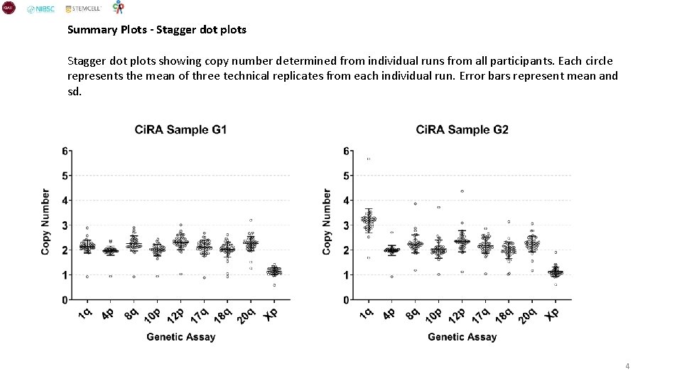
Summary Plots - Stagger dot plots showing copy number determined from individual runs from all participants. Each circle represents the mean of three technical replicates from each individual run. Error bars represent mean and sd. 4

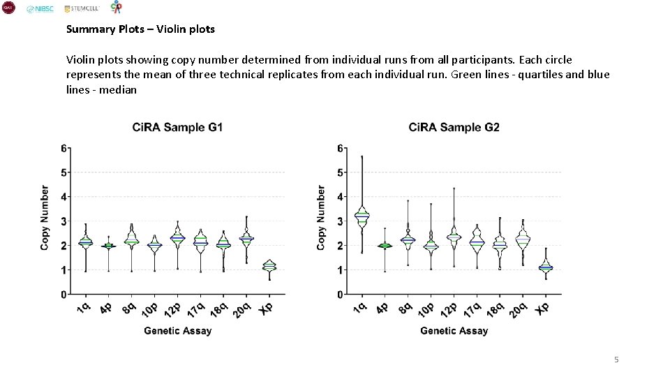
Summary Plots – Violin plots showing copy number determined from individual runs from all participants. Each circle represents the mean of three technical replicates from each individual run. Green lines - quartiles and blue lines - median 5

Individual Participant Plots 6

Top: Scatter dot plot showing mean of individual runs with error bars representing sd Below: Individual bar plots showing individual runs with error bars representing SD between technical replicates 7

Top: Scatter dot plot showing mean of individual runs with error bars representing SD Below: Individual bar plots showing individual runs with error bars representing SD between technical replicates 8

Top: Scatter dot plot showing mean of individual runs with error bars representing SD Below: Individual bar plots showing individual runs with error bars representing SD between technical replicates 9

Top: Scatter dot plot showing mean of individual runs with error bars representing SD Below: Individual bar plots showing individual runs with error bars representing SD between technical replicates 10

Top: Scatter dot plot showing mean of individual runs with error bars representing SD Below: Individual bar plots showing individual runs with error bars representing SD between technical replicates 11

Top: Scatter dot plot showing mean of individual runs with error bars representing SD Below: Individual bar plots showing individual runs with error bars representing SD between technical replicates 12

Top: Scatter dot plot showing mean of individual runs with error bars representing SD Below: Individual bar plots showing individual runs with error bars representing SD between technical replicates 13

Top: Scatter dot plot showing mean of individual runs with error bars representing SD Below: Individual bar plots showing individual runs with error bars representing SD between technical replicates 14

Top: Scatter dot plot showing mean of individual runs with error bars representing SD Below: Individual bar plots showing individual runs with error bars representing SD between technical replicates 15

Top: Scatter dot plot showing mean of individual runs with error bars representing SD Below: Individual bar plots showing individual runs with error bars representing SD between technical replicates 16

Top: Scatter dot plot showing mean of individual runs with error bars representing SD Below: Individual bar plots showing individual runs with error bars representing SD between technical replicates 17

Top: Scatter dot plot showing mean of individual runs with error bars representing SD Below: Individual bar plots showing individual runs with error bars representing SD between technical replicates 18

Top: Scatter dot plot showing mean of individual runs with error bars representing SD Below: Individual bar plots showing individual runs with error bars representing SD between technical replicates 19

Top: Scatter dot plot showing mean of individual runs with error bars representing SD Below: Individual bar plots showing individual runs with error bars representing SD between technical replicates 20

Top: Scatter dot plot showing mean of individual runs with error bars representing SD Below: Individual bar plots showing individual runs with error bars representing SD between technical replicates 21

Top: Scatter dot plot showing mean of individual runs with error bars representing SD Below: Individual bar plots showing individual runs with error bars representing SD between technical replicates 22

Top: Scatter dot plot showing mean of individual runs with error bars representing SD Below: Individual bar plots showing individual runs with error bars representing SD between technical replicates 23

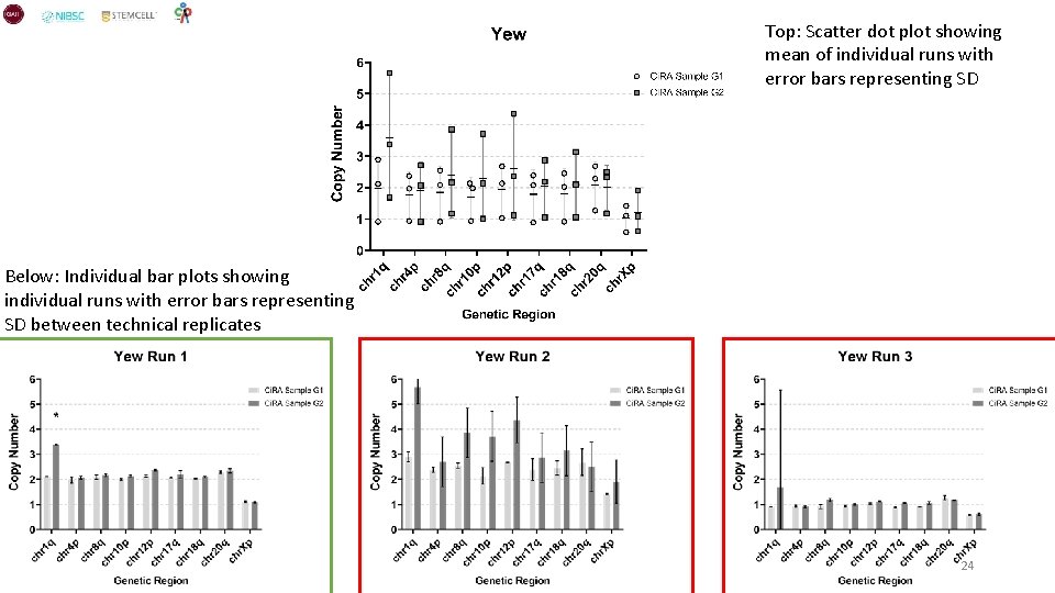
Top: Scatter dot plot showing mean of individual runs with error bars representing SD Below: Individual bar plots showing individual runs with error bars representing SD between technical replicates 24

25