Human Computer Interaction Designing Websites using the Design
Human Computer Interaction Designing Websites using the Design Process Human-Computer Interaction 1
The Web Page Represents. . . l l User's view of information on screen. Unit of navigation: l l Address to get information over the net (URL). Storage of the information: l l What you get when you click a link. Navigation: you need to be able to understand what will happen when a button is pressed, to understand where you are in the interaction. On the server and the author's editing unit. Page: atomic unit – unifies( )ﻳﻮﺣﺪ these concepts. Human-Computer Interaction 2
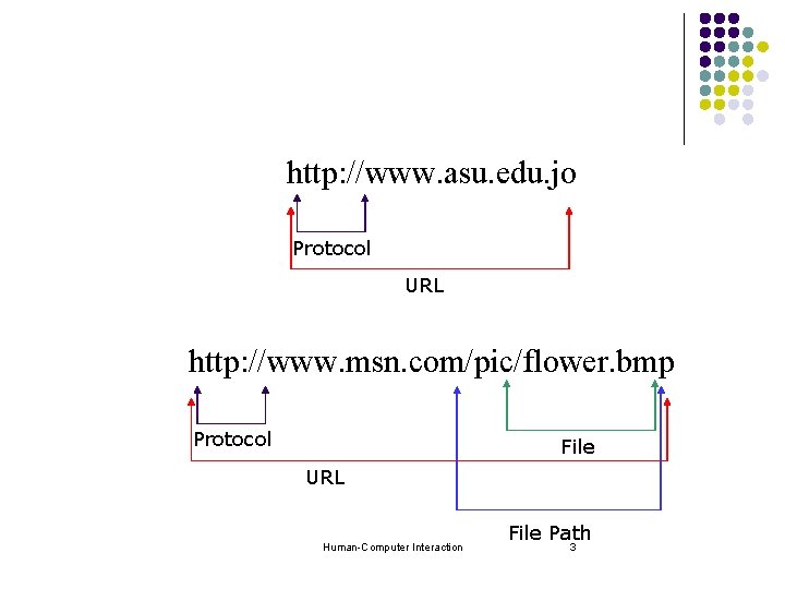
http: //www. asu. edu. jo Protocol URL http: //www. msn. com/pic/flower. bmp Protocol File URL Human-Computer Interaction File Path 3

l Hyper Text Transfer Protocol (http) is protocol for transferring data over the internet. Human-Computer Interaction 4
Terms l l l Webpage: one page on the internet. Website: collection of pages, such as all the pages on the school site. Subsite: smaller site on a larger site, such as the virtual classroom site which is a subsite of the school website Main page: the first page that is seen at a site, generally the index. html file. Dynamic: content changes automatically (ie, you get new mail). Static: nothing changes unless you edit the page (like these notes). Human-Computer Interaction 5
Anatomy of a website ( )ﻋﻠﻢ ﺍﻟﺘﺸﺮﻳﺢ l Websites come in all shapes, colors and sizes, but most good websites utilize the consistency principle and follow these standards: l Menu: All websites should have some sort of menu that is either at the top or along the left of the page. This should have links to all other pages and subsites on the website. Human-Computer Interaction 6
Anatomy of a website (Cont. ) l Contact Information: Generally, phone numbers, emails, addresses, etc… can be found on each page, or there is a well-marked contact page for people to use and send feedback. l Content l Banner( )ﺷﻌﺎﺭ : Generally, at the top of your page there is a banner/icon that presents your site. Often, there is a “footer” banner at the bottom as well. Human-Computer Interaction 7
Elements in a webpage l Text: l l l Pictures: l l l Linked. Image maps. Sounds: l l l Hyperlink. Static text. Background sounds. Event sounds. Other controls: l l l Text boxes. Radio buttons, check boxes. Buttons. Human-Computer Interaction 8
Applying the Principles 1. Consistency: l l l Menu at top or left. Contact information at bottom. Standard set of pages: l l l Personal: About me, photos, contact, etc… Business: Online store, order items, company info, product info, customer support. Non-profit: Mission statement, current projects, contact information, past projects, get involved. Tutorial: Introduction, help. Pages should all share same basic layout. Human-Computer Interaction 9
Consistency l In layout, color, images, typography( )ﺃﺴﻠﻮﺏ ﺍﻟﻄﺒﺎﻋﺔ , text, etc… l Within screen, across screens. l Stay within metaphor everywhere. l icons, Metaphor: Tying presentation and visual elements to some familiar relevant items Human-Computer Interaction 10
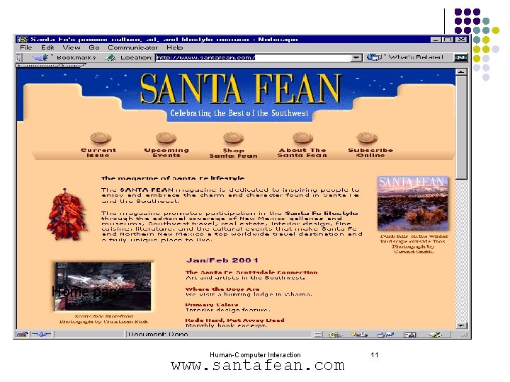
Example Home page Human-Computer Interaction www. santafean. com 11

Content page 1 Human-Computer Interaction 12
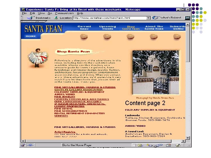
Content page 2 Human-Computer Interaction 13
Applying the Principles(Cont. ) 2. Feedback: l l Confirmation pages. Thank you pages. 3. Aesthetics( )ﺍﻟﺠﻤﺎﻟﻴﺎﺕ : l l l Most important principle of website design. Appealing colors, shapes, sizes. Information should be easy to find. Human-Computer Interaction 14
Applying the Principles(Cont. ) 4. Simplicity: l l 5. Websites have multiple pages for a reason—don’t put too much information on! Page should fit on one screen (unless you have lots of text to read… clicking next is annoying). User in control: l l Don’t play sounds without the user asking first. Allow user to stop and close your web page at any time. Human-Computer Interaction 15
Design Methodology in Website Design l Know the user: l l What group? How old? What gender? What nationality? What type of connection? Know the purpose: l l l Why this website needed? How this website different from similar websites out there? Why will people want to look at your site? Human-Computer Interaction 16
Design Methodology in Website Design (Cont. ) l Make scenarios: l l l At least, make a list of different types of information that your website will present to the user. Scenarios help us envision someone using our website. Draw it out: l l Flowcharts. Make storyboards. Human-Computer Interaction 17
Design Methodology in Website Design (Cont. ) l Prototype l l l Prototype this website using Dream-weaver. Often websites are pro-typed in art programs such as paint. Test l l Have different people in your focus group use your website, and comment on things that they did/didn’t like. Give the users a list of things that they should do (i. e. create a new account, find a class, find an assignment). Human-Computer Interaction 18
Design Methodology in Website Design (Cont. ) l l l Watch the user when using your product, take notes at the places where the user has problems. Don’t help the user!!! You won’t be there for them when the page goes online! Iterate: l Normally, iteration is continuous. Human-Computer Interaction 19
Top 8 Mistakes in Web Design 8. Long download times. 7. Outdated information. 6. Link colors & consistency. 5. Lack of navigation support. 4. Long pages. 3. Orphan pages. 2. Complex URLs. 1. Animations. Human-Computer Interaction 20

21
: I would like to add l l l Spelling Mistakes No Clear call to Action Pop Up Windows Increased number of clicks Non-interactive designs Not Formatting a Print View Text Layout Human-Computer Interaction 22
8. Overlay Long Download Times l 10 second rule: l “amount of wait time before users lose interest” l l 15 seconds may be acceptable on web: l l l Traditional human factors studies back this up. People are getting trained to endure( )ﺗﺤﻤﻞ. But only for a few key pages. Web is getting slower, not faster. Human-Computer Interaction 23
7. Outdated Information l Hire a web gardener for your team: l l “Root out the weeds and replant the flowers”. Cheap way of enhancing content: l l Still relevant -> link to new pages. Otherwise remove them. Human-Computer Interaction 24
6. Non-standard Link Colors l Links to: l l l Pages that haven’t been seen are blue. Previously seen pages are purple/red. Consistency is important for learning: l Don’t underline other objects with blue/red! Human-Computer Interaction 25
5. Lack of Navigation Support l Users don’t know much about your site: l l l They always have difficulty finding information. Give a strong sense of structure and place. Communicate site structure: l Provide a site map. l l So users know where they are & where they can go. Provide a good search feature. Human-Computer Interaction 26
4. Long Scrolling Pages l l l Only 10% of users scroll beyond visible section when page comes up. All critical content & navigation should be on the top part of the page. Leaf nodes can be longer: l l People who have that interest will be reading it. Still good to be brief. Human-Computer Interaction 27
3. Orphan Pages l All pages should have a clear indication of what web site they belong to. l l Users may not come in through your home page. Every page should have: l l A link up to your home page. Some indication of where they fit within the structure of your information space. Human-Computer Interaction 28
2. Complex URLs l l Shouldn’t have exposed machine address. Users try to decode URLs of pages: l l To infer the structure of web sites URL should be human-readable: l l Names should reflect nature of the information space. Sometimes need to type in URL->minimize typos l Use short names with no special character. § many people don't know how to type a character ( ~ ). Human-Computer Interaction 29
1. Constantly Running Animations l Don’t have elements that move incessantly: l Moving images have an overpowering effect on the human peripheral vision. l l No animations, scrolling text. Give your user some peace and quiet to actually read the text! Human-Computer Interaction 30
Using colors in the design process Human-Computer Interaction 31
Why Study Color? Color can be a powerful tool to improve user interfaces, but its inappropriate use can severely reduce the performance of the systems we build. Human-Computer Interaction 32
The Power of Color l We perceive color through receptors at the back of our eyes. They translate the different wavelengths of light reflected from surfaces into distinctive stimuli that our brain converts into red, green and blue and other colors. So, the eye sees the light and the brain interprets it and identifies the colors. l But it does more than just identify. It makes certain judgments based upon basic human instincts, and on other learned information. Human-Computer Interaction 33
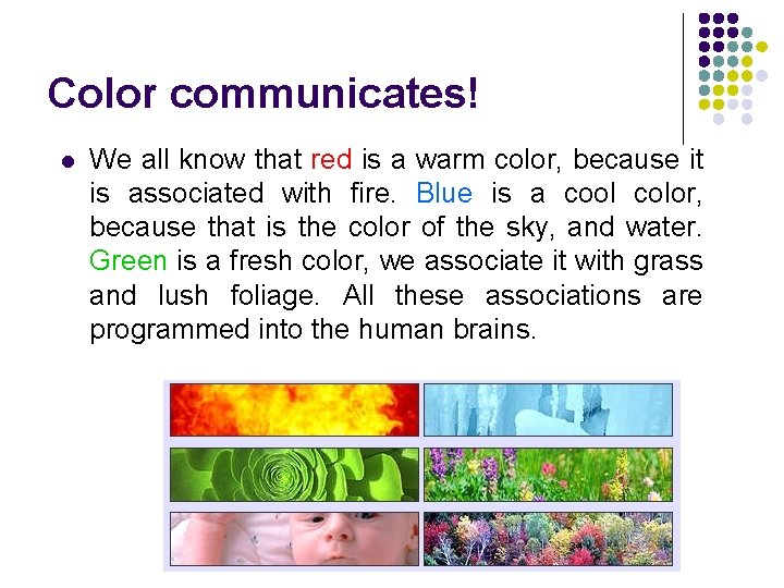
Color communicates! l We all know that red is a warm color, because it is associated with fire. Blue is a cool color, because that is the color of the sky, and water. Green is a fresh color, we associate it with grass and lush foliage. All these associations are programmed into the human brains. Human-Computer Interaction 34
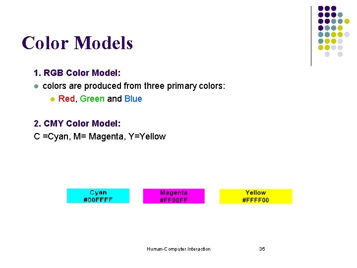
Color Models 1. RGB Color Model: l colors are produced from three primary colors: l Red, Green and Blue 2. CMY Color Model: C =Cyan, M= Magenta, Y=Yellow Human-Computer Interaction 35
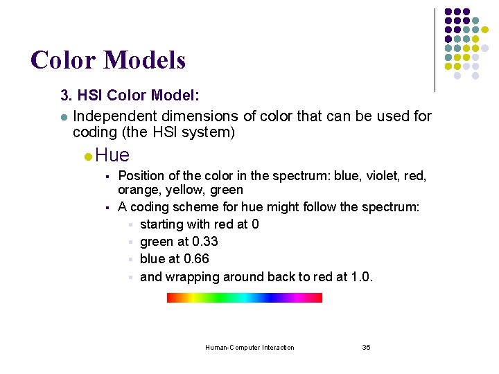
Color Models 3. HSI Color Model: l Independent dimensions of color that can be used for coding (the HSI system) l Hue § Position of the color in the spectrum: blue, violet, red, orange, yellow, green § A coding scheme for hue might follow the spectrum: § starting with red at 0 § green at 0. 33 § blue at 0. 66 § and wrapping around back to red at 1. 0. Human-Computer Interaction 36
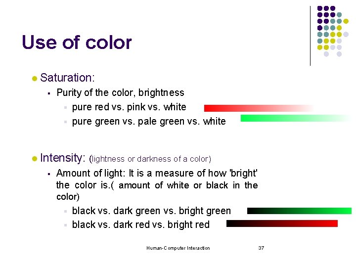
Use of color l Saturation: § l Purity of the color, brightness § pure red vs. pink vs. white § pure green vs. pale green vs. white Intensity: (lightness or darkness of a color) § Amount of light: It is a measure of how 'bright' the color is. ( amount of white or black in the color) black vs. dark green vs. bright green § black vs. dark red vs. bright red § Human-Computer Interaction 37
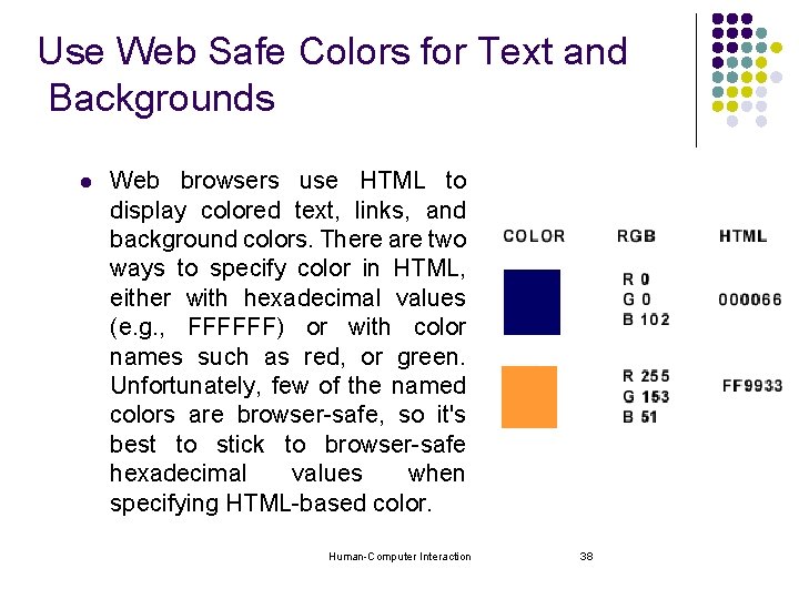
Use Web Safe Colors for Text and Backgrounds l Web browsers use HTML to display colored text, links, and background colors. There are two ways to specify color in HTML, either with hexadecimal values (e. g. , FFFFFF) or with color names such as red, or green. Unfortunately, few of the named colors are browser-safe, so it's best to stick to browser-safe hexadecimal values when specifying HTML-based color. Human-Computer Interaction 38
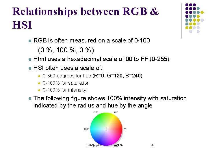
Relationships between RGB & HSI l RGB is often measured on a scale of 0 -100 (0 %, 100 %, 0 %) l l Html uses a hexadecimal scale of 00 to FF (0 -255) HSI often uses a scale of: l l 0 -360 degrees for hue (R=0, G=120, B=240) 0 -100% for saturation 0 -100% for intensity The following figure shows 100% intensity with saturation indicated by the radius and hue by the angle Human-Computer Interaction 39
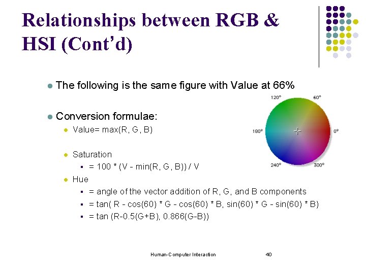
Relationships between RGB & HSI (Cont’d) l The following is the same figure with Value at 66% l Conversion formulae: l Value= max(R, G, B) l Saturation § = 100 * (V - min(R, G, B)) / V Hue § = angle of the vector addition of R, G, and B components § = tan( R - cos(60) * G - cos(60) * B, sin(60) * G - sin(60) * B) § = tan (R-0. 5(G+B), 0. 866(G-B)) l Human-Computer Interaction 40
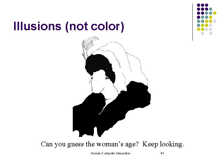
Illusions (not color) Can you guess the woman’s age? Keep looking. Human-Computer Interaction 41
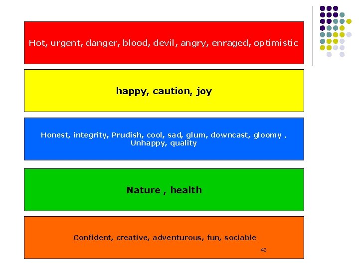
Hot, urgent, danger, blood, devil, angry, enraged, optimistic happy, caution, joy Honest, integrity, Prudish, cool, sad, glum, downcast, gloomy , Unhappy, quality Nature , health Confident, creative, adventurous, fun, sociable Human-Computer Interaction 42
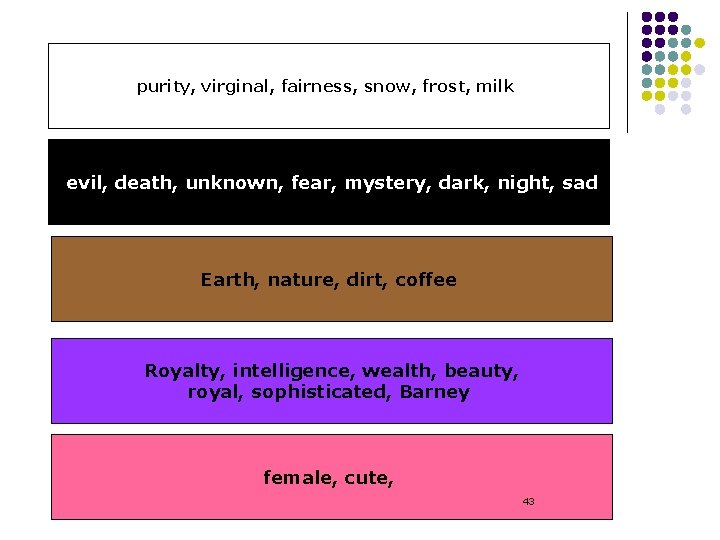
purity, virginal, fairness, snow, frost, milk evil, death, unknown, fear, mystery, dark, night, sad Earth, nature, dirt, coffee Royalty, intelligence, wealth, beauty, royal, sophisticated, Barney female, cute, Human-Computer Interaction 43
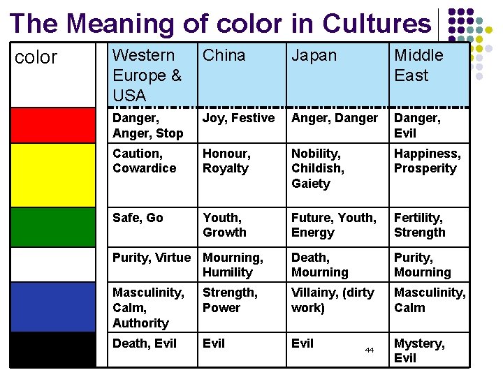
The Meaning of color in Cultures color Western Europe & USA China Japan Middle East Danger, Anger, Stop Joy, Festive Anger, Danger, Evil Caution, Cowardice Honour, Royalty Nobility, Childish, Gaiety Happiness, Prosperity Safe, Go Youth, Growth Future, Youth, Energy Fertility, Strength Purity, Virtue Mourning, Humility Death, Mourning Purity, Mourning Masculinity, Calm, Authority Strength, Power Villainy, (dirty work) Masculinity, Calm Death, Evil Human-Computer Interaction 44 Mystery, Evil
Color Guideline l How to use Color in our design. Human-Computer Interaction 45
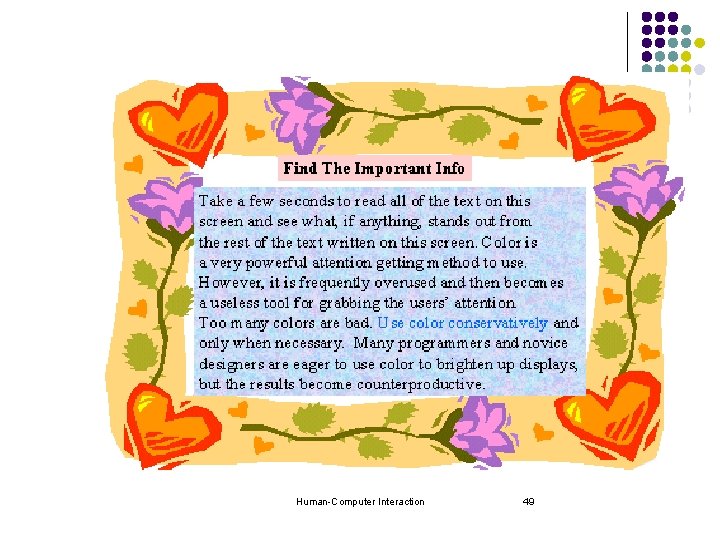
1. Use color purposefully to attract attention. • Take a few seconds to read all of the text in this paragraph and see what, if anything stands out from the rest of the text. Color is a very powerful attention getting method; however it needs to be used sparingly. When too many colors are used on a screen they compete for the users' attention and nothing stands out from the rest. Use color conservatively • Many programmers and novice designers are eager to use color to brighten up displays, but the results become counter productive. Human-Computer Interaction 46
2. Don't rely on color alone, use other highlighting. l It is also important to remember that 9% of men and 2% of women have some form of color blindness. Therefore, it is important to never rely on color alone to call attention to an item. This screen shows how to use a secondary highlighting technique and not rely strictly on color. Human-Computer Interaction 47
3. Don't overuse color. l Too many colors on one screen sends confusing signals to the user about which item is important to look at. This screen shows the effect of overusing color. Instead of attracting it becomes distracting. Human-Computer Interaction 48
Human-Computer Interaction 49
4. Use appropriate background colors for text. l l Backgrounds should never distract the user from accomplishing the task at hand. Using dark colors, or patterns and textures as backgrounds causes eye fatigue and makes reading text more difficult. Users attempting to print web pages using dark or patterned backgrounds often end up with an unreadable document. Using light-colored backgrounds with black or darkcolored text offers the most contrast and improves readability for users. Judge for yourself which combination is most readable. Human-Computer Interaction 50
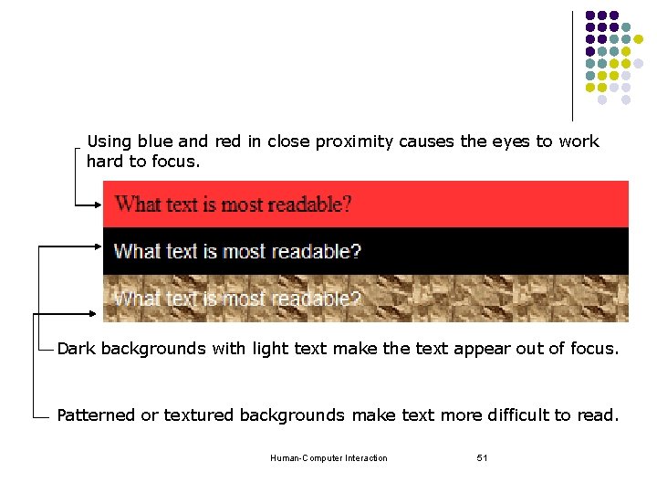
Using blue and red in close proximity causes the eyes to work hard to focus. Dark backgrounds with light text make the text appear out of focus. Patterned or textured backgrounds make text more difficult to read. Human-Computer Interaction 51
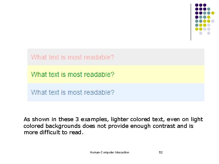
As shown in these 3 examples, lighter colored text, even on light colored backgrounds does not provide enough contrast and is more difficult to read. Human-Computer Interaction 52
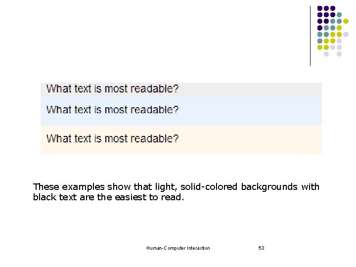
These examples show that light, solid-colored backgrounds with black text are the easiest to read. Human-Computer Interaction 53
Other Color Guidelines l Avoid using color in non-task related ways. l Older users need higher brightness levels to distinguish colors. l Use color to draw attention, communicate organization, to indicate status, to establish relationships. l Be consistent with color associations from jobs and cultures. l Allow users to tailor their preferred colors. Human-Computer Interaction 54
Other Color Guidelines l Limit coding to 8 distinct colors (4 better). l Make sure colors do not “vibrate”. l Opponent colors go well together: l (red & green) or (yellow & blue) l Use color for the following purposes: l Helps in searching tasks (Color is good for supporting search). l To sell the system (users like color). Human-Computer Interaction 55
Other Color Guidelines l Use colors to help express information as follows: l To express contrast (To express difference, use high contrast colors (and vice versa)), use contrasting colors: § § l Use light colors on dark background Use dark colors on light background l To express similarity, use similar colors l To emphasize, use bright, saturated colors (e. g. , Red) l To de-emphasize, use dark, unsaturated colors (e. g. , Grey) Consider the emotional effects of colors l l Bright saturated colors ‘shout’ and are annoying Reds, oranges and brighter colors appear more joy Human-Computer Interaction 56
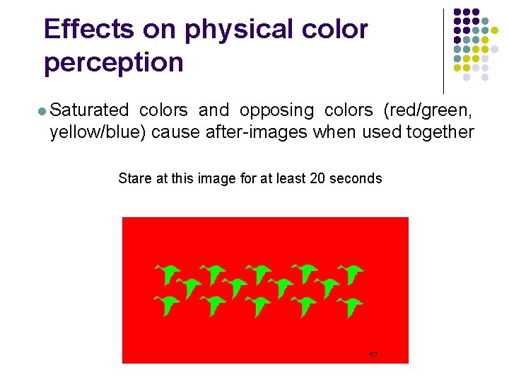
Effects on physical color perception l Saturated colors and opposing colors (red/green, yellow/blue) cause after-images when used together Stare at this image for at least 20 seconds Human-Computer Interaction 57
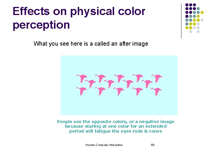
Effects on physical color perception What you see here is a called an after image People see the opposite colors, or a negative image because staring at one color for an extended period will fatigue the eyes rods & cones Human-Computer Interaction 58
- Slides: 58