HTML 5 Tutorial Chapter 9 Form Attributes New
HTML 5 Tutorial Chapter 9 Form Attributes

New Form Attributes • HTML 5 has several new elements and attributes forms. New form attributes : • • autocomplete novalidate • New input attributes : • • • autocomplete autofocus form overrides (formaction, formenctype, formmethod, formnovalidate, formtarget) height and width list min, max and step multiple pattern (regexp) placeholder required
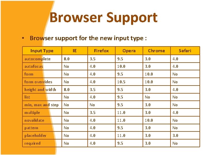
Browser Support • Browser support for the new input type : Input Type IE Firefox Opera Chrome Safari autocomplete 8. 0 3. 5 9. 5 3. 0 4. 0 autofocus No 4. 0 10. 0 3. 0 4. 0 form No 4. 0 9. 5 10. 0 No form overrides No 4. 0 10. 5 10. 0 No height and width 8. 0 3. 5 9. 5 3. 0 4. 0 list No 4. 0 9. 5 No No min, max and step No No 9. 5 3. 0 No multiple No 3. 5 11. 0 3. 0 4. 0 novalidate No 4. 0 11. 0 10. 0 No pattern No 4. 0 9. 5 3. 0 No placeholder No 4. 0 11. 0 3. 0 required No 4. 0 9. 5 3. 0 No
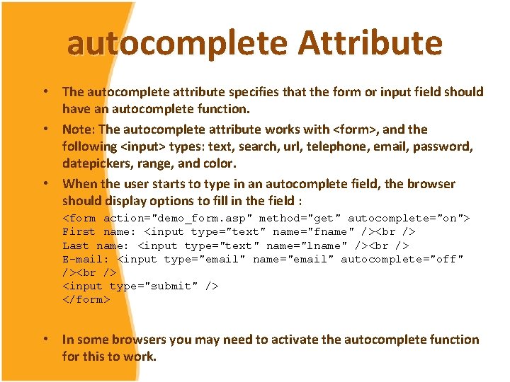
autocomplete Attribute • The autocomplete attribute specifies that the form or input field should have an autocomplete function. • Note: The autocomplete attribute works with <form>, and the following <input> types: text, search, url, telephone, email, password, datepickers, range, and color. • When the user starts to type in an autocomplete field, the browser should display options to fill in the field : <form action="demo_form. asp" method="get" autocomplete="on"> First name: <input type="text" name="fname" /><br /> Last name: <input type="text" name="lname" /><br /> E-mail: <input type="email" name="email" autocomplete="off" /><br /> <input type="submit" /> </form> • In some browsers you may need to activate the autocomplete function for this to work.

autofocus Attribute • The autofocus attribute specifies that a field should automatically get focus when a page is loaded. • Note: The autofocus attribute works with all <input> types. User name: <input type="text" name="user_name" autofocus="autofocus" />
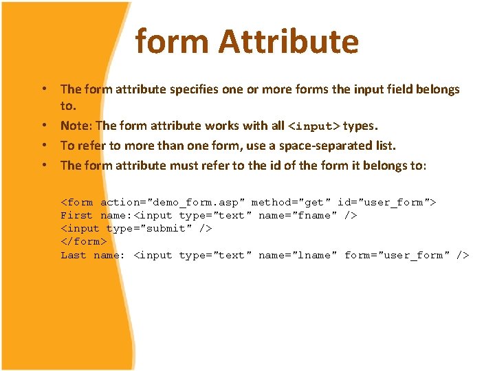
form Attribute • The form attribute specifies one or more forms the input field belongs to. • Note: The form attribute works with all <input> types. • To refer to more than one form, use a space-separated list. • The form attribute must refer to the id of the form it belongs to: <form action="demo_form. asp" method="get" id="user_form"> First name: <input type="text" name="fname" /> <input type="submit" /> </form> Last name: <input type="text" name="lname" form="user_form" />
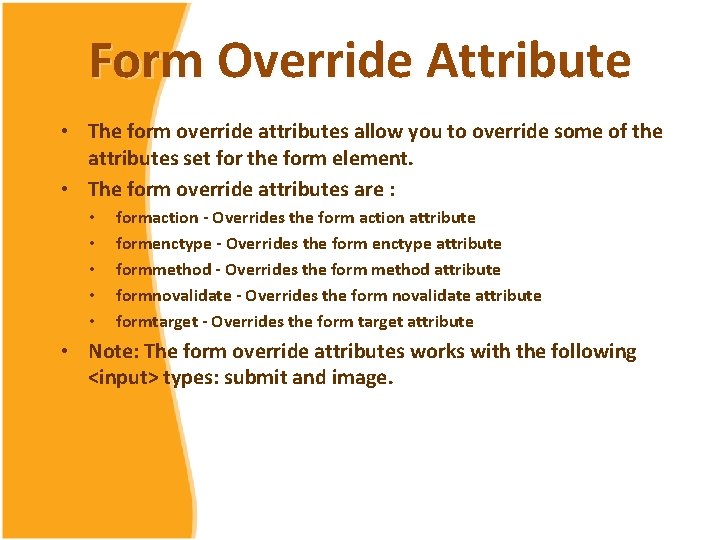
Form Override Attribute • The form override attributes allow you to override some of the attributes set for the form element. • The form override attributes are : • • • formaction - Overrides the form action attribute formenctype - Overrides the form enctype attribute formmethod - Overrides the form method attribute formnovalidate - Overrides the form novalidate attribute formtarget - Overrides the form target attribute • Note: The form override attributes works with the following <input> types: submit and image.
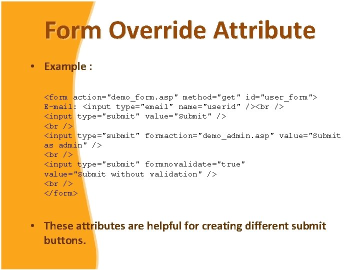
Form Override Attribute • Example : <form action="demo_form. asp" method="get" id="user_form"> E-mail: <input type="email" name="userid" /><br /> <input type="submit" value="Submit" /> <br /> <input type="submit" formaction="demo_admin. asp" value="Submit as admin" /> <br /> <input type="submit" formnovalidate="true" value="Submit without validation" /> <br /> </form> • These attributes are helpful for creating different submit buttons.
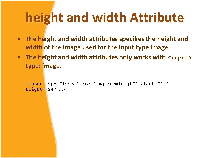
height and width Attribute • The height and width attributes specifies the height and width of the image used for the input type image. • The height and width attributes only works with <input> type: image. <input type="image" src="img_submit. gif" width="24" height="24" />
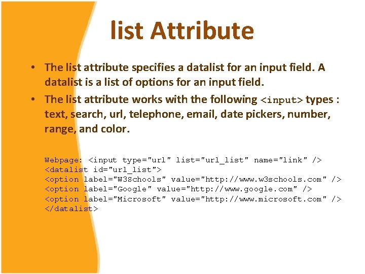
list Attribute • The list attribute specifies a datalist for an input field. A datalist is a list of options for an input field. • The list attribute works with the following <input> types : text, search, url, telephone, email, date pickers, number, range, and color. Webpage: <input type="url" list="url_list" name="link" /> <datalist id="url_list"> <option label="W 3 Schools" value="http: //www. w 3 schools. com" /> <option label="Google" value="http: //www. google. com" /> <option label="Microsoft" value="http: //www. microsoft. com" /> </datalist>
min, max and step Attribute • The min, max and step attributes are used to specify restrictions for input types containing numbers or dates. • The max attribute specifies the maximum value allowed for the input field. • The min attribute specifies the minimum value allowed for the input field. • The step attribute specifies the legal number intervals for the input field (if step="3", legal numbers could be -3, 0, 3, 6, etc).
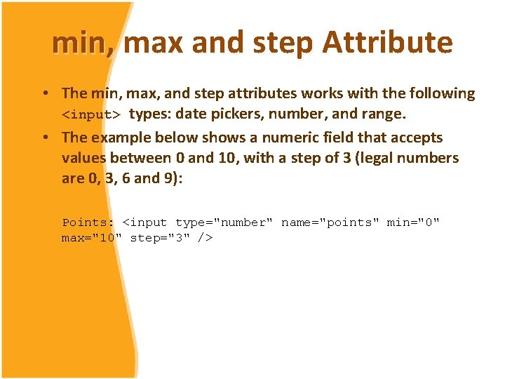
min, max and step Attribute • The min, max, and step attributes works with the following <input> types: date pickers, number, and range. • The example below shows a numeric field that accepts values between 0 and 10, with a step of 3 (legal numbers are 0, 3, 6 and 9): Points: <input type="number" name="points" min="0" max="10" step="3" />
multiple Attribute • The multiple attribute specifies that multiple values can be selected for an input field. • The multiple attribute works with the following <input> types: email, and file. • Example : Select images: <input type="file" name="img" multiple="multiple" />
novalidate Attribute • The novalidate attribute specifies that the form or input field should not be validated when submitted. • If this attribute is present the form will not validate form input. • The novalidate attribute works with: <form> and the following <input> types: text, search, url, telephone, email, password, date pickers, range, and color. • Example : <form action="demo_form. asp" novalidate="novalidate"> E-mail: <input type="email" name="user_email" /> <input type="submit" /> </form>
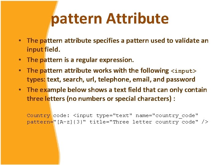
pattern Attribute • The pattern attribute specifies a pattern used to validate an input field. • The pattern is a regular expression. • The pattern attribute works with the following <input> types: text, search, url, telephone, email, and password • The example below shows a text field that can only contain three letters (no numbers or special characters) : Country code: <input type="text" name="country_code" pattern="[A-z]{3}" title="Three letter country code" />
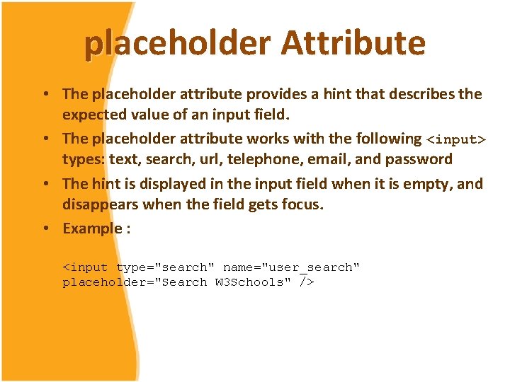
placeholder Attribute • The placeholder attribute provides a hint that describes the expected value of an input field. • The placeholder attribute works with the following <input> types: text, search, url, telephone, email, and password • The hint is displayed in the input field when it is empty, and disappears when the field gets focus. • Example : <input type="search" name="user_search" placeholder="Search W 3 Schools" />
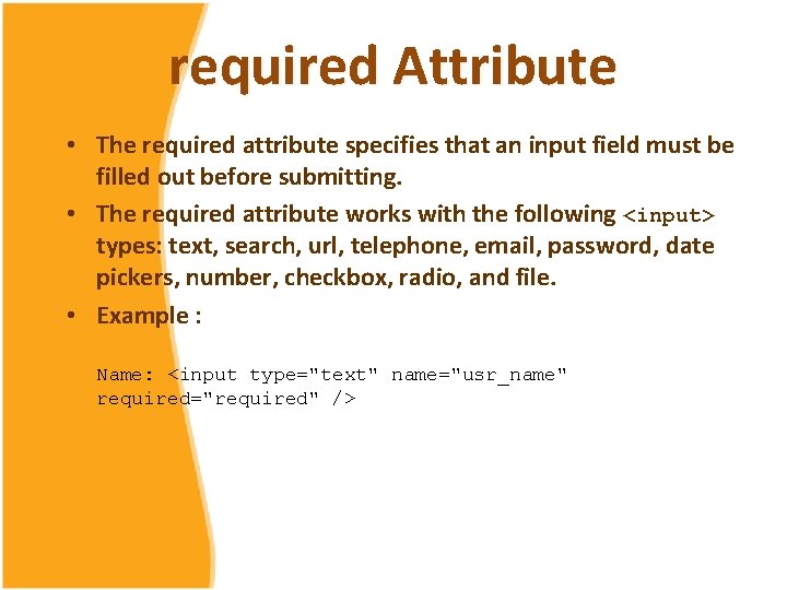
required Attribute • The required attribute specifies that an input field must be filled out before submitting. • The required attribute works with the following <input> types: text, search, url, telephone, email, password, date pickers, number, checkbox, radio, and file. • Example : Name: <input type="text" name="usr_name" required="required" />
Reference 1. Hickson, I. (Eds. ). (2011). HTML Living Standar. Retrieved from http: //www. whatwg. org/specs/webapps/current-work/multipage/ 2. World Wide Web Consortium. (n. d. ). HTML 5 Tutorial. Retrieved from http: //www. w 3 schools. com/html 5/default. asp
- Slides: 18