How to make Graph our favorite pizza toppings


")


- Slides: 29
How to make
Graph our favorite pizza toppings in a bar graph. Pizza Topping Students Cheese 8 Pepperoni 5 Sausage 3 Green Pepper 2 Veggie 6 Hawaiian 2
Step 1 1. Click the Start Menu. 2. Select ‘Microsoft Office 2. Excel. ’ 1.
Step 2 In cell A 1, type ‘Topping. ’ In cell B 1 type, ‘Students. ’
Step 3 Under the ‘Topping’ heading, enter the types of pizza toppings in cells A 2 -A 7. Enter the data for the number of students under column B ‘Students. ’
Step 4 Highlight the data in cells A 2 through B 7 by clicking and dragging the mouse.
Step 5 Click the Chart Wizard icon on the toolbar… …and select ‘Column’ in the Chart type menu. Then, click ‘Next. ’
Step 6 A preview of the graph appears. Click ‘Next>’
Step 7 Click off the ‘Show Legend’ checkmark to remove the legend. (click off) Click, ‘Next >’
Step 8 • Click the Titles tab. • Type the Chart title. • Type the label for the horizontal axis in ‘Category (X) axis. ’ • Type the label for the Vertical axis in ‘Value (Y) axis. ’ Then, click ‘Next >’
Step 9 Choose where to place the graph. • Select the ‘As new sheet’ button for the graph to appear on a separate new sheet. • Select the ‘As object in’ button for the graph to appear on the spreadsheet. Click ‘Finish. ’
Step 10 View the finished bar graph.
Format any of these parts of the graph: • Plot area • Data series (the bars) • Grid Lines • Labels • Titles Move the mouse over the graph part, then double click to get a dialog box.
How to make
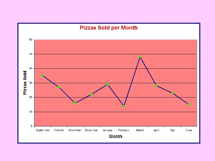
Graph the number of pizzas bought each month in our cafeteria. MONTH PIZZAS SOLD September 35 October 27 November 16 December 22 January 29 February 14 March 48 April 28 May 23 June 15
Step 1 • Click the Start Menu. • Select ‘Microsoft Office Excel. ’
Step 2 • In cell A 1, type ‘Month. ’ • In cell B 1 type, ‘Pizzas Sold. ’
Step 3 • Enter the months in cells A 2 -A 11. • Enter the data for the number of ‘Pizzas Sold. ’
Step 4 • Highlight the data in cells A 2 through B 12 by clicking and dragging the mouse.
Step 5 • Click the Chart Wizard icon on the toolbar… …and select ‘Line’ in the Chart type menu. • Then, click ‘Next. ’
Step 6 A preview of the graph appears. • Click ‘Next>’
Step 7 • Click off the ‘Show Legend’ checkmark to remove the legend. (click off) • Click, ‘Next >’
Step 8 • Click the Titles tab. • Type the Chart title. • Type the label for the horizontal axis in ‘Category (X) axis. ’ • Type the label for the Vertical axis in ‘Value (Y) axis. ’ Then, click ‘Next >’
Step 9 Choose where to place the graph. • Select the ‘As new sheet’ button for the graph to appear on a separate new sheet. • Select the ‘As object in’ button for the graph to appear on the spreadsheet. • Click ‘Finish. ’
Step 10 View the graph and format. Pizzas Sold Per Month