How to Create Accurate Graphs And Identify Misleading


- Slides: 17
How to Create Accurate Graphs And Identify Misleading Ones
Understanding Graphs • Basic graphing skills can help you be a better scientist. • Understanding how to convey your information in an accurate and honest way is the best way to demonstrate your credibility
First, a refresher on what a good graph looks like Line graphs are usually the best way to show values that change with time The vertical and horizontal labels both need units of measurement Find 7 marks using this graph format
Bar Graph vs Histogram Bar graphs are better for categorical data, but histograms are better for continuous
Pie Graphs Another way to show categorical data is a Pie Graph What information does a Bar graph provide, that a pie graph does not?
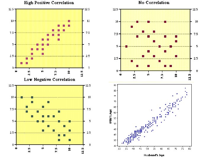
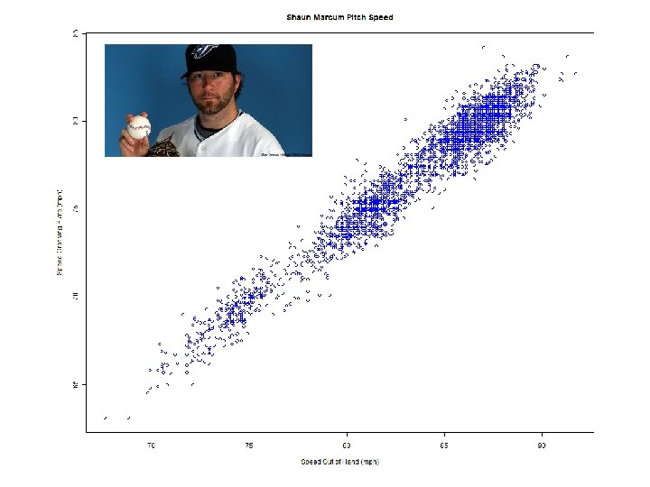
Scatter Plots Scatter plots are useful when you have a very large amount of data points Scatter Plots show several things about the correlation between two variables • Strength • Shape (linear or curved) • Direction (positive or negative) • Presence of outliers
This Graph was used to support the value of the ‘Stand Your Ground Law’ Flo enacted in Florida But if you take a close look at the vertical axis, you’ll see that the top of the graph is labelled How the public have ‘ 0’. would This means that the reacted if the data had been greatest number of murders presented in the conventional committed using firearms has way? the lowest point on the graph. What does this say about the effects of the ‘Stand Your Ground Law’ ?
These are rates of return on a mutual fund as quoted by a large commercial bank How would you interpret these numbers as a potential customer? How would it change your perspective if the vertical axis started at 0 % ?
Sometimes, political bias can be seen in how a graph is presented. This graph was intended to show that the unemployment rate went down, then much higher, and then stayed there. This is what the graph should look like with an accurate scale. But look at the last value on the graph. The scale is (mysteriously) changed so that it stays the same.
Sometimes, political bias can be seen in how a graph is presented. • Here is another graph from the same source, regarding candidates for an upcoming election. • What is wrong with this graph?
Incorrect representations In what way is this graph misleading?
Line of Best Fit A line of best fit is a straight line that attempts to best capture the relationship of the graph What assumptions does a line of best fit require?
Curve of Best Fit Sometimes data is not best represented by a straight line. In these cases, a curve of best fit is the appropriate way to summarize the data A curve of best fit is the way to summarize data, and sometimes these ‘curves’ are a straight line
Real examples of graphing manipulation The difference is made to look like about 7 x , when in reality it is only about 2. 5 x